our carpet choice will set the tone for your entire room.
It can make your space feel larger, cozier, or more luxurious depending on what you choose.
The perfect carpet not only needs to look good with your walls but also match your lifestyle needs.
Do you have kids or pets that might make lighter colors impractical?
Or are you creating a formal space where elegance is the priority?
Let’s discover my favorite carpet colors that pair beautifully with Repose Gray walls:

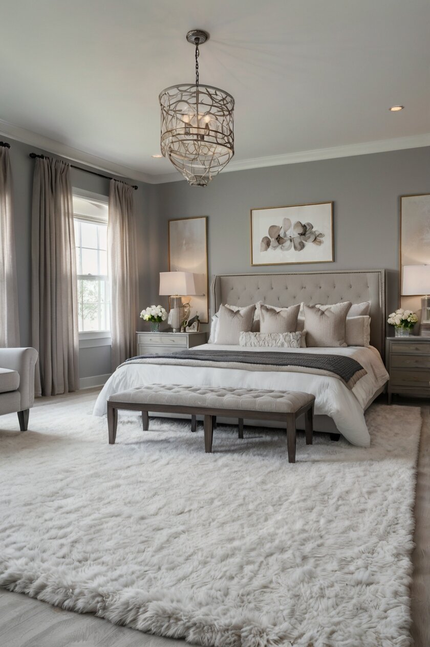
Crisp White Carpet
White carpet creates a clean, bright combination with Repose Gray walls that feels modern and spacious.
When paired with Repose Gray, white carpet reflects light around the room.
This combination makes smaller spaces appear instantly larger and more open.
The contrast between the soft gray walls and bright white flooring creates a fresh, airy feeling.
White carpet acts as a blank canvas that allows your furniture and accessories to stand out.
This combination works especially well in bedrooms and formal living rooms where you want a sophisticated, clean look.
In a bedroom, white carpet adds a luxurious hotel-like quality that feels indulgent underfoot.
The neutral pairing allows you to add colorful accents through pillows, artwork, or window treatments.
For a more interesting look, choose white carpet with subtle texture or a low-pile pattern.
This adds visual interest without compromising the clean aesthetic.
Be aware that white carpet does require more maintenance than darker colors.
You’ll need to remove shoes, vacuum regularly, and address spills immediately.
Professional cleaning once or twice a year is recommended to keep white carpet looking fresh.
This combination works well in formal spaces, adult bedrooms, or homes without young children or pets.
If you love the look but worry about practicality, consider cream or off-white as slightly more forgiving alternatives.
Area rugs over white carpet in high-traffic areas can also help protect your investment while adding additional style elements.
This color combination creates a timeless, elegant foundation that you can easily update with different accent colors as trends change.
White carpet with Repose Gray gives you maximum flexibility with your decorating style, working equally well with traditional, contemporary, or transitional décor.
Tap to Explore These Beauties
See my ideas in action 👇 Tap any image to explore full details.
Soft Beige Carpet
Beige carpet paired with Repose Gray walls creates a warm, cohesive look that feels inviting and versatile.
This combination brings out the subtle warm undertones in Repose Gray, creating a harmonious flow throughout your space.
Beige ranges from light tan to deeper taupe, giving you flexibility within this neutral palette.
Lighter beige carpets maintain a bright, open feeling while still being more practical than pure white.
Deeper beige or taupe carpets add warmth and coziness, perfect for creating comfortable living spaces.
This pairing works well in family rooms, dining areas, and hallways where you want a welcoming atmosphere.
The neutral-on-neutral combination provides an excellent backdrop for both colorful and natural-toned furniture.
Beige carpet has the advantage of hiding minor dirt and dust better than white while still keeping your space feeling open.
For the most harmonious look, choose a beige carpet that shares the same undertones as your specific Repose Gray paint.
Some Repose Gray walls lean slightly warm, while others might appear cooler depending on your lighting conditions.
💭 Ever wondered what your room would actually look like rearranged?
I built a free tool that lets you drag furniture around a 2D floor plan. No signup, no catch.
See the Room Planner →Beige carpet with texture, like a subtle pattern or berber style, adds visual interest while maintaining the neutral palette.
This combination allows your decorative elements and furniture to take center stage.
Your artwork, throw pillows, and accent pieces will pop against this neutral foundation.
Beige carpet with Repose Gray walls creates a timeless look that won’t feel dated as trends change.
This versatile pairing works with virtually any decorating style from farmhouse to modern.
For added dimension, layer area rugs with patterns or deeper colors over your beige carpet in seating areas.
This neutral combination also makes it easy to sell your home if you’re considering resale value.
Potential buyers can envision their own furniture and style preferences in such a versatile space.
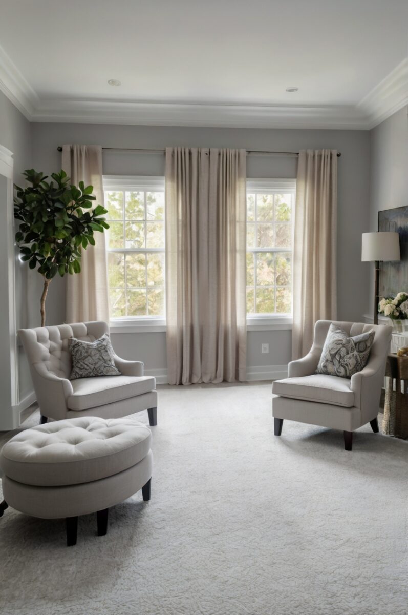
Light Gray Carpet
Light gray carpet paired with Repose Gray walls creates a sophisticated monochromatic look that feels modern and serene.
This tone-on-tone approach creates a cohesive, flowing feel throughout your space.
When you match similar shades of gray, your room appears larger and more continuous.
Choose a light gray carpet that’s a shade or two lighter than your Repose Gray walls for subtle contrast.
This subtle difference prevents the space from feeling flat or one-dimensional.
The monochromatic palette serves as an excellent backdrop for colorful furniture and accessories.
Light gray carpet hides dust and minor stains better than white while still maintaining a bright, open feeling.
This combination works particularly well in bedrooms, home offices, and formal living spaces.
For added interest, select a light gray carpet with subtle texture or a low-profile pattern.
The texture adds depth to your monochromatic design without disrupting the clean aesthetic.
Light gray carpet with Repose Gray walls creates a calming, peaceful environment that reduces visual stimulation.
This makes it perfect for spaces where you want to relax or concentrate.
Consider the undertones of both your specific Repose Gray paint and the gray carpet you select.
For the most harmonious look, match cool-toned gray carpet with cooler Repose Gray walls, or warm-toned carpet with warmer walls.
This pairing offers excellent versatility with different decorating styles from Scandinavian minimalism to contemporary designs.
Light gray carpet provides a neutral foundation that allows statement furniture pieces to stand out.
In bedrooms, this combination creates a serene retreat that promotes restful sleep.
In home offices, the monochromatic palette reduces visual distractions, helping you stay focused on work.
Add metallic accents like silver, gold, or copper to bring warmth and interest to this neutral color scheme.
This timeless combination won’t look dated quickly and allows for easy updates by simply changing accessories.
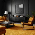
Charcoal Gray Carpet
Charcoal gray carpet creates dramatic contrast with Repose Gray walls, adding depth and sophistication to your space.
This bold pairing makes a contemporary statement that feels intentional and designed.
The dark floor anchors the room while the lighter walls keep the space from feeling too heavy or closed in.
Charcoal carpet provides practical benefits for busy households with its excellent ability to hide stains and dirt.
This makes it perfect for high-traffic areas like family rooms, playrooms, or homes with children and pets.
The contrast between light walls and dark floors creates visual interest and defines the space more clearly.
Charcoal gray carpet adds warmth and coziness to larger rooms that might otherwise feel too open or cold.
This combination works especially well in modern and contemporary spaces with clean lines and minimal designs.
For a cohesive look, incorporate a few charcoal or black accessories throughout the room to tie in with the carpet.
Consider charcoal carpet with subtle patterns or texture to add dimension and prevent it from looking flat.
This color combination is particularly effective in rooms with plenty of natural light to balance the darker floor.

Find Your Room’s Color Palette
Tap a vibe — get a curated 5-color palette with hex codes you can copy ✨
💭 I Wrote a Book About My Biggest Decorating Mistakes!
When I decorated my first home, I thought I knew what I was doing. Spoiler: I didn’t. 😅
💸 I bought a sofa way too big for my living room. Paint colors that looked amazing in the store but terrible on my walls.
In rooms with less natural light, add strategic lighting to prevent the space from feeling too dark.
Charcoal carpet makes furniture in light colors like white, cream, or light gray really stand out.
This creates a striking visual effect that draws attention to your seating areas or important furniture pieces.
The contrast between Repose Gray walls and charcoal carpet creates a sophisticated framework for adding colorful accessories.
Jewel tones like emerald green, sapphire blue, or ruby red look particularly stunning against this neutral backdrop.
This combination works well in dining rooms, creating an elegant atmosphere for entertaining.
In bedrooms, charcoal carpet creates a cozy, enveloping feeling that promotes rest.
While bold, this pairing has staying power beyond passing trends due to its classic contrast.
Charcoal carpet is also a practical choice for rental properties or homes that see heavy use.
Navy Blue Carpet
Navy blue carpet paired with Repose Gray walls creates a sophisticated, classic combination with timeless appeal.
This pairing brings depth and interest to your space without overwhelming it.
Navy acts as a neutral while still adding rich color that grounds the room.
The cool tones of navy complement the subtle undertones in Repose Gray beautifully.
This combination works especially well in studies, libraries, formal living rooms, and master bedrooms.
Navy carpet creates a sense of luxury and elegance that elevates your entire space.
The contrast between light walls and dark flooring adds architectural interest even in simpler rooms.
Navy blue has the practical advantage of hiding stains and dirt while still adding distinct color to your space.
For a cohesive look, incorporate navy blue accents in artwork, pillows, or window treatments throughout the room.
This color combination provides a perfect backdrop for brass or gold accents, which pop beautifully against both the gray and navy.
Navy carpet adds warmth to rooms with northern exposure that might otherwise feel too cool or stark.
This pairing works well with many design styles from traditional to nautical to modern.
In bedrooms, navy carpet creates a cocoon-like feeling that supports restful sleep.
In home offices or libraries, this combination feels scholarly and focused without being too dark or heavy.
Consider navy carpet with subtle patterns or textures to add additional visual interest.
The depth of navy blue creates an excellent foundation for layering area rugs in complementary colors or patterns.
This combination allows wood furniture to stand out beautifully, especially medium to light wood tones.
Light-colored furniture and accents appear crisp and defined against the navy carpet.
Despite being a bolder choice than neutral carpet colors, navy has staying power that won’t look dated quickly.
This classic pairing creates rooms that feel intentionally designed rather than randomly assembled.
Greige Carpet
Greige carpet—a perfect blend of gray and beige—creates a harmonious partnership with Repose Gray walls that feels current yet timeless.
This combination embraces the “greige” trend that has dominated interior design in recent years.
Greige carpet picks up and enhances the warm undertones present in Repose Gray paint.
This creates a cohesive, flowing look throughout your space that feels intentionally designed.
The beauty of greige carpet lies in its versatility—it’s neither too warm nor too cool.
This neutral quality makes it complement virtually any accent colors or decorating styles you choose.
Greige carpet works particularly well in open-concept homes where flooring flows between multiple spaces.
It creates visual continuity while still providing subtle texture and warmth underfoot.
This carpet color hides everyday dirt and minor stains better than lighter options like white or cream.
For smaller spaces, greige carpet helps maintain a bright feel while being more practical than pure light colors.
This combination works exceptionally well in living rooms, bedrooms, and transitional spaces like hallways.
Greige carpet provides a relaxed, comfortable foundation that still feels current and stylish.
The subtle color variations in most greige carpets add visual interest without competing with your furnishings.
This pairing creates an excellent backdrop for both cool and warm accent colors.
Blues, greens, rust oranges, and deep reds all look beautiful against the greige and Repose Gray combination.
Natural elements like wood and stone complement this neutral palette perfectly.
Greige carpet maintains a bright, open feeling similar to beige but with a more contemporary edge.
This combination adapts well to changing light throughout the day, maintaining its balanced appearance.
For added interest, consider greige carpet with subtle patterns or varying pile heights.
This modern neutral pairing has staying power beyond passing trends, making it a smart long-term investment.
What’s Your Decor Personality?
5 questions · 30 seconds · Instant style match 🏡
Taupe Carpet
Taupe carpet creates a rich, sophisticated partnership with Repose Gray walls that feels both grounded and elegant.
This earthy neutral has more depth than beige while maintaining warmth that softens the gray walls.
Taupe carpet brings out the subtle warm undertones in Repose Gray, creating a harmonious flow in your space.
This combination works particularly well in living rooms, dining rooms, and master bedrooms where you want a refined atmosphere.
Taupe spans a range of colors from grayish-brown to warmer brownish-gray, giving you flexibility within this color family.
Choose a taupe that leans more gray for a cooler, more contemporary feel with your Repose Gray walls.
Select a warmer, more brown-influenced taupe to create a cozier, more traditional atmosphere.
Taupe carpet hides dirt and stains exceptionally well, making it practical for busy households.
This combination creates a sophisticated neutral backdrop that allows your furniture and accessories to shine.
Both rich jewel tones and subtle pastels work beautifully against this neutral foundation.
Natural wood furniture stands out beautifully against taupe carpet and Repose Gray walls.
This pairing creates a grounded feeling that makes larger spaces feel more intimate and welcoming.
Taupe carpet adds visual weight to a room without making it feel dark or closed in.
The subtle contrast between the wall and carpet colors adds dimension without creating stark divisions.
This combination transitions well between different decorating styles as your preferences evolve.
Taupe carpet with Repose Gray walls works with traditional, transitional, and even contemporary designs.
For added interest, choose taupe carpet with subtle patterns or texture variations.
This neutral pairing provides excellent versatility if you like to change your accent colors seasonally.
In dining rooms, this combination creates an elegant atmosphere that feels formal without being stuffy.
This timeless color combination provides excellent return on investment, appealing to future homebuyers.
Sage Green Carpet
Sage green carpet paired with Repose Gray walls creates a nature-inspired, calming combination that feels fresh and organic.
This unexpected pairing brings the outdoors in, creating a serene environment connected to nature.
Sage green is a muted, grayish green that complements rather than competes with Repose Gray.
This soft green adds color while still functioning as a neutral in your overall design scheme.
The combination works particularly well in bedrooms, meditation spaces, home offices, and sunrooms.
Sage green carpet with Repose Gray creates a subtle color story without overwhelming the space.
This pairing has been shown to reduce stress and promote relaxation through its connection to nature.
The muted quality of both colors creates a sophisticated backdrop for both modern and traditional furnishings.
Sage green carpet adds warmth and interest while still maintaining a light, airy feeling in your space.
This color combination works beautifully with natural materials like wood, rattan, and stone.
Consider sage green carpet with varying pile heights or subtle patterns to add texture and dimension.
This pairing creates an excellent foundation for botanical themes and natural decorative elements.
In home offices, this calming combination can help promote focus and reduce eye strain.
In bedrooms, the nature-inspired palette creates a restful environment conducive to quality sleep.
Sage green hides minor stains and dirt better than light neutrals while still brightening your space.
This color combination allows metallic accents in warm tones like brass or gold to truly shine.
The earthy quality of sage green grounds spaces that might otherwise feel too cool or clinical.
This pairing works especially well in rooms with plenty of natural light to bring out the subtle undertones.
While more colorful than neutral carpets, sage green has staying power as a nature-inspired classic.
This combination feels current without being trendy, giving your space timeless appeal.
This or That?
Pick your fave — see what other readers chose! 👀
Soft Blue Carpet
Soft blue carpet creates a serene, spa-like atmosphere when paired with Repose Gray walls.
This combination feels fresh, clean, and subtly coastal without being overtly beachy.
Soft blue—ranging from pale sky blue to muted blue-gray—adds gentle color while maintaining a light, open feeling.
The cool tones in both the carpet and wall color create a cohesive, harmonious look.
This pairing works beautifully in bedrooms, bathrooms, and spaces where you want to create a calming retreat.
Soft blue and gray together create a color story that feels both current and timeless.
This combination has been shown to lower blood pressure and heart rate, making it perfect for spaces dedicated to relaxation.
The subtle color contrast adds interest without creating jarring visual transitions in your space.
Soft blue carpet brightens rooms with limited natural light, making them feel more open and airy.
This pairing provides an excellent backdrop for both white furniture (for a crisp look) or natural wood tones (for warmth).
Consider soft blue carpet with subtle patterns or texture for added visual interest.
✦ You Might Love This
Olive Walls, Endless Possibilities: 7+ Carpet Colors to Upgrade Your Place Keep Reading →This combination works particularly well with silver or chrome accents for a cool, contemporary feel.
In children’s rooms or nurseries, this pairing creates a calm environment that can grow with the child.
For home offices, the blue-gray combination promotes focus and productivity without being distracting.
Soft blue carpet hides minor dust and dirt better than pure white while maintaining a light, open feeling.
This color combination adapts well to different lighting conditions throughout the day.
The subtle color of the carpet adds personality without limiting your furniture or accessory choices.
For a cohesive look, incorporate varying shades of blue in your accessories throughout the space.
While adding distinct color, soft blue carpet has remarkable staying power beyond passing trends.
This combination feels especially appropriate in homes with water views or in coastal regions.
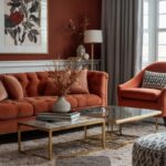
Warm Brown Carpet
Warm brown carpet creates a grounding, cozy contrast when paired with Repose Gray walls.
This combination balances cool and warm elements for a welcoming, balanced space.
The warmth of brown carpet softens the cooler tones of Repose Gray, creating visual harmony.
This pairing works especially well in living rooms, family rooms, and spaces where comfort is a priority.
Warm brown carpet adds a natural element that connects your space to the outdoors.
This combination creates an excellent backdrop for both traditional and rustic decorating styles.
The contrast between the light walls and darker floor adds architectural interest and definition to your space.
Brown carpet hides dirt, stains, and wear exceptionally well, making it practical for busy households.
This pairing creates a perfect foundation for incorporating natural elements like wood, leather, and stone.
The warm-cool balance provides flexibility for accessorizing with either cool or warm accent colors.
Warm brown carpet with Repose Gray walls creates defined spaces in open floor plans without walls or barriers.
This combination feels particularly inviting in rooms used for entertaining or gathering.
For added interest, consider brown carpet with subtle variations in tone or texture.
This pairing creates a timeless look that won’t feel dated as trends change.
In bedrooms, this combination creates a cozy, enveloping feeling that promotes rest.
The contrast between light walls and dark flooring makes furniture and decorative elements stand out.
Warm brown carpet adds visual weight that helps ground larger spaces and make them feel more intimate.
This combination works beautifully with traditional furniture styles and antique pieces.
For a cohesive look, incorporate wood tones similar to your carpet color in furniture or accessories.
This practical pairing has excellent longevity both aesthetically and in terms of wear resistance.
💭 I Wrote a Book About My Biggest Decorating Mistakes!
When I decorated my first home, I thought I knew what I was doing. Spoiler: I didn’t. 😅
💸 I bought a sofa way too big for my living room. Paint colors that looked amazing in the store but terrible on my walls.
Lavender or Lilac Carpet
Lavender or lilac carpet creates an unexpected yet harmonious pairing with Repose Gray walls that feels both sophisticated and unique.
This subtle purple tone adds personality while maintaining a soft, refined aesthetic.
The cool undertones in both lavender and Repose Gray create a cohesive color story with gentle contrast.
This combination works beautifully in bedrooms, dressing rooms, or creative spaces where you want a touch of gentle color.
Lavender carpet adds a soothing quality that promotes relaxation and calm in your space.
This pairing feels elegant and intentional rather than trendy or overly themed.
Softer lavender shades maintain a neutral quality that won’t overwhelm your space or limit your decorating options.
This combination works particularly well in spaces with good natural light that brings out the subtle color variations.
Lavender carpet can make a smaller space feel more interesting without making it feel closed in or dark.
This pairing creates an excellent backdrop for both silver/chrome accents or warm gold/brass metals.
Consider lavender carpet with varying pile heights or subtle patterns to add texture and dimension.
This color combination is particularly flattering to skin tones, making it excellent for dressing areas or vanities.
In creative spaces, this gentle color pairing stimulates imagination without being overly stimulating.
For children’s rooms, this combination creates a sophisticated space that can grow with them over time.
Lavender carpet with Repose Gray walls creates a blank canvas for either cool or warm accent colors.
This unique pairing makes a subtle design statement without shouting for attention.
The soft purple tones add personality while still functioning as a near-neutral in your overall design.
This combination works well with both contemporary and traditional furniture styles.
For a cohesive look, incorporate small touches of lavender in accessories throughout the space.
While more distinctive than neutral carpets, lavender has surprising staying power when paired with versatile Repose Gray.
Quick Design Dilemma
Cast your vote — see what other readers think! 🤔
Cream Carpet
Cream carpet creates a soft, warm partnership with Repose Gray walls that feels both elegant and comfortable.
This combination brightens your space while adding gentle warmth that pure white can’t provide.
Cream has subtle yellow undertones that complement and soften the cooler aspects of Repose Gray.
This pairing works particularly well in formal living rooms, dining rooms, and master bedrooms.
Cream carpet makes spaces feel larger and more open while still being more practical than pure white.
This combination creates a light, airy feeling perfect for rooms with limited natural light.
The subtle contrast between the gray walls and cream carpet adds interest without creating stark divisions.
This neutral pairing provides maximum flexibility with furniture styles and accent colors.
Cream carpet with Repose Gray walls creates an excellent backdrop for both colorful art and accessories.
This combination works equally well with traditional, transitional, and contemporary decorating styles.
For added interest, consider cream carpet with subtle patterns or texture variations.
This pairing allows wood furniture and natural elements to stand out beautifully in your space.
In bedrooms, this combination creates a serene retreat that promotes restful sleep.
Cream carpet adds a luxurious quality that elevates the overall feeling of your space.
This color combination has excellent longevity, appealing to future homebuyers if you plan to sell.
Cream is slightly more forgiving than pure white, hiding minor dust and wear between cleanings.
For a cohesive look, incorporate cream tones in your window treatments or major furniture pieces.
This light pairing makes architectural elements and trim work stand out more prominently.
The warmth of cream softens the gray, preventing your space from feeling too cool or industrial.
This timeless combination provides a neutral foundation that supports changing accent colors as trends evolve.
Patterned Carpet with Gray Background
Patterned carpet with a gray background creates visual interest while maintaining harmony with Repose Gray walls.
This combination adds personality and dimension without competing with your wall color.
Patterned carpet with a gray base ensures coordination even as the pattern introduces additional colors.
This pairing works particularly well in home offices, dens, and spaces where you want visual stimulation.
Pattern adds texture and movement to your space, preventing it from feeling flat or one-dimensional.
Consider geometric patterns for contemporary spaces or traditional motifs for classic interiors.
Patterned carpet hides stains and wear exceptionally well, making it practical for busy areas of your home.
This combination allows you to introduce accent colors through the pattern that you can carry throughout the room.
Gray-based patterns with subtle cream, beige, or blue accents create a cohesive look with Repose Gray walls.
This pairing works especially well in spaces where you want to make a design statement without painting accent walls.
Patterned carpet defines spaces effectively in open floor plans or larger rooms.
This combination draws the eye downward, creating a balanced visual flow throughout your space.
For a subtle effect, choose a tone-on-tone gray pattern that adds texture without bold color contrasts.
This pairing can make smaller spaces feel more distinctive and intentionally designed.
Patterned carpet with a gray background works with both traditional and contemporary furniture styles.
This combination provides visual anchoring that makes floating furniture arrangements feel more connected.
The pattern complexity can be adjusted to suit your preference—from subtle textures to bold geometric designs.
Consider the scale of the pattern carefully—larger patterns work better in bigger rooms, while smaller patterns suit cozier spaces.
This pairing allows you to introduce personality while maintaining the sophisticated quality of your Repose Gray walls.
Patterned carpet creates a more customized, designed look that elevates your entire space beyond basic neutrals.