ave you ever painted your walls a beautiful sage green only to feel stuck when choosing the perfect carpet?
The good news is that sage green offers more matching options than you might think!
With the right combination, you can create a room that feels both pulled-together and personally yours.

Warm Cream Carpet


Warm cream carpet creates a soft, inviting foundation that lets your sage green walls shine as the star of the show.
This pairing brings a natural, earthy feeling to any room while maintaining an airy, open atmosphere.
The subtle contrast between the cool sage and warm cream creates a balanced, harmonious look that works in any space from living rooms to bedrooms.
When selecting your cream carpet, look for options with yellow or beige undertones rather than stark white shades.
These warmer creams will complement the natural qualities of sage green much better than cooler whites.
This combination works particularly well in rooms that receive plenty of natural light, as the sunlight will enhance the warmth of the cream while softening the sage.
For furniture, this palette welcomes wooden pieces in medium to light tones like oak or maple.
Add texture with natural fiber elements like rattan, jute, or wicker to enhance the organic feel.
Accents in terracotta, rust, or soft coral will add pops of complementary color that bring the space to life.
This palette also welcomes metallic touches – consider brass or gold hardware and light fixtures to add a touch of elegance.
Plants are a natural addition to this earth-toned combination, with their greens echoing and enhancing your wall color.
For window treatments, consider natural linen in cream or a slightly darker beige to frame your windows without competing with your walls.
This cream and sage combination creates a versatile backdrop that can shift from casual to formal depending on your accessories and furniture choices.
In a living room, this palette creates a welcoming, relaxed atmosphere perfect for gathering with family and friends.
In a bedroom, the combination promotes restfulness and calm, making it ideal for your personal retreat.
One of the greatest benefits of this pairing is its timeless quality – while both sage green and cream cycle in and out of trend status, their combination has a classic appeal that won’t feel dated in a few years.
Tap to Explore These Beauties
See my ideas in action 👇 Tap any image to explore full details.
Soft Gray Carpet


Soft gray carpet paired with sage green walls creates a sophisticated, contemporary look with a calming effect that works beautifully in modern homes.
This combination offers a subtle contrast that’s interesting without being overwhelming, creating balance through complementary cool tones.
The gray acts as a neutral backdrop that allows your sage walls to make a gentle statement without competing for attention.
When choosing your gray carpet, look for softer heather grays with slightly warm undertones to prevent the room from feeling too cool or clinical.
A plush texture in your carpet can add warmth and comfort to balance the coolness of the color palette.
This combination works wonderfully in spaces where you want to create a serene, peaceful atmosphere like bedrooms, home offices, or meditation spaces.
Furniture in darker woods like walnut or even black pieces create striking contrast against this palette while still maintaining harmony.
For a more subtle approach, light wood or white furniture pieces keep the space feeling open and bright against the gray floors.
To add visual interest, consider incorporating textural elements through pillows, throws, and window treatments in varying shades of gray, cream, and sage.
Metal accents in brushed nickel or chrome enhance the contemporary feel, while black metal fixtures add definition and structure.
This color scheme readily accepts accent colors like dusty blue, mauve, or even dark teal for added depth and personality.
Artwork featuring these colors can tie the whole room together beautifully.
For lighting, consider modern fixtures with clean lines to complement the contemporary feel of this color combination.
The gray and sage palette creates a wonderful backdrop for both artificial and natural light, maintaining its sophisticated appearance throughout the day.
Plants with silver-gray foliage like lavender or lamb’s ear can echo the floor color while creating a cohesive connection to your green walls.
This combination also allows flexibility in your decorating styles – it works equally well with minimalist, Scandinavian, or transitional design approaches.
As seasons or trends change, you can easily update the look with different accent colors without needing to replace major elements like your carpet or wall color.
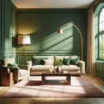
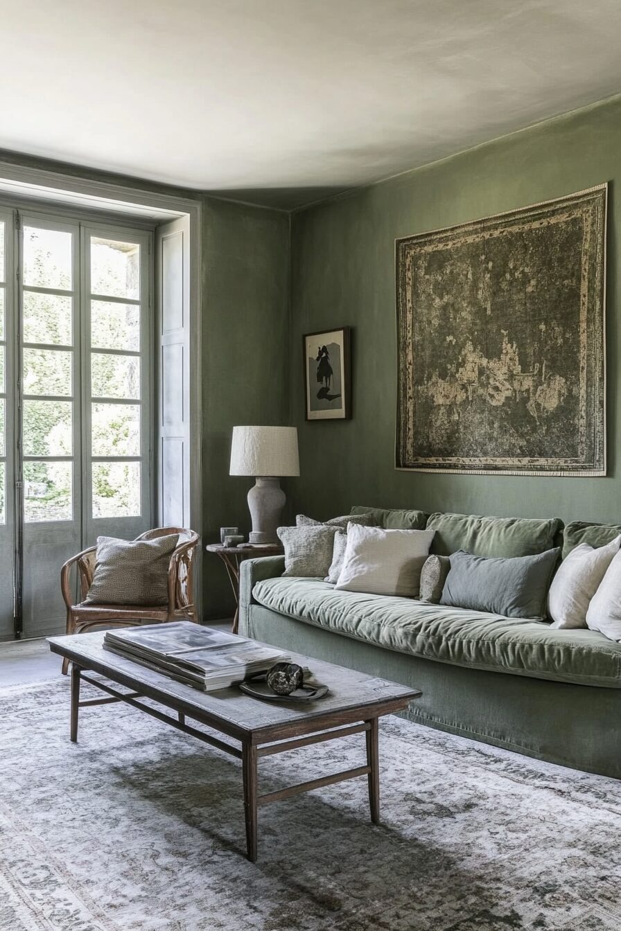
Rich Chocolate Brown Carpet
Rich chocolate brown carpet creates a stunning ground for sage green walls, offering a nature-inspired palette that feels both sophisticated and comforting.
This combination mimics the colors of the forest floor and canopy, bringing the outdoors inside in an elegant way.
The deep, rich brown provides a solid visual foundation that allows the sage to appear lighter and more vibrant by contrast.
The warmth of chocolate brown balances the coolness of sage green, creating a room that feels complete and thoughtfully designed.
This combination works particularly well in spaces where you want to create a cozy, enveloping atmosphere, such as living rooms, dens, or master bedrooms.
For furniture, consider lighter pieces in cream, tan, or even a warm white to prevent the room from becoming too dark or heavy.
Natural materials shine in this color scheme – think raw wood, leather, and stone that enhance the organic quality of your brown and green palette.
Metallic accents in antiqued brass or copper add warmth and dimension, catching the light and adding interest against the deeper carpet.
For textiles and accessories, consider incorporating patterns that feature both your wall and carpet colors, such as botanical prints or abstract nature-inspired designs.
This combination welcomes accent colors like burnt orange, mustard yellow, or even a pop of deep red to add energy to the space.
Lighting becomes especially important with a darker carpet – ensure adequate overhead lighting supplemented with strategically placed lamps to prevent the room from feeling shadowy.
Window treatments in a lighter shade than your walls can help balance the darker floor while maintaining the cohesive color story.
The chocolate brown and sage green palette has impressive staying power, as it’s rooted in natural colors that don’t quickly go out of style.
This combination works across different design styles, from traditional to rustic modern, making it adaptable to changing tastes over time.
In a home office, this palette creates a grounding environment that promotes focus and connection to nature.
In dining spaces, the rich brown carpet adds formality and elegance that pairs beautifully with wooden dining furniture against sage walls.
For larger rooms, area rugs with patterns incorporating browns and creams can break up the expanse of dark carpet while adding visual interest and defining conversation areas.
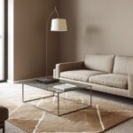
Beige Carpet
Beige carpet offers a versatile, timeless foundation that effortlessly complements sage green walls without competing for attention.
This neutral pairing creates a balanced, harmonious look that makes rooms feel larger and more open while maintaining warmth and comfort.
The subtle contrast between cool sage and warm beige generates visual interest while remaining soothing to the eye.
When selecting your beige carpet, look for options with slight yellow or green undertones rather than pink ones, as these will better harmonize with your sage walls.
A medium-pile beige carpet adds comfort underfoot while providing a practical option that doesn’t show footprints or vacuum lines as obviously as darker colors.
This combination creates an excellent backdrop for nearly any furniture style or color, making it incredibly versatile for changing decor over time.
Natural wood furniture in any finish from light oak to dark walnut looks beautiful against this palette, allowing you to choose based on your personal style preferences.
For a more contemporary look, furniture in black, white, or even bold colors like navy will stand out beautifully against this neutral background.
Textural elements become particularly important with this subtle color scheme – consider incorporating natural fibers, woven patterns, and varied fabrics to add depth.
This beige and sage combination welcomes accent colors across the spectrum – from vibrant jewel tones to soft pastels – giving you freedom to express your personality through accessories.
For a cohesive look, choose artwork that incorporates both your wall and carpet colors along with your chosen accent hues.
Metal finishes in gold or brass add warmth and elegance to this palette, while silver or chrome introduce a more contemporary, cool element to the space.
This combination works beautifully in high-traffic areas like family rooms and hallways, as beige carpet tends to be forgiving with everyday wear and stains.
In bedrooms, this palette creates a restful retreat that can be dressed up or down depending on your bedding and accessory choices.
Beige carpet provides excellent versatility through the seasons – in summer it feels light and airy, while in winter it creates a warm, cozy foundation when paired with appropriate textiles.
For window treatments, consider natural materials like bamboo or woven wood shades, or soft linen curtains in cream or beige to complete the organic, soothing vibe.
The timeless quality of this combination means you won’t tire of it quickly, making it a wise investment for your home’s interior design.

Find Your Room’s Color Palette
Tap a vibe — get a curated 5-color palette with hex codes you can copy ✨
💭 I Wrote a Book About My Biggest Decorating Mistakes!
When I decorated my first home, I thought I knew what I was doing. Spoiler: I didn’t. 😅
💸 I bought a sofa way too big for my living room. Paint colors that looked amazing in the store but terrible on my walls.
Navy Blue Carpet
Navy blue carpet paired with sage green walls creates a bold yet sophisticated color statement that brings depth and drama to any room.
This unexpected combination draws inspiration from nature – the deep blue of water against the soft green of foliage – creating a space that feels both grounded and refreshing.
The contrast between these colors creates visual interest while maintaining a cohesive feel through their shared cool undertones.
Navy carpet anchors the space with a sense of stability and permanence, while the lighter sage walls keep the room from feeling too dark or closed in.
This color combination works beautifully in spaces where you want to make a design statement, such as formal living rooms, home libraries, or master bedrooms.
When furnishing a room with this color palette, consider introducing lighter elements to balance the deep navy floor – cream, ivory, or light gray furniture pieces can prevent the space from feeling too heavy.
Wood tones in medium to light finishes provide warmth against the cool blue and green, with ash or oak being particularly complementary choices.
For accent colors, consider coral, mustard yellow, or even a touch of rust to add warmth and create dynamic contrast against the cool primary colors.
Metallic elements shine against this rich backdrop – brass or gold fixtures and accessories add warmth and sparkle that elevates the entire space.
Patterns that incorporate navy, sage, and your accent colors can tie the room together beautifully through pillows, throws, or area rugs atop your carpet.
This combination lends itself well to several design styles, from nautical and coastal to traditional or even contemporary approaches depending on your furniture and accessory choices.
Lighting becomes crucial with navy carpet – ensure ample illumination through overhead fixtures supplemented with table and floor lamps to prevent the space from feeling too dark.
The navy and sage combination creates a perfect backdrop for artwork and statement pieces, allowing them to stand out while remaining part of a coordinated design story.
In spaces like offices or studies, this color palette promotes focus and concentration while providing a distinctive, memorable environment.
Consider textural elements to add dimension to this color scheme – velvet furniture, silk pillows, or woven throws can add tactile interest that enhances the rich colors.
For window treatments, light-colored drapes or Roman shades prevent the windows from becoming heavy visual elements while framing your views elegantly.
This bold combination shows design confidence and creates spaces with character that stand apart from more common neutral-on-neutral approaches.
Taupe Carpet
Taupe carpet creates a sophisticated, versatile foundation that complements sage green walls with understated elegance.
This muted, complex neutral – with its perfect balance of gray and beige undertones – bridges the gap between warm and cool colors, making it an ideal partner for sage green.
The combination creates a serene, mature palette that works beautifully in both traditional and contemporary homes.
When selecting your taupe carpet, consider options with slight green undertones to create a subtle connection with your walls without being too matched or predictable.
This color pairing creates a backdrop that remains interesting while allowing your furniture and accessories to take center stage when desired.
Taupe’s chameleon-like quality means it can appear slightly different throughout the day as lighting changes, adding visual depth to your flooring.
This combination works particularly well in spaces meant for relaxation and contemplation – living rooms, bedrooms, or reading nooks all benefit from this calming palette.
For furniture, consider pieces in cream, ivory, or even white to create bright contrast against the mid-tone carpet and walls.
Wood furniture in almost any finish works with this combination – from light oak to deep walnut – giving you flexibility with existing pieces or future purchases.
Accent colors that pair beautifully with this base include dusty pink, terracotta, soft lavender, or even a pop of deep teal for more dramatic contrast.
Metallic accessories in brushed nickel, chrome, or champagne brass add subtle shine without overwhelming the restrained color palette.
This combination provides an excellent backdrop for highlighting artwork, allowing paintings and prints to stand out without competing with bold wall or carpet colors.
Textural elements become particularly important with this subtle color scheme – consider incorporating bouclé fabrics, nubby linens, or plush velvets to add tactile interest.
The taupe and sage combination transitions seamlessly between seasons – it feels cool and sophisticated in summer months and warm and cozy in winter with the right accessories.
This palette creates rooms that photograph beautifully and appear larger than they are, making it particularly good for smaller spaces that need visual expansion.
Pattern can be introduced through accent pillows, throws, or even an occasional chair in a complementary print to add visual interest to this understated base.
The timeless quality of both taupe and sage green means this combination will remain relevant for years, making it a wise choice for more permanent elements of your home.
What’s Your Decor Personality?
5 questions · 30 seconds · Instant style match 🏡
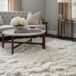
Ivory Carpet
Ivory carpet paired with sage green walls creates a fresh, airy combination that brightens any space while maintaining a sophisticated, serene atmosphere.
This pairing offers enough contrast to define the elements of your room while presenting a cohesive, harmonious look that feels intentionally designed.
The warmth of ivory softens the sometimes-cool undertones of sage, resulting in a balanced palette that welcomes natural light and makes spaces feel more expansive.
When selecting your ivory carpet, look for options with subtle cream or yellow undertones rather than stark white to create a more natural, livable space.
This combination works beautifully in rooms where you want to create a sense of tranquility and openness, such as bedrooms, formal living rooms, or home offices.
Furniture in natural wood tones from light oak to medium walnut adds warmth and organic texture that complements this nature-inspired color palette.
For a more contemporary approach, furniture in black or charcoal creates dramatic contrast against the lighter floor and walls while maintaining the room’s sophisticated feel.
Textiles play an important role in rooms with this color combination – consider incorporating various textures through pillows, throws, and window treatments to add dimension.
This palette welcomes accent colors across a wide spectrum – from pastels like blush pink or powder blue to more saturated hues like mustard yellow or terracotta.
Metal finishes in gold or brass add warmth and elegance, while silver or chrome introduce a cooler, more contemporary element to the space.
The ivory and sage combination creates an excellent backdrop for showcasing art, plants, and statement furniture pieces without overwhelming them.
For window treatments, consider natural materials like linen or cotton in ivory or a slightly warmer cream to maintain the light, airy quality of the room.
This color pairing transitions beautifully from season to season – it feels fresh in spring and summer and can be warmed up with deeper accent colors and textiles for fall and winter.
In spaces with limited natural light, this combination helps maximize brightness without resorting to stark white, which can sometimes feel clinical or uninviting.
Pattern can be introduced through area rugs layered over your ivory carpet, allowing you to define spaces and add visual interest while maintaining your clean base palette.
For a cohesive look throughout your home, this combination allows for easy transitions between rooms with different color schemes, serving as a neutral bridge.
The timeless quality of ivory flooring paired with the currently popular but enduring sage green creates a room that will remain stylish for years to come.
Light Dusty Blue Carpet
Light dusty blue carpet creates a unique, serene combination with sage green walls that evokes the subtle beauty of a misty garden landscape.
This unexpected pairing brings together two soft, muted colors that share cool undertones, creating a harmonious space that feels both fresh and calming.
The color combination works because both hues are present in nature – think of sage leaves against a morning sky – giving your room an organic, cohesive quality.
When selecting your dusty blue carpet, look for options with gray undertones rather than vivid blues to maintain the subtle, sophisticated nature of this color scheme.
This combination works beautifully in bedrooms, meditation spaces, or home offices where a sense of tranquility and focus is desired.
For furniture, consider pieces in warm cream, light wood tones, or even white to provide contrast against the cool-toned walls and floor.
To prevent the space from feeling too cool or distant, incorporate warm elements through natural materials like wood, rattan, or jute in accessories and furniture.
This color palette welcomes metallic accents in silver, pewter, or brushed nickel, which enhance the cool sophistication of the blue and green combination.
For accent colors, consider coral, peach, or terracotta to add warmth and vibrance that complements the cool primary colors without overwhelming them.
Textiles play an important role in adding depth to this subtle palette – look for patterns that incorporate your wall and carpet colors along with your chosen accent hues.
This combination creates a perfect backdrop for botanical elements, from actual houseplants to floral or leaf patterns in artwork and accessories.
The light dusty blue and sage palette has a timeless quality that references classic design while feeling fresh and contemporary in today’s homes.
For window treatments, consider soft white or cream sheers that diffuse light beautifully across your sage walls while adding contrast to your blue floors.
This color combination adapts well to different lighting conditions, maintaining its subtle beauty in both natural daylight and warmer evening illumination.
In larger spaces, the blue carpet helps define the room’s boundaries while the sage walls expand the space, creating a balanced sense of enclosure and openness.
This palette works across decorating styles from coastal casual to Scandinavian minimalism to traditional, adapting to your preferred aesthetic through furniture and accessory choices.
The unique quality of this color combination creates memorable spaces with distinctive personality that stands apart from more common neutral flooring options.
💭 Ever wondered what your room would actually look like rearranged?
I built a free tool that lets you drag furniture around a 2D floor plan. No signup, no catch.
See the Room Planner →Soft Lavender Carpet
Soft lavender carpet paired with sage green walls creates an unexpected yet harmonious combination that brings a touch of whimsy and sophistication to any space.
This color pairing draws inspiration from nature’s own garden palette – think of lavender plants with their purple blooms against their sage-green leaves.
The result is a room that feels both grounded and uplifting, with a subtle femininity that doesn’t overwhelm the space.
When selecting your lavender carpet, look for muted, dusty shades rather than bright purple to maintain the sophisticated, subtle quality of this unique combination.
This pairing works particularly well in spaces meant for relaxation and rejuvenation, such as bedrooms, reading nooks, or even spa-like bathrooms.
For furniture, consider neutral pieces in cream, white, or light gray to allow the wall and carpet colors to take center stage without competing elements.
Wood tones in light to medium finishes like ash, maple, or oak add natural warmth that balances the cooler undertones of the lavender and sage.
This color scheme welcomes metallic accents in silver or chrome, which enhance the cool sophistication while adding reflective elements that catch the light.
For accent colors, consider deeper purples, soft blues, or even a touch of dusty pink to create a cohesive color story that builds upon your base palette.
Patterns that incorporate lavender and sage, such as floral prints or abstract watercolors, can tie the room together through pillows, artwork, or window treatments.
This combination creates a perfect backdrop for vintage or antique furniture pieces, which add character and history against this softly colored canvas.
The lavender and sage palette has a timeless quality that references English country gardens while feeling fresh and unexpected in contemporary settings.
For window treatments, consider sheer white curtains that diffuse light beautifully or Roman shades in a complementary color from your accent palette.
This color combination adapts beautifully through seasonal changes – it feels fresh in spring, cool in summer, and can be warmed with appropriate accessories in fall and winter.
In smaller spaces, this palette creates interest without overwhelming, making rooms feel distinctive and thoughtfully designed rather than cramped.
This combination works well in spaces designated for creative activities, as the unusual yet harmonious colors can stimulate imagination and artistic thinking.
The unique quality of lavender carpet ensures your space will stand apart from more common neutral floors while still providing a versatile foundation for evolving decor.
This or That?
Pick your fave — see what other readers chose! 👀
Charcoal Gray Carpet
Charcoal gray carpet creates a bold, grounding contrast against sage green walls, resulting in a sophisticated, contemporary space with dramatic appeal.
This combination balances the lightness of sage with the depth of charcoal, creating visual weight that anchors your room while maintaining an elegant, cohesive look.
The cool undertones shared by both colors ensure harmony, while their different intensity levels create dynamic interest that draws the eye.
When selecting your charcoal carpet, consider options with slight blue or green undertones rather than warm browns to best complement your sage walls.
This combination works beautifully in spaces where you want to create a strong design statement, such as formal living rooms, dining rooms, or home offices.
For furniture, consider lighter pieces in cream, light gray, or even white to provide contrast against the dark floor and prevent the room from feeling too heavy.
Wood furniture in light to medium tones adds necessary warmth to balance the coolness of the charcoal and sage, with ash or oak being particularly complementary.
This palette welcomes accent colors like mustard yellow, rust orange, or even blush pink, which pop brilliantly against the neutral backdrop of gray and green.
Metallic elements shine against this rich background – brass or gold add warmth and luxury, while silver or chrome enhance the contemporary feel.
Patterns that incorporate your wall and carpet colors along with your chosen accents can tie the room together through textiles, artwork, and accessories.
This combination creates a perfect backdrop for statement art pieces or focal-point furniture, allowing them to stand out while remaining part of a cohesive design story.
The charcoal and sage palette has impressive versatility, working equally well in minimalist modern spaces or more traditional rooms depending on your furniture choices.
For window treatments, lighter fabrics prevent the windows from becoming heavy visual elements while framing your views with elegant contrast.
This color combination maintains its sophisticated appearance throughout the day and evening, adapting beautifully to both natural and artificial lighting.
In larger spaces, the dark carpet helps define boundaries while creating intimacy, making expansive rooms feel more welcoming and properly scaled.
This palette works particularly well in northern-facing rooms, where the cooler natural light enhances the true tones of both the charcoal and sage.
The dramatic quality of this combination creates memorable spaces that showcase design confidence while remaining livable and adaptable through changing decor trends.
💭 I Wrote a Book About My Biggest Decorating Mistakes!
When I decorated my first home, I thought I knew what I was doing. Spoiler: I didn’t. 😅
💸 I bought a sofa way too big for my living room. Paint colors that looked amazing in the store but terrible on my walls.
Oatmeal Carpet
Oatmeal carpet creates a warm, textural foundation that perfectly complements sage green walls with natural, organic harmony.
This combination draws inspiration from the outdoors – think of forest floors and meadow landscapes – resulting in a space that feels both grounded and refreshing.
The textural quality of oatmeal carpet adds visual interest through its flecked appearance, creating subtle dimension that enhances the solid sage walls.
When selecting your oatmeal carpet, look for options with visible texture and a mix of fibers in varying neutral tones to maximize the natural, organic appeal.
This combination works beautifully in spaces where you want to create a welcoming, relaxed atmosphere, such as family rooms, casual dining areas, or bedrooms.
For furniture, consider pieces in deeper wood tones like walnut or mahogany to create rich contrast against the lighter floor and walls.
This palette welcomes upholstery in nearly any color – from neutrals like brown and gray to bolder hues like navy, rust, or even emerald green.
Natural materials shine in this environment – think rattan, wicker, leather, and stone that enhance the organic quality and add textural variety.
For accent colors, consider terra cotta, mustard yellow, or deep rust, which all complement the natural quality of the oatmeal and sage while adding warmth.
This combination provides an excellent backdrop for displaying collections of pottery, basketry, or other artisanal items that enhance the natural, handcrafted feel.
The oatmeal and sage palette has impressive staying power, as it’s rooted in colors found in nature that don’t quickly cycle in and out of design trends.
For window treatments, consider natural materials like bamboo shades or linen curtains in cream or beige to continue the organic theme throughout the space.
This color combination transitions effortlessly between seasons – it feels cool and refreshing in summer months and warm and cozy in winter with the right accessories.
In spaces with abundant natural light, this palette glows with warmth throughout the day, creating rooms that feel inviting and connected to the outdoors.
Pattern can be introduced through tribal or geometric prints in accent pillows, throws, or artwork to add visual interest without competing with the textural carpet.
This combination creates spaces that both photograph beautifully and feel wonderful to live in, as the colors and textures have depth that appeals to multiple senses.
The versatility of this pairing means it works across different design styles, from bohemian to modern farmhouse to contemporary, adapting easily to your personal aesthetic.
Psst… Check This Out
11+ Designer-Approved Carpet Colors That Complement White Walls Take Me There →Quick Design Dilemma
Cast your vote — see what other readers think! 🤔
Butter Yellow Carpet
Butter yellow carpet paired with sage green walls creates a cheerful, sunny combination that brings warmth and optimism to any room.
This unexpected pairing draws from nature’s own color scheme – think of wildflower meadows with yellow blooms against green foliage – resulting in a space that feels fresh and alive.
The warm yellow floor balances and complements the cooler sage walls, creating a harmonious temperature balance that feels both energizing and soothing.
When selecting your butter yellow carpet, look for softer, more muted tones rather than bright lemon yellows to maintain a sophisticated, livable space.
This combination works particularly well in rooms that can benefit from added warmth and light, such as north-facing spaces or rooms used primarily in the morning.
For furniture, consider pieces in cream, white, or light wood to maintain the bright, airy quality of this color scheme without competing with the yellow floor.
Deeper wood tones like walnut or cherry can add elegant contrast against the lighter colors while grounding the potentially playful quality of the yellow.
This color palette welcomes accent colors in coral, light blue, or even lavender, which can be introduced through accessories, artwork, and textiles.
Patterns that incorporate yellow and green, such as botanical prints or geometric designs, can tie the room together through pillows, throws, or window treatments.
This combination creates a perfect backdrop for casual, comfortable living spaces where family gathering and relaxation are the primary functions.
The butter yellow and sage palette has a timeless quality that references vintage design while feeling fresh and unexpected in contemporary settings.
For window treatments, consider white or cream curtains that maintain the light, bright quality while softening windows and adding textural interest.
This color combination shines in spaces used during daytime hours, as natural light enhances the sunny qualities of the yellow while keeping the sage fresh and vibrant.
In children’s rooms or playspaces, this palette creates a gender-neutral background that’s stimulating without being overwhelming or too theme-specific.
This combination works beautifully in kitchens and dining areas, where the warm yellow creates an appetizing backdrop for meals and socializing.
Consider incorporating plants and natural elements to enhance the garden-inspired quality of this color combination, bringing the outdoors in.
The unique quality of butter yellow carpet ensures your space will stand apart from more common neutral floors while still providing a versatile foundation for evolving decor over time.
Soft Mint Carpet
Soft mint carpet paired with sage green walls creates a serene, monochromatic space that’s both subtle and sophisticated in its tonal approach.
This combination plays with different values of green – the lighter mint floor and the deeper sage walls – creating depth through variation within the same color family.
The result is a harmonious, cohesive space that feels intentionally designed with a gentle, nature-inspired palette that promotes tranquility and relaxation.
When selecting your mint carpet, look for options with gray undertones rather than blue to best complement the earthy quality of sage green walls.
This combination works beautifully in spaces meant for relaxation and rejuvenation, such as bedrooms, meditation rooms, or spa-like bathrooms.
For furniture, consider pieces in white, cream, or light natural wood to provide contrast against the green backdrop without competing with the color story.
This palette welcomes contrast through deeper wood tones like walnut or even black furniture pieces, which stand out dramatically against the soft green backdrop.
For accent colors, consider blush pink, light coral, or soft terracotta, which complement green beautifully while adding warmth to balance the cool undertones.
Metallic elements in brass or gold add necessary warmth and sparkle to this cool-toned environment, preventing it from feeling too one-dimensional.
Patterns that incorporate various shades of green along with your chosen accent colors can add visual interest through pillows, artwork, or area rugs layered over your carpet.
This combination creates a perfect backdrop for botanical elements, from actual houseplants to botanical prints or leaf-patterned textiles.
The mint and sage palette has a fresh, contemporary quality while referencing nature in a way that ensures longevity beyond current trends.
For window treatments, consider white or cream sheers that diffuse light beautifully while adding subtle contrast to your green-on-green scheme.
This color combination adapts beautifully to different lighting conditions, maintaining its serene quality in both bright daylight and softer evening illumination.
In smaller spaces, this tonal approach creates a continuous flow that can make rooms appear larger and more cohesive than high-contrast color schemes.
This palette works particularly well in spaces where visual calm is desired – home offices, reading nooks, or rooms dedicated to hobbies that require concentration.
The unique quality of this monochromatic approach showcases design confidence and intentionality, creating memorable spaces that feel both current and timeless.