

I almost bought the paper plates with the giant bald eagle on them.
I was standing in the Target dollar section, running late, and they were right there.
And honestly?
I put them back.
Not because I’m a snob about patriotic decor — I’m genuinely not — but because I’ve spent too many Julys looking at my table mid-party and feeling like I accidentally set up a school cafeteria.
This year I did it differently.
Same colors, totally different vibe.
And now I kind of want to use this table every summer, not just the fourth.
Here’s what actually worked.
Start With Texture, Not Color
The cheesy version of this table exists because it leads with color.
Everything is red, white, and blue — and it all screams at you at the same volume.
The non-cheesy version?
It leads with texture first.
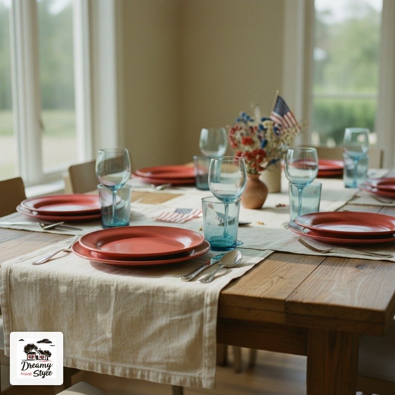
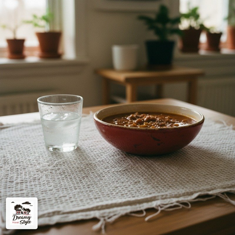
Think: a linen tablecloth, a woven runner, a chunky ceramic bowl.
The color comes second, layered over something that has physical weight and warmth to it.
I used a natural linen runner I already owned (beige, totally neutral) and built everything else on top of it.
The texture grounded the whole thing.
It made the red and blue feel intentional instead of costumey.
Texture gives a table something to hold onto.
Without it, even expensive decor can look flat and themed-party adjacent.
The Tablecloth Decision (This One Matters More Than You Think)
Red tablecloth = instant picnic vibes.
Not always bad.
But if you want something that reads as ‘styled’ rather than ‘party supply store,’ go neutral underneath.
White linen is gorgeous and also a nightmare if your guests have barbecue hands.
I’ve been there.
Twice.
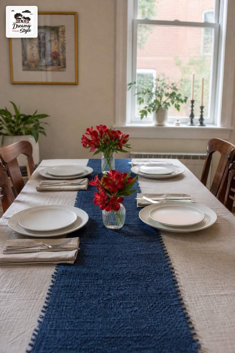
My actual solution: a cream or oat-colored linen cloth from the thrift store (mine was $4, I am not kidding), with a navy or red runner laid over it.
You still get the color, but the base reads as intentional adult hosting instead of red-themed anything.
If you do want a white tablecloth, get one with texture — waffle weave, fringe edge, something.
Flat white polyester is truly the worst thing you can do.
Choosing Plates That Don’t Look Like They Came in a 50-Pack
Here’s the thing about patriotic paper plates: they telegraph ‘I didn’t think about this.’ And I say that as someone who has bought them more than once.
You don’t have to use real dishes for a backyard party.
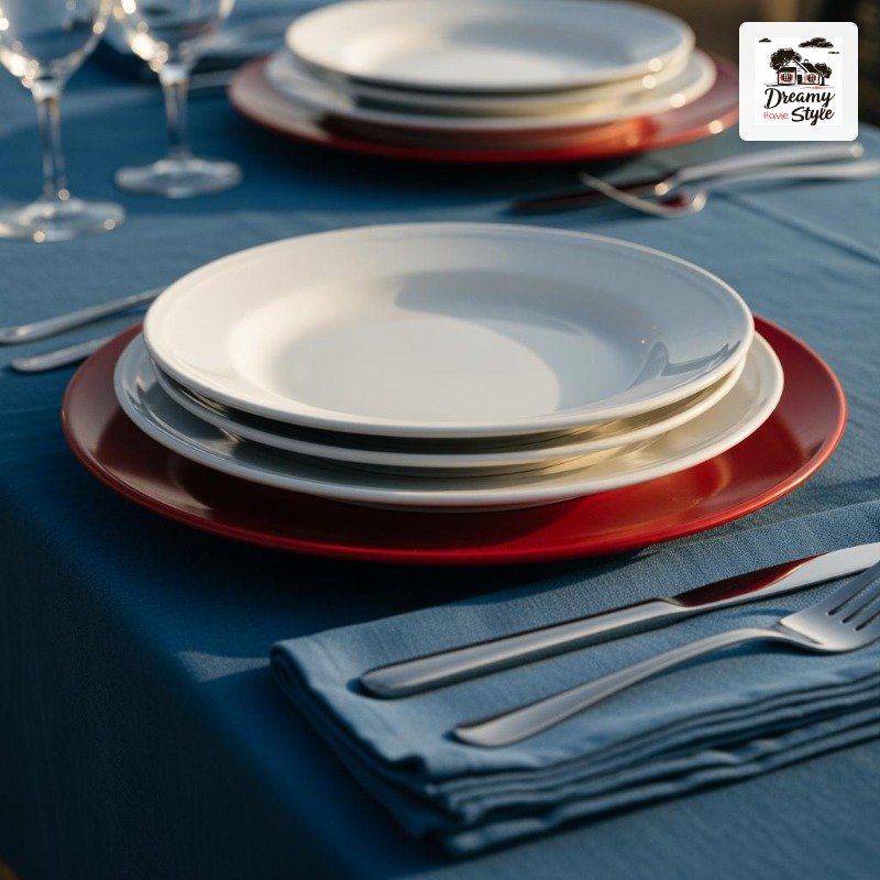
But if you’re doing disposable, please just go plain white.
White plates are clean, they let the food look good, and they work with literally any color scheme you’re building around them.
If you want red plates, get solid red ones — not printed ones.
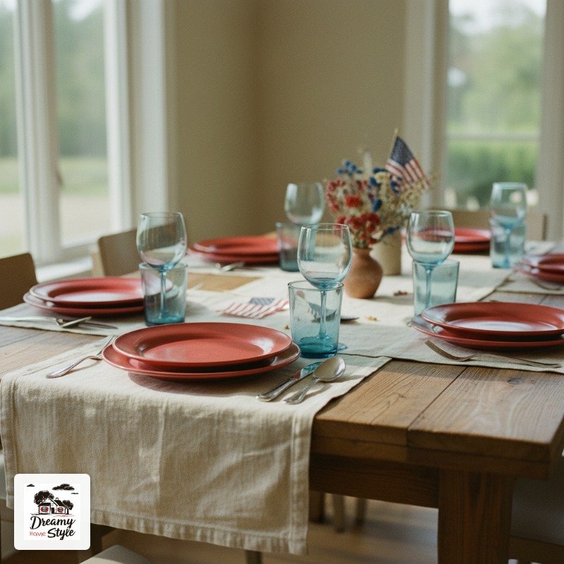
IKEA has solid red melamine that I’ve used for outdoor parties and they look great.
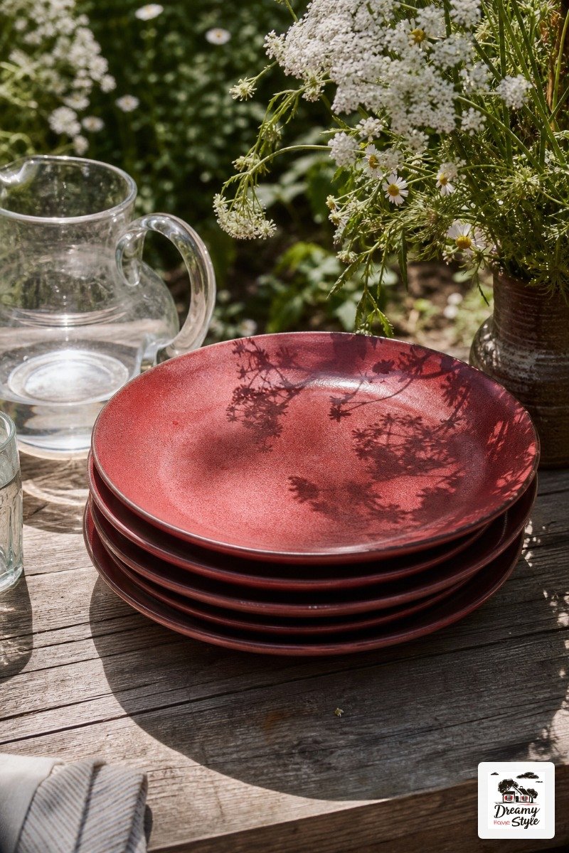
Same with thrifted red stoneware.
Solid color reads as a design choice.
Printed patterns with stars read as a product.
Mix your plate colors if you want.
I did white dinner plates with small red salad plates and it looked really intentional.
Sort of like I planned it.
(I did not plan it.
I grabbed what I had.)
Glassware: Where the Blue Actually Lives
Blue is the hardest color to work into a table setting without it looking forced.
Red shows up naturally in flowers and food.
White is everywhere.
But blue?
It tends to look like you tried.
Glassware is where it earns its place.
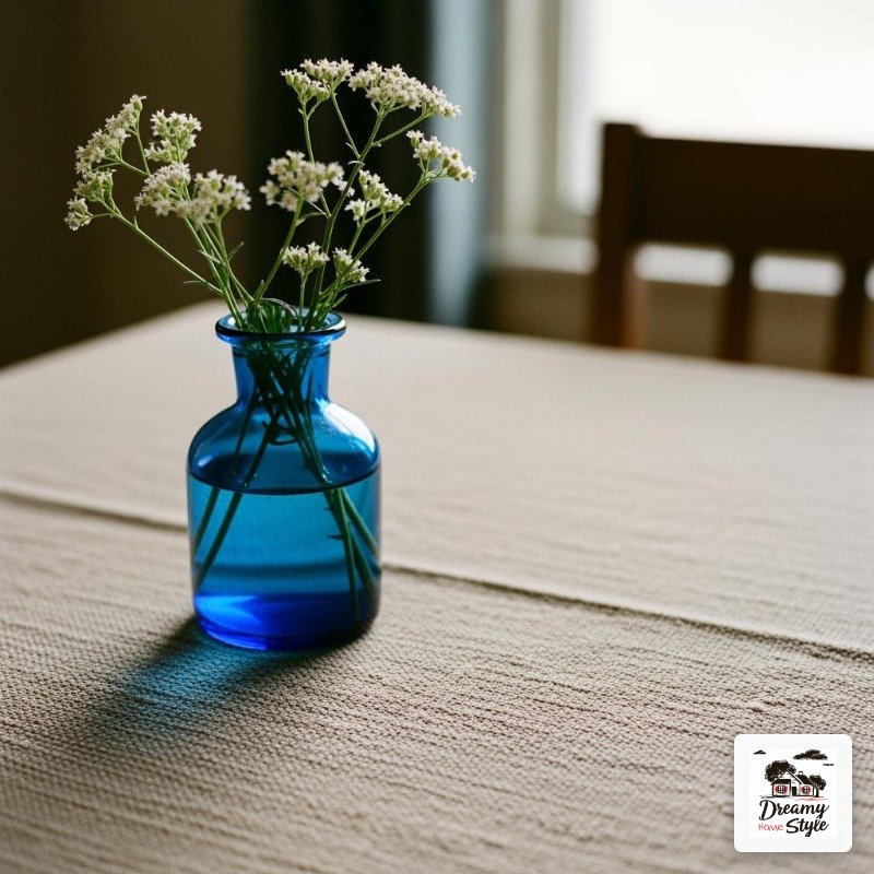
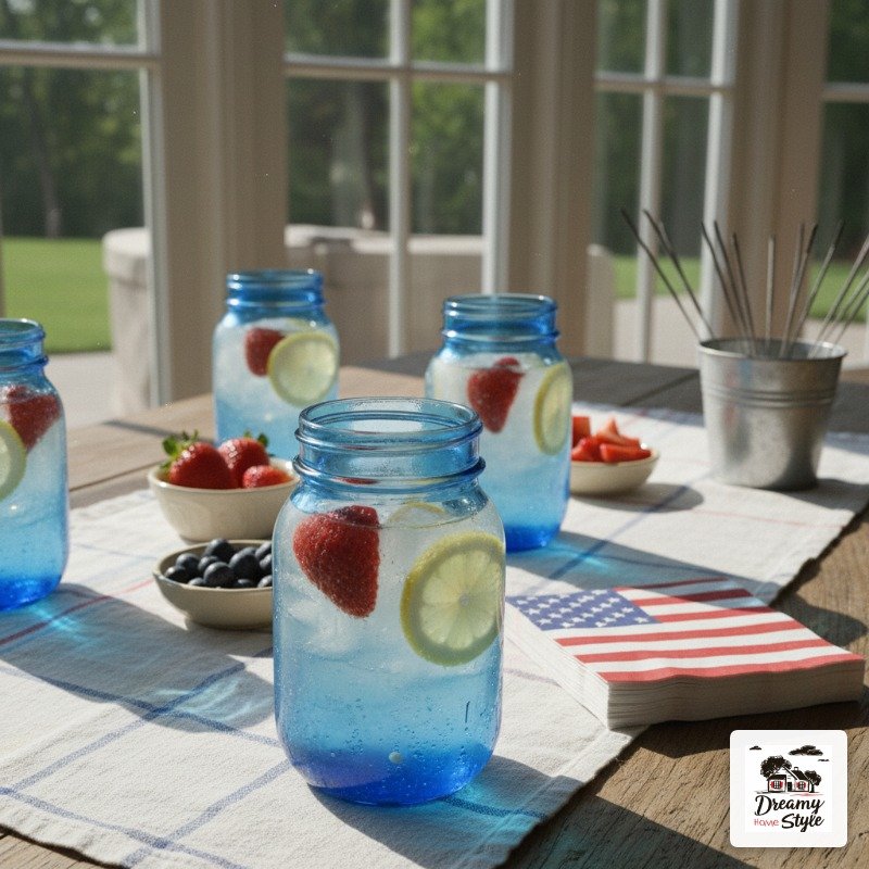
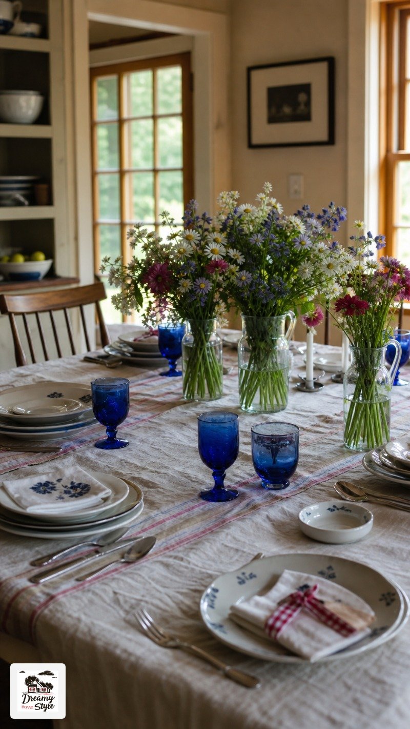
Blue tinted glasses or even cobalt blue mason jars are genuinely beautiful on a table — the light comes through them and they feel like something, not like a theme.
I picked up four cobalt blue Ball mason jars at a thrift store for about $6 total.
They doubled as glasses and as small vases.
I’m honestly obsessed with how they turned out.
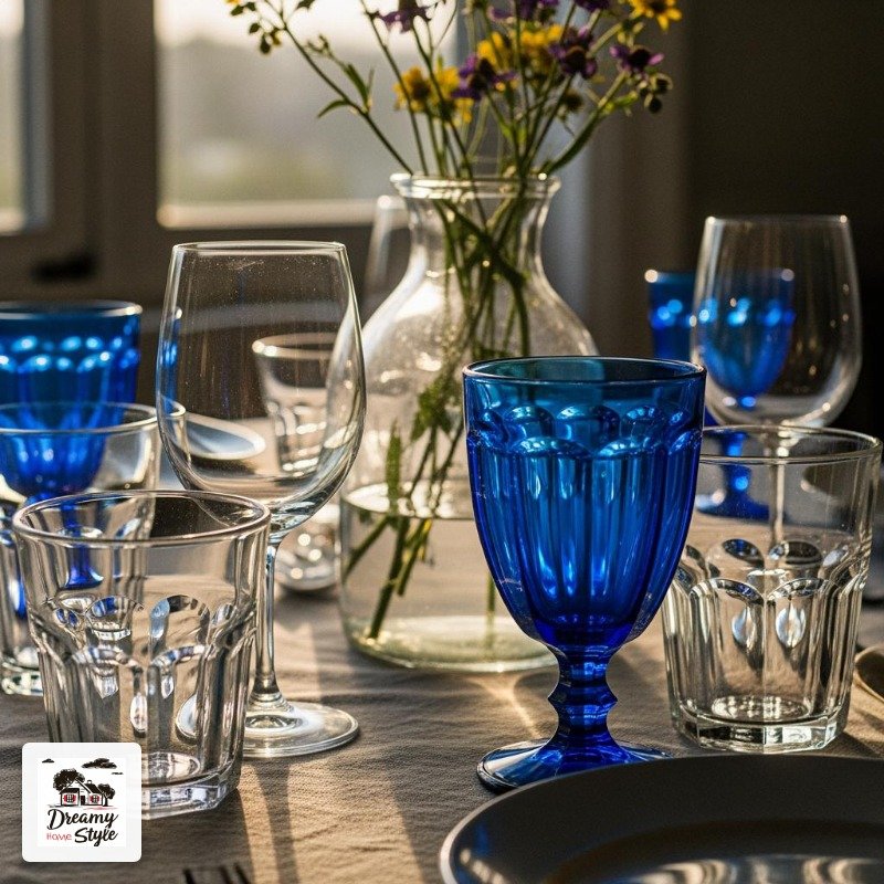
You don’t need every glass to be blue.
Even two or three blue pieces scattered across a table of clear glassware gives you the color payoff without making it look like a blue plate special.
Flowers: Go Wild, Literally
Red roses screaming out of a vase?
That’s a Valentine’s Day table that wandered into the wrong holiday.
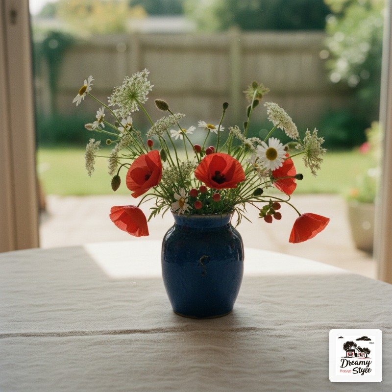
For July 4th I want flowers that feel like summer — loose, a little wild, like they came from someone’s garden or a farm stand.
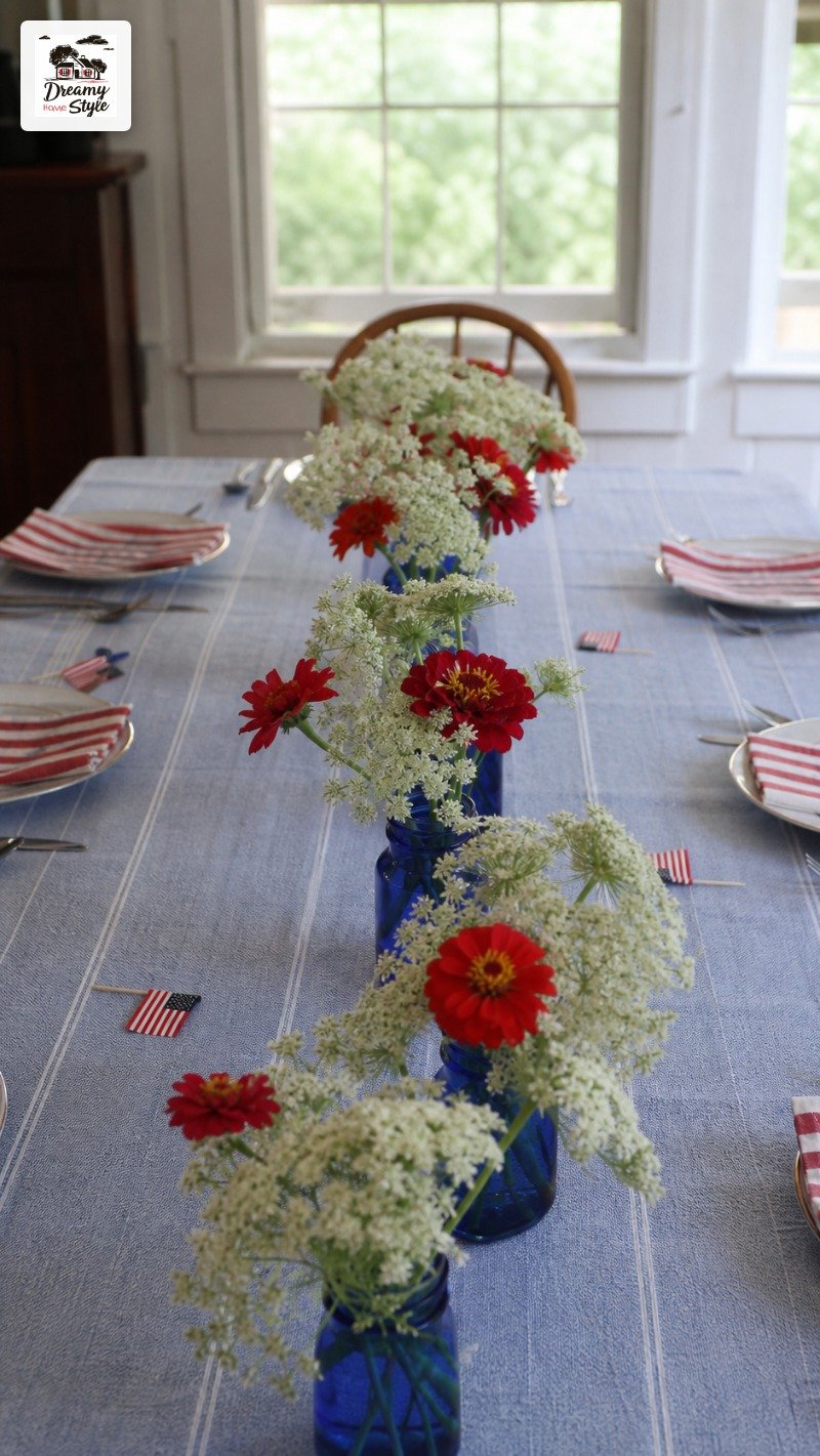
White queen anne’s lace, red zinnias, blue salvia if you can find it.
Tucked into small vessels, not arranged tightly.
I spent $8 at a farmers market on mixed stems and split them between three little cobalt blue jars down the center of my table.
It looked a thousand times better than a grocery store bouquet in one big vase.
The looseness is the whole point.
Bonus: white flowers do an incredible amount of work.
They’re bright, they’re airy, and they keep the whole table from feeling heavy with color.
Napkins: The Easiest Swap You’re Probably Not Making
Paper napkins printed with fireworks are everywhere in July.
And they do the job.
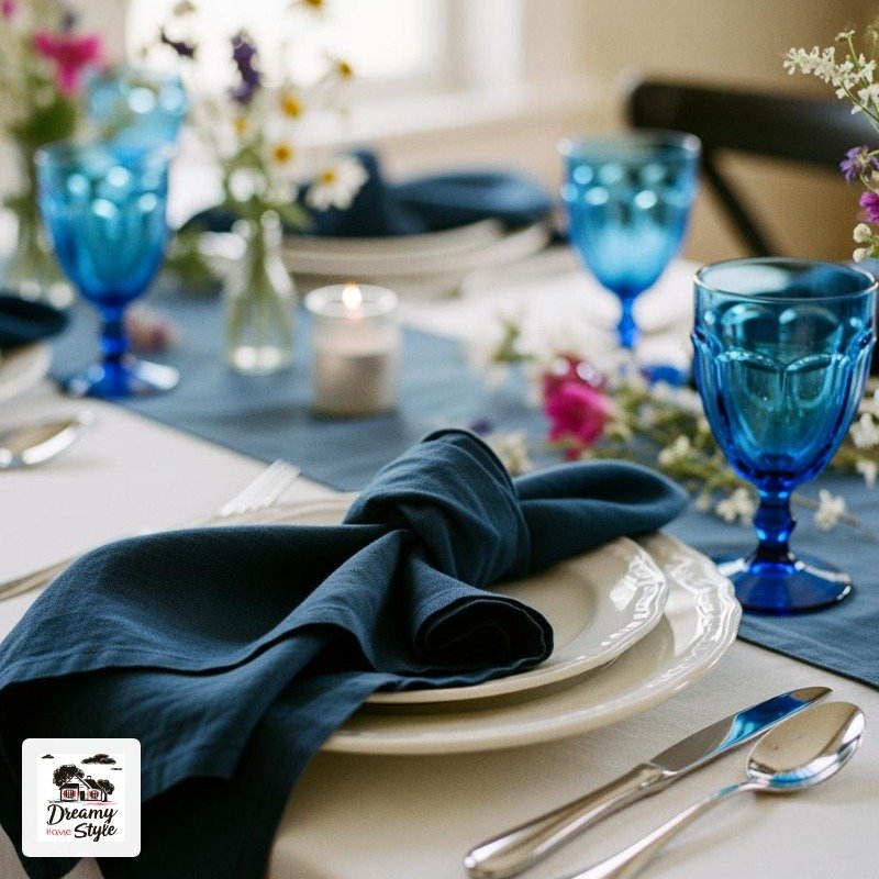
But cloth napkins change everything — even cheap ones from Target’s threshold line or a thrift store bin.
I keep a stack of navy blue linen napkins that I use basically all summer.
They work here, they work for a regular dinner, they never look wrong.
Navy reads as classic and a little nautical, which feels appropriately summery without screaming holiday.
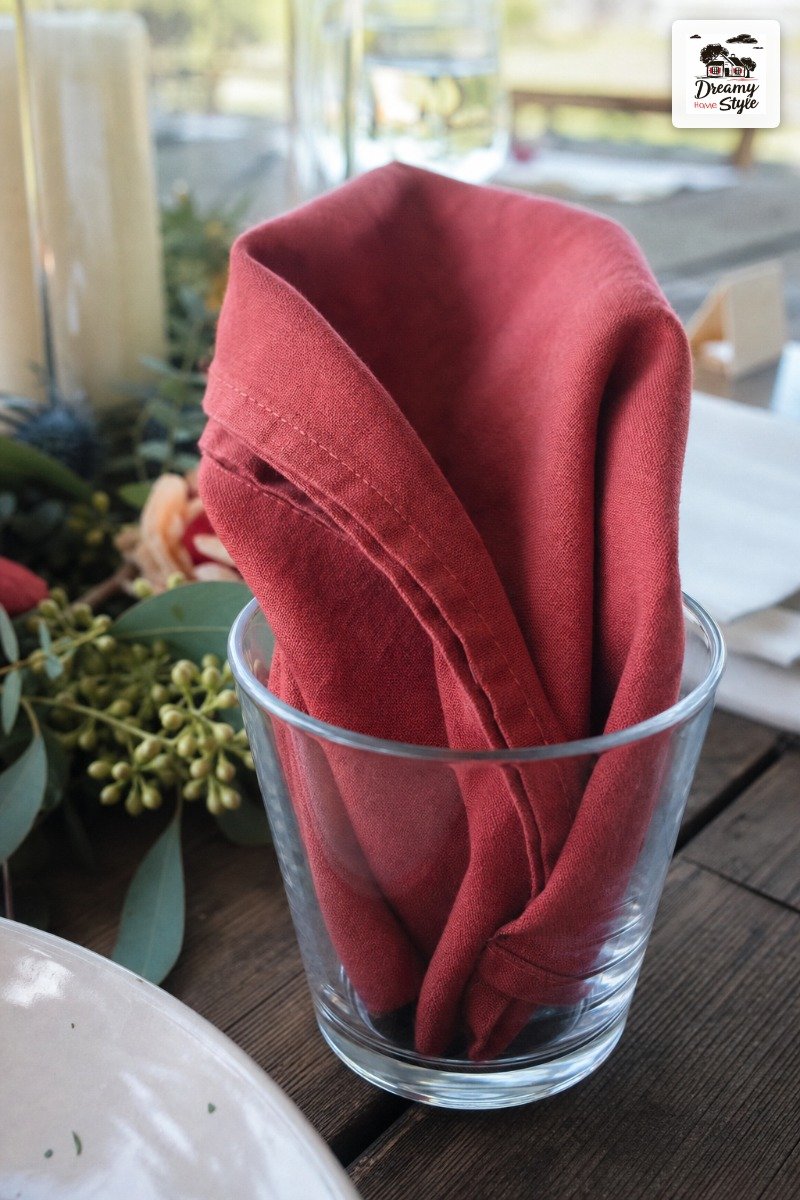
Red napkins are fun too.
I’d just avoid anything with a print on it.
Solid red, loosely folded or tucked into a glass — done.
If you only make one upgrade to your table this year, honestly, make it the napkins.
Huge impact, low cost.
Centerpieces That Aren’t a Miniature Statue of Liberty
I love a good themed accent.
I do.
But patriotic figurines on a dinner table cross a line I am personally not willing to cross.
The best July 4th centerpieces feel more ‘summer’ than ‘holiday.’ A wooden cutting board propped up casually.
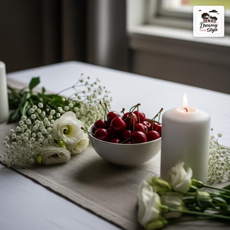
A bowl of lemons and red cherries.
A lantern with a white candle.
Things that feel like they belong on the table versus things that got purchased specifically for this one occasion.
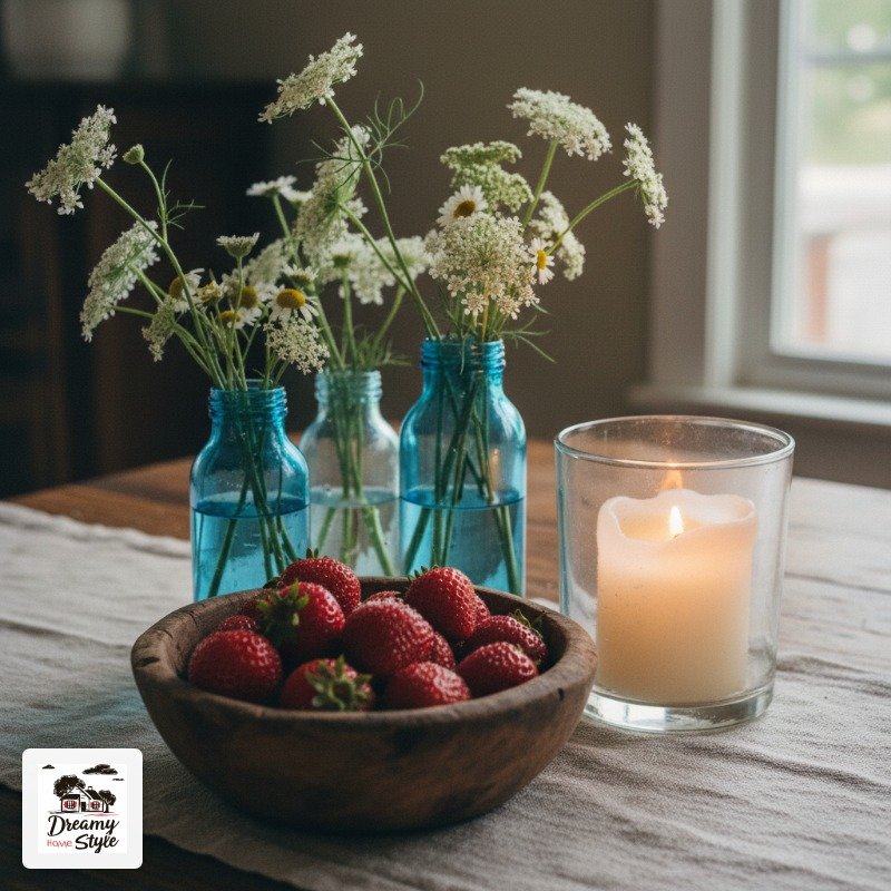
I did a row of three small blue jars with white flowers, a little wooden bowl of strawberries in the middle for snacking, and one pillar candle in a clear glass holder.
Very low, so people could actually see each other across the table (a rule I will enforce aggressively).
Low and spread out beats tall and central every time for dinner tables.
Every time.
Candles and Light (Especially at Dusk)
Overhead lighting is, in my opinion, a crime against dinner parties.
And outside?
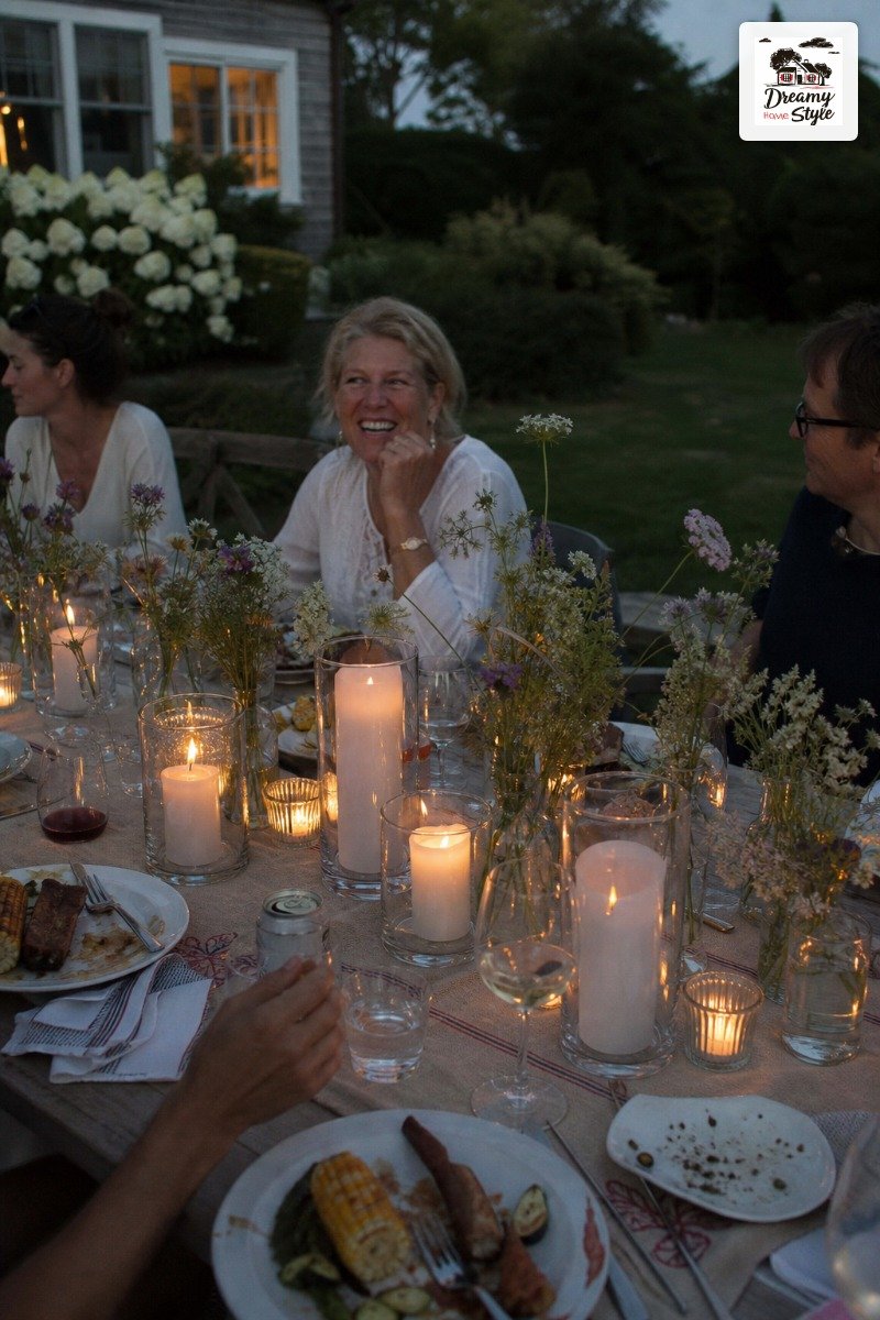
It barely exists anyway, which means July 4th evening tables are actually an incredible opportunity for candlelight.
White pillar candles in clear glass holders look beautiful and feel intentional.
I also love tea lights scattered in small glass votives along the runner — they catch the blue and red tones in everything around them.
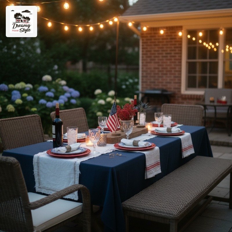
String lights above the table if you have them.
That warm glow at dusk, right as the fireworks start?
Genuinely one of my favorite summer moments.
Biscuit usually ruins it by stealing something off the table, but still.
Candles make a themed table feel sophisticated.
It’s almost a cheat code.
The ‘Third Color’ Problem and How to Solve It
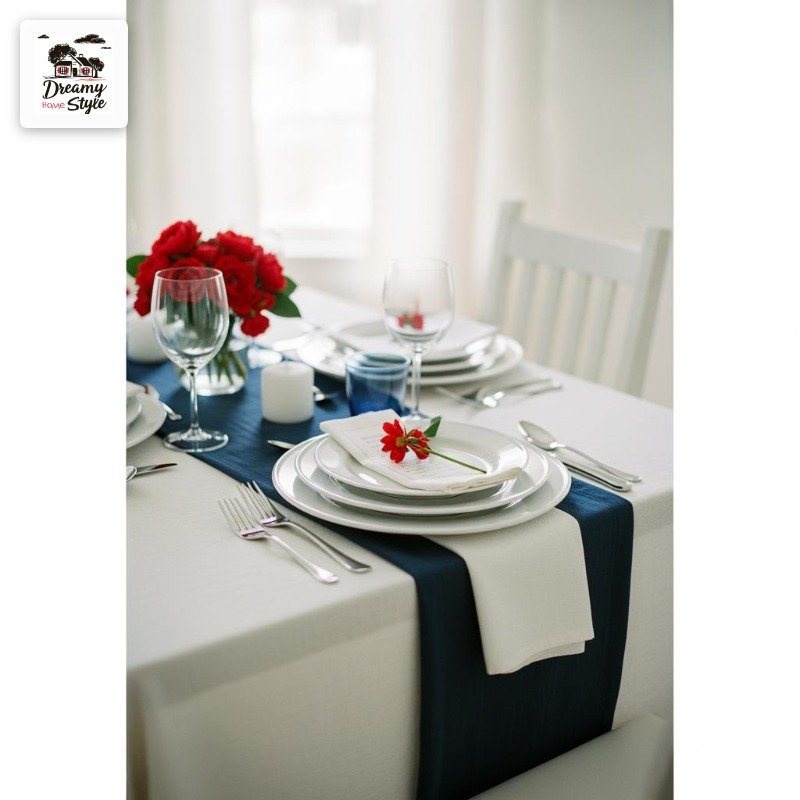
Red, white, and blue in equal amounts looks like a flag.
Which is a wonderful thing to look like — if you are a flag.
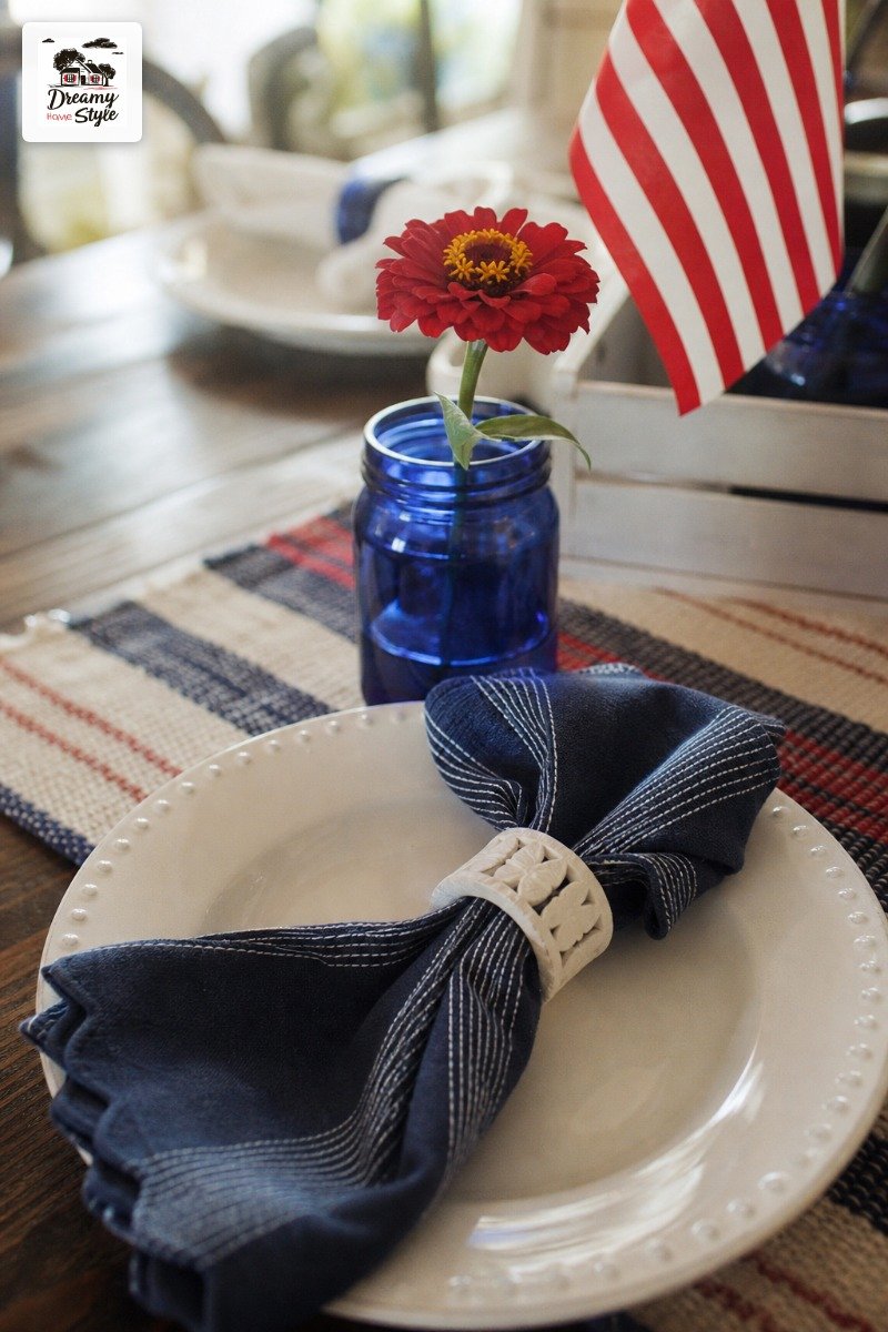
For a table, you want a dominant color, a secondary, and then the third as an accent.
My rule: white dominates (tablecloth, plates, flowers), navy or red shows up in a few intentional spots (runner, napkins, glasses), and the other one is just a hit here and there.
So if your runner is navy and your napkins are navy, maybe just a small red flower in each jar.
You don’t need all three colors fighting for equal attention.
This sounds like design theory, and I guess it is, but I only learned it by staring at a table that felt wrong and trying to figure out why.
(It was too much red AND too much blue.
Everything was yelling.)
Mixing In Natural Elements So It Doesn’t Look Costume-y
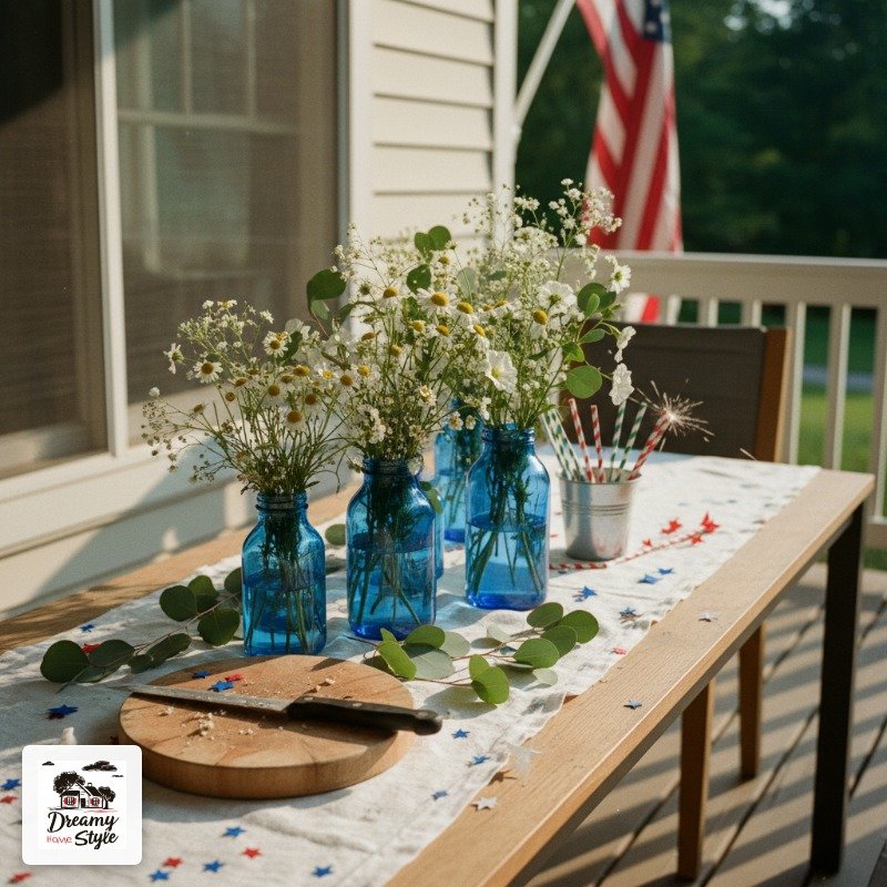
Wood.
Linen.
Greenery.
These are your best friends when you’re trying to keep a patriotic table from tipping into theme-party territory.
I put a small wooden serving board on my table last year and it immediately anchored everything.
It felt like ‘someone’s beautiful home’ instead of ‘patriotic party kit from Amazon.’
Greenery is huge too — even just some eucalyptus tucked between the flower jars, or fresh basil sprigs if you want to get weird about it.
Green is a neutral in floral design and it cools everything down visually.
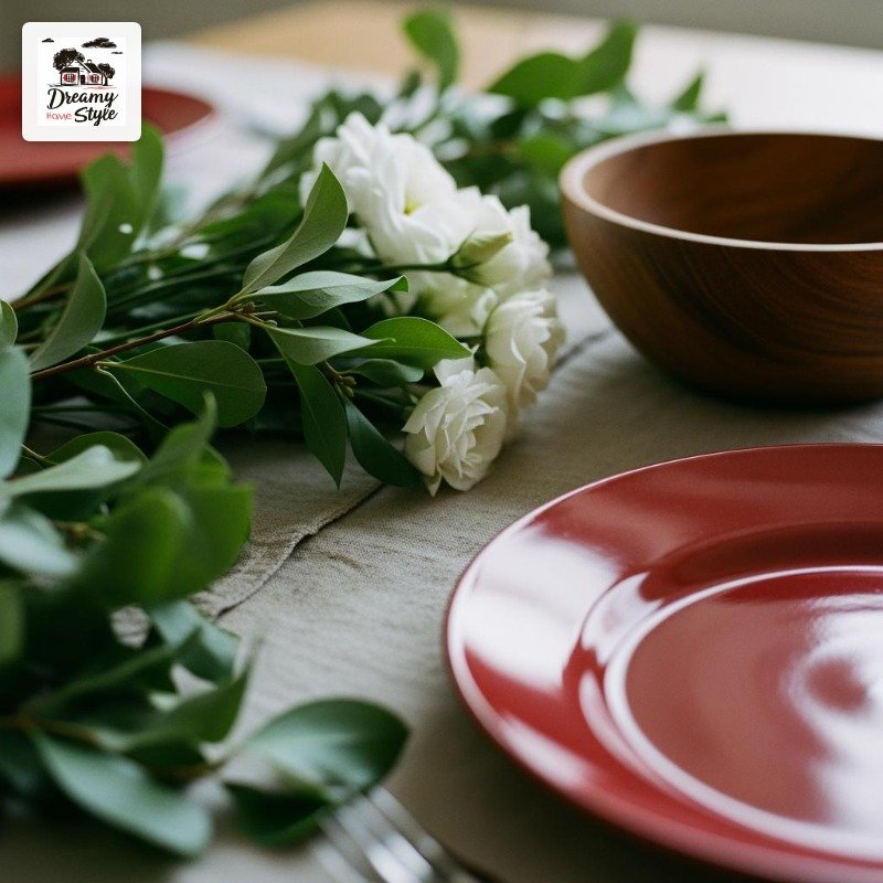
Natural materials remind the eye that this is a real table in a real home.
They do the heavy lifting of making the color scheme feel grounded.
Outdoor vs. Indoor: What Changes
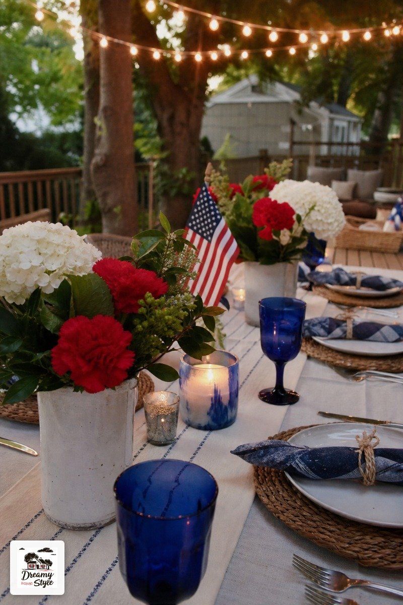
Outdoor tables can take more.
More color, more casual, more mismatched chairs that add charm instead of chaos.
The outdoor setting does a lot of the work — the sky, the greenery, the light — so your table doesn’t have to try as hard.
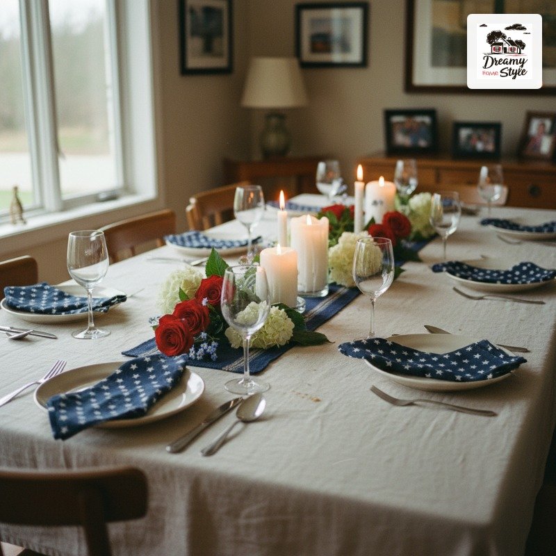
Indoor tables need a bit more restraint.
In a dining room, a very colorful table can feel heavy.
I’d lean even more neutral on the base (definitely go cream or white tablecloth) and let the accents carry the red, white, and blue.
Either way, the rules are the same: texture first, lead with neutral, keep the colors unequal.
Outdoors you just have more room to play.
Also outdoors: weight your centerpiece.
My flowers blew over three separate times before I put rocks in the bottom of the jars.
Learn from me.
Things I Actually Bought vs. Things I Already Had
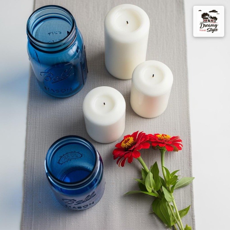
Real talk: I spent maybe $22 total on this table setup.
The cobalt jars were from a thrift store.
The linen runner I already owned.
The flowers were from the farmers market.
I bought one bag of white pillar candles from the dollar section (three for a dollar, unbelievable), and a small bundle of red zinnias to supplement my white flowers.
That was basically it.
The plates and glasses I already owned — white IKEA plates and a mix of clear and cobalt glasses I’ve collected over time.
None of it matches perfectly and somehow that makes it look more intentional.
You genuinely don’t need to buy a ‘July 4th tablescape kit’ from anywhere.
The stuff you have is probably most of what you need, you just have to look at it differently.
The Details That Make People Say ‘Wait, This Is So Pretty’
It’s always the small things.
Always.
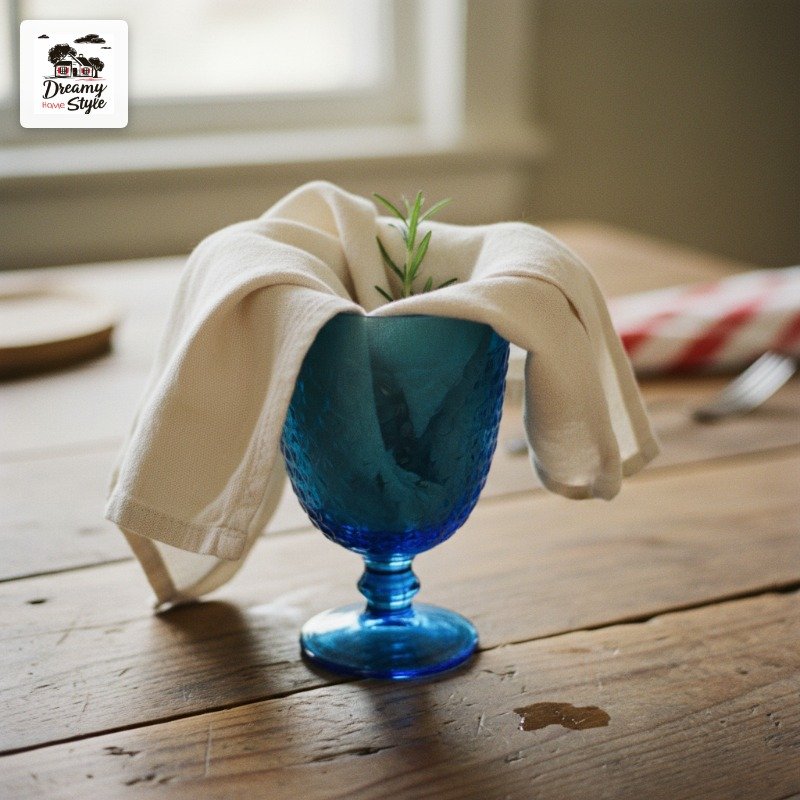
A folded cloth napkin tucked into a blue glass looks so much better than a napkin just sitting on a plate.
A sprig of something green peeking out of a flower jar.
A little dish of flaky salt on the table because you’re serving corn and it looks pretty.
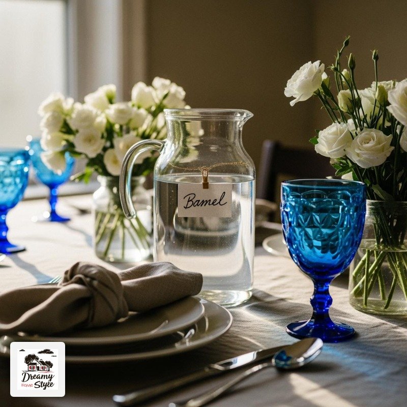
I put a small label on my water pitcher that said ‘cold water’ in a handwritten marker.
Completely unnecessary.
Biscuit knocked it over immediately.
But for the twenty minutes before that it looked adorable.
The details that feel extra are the ones people notice.
Not the color scheme, not the tablecloth.
The tiny moment of care that says you thought about it.
That’s what makes a table feel like yours.
Related read: The IKEA Kallax Bible — Instant PDF + Kindle download. Secure checkout by Stripe

