
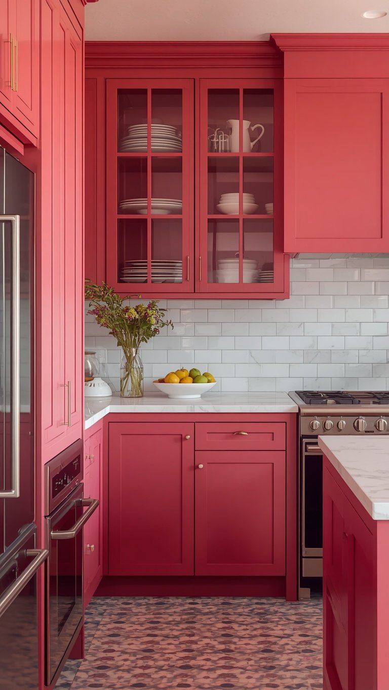

I almost painted my kitchen island beige again last spring.
I had the swatch taped to the cabinet for three weeks.
And then I walked into a friend’s newly renovated kitchen and just stopped in the doorway.
Her island was this deep, moody raspberry pink, and the light was hitting it in a way that made the whole room feel warm and alive.
I remember thinking, why have I been so scared of color.
So today I want to talk about raspberry pink kitchens, because I’ve fallen kind of hard for this trend and I think you might too.
This isn’t the pastel, sugary pink from a decade ago.
It’s richer, moodier, more grown up.
It reads modern, not candy-coated.
And if you’ve been eyeing this color but talking yourself out of it, I get it, I was there too.
So let’s get into why this shade is stealing the spotlight and how you can bring it into your own home without it feeling like a phase.
Why Raspberry Pink Is Having Its Moment Right Now

Color trends usually creep in slowly, and this one did too.
For years kitchens were all about white, then greige, then that deep forest green everyone loved.
But there’s been a shift toward warmth lately, toward colors that feel emotional instead of just safe.
Raspberry pink sits in this perfect space between bold and livable.
It’s confident without screaming for attention.
Honestly, I think it’s a reaction to how cold and neutral kitchens got for a while.
People want their homes to feel like them again.
They want a little personality in the one room where everyone actually gathers.
And raspberry pink does that in a way that still feels sophisticated.
It’s not baby pink, it’s not Barbie pink, it’s something deeper and more mysterious.
When I saw my friend’s island, it almost looked like a rich wine color in low light and a true raspberry in daylight.
That shift throughout the day is part of the magic honestly.
If you love color but you’re nervous about commitment, this shade kind of solves that problem for you.
It gives you drama without tipping into something you’ll regret in a year.
And that’s rare for a statement color, most of them don’t age this gracefully.
So if you’ve been feeling the pull toward something bolder, trust that instinct a little.
How To Choose The Right Shade Of Raspberry Pink

This is the part people rush, and I really wish they wouldn’t.
Not all raspberry pinks are created equal, not even close.
Some lean cool and almost berry-toned, others lean warm with a hint of coral underneath.
You have to look at your natural light before anything else.
North facing kitchens tend to wash out warm pinks, so I’d lean into a slightly deeper, cooler raspberry there.
South facing kitchens get gorgeous warm light, which lets you play with a softer, warmer pink without it looking washed out.
When I helped my sister pick hers, we tested five different swatches on the actual cabinets, not just on paper.
Paint chips lie, you guys, they really do.
The color always looks different once it’s on a big vertical surface with your actual lighting hitting it.
My personal tip is to paint a poster board and move it around your kitchen for a full day.
Watch how it looks in the morning, at noon, and again at night with your overhead lights on.
If it still feels good in all three lighting moments, that’s your color.
I’m partial to shades with a little gray undertone mixed in, it keeps things feeling modern instead of sweet.
Avoid anything too bright or neon unless you’re going for a really playful, maximalist look.
Soft, muted raspberry is the move if you want longevity.
Pairing Raspberry Pink With Modern Finishes
Okay, this is where the magic really happens.

Raspberry pink on its own is pretty, but the finishes around it are what make it feel intentional.
Brass hardware is my favorite pairing, hands down.
There’s something about warm brass against that deep pink that feels rich and a little old world glam.
Matte black is the other direction, and it’s stunning too, just moodier and more dramatic.
I’ve seen kitchens with black faucets and black cabinet pulls against raspberry cabinetry and it looks like something out of a boutique hotel.
Chrome tends to feel a little too cold and clinical for this palette, so I’d steer away from it if you can.
If you want something in between, brushed nickel works as a softer, quieter option.
When my friend did her island, she went with unlacquered brass, which develops a patina over time.
I love that it’s going to age and change right along with her, nothing about it feels static.
Think about your appliances too, not just your hardware.
Stainless steel keeps things feeling current and lets the pink be the star.
Black stainless is even more striking if you’re leaning into that moodier direction.
Whatever you choose, just make sure your finishes feel cohesive throughout the whole space.
Mixing too many metals can make even a gorgeous color feel a little chaotic.
Pick one primary metal and let it repeat through your fixtures, hardware, and lighting.
Countertop And Backsplash Combos That Actually Work

This is where people get stuck, I promise you’re not alone if this feels overwhelming.
Raspberry pink is bold enough that your countertops and backsplash need to support it, not compete with it.
White marble, or a marble look quartz, is honestly foolproof here.
It keeps things airy and lets the cabinets do the talking.
I’m also kind of obsessed with a soft warm white countertop paired with a subtle veined backsplash in the same tone.
It creates this quiet, elegant backdrop that makes the pink pop even more.
If you want something a little more unexpected, try a warm travertine.
It has this earthy, textured quality that softens the boldness of the pink beautifully.
For backsplash, I’d avoid anything with a lot of competing color or a busy pattern.
Simple subway tile in a warm white or cream keeps the eye moving smoothly through the space.
If you’re feeling brave, a thin brass trim along the backsplash edge ties back into your hardware in the prettiest way.
My honest advice, when in doubt, keep your hard surfaces neutral and let your cabinetry carry the color.
You can always add more personality through smaller, changeable elements later.
Countertops are a long term investment, so this is not the place to also experiment with bold color.
Save the risk taking for things you can swap out easily down the road.
Flooring That Grounds The Whole Look

Floors do so much heavy lifting and they rarely get the credit.
With a color as rich as raspberry pink, your flooring needs to feel grounding, almost like a deep breath after all that boldness.
Warm Wood Tones are my go to recommendation every single time.
Think honey oak or a medium walnut, something with visible grain and texture.
It brings a natural, earthy warmth that balances the more saturated cabinetry beautifully.
I’ve also seen this trend paired with Black and White checkered floors, and honestly, it’s a little retro glam and I love it.
If your home leans more traditional, a herringbone wood floor adds movement without adding more color to the mix.
For a more minimalist approach, a light natural oak keeps things airy and Scandinavian feeling.
Avoid cool gray toned floors if you can, they tend to fight with the warmth of the pink.
When my sister redid her kitchen, she went with a wide plank white oak and it just made the whole room feel settled.
Nothing felt too matchy, nothing felt off, it just flowed.
Tile is another lovely option if you want something more durable and easy to clean.
Look for a warm toned tile, even one with a subtle terracotta influence.
Your floor is the foundation, literally and visually, so give it the same thought you’re giving your cabinets.
Get samples, live with them for a few days, and trust your gut on what feels calm underfoot.
How Lighting Changes The Way The Color Reads

Nobody talks about this enough and it drives me a little crazy honestly.
The exact same raspberry pink can look completely different depending on your lighting temperature.
Warm bulbs, anything around 2700K, will make the pink feel cozier and slightly more coral.
Cooler bulbs, closer to 4000K, will pull out the blue undertones and make it read more berry or wine toned.
Neither is wrong, it just depends on the mood you’re going for.
I personally love warm lighting in kitchens because it makes the whole space feel like a hug.
Layer your lighting too, don’t just rely on one overhead fixture.
Under cabinet lighting is a small hack that makes a massive difference with a bold cabinet color.
It highlights the texture of the paint and makes those cabinets feel almost jewelry-like at night.
Pendant lights over your island are also a chance to bring in more of that brass or black finish we talked about earlier.
When my friend added warm brass pendants over her raspberry island, the whole kitchen suddenly felt finished, like it clicked into place.
Natural light matters just as much, so pay attention to what direction your windows face before committing to a shade.
My tip, always test your paint swatch at night under your actual bulbs, not just during the day.
You might be surprised how much it shifts once the sun goes down.
Small Doses Versus Full Commitment

You do not have to paint every single cabinet to enjoy this trend, and I want you to know that.
An island alone can carry so much visual weight in a kitchen.
It’s honestly my favorite way to introduce raspberry pink if you’re feeling a little nervous.
Keep your perimeter cabinets a soft white or cream and let the island be the moment.
It gives you all the drama with a much lower commitment level.
If you’re feeling bolder, lower cabinets in raspberry with white uppers is such a beautiful, balanced look too.
It grounds the room while still keeping things light and airy up top.
Full cabinetry in raspberry is stunning, but it’s definitely the boldest version of this trend.
I’d only recommend that if you already know you love saturated color in general.
When I redid my own kitchenette last fall, I started with just the island because I genuinely wasn’t sure I’d love it long term.
A year later, I’m still obsessed, so maybe next time I’ll go bigger.
That’s sort of the beauty of starting small, you get to fall in love with it before going all in.
There’s no rule that says you have to commit fully on day one.
Let your confidence build the same way the room does.
Hardware And Fixtures That Elevate The Whole Look


Small details make such a massive difference here, more than people expect.
Once your color is chosen, hardware is honestly what elevates it from pretty to polished.
Skinny, unlacquered brass pulls feel timeless and a little bit boutique hotel.
Knobs in a soft aged brass work beautifully on drawers if you want something a little more delicate.
For a moodier, more dramatic feel, matte black bar pulls look incredible against raspberry cabinetry.
Faucets matter just as much as your cabinet hardware, so don’t treat them as an afterthought.
A brass or black faucet with a gooseneck shape adds a little old world charm to the whole space.
I’m also loving unlacquered brass pot fillers lately, they patina beautifully over time and feel so personal.
Cabinet hinges are a tiny detail most people forget entirely.
Exposed brass hinges add a subtle designer touch that photographs so beautifully too.
When my sister finished her kitchen, it was genuinely the hardware that made guests stop and ask where everything came from.
Not the paint color itself, the hardware.
That tells you everything about how much weight these small details carry.
My advice, spend a little more on hardware even if you save elsewhere in the kitchen.
It’s the jewelry of the room and it shows.
Balancing Warmth With Natural Wood Accents
Raspberry pink can feel a little cool or moody if you don’t balance it with warmth somewhere.

Wood is the easiest, most effortless way to soften that.
Open wood shelving against a raspberry wall is one of my favorite combinations in the entire design world.
It brings in texture, warmth, and a lived in quality that paint alone can’t achieve.
A wood cutting board leaning against the backsplash does more work than you’d think too.
Wooden bar stools at your island soften the whole silhouette of the room.
I love a natural rattan or cane stool here especially, it adds a little texture without competing with anything else.
Butcher block accents on part of your counter, even just a small section, bring warmth right into the working part of your kitchen.
When I think about why this combination works so well emotionally, it’s because wood feels human and organic against something so saturated and considered.
It keeps the whole room from feeling too styled or too perfect.
Wood grounds a bold color choice in something that feels lived in and real.
My personal hack, add one substantial wood element, like open shelves or a big butcher block island top, rather than scattering tiny wood accents everywhere.
One strong gesture reads so much more intentional than five small ones.
Trust me, it makes a difference you can feel the moment you walk in.
Open Shelving And How To Style It With This Palette
Open shelving terrifies people, and honestly I understand why.

It requires a little more curation and a little more upkeep than closed cabinetry.
But against a raspberry pink backdrop, open shelves become almost like a little art installation.
Stick to a simple color story on your shelves, mostly white, cream, and warm wood tones.
A few pieces of stoneware in soft terracotta or blush tones tie back beautifully into the wall color.
Avoid overcrowding your shelves, this is not the place for every mug you own.
I like the rule of odd numbers, group items in threes for a more natural, balanced look.
Add one plant, even a small one, it brings life and softens all those hard surfaces.
A stack of your favorite cookbooks adds warmth and a little personality too.
When I styled a friend’s shelves last year, we kept coming back to fewer items, better spacing.
Less really is more here, especially against a color this bold.
Your shelving should feel like a breath, not another loud moment competing with your cabinets.
My tip, take a photo of your shelf once it’s styled and look at it in black and white.
It helps you see the composition and spacing clearly without the color distracting you.
If it looks balanced in black and white, it’ll look even better in color.
Making It Feel Modern, Not Sweet Or Overly Girly
This is the question I get asked the most, and it’s a fair one.

Raspberry pink can tip into feeling a little too soft or sugary if you’re not careful with the supporting elements.
The trick is contrast, and honestly it’s simpler than people expect.
Pair the pink with something structural and a little masculine, like black steel window frames or matte black hardware.
Clean, simple cabinet shapes help too, avoid ornate or overly traditional door styles.
Shaker style or simple flat panel doors keep things feeling current instead of cottagecore.
Concrete or stone countertops add a coolness that balances the warmth of the pink beautifully.
Industrial pendant lighting is another easy way to add a little edge to the room.
I’ve noticed the kitchens that nail this best usually have one or two unexpected, slightly unexpected material choices mixed in.
Think raw steel shelf brackets, or a concrete floor, something with a little grit.
That contrast is what makes the whole space feel curated instead of themed.
When my friend added a black steel pot rack to her raspberry kitchen, it instantly felt more grown up and considered.
It stopped feeling like a color choice and started feeling like a design choice.
My honest tip, always ask yourself if a detail feels too matchy or too perfect.
If it does, swap it for something with a little more texture or edge.
Renter Friendly Ways To Try This Trend

Not everyone can paint their cabinets, and I really feel for you if that’s your situation right now.
There are so many lower commitment ways to bring raspberry pink into your kitchen without touching a single cabinet.
Removable wallpaper is honestly incredible these days, and a raspberry pink pattern on one wall can transform a space overnight.
A bold rug in raspberry tones adds color at floor level without any permanence at all.
Bar stools are another easy swap, and they’re usually something you can take with you when you move.
Open shelving with raspberry toned dishware brings the color in through your decor instead of your walls.
Even a set of raspberry linen tea towels hanging on your oven handle adds a little pop of color.
Small kitchen appliances in this shade, like a stand mixer or an electric kettle, are such an easy entry point too.
When I lived in my first rental years ago, I used a raspberry pink curtain under my sink as a cabinet cover, and it made the whole kitchen feel more like mine.
It’s funny how one small textile choice can shift your whole mood in a space.
My tip for renters specifically, focus on textiles and small decor first.
They’re the lowest risk, lowest cost way to fall in love with a color before ever committing to paint.
You get all the joy without any of the security deposit anxiety.
Common Mistakes To Avoid With This Color
I’ve made a few of these mistakes myself, so consider this me saving you some trouble.

Going too bright or neon is probably the biggest one I see.
A true, muted raspberry ages so much better than anything closer to hot pink or bubblegum.
Mixing too many metals is another common slip up, it makes the whole kitchen feel a little busy and unresolved.
Pick one primary metal finish and let it repeat consistently throughout the space.
Skipping the swatch test is a mistake I see constantly, and I understand the temptation to just trust the paint chip.
But lighting changes everything, so please, please test it on your actual walls first.
Overcrowding your open shelves, if you have them, is another easy trap to fall into.
Let the color breathe, let the shelves feel curated rather than cluttered.
Ignoring your existing floor tone is another one people overlook.
If your floors are cool toned and your cabinets are warm, the whole room can feel slightly off balance.
Ignoring flow between your kitchen and the rooms around it also trips people up.
A bold kitchen color should feel connected to the rest of your home, not like a completely separate world.
My last piece of advice, don’t rush this decision.
Live with your swatches for at least a week before committing to anything permanent.
A color this special deserves a little patience before it becomes part of your everyday life.
Related read: Things I Wish I Knew Before I Decorated My First Home — Instant PDF + Kindle download. Secure checkout by Stripe

