
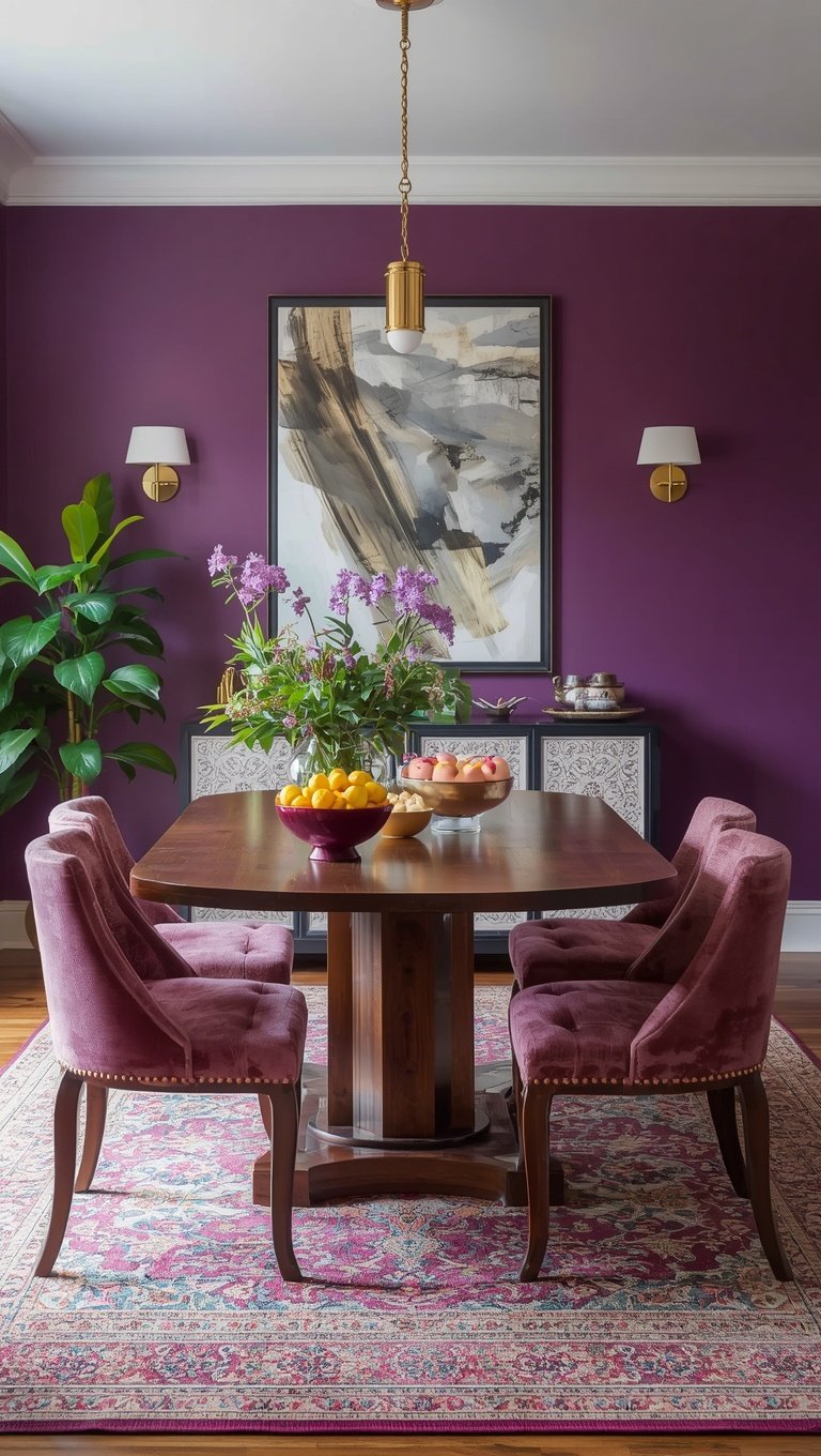

I almost talked myself out of plum walls three separate times.
Every time I’d pull up the paint swatch, that little voice in my head would go “this is going to look like a cave.”
So I get the hesitation, I really do.
But here’s my confession: the night I finally painted that first accent wall, I stood in the doorway with a glass of wine and just… stared.
It wasn’t dark.
It was warm, moody in the best way, and honestly kind of romantic.
My dining room went from “fine, I guess” to the room everyone wants to linger in after dinner.
If you’ve been scared of plum because you think it’ll swallow the light, I promise you, it’s all about how you layer it.
Let’s get into exactly how I made it work.
Start With The Undertone, Not The Color Itself

This is the part nobody tells you.
Plum isn’t just plum.
Some plums lean blue and cool, almost like a bruised eggplant.
Others lean warm, closer to a deep wine or garnet.
I made the mistake early on of grabbing a cool-toned plum because I liked it on the little paint chip.
In my actual room, with north-facing windows, it read almost gray-purple and kind of sad.
So I swapped to a warmer, redder plum and the whole room changed personality.
It suddenly felt cozy instead of cold.
My tip: hold your swatch up at different times of day before committing.
Morning light and evening light will show you two totally different colors.
And if your room doesn’t get much natural light, lean warm every single time.
Cooler plums need sunshine to sing.
Warmer plums glow even under lamplight, which is kind of magic honestly.
This one decision is the difference between “rich and inviting” and “why does this feel like a basement.”
Trust me on this one, I learned it the hard way so you don’t have to.
Keep The Ceiling Light, Always

Okay, this is my golden rule.
If your walls are going plum, your ceiling needs to stay bright.
I’m talking crisp white or a soft, barely-there cream.
When I first painted my dining room, I got a little too confident and considered a tinted ceiling too.
Thank goodness a friend talked me out of it.
A light ceiling does something sneaky and wonderful, it visually pushes the room upward.
Your eye reads height instead of heaviness.
It’s such a simple trick but it completely changes how “dark” the space feels, even though technically nothing about the wall color changed.
I always tell people this is the one thing you cannot skip.
You can go bold, dramatic, moody with your walls.
But that ceiling is doing quiet work to keep the whole room from feeling like it’s closing in on you.
Think of it as the exhale in the room.
Everything else can feel rich and heavy, but the ceiling needs to breathe.
Layer In Warm Metallics For Instant Glow

Plum and gold together is one of those combinations that just feels expensive.
I added brass drawer pulls to my sideboard and it was such a small change but it completely elevated the room.
Warm metallics catch the light in a way that cool metals just don’t against plum.
I tried silver first, if I’m being honest, and it felt flat and kind of cold against the wall color.
The second I swapped to brass and antique gold accents, the whole room started to shimmer a little at night.
Candlelight bounces off it beautifully.
So does the light from my chandelier.
My favorite pieces to swap are drawer pulls, picture frame edges, and the rim of my dinnerware.
You don’t need to go overboard here.
Even one or two gold moments in the room will do the trick.
I have a small brass bar cart in the corner and honestly, it might be doing more visual work than anything else in the space.
Little pockets of warm shine against that deep purple, it’s just so pretty.
If I had to pick one easy upgrade for anyone nervous about going plum, it’s this one.
Add the gold, watch the room come alive.
Don’t Skip A Statement Light Fixture

A dim, boring light fixture is honestly the real reason most dark dining rooms feel gloomy, not the wall color.
I learned this after living with my old builder-grade fixture for way too long.
The second I swapped it for a fixture with more bulbs and a warmer glow, my plum walls looked completely different.
Suddenly they looked intentional and elegant instead of moody in a bad way.
My advice is to go bigger and brighter than you think you need.
Dining rooms usually only have one main light source, so it’s carrying a lot of weight.
I went with a fixture that has exposed bulbs and brass detailing, and it’s become the actual centerpiece of the room.
Guests comment on it constantly.
And it makes the plum walls feel like a deliberate design choice rather than an accident.
If you’re on a budget, even swapping your bulbs to a warmer temperature can shift everything.
I did that in my old apartment before I could afford a real fixture upgrade.
It’s a tiny change that makes a genuinely huge difference.
Light is honestly half the battle when you’re working with a deep color like this.
Don’t let a sad little fixture undo all your hard work.
Bring In Texture, Not Just Color

This one took me a minute to figure out.
A flat plum wall can feel a little heavy on its own.
But the second you add texture, everything softens.
I added a linen table runner and suddenly the room felt layered instead of flat.
Velvet dining chairs were probably my favorite addition though.
There’s something about velvet against plum that just feels indulgent, like you’re eating dinner in a little jewel box.
I also love a woven rattan or jute rug under the table for contrast.
It grounds the richness of the walls with something that feels more natural and relaxed.
Linen curtains are another one of my go-tos.
They let light filter through softly instead of blocking it out completely.
My tip here is to mix at least three textures in the room.
Something soft, something structured, and something natural.
That combination is what makes a plum room feel curated instead of overwhelming.
It’s such a simple layering trick but it makes the whole space feel finished.
Use White Or Cream As Your Breathing Room

Plum needs a partner in crime, and for me that’s always been a soft white or warm cream.
I use it on my trim, my tablecloth, and even my dinnerware.
It creates these little visual pauses throughout the room so your eyes have somewhere to rest.
Without it, a fully plum room can start to feel a bit much, if I’m honest.
My dining table itself is a warm, natural wood tone, but my chairs have cream cushions.
That contrast keeps the whole space feeling airy instead of closed in.
I also keep my curtains a soft ivory instead of matching the walls.
It’s a small decision but it makes such a difference.
Think of cream as the exhale between all that rich, saturated color.
You want your eye to move around the room, not just sit in one heavy block of purple.
This balance is honestly the secret to making a bold color feel sophisticated instead of overwhelming.
I always tell people, go bold with one thing and let everything else support it quietly.
Add Greenery For A Living, Breathing Feel

I did not expect plants to make such a difference, but here we are.
A little greenery against plum walls looks so lush and alive.
I keep a trailing pothos on my sideboard and it softens the whole corner of the room.
Fresh eucalyptus in a vase on the table is one of my favorite quick tricks before guests come over.
It adds movement and a little bit of life to what could otherwise feel like a static, formal space.
And honestly, the green against the purple is just gorgeous together.
They’re practically neighbors on the color wheel, so it never feels out of place.
My tip is to keep the greenery a little wild and not too manicured.
A perfectly trimmed plant feels stiff.
Something with movement, trailing vines or loose branches, feels more organic against that deep wall color.
If you don’t have a great green thumb, and no judgment because I struggle too, a few stems of faux eucalyptus look surprisingly real these days.
It’s such a small addition but it keeps the whole room from feeling too formal or too heavy.
Consider An Accent Wall Before Committing Fully
If you’re still nervous, and that’s so okay, start with just one wall.

This is exactly what I did the first time around.
I chose the wall behind my china cabinet, the one that gets seen but isn’t hit directly by window light.
It let me test the mood of the color without fully committing my whole room.
Living with it for a few weeks helped me realize how much I loved it before I painted the rest.
An accent wall also naturally creates a focal point in the room, which dining rooms honestly need.
Your eye goes right there the second you walk in.
My favorite spot for this is always the wall your table faces, so you’re looking at it while you eat.
It becomes this backdrop for every dinner and every conversation.
If you end up loving it like I did, painting the rest of the room later is so much easier once you already know the color works in your space.
Baby steps are completely valid here.
There’s no rule that says you have to go all in on day one.
Play With Different Shades In The Same Family

Something I wish I’d known sooner, you don’t have to pick just one plum.
I actually used two different shades in my dining room, a deeper eggplant on the lower half and a slightly lighter mauve-plum above a chair rail.
It added so much depth without feeling like two competing colors.
This trick works beautifully in rooms with any kind of molding or trim detail.
It also makes the room feel more custom, like you actually thought about it instead of just grabbing one can of paint.
My favorite combination ended up being a deep plum below and a dusty rose-plum above.
It’s subtle, but it adds this layered richness that photographs so beautifully too.
If your room doesn’t have a chair rail, even a painted ceiling in a lighter plum shade can create this same layered effect.
I did this in a friend’s apartment and it completely changed how spacious the room felt.
My tip is to stay within the same color family so it still feels cohesive.
Jumping to a totally different hue can feel jarring, but shades of the same color always feel intentional.
It’s a subtle move but such a sophisticated one.
Style Your Table With Warm, Moody Tones

Your tablescape is doing more work than you’d think in a plum room.
I always reach for warm-toned dinnerware, think terracotta, cream, or even a deep burgundy, instead of stark white.
It keeps the whole palette feeling cohesive from wall to table.
Candles are non-negotiable for me in this room.
Warm candlelight against plum walls at dinner is honestly one of my favorite things in my whole house.
I use taper candles in brass holders most nights, even on random Tuesdays, because it just makes dinner feel special.
My linens are usually a soft rust or cream, never bright white, because it keeps that cozy, grounded feeling going.
I also love adding a few dried floral stems down the center of the table instead of a big fresh arrangement every time.
It’s low maintenance and it fits the moody, romantic vibe so well.
My favorite hack is layering a patterned runner over a solid tablecloth for texture without overcomplicating things.
Little details like this make the room feel finished, like you actually live in it and love it.
It’s these small styling choices that take the room from “nice paint color” to “wow, I want to eat dinner here every night.”

