
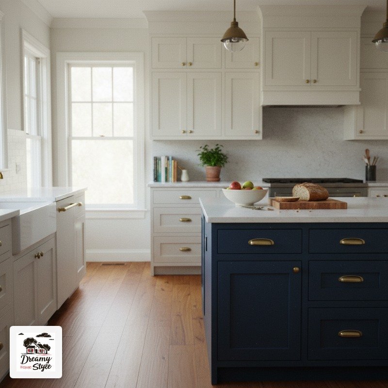

I painted my kitchen island on a Tuesday in October and by Friday I was standing in my kitchen at 6am with my coffee, genuinely happy for the first time in three years about that space.
Not kidding.
I’d been staring at that sad beige box for so long I’d stopped seeing it.
One coat of paint and the whole kitchen looked like it belonged to someone who had their life together.
Which I absolutely do not, but the illusion was nice.
Here’s what nobody warned me though: the prep, the right paint type, and the fact that your kitchen lighting will completely change how the color reads.
I’ve made basically every mistake and stumbled onto some genuinely good ideas.
All of it, below.
Your Island Should Be a Different Color Than Your Cabinets. Full Stop.
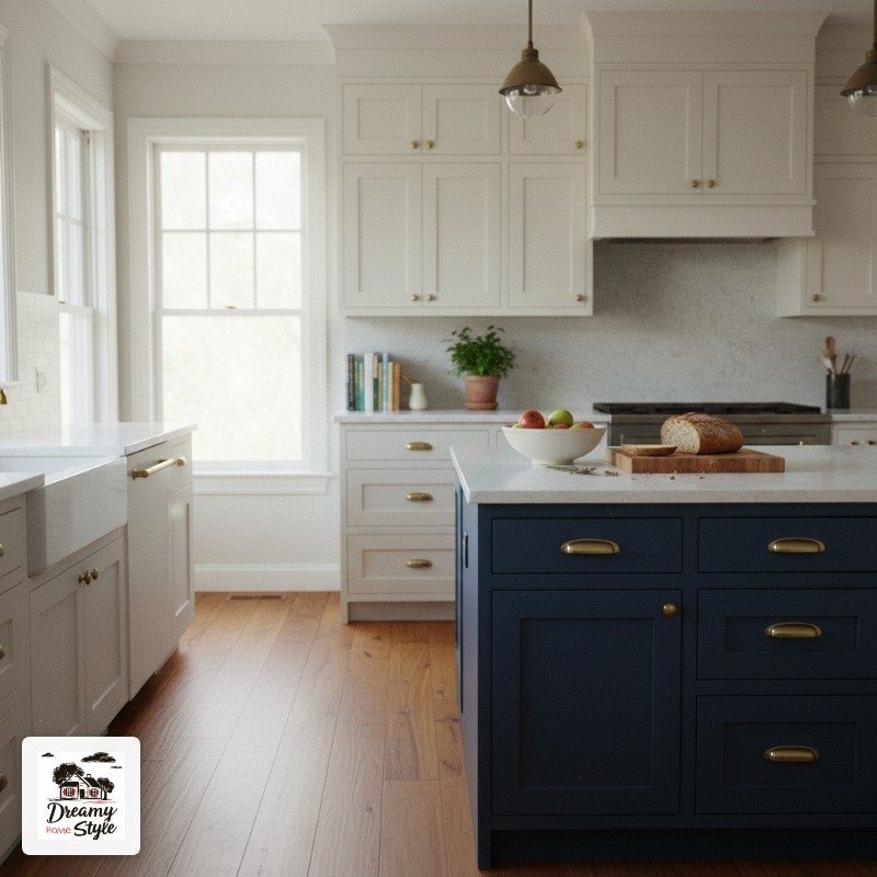
The single most common mistake I see is people painting their island the exact same color as their upper cabinets.
I get the impulse.
It feels safe and cohesive.
But in practice it just makes the whole kitchen look like one big, flat blob.
Contrast is what makes an island feel intentional.
When your island is clearly a different color from your perimeter cabinets, it reads as a piece of furniture rather than just more cabinetry.
That distinction is huge.
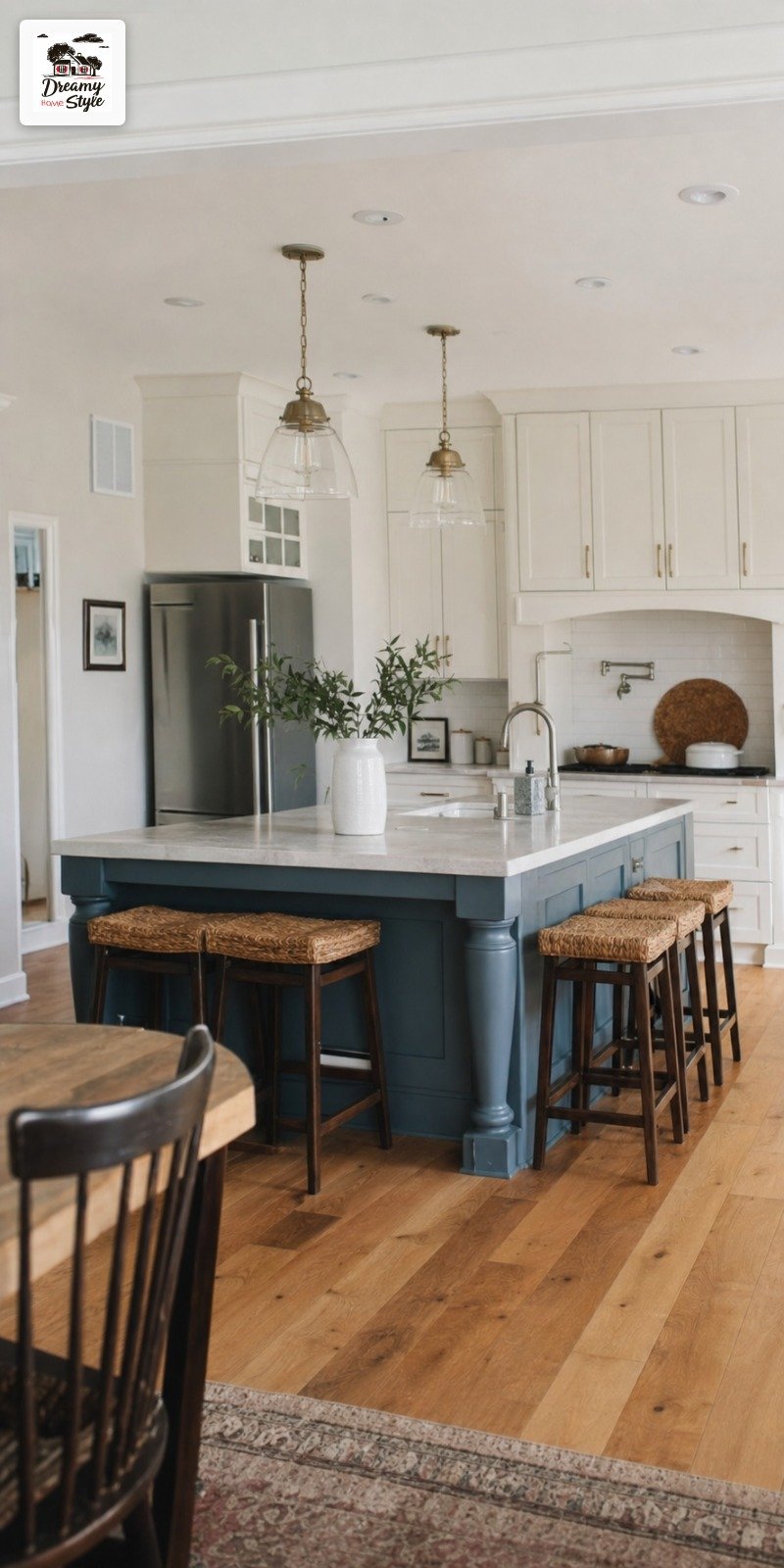
Even if you want a neutral island, try going a shade or two warmer or cooler than the surrounding cabinets.
My upper cabinets are a cool off-white and my island is a warm creamy white, and even that tiny shift does a lot.
You’d be surprised.
Navy Blue: The Gateway Drug of Bold Island Colors
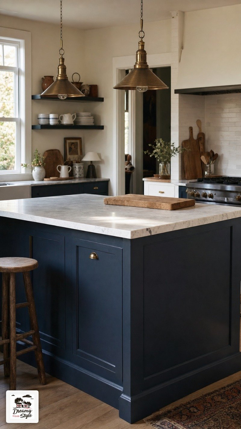
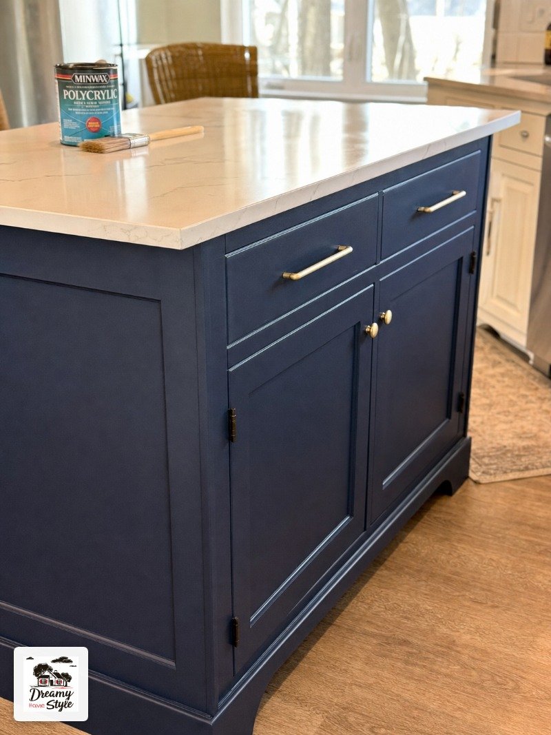
I painted my own island Benjamin Moore Hale Navy and honestly I’d do it again without thinking twice.
Navy is forgiving in a way that other bold colors just aren’t.
It reads as sophisticated instead of trendy, it pairs with basically every countertop material you can throw at it (butcher block, white quartz, dark granite, doesn’t matter), and it photographs beautifully.
Which is not irrelevant.
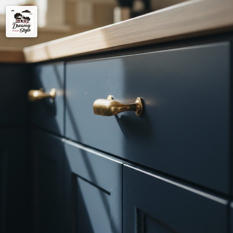
The one thing I’ll say is that true navy in a north-facing kitchen can go almost black by late afternoon.
It’s not necessarily bad.
Just know what you’re signing up for before you open the can.
If you want to try navy but you’re nervous, Sherwin-Williams Naval is slightly softer and less saturated.
Good for kitchens that don’t get great natural light.
Sage Green Is Everywhere Right Now and I Don’t Care, Do It
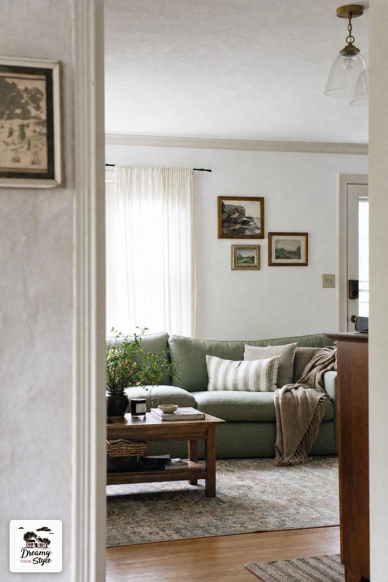
Yes, sage green is on every mood board on the internet right now.
And you should still do it if you love it.
Trends move fast in fast decor, but kitchen paint colors stick around for years.
By the time sage green feels ‘over,’ you’ll probably be ready for something new anyway.

The trick with sage is picking the right undertone.
Some sage greens pull gray, which reads cold and sort of clinical in a kitchen.
Others pull yellow or olive, which feels warm and earthy.
I’ve seen the same shade look completely different in two separate kitchens.
Farrow & Ball Mizzle is a good one if your kitchen gets warm afternoon light.
For a more budget-friendly option, Behr’s Aged Whiskey reads as a warmer sage and costs a fraction of the price.

Just don’t go too light with it.
A sage that’s too washed out just looks dirty, like something you’d see in a 1987 bathroom.
And not in a good way.
Dark Forest Green for When You’re Ready to Commit
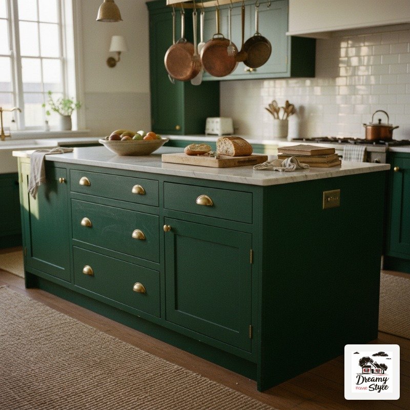
This is not a starter color.
Dark forest green on an island is a full personality statement and I mean that as a compliment.
I have a friend who painted her island in Sherwin-Williams Jasper and it is genuinely one of the most beautiful kitchens I’ve ever stood in.
Paired with brass hardware and a white marble countertop, it looked like something out of a magazine.
I stood there for probably too long.
The practical caveat is that dark colors show dust, water spots, and Biscuit’s nose prints if you have a curious dog who investigates at island level.
You’ll wipe it down more than you would a lighter color.
Not a dealbreaker, just be ready.
Dark green also loves warm light.
If your kitchen is cold and dim, go a little lighter or add some warm pendant lights before you commit to a color this deep.
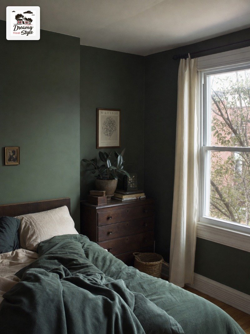
Black Islands Are Less Scary Than You Think
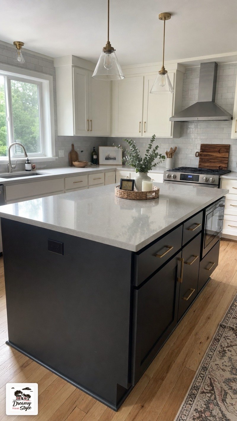
Black feels extreme until you actually see it in person.
Then it feels like the obvious choice.
What trips people up is choosing the wrong black.
There are warm blacks, cool blacks, and true flat blacks and they’re not the same at all.
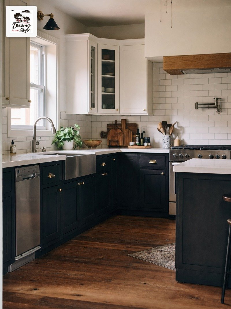
Sherwin-Williams Tricorn Black is a true black with barely any undertone.
Benjamin Moore Black Beauty reads slightly warmer, which I actually prefer for kitchens.
A matte or eggshell finish helps a lot here.
High gloss black on an island would be a smudge nightmare (I know because I briefly considered it and then came to my senses).
Eggshell gives you something wipeable without looking like a piano lid.
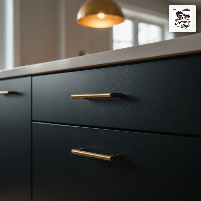
Black reads smaller visually, so if your island is already on the compact side, just be aware.
A small black island in a small kitchen can start to feel a little heavy.
Warm White vs. Bright White: This Difference Will Haunt You
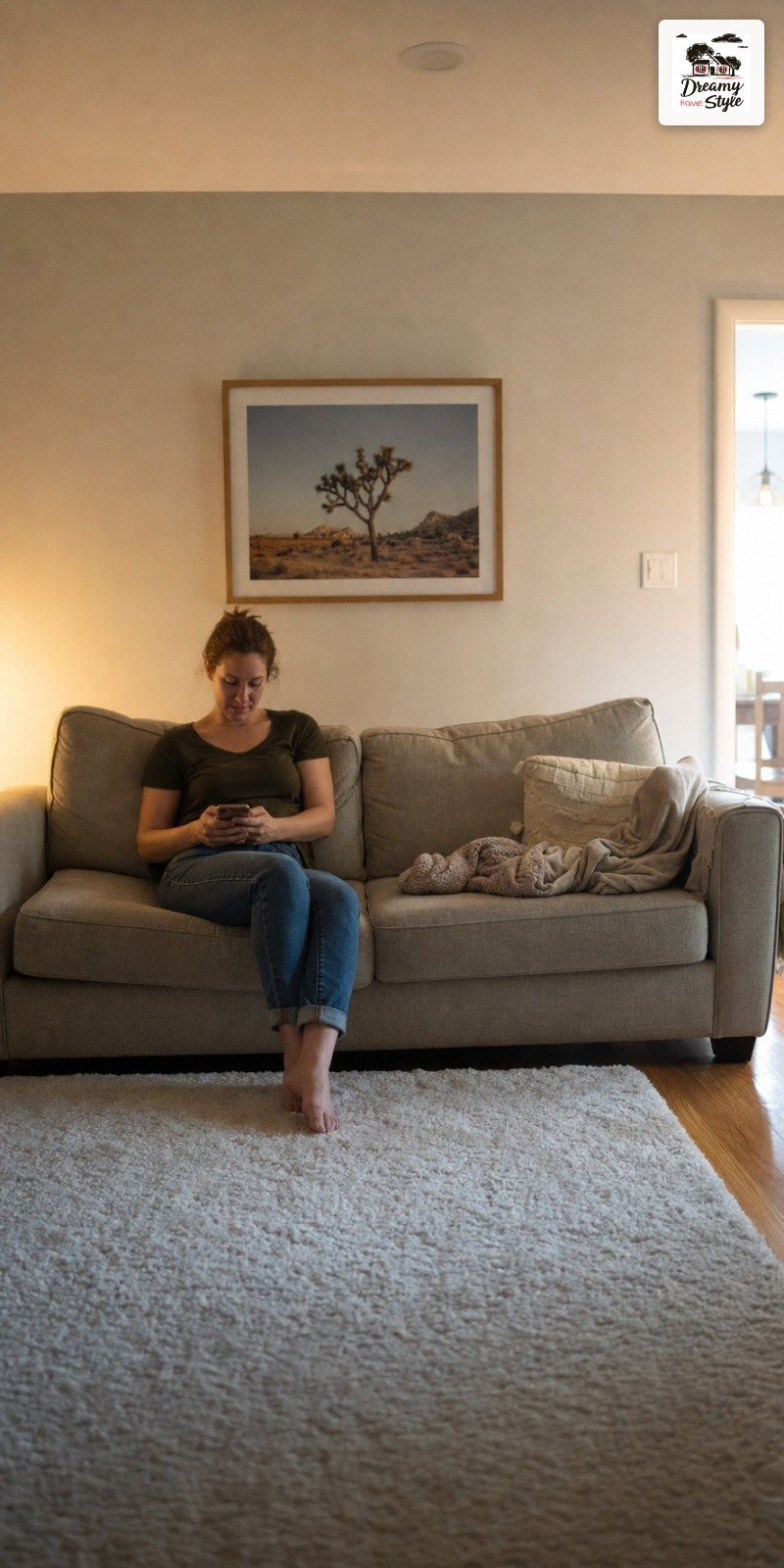
I made this mistake.
I painted an island with a bright white because it was on sale and it looked fine in the store.
In my kitchen, under warm pendant lighting, it looked almost yellow.
The wrong kind of yellow.
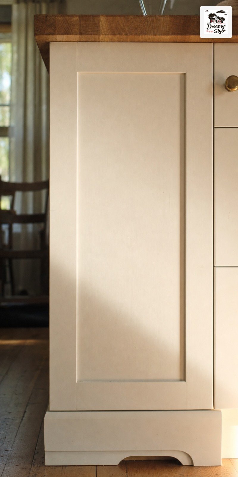
Warm whites have undertones of cream or beige.
Bright whites are sharp, almost blue-white.
Neither is bad, but they do not both belong in the same kitchen unless you plan very carefully.
If your kitchen leans warm (wood tones, warm lighting, butcher block anything), go warm white.
Benjamin Moore White Dove or Sherwin-Williams Alabaster are both solid.
If your kitchen is cool and contemporary with stainless everything, a brighter white might actually work.
Swatch it on the actual island surface.
Not the wall.
Cabinet material absorbs paint differently than drywall and the color will read differently than you expect.
The Prep Work Nobody Actually Warns You About
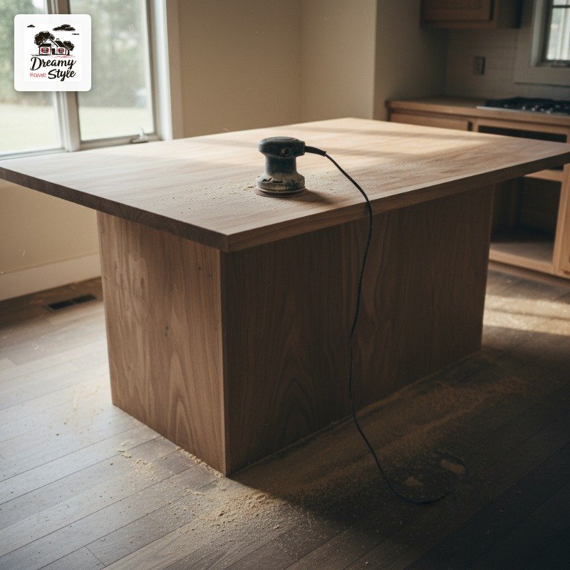
The part that actually determines how long your island looks good isn’t the color you pick.
It’s everything you do before you open the can.

Sand the surface.
I know, it’s tedious and the dust gets everywhere (Biscuit ended up looking like a powdered donut for two days).
But if you skip sanding, the paint won’t adhere properly and it’ll start chipping off the edges within a few months.
Also clean the surface with a degreaser before you do anything else.
Kitchen cabinets absorb grease and you can’t see it, but it’s there.
TSP substitute from the hardware store works great, around $6 a bottle.
Prime.
Always prime.
Use a shellac-based primer if your island has existing stain or dark paint underneath.
Oil-based primer like Zinsser BIN grips better than water-based on previously finished wood and it’s worth every tedious minute.
Regular Wall Paint Will Break Your Heart (Use This Instead)
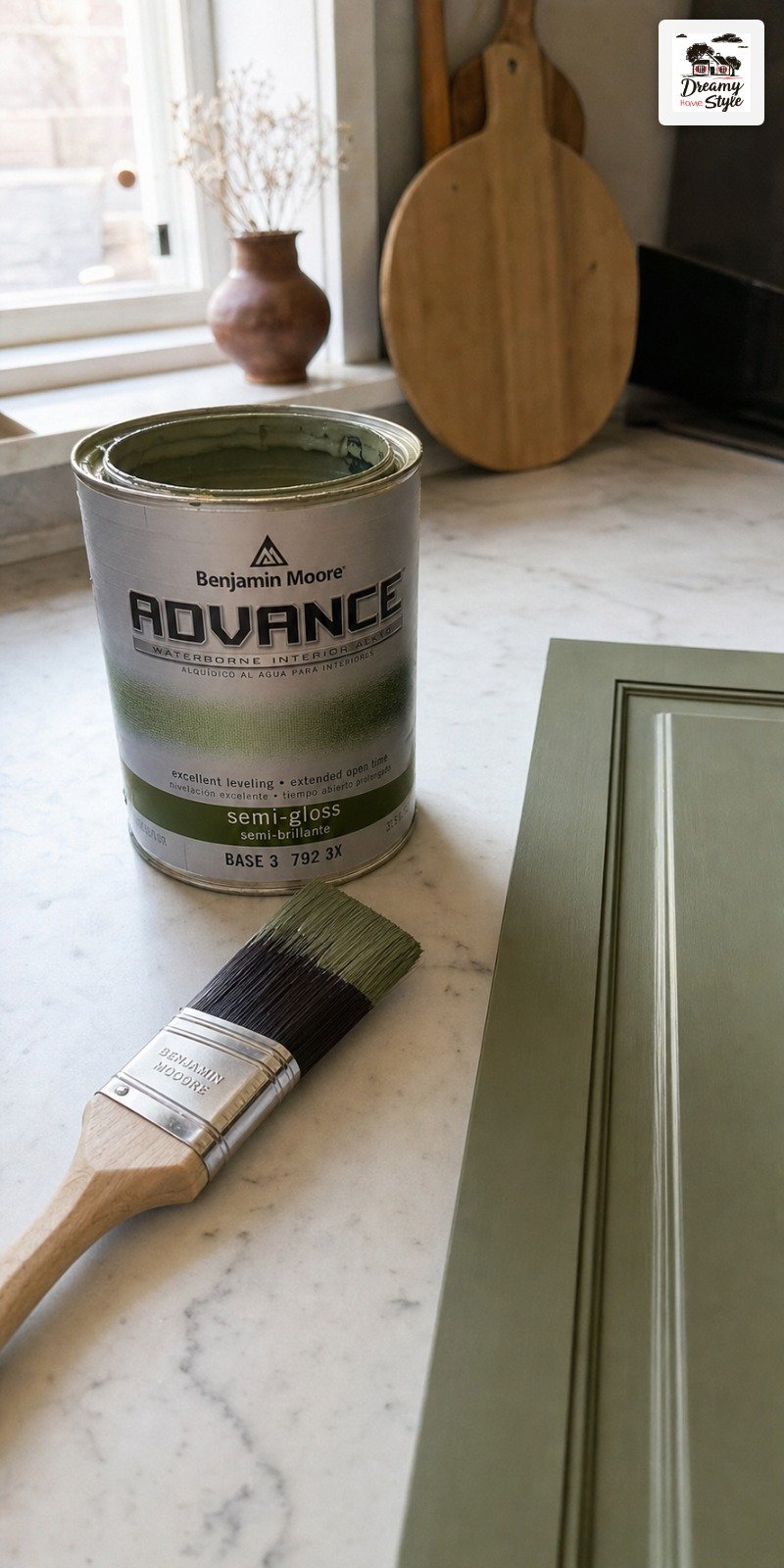
Regular latex wall paint sounds totally fine until six months later when you’re watching chunks of it peel off your drawer fronts.
Ask me how I know.
(I know.)
You want a cabinet-specific paint or a furniture paint.
Benjamin Moore Advance is the one I hear about most from people who actually refinish cabinetry for a living.
It’s alkyd-modified latex, which means it self-levels with fewer brush marks and hardens properly over time.
Sherwin-Williams Emerald Urethane Trim is another solid option.
It’s thicker so you need fewer coats, and it cures to a really hard finish that holds up to daily kitchen chaos.
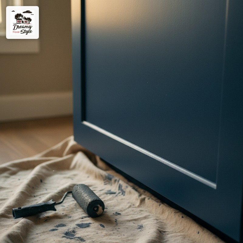
It costs more than regular wall paint.
I spent $72 on a quart of Advance and I’ve had zero chips in almost two years of daily use.
Worth every cent.
Hardware Color Changes Everything About the Paint Shade
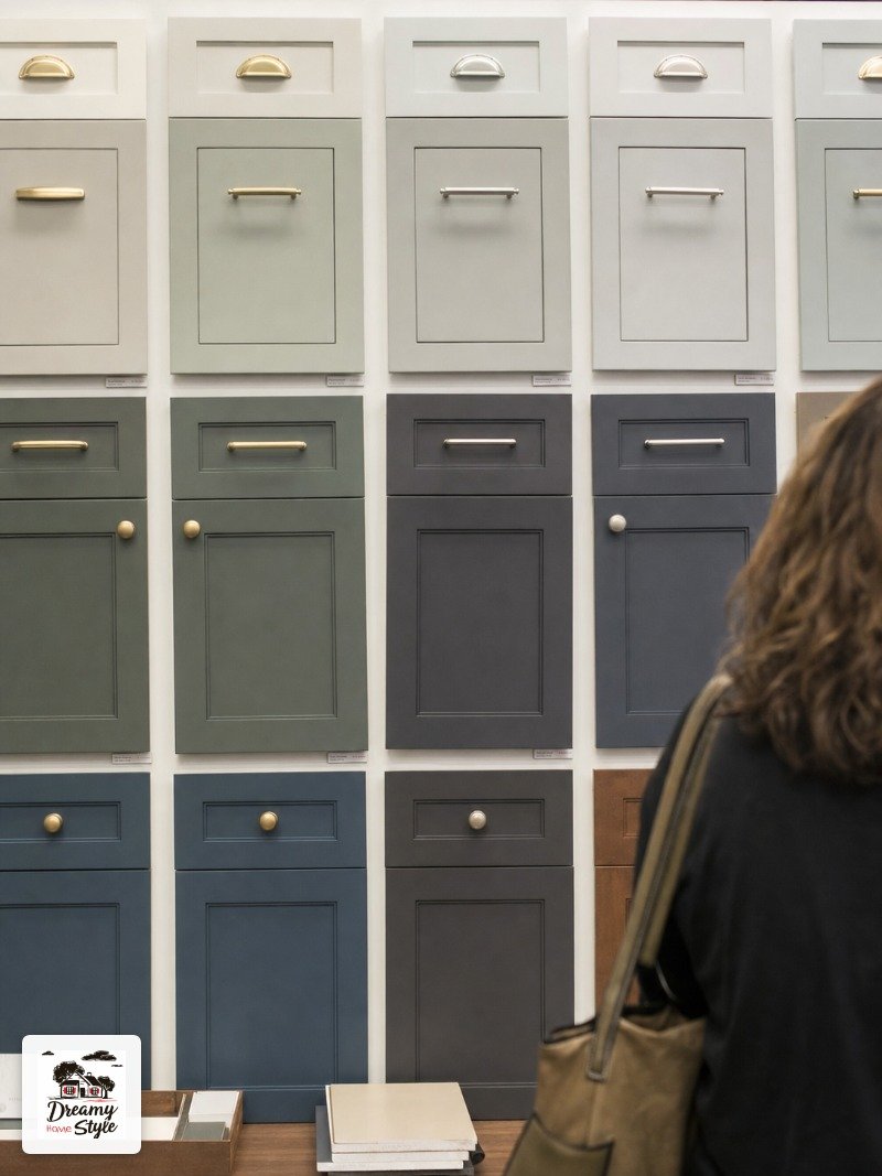
Nobody talks about this enough.
You can pick the most perfect navy blue in the world and then put chrome hardware on it and it’ll look completely wrong.
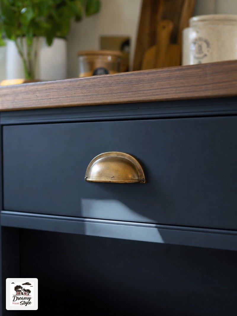
Warm Paint Colors (greens, terracottas, warm whites, navy) almost universally want warm hardware.
Brass, unlacquered brass, aged bronze, antique gold.
The warmth in the metal picks up the warmth in the paint and everything just clicks.
Cool tones (true grays, bright whites, cool-leaning sage greens) can handle chrome or brushed nickel without looking too cold.
But I’d still nudge you toward a warmer finish if you can swing it.
I swapped out the builder-grade silver knobs on my island for $4 brass pulls from Amazon and the whole color shifted.
Same paint.
Completely different feel.
Honestly shocking how much that one change did.
The Two-Tone Kitchen Strategy That Makes It All Work
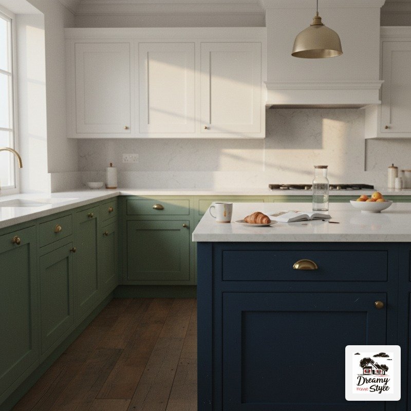
If you’re terrified to paint your upper cabinets but desperate to add color somewhere, this is the move.
Keep uppers white or neutral and paint just the island, and maybe the lowers.
The visual logic is that your eye goes up toward the lighter, airier upper cabinets, so the kitchen still feels open even when the island is dark.
It’s a smart trick.
I’ve also seen the reverse work really well: lower cabinets in a deep color, uppers white, island in a completely different accent color altogether.
It sounds like chaos but it works if you repeat a metal finish or countertop material throughout to tie everything together.
Pick one consistent thread and let it run through the whole kitchen.
Same hardware finish, same countertop, something.
One quiet repeated element and the rest can do whatever it wants.
Terracotta and Clay Tones for the Brave Ones
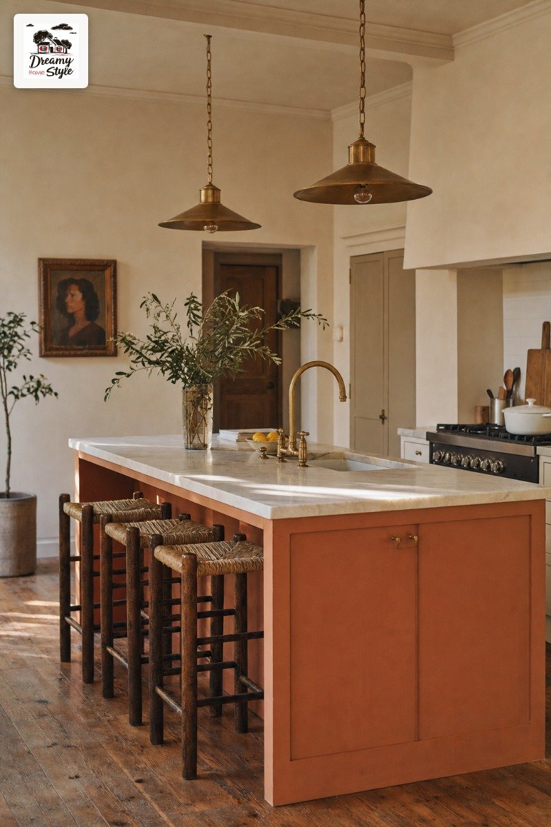
Okay, this is the sleeper hit of island paint colors and I need more people to know about it.
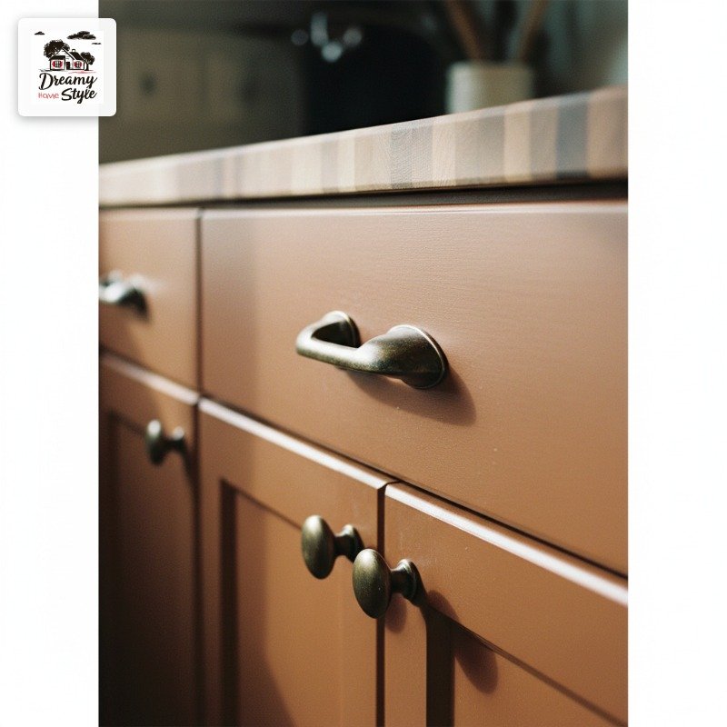
Terracotta on an island sounds intense.
It feels intense when you swatch it.
And then you paint the whole thing, stand back, and it’s just warm and grounding and sort of feels like it’s always been there.
Sherwin-Williams Cavern Clay is the one everyone knows, but for islands I actually prefer something slightly more muted.
Benjamin Moore Pueblo shows up a lot on design Instagram and it’s less saturated than Cavern Clay, which makes it easier to live with long term.
The countertop pairing matters a lot here.
White countertops make terracotta feel bright and bold.
Wood or butcher block makes it feel organic and calm.
Both are good, just really different vibes.
Test the Color in Your Actual Kitchen Light First

This one sounds obvious until you’ve painted an entire island a color that looks nothing like what you expected.
Hi.
That was me.
The whole thing had to be repainted (I learned this the expensive way).
Kitchen lighting is weird and specific.
Under recessed warm LEDs a sage green can look almost yellow.
Under natural morning light it might look fresh and cool.
At 6pm with the overheads off and just pendants on, it might read completely different again.
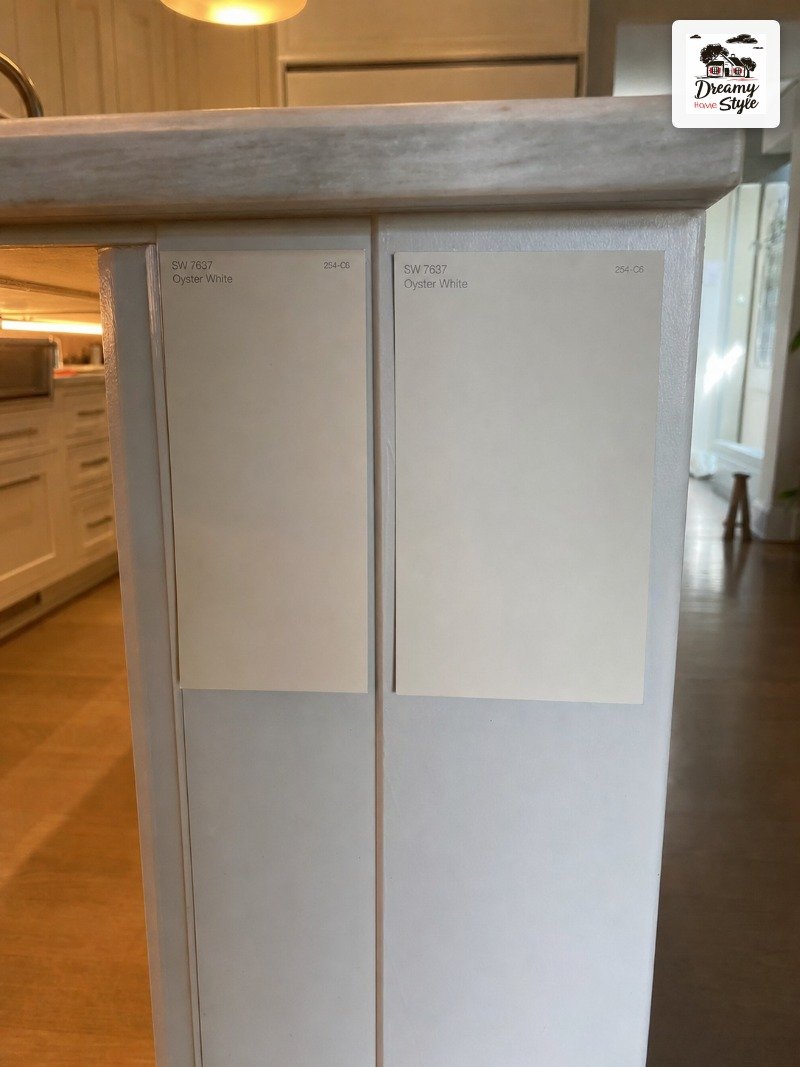
Buy a pint and paint a large swatch directly on the island.
Like twelve inches by twelve inches, minimum.
Live with it for a full weekend before you buy the full gallon.
Check it with your kitchen lights on.
Then off.
Then with the cabinet doors open.
Sounds obsessive but it’s genuinely how you avoid an expensive redo.
Gray That Actually Works (Hint: It Has Undertones)
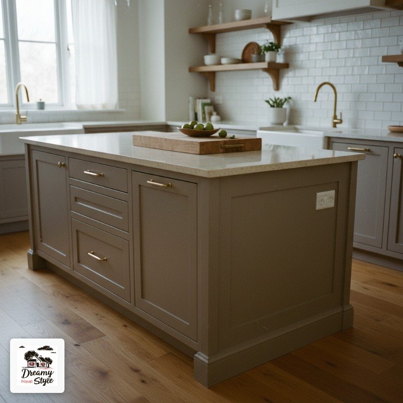
Gray islands get a bad reputation, mostly because people pick a gray that looks perfect in the can and then reads as purple or blue or vaguely sad in their kitchen.
That’s not gray’s fault.
It’s undertone blindness.
For a warm kitchen with wood floors or warm-toned tile, you want a gray with a brown or beige undertone.
Benjamin Moore Revere Pewter is the classic.
Sherwin-Williams Accessible Beige if you want to go even warmer.
For a cooler, more modern kitchen, Sherwin-Williams Repose Gray can work but it does pull lavender in warm light, so be ready for that.
Test it first.
Seriously.
My personal pick for gray that actually reads as gray?
Benjamin Moore Amherst Gray.
True mid-tone, barely any weird undertone, and it looks intentional without being aggressive.
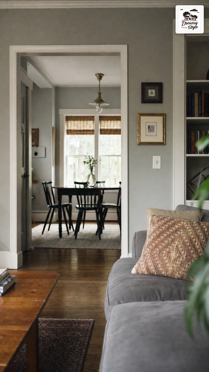
Seal It. Seriously. Don’t Skip This Step.
You did all the prep, you used the right paint, you found the perfect color.
Do not stop now.
A topcoat sealer on a painted island adds real protection against moisture, cooking oils, and general kitchen chaos.
I use Minwax Polycrylic in a satin finish.
It dries clear, doesn’t yellow over time unlike oil-based poly, and you can apply it right over water-based cabinet paint.
Two thin coats is all you need.
Don’t glob it on.
Sand lightly between coats with a 400-grit sanding sponge, wipe clean, then apply the second coat.
The island needs to cure, not just dry, before it’s actually hard.
Most cabinet paints take two to four weeks to fully cure even though they feel dry to the touch within a day.
Be gentle with it during that window.
Soft cloth only, no scrubbing.
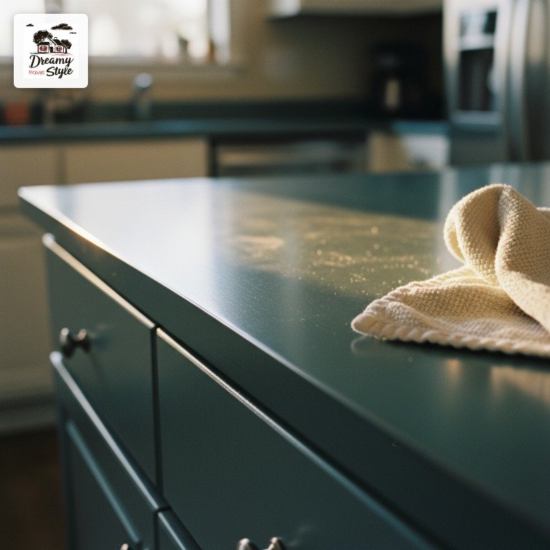
The seal coat is what separates a painted island that looks amazing for five years from one that starts looking rough by Christmas.

