

I’ll never forget the morning I walked into my north facing living room with a coffee in hand.
The light was flat and a little bluish.
And my “perfect” soft white wall looked like wet concrete.
I almost cried, honestly.
I had spent whole weekends picking that color.
So I repainted, and then repainted again, and I learned so much along the way.
North light is cool and quiet, but it doesn’t have to feel dreary.
You just need colors with a little warmth baked in.
Here’s everything I’ve figured out, friend.
Creamy Warm White

I’m obsessed with a creamy white in a north facing room.
Stark bright white turns icy and sad in that gray light.
A white with a soft yellow or cream undertone does the opposite.
It gives the walls a gentle glow, kind of like candlelight.
When I painted my hallway in a buttery cream, it felt like someone turned on a lamp.
My favorite is Benjamin Moore Swiss Coffee, but any cream that looks slightly yellow on the swatch works.
Skip anything labeled “pure” or “brilliant” white.
Those tend to lean blue in shadow.
If you want a crisp feel, go for a cream with just a whisper of gray.
I love it with natural linen curtains and a chunky wool throw.
It feels like a hug in paint form.
Warm Greige

Greige is the little black dress of paint colors, you know?
But in a north facing room, you have to be picky.
A cool greige will slide right into green or purple in that flat light.
A warm greige, with a beige or pinkish base, stays cozy.
When I tackled my own cramped guest room last fall, I tested a whole parade of greiges before a lucky one finally behaved.
It looked soft and creamy at noon and still lovely at dusk.
Look for a color that’s on the lighter side, so it doesn’t swallow the light you do have.
Sherwin-Williams Accessible Beige is a classic for a reason.
I love it with cream bedding and a warm wood nightstand.
It’s calm without being boring.
Soft Butter Yellow

Okay, hear me out on yellow.
I know it sounds bold for a gray room.
But a soft, buttery yellow is like bottled sunshine for north walls.
I painted my tiny home office in a pale butter shade and I swear my mood changed.
Gray light actually mellows the color, so it never gets too loud.
Stay away from lemon or neon tones, because those can feel sharp.
You want something creamy, almost like a spoonful of custard.
It pairs beautifully with white trim and a soft green plant in the corner.
If you’re nervous, try it in a powder room before you go bigger.
You’ll fall in love, I promise.
Dusty Blush

Blush might be my secret weapon.
A dusty, slightly peachy pink warms up a north room like nothing else.
The gray light tames the sweetness, so it feels grown up instead of girly.
My friend painted her bedroom in a muted blush and it looks like a sunset all day long.
Pick one with a little brown or clay in it.
That keeps it earthy rather than bubblegum.
I’d pair it with brass hardware and an ivory rug.
And a deep green velvet pillow looks so pretty against it.
If I had a dark bedroom, this is the color I’d try right away.
It makes you feel cared for, kind of like a soft blanket.
Warm Sage Green
Sage is everywhere right now, but the undertone matters so much here.

A gray-green will look drab and cold in north light.
A sage with a yellow base feels fresh and alive instead.
I painted my entryway in a soft yellow-leaning sage and it felt like walking into a garden.
Test it next to your trim, because the wrong white can make it look muddy.
I love it with warm oak, rattan, and anything woven.
It brings the outdoors in, which is a gift when your window light is so moody.
Benjamin Moore Saybrook Sage was a sweet one I tried.
Hold the swatch up at different times of day, always.
Green holds on to its personality, even in the gray.
Terracotta and Clay

Earthy colors are made for cool light.
A soft terracotta or clay pink adds heat right where you need it.
I tried a muted clay in my reading nook and wow.
It felt like sitting inside a warm pottery bowl.
Go for a toned-down version rather than a bright orange.
You want dusty and sun-baked, not fiery.
It looks amazing with cream furniture and a few black accents.
And it makes wood tones look richer than ever.
If a full room feels like too much, paint just the wall behind your sofa.
I think this is such a fun, cozy choice.
Mushroom Taupe

Mushroom taupe is that sort of soft brown-gray that feels so expensive.
It’s warm enough to fight the chill but quiet enough to relax in.
I used it in my dining room, and candlelit dinners there feel like a little restaurant.
The trick is picking one with a red or pink undertone.
Those hold their warmth, even on a gloomy afternoon.
A taupe that leans green or blue will flatten out.
I like it with white trim and lots of texture, like boucle and jute.
It also hides scuffs well, which is a bonus with kids or pets.
If you want something that feels grown up and cozy, start here.
Peachy Cream
This one is a little unexpected, but I love it.

A creamy peach, super pale and soft, glows in north light.
It reads as almost white in the daytime.
But at night, with warm lamps on, it turns the whole room into a hug.
I used it in my bathroom and every selfie in there looks flattering now.
That’s the real magic, honestly.
Warm walls reflect a lovely tone onto your skin.
Pair it with white towels, gold mirrors, and a little eucalyptus.
Test it before you commit, since peach can swing orange if it’s too saturated.
You want it whisper-soft.
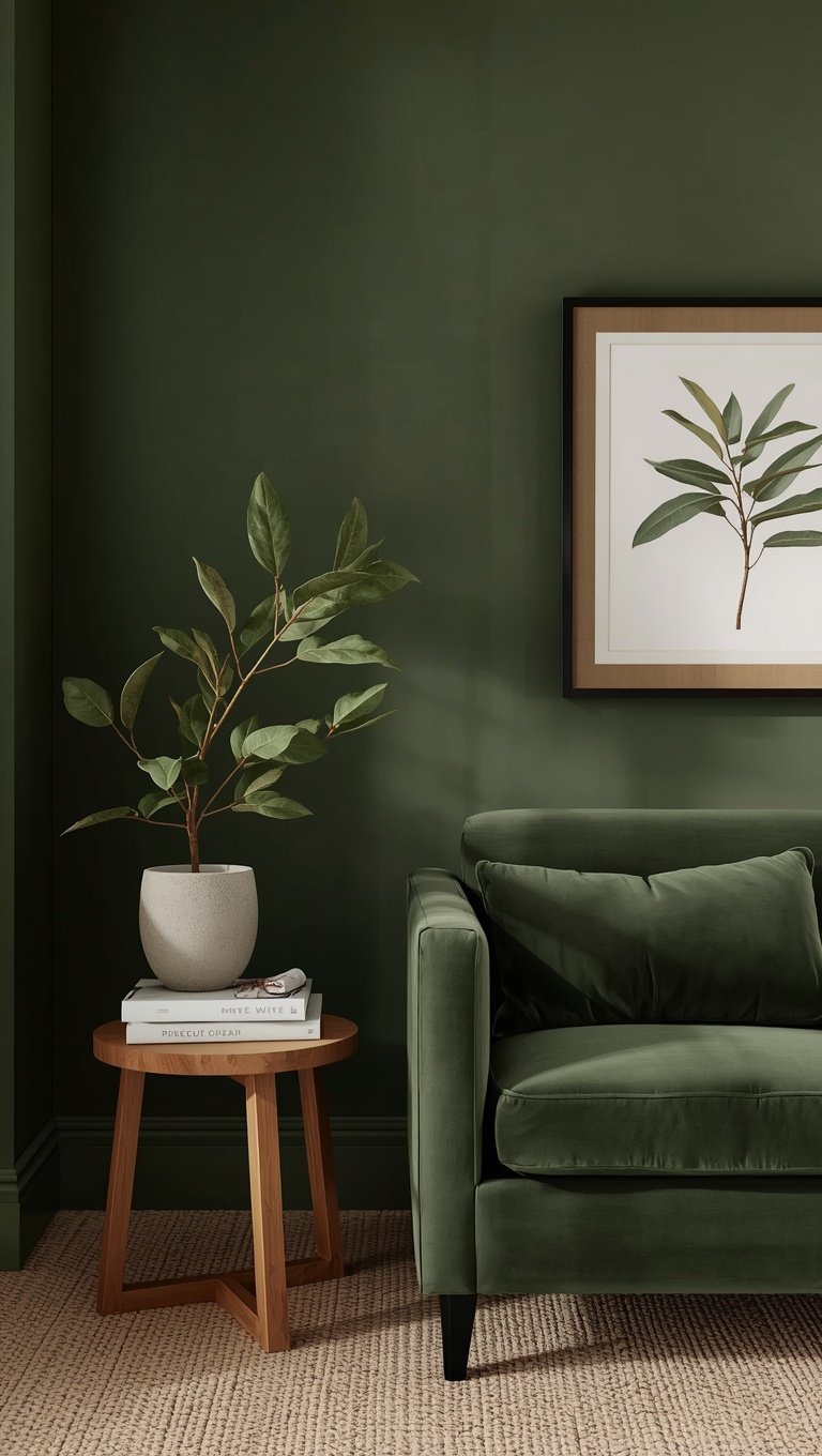
Deep Olive Green

Sometimes I want drama, and north rooms can actually handle it.
Dark colors don’t fight the gray light, they embrace it.
A deep olive green feels rich and a little mysterious.
I painted my den in olive and now it’s my favorite place to curl up with a book.
The yellow undertone keeps it from feeling heavy or cold.
Go all in and paint the trim and ceiling too.
That wrapped-in-color look makes the room feel intentional, not dark by accident.
Add lots of warm lamps and a cozy velvet chair.
It’s kind of a cocoon, and I mean that in the best way.
Warm Navy With a Hint of Ink

Navy can work in a north room, but choose carefully.
A cool, bright navy will feel chilly.
A deep, inky navy with a touch of black or green feels moody and warm instead.
I did my bedroom in a dark inky blue, and at night it feels like sleeping inside a velvet sky.
Balance it with warm whites, cognac leather, and brass.
Those little glints of gold keep it glowing.
I wouldn’t do navy in a tiny dark closet-like space, though.
Give it a room with a decent window.
And use a matte finish so it feels soft rather than shiny.
Dark and cozy can be so romantic.
Don’t Forget the Ceiling

Here’s a hack I wish I’d known sooner.
Paint your ceiling a warm tone, too.
A stark white ceiling in a north room can look gray and heavy.
I tried a soft cream ceiling and the whole room lifted.
Or go bolder and color-drench, with the ceiling slightly lighter than the walls.
It sounds scary, but it feels so cozy.
Light bounces down from above, so a warm ceiling quietly warms everything below.
I’d do this before buying any new decor.
It’s the cheapest upgrade I’ve ever made.
And it makes you look up and smile.
Test Like Your Life Depends on It

I know, I know, sampling feels tedious.
But I’ve wasted so much money skipping this step.
Paint large swatches on a couple of different walls, and use a sample board you can move around.
Look at them in the morning, at noon, and at night.
North light changes dramatically, and a color can be a total stranger by evening.
Live with it for a few days before you commit.
I also tape the swatches next to my sofa and rug, because everything influences everything.
It kind of becomes a little ritual for me.
Grab a coffee, sit down, and just watch the colors shift.
You’ll know when it’s right.

