
Sponsored: Love vs. Design paid for this post.
Almost every black wallpaper photo you’ve saved has the same problem.
Somebody bought the whole room at once, which is a total luxury.
New sofa, new rug, a sideboard that matches the frames, all of it picked to go with the wall.
That’s not your house.
You’ve got a couch you’re not replacing, a dresser from a thrift run, a coffee table your aunt didn’t want anymore.
And honestly?
That’s the better starting point.
You just have to do it in the opposite order from the photos: furniture first, wallpaper second.
Here’s how I’d pick black wallpaper around stuff you already own, without the room turning into a cave or your favorite pieces disappearing into the wall.
Write down your three biggest pieces before you look at a single pattern

Grab your coffee and walk the room.
List the three largest things that sit against or near the wall you’re thinking about.
Usually that’s a sofa, a bed, a dresser or a big bookcase.
Next to each one, I’d write two things: its main color and which way it leans.
Warm wood leans orange, red or honey.
Cool wood looks gray-washed or ashy.
Upholstery is light, mid-tone or dark.
Black or near-black furniture gets its own line, because it plays by different rules (more on that below).
This takes about 5 minutes, and it saves you from falling for a pattern online that fights the sofa you’re keeping for another ten years.
Your list is now the brief.
The wallpaper’s job is to make those pieces look better, not to be the star.
Warm wood is the easy win, so lean into it

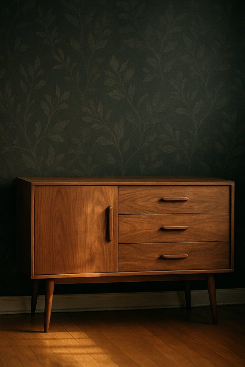
If your list is mostly honey oak, cherry, walnut or that orange-ish pine every thrift store has, you’re in luck.
Against a near-black background, mid-tone wood tends to read lighter and richer than it does against white.
Grain shows up.
A dresser that looked tired against beige suddenly looks like you meant it.
The trick is the second color in the pattern.
Look for a black wallpaper whose motif carries a warm color that already lives in the room: cream, ochre, rust, brass, a faded gold.
That thread ties the wood to the wall.
A black pattern with icy blue or silver accents can make orange oak look even more orange, and not in a cute way.
Mixing a few different woods in front of it?
That’s fine, and the black actually helps, since it gives them one calm backdrop.
If you’re nervous about it, my post on mixing wood tones in one room walks through how to make different finishes look intentional.
Black furniture needs a lighter ground, or a little breathing room

Hear me out on this one, because it’s where people get burned.
Put a black dresser in front of a solid black wall and it doesn’t look moody, it looks like it’s missing.
You lose its outline, and with it most of the reason you bought it.
You’ve got three fixes, and you can stack them:
- Pick a pattern with a lighter ground or a busy motif where the furniture sits, so there’s something behind the piece for its edge to read against.
- Pull the piece off the wall 1 or 2 inches and put a lamp beside it. A little light behind and to the side draws the silhouette back in.
- Put something light on top. A cream lamp shade, a stack of pale books, a white ceramic. It gives the eye a place to land.
If a lot of your furniture is black, I’d look at a black-and-cream or black-and-tan print instead of a near-solid black.
For more on what colors hold their own against dark walls, here’s my list of furniture colors that work with black walls.
Size the pattern to the biggest thing in front of it

Pattern scale is kinda the part online shopping hides, because a tiny product photo makes every print look the same size.
My rule of thumb: a big, low piece like a sectional or a long sideboard wants a big motif behind it.
A small, busy print over a long sofa turns into visual static.
Leggy, delicate pieces (a spindly side chair, a skinny console) can take a smaller print, since there’s less furniture blocking it.
Here’s a test you can do at home.
Tape a sample to the wall, walk to the doorway and squint.
If you can’t tell what the motif is from there, it’s probably too small for that wall.
If the motif is so big you only see half of one behind your headboard, it’s probably too large.
I’d want at least a couple of full repeats visible above the furniture.
Choose the type and finish for the wall you actually have

Older walls have dings, patches and the ghost of every nail hole the last owner made.
Turns out black is brutally honest about all of it.
A matte finish hides a lot.
Anything with sheen catches the light right on every bump, so if your walls are rough, go flatter.
If you rent, or you just don’t want a weekend of paste and a sponge, self-adhesive wallpaper is the low-commitment way to try a black wall.
A few things to know before you order:
- It wants a smooth wall. Heavy texture (that bumpy orange-peel finish) gives the adhesive less to grab, and the edges can lift.
- Fresh paint is a problem. Most peel-and-stick makers ask you to let new paint cure for a few weeks before you hang anything, so check the instructions for the one you buy.
- In a rental, test the peel. Put one strip somewhere hidden, like inside a closet, leave it for 3 days or so, then pull it off slowly and look at the paint underneath.
One more budget note.
Order more than your math says.
I’d add 10 percent at the very least.
Pattern matching eats extra length, and running out three-quarters of the way across a black wall is a special kind of sad.
Test the sample behind the real furniture, at night

Don’t judge a black sample on the kitchen counter.
I like a sample at least 12 inches square, because a tiny swatch tells you almost nothing.
Tape it to the actual wall, at the height where it’ll show above the sofa or dresser, with the furniture in front of it.
That’s the only view that matters.
Then look at it twice.
Once in daylight, and once about 2 hours after sunset with the lamps you really use.
I’d live with it for 3 days before deciding anything.
Black wallpaper is the most light-hungry thing you can put on a wall.
Most true black paints sit under 10 on the light reflectance scale, so very little light bounces back.
Under one overhead fixture it goes flat and gloomy.
You already know how I feel about overhead lighting, and this is the room where it’ll punish you hardest.
Two or three lamps at different heights make the pattern glow instead.
This is also where a custom option is handy.
Love vs. Design lets you change the colors in a pattern and order a sample before you commit, so you can pull the accent color straight from your rug or your sofa’s piping and see it in your own light.
Honestly, that beats guessing from a screen, and a sample costs way less than a do-over.
Start with one wall, and pick it by the furniture

You don’t need four black walls to get the look.
One wall does most of the work, and it’s a lot easier to live with (and undo).
Pick the wall behind the piece you love most: the bed you just refinished, the thrifted dresser, the sofa you finally found on Facebook Marketplace.
Skip the wall with the big window.
When daylight comes from behind it, a black wall around the window reads like a dark hole, and nobody’s furniture looks good against that.
If you like the idea of a removable feature wall, I’ve got more ideas in my post on peel and stick accent walls.
And if your three pieces are warm wood, a light sofa and one black chair, you already know what to look for: a black pattern with a warm second color, big enough for the sofa, a lighter spot behind the chair, and a lamp on either side.
Related read: Things I Wish I Knew Before I Decorated My First Home — Instant PDF + Kindle download. Secure checkout by Stripe