
My foyer used to be a six-foot stretch of builder-beige nothing with a light fixture so bad I unscrewed it and left the wires capped for four months.
I’ve been obsessed with entryways ever since — because once I fixed mine, the whole house felt different.
Below are 13 foyer styles I genuinely love, plus the specific details that make each one work.
Further down I’ll get into the glam mirrored-wall look that stopped me mid-scroll at 11pm, the Spanish tile style I want so badly it hurts, and a full tips section with stuff I actually had to learn the hard way.
Stay with me.
The good stuff starts now.

Rustic Foyer with Wood Accents

I have a soft spot for rustic foyers because the whole vibe is basically “warm hug the second you walk in.”
And honestly, it’s one of the more forgiving styles to pull off — worn and imperfect is kind of the whole point.
The move here is reclaimed wood.
Cover one or more walls with reclaimed wood planks for that layered, textured look that paint just can’t replicate.
If full-wall planks feel like too much, start with a single accent wall behind a console table.
Even that much wood changes the whole energy of a space.
Overhead, an antler chandelier or a wrapped-rope pendant reads “rustic” immediately without trying too hard.
I found a beat-up one at a consignment shop for $34 and repainted the hardware matte black.
Took an afternoon.
Worth it.
For furniture, stick to pieces with visible wood grain, leather details, or iron hardware.
A console table with chunky legs, a storage bench with a leather cushion, a coat rack made from actual branches — all of that.
Woven baskets tucked underneath store shoes and scarves and look intentional instead of messy (I have three; Biscuit has knocked all of them over at least twice).
Pull it together with an area rug in earthy tones — think oatmeal, bark brown, sage green.
Keep the color palette tight: soft tans, warm browns, muted black, and a touch of forest green.
Nothing bright.
Nothing shiny.
The one rule for rustic style that I will absolutely stand behind: nothing should look pristine.
If a piece looks too new, lightly sand it.
Distress the edges.
Let the dog rub against it a few times.
The more worn and lived-in, the more authentic the whole thing feels.
Bohemian Foyer with Vintage Touches

A boho foyer is basically a permission slip to collect things you love and call it decorating.
I mean that sincerely.
This style rewards the person who has a stack of vintage finds with nowhere to put them.
Start with a warm wall color — terracotta, spiced amber, or even a deep rust.
Then add texture everywhere: stenciled wall motifs, wood ceiling beams, patterned encaustic cement tile on the floor or a vintage wood floor with visible character marks.
The walls and floor should feel like they have a story.
Furniture-wise, look for a hand-carved console table (I found mine at an estate sale for $55, missing one drawer pull, which I replaced with a vintage brass one from the hardware bin at a flea market).
Add a distressed mirror, a bench buried in embroidered pillows, and mismatched pendant lights that look artfully discovered rather than matchy-matchy.
The accessories are where bohemian style really lives.
Framed vintage maps, a ceramic pot from a pottery market, an old instrument hung on the wall as art, small woven baskets in three different sizes — none of it needs to match.
That’s genuinely the rule.
Symmetry is not your friend here.
A worn Persian rug anchors the space.
Wrought iron lanterns on a console top add warm light.
And any item that carries a real story — something you bought while traveling, something handed down, something with obvious age and use — belongs here.
Display it proudly.
The result isn’t a catalog page.
It’s a foyer that feels like it belongs to someone with a genuinely interesting life.
Traditional Foyer with Wainscoting

Wainscoting is one of those details that makes a foyer look like it cost twice as much as it did.
I’m a huge fan.
It’s an older technique — originated in the 1700s as a practical way to protect walls from scuffs — but it holds up beautifully in modern traditional spaces.
The basic setup: paneled molding covers the lower half of the wall, usually painted white or cream, with a different (usually deeper) color on the upper wall.
That contrast is what makes the architectural detail pop.
Light gray, warm tan, or a soft sage on the upper walls all work well with white wainscoting.
For flooring, wide-plank hardwood laid in a herringbone or straight pattern feels right.
Porcelain tile in a classic herringbone works too, especially if you want something more durable near the front door.
(I spilled an entire mug of coffee on my entryway floor once and was very grateful for tile.)
A crystal chandelier overhead is the classic choice, and I’d say don’t fight it — it’s classic for a reason.
The way chandelier light hits wainscoted walls makes the whole thing feel genuinely elegant without being stiff.
Furnishings should lean toward the ornate side: a carved wood hall tree or console table, a gilded mirror above, maybe a cushioned bench with cabriole legs.
Antique or reproduction pieces are both fair game.
Stick to your neutral palette and resist the urge to add too many colors.
The architectural detail is doing the work here.
Let it.
Modern Foyer with Texture and Patterns

This is the foyer style for people who are tired of safe.
Navy walls, charcoal accents, a checkerboard tile floor, a faux crocodile wallcovering on one surface — modern foyers can handle a lot more personality than most people give them credit for.
The starting point is usually an accent wall or an unexpected material.
Deep navy or charcoal gray immediately signals “intentional and modern.”
A textured wallcovering — faux crocodile, linen-wrapped panels, even a matte concrete-look wallpaper — adds tactile interest that photographs can’t fully capture but that every person who walks through your front door will notice.
Layer patterns from there: a geometric area rug, graphic art in simple frames, maybe a graphic-print bench in an animal print or bold stripe.
The key (and this is where I’ve messed it up before) is to keep the furniture itself fairly minimal.
Sleek steel legs, a simple silhouette, clean lines.
The patterns and textures are the stars; the furniture is their backdrop.
Metallics pull it all together.
Steel, chrome, and brushed silver in lighting fixtures and hardware read modern without going cold.
A mid-century starburst pendant or a globe-style pendant with a matte finish make a strong statement overhead.
Keep the floor clear of clutter.
One console table, one rug, one statement light.
That’s enough.
Modern style suffers most when people add too much “just in case” — every extra thing dilutes the impact.
And honestly, this is the style where whimsy earns its place.
A retro print, an unexpected pop of burnt orange, a sculptural coat hook — go for it.
Feminine Foyer with Pastel Colors


I went through a pastel phase a couple years ago and I don’t regret a single decision.
There’s something so genuinely calming about walking into a space that’s soft and light and gentle — especially in a foyer, where first impressions are everything.
Blush pink and mint green are the obvious starting points, but pale lavender and dusty blue work just as well.
The trick is picking two or three shades that live in the same tonal family — not so matchy they look like a set, but harmonious enough that the eye doesn’t fight itself.
Paint the walls your primary pastel, then bring the color story forward through furniture.
A painted white console table with blush hardware, a tulip-style accent chair reupholstered in a soft green or pink velvet — pieces like that carry the palette without screaming it.
Textures matter a lot here.
Velvet, silk, faux fur, even a lightweight linen cushion — soft textures reinforce the whole mood.
Add warmth with gold accents: sconces, a thin-framed mirror, metal legs on a console table.
Gold and pastels are genuinely one of my favorite pairings.
They feel luxe without being heavy.
Floral details — art prints, a small vase, a rug with a soft botanical print — add femininity without overdoing it.
Keep lighting ambient; a bare overhead bulb will kill this vibe instantly (overhead lighting is always the enemy, but especially here).
The result is a foyer that feels like an exhale.
Guests walk in and relax before they even take off their shoes.
Nautical Foyer with Coastal Accents

I don’t live near the water, which makes me want a nautical foyer even more.
There’s something about that crisp navy-and-white palette and the smell of actual rope texture (don’t ask, I’ve bought rope-wrapped things I had no plan for) that just feels like summer.
Crisp white walls are your foundation.
Navy and white patterned floor tile — anything that reads like waves or simple stripes — makes the theme legible the second you step inside.
From there, build with materials that feel coastal without going full party-store-beach-theme.
Reclaimed wood is your best friend: a console table with weathered boards, a coat rack made from driftwood-look timber, a few frames in whitewashed finishes.
Natural textures do a lot of work here — woven seagrass baskets, a sisal area rug, jute accents layered with different weights and weaves.
Blues throughout: soft powder blue upholstery on a bench, deep navy drapes if the space has a window, pale blue ceramics on the console.
You don’t need to repeat the same blue; mixing a few shades reads more like the actual ocean than a single flat color would.
For accessories, real seashells beat fake ones every time.
A couple of conch shells, a small piece of driftwood used as a decorative tray, a print of a coastline in a simple frame — these feel genuine.
Avoid anything with the word “BEACH” printed on it in large font.
(I feel strongly about this.)
An anchor-motif chandelier or a pair of lantern-style sconces finishes it off.
The whole thing comes together quickly, and it’s one of those styles that feels cohesive even before you’re “done.”
Open-Concept Foyer

My current house has this style half by accident and half by me taking down a half-wall that had no business being there.
If your floor plan allows, letting the foyer blend into the living space creates a relaxed, communal feeling that’s really hard to replicate any other way.
The first thing to address is consistency.
When the foyer isn’t a separate room, cohesion is what defines it.
Same flooring running from entry through the living area — hardwood, a large-format tile, whatever your choice — signals that the spaces belong together.
Same wall color, or at least the same paint family.
Consistent lighting fixtures, even if they vary slightly in size.
Don’t clump all the furniture at the front door.
Distribute it.
A console table and a small bench near the entry do the functional work (keys, shoes, bags), but a seating area a few feet further in invites guests to keep moving, to make themselves at home.
That flow matters more than most people think.
Area rugs are your room-definers here.
A rug anchoring the entry zone and a separate rug anchoring the living seating area give each space a sense of identity even without walls between them.
The open layout also makes the home feel genuinely bigger.
With fewer walls interrupting sight lines, natural light moves freely, and even a modest square footage feels more generous.
Traffic flows more naturally too — no awkward bottleneck at a narrow foyer doorway.
It’s not the right choice for everyone.
Some people want that sense of enclosure and transition when they walk in.
But if you like a relaxed, come-on-in atmosphere, an open foyer really does deliver it.
Glam Foyer with Mirrored Wall


I saw a mirrored wall foyer on Pinterest at 11pm and genuinely could not sleep.
It was that kind of instant, irrational love.
And here’s the thing — it’s not as impractical or over-the-top as it sounds.
A floor-to-ceiling mirrored wall does two things immediately: it doubles the perceived size of the space, and it bounces light in every direction.
In a foyer, which tends to be one of the darker spots in a home, that second point alone is almost functional justification.
Small entryway?
Suddenly it doesn’t look small anymore.
Pair it with Black and White marble tile in a geometric pattern on the floor — the reflection plays off the pattern beautifully.
Overhead, a crystal chandelier is basically non-negotiable here; the way the crystals catch in a mirrored wall is genuinely dazzling in a way that photographs don’t capture.
Furnishings should stay clean and unbusy.
A glass-top console table, a gilded mirror (yes, a mirror near a mirrored wall — I know it sounds redundant, it actually works), polished chrome coat hooks.
The room itself is the statement.
The furniture is there to support it, not compete.
One or two fresh floral arrangements soften the whole thing.
Without them, all that glass and metal can feel a bit cold.
A bunch of white peonies or even simple eucalyptus branches in a clear vase adds just enough organic warmth.
Limit additional accessories.
Seriously.
The mirrored wall is doing all the heavy lifting — let it.
Industrial Foyer with Exposed Brick


If your house has exposed brick hiding behind drywall, I want you to stop reading this and go find it immediately.
(I learned the hard way that my older house had beautiful brick under a layer of wallpaper and then two layers of paint.
It took a weekend and a lot of chemical stripper, but it was worth every minute.)
Exposed brick is the foundation of industrial foyer style, and everything else builds around it.
The brick brings texture and warmth that no faux finish can replicate.
Against it, concrete floors stained in dark espresso or charcoal anchor the space with that raw, utilitarian edge.
Metal details are essential: pendant lights on metal pipe stems, wrought iron railings if there’s a staircase nearby, a factory-cart style console table with iron wheels (I’ve seen good ones for around $180 at places like HomeGoods, though they go fast).
Black-painted furniture with leather upholstery and stainless steel hardware all fit the aesthetic without looking like a theme park.
Weathered trunks used as side tables, a few tall industrial-style bar stools, reclaimed wood shelving installed with black metal brackets — all of this reads authentic rather than costumey, as long as you don’t over-accessorize.
Bold graffiti-style art on one wall (not the brick wall — that would compete) adds creative energy.
Keep the remaining walls neutral: white or off-white, possibly a matte charcoal.
The whole point of industrial style is letting the architecture speak.
Don’t muffle it with too many decorative pieces.
Let the brick, the metal, and the raw materials be the decor.
Spanish Style Foyer with Handpainted Tile

This is the style I want most for my own house and can’t currently afford.
I’m being honest about that.
Handpainted Spanish tiles are not cheap.
But they are extraordinary — and even a small application goes a very long way.
You don’t need to tile an entire floor to get the effect.
A tiled backsplash along a console table wall, a few inset tiles framing a doorway, or a tiled accent strip along the base of a stair riser creates an enormous amount of impact for a relatively modest investment.
Traditional patterns — geometric stars, floral medallions, interlocking diamonds in azure and saffron and terra cotta — carry the entire Mediterranean mood.
Build the rest of the space around the tile’s palette.
Pull one or two of the tile colors and echo them elsewhere: a deep blue ceramic pot, a saffron-toned pillow on a bench, an art print with warm earthy tones.
Let the tile be the loudest voice; everything else plays supporting role.
Wrought iron is your material choice for everything metal: sconces, a chandelier, a mirror frame, even coat hooks.
Dark carved wood for any furniture — a console table, a bench, a small chair.
These materials feel genuinely Old World in a way that lighter, more modern finishes don’t.
Terra cotta pots with painted folk-art designs on a console top, woven rugs in warm reds and golds, iron lanterns flanking the front door — these details complete the picture.
Keep it warm, rich, and slightly imperfect.
The Spanish aesthetic isn’t about perfection; it’s about craftsmanship and heritage.
The finished foyer should feel like you’ve crossed into a different country.
That’s the goal and it’s a good one.
Bright and Airy All-White Foyer

Before you say “all white is impractical” — I know.
I have a dog named Biscuit who is the color of a golden retriever and sheds like it’s a competitive sport.
An all-white foyer is not my personal reality.
But I respect it enormously and I think it’s one of the most underrated foyer styles out there.
Done right, an all-white foyer doesn’t feel cold or sterile.
It feels like an exhale.
Like a deep breath before stepping into the rest of the house.
There’s something quietly sophisticated about it that more colorful spaces genuinely can’t replicate.
The secret is texture.
When everything is white, texture becomes your visual interest.
Walls in a flat white.
Ceiling in a semi-gloss.
Trim in a bright white.
Flooring in white marble, limestone, or matte porcelain — each surface reads slightly differently and that variation keeps the space from falling flat.
Furniture in white-painted wood or natural light oak bridges the gap between pure white and warm neutrals.
A white console table, a wooden bench in a bleached finish, coat hooks in matte white — all intentional, all cohesive.
Chandeliers or sconces with clear crystals or glass shades allow the light itself to do the decorating.
Avoid bold color.
I know it’s tempting to add “just a little” pop — but in an all-white foyer, even a medium-saturated accent color will dominate.
Stick to pale blush, the softest ivory, warm cream, or natural jute for any area rug.
Those add depth without breaking the mood.
A few fresh white or blush flowers in a simple vase are the only finishing touch you need.
The rest speaks for itself.
Foyer Accented with Wallpaper


Wallpaper in a foyer is honestly one of my favorite decorating moves, and it’s underutilized.
People get intimidated by it — worried about commitment, cost, removal.
But here’s the truth: a foyer is usually a small space.
The investment in wallpaper is more manageable than in a living room or bedroom, and the impact is wildly disproportionate to the square footage.
You can paper all four walls for a fully immersive effect, or do just one accent wall behind the console table if you want to test the look with lower stakes (and lower cost — I did one wall with a botanical print for about $90 in paper plus an afternoon of installation).
Either approach works.
The single accent wall actually tends to photograph better, if that matters to you.
Pattern selection matters more here than most people realize.
Florals and damasks suit traditional homes and feel warm and layered.
Bold geometrics and graphic prints read modern and confident.
Chinoiserie-style scenes add drama and artistry in equal measure.
And in a foyer especially, where people spend only a few moments, a bolder print is totally appropriate — no one has to live with it long enough to feel overwhelmed.
Match the wallpaper style to your home’s broader aesthetic.
A Victorian foyer with clean white wainscoting can handle an ornate print.
A contemporary home with simple architecture is better served by a large-scale geometric or a clean abstract pattern.
For furniture and accessories, pull back significantly.
Let the wallpaper be the thing everyone notices.
Choose one or two accent colors from the pattern and echo them in small doses — a pillow, a ceramic piece, a candle — but keep everything else neutral.
The wallpaper earned the starring role.
Let it have it.
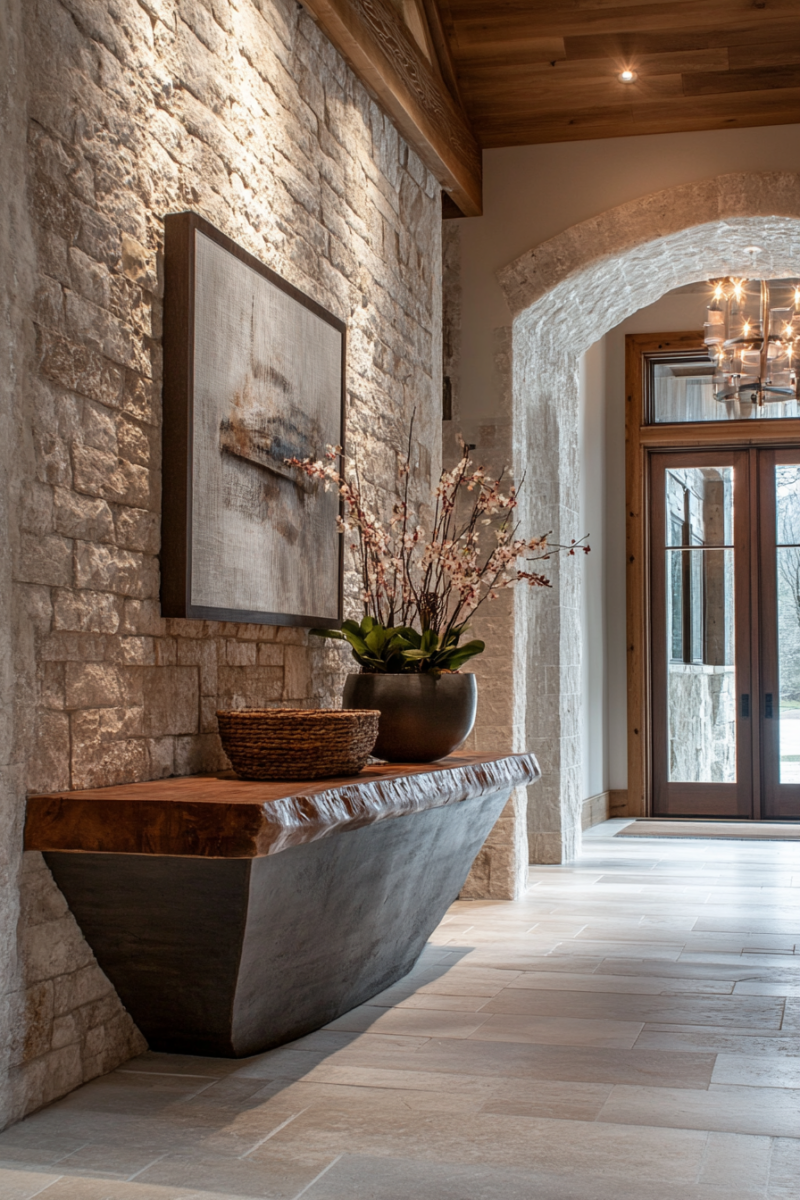
Warm and Woodsy Foyer with Stone Accent Wall
This is the foyer style that makes people stop when they walk in.
Stone walls have that effect.
There’s something elemental about them — they feel ancient and solid and completely real in a way that most decor doesn’t.
Dry-stack stone is the best choice for a foyer accent wall because it has the most texture and organic variation.
The stones are laid without visible mortar, which gives it that natural, found-in-the-woods quality.
Surround it with wood paneling on the lower walls and the combination is genuinely stunning — rough stone against warm wood grain, each material making the other look better.
Dark wide-plank floors in a rich walnut or espresso stain ground everything.
Against those floors, a live-edge console table feels both rustic and designer-level intentional.
A woven pendant light overhead (not a sleek modern fixture — something textured, something that belongs in the same material family as the stone and wood) completes the ceiling without fighting the walls.
Color palette: creamy whites, warm tans, soft greens, and the natural variations in the wood and stone.
No bright colors.
A vintage-style area rug in ivory or oatmeal softens underfoot and breaks up all that hard surface.
A fur or sherpa throw pillow on a rustic bench adds softness in a way that feels completely right here.
Greenery connects all of it.
A potted fern, a small olive tree, a bundle of dried eucalyptus on the console — anything that brings the actual outdoors in reinforces the whole story the materials are already telling.
When selecting stone and wood, look for pieces that share warm undertones — golden browns, amber, cream — so they read as a family.
The moment they fight each other tonally, the whole thing falls apart.
(I learned this by buying a cool-gray stone tile for a bathroom and pairing it with a warm wood vanity.
It was a whole situation.)
Tips for Designing a Foyer That Actually Works
I’ve redesigned my foyer three times now.
Each version taught me something the last one didn’t.
Here’s what I’d tell someone starting from scratch:
- Work with your architecture, not against it. High ceilings call for tall lighting. Arched doorways want something softer and more ornate. Ornate trim deserves a color that makes it stand out. Whatever the bones of your space are, design choices that acknowledge them always look more intentional than ones that ignore them.
- Layer your lighting. A chandelier or pendant overhead, plus wall sconces at eye level, plus a lamp on a console if the space is wide enough. Overhead lighting alone is harsh and flat. (I feel strongly enough about this to mention it every time it comes up.)
- Include at least one seat. A bench, an accent chair, a cushioned storage box — something for guests to sit on when they’re pulling off shoes or waiting. It’s one of those things that sounds minor and then you miss it the moment it’s gone.
- Build in storage that hides things. A console table with a drawer for keys and mail, a cabinet for shoes, coat hooks at a functional height. Foyers become dumping grounds fast; the storage you plan for at the design stage is the storage you’ll actually use.
- Invest in the flooring. It’s the first surface guests see and it takes the most physical abuse — shoes, umbrellas, wet boots, dog paws. Natural stone, hardwood, or quality porcelain tile are all worth the cost. Cheap peel-and-stick tile in a foyer looks cheap, full stop.
- Define the space with a rug. Even in open-concept foyers, a rug signals “this is the entry.” It also adds sound absorption (foyers can echo badly without soft surfaces) and warmth underfoot. A rug that’s too small looks like a doormat. Go bigger than you think you should.
- Edit ruthlessly. Foyers are small. Every extra piece competes for attention. One good mirror, one piece of art or a collection of art hung as a group, one rug, one light fixture, one bench or console. That’s really enough. The restraint is what makes it look designed.
- Hang art at the right height. Center point at eye level — roughly 57 to 60 inches from the floor. Not higher. This is the mistake I see most often and it makes even beautiful art look awkward.
- Fresh flowers as the final step. A simple bunch of something seasonal on the console table. Even grocery-store flowers in a good vase read as welcoming and cared-for. It’s a small thing that does a lot of work.
The foyer is genuinely the first chapter of your home’s story.
It’s also usually one of the smallest spaces, which means changes feel manageable and the impact-to-effort ratio is really in your favor.
You don’t need a full renovation.
Sometimes a new light fixture, a good rug, and one deliberate piece of furniture is all it takes to make the whole entry feel completely different.
Pick the style that makes you feel something when you look at it.
Then start there.