

I stood in my hallway at 11pm with four paint swatches taped to the wall.
And I almost cried.
Not because it was dramatic, but because for the first time, one of them actually looked like home.
I’d spent years chasing Bright White Walls because that’s what everyone said would make my small house feel bigger.
It didn’t.
It just felt cold, like I was living in a doctor’s office.
The night I finally let myself go warm, go earthy, go a little wild with clay and rust and sand, something in my chest unclenched.
So if you’re standing in your own hallway right now, swatch in hand, overwhelmed and a little skeptical, I get it.
I’ve been exactly there.
Let’s talk about the palette that changed everything for me.
Why Earthy Boho Started Speaking to My Soul

I didn’t plan to fall for earthy boho.
It kind of snuck up on me.
I was scrolling one night, exhausted, and I kept stopping on rooms with terracotta walls and clay pots and soft, sandy light.
Something about it felt like exhaling.
Not sterile, not stark, just warm.
I think that’s the thing nobody tells you about color.
It’s not decoration, it’s mood.
White walls made my house feel like a showroom.
Earthy tones made it feel like mine.
There’s a groundedness to these colors that I can only describe as emotional.
Clay reminds me of pottery classes and slow afternoons.
Rust reminds me of fall leaves crunching under my boots.
Sand reminds me of vacations I didn’t want to end.
When I finally painted my first accent wall in a warm terracotta, I remember standing back and just feeling calmer.
My shoulders actually dropped.
I’m not being dramatic when I say color can do that.
If your home currently feels a little flat or a little cold, this might be exactly why.
You don’t need more stuff.
You might just need warmer walls.
And honestly, once you go earthy, it’s hard to go back.
I haven’t looked at a stark white swatch the same way since.
The Core Palette: Terracotta, Clay, and Rust

If I had to build an earthy boho palette from scratch, I’d start with these three.
Terracotta first, always.
It’s warm without being loud, and it photographs like an absolute dream in natural light.
Clay is next, a little softer, a little dustier, like terracotta’s calmer sibling.
And then rust, which I use sparingly because it’s bold, but it adds this rich depth that grounds a whole room.
When I redid my living room last spring, I used clay on three walls and terracotta on the fourth.
The difference was subtle but powerful.
It didn’t feel matchy or overdone.
It felt intentional, like the room had been curated slowly over years instead of painted in a weekend.
My tip here is to test these in both morning and evening light before committing.
Terracotta can shift orange under yellow bulbs, so I always suggest warm white LED bulbs to keep it balanced.
If you’re nervous about commitment, start with clay.
It’s the most forgiving of the three and works with almost any wood tone.
Rust is the one I’d save for an accent wall or even just trim.
A rust-painted door frame can do more than you’d think.
Why does this trio work so well together?
Because they all come from the same warm undertone family, so nothing clashes.
It’s basically color harmony on autopilot.
And if I’m honest, there’s something deeply satisfying about walls that remind you of actual earth.
Not a trend, just a feeling.
Warm Neutrals That Feel Like Sand Underfoot

Neutrals get a bad reputation for being boring, but earthy boho neutrals are anything but.
I’m talking about warm sand, oatmeal, and soft putty tones.
These aren’t the flat beiges from a decade ago.
They have depth, almost a pinkish or golden undertone depending on the light.
When I painted my bedroom in a warm oatmeal shade, it felt like waking up inside a cozy sweater.
That’s genuinely the best way I can describe it.
Sandy neutrals are my go-to for ceilings too, which might sound unusual.
But a warm ceiling instead of stark white makes a room feel wrapped, not capped.
It’s a small change that people notice without knowing why.
My favorite trick is layering two neutrals in the same room, one on walls and a slightly lighter one on trim.
It creates this soft, tonal look instead of a harsh contrast line.
If you’re renting and can’t commit to bold color, start here.
Warm neutrals are the safest entry point into earthy boho, and they still deliver that grounded feeling.
I also love pairing sandy walls with rattan or jute textures.
It doubles down on that sun-baked, lived-in warmth.
One thing I’d avoid is going too gray-beige, sometimes called greige.
It can pull cold fast and undo the whole earthy vibe you’re going for.
Stick to warm undertones and test in daylight before you decide.
Trust your eyes over the paint chip name.
Deep Greens for a Grounded, Jungle-Like Feel

Green wasn’t on my radar until I visited a friend’s kitchen with deep olive cabinets.
I stood there staring like a weirdo.
It felt earthy, moody, and alive all at once.
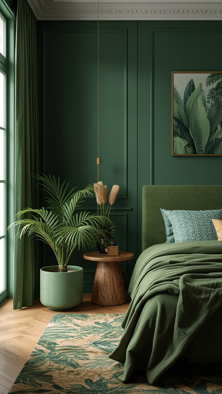
Deep greens like olive, moss, and sage bring a plant-like grounding to a space, even without a single actual plant in the room.
I ended up painting my kitchen island a soft moss green, and it’s become my favorite spot in the house.
It pairs beautifully with warm wood countertops and brass hardware.
Something about green and gold together just feels rich.
Sage is the softer option if deep olive feels intimidating at first.
It still reads earthy but leans lighter, which works well in smaller rooms with less natural light.
My honest tip is to avoid mint or overly bright greens here.
They read fresh and modern, not grounded and boho.
You want colors that feel like moss on a forest floor, not a spring garden.
If you’re hesitant, try green on a bathroom vanity or a bookshelf first.
It’s a low-commitment way to test the mood before painting an entire wall.
I did that in my powder room and ended up loving it so much I repainted my whole hallway.
Green, more than any other earthy tone, brings a calming, almost outdoorsy energy indoors.
And on stressful days, walking past that mossy hallway wall genuinely settles me a little.
It sounds silly until you try it yourself.
Muted Blues That Whisper Instead of Shout

Blue feels like an odd fit for earthy boho at first glance, but muted, dusty blues absolutely belong here.
Think denim, faded chambray, or the color of sky right before it rains.
These aren’t bright coastal blues.
They’re soft, almost grayed-out, and they add just enough coolness to balance all that warm terracotta and clay.
I used a dusty blue in my reading nook, and it instantly felt like a little pause button in my house.
Calm, quiet, unhurried.
The trick with earthy boho blue is keeping it muted.
The second it gets too saturated or bright, it starts to feel coastal or preppy instead of grounded.
I always tell people to look for blues described as “faded” or “washed” on paint strips.
Those undertones read gray and dusty rather than crisp and clean.
Pairing dusty blue with rattan, linen, and warm wood keeps it from feeling cold.
It’s honestly one of my favorite contrast colors in this whole palette.
A small nook, a reading chair, even just a closet door in dusty blue can add a surprising amount of personality.
I did my laundry room in this shade and it turned a chore space into somewhere I don’t mind lingering.
Little wins like that matter more than people think.
If you only add one unexpected color to your earthy palette, let it be this one.
It’s subtle, but it changes the whole feel of a room.
Mixing Warm and Cool Without Losing the Vibe

This is the part that scares people the most, and I get it.
Mixing warm terracotta with cool blue sounds risky on paper.
But earthy boho actually thrives on this contrast, as long as the undertones stay muted.
The secret is balance, not perfection.
I usually keep warm tones as the majority, maybe seventy percent of a room, and let cool tones act as an accent.
That ratio keeps things grounded instead of chaotic.
In my living room, the walls are clay, but my throw pillows and one accent chair are dusty blue.
It creates this quiet tension that somehow just works.
My rule of thumb is to always test fabric or paint swatches together before buying anything.
Hold them side by side in the actual room, not under store lighting.
Lighting changes everything, and I’ve been burned by this before.
If a combo feels off, it’s almost always because one color is too saturated compared to the other.
Muting both tones down usually fixes it instantly.
I also love adding a neutral buffer between warm and cool colors, like a jute rug or linen curtains.
It softens the transition and keeps the whole room feeling cohesive.
Honestly, some of my favorite rooms are the ones where I broke the “matchy” rule a little.
Imperfect balance feels more human than a perfectly coordinated palette ever could.
That’s kind of the whole point of boho anyway.
Choosing the Right Finish (Matte vs Eggshell)

Nobody warns you how much finish matters until you’ve lived with the wrong one.
Matte paint is my personal favorite for earthy boho walls.
It absorbs light instead of bouncing it, which gives colors like terracotta and clay this soft, chalky, almost pottery-like look.
Eggshell has a slight sheen and works better in high-traffic areas like hallways or kids’ rooms, since it wipes clean more easily.
I learned this the hard way in my kitchen, where I used matte and now have a permanent smudge near the stove that won’t wipe off.
Lesson learned.
For living rooms and bedrooms, matte is worth the extra care.
It just feels more textured, more intentional, more like handmade ceramics than flat paint.
For bathrooms, I’d lean eggshell or even satin because of moisture.
Nobody wants peeling matte paint in a steamy shower situation.
My tip is to always buy a sample pot before committing to a full gallon.
Paint a poster-board sized swatch and move it around the room throughout the day.
You’ll be shocked how different matte terracotta looks at 9am versus 6pm.
Finish isn’t just practical, it’s emotional too.
Matte feels cozy and lived-in.
Glossier finishes feel more polished and formal.
Pick based on the feeling you’re chasing, not just the durability specs on the can.
Accent Walls That Actually Work

I used to think accent walls were a little dated, and then I did one right and completely changed my mind.
The trick is choosing the wall your eye naturally lands on first when you walk into the room.
For me, that was the wall behind my bed.
I painted it a deep rust and left the rest of the room in warm sand.
It instantly became the focal point without overwhelming the space.
A good accent wall should feel like a deep breath, not a shout.
I avoid choosing the busiest wall, like one with a window or a doorway, because it breaks up the color and makes it feel choppy.
Solid, uninterrupted walls work best.
Headboard walls, walls behind a dining table, or the wall facing your front door are my top picks.
My honest tip is to go one to two shades darker than you think you want.
Paint always looks lighter once it’s up and dry on a full wall compared to the swatch.
I’ve made that mistake more than once.
Accent walls are also a great way to test bold earthy colors like rust or olive without committing your whole room to them.
Low risk, high impact, and honestly kind of addictive once you see how much personality one wall can add.
I’ve since done accent walls in three rooms of my house.
I don’t think I’m stopping anytime soon.
Pairing Paint with Wood Tones and Texture

Paint color means almost nothing without thinking about what’s sitting next to it.
Earthy boho lives and dies by texture.
Warm Wood Tones, think honey oak or walnut, pair beautifully with clay and terracotta walls.
They share the same warm undertone family, so nothing fights for attention.
When I brought in a rattan mirror and a jute rug against my clay walls, the whole room suddenly felt finished in a way paint alone never could.
Texture does the heavy lifting that color can’t do by itself.
Linen curtains, woven baskets, and raw wood shelving all reinforce that grounded, natural feeling.
My tip is to avoid pairing earthy walls with anything too sleek or high-gloss, like glossy black furniture or chrome fixtures.
It creates a jarring contrast that fights the cozy vibe you’re building.
Instead, lean into matte black, aged brass, or warm wood finishes for hardware and fixtures.
They blend instead of compete.
If I had a small hallway, this is what I’d do first: paint it clay, add a jute runner, and hang a rattan mirror at the end.
Simple, cheap, and it instantly feels curated.
Texture is the difference between a room that looks painted and a room that looks styled.
Don’t skip this step.
It’s honestly more important than the paint color itself, even though paint gets all the credit.
Small Space Boho: Colors That Open a Room

I have a small guest room, barely big enough for a bed and a nightstand.
I used to think small spaces needed to stay pale to feel bigger.
That’s not entirely true.
When I tackled that cramped guest room last fall, I painted it a warm, muted sand instead of stark white, and it actually felt more open, not less.
The key was keeping the color consistent from wall to ceiling.
No harsh lines, no contrast breaking up the space visually.
Monochromatic warmth tricks the eye into seeing continuous space instead of a boxed-in room.
I also kept the trim the same soft tone instead of bright white, which usually creates a jarring frame effect in small rooms.
For truly tiny spaces, I’d avoid deep rust or dark olive on all four walls, since that can feel heavy without enough natural light to balance it.
Save the bold, saturated tones for an accent wall or use them lower down, like on a window seat or built-in.
Mirrors also do wonders in small earthy rooms, bouncing that warm light around.
I added one rattan-framed mirror in that guest room and it made a noticeable difference.
My final tip is to keep furniture light in color if your walls are dark, or vice versa.
Contrast in value, not just hue, keeps a small space from feeling like a cave.
That little guest room is now my favorite room to show people, ironically because it’s the smallest one in the house.
Lighting and How It Changes Every Shade

I cannot stress this enough, lighting will make or break your earthy boho palette.
The same terracotta swatch can look peachy pink in morning light and deep orange under evening lamps.
I learned this after repainting one wall twice because I only tested it during the day.
My rule now is simple.
Tape swatches up and observe them at three different times, morning, midday, and after dark with your lamps on.
North-facing rooms get cooler light, which can mute warm tones and make them feel flatter.
South-facing rooms get warmer light, which intensifies earthy tones, sometimes almost too much.
If your room doesn’t get much natural light, lean toward the lighter end of the earthy palette, like sand or soft clay, rather than deep rust or olive.
Dark rooms need help, not more darkness.
Light bulb temperature matters just as much as the paint itself.
I switched all my bulbs to warm white, around 2700 to 3000 kelvin, and it made every earthy tone in my house look richer and more cohesive.
Cool white bulbs can wash out warm colors and make them look muddy or gray.
It’s a five dollar fix that makes a genuinely huge difference.
Before you blame a paint color for looking wrong, check your lighting first.
Nine times out of ten, that’s actually the real problem.
My Favorite Room-by-Room Color Combos

I get asked constantly which colors go where, so here’s what’s actually worked in my own house.
Living room, clay walls with a rust accent wall and dusty blue throw pillows.
Bedroom, warm sand walls with a deep olive headboard nook.
Kitchen, warm white cabinets with a moss green island and brass hardware.
Bathroom, soft terracotta on a half wall with White Subway Tile below.
Hallway, sandy neutral with a rust-painted front door as the surprise pop of color.
Home office, muted sage walls, which somehow keeps me calmer during stressful workdays.
Guest room, monochromatic soft clay from wall to ceiling for that cozy, enveloping feeling.
Laundry room, dusty blue, because even boring chores deserve a little charm.
Reading nook, deep olive with warm wood shelving and a rattan lamp.
My favorite combo overall is honestly the living room.
Clay and rust together feel like a sunset trapped inside my walls.
If you’re not sure where to start, pick the room you spend the most time in and begin there.
Momentum matters more than a perfect plan.
Once one room feels right, the rest of the house tends to follow naturally.
That’s exactly how mine happened, one room at a time, no big renovation required.
Mistakes I Made (So You Don’t Have To)

Let me save you some trial and error, because I made plenty of it.
One thing I got wrong early on was skipping sample pots and going straight to full gallons.
That clay-colored kitchen wall I mentioned earlier was actually my third attempt.
Another slip-up was painting at night under yellow bulbs, since the color looked completely different by morning.
Always check in daylight before you commit.
I also matched trim to the ceiling instead of the wall once, and it made my small bedroom feel choppy and disconnected.
And there was the time I went too bold too fast, painting an entire room in deep rust before testing an accent wall first.
I ended up repainting three walls back to a softer clay within a month.
I ignored finish considerations too, using matte in my high-traffic entryway, which now shows every scuff mark from shoes and bags.
The one that still makes me cringe a little is forgetting how much natural light my north-facing living room actually got, so my terracotta looked muddy for weeks until I switched bulbs.
If there’s one thing I’d tell my past self, it’s to slow down.
Test more, commit less, and trust that the right color will feel obvious once it’s actually on the wall.
Paint is forgiving, but time and patience save you money and frustration.
Every mistake taught me something, and honestly, my house feels more like me because of the trial and error, not despite it.
Related read: Things I Wish I Knew Before I Decorated My First Home — Instant PDF + Kindle download. Secure checkout by Stripe

