
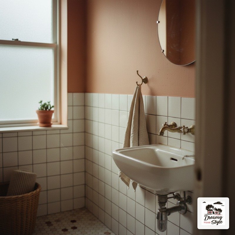

I repainted my bathroom three times in two years.
White, then gray, then some shade called ‘Coastal Mist’ that looked purple under my vanity light.
It wasn’t until I stripped everything back and went full earth tones — terracotta, warm sand, deep olive — that I finally stopped hating the room.
Like, truly stopped.
Now I walk in every morning and feel something I can only describe as relief.
It’s calm in there.
Grounded.
Biscuit even naps on the bath mat, which is honestly the highest design endorsement I know.
If you’re tired of chasing the right neutral and missing, this is your sign to go earthy and stay.
Terracotta Walls That Actually Look Good (Not Taco Bell)
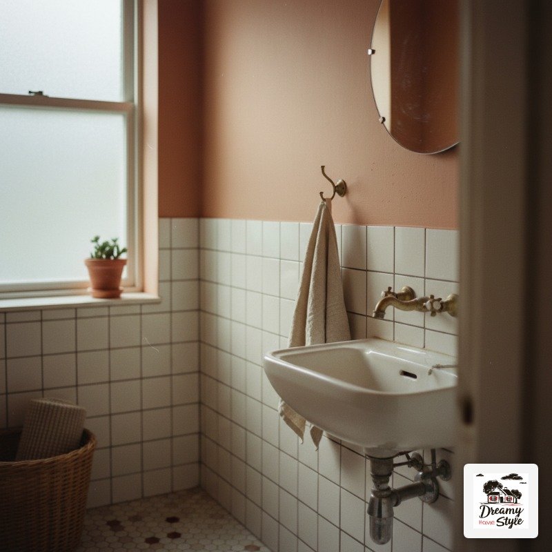
I almost didn’t do terracotta because I was scared.
Every photo I’d seen looked either amazing or deeply wrong, and I couldn’t figure out why until I realized it’s all about undertone.
You want a terracotta with a peachy-brown base, not one that leans orange-red.
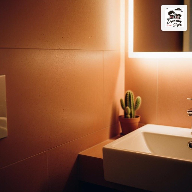
The color I landed on was Sherwin-Williams ‘Fired Brick’ and honestly I cried a little when it dried.
In a good way.
The key detail people skip: finish matters more than color in a bathroom.
Go eggshell minimum, satin if you want it to glow in candlelight.
Flat paint in a bathroom is a disaster waiting to happen (I learned this the expensive way — mold, peeling, the whole thing).
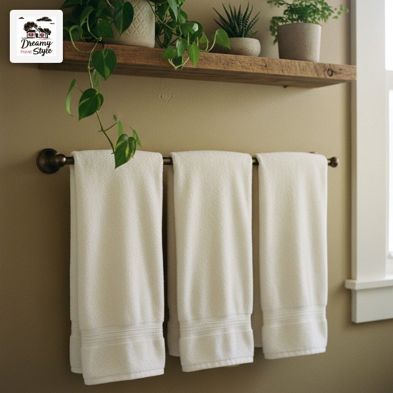
Pair terracotta walls with white grout, warm brass fixtures, and one white towel folded on a hook.
That’s it.
You don’t need much else.
Sandy Beige Tile That Feels Like a Spa and Costs Like a Normal Human Budget
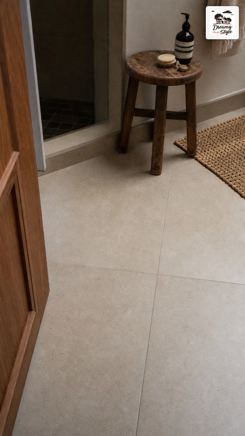
Floor tile is where a lot of people blow their earth tone budget.
You do not need to.
I found 12×24 sandy beige porcelain at a Habitat for Humanity ReStore for $0.89 a square foot and it looks identical to the $8 stuff at the tile boutique downtown.
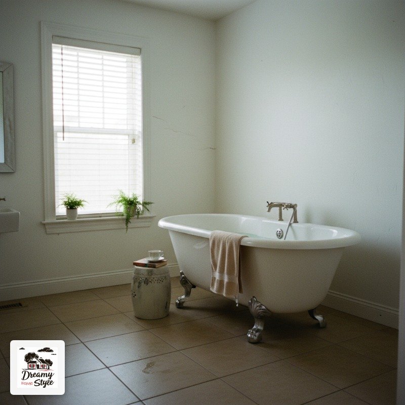
The color to look for is what designers call ‘greige’ with a warm lean.
Not cool gray-beige.
Warm.
If it looks like wet sand, you’re in the right zone.
Go large format if your bathroom is even slightly small.
Counterintuitive, I know.
But fewer grout lines make the floor read as one calm surface, and that reads as bigger.
One thing I’d do differently: I did matte tile on the floor and glossy on the walls and the contrast feels intentional in a way I love.
If I’d done both matte, the whole room might’ve felt flat.
Warm Mushroom and Taupe for People Who Think Beige Is Boring
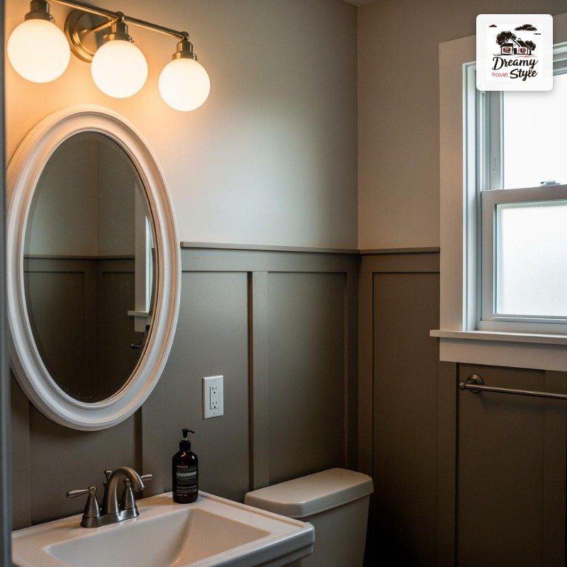
Mushroom tones are beige’s cooler older sister.
Still neutral, still earthy, but with a slight gray or mauve undertone that keeps things from feeling too safe.
I think of it as the color of a linen shirt that’s been washed a hundred times.
I used a deep taupe on my lower walls (board and batten panel situation) with a lighter mushroom above the rail.
It adds visual depth without being loud.
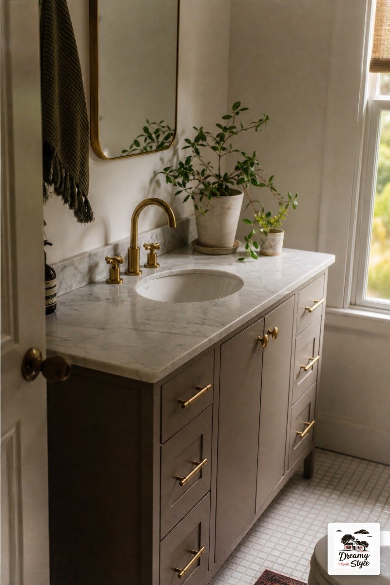
This combo works especially well if your bathroom gets cold light.
The warm undertones fight back against blue-gray daylight and keep the room feeling cozy even in winter.
Don’t sleep on mushroom for cabinetry either.
If you have a vanity you’re not replacing, a coat of Benjamin Moore ‘Rockport Gray’ or similar can make it look genuinely expensive.
Raw Wood Accents That Don’t Warp or Make You Regret Your Life
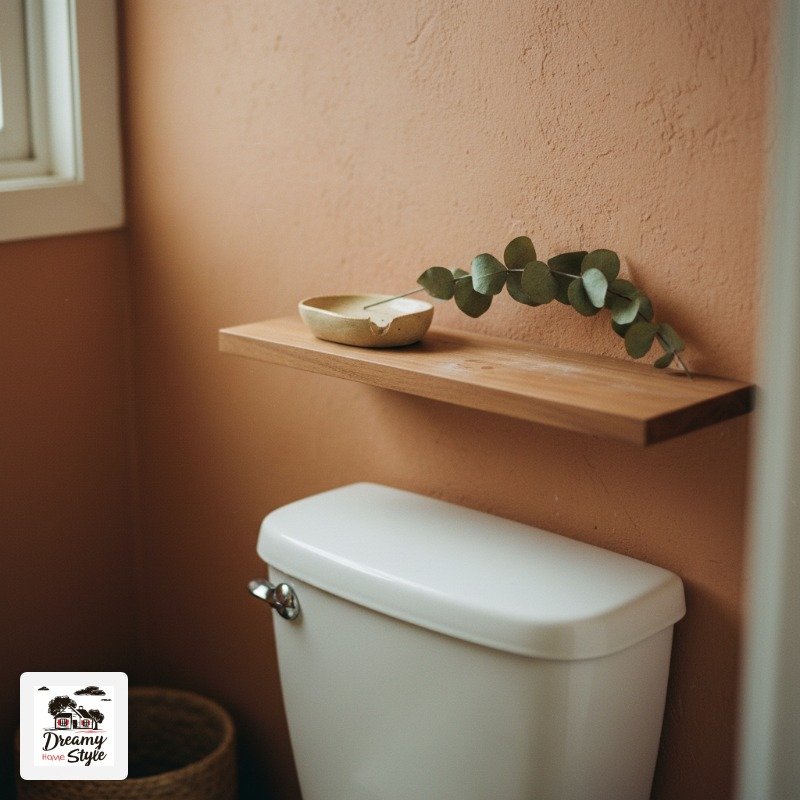
Every time I post a wood bathroom shelf someone DMs me asking if it warps.
Real answer: it can, if you use the wrong wood and don’t seal it.
But the right approach and it’s totally fine.
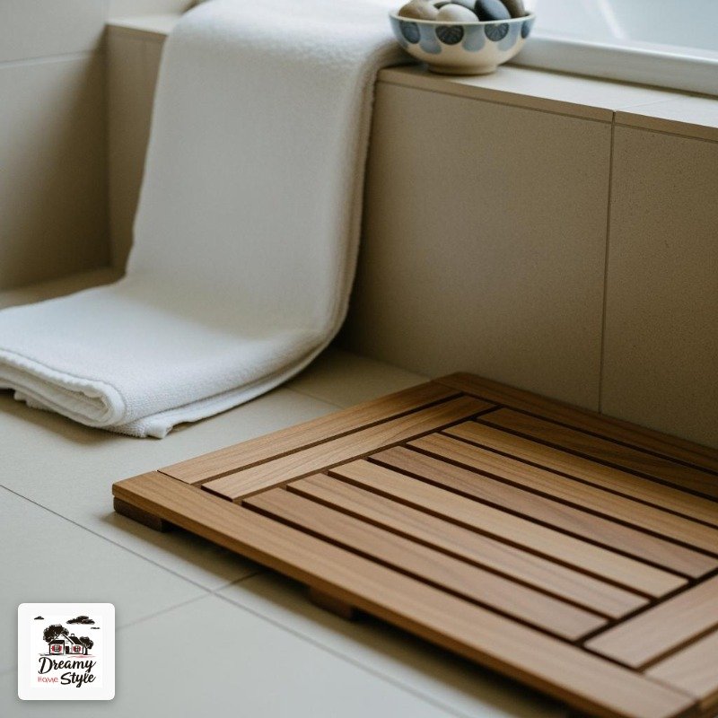
Teak is the gold standard for wet-area wood.
It’s naturally oily, doesn’t swell much, and ages beautifully.
Bamboo works too.
Regular pine shelf from the hardware store near a shower?
That’s a soggy mess in six months.
I have a small floating teak shelf above my toilet for extra hand soap and some dried eucalyptus.
Cost me $34 at HomeGoods.
It’s been there two years and looks exactly the same.
For extra protection, hit any wood piece with two coats of Waterlox or a food-safe tung oil finish.
Reapply once a year.
Thirty seconds of effort, genuinely.
Olive Green: The Color I Was Scared Of and Now Can’t Stop Recommending
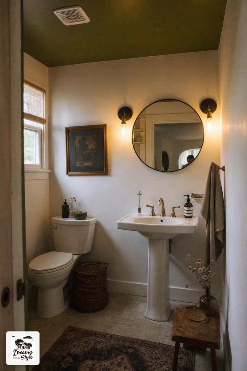
Olive green hit different from every other trend color I’ve tried because it actually plays well with other earth tones instead of fighting them.
Terracotta?
Yes.
Warm wood?
Obviously.
Sandy tile?
Perfect.
I painted the ceiling of my bathroom in Farrow & Ball ‘Mizzle’ (it’s an olive-sage situation) and kept the walls white.
People ask about my bathroom more than any other room in my house.
It feels like being inside a terrarium, in the best possible way.
The trick with olive is lighting.
It looks completely different under warm bulbs versus cool ones.
Always test your sample under both before committing.
Avoid olive if your bathroom has no natural light and you refuse to fix the lighting.
It’ll go dark and swampy.
But if you’ve got even one decent window, go for it.
Warm White Grout (and Why I Will Never Do Bright White Again)
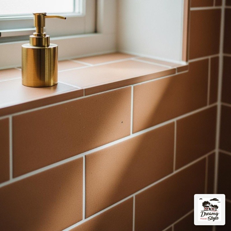
Bright white grout in an earth tone bathroom is a mistake I made once.
It looked clinical.
Almost aggressive.
Like the tile was apologizing for trying to be warm.
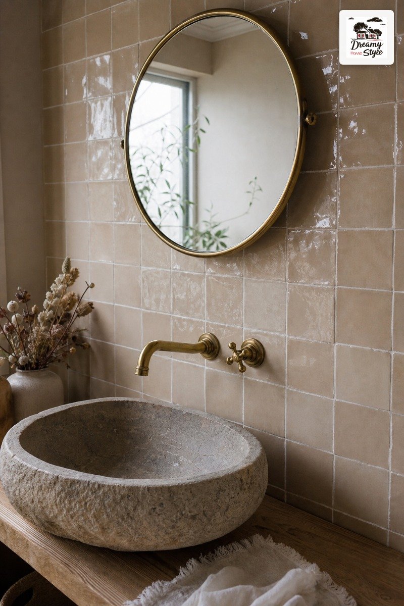
Switch to a warm white or light ivory grout and everything changes.
The tile looks intentional.
The room looks cohesive.
It’s such a small tweak and it matters so much.
My go-to is Custom Building Products ‘Antique White’ or Mapei ‘Ivory.’ Both read as a soft warm white in real life, not yellow, not gray.
Just right.
If you’re regrouting existing tile, this is probably the highest-impact low-cost update you can make in a bathroom.
We’re talking a $12 bag of grout and a few hours on a Saturday.
Worth it.
Stone and Pebble Textures That Make Shower Floors Feel Luxurious
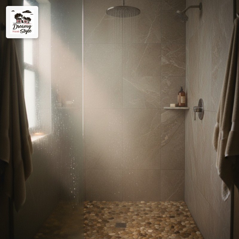
I’m a little obsessed with pebble shower floors.
The kind where the floor is a mosaic of smooth river stones set in tile.
They feel incredible underfoot and they add this organic, almost spa-like texture that no flat tile can compete with.
The ones I’ve seen at Floor & Decor run around $6 to $9 per square foot.
Not nothing, but for a shower floor it’s maybe 10 to 15 square feet total, so you’re not breaking the bank.
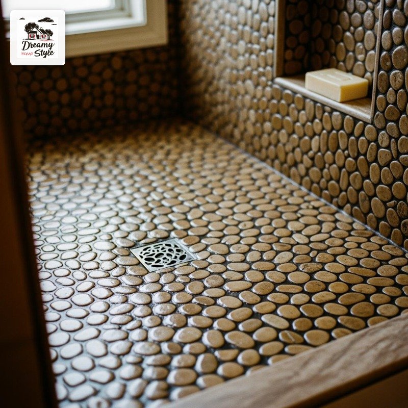
Important caveat: pebble floors need sealing every year and the grout lines are endless.
Cleaning takes a little more effort.
Not a big deal, just real.
If full pebble feels like too much, even a single row as a border strip at the base of the shower wall adds texture without the maintenance commitment.
Brass and Bronze Fixtures That Pull Every Earth Tone Together
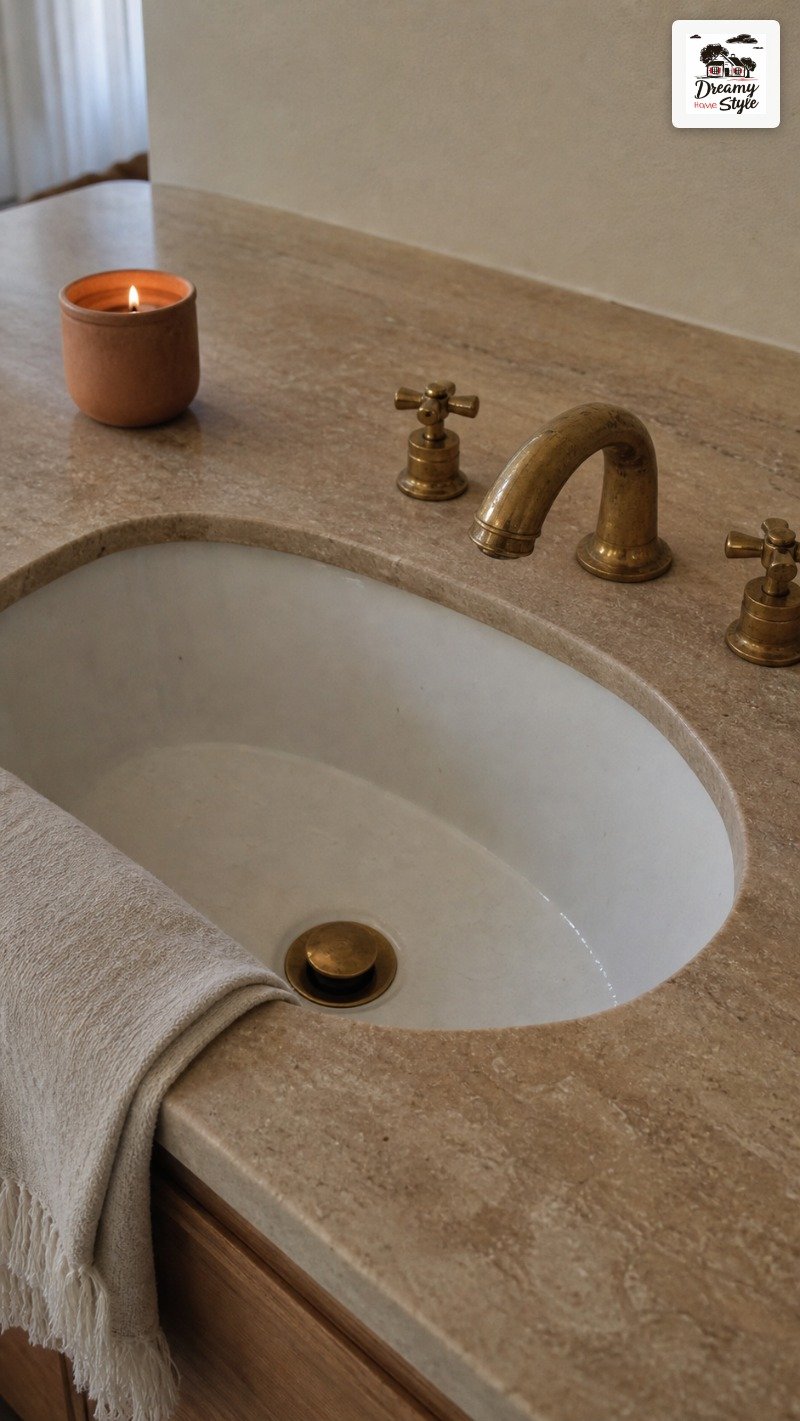
Chrome fixtures in an earth tone bathroom look like someone left something behind by accident.
Brass and bronze are the finishes that make everything make sense.
Unlacquered brass is my personal favorite.
It patinas over time, gets a little deeper and warmer, and honestly just keeps getting better.
The first month it looks bright and gold.
By year two it looks like an heirloom.
If you don’t want the patina situation, brushed brass or satin brass stays pretty consistent and still reads as warm and grounded.
You don’t have to replace everything at once.
Start with a new faucet and towel bar.
If they’re the same finish, the room immediately looks more pulled together even if nothing else changed.
I did this and it held me over for almost a year before I did the bigger updates.
Linen and Woven Textiles That Add Warmth Without Adding Clutter
One of the fastest ways to make a bathroom feel earthy and warm is textiles.
Not fluffy white hotel towels (though those are great in the right room).
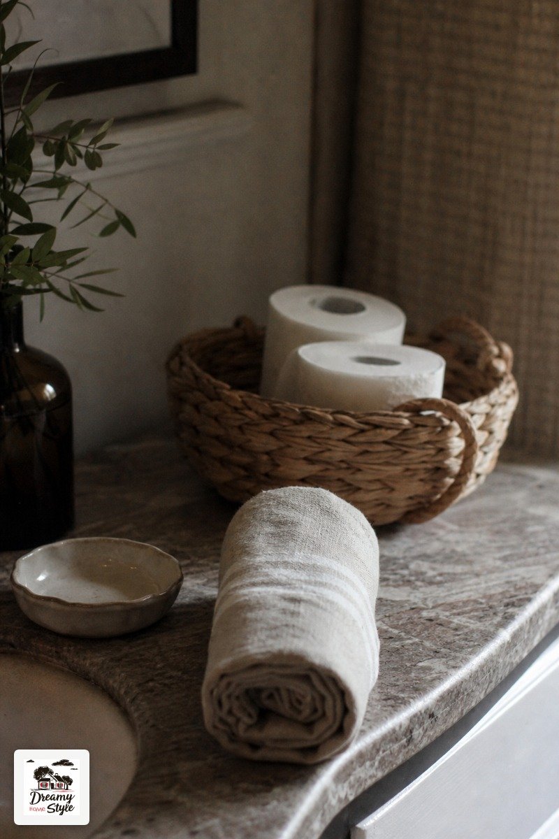
I mean linen hand towels, woven cotton bath mats, maybe a macrame hook on the wall.
The texture contrast is the whole point.
Hard tile, smooth stone, soft linen.
Your eyes move around the room and nothing feels like too much of one thing.
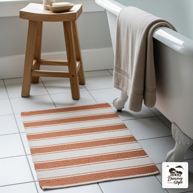
I swap out my bath mat seasonally, which sounds extra but hear me out: a $15 woven mat from World Market in a different earth tone can completely shift the feeling of the room.
Summer I do sandy tan.
Fall I go rust and chocolate.
It takes two minutes.
Avoid overly thick or shaggy mats in a small bathroom.
They eat floor space visually.
Flat-woven is the move.
Concrete and Plaster Walls for People Who Want That Organic, Slightly Imperfect Look
Venetian plaster in a bathroom sounds expensive and complicated.
And it can be.
But there are plaster-effect paints now that get you 80% of the way there for a fraction of the cost and without needing to hire someone.
I used Modern Masters Venetian plaster paint in my half bath.
Took a weekend.
The finish has this warm, slightly mottled depth that you just cannot get from flat paint.
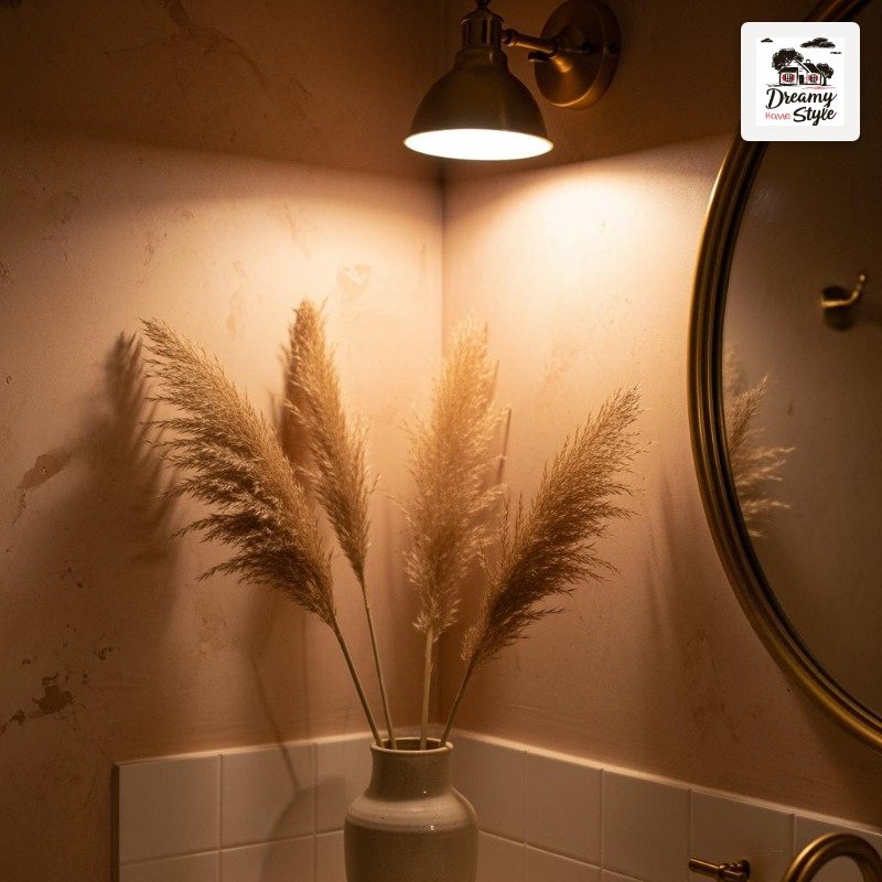
Seal it with a clear wax or polycrylic for moisture protection.
Non-negotiable in a bathroom.
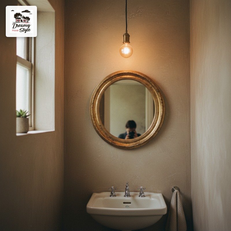
This look is chef’s kiss with warm LED lighting and a single statement piece like a vintage mirror or a chunky ceramic vessel sink.
You don’t need a lot happening when the walls are already doing that much work.
Dark Moody Earth Tones for Bathrooms That Should Feel Like a Cave (Complimentary)
Not everyone wants light and airy.
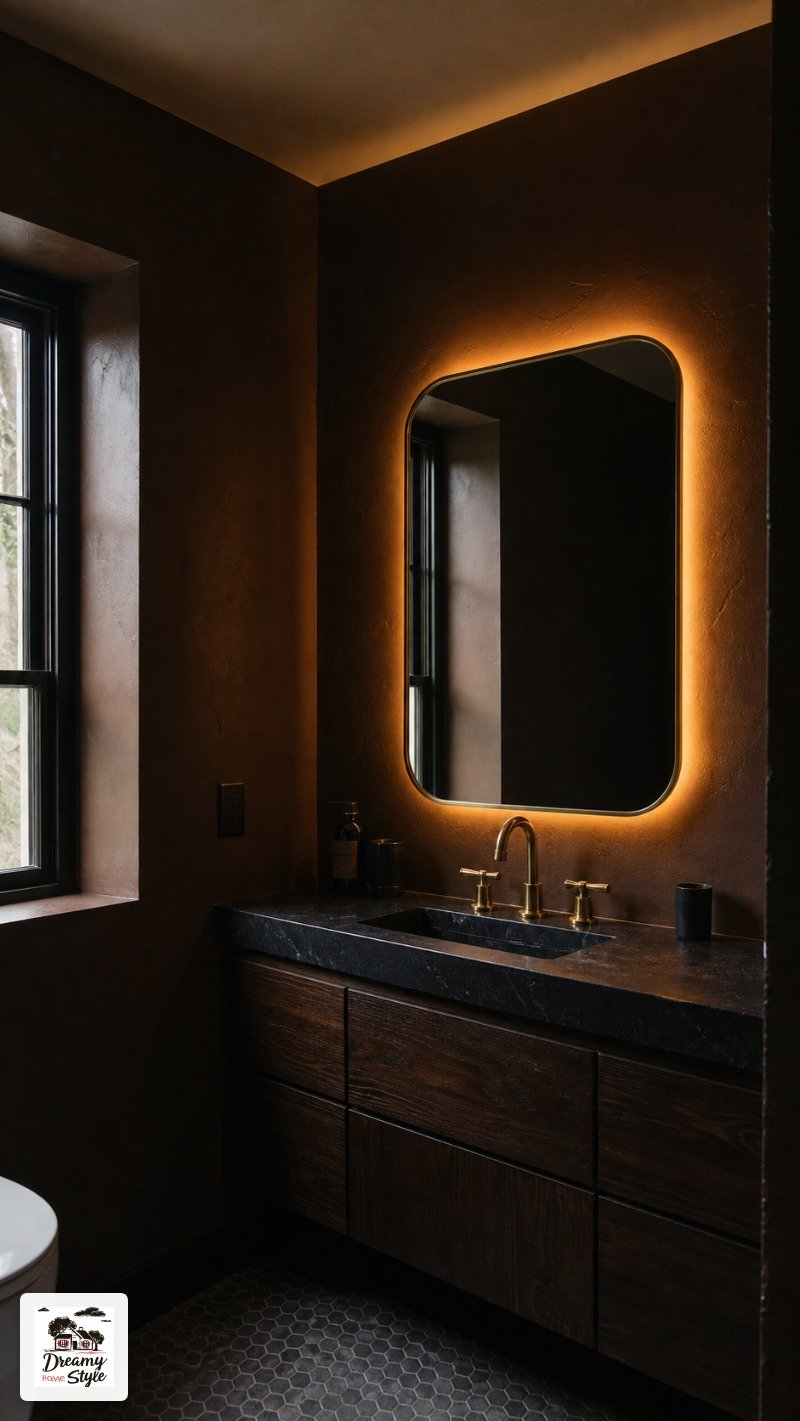
Some of us want a bathroom that feels like a warm, dark cocoon.
And earth tones can absolutely go there.
Deep chocolate brown, dark ochre, near-black forest green — these are all earth tones, just at full saturation.
A small bathroom with dark walls doesn’t feel smaller if the lighting is right.
It feels intentional.
Intimate.
I’d go dark on all four walls plus the ceiling for maximum drama.
Paint the ceiling too.
People are afraid of that and they shouldn’t be.
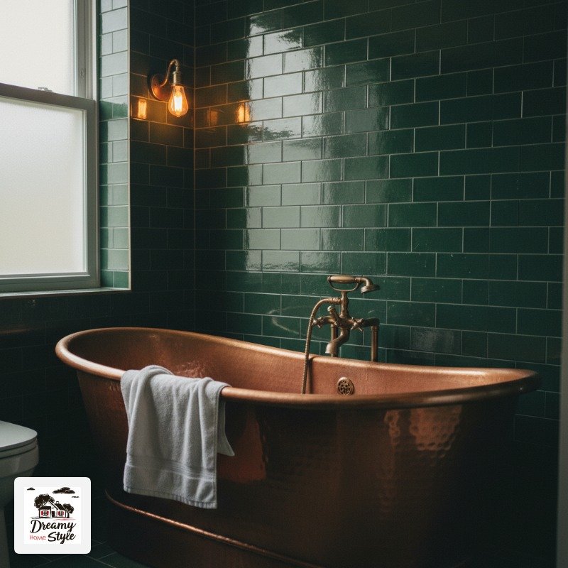
The lighting needs to be warm, dimmable, and layered.
Overhead lighting in a dark bathroom is genuinely terrible.
Get a couple of wall sconces at eye level and a candle situation going.
Overhead is a crime anyway, but especially here.
Plants in the Bathroom: Which Ones Actually Live and Which Ones Die Immediately
I have killed every fern I’ve ever put in a bathroom.
Every single one.
I’m done pretending I can keep a fern alive.
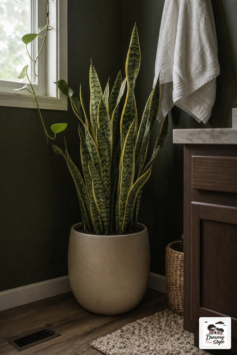
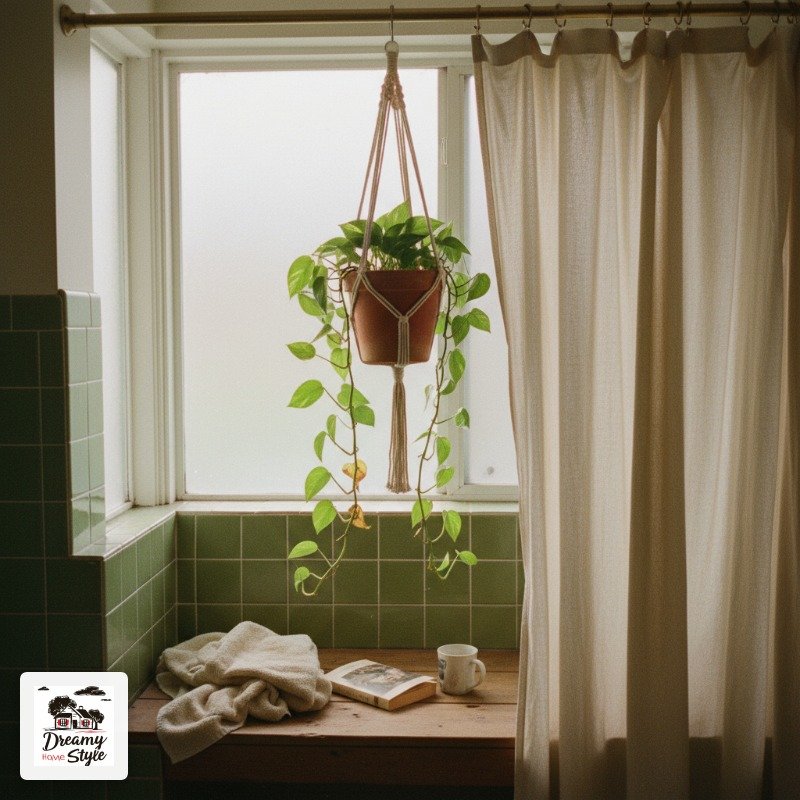
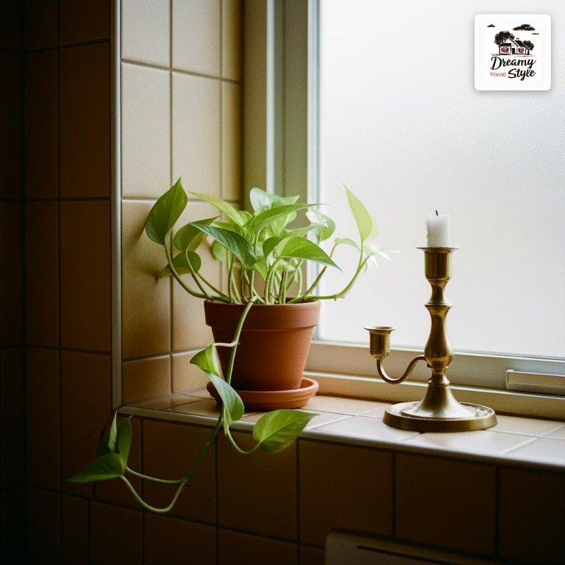
What actually works in a low-light, humid bathroom: pothos (unkillable, trailing, gorgeous), ZZ plants, snake plants, and cast iron plants.
All of them lean into the earthy vibe and need basically nothing from you.
Pothos in particular looks incredible against terracotta or olive green walls.
The bright green against warm earthen tones is that satisfying contrast that makes a room feel alive.
Put your plant in a ceramic or terracotta pot, not plastic.
The pot matters.
A $4 terracotta pot from the garden center looks more intentional than a $20 plastic nursery pot.
Small detail, big difference.
The Vanity Refresh That Costs Under $100 and Looks Like It Didn’t
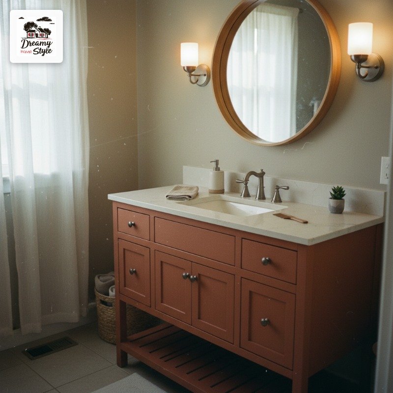
My bathroom vanity was oak.
Light oak from approximately 1997.
It wasn’t offensive, just dated.
I couldn’t afford to replace it, so I refinished it.
Sanded it lightly, primed it, and painted it in Behr ‘Burnished Clay’ — this warm, earthy reddish-brown that somehow made the whole vanity look like it cost three times what it did.
New hardware in brushed bronze, and that was it.
Total cost: $78.
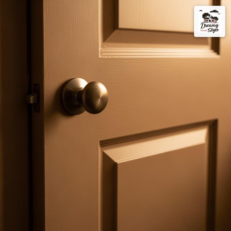
The before and after made me genuinely emotional.
Same bones, completely different feel.
One thing: don’t use regular wall paint on a vanity.
Get a cabinet-specific paint or add a hardener like Floetrol.
Regular paint chips off cabinet surfaces way faster than you’d expect and then you’re doing it all over again (yes, I know this from experience).
Layered Lighting That Makes Earth Tones Glow Instead of Muddle
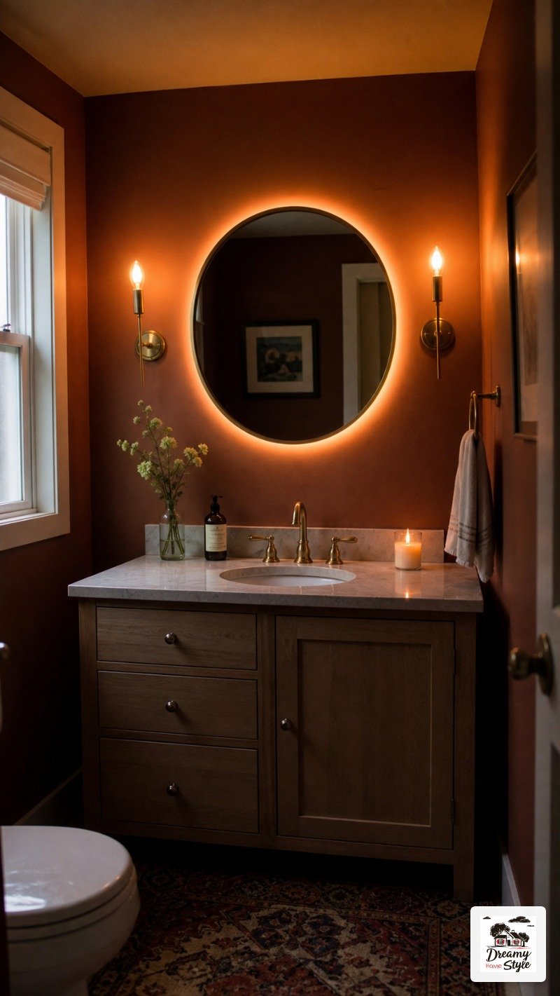
Overhead lighting is the enemy of earth tones.
I will say this until I run out of breath.
Overhead light flattens everything.
It kills the warmth.
It makes terracotta look brown and olive look gray.
You need at least two light sources, ideally three.
Wall sconces at face level are non-negotiable.
A lighted mirror counts as one.
A small lamp on the counter if there’s space.
Candles for the evenings because yes, obviously.
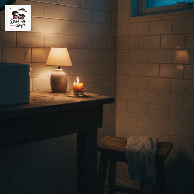
Bulb color temperature matters more than fixture style.
Go 2700K to 3000K max.
That’s the warm yellow-white range.
Anything cooler and your earth tones start to fight back against the light instead of soaking it up.
I added plug-in sconces from Amazon (around $40 each, brushed brass finish) when I couldn’t hardwire anything, and they work just as well as the real thing if you tuck the cord behind a frame or shelf.

