
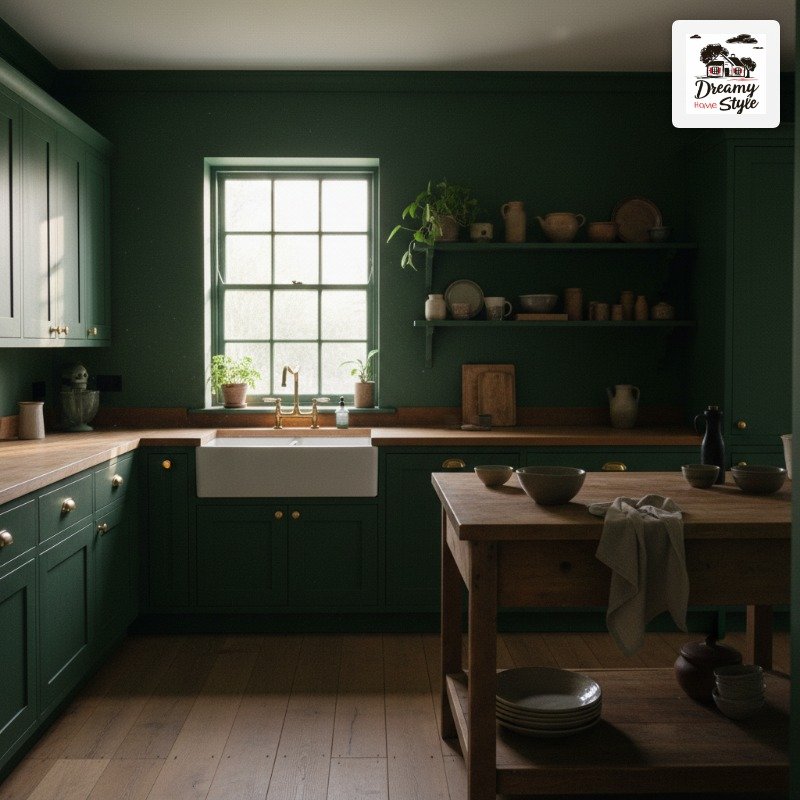

I painted my kitchen cabinets a deep forest green on a Tuesday and stood there at 6am Wednesday with my coffee just staring at them.
Not in a bad way.
In a ‘why did I spend three years being scared of this’ way.
Color drenching is one of those things that sounds extreme until you actually do it, and then you wonder why every kitchen you’ve ever had was beige.
If you’ve been saving dark kitchen photos on Pinterest for months and never pulling the trigger, I get it.
But I’m telling you — seven days is all it takes.
After a week living inside a color-drenched kitchen, going back feels like settling.
What ‘Color Drenching’ Actually Means (It’s More Than Just Dark Cabinets)
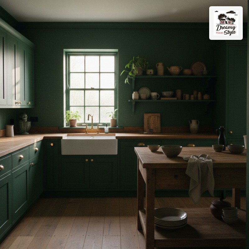
Color drenching isn’t just painting your cabinets a bold color.
It’s committing.
Walls, cabinets, trim, ceiling — all pulled into one deep, saturated family of color so the room reads as a single intentional thing instead of a bunch of separate decisions.
It’s the difference between ‘I painted my cabinets navy’ and ‘I walked into a navy kitchen.’ One is a choice.
The other is an experience.
A lot of people do the cabinets and stop, and then it looks a little awkward — like the cabinets are trying too hard while everything else is still playing it safe.
The magic happens when the color wraps.
Think tone-on-tone, not matchy-matchy.
Your wall can be slightly lighter or more matte than your cabinets and it still works.
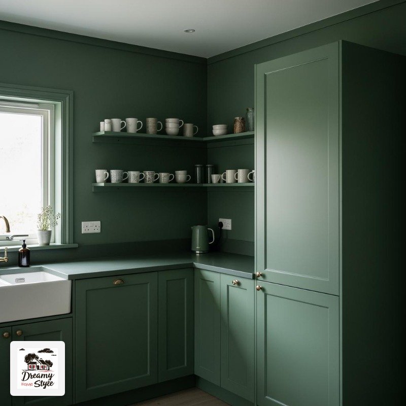
I made the mistake my first attempt of stopping at just the lower cabinets.
It looked like I’d run out of paint and given up.
Which, honestly, I sort of had.
Don’t do that.
The Colors That Actually Work (My Honest Shortlist)
Deep forest green.
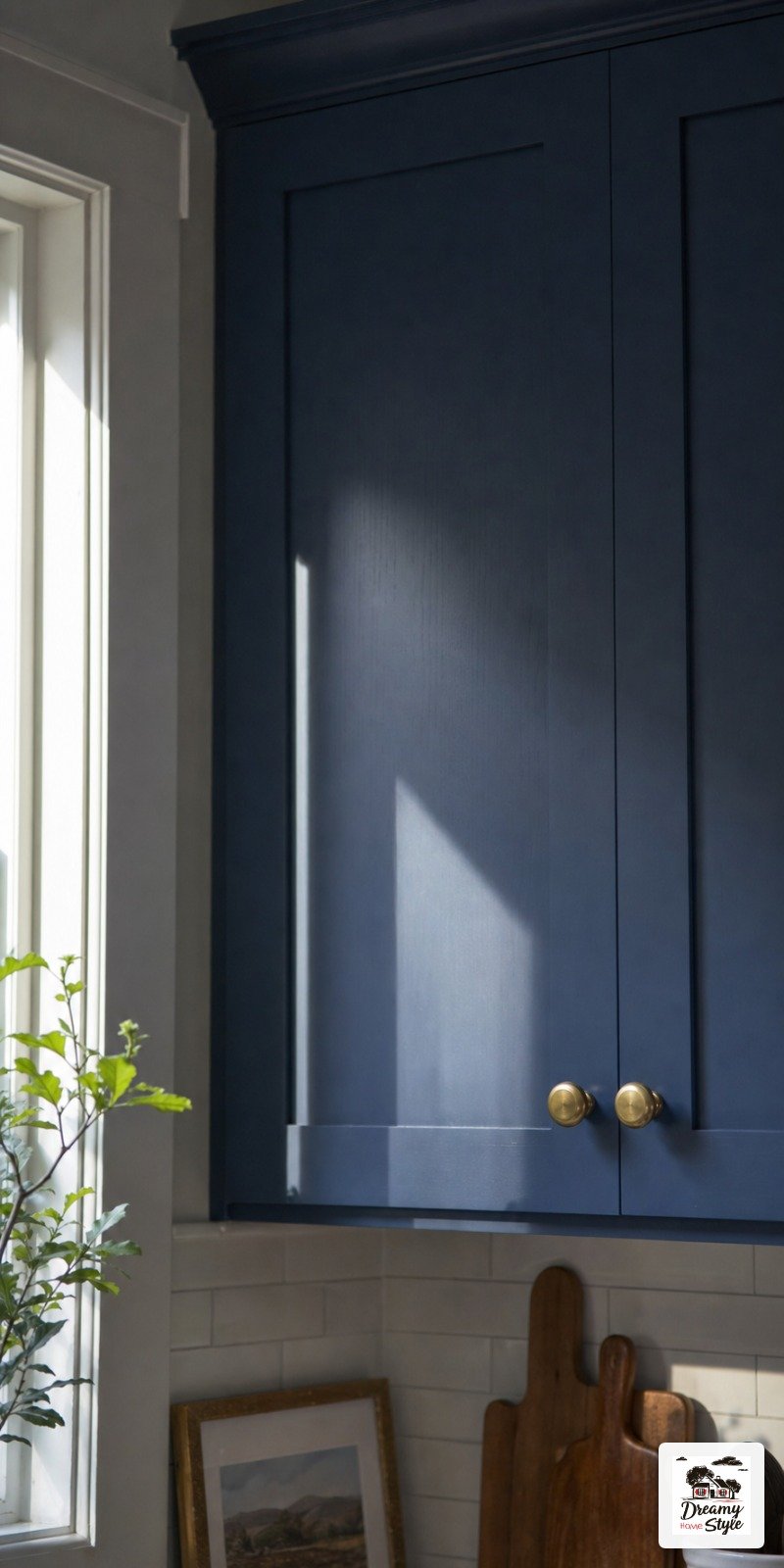
Inky navy.
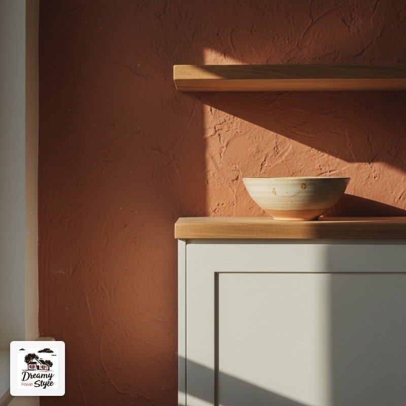
Warm terracotta.
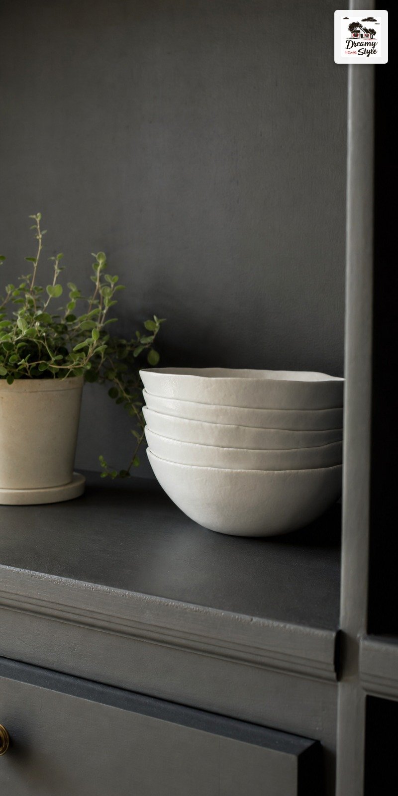
A black that’s actually a very dark charcoal.
These are the ones I’ve seen work in person, in real light, in houses that aren’t magazine sets.
Dusty sage is gorgeous but it’s softer — it reads more as a wall color than a full drench, so manage your expectations.
Same with muted olive.
Pretty, but it’s doing a different thing.
My personal obsession right now is a color called ‘Studio Green’ by Farrow and Ball, or if that price makes you wince (same), Sherwin-Williams ‘Pewter Green’ gets you 90% there for a fraction of the cost.
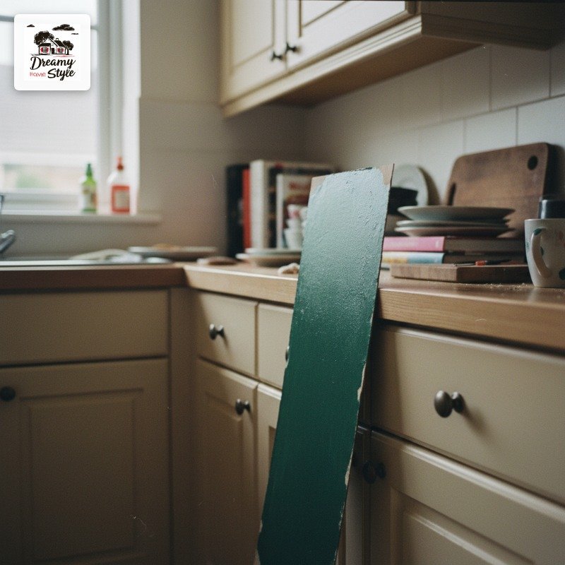
I tested them side by side on cardboard and honestly the difference in my kitchen’s light was minimal.
One thing I’ve changed my mind about: red.
I used to say never.
But a very specific warm brick-red, in a kitchen with good natural light and wood counters?
It’s stunning.
Not for everyone.
But I’m no longer anti-red.
Starting With the Cabinets — and Why You Should Paint the Insides Too
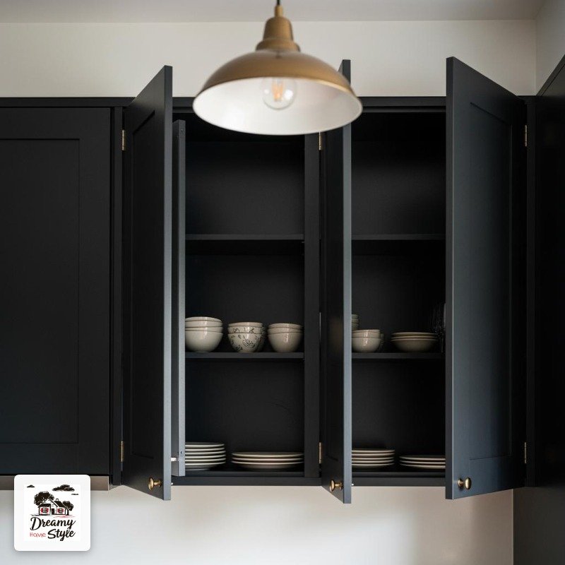
Yes, the insides.
I know.
But here’s the thing — when those cabinet doors are open, and they always are because you’re always looking for something, the raw unpainted interior completely breaks the spell.
I used leftover paint and a small roller and did the interior backs in about an hour.
It made the whole kitchen look ten times more intentional.
Like it was designed that way instead of painted last weekend (which it was).
For prep: sand lightly, prime if you’re going light-to-dark or dark-to-light, and use a cabinet-specific paint.
I’ve tried just using wall paint on cabinets before and it chips embarrassingly fast.
Benjamin Moore Advance is worth the money.
It self-levels and the finish doesn’t show brush marks.
Also — two thin coats will always beat one thick coat.
Every single time.
Doing the Walls — This Is Where People Chicken Out
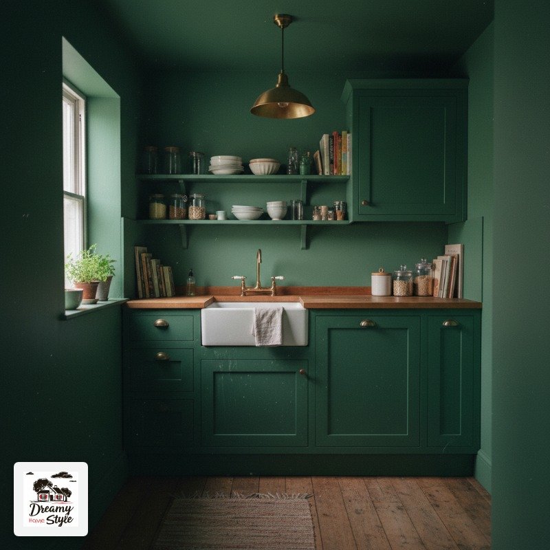
The walls are where the drench becomes a drench.
And yes, this is the step where most people stall.
It feels like too much.
Until it’s done and then it feels exactly right.
Go one shade lighter or one shade more matte than your cabinets.
Not a completely different color — just a whisper of breathing room so the room doesn’t feel like a cave.
I went with the same green as my cabinets but in an eggshell finish instead of semi-gloss, and the subtle difference in sheen is enough that your eye reads them as slightly separate elements.
It keeps the depth without flattening everything into a monolith.
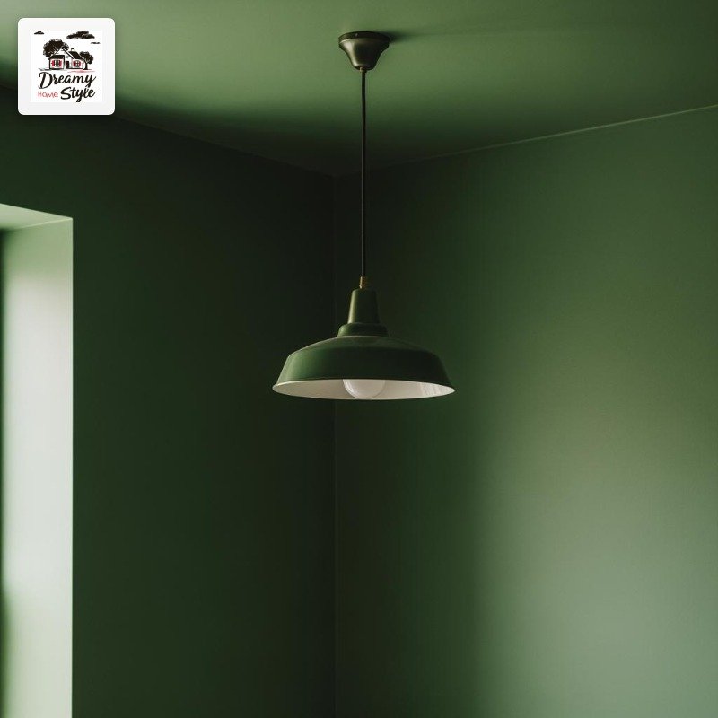
Paint the ceiling the same color too, or at least consider it.
I was scared to.
I did it anyway.
My kitchen is small and it now feels like being inside a terrarium in the best possible way.
Biscuit seems unbothered.
Hardware as the Secret Weapon
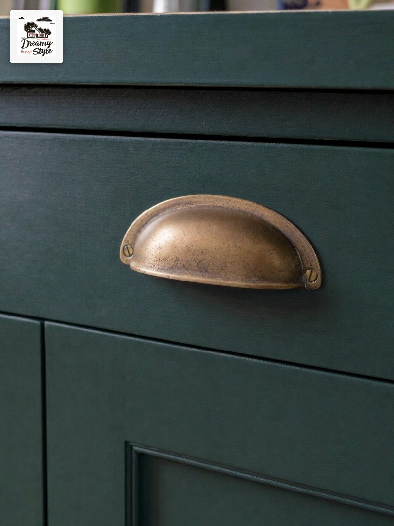
Hardware on dark cabinets is like jewelry.
It either makes the whole look or it quietly ruins it.
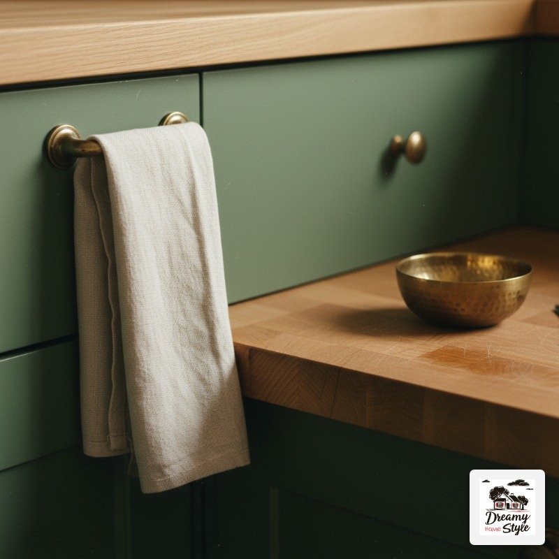
Unlacquered brass is my forever answer for warm colors — greens, terracottas, anything brown-adjacent.
It has that slightly imperfect, aged quality that feels collected instead of coordinated.
For true navy or deep black, I go brushed nickel or aged pewter.
Chrome is too cold and too perfect.
It sticks out like a wrong note.
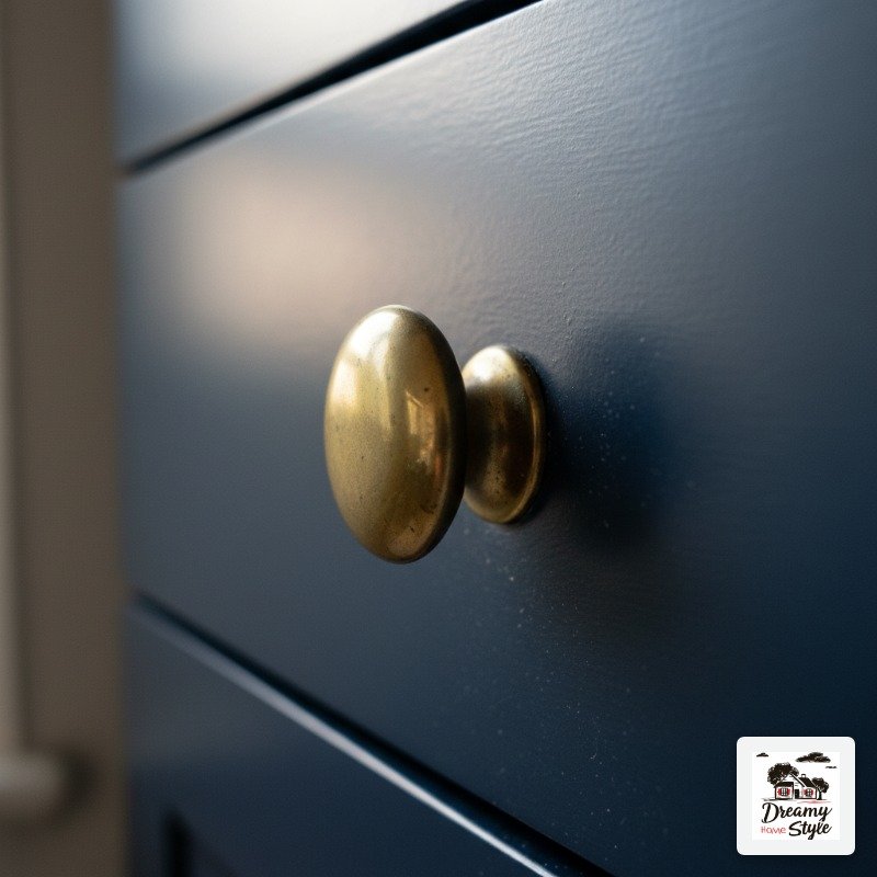
I spent $67 on new hardware for my kitchen at a home goods store and it completely changed how expensive the cabinets looked.
That might be the highest return-on-investment thing I’ve ever done in this house.
(The lowest was that one accent wall in terracotta peel-and-stick wallpaper.
We don’t talk about that.)
Lighting in a Dark Kitchen — Please Stop Relying on Overhead Lights
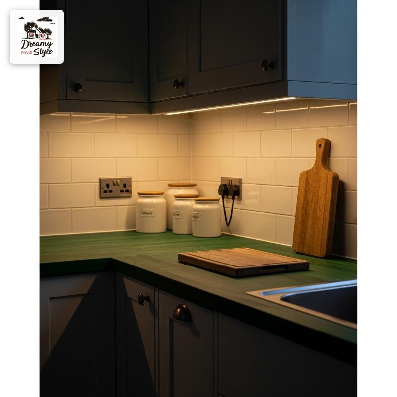
Overhead lighting is my nemesis in any room, but it’s especially criminal in a color-drenched kitchen.
That flat fluorescent wash will make even the most beautiful dark green look like a basement.
Layer it.
Under-cabinet lights are non-negotiable — I use warm-toned LED strips and they cost me about $40 from Amazon.
They make the counters glow and suddenly the whole room has depth.
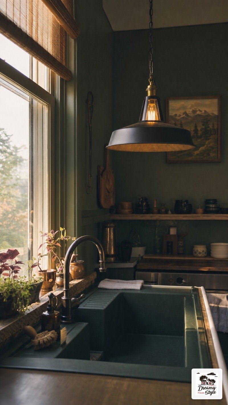
A pendant light over the sink or island does more for ambiance than any other single thing.
I found a black metal one at a thrift store for $12, rewired it (YouTube is a valid education), and it’s the first thing people comment on.
Natural light, obviously.
But even on cloudy days, warm artificial light at multiple heights keeps a dark kitchen feeling rich instead of dreary.
That’s the difference.
Height variety.
Countertops That Play Nice With Dark Color
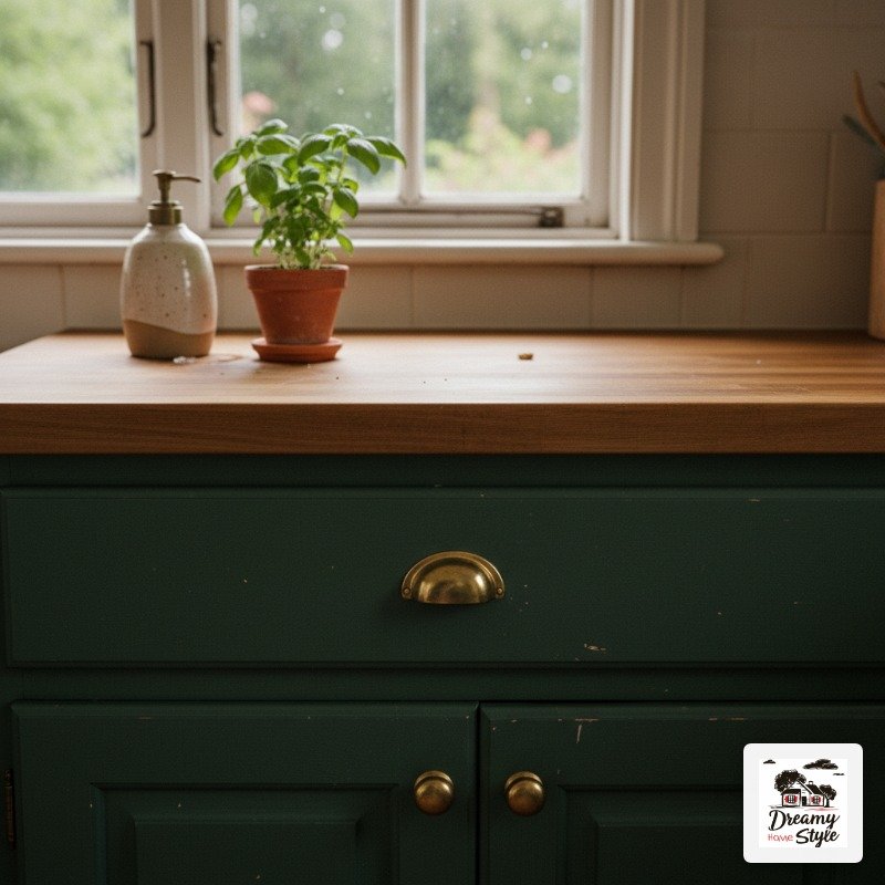
Light counters against dark cabinets.
That’s the rule I follow and I’m sticking to it.
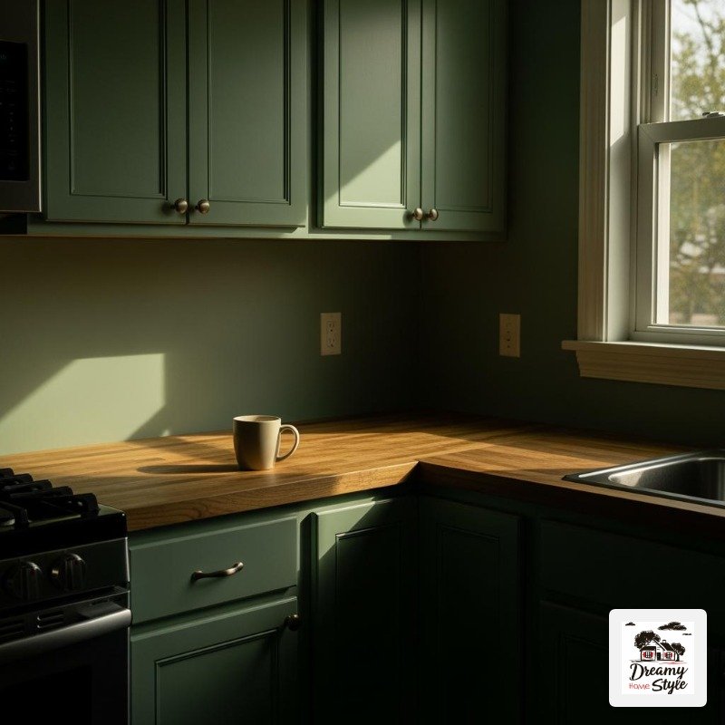
Butcher block is my first love — warm, natural, slightly imperfect.
It feels right against deep green or navy in a way that cold white quartz sometimes doesn’t.
Though white quartz with dark gray or black cabinets is genuinely stunning, so it depends on your color.
I have a light-veined marble-look laminate from IKEA on my lower cabinets (budget, remember?) and it reads just as good in photos as actual marble.
Nobody has ever noticed.
Or if they have, they’ve been polite about it.
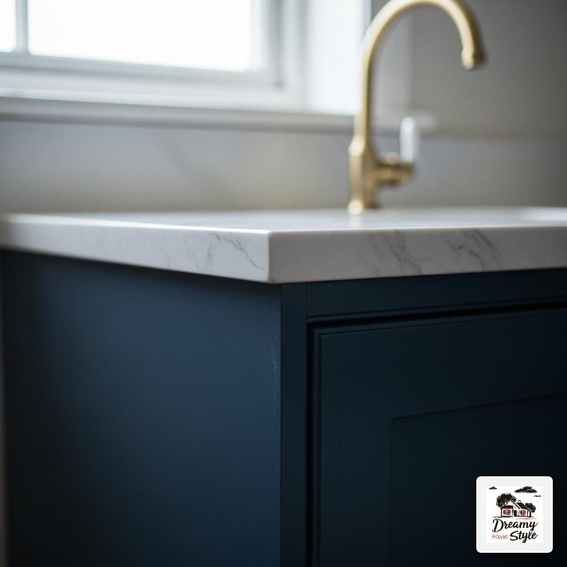
What I’d avoid: dark counters with dark cabinets.
It can be done beautifully but you need extremely good lighting or it all bleeds together into one muddy mass.
I’ve seen it go wrong more than right.
Open Shelving in a Color-Drenched Kitchen — Yes, Paint Behind Them Too
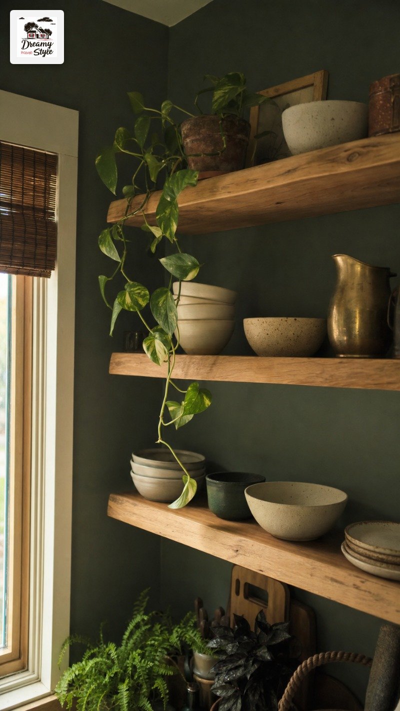
Open shelves in a dark kitchen are a design moment.
But only if you paint the wall behind them the same deep color as everything else.
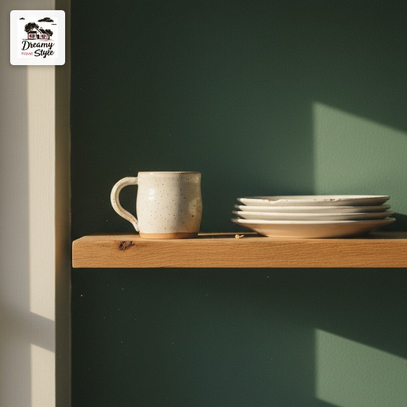
White or unpainted wall peeking out behind open shelves in a drenched kitchen is the decorating equivalent of leaving the tag on.
It breaks the whole thing.
I painted behind my open shelves the same forest green and then loaded them with a mix of warm wood, cream ceramics, and a few vintage brass pieces.
The contrast between the objects and the dark background is everything.
It looks intentional.
Considered.
Keep the shelves lighter than the wall — natural wood is perfect.
It floats against the dark and adds warmth.
Painted-to-match shelves disappear in a way that looks unfinished rather than intentional, at least in my kitchen.
Small Kitchens Can Absolutely Do This (I Have Proof)
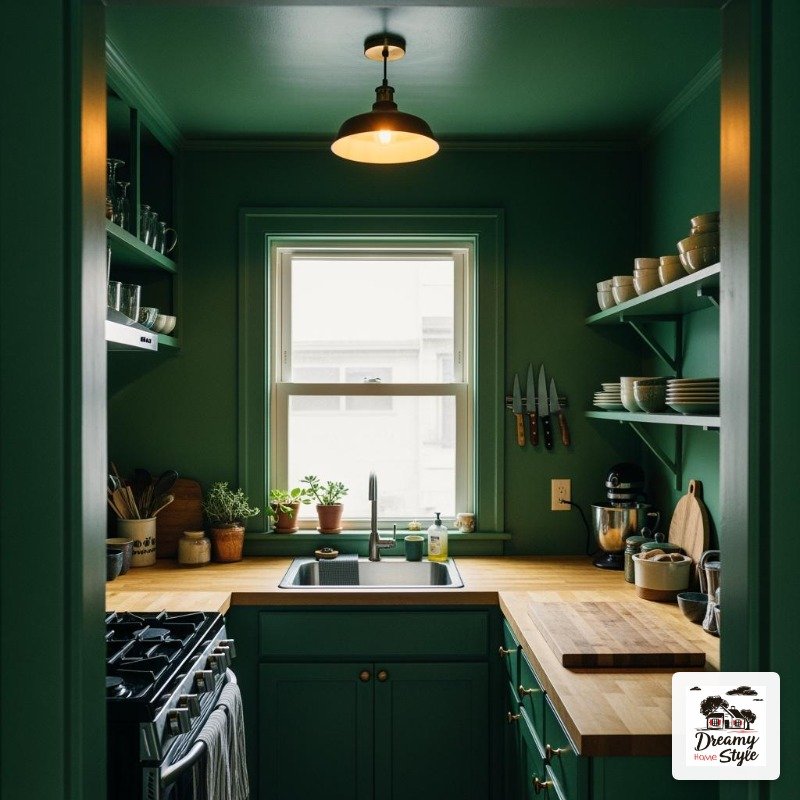
My kitchen is 9 feet by 11 feet.
I have one window.
I painted it deep green all the way around including the ceiling and it is the coziest, most intentional-feeling room in my whole house.
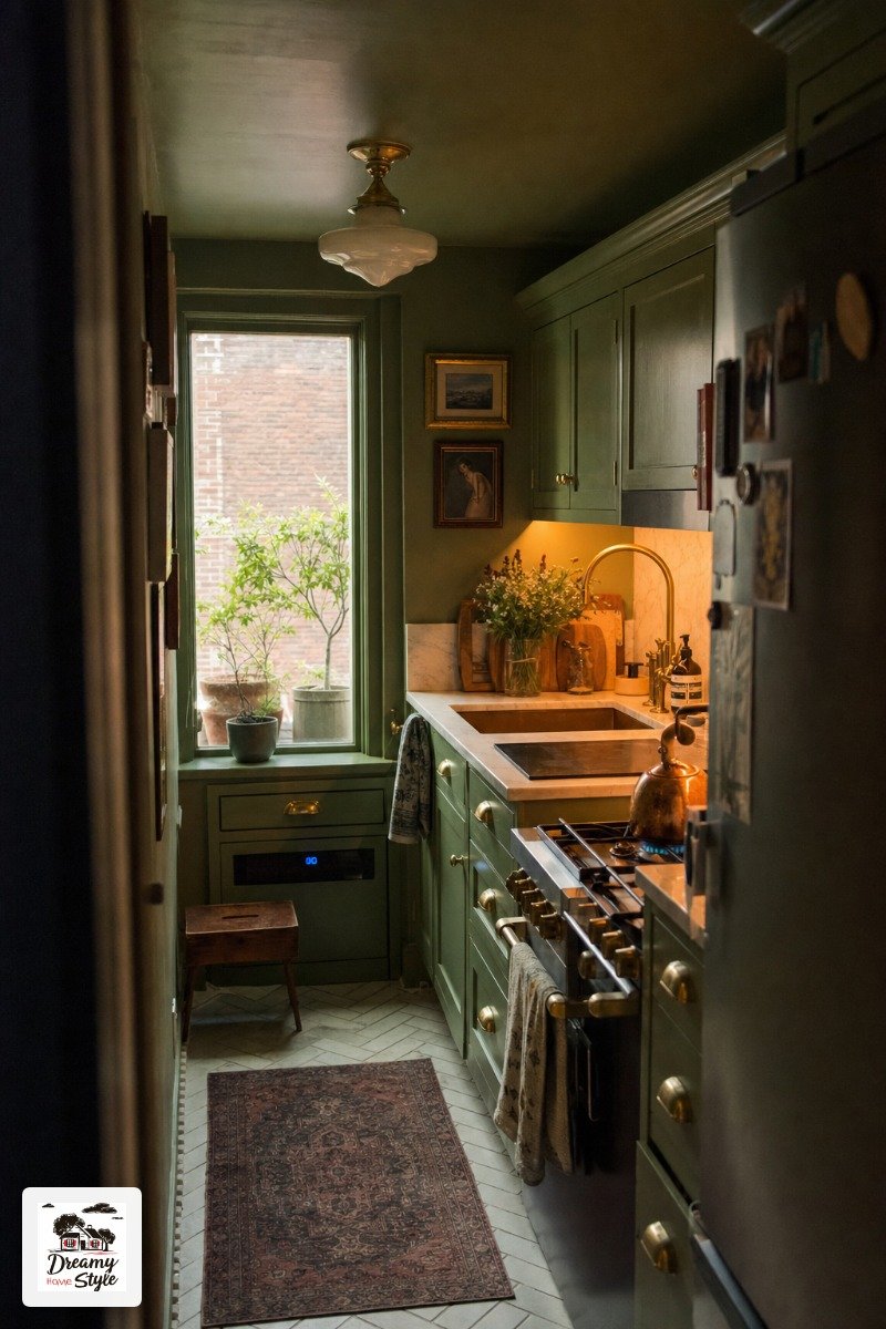
The myth that small spaces need light colors to feel bigger is one I’d gently push back on.
Light colors in a small kitchen can make it feel like a blank afterthought.
Dark colors in a small kitchen make it feel like a room that was designed.
The difference is in how you light it and what you put in it.
Warm light, reflective surfaces (a mirror, a glossy tile backsplash), light-colored counters — these things keep a dark small kitchen from feeling oppressive.
It’s not for everyone.
But ‘small’ is not by itself a reason to avoid it.
The Backsplash Question — Tile, Paint, or Nothing?
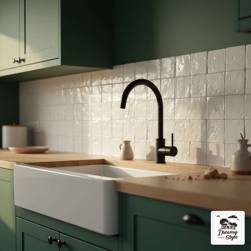
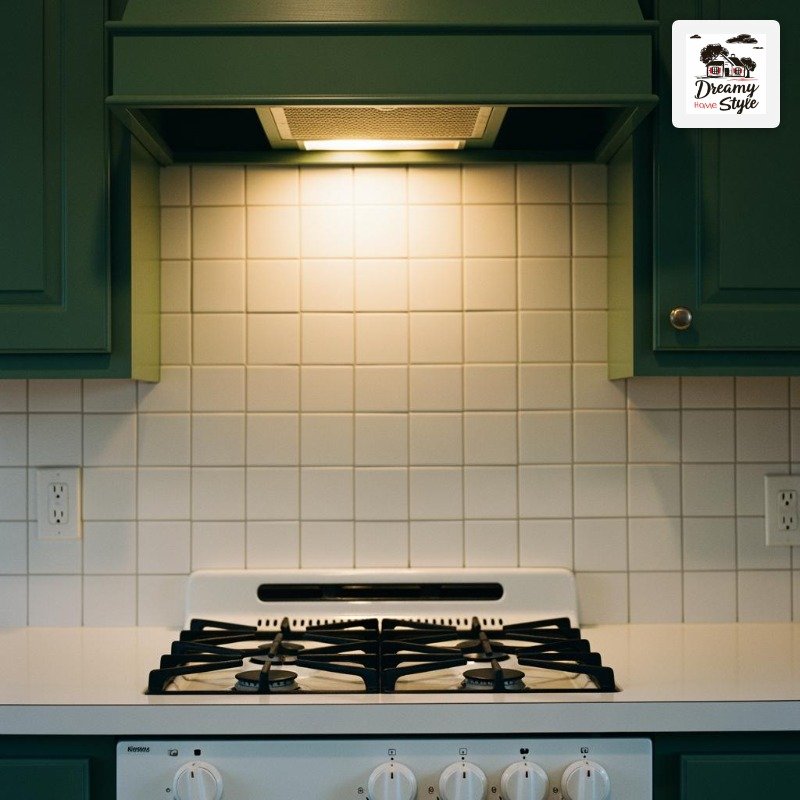
Honestly, in a fully drenched kitchen, you don’t need a backsplash.
The painted wall IS the backsplash.
A lot of people (including me, initially) feel weird about that but it’s a completely valid choice especially behind a range or open counter area.
If you do tile, keep it simple.
White subway, zellige, plain ceramic.
The tile becomes a textural detail against the color rather than a competing visual element.
I have a small section of white zellige behind my stove and the way it catches light against the green is genuinely beautiful.
What I’d skip: bold pattern tiles in a color-drenched kitchen.
Too much going on.
Pick your statement — the color is the statement.
Painted backsplash in a high-moisture area does need a wipe-down-friendly finish.
Semi-gloss or satin, sealed well.
I used a furniture wax over my painted section and it’s held up through a year of cooking splatters.
Bringing in Wood, Brass, and Texture So It Doesn’t Look Flat
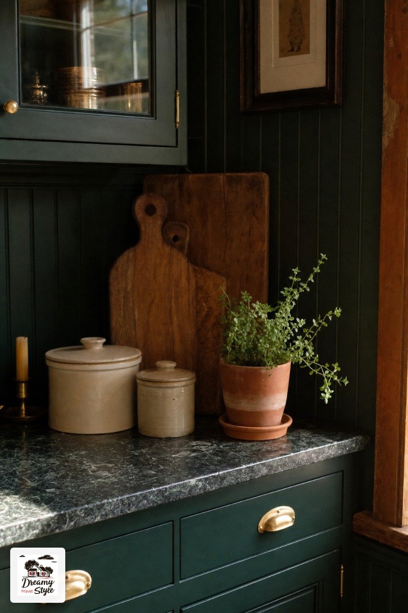
A fully painted dark kitchen needs warmth or it can tip into cold and heavy.
Wood, brass, linen, natural fiber — these are your balance.
A wooden fruit bowl on the counter.
Linen dish towels in cream or tan.
A jute rug if your kitchen floor is hard tile.
A few ceramic pieces in earthy off-whites.
These aren’t decorating extras, they’re what make the color look intentional rather than just dark.
Brass specifically does something to dark paint that I can’t fully explain — it just warms it.
Even a single brass candle holder on the counter changes the whole feeling of the room.
I also keep a small potted herb (usually rosemary, usually half-dead) on my counter and the green-on-green layering is genuinely nice.
Living things in a dark kitchen look incredible.
Even kind-of-struggling ones.
The 7-Day Living Test — What Actually Changes
Day one you’ll feel like you did something insane.
That’s normal.
Stay with it.
By day three the color stops feeling bold and starts feeling like your kitchen.
Your eye adjusts completely.
What felt dark and heavy starts feeling warm and grounded.
Day five is when you start noticing the things you love — how food looks more beautiful on the counter, how morning coffee feels different in that room, how the space finally feels like it has a personality.
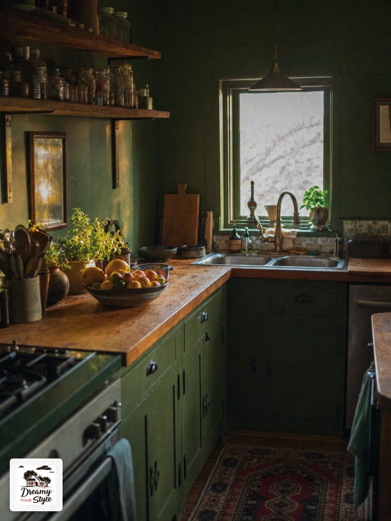
By day seven, most people can’t picture going back.
I genuinely can’t.
I’ve repainted rooms before when I changed my mind.
This one I have zero urge to change.
That’s how I know it worked.
Give it the full week before you decide.
One day isn’t long enough.
Your brain needs time to stop comparing it to what was there before.
When to Call It — Signs the Color Drenching Isn’t Working
I’ll be honest: it doesn’t always work perfectly the first time.
And there are a few real warning signs.
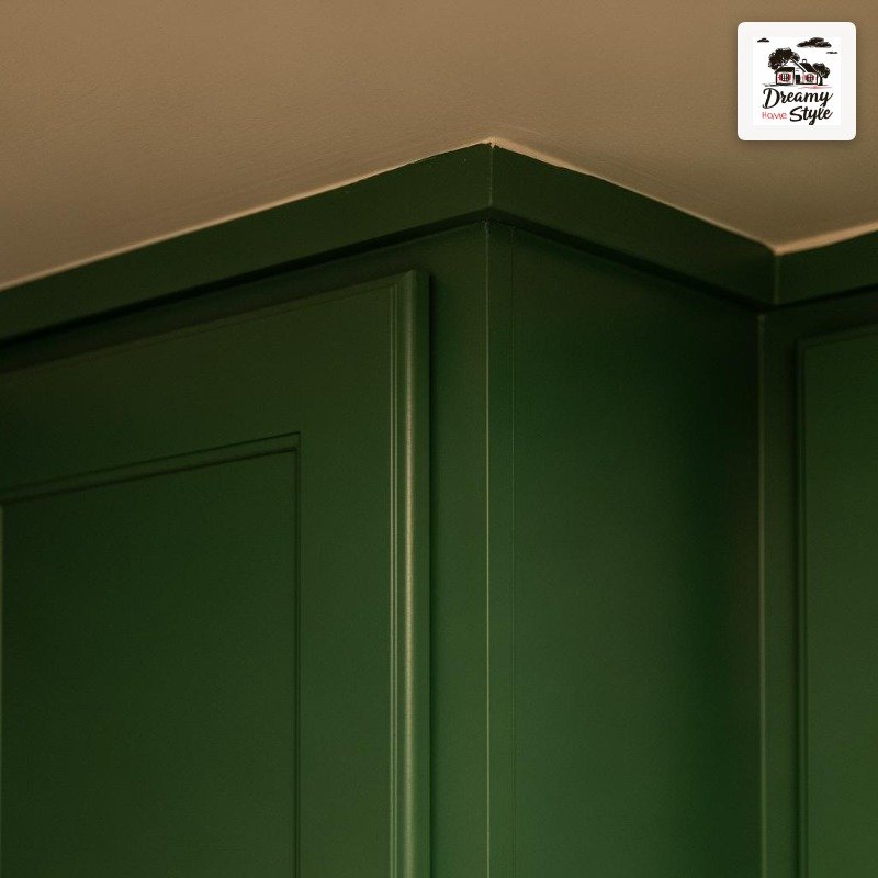
If the color you chose is pulling too cool (blue-gray instead of green-gray, for example) in your specific light, it can feel sterile rather than cozy.
Test on a large piece of cardboard first — like 2 feet by 2 feet — and live with it for a couple days in your actual kitchen light.
Not a paint chip.
A real large sample.
If it feels heavy and oppressive at night, the problem is almost always lighting, not the color.
Add a warm lamp, swap to lower-kelvin bulbs, get those under-cabinet lights in.
Give it another few days.
Sometimes the color is just wrong for the space and you do have to repaint.
That happened to me with a deep terracotta attempt in my old apartment.
But I don’t regret trying it.
The attempt taught me more about light and color than any amount of scrolling ever did.
Related read: The IKEA Kallax Bible — Instant PDF + Kindle download. Secure checkout by Stripe

