
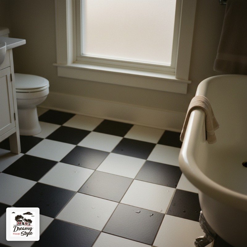

I walked into a bathroom at an Airbnb in Savannah and literally stopped moving.
Like my feet just quit.
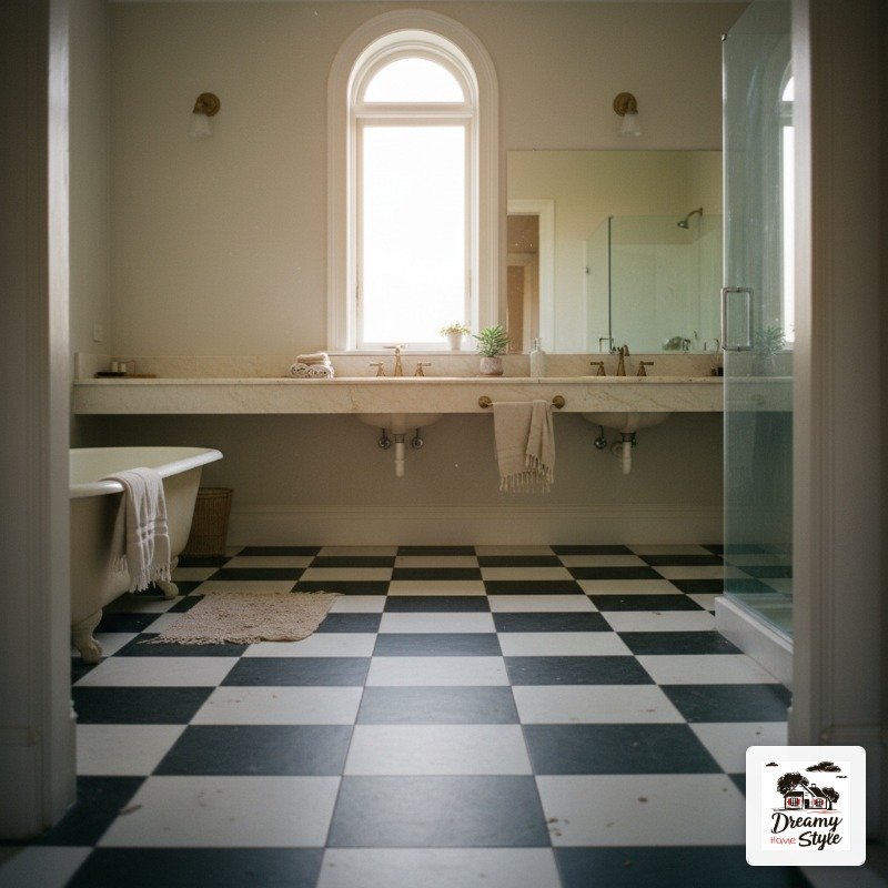
It was the floor — classic Black and White checkerboard tile, slightly worn at the edges, glowing under the light from this little frosted window.
I stood there for probably thirty seconds just… looking at it.
Biscuit would’ve loved the cold of it on his belly.
I went home and tore up my own bathroom plan completely.
That was two years ago.
I’ve been obsessed ever since, and I’ve now talked myself in and out of approximately four different versions of this floor.
So here’s everything I’ve learned, stolen, and drooled over.
Classic Black and White on the Floor (The One That Started It All)
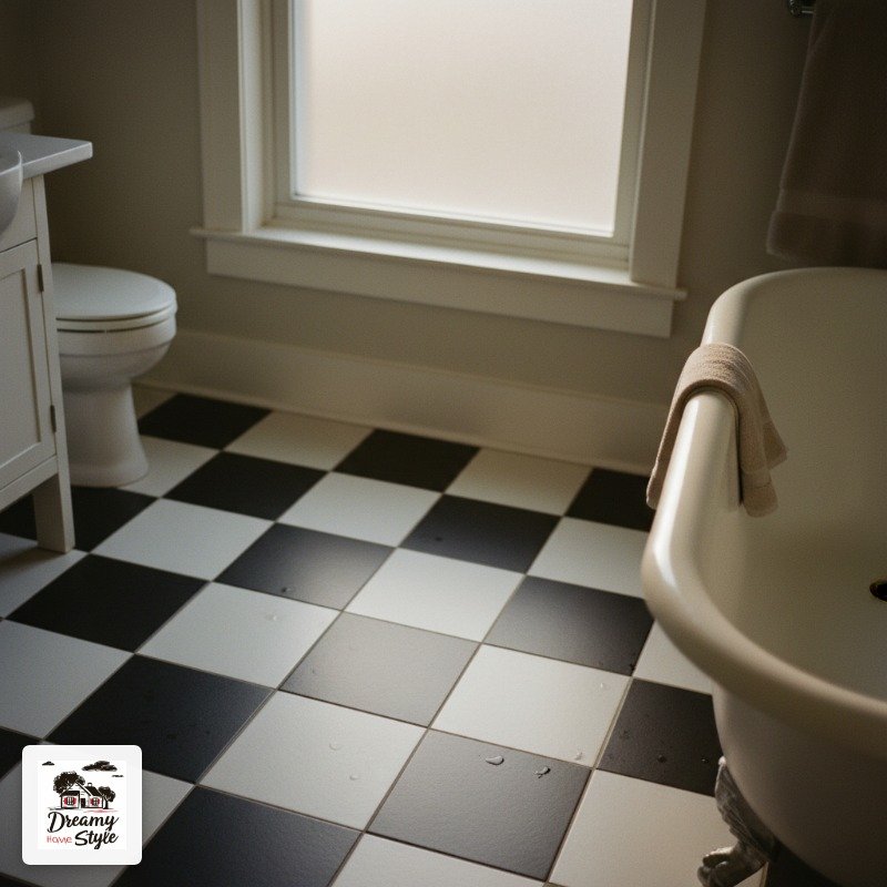
There’s a reason this combo has been on bathroom floors since, like, forever.
It’s graphic without being loud.
It reads clean even when the grout gets a little funky (and it will — I say this with love).
The tile size matters more than people admit.
Four-inch squares in a small bathroom feel proportionate and almost Victorian in the best way.
Go up to six-inch and the room suddenly looks bigger, more modern.
Go down to two-inch and you’re in a whole different mood, something almost mosaic-y.
I personally love the slightly worn, matte finish over glossy here.
Glossy shows every water drop and dog paw print.
My grout is light gray instead of bright white and honestly that single choice saved my sanity.
Start with this if you’re overwhelmed by the options.
It’s the anchor everything else grew from.

Mini Checkerboard Mosaic Tile for a Shower Floor
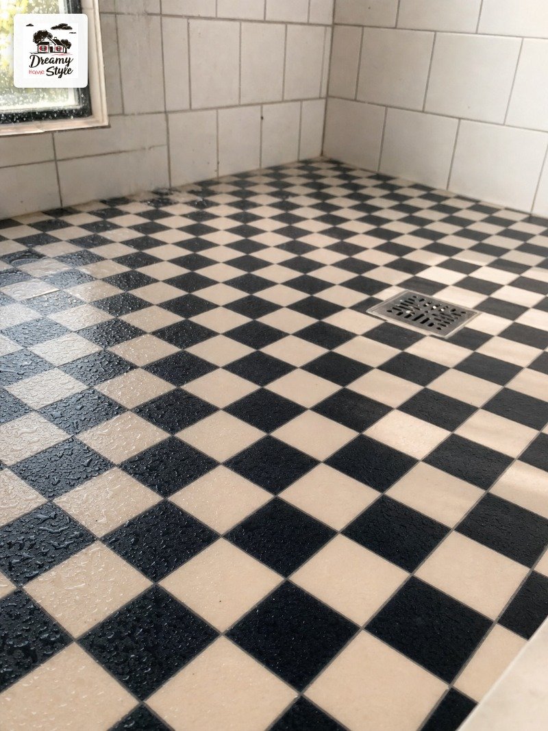
Okay so this is where I made my first expensive mistake.
I saw this look on Pinterest — tiny one-inch black and white mosaic squares on a shower floor — and I thought it would be easy to DIY.
It is not easy to DIY.
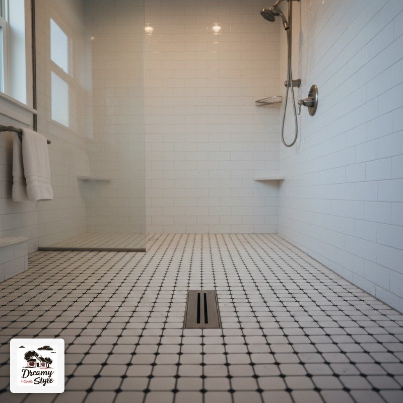
The sheets help.
Mosaic tile comes on mesh backing so you’re not placing each tiny square individually, but getting the pattern aligned across sheets is genuinely fiddly.
I had to re-do one row three times.
The payoff is insane though.
That tiny scale on a shower floor feels almost like old European tile work.
Spa-level.
And the texture gives you grip, which matters when you’re half-asleep at 7am.
Worth hiring out if budget allows.
Worth the hassle if you’re stubborn like me.
Diagonal Checkerboard (Rotated 45 Degrees, Way More Drama)
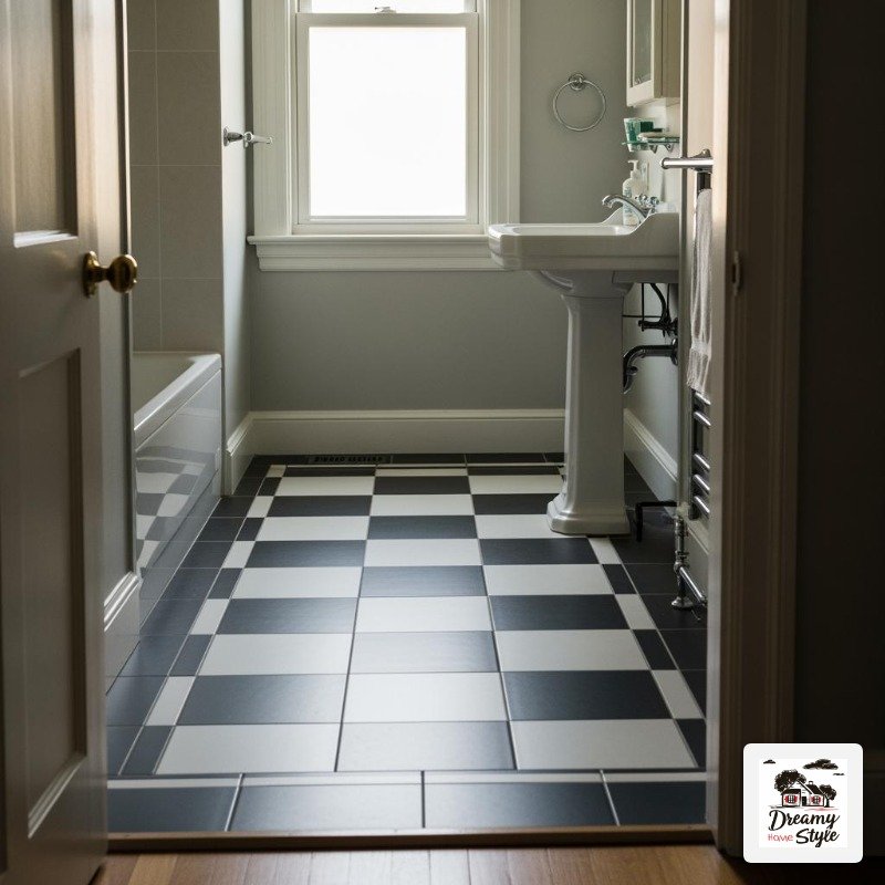
Take your standard checkerboard.
Now rotate the whole thing forty-five degrees so the squares sit on their points like diamonds.
The floor immediately looks fancier, more intentional, and somehow bigger.
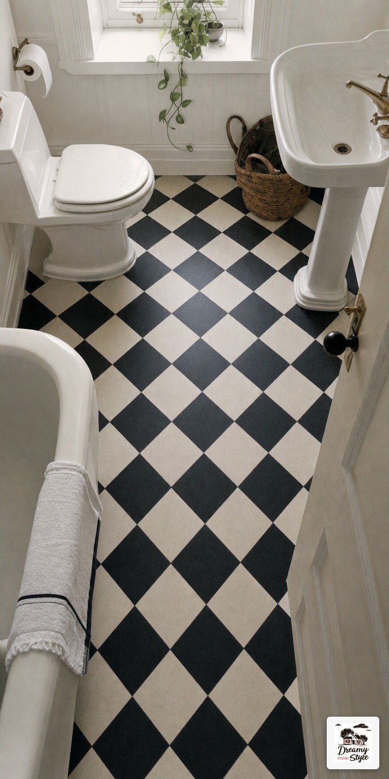
This is the version I see most often in older homes and renovated Victorian bathrooms.
There’s something about the diagonal layout that pulls your eye toward the center of the room rather than along the walls.
The catch: it creates more cut pieces at the edges, which means more waste and more time during install.
My tile guy warned me and I didn’t really listen to how much that adds up.
Budget an extra fifteen percent for cuts on a diagonal layout.
It’s a small change with a disproportionately big visual result.
Honestly one of my favorite tricks in a tiny bathroom.
Warm Tones: Terracotta and Cream Checkerboard
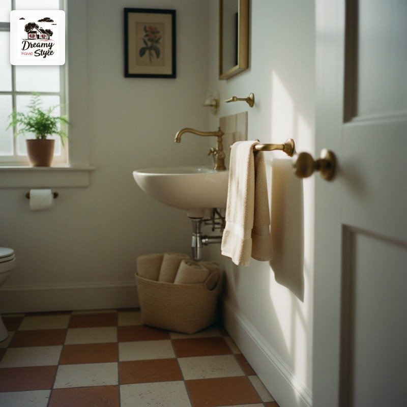
Not everyone wants black and white.
I went through a whole phase of being a little tired of it, honestly.
And then I found terracotta and cream checkerboard and my heart did a thing.
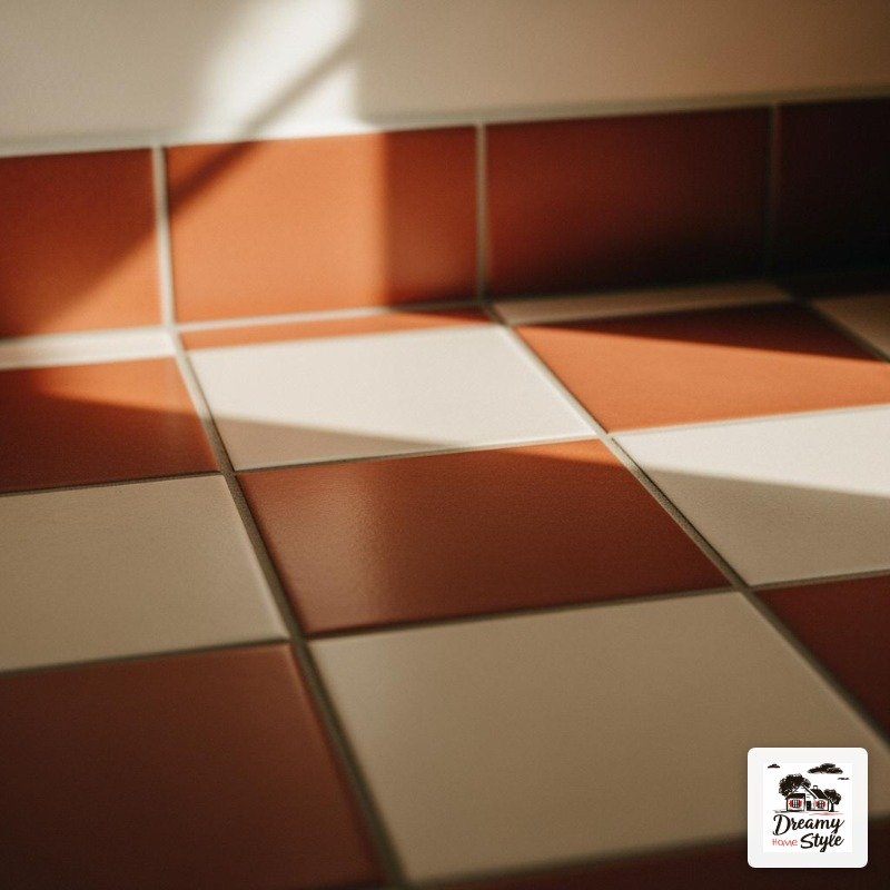
It’s warm.
Like, genuinely warm in a way that makes a bathroom feel less clinical and more like a room you actually want to spend time in.
Pair it with warm brass fixtures and you’ve got something that looks like it belongs in a farmhouse in Tuscany.
Or at least a really good Instagram version of one.
The terracotta tones vary a lot by brand.
Some lean orange, some lean pink-brown.
Order samples.
I cannot stress this enough — order the actual physical tile samples before you commit to anything.
This combo also hides dirt better than black and white.
Practical AND beautiful.
I’m into it.
Going Bold: Checkerboard on the Wall Instead of the Floor
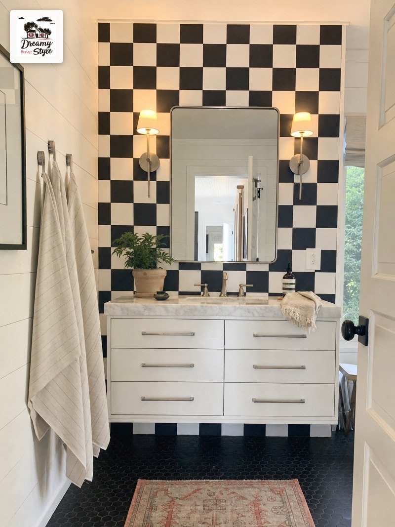
This one surprised me.
I always assumed checkerboard was a floor thing.
Then I saw it tiled vertically on an accent wall behind a vanity and I kind of had to sit down.
It works especially well as a backsplash behind a floating vanity or as a full feature wall in a narrow bathroom.
The pattern draws the eye up, which makes low-ceilinged bathrooms feel taller.
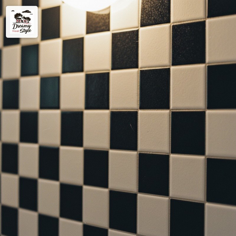
Go smaller scale on a wall — two-inch or even one-inch tiles feel right.
Large squares on a vertical surface can tip into retro-diner territory, which is its own valid aesthetic, but just know what you’re choosing.
I’ve been plotting this for my downstairs half bath for six months.
It’s happening.
I’ve already bought the tile.
Soft Gray and White for a Quieter, More Modern Look
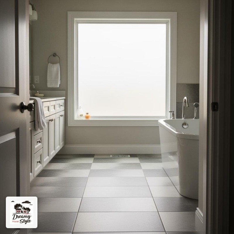
If black and white feels too high-contrast for your space, soft gray and white is your answer.
It’s the same graphic pattern but turned down a few notches.
Calmer.
More spa-like.
I actually like this version better in bathrooms with a lot of natural light.
Harsh direct sun on stark black and white can feel a little aggressive by mid-morning.
The gray softens everything.
The challenge is finding the right gray — too cool and it reads lavender in certain lights, too warm and it shifts toward beige and loses the punch of the pattern.
I liked Daltile’s ‘Ice Gray’ ceramic for this.
Not sponsored, just genuinely what I tested.
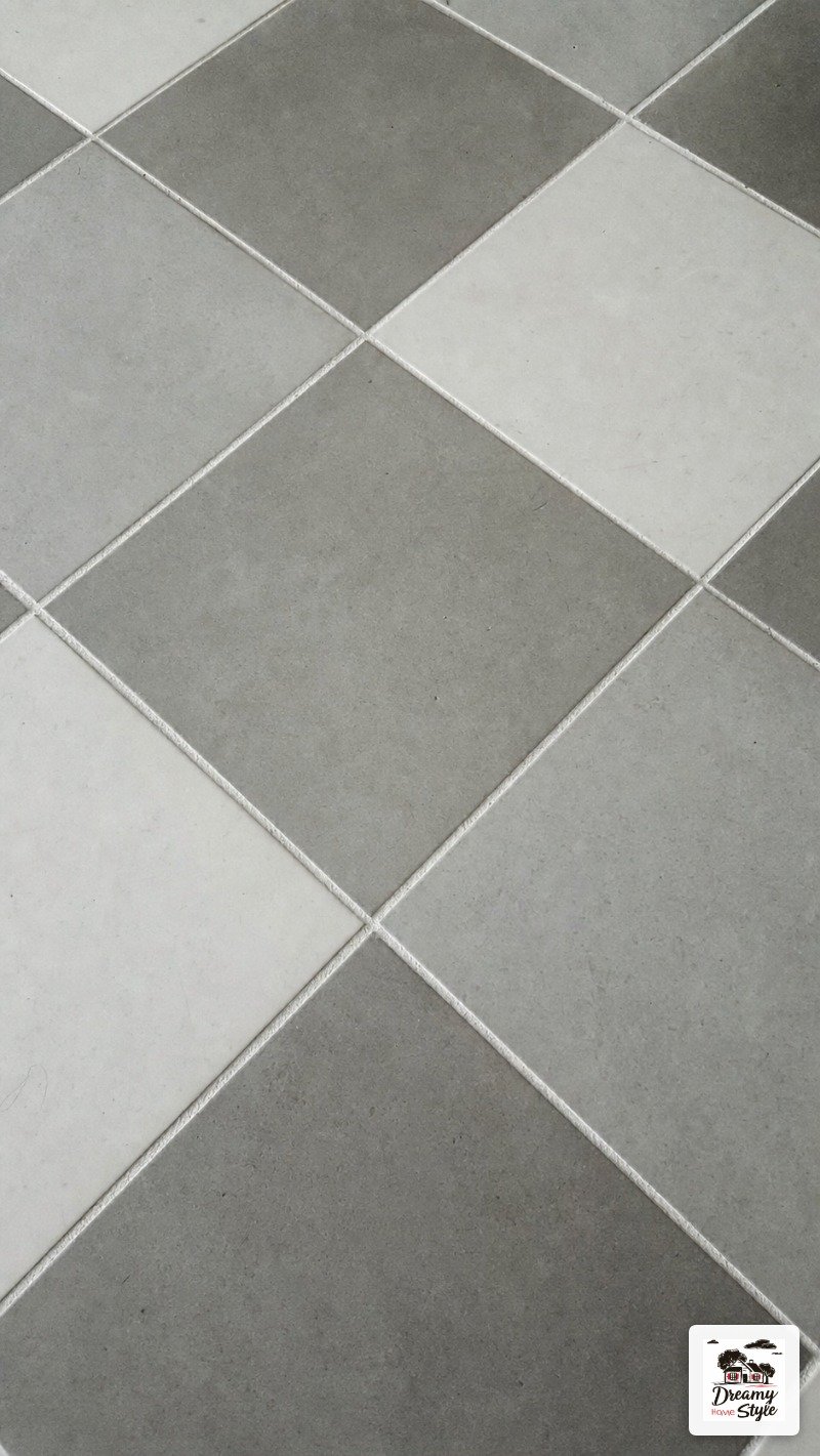
It’s subtle without being boring.
That’s actually pretty hard to pull off.
The Oversized Statement: Twelve-Inch Checkerboard Squares
Big.
Bold.
Not subtle at all.
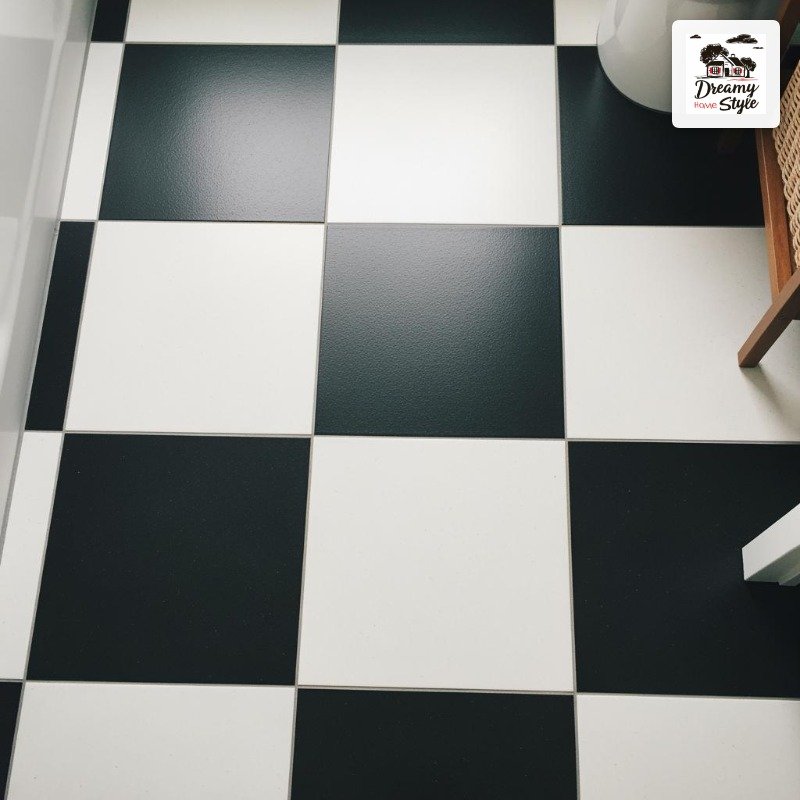
Twelve-inch checkerboard squares on a bathroom floor are a commitment and I respect anyone who makes them.
This scale works best in larger bathrooms — a primary bath or a bigger guest bath with some square footage to spare.
In a tight four-by-six powder room it can feel genuinely overwhelming, like the floor is eating the room.
In the right space though?
It’s architectural.
Almost graphic in a way that feels more design-forward than traditional.
You could do a completely plain everything else — white walls, simple fixtures — and the floor does all the talking.
Pair with really clean grout.
White or matching-shade grout keeps it fresh.
Dark grout on big squares can get heavy fast.
Penny Tile in a Checkerboard Pattern (Yes, This Exists)
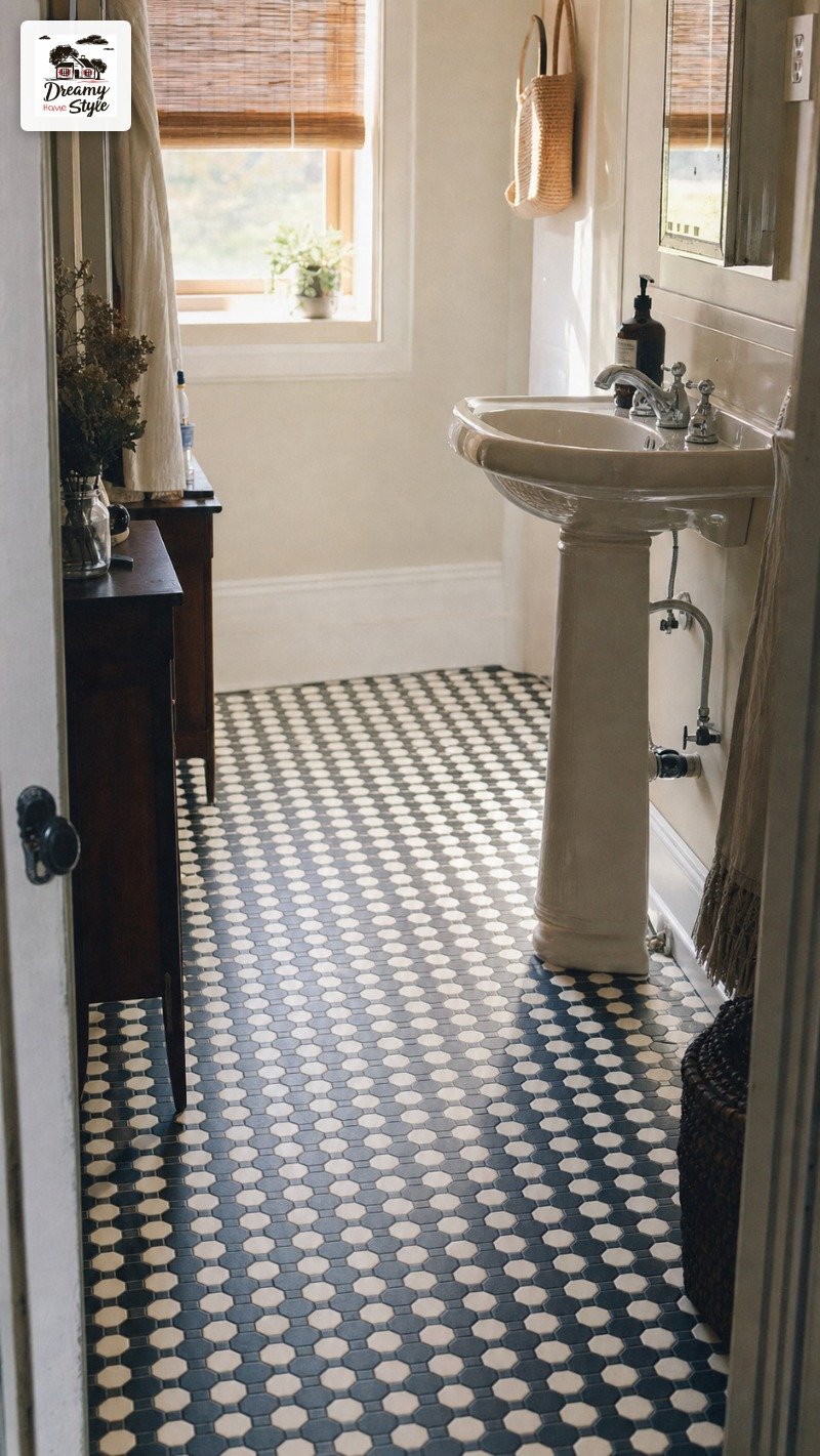
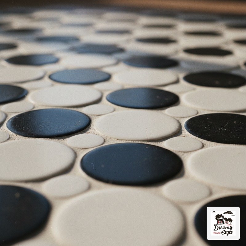
Penny tile in alternating black and white arranged in a checkerboard grid is one of the more unexpected takes on this trend and I am completely here for it.
The round shape softens the graphic nature of the pattern.
It reads vintage, almost Art Deco, without being costume-y.
And the texture underfoot from all those little rounded edges feels genuinely nice.
The grout situation is intense.
More tiles per square foot means way more grout lines, which means more grout to seal and maintain.
I go over mine with grout sealer every year.
It’s about twenty minutes of effort that saves a lot of grief.
This works especially beautifully in a small bathroom.
The scale is just right for a powder room or a narrow WC.
Navy and White Checkerboard for a Nautical-Adjacent Vibe
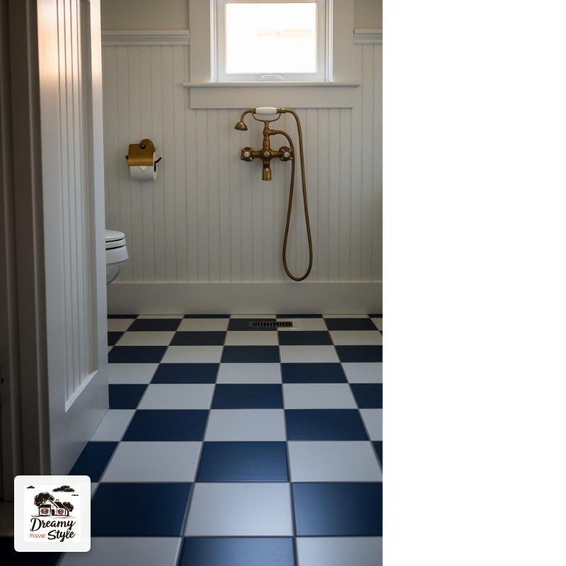
I know navy tile sounds very specific but stay with me.
Navy and white checkerboard hits different from black and white — it’s more relaxed, slightly preppy, and weirdly flattering to skin tones in mirror light.
I have no scientific basis for that last claim but I stand by it.
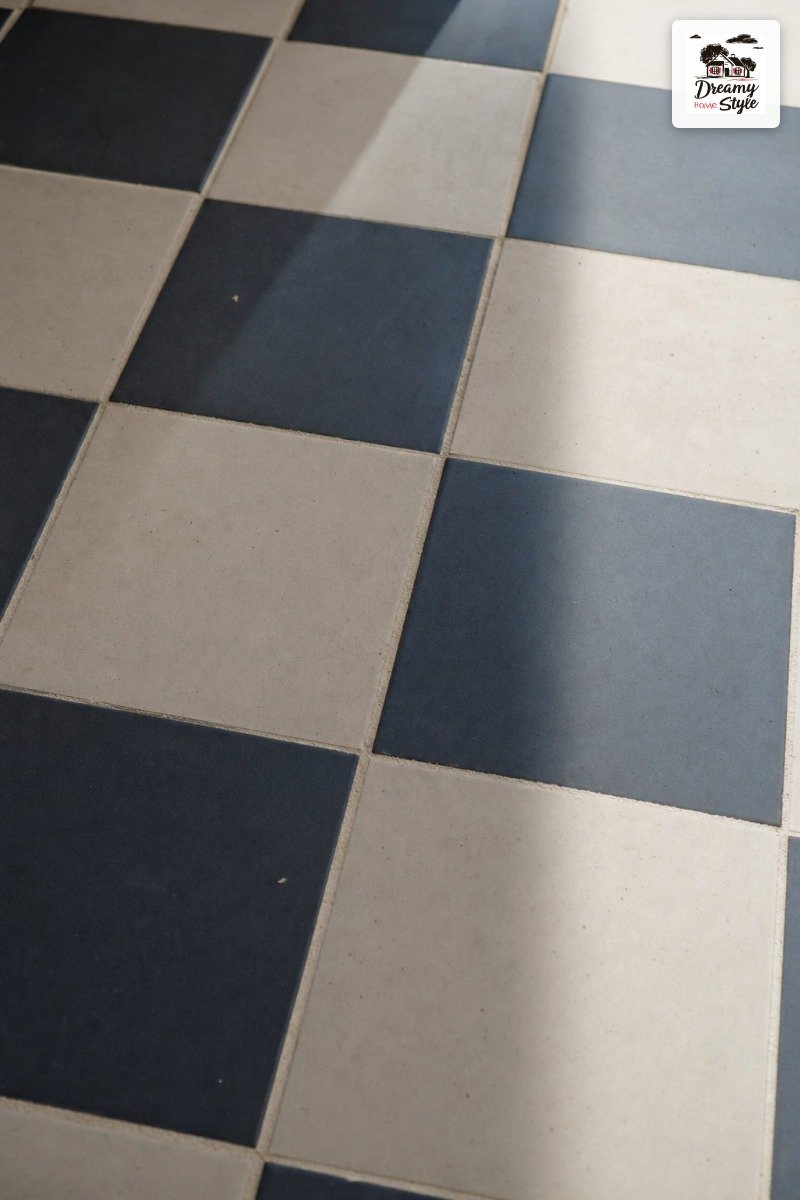
It pairs naturally with warm white shiplap, brass or oil-rubbed bronze fixtures, and white painted wood vanities.
The whole thing ends up feeling like a really elevated beach house bathroom without being kitschy.
The tile is harder to source than standard black and white.
Not impossible, but you’ll likely be special-ordering.
Factor in the lead time, especially if you’re on a renovation schedule.
This is the version I want for my eventual primary bath remodel.
Pinned and waiting.
Mixing Checkerboard with Zellige or Handmade Tile
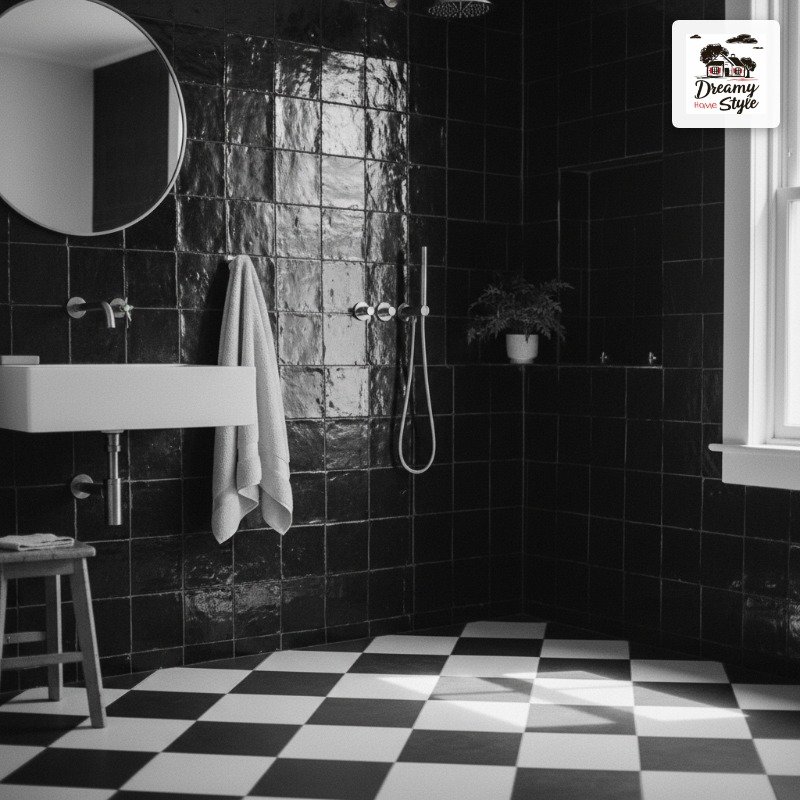
This is an advanced move and I’ll be honest, I watched it fail in a design show before I saw it succeed in a real house.
The texture of zellige — that handmade, slightly irregular Moroccan tile — is such a contrast to the geometric precision of checkerboard that it can go either really right or really wrong.
When it works, it’s because the colors are harmonious even when the textures clash.
Black zellige on a white and black checkerboard floor as a shower wall, for example.
The imperfect edges of the zellige make the checkerboard pattern look more intentional by comparison.
Keep the color palette tight.
One or two colors max.
The interest comes from the texture difference, not color variety.
This is genuinely a ‘show your tile samples to a designer friend’ situation.
Or at minimum, tape them to your wall and live with them for a week.
Checkerboard Ceiling Tile (The Wildest Thing I’ve Ever Loved)
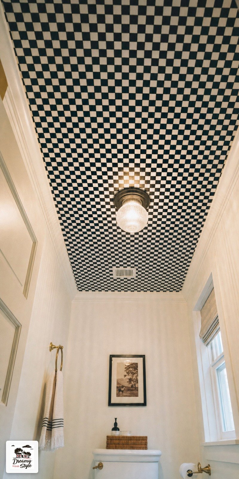
I did not put this on my bingo card.
A checkerboard ceiling.
But I walked into a powder room at a friend’s house last fall and the entire ceiling was done in two-inch black and white tile and I just… stood there looking up like I was at a planetarium.
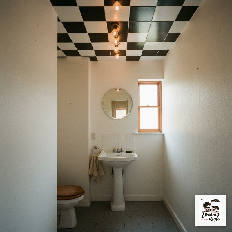
It sounds insane and it is a little insane and it’s also kind of perfect for a small bathroom where you want maximum drama without a complicated layout.
The walls and floor can be totally plain and the ceiling does everything.
Structurally it’s a legitimate project — tile on a ceiling needs proper adhesive and backing, and you probably want a pro unless you’re very confident in your overhead tiling skills.
I have humility about what I should and shouldn’t DIY at this point.
If you want a conversation piece that will make every single guest go ‘wait, is that… the ceiling?’ — this is it.
Colored Grout as a Completely Unexpected Twist
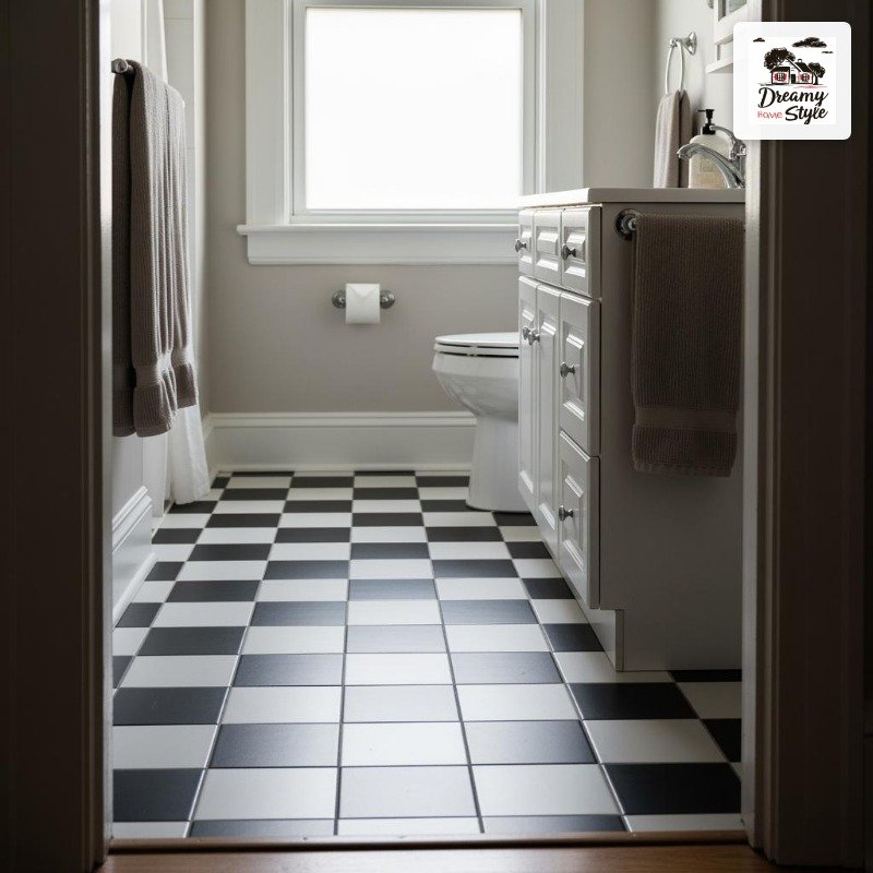
Take a standard black and white checkerboard floor.
Now imagine the grout is dusty pink.
Or sage green.
Or terracotta.
The tile pattern stays the same but the whole mood shifts.
I tried this with a warm sand-toned grout on white and pale gray tile in my upstairs bathroom and it reads completely differently than white grout would.
More aged, more collected, less brand-new-builder-grade.
Grout color is also, blessedly, not permanent in the way tile is.
You can re-grout if you hate it, or use grout paint if you want to experiment first without committing.
I used Rustoleum grout paint to test the sand tone before I grouted my whole floor.
Did not regret it.
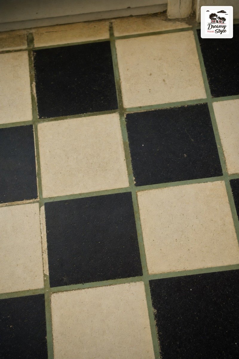
It’s a detail most people don’t notice immediately but everyone feels.
That’s kind of my favorite type of design choice.

