
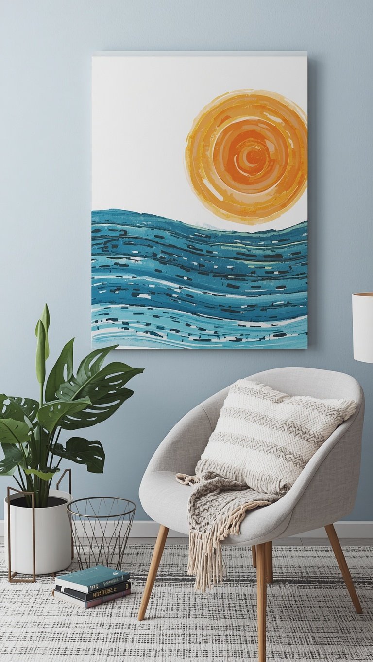

I almost bought a $180 canvas print last spring.
I had it in my cart.
My thumb was literally hovering over “buy now.”
And then I closed my laptop and just sat there for a second, kind of annoyed at myself.
Because I knew, deep down, I could make something better with stuff sitting in my craft closet.
So I did.
And that one decision turned into a whole obsession that’s saved me hundreds of dollars since.
If you’ve ever stared at overpriced art in a home decor store and felt that little pang of “I could do this,” you’re so right, and I’m about to show you exactly how.
Why I Stopped Buying Store Canvas Art For Good
The moment that changed everything for me was standing in a big box home store, staring at a plain three-panel canvas set.

It was literally just a few brushstrokes of sage green and cream.
The price tag said $220.
I remember laughing out loud, alone, in the middle of the aisle.
Something about paying that much for what looked like a happy accident just didn’t sit right with me.
So I went home, grabbed a blank canvas from my stash, and tried to recreate the vibe myself.
It took me maybe forty minutes.
It cost me about six dollars in paint I already owned.
And honestly, I liked mine better.
There’s something so satisfying about hanging art you made with your own hands.
It just feels different when guests ask where you got it and you get to say “I made that.”
Your chest puffs up a little.
Mine still does, every single time.
This is the whole reason DreamyHomeStyle exists, if I’m being honest.
I want you to feel that same little spark of pride in your own space.
Store-bought art can look pretty, sure.
But it will never carry a story the way something you created does.
And once you start making your own, it’s genuinely hard to go back.
The Supplies You Actually Need (No Fancy Art Degree Required)

Okay, let’s talk basics, because I know the supply list can feel overwhelming if you’ve never done this before.
You do not need a fully stocked art studio, I promise.
Here’s what I keep on hand at all times.
A few blank canvases in various sizes, usually from the dollar store or a craft store during a sale.
Acrylic paint in a handful of colors you love.
A cheap set of foam brushes and a couple of nicer bristle brushes.
Painter’s tape for clean lines.
Mod podge, because it’s basically magic in a bottle.
Scissors and an old gift card for smoothing things down.
That’s genuinely it.
I spent under thirty dollars building my whole kit, and I still use most of the same supplies two years later.
My tip here is to start small.
Buy one canvas and one color palette before you commit to a big gallery wall.
Get comfortable with the process first.
And don’t buy expensive paint right away.
The cheap craft paint works shockingly well for most of these techniques.
Save the fancy stuff for when you know you’re hooked.
Trust me, you will be.
Abstract Paint Pour Art That Looks Expensive

This is the technique that started it all for me, and it’s still my most requested one.
Paint pouring sounds intimidating, but it’s kind of foolproof once you get the hang of it.
You mix a few colors with a pouring medium until it’s the consistency of warm honey.
Then you just pour it onto your canvas and tilt it around until it covers the surface.
That’s it.
That’s the whole technique.
The first time I tried this, I did it on my kitchen table with old towels underneath, feeling like a total mad scientist.
And when I lifted that canvas up and saw the colors swirl together, I actually gasped.
It looked like something out of a boutique art gallery.
My mom asked where I bought it.
I still bring that up sometimes, not gonna lie.
My favorite color combo is a soft blush, warm cream, and a touch of gold for shimmer.
It gives off such a dreamy, luxe feeling without trying too hard.
If you want a moodier look, try navy, charcoal, and a hint of copper instead.
One little hack: add a few drops of silicone oil to your paint mix for those gorgeous cell patterns you see in high-end pieces.
It genuinely changes everything.
Just don’t skip the ventilation, because the fumes can sneak up on you.
Fabric-Wrapped Canvas Art For An Instant Custom Look

This one feels like cheating because it’s so easy, but don’t tell anyone.
All you need is a blank canvas and a piece of fabric you love.
I raided my own scrap bin the first time I tried this and found a floral remnant from an old curtain project.
You simply stretch the fabric over the canvas and staple it to the back, just like upholstering a tiny piece of furniture.
The whole thing took me under fifteen minutes.
And when I hung it in my hallway, it looked like a custom piece from a boutique shop.
What I love most about this method is how personal it feels.
You can use fabric that matches your curtains, your bedding, or even a piece of clothing that has sentimental value.
I actually made one using a swatch from my grandmother’s old tablecloth, and it makes me smile every time I walk past it.
That’s the kind of art that money genuinely cannot buy.
A few variations to try.
Use a bold graphic print for a modern nursery.
Try a soft linen texture for a coastal, breezy feel.
Or mix two fabrics in a color-block pattern for something a little more unexpected.
My honest tip here is to iron your fabric first.
Wrinkles will drive you a little crazy once it’s stretched and stapled down.
Photo Transfer Canvas Art That Feels Like A Keepsake

I did this one for my sister’s birthday and she actually teared up a little, which I was not expecting.
Photo transfer is basically printing a mirrored image onto a canvas using mod podge and a laser print.
It takes some patience, but the payoff is so worth it.
You coat the canvas with a thick layer of mod podge, press your printed image face down, and let it dry completely overnight.
Then comes the fun part, where you gently rub the paper away with a damp cloth until the image reveals itself underneath.
The first time it worked for me, I literally squealed.
It felt like uncovering a little treasure.
My favorite use for this technique is old vacation photos, especially ones with soft, warm lighting.
Black and White portraits also transfer beautifully and give off such a timeless, gallery feel.
One important tip, and I learned this the hard way, always use a laser print, not an inkjet one.
Inkjet ink will smear and ruin the whole thing, and yes, I definitely cried a little the first time that happened.
If you want to get fancy, add a coat of matte varnish once it’s dry for extra durability.
This is one of those projects that turns into a genuine family heirloom.
Every single person who sees it asks how you made it.
And honestly, that reaction alone makes it worth the little bit of extra effort.
Pressed Botanical Canvas Art For A Soft, Organic Feel

There’s something so calming about this project, and I always find myself doing it on a slow Sunday afternoon.
You press flowers, leaves, or even herbs between heavy books for about a week or two.
Once they’re flat and dry, you arrange them on your canvas and seal them down with mod podge.
I did this with eucalyptus sprigs from my own backyard last fall, and the finished piece still makes my dining room smell faintly earthy, which sounds strange but feels so cozy.
The texture this creates is unlike anything you’ll find in a store.
You can genuinely see the delicate veins in the leaves up close.
It feels alive in a way that printed art never quite manages.
My favorite combination is soft sage leaves paired with tiny dried baby’s breath for a whisper of texture.
If you want more color, pressed pansies or violas work beautifully and keep their color surprisingly well.
A little hack here, press your botanicals with a heavy dictionary if you don’t own flower press.
It works just as well and probably sounds a little more charming anyway.
This piece works so well in a bedroom or reading nook, somewhere quiet where you want that gentle, grounded energy.
It’s soft, it’s romantic, and it costs basically nothing beyond a walk through your own yard.
Stencil Art For Clean, Modern Patterns

If you love a more structured, graphic look, stencils are going to be your new best friend.
I was intimidated by these at first because I assumed I’d mess up the lines.
But cheap vinyl stencils make it nearly impossible to fail.
You tape the stencil down firmly, dab your paint on with a stencil brush using very little paint at a time, and peel it back slowly once it’s dry.
The key is using barely any paint on your brush.
I learned this after my first attempt bled under the edges and looked kind of like a sad smudge.
Less paint really is more here.
My go-to pattern is a simple arch or a modern geometric line, painted in a warm terracotta on a raw canvas background.
It gives off such an earthy, boutique feel.
For a nursery, try soft clouds or a gentle rainbow arch instead.
One of my favorite variations is layering two stencils in slightly different shades for a subtle depth effect.
It looks so much more expensive than it actually is.
A small tip, always let each layer dry fully before adding the next one.
Rushing this step is where most little mistakes happen.
This technique feels so satisfying because of how crisp and intentional the final result looks.
It’s the kind of piece that makes people assume you hired someone.
Ombre And Color Gradient Canvas Art

This might be the easiest technique on this entire list, and I say that with full confidence.
You simply blend two or three shades of the same color family from dark to light across your canvas.
I did this in dusty blue tones for my son’s room, and it turned out to be one of my favorite pieces in the whole house.
The trick is working while the paint is still wet so the colors blend into each other naturally.
I use a wide foam brush and just gently drag it back and forth where the colors meet.
It creates this soft, dreamy transition that looks incredibly professional.
Honestly, the first time I finished one of these, I stood back and just stared at it for a solid minute.
It felt like something you’d see in a design magazine.
My favorite combinations are blush fading into cream, or a deep forest green fading into a soft sage.
Both feel so calming and pulled together.
If you want more drama, try a sunset-inspired gradient with coral, orange, and a touch of deep plum.
A little hack, work in sections and mist your canvas lightly with water if your paint starts drying too fast.
It gives you a few extra minutes to blend.
This technique works beautifully as a set of three canvases in ascending shades, hung together in a row.
It’s simple, it’s elegant, and it never goes out of style.
Turning Your Kid’s Artwork Into A Real Canvas Masterpiece

I did this with my daughter’s finger painting from preschool, and it’s now one of the most complimented pieces in my entire home.
You take a piece of your child’s original art and either photo transfer it onto canvas or simply mount the actual paper piece using mod podge and a protective varnish.
The first time I saw her scribbly little handprint tree hanging in a real frame in our living room, I got a little emotional, not gonna lie.
There’s something about elevating a child’s art that makes it feel important, like it matters just as much as anything you’d buy at a gallery.
My tip is to choose pieces with strong color contrast, since those tend to photograph and transfer the best.
If you’re using the original paper, coat both sides with mod podge to prevent yellowing over time.
A fun variation is combining several small drawings onto one canvas in a collage style.
It turns a whole year of artwork into one cohesive piece instead of a pile of papers in a drawer.
This is also just such a sweet way to preserve memories without the clutter.
Guests always ask about it, and there’s nothing better than watching your kid’s little chest puff up with pride when you tell the story.
It costs almost nothing and means absolutely everything.
Thrifted Frame Plus Canvas Combos

One of my favorite budget secrets involves hitting up a thrift store for old frames, not paintings.
You want frames with interesting shapes or finishes, even if the artwork inside is something you’d never actually hang.
You simply remove the original art, paint or distress the frame if needed, and either insert a smaller canvas piece or attach fabric directly to the frame’s backing.
I found a gorgeous ornate gold frame for two dollars once and nearly did a happy dance in the aisle.
I swapped out the boring landscape inside for one of my own abstract paint pours, and it instantly looked like a piece from an upscale boutique.
The contrast between an ornate vintage frame and a modern abstract piece is honestly one of my favorite design tricks.
It creates this unexpected, curated feeling that’s so hard to replicate with matching store sets.
My tip is to check the frame depth before buying, since you’ll want enough room to fit your canvas or fabric without it looking bulky.
A quick coat of spray paint can also completely transform a dated frame in under an hour.
Try a soft brushed gold or a matte black for something timeless.
This combo approach genuinely feels like your own little design secret once you start doing it.
Arranging Your DIY Pieces Into A Gallery Wall

Making the art is honestly only half the fun for me.
Arranging it is where the real magic happens.
I spent an entire Saturday afternoon last year laying pieces out on my living room floor before committing to anything on the wall.
My best tip is to trace each canvas onto craft paper and tape those outlines to the wall first.
It saves you from unnecessary nail holes, and trust me, your walls will thank you.
I like mixing sizes and textures rather than keeping everything uniform.
A fabric piece next to a paint pour next to a small botanical canvas creates such a layered, collected-over-time feel.
Keep your spacing consistent, usually about two to three inches between pieces, so it feels intentional rather than scattered.
If you’re nervous about symmetry, an odd number of pieces, like five or seven, tends to feel more balanced than an even number.
One thing I always do is step back frequently during the process.
Standing close up can trick your eye, and you won’t notice a crooked piece until you’re sitting on the couch staring at it later.
My favorite arrangement style right now is an asymmetrical cluster rather than a strict grid.
It feels more organic, more like your own personal story unfolding across the wall.
This is the part where your whole collection finally comes together and feels like a real design moment.
Sealing And Protecting Your Finished Canvas Art

This step is so easy to skip, and I definitely skipped it early on, which I regret.
A simple coat of matte or satin varnish protects your finished piece from dust, fading, and general wear over time.
I use a soft brush and apply it in thin, even layers, letting each one dry fully before adding another.
My botanical pieces especially need this step, since pressed flowers can become brittle and fade faster without protection.
For photo transfers, varnish also deepens the color slightly and gives it this gorgeous, gallery-finish sheen.
I remember the first time I varnished one of my paint pours and watched the colors suddenly look so much richer and more saturated.
It felt like watching the piece finally become finished.
A little hack, avoid glossy varnish if your piece will hang somewhere with a lot of natural light, since it can create distracting glare.
Matte finishes tend to look more sophisticated anyway, at least in my opinion.
Let everything cure for a full day or two before hanging, even if it feels dry to the touch.
Rushing this part can lead to smudges you cannot fix later.
This step feels tedious, I know, but it’s the difference between a piece that lasts for years and one that fades within a few months.
Command strips have honestly become my best friend for lighter canvases, especially in rental homes.
They hold surprisingly well and save your walls completely.
For heavier pieces, a simple picture hanging kit with the little level built in makes everything so much easier.
I cannot tell you how many crooked frames I’ve fixed since discovering those.
Related read: Things I Wish I Knew Before I Decorated My First Home — Instant PDF + Kindle download. Secure checkout by Stripe

