
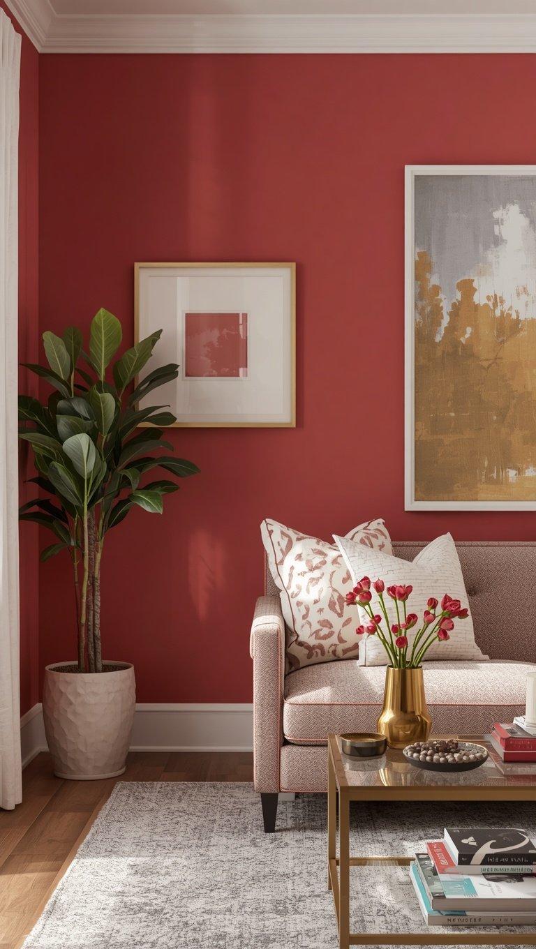

I painted my dining room the wrong white four times before I got it right.
Ready to paint?
The free paint calculator tells you how many gallons to buy for your room.
Four times.
I still cringe thinking about the money I wasted on sample pots that looked like hospital walls by 4pm.
And that’s kind of the whole reason I’m writing this post.
Because the difference between a room that looks expensive and a room that looks like a rental isn’t the furniture.
It’s not the art, either.
It’s the paint, and more specifically, it’s knowing which Benjamin Moore shades actually hold up in real light, in a real house, with real windows that don’t face perfectly south.
So grab your coffee.
I’m handing you my actual palette notes, the ones I’ve built up over years of trial, error, and a few tears in the paint aisle.
Why Undertones Are Everything

Okay, so this is the part nobody explains to you at the paint counter.
Every single “neutral” has an undertone hiding underneath it.
Pink, green, purple, yellow — it’s always something.
And that hidden undertone is exactly why your beige can look beautiful on the swatch and then turn muddy pink the second the sun hits it at 3pm.
I learned this the hard way in my first apartment.
I chose a “warm white” that turned into a weird salmon color every afternoon.
It was not cute.
So now, before I commit to anything, I hold the swatch up against a plain white piece of paper.
If it leans pink, green, or yellow against that white, I know exactly what I’m dealing with.
This one habit alone will save you so much frustration, I promise.
It’s the difference between a wall that feels expensive and one that feels accidental.
And honestly, once you start seeing undertones, you can’t un-see them.
You’ll be side-eyeing paint chips in Target for the rest of your life.
Sorry in advance for that.
My Favorite Expensive-Looking White

If you only take one color away from this whole post, let it be this one.
White Dove.
I have used this color in three different homes now, and it has never once let me down.
It’s soft, it’s warm, but it never tips into that yellowy, dated cream territory.
When I painted my kitchen cabinets in White Dove a couple years back, my contractor actually stopped and asked what color it was because he wanted it for his own place.
That’s how you know a white is doing its job.
It photographs beautifully too, which matters more than people admit.
In morning light it feels crisp and clean.
By evening, under lamp light, it goes soft and buttery.
That kind of range is rare.
Most whites pick a lane and stay there all day, but this one just moves with you.
If your space gets a lot of natural light, this is the safest, most flattering choice I can give you.
And if I had to redo my own kitchen tomorrow, I would choose it again without even thinking twice.
The Warm Greige That Changed My Living Room


Edgecomb Gray deserves its own little shrine, honestly.
I put it in my living room last fall when I was so tired of my walls looking flat and lifeless.
The second it went up, the whole room felt calmer.
It’s technically a greige, which I know sounds like a made-up word, but stay with me.
It reads warm in the morning and cooler in the evening, which sounds impossible until you see it happen in your own space.
My couch is a soft oatmeal color, and against this wall it looks like it belongs in a magazine spread.
I’m not exaggerating.
This is the color I recommend to friends who say they “don’t know what they want” but they know they hate their current beige.
It’s the in-between color that just works.
If you’re someone who changes your mind a lot with decor, this is a safe long-term bet.
It plays nice with almost every other tone you’ll want to bring in later.
Gold accents, black frames, wood tones, it doesn’t fight with any of it.
Honestly, it’s one of those colors that makes your furniture look more expensive than it actually is.
Which, let’s be real, is the whole goal here.
Going Bold Without the Regret

I get it, dark colors feel scary.
You’re picturing a cave, and I understand the fear completely.
But hear me out on Kendall Charcoal for just a second.
I used it on a small powder room accent wall, and it turned that tiny, forgettable space into the room everyone comments on.
It’s not black, and it’s not quite navy either.
It sits somewhere moody and rich in between, and it makes brass hardware and gold mirrors look absolutely stunning against it.
The trick is committing to one contained space first.
A powder room, a den, maybe a home office.
Somewhere small enough that it feels like an experiment, not a financial commitment.
Once you see how good dark paint looks with warm lighting, you’ll want it everywhere.
I did.
My husband had to talk me down from painting our entire hallway in it.
He was probably right, but I still think about it sometimes.
If you’re nervous, start with the ceiling in there too.
Trust me on this one, it wraps the whole room and makes it feel intentional instead of accidental.
The Trick to Testing Paint Before You Commit

Please, please do not skip this step.
I know sample pots feel like an annoying extra expense.
But painting a huge poster board and moving it around your room for a full day will save you from a wall you hate for the next five years.
I tape mine to foam board now instead of painting directly on the wall.
That way I can slide it around, hold it near the window, near the lamp, even outside on the porch for a second.
Paint changes so much depending on where the light is coming from.
What looks perfect at noon can look completely different by 7pm.
I learned this lesson with a green I was obsessed with in the store.
By nighttime it looked almost gray and sad.
So now I always check a color in three different lighting moments before I buy the big can.
Morning light, midday, and evening lamp light.
It sounds like overkill, I know.
But it’s kind of the difference between a color you settle for and one you actually love waking up to every single day.
Sheen Matters More Than People Think


Nobody talks about sheen enough, and it drives me a little crazy.
You can pick the perfect color and still ruin the whole look with the wrong finish.
For walls, I almost always go with a matte or eggshell.
It gives that soft, velvety look that feels expensive and hides little wall imperfections so well.
Glossy finishes on walls can look cheap fast, especially in older homes with uneven plaster.
But for trim and doors, I flip it completely and go semi-gloss.
That contrast between a matte wall and a slightly shiny trim is what gives a room depth.
It’s subtle, but your eye notices it even if you can’t explain why.
When I redid my son’s bathroom trim in semi-gloss white against a soft matte wall color, it suddenly looked like a professional did it.
And nobody touched a single other thing in that room.
So if your space already feels a little flat, check your sheen before you blame the color.
Sometimes that’s really the whole problem.
The Ceiling Color Nobody Talks About


I used to slap builder white on every ceiling without a second thought.
Then I tried something different in my bedroom and it changed everything.
I had the ceiling painted in the same color as the walls, just in a flat finish.
It sounds simple, but it makes the whole room feel taller and more cohesive somehow.
There are no harsh lines where wall meets ceiling anymore.
It just flows.
This trick works especially well in smaller rooms that feel a little chopped up or boxy.
Removing that visual stop at the ceiling line tricks your eye into seeing more space than is actually there.
I did this in my home office too, using a soft creamy white, and it feels like a cozy little cocoon now instead of a cramped afterthought.
It’s such a small change on paper.
But it’s one of those things guests notice without knowing exactly why they like the room so much.
If you’re repainting soon, at least consider it.
You might be surprised how much it elevates the whole space.
Trim Colors That Make Walls Pop

Your trim is basically the frame around your whole room.
And most people just default to plain white without thinking twice.
That’s fine, but a slightly warmer trim white can genuinely change how expensive a space feels.
I use Simply White on trim in almost every room now.
It’s crisp without turning stark or clinical looking.
Against Edgecomb Gray walls, it creates this soft, clean contrast that photographs beautifully.
Honestly, good trim paint is kind of underrated in general.
Chipped or yellowed trim can make an otherwise gorgeous room look tired and neglected.
So if you’re on a tight budget this season, sometimes just redoing the trim alone can breathe new life into a space.
You don’t even need to touch the walls.
I did this in my entryway last spring, just trim and doors, nothing else.
The whole space instantly felt fresher and more put together.
It’s a small job with a genuinely huge visual payoff.
My Go-To Moody Blue

Hale Navy is one of those colors that just feels like a warm hug.
I first used it on my kitchen island, and I still get compliments on it constantly.
It’s deep and rich, but it never feels cold or harsh the way some navy paints can.
Against white cabinets and brass hardware, it looks like something straight out of a coastal cottage.
But it works in modern spaces too, which is honestly what surprised me most.
I’ve since used it on a front door, and it made our whole entryway feel so much more welcoming.
There’s something about a good navy that just feels timeless in a way trendy colors never quite manage.
It doesn’t scream for attention.
It just quietly makes everything around it look a little more polished.
If you’re nervous about committing to a bold color anywhere in your home, this is genuinely one of the safest bold choices you can make.
It ages beautifully and pairs with almost any metal finish you already own.
The Warm Neutral for North-Facing Rooms

If your room faces north, you already know the struggle.
Everything looks a little gray and flat, no matter what color you choose.
I dealt with this in my guest room for years before I figured it out.
The fix is choosing a color with a slightly warmer undertone than you think you need.
I went with a soft warm cream in that room, and it completely balanced out the cooler natural light.
What looked almost beige on the swatch actually reads perfectly warm once it’s on the walls.
It’s counterintuitive, but north light needs a little extra warmth to compensate.
Otherwise everything just feels a bit dreary, even on a sunny day.
Once I made the switch, that guest room finally felt inviting instead of like an afterthought nobody wanted to sleep in.
So if you’ve been fighting with a gray, sad-feeling room, check which direction your windows face first.
It might not be the color’s fault at all.
It might just need a warmer partner to balance things out.
Pairing Colors Room to Room
This is the part that took me the longest to figure out.


You don’t need every room to be the same color.
But you do need some kind of thread connecting them, or your home starts to feel disjointed.
I like picking one anchor neutral, like White Dove, and using it as trim or ceiling color throughout the whole house.
Then each room gets its own personality built around that same anchor.
It creates flow without forcing every space to feel identical and boring.
My hallway is the neutral, calm transition space.
My living room leans warmer.
My son’s room gets to be a little more playful.
But because they all share that same trim white running through them, walking from room to room feels intentional instead of jarring.
This is honestly the secret behind those homes that feel effortlessly pulled together.
It’s not that every room matches.
It’s that they’re all speaking the same quiet language underneath.
Lighting Changes Absolutely Everything
I cannot stress this enough, your lightbulbs are sabotaging your paint color.

Cool white bulbs will make even the warmest paint look sterile and a little sad.
I swapped every bulb in my house to soft warm white, around 2700K, and it changed how every single room felt.
Colors that looked flat and boring suddenly had depth and warmth again.
It’s such a cheap fix compared to repainting an entire room.
Before you blame your paint choice for feeling off, check your bulbs first.
Seriously, it might save you a whole weekend of unnecessary repainting.
I also try to get natural light bulbs near mirrors and vanities specifically, because that’s where cool lighting feels the harshest.
Little lamps in corners with warm bulbs add so much coziness too.
It’s a detail most people skip, but it makes such a noticeable difference once you notice it.
For the tiny spots, let everything melt together softly instead.
It’s such a simple trick, but it makes such a massive visual difference.
For the tiny spots, let everything melt together softly instead.
It’s such a simple trick, but it makes such a massive visual difference.
xo, Madison
Related read: Things I Wish I Knew Before I Decorated My First Home — Instant PDF + Kindle download. Secure checkout by Stripe

