Green cabinets are taking over kitchens everywhere, and for good reason.
These bold, nature-inspired colors bring life and energy into your cooking space.
But here’s the thing that stops most people in their tracks: what wall color should you pick?
Choosing the wrong wall color can make your beautiful green cabinets look muddy or clash terribly.
The right wall color, however, can make your green cabinets the star of the show.
Some wall colors will make your green cabinets look brighter and more vibrant.
Others will create a calm, peaceful feeling that makes your kitchen feel like a cozy retreat.
Now let’s have a look at which colors work together and why:
Crisp White Walls Create Fresh Contrast


White walls are the classic choice that never goes out of style with green cabinets.
This combination creates a fresh, clean look that feels both modern and timeless.
Pure white walls make your green cabinets pop forward and become the focal point of your kitchen.
The contrast between white and green is natural and pleasing to the eye, like fresh leaves against snow.
White walls also reflect light beautifully, making your kitchen feel bigger and brighter.
This is especially helpful if your kitchen doesn’t get tons of natural light.
You can choose from different shades of white to get exactly the look you want.
Bright white creates a crisp, modern feeling that works great with sage or forest green cabinets.
Warm white has a slight cream undertone that feels cozy and welcoming.
Cool white has a hint of gray or blue that creates a more contemporary feel.
The beauty of white walls is that they work with any shade of green cabinets.
Whether you have light mint green or deep hunter green, white walls will complement them perfectly.
White walls also give you flexibility with your decor and accessories.
You can add colorful artwork, plants, or decorative items without worrying about clashing.
This combination works especially well in farmhouse, modern, and traditional kitchen styles.
Warm Cream Walls Add Cozy Comfort


Cream walls bring warmth and comfort to kitchens with green cabinets.
This soft, neutral color creates a cozy atmosphere that feels like a warm hug.
Cream has just enough color to add warmth without competing with your green cabinets.
The combination of cream and green feels natural and organic, like a peaceful garden.
Cream walls work especially well with lighter shades of green cabinets.
Sage green, mint green, and seafoam green all look beautiful against cream walls.
The warm undertones in cream complement the cool tones in green perfectly.
This creates a balanced color palette that feels harmonious and relaxing.
Cream walls also help soften the boldness of green cabinets.
If your green cabinets feel too strong or overwhelming, cream walls can tone them down.
This combination works wonderfully in traditional and farmhouse-style kitchens.
Cream walls also pair beautifully with natural wood elements and brass hardware.
You can choose from different shades of cream to match your style.
Light cream creates an airy, open feeling that works well in smaller kitchens.
Rich cream has more yellow undertones and creates a more dramatic, cozy feeling.
Cool-toned creams can make green cabinets look muddy or unpleasant.
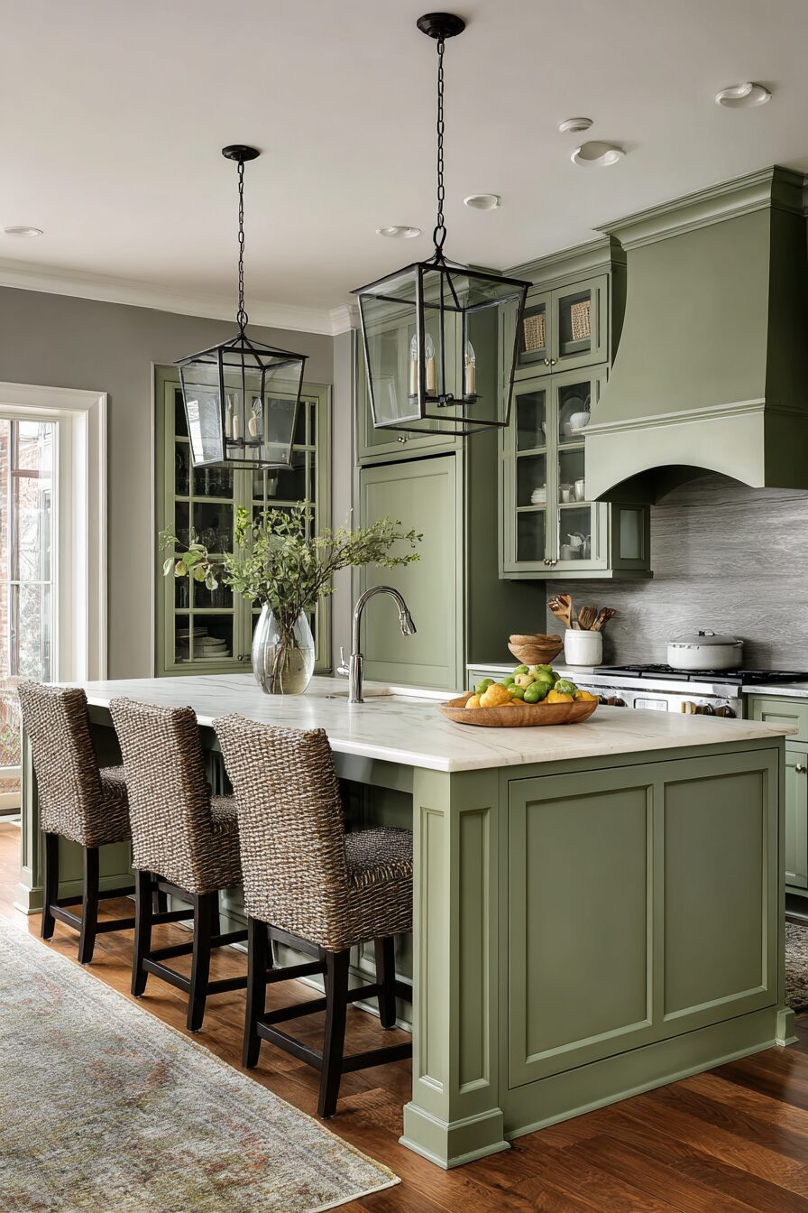
Soft Gray Walls Bring Modern Elegance


Gray walls create a sophisticated, modern look when paired with green cabinets.
This neutral color adds elegance without overwhelming your beautiful green cabinetry.
Gray is the perfect backdrop that lets your green cabinets shine while adding contemporary style.
The combination of gray and green feels fresh and current, like something from a design magazine.
Light gray walls work especially well with darker green cabinets.
Forest green, hunter green, and deep sage all look stunning against soft gray walls.
The cool undertones in gray complement the natural tones in green beautifully.
This creates a calming, spa-like atmosphere that feels peaceful and relaxing.
Gray walls also work well with stainless steel appliances and modern fixtures.
This combination is perfect for contemporary and transitional kitchen styles.
You can choose from warm gray or cool gray depending on your preference.
Warm gray has slight beige or brown undertones that feel cozy and inviting.
Cool gray has blue or purple undertones that feel crisp and modern.
Dark gray walls can make your kitchen feel closed in and gloomy.
Gray walls also give you lots of flexibility with accent colors and decor.
Bold Navy Blue Walls Create Dramatic Flair
Navy blue walls make a bold statement when paired with green cabinets.
This deep, rich color creates drama and sophistication in your kitchen space.
Navy blue is a classic color that never goes out of style and works beautifully with green.
The combination of navy and green feels nautical and fresh, like a coastal retreat.
This color pairing works especially well with lighter shades of green cabinets.
Sage green, mint green, and pale seafoam look stunning against navy blue walls.
The contrast between the deep blue and soft green creates visual interest and depth.
Navy blue walls also make your green cabinets appear brighter and more vibrant.
This combination works wonderfully in traditional and coastal-style kitchens.
Navy blue walls pair beautifully with white trim and brass or gold hardware.
You can also add white or cream accents to balance the boldness of the navy.
This color combination feels both classic and contemporary at the same time.
Navy blue walls work well with natural wood elements and woven textures.
Navy walls can make small kitchens feel cramped, so consider this carefully.
If you love the idea but worry about darkness, try navy on just one accent wall.
Warm Beige Walls Offer Timeless Appeal
Beige walls provide a timeless, neutral backdrop for green cabinets.
This warm, earthy color creates a comfortable and inviting kitchen atmosphere.
Beige has enough warmth to feel cozy but stays neutral enough not to compete with green.
The combination of beige and green feels natural and organic, like colors found in nature.
Warm beige walls work well with both light and dark green cabinets.
The earthy undertones in beige complement the natural tones in green perfectly.
This creates a harmonious color palette that feels balanced and peaceful.
Beige walls also help ground bold green cabinets and make them feel more approachable.
This combination works beautifully in traditional, farmhouse, and rustic kitchen styles.
Beige walls pair wonderfully with natural wood elements and antique brass hardware.
You can choose from different shades of beige to match your desired mood.
Light beige creates an airy, open feeling that works well in any size kitchen.
Rich beige has more brown undertones and creates a more dramatic, cozy atmosphere.
Cool-toned beiges can make your kitchen feel dull and lifeless.
Beige walls also provide a neutral foundation for colorful accessories and artwork.
Soft Pink Walls Add Unexpected Charm
Pink walls might sound surprising, but they create magic with green cabinets.
This unexpected color combination feels fresh, playful, and completely charming.
Soft pink and green are complementary colors that naturally look beautiful together.
Think of pink flowers blooming on green stems – it’s a combination nature uses all the time.
Light pink walls work especially well with sage or mint green cabinets.
The soft, romantic feeling of pink balances the earthiness of green perfectly.
This combination creates a kitchen that feels unique, cheerful, and welcoming.
Pink walls make green cabinets look more vibrant and alive.
This color pairing works wonderfully in cottage, farmhouse, and vintage-style kitchens.
Blush pink is the most popular shade because it’s subtle and sophisticated.
Dusty rose pink has gray undertones that feel more mature and elegant.
Coral pink has orange undertones that create a warmer, more energetic feeling.
Bright pink can overwhelm green cabinets and make your kitchen feel like a candy store.
Pink walls also pair beautifully with white trim and gold or brass hardware.
This combination feels feminine but not overwhelmingly girly.
Rich Burgundy Walls Bring Cozy Warmth
Burgundy walls create a rich, cozy atmosphere with green cabinets.
This deep red color adds warmth and sophistication to your kitchen space.
Burgundy and green are analogous colors that work beautifully together in nature.
Think of deep red roses growing among green leaves – it’s a classic combination.
Burgundy walls work especially well with darker shades of green cabinets.
Forest green, hunter green, and deep sage all look stunning against burgundy walls.
This combination creates a warm, inviting feeling that’s perfect for entertaining.
Burgundy walls make your kitchen feel cozy and intimate, like a wine cellar or library.
This color pairing works wonderfully in traditional and rustic kitchen styles.
Burgundy walls pair beautifully with natural wood elements and antique brass hardware.
You can also add cream or beige accents to lighten the overall feeling.
Dark walls like burgundy can make small kitchens feel cramped and closed in.
If you love this look but have a small kitchen, try burgundy on just one accent wall.
Burgundy walls also work well with copper pots and warm metal finishes.
This combination feels rich and luxurious, like something from a fancy restaurant.
Sunshine Yellow Walls Create Happy Energy
Yellow walls bring sunshine and happiness to kitchens with green cabinets.
This cheerful color combination feels bright, energetic, and welcoming.
Yellow and green are analogous colors that create a natural, harmonious feeling.
Think of yellow sunflowers growing in a green field – it’s pure joy in color form.
Light yellow walls work especially well with deeper green cabinets.
Forest green, sage green, and olive green all look beautiful against sunny yellow walls.
This combination creates an uplifting atmosphere that makes cooking feel fun.
Yellow walls reflect light wonderfully, making your kitchen feel bigger and brighter.
This color pairing works great in farmhouse, country, and casual kitchen styles.
Butter yellow is soft and creamy, creating a gentle, warm feeling.
Lemon yellow is brighter and more energetic, perfect for morning coffee preparation.
Pale yellow is subtle and sophisticated, working well in more formal kitchens.
Neon or electric yellow can be overwhelming and make your green cabinets look muddy.
Yellow walls also pair beautifully with white trim and natural wood elements.
This combination feels fresh and natural, like a sunny spring day.
Deep Teal Walls Add Sophisticated Drama
Teal walls create sophisticated drama when paired with green cabinets.
This blue-green color adds depth and richness to your kitchen design.
Teal and green are analogous colors that flow together beautifully and naturally.
The combination feels like looking at ocean water next to tropical foliage.
Deep teal walls work especially well with lighter shades of green cabinets.
Sage green, mint green, and seafoam all look stunning against rich teal walls.
This combination creates a moody, sophisticated atmosphere that feels very current.
Teal walls make your green cabinets appear brighter and more vibrant by contrast.
This color pairing works wonderfully in modern and contemporary kitchen styles.
Teal walls pair beautifully with brass hardware and warm metal finishes.
You can also add white or cream accents to balance the intensity of the teal.
Teal that’s too green will blend with your cabinets and look muddy.
This combination works well with natural textures like wood and stone.
Teal walls also create a calming, spa-like feeling that’s perfect for busy kitchens.
The overall effect is both dramatic and peaceful at the same time.
Warm Peach Walls Offer Gentle Contrast
Peach walls provide gentle contrast and warmth with green cabinets.
This soft, warm color creates a welcoming and comfortable kitchen atmosphere.
Peach and green are complementary colors that naturally look beautiful together.
Think of peach blossoms on green tree branches – nature knows what works.
Light peach walls work especially well with darker green cabinets.
Forest green, hunter green, and deep sage all look lovely against soft peach walls.
This combination creates a warm, inviting feeling that’s perfect for family gatherings.
Peach walls have enough color to add interest without overwhelming your green cabinets.
This color pairing works beautifully in traditional and country kitchen styles.
Coral peach has more orange undertones and creates a more energetic feeling.
Blush peach has pink undertones and feels softer and more romantic.
Warm peach has yellow undertones and creates a cozy, golden atmosphere.
Bright orange-peach can clash with green cabinets and feel overwhelming.
Peach walls also pair wonderfully with cream trim and warm metal hardware.
This combination feels fresh and cheerful without being too bold or dramatic.
Classic Black Walls Make Bold Statements
Black walls create the ultimate bold statement with green cabinets.
This dramatic color combination feels sophisticated, modern, and completely striking.
Black provides the perfect contrast to make your green cabinets the star of the show.
The combination of black and green feels natural and elegant, like a formal garden.
Black walls work well with any shade of green cabinets, from light to dark.
The contrast makes light green cabinets pop dramatically against the dark background.
With darker green cabinets, black walls create a moody, sophisticated atmosphere.
Black walls also make your kitchen feel intimate and cozy, like a high-end restaurant.
This combination works wonderfully in modern and contemporary kitchen styles.
Black walls pair beautifully with brass, gold, or copper hardware and fixtures.
You’ll want to add plenty of white or light accents to balance the darkness.
Pendant lights, under-cabinet lighting, and natural light are all essential.
Black walls also show fingerprints and dust more easily than lighter colors.
You’ll need to clean them regularly to keep them looking their best.
This combination is definitely bold and not for everyone, but it can look absolutely stunning.
Soft Lavender Walls Bring Calming Beauty
Lavender walls create a calming, beautiful atmosphere with green cabinets.
This soft purple color adds elegance and tranquility to your kitchen space.
Lavender and green work together beautifully, like lavender flowers growing in a garden.
The combination feels peaceful and spa-like, perfect for creating a relaxing cooking environment.
Light lavender walls work especially well with sage or mint green cabinets.
The soft, muted tones create a harmonious and soothing color palette.
This combination makes your kitchen feel like a peaceful retreat from daily stress.
Lavender walls have a romantic, feminine quality that feels gentle and welcoming.
This color pairing works wonderfully in cottage, shabby chic, and vintage kitchen styles.
Gray-lavender has cooler undertones and feels more sophisticated and modern.
Pink-lavender has warmer undertones and feels more romantic and cozy.
Blue-lavender has cooler undertones and creates a more serene, spa-like feeling.
Bright purple can overwhelm green cabinets and make your kitchen feel like a child’s room.
Lavender walls also pair beautifully with white trim and silver or brushed nickel hardware.
This combination feels unique and special without being too bold or overwhelming.
Rich Chocolate Brown Walls Add Earthy Elegance
Chocolate brown walls bring earthy elegance to kitchens with green cabinets.
This rich, warm color creates a sophisticated and grounding atmosphere.
Brown and green are natural partners that you see everywhere in nature.
Think of tree trunks growing up through green leaves – it’s a timeless combination.
Rich chocolate walls work especially well with lighter shades of green cabinets.
Sage green, mint green, and seafoam all look beautiful against deep brown walls.
This combination creates a warm, cozy feeling that’s perfect for family kitchens.
Brown walls make your green cabinets appear brighter and more vibrant by contrast.
This color pairing works wonderfully in rustic, traditional, and farmhouse kitchen styles.
Chocolate brown pairs beautifully with natural wood elements and warm metal hardware.
You can also add cream or beige accents to lighten the overall feeling.
Cool-toned browns can make your kitchen feel dark and unpleasant.
This combination works well with copper pots, wooden cutting boards, and natural textures.
Brown walls also create a sophisticated backdrop for displaying colorful dishes and artwork.
The overall effect is both elegant and comfortable, like a high-end lodge or cabin.


