


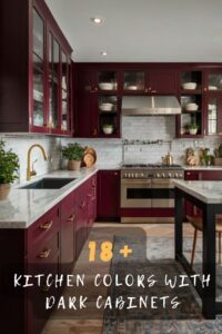
ray has emerged as one of the most popular cabinet colors in recent years due to its versatility and ability to work with a wide range of wall colors and design styles.
Pairing the right wall color with gray cabinets can help to accentuate the cabinetry or make a bold design statement.
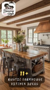
This article will explore 17 top kitchen wall color options that pair beautifully with gray cabinets.
Whether you prefer light and bright hues, rich jewel tones, or soothing neutrals, there is a color that will work perfectly with your gray cabinets.
Read on for inspiration and ideas to help you select the right kitchen wall color for your remodel or new construction project featuring gray as the cabinet shade.
Here is a suggested list of 17 top kitchen colors that pair well with gray cabinets:
💭 Ever wondered what your room would actually look like rearranged?
I built a free tool that lets you drag furniture around a 2D floor plan. No signup, no catch.
See the Room Planner →White
The light reflectiveness of white wall paint bounces light around the room, making the space feel larger and more open.
This helps gray cabinets recede and not feel too dark or heavy.
White paint provides high tonal contrast against gray cabinets, making cabinet fronts, knobs and pulls really stand out for easy visibility.
This helps with functionality.
White and gray have been a popular pairing for centuries.
They work well together because white is considered a neutral canvas that allows the gray cabinets to take center stage without dominating.
The white and gray color scheme is versatile, working with everything from traditional to contemporary to modern styles.
It allows homeowners to customize the look with accessories, backsplashes, lighting and more.
White is one of the lightest colors, so it keeps the mood in the room feeling fresh and inviting.
This is ideal for kitchens where homeowners spend a lot of time.
White shows minor spills, splatters and fingerprints less than darker colors.
So it requires less frequent washing and scrubbing to keep the walls looking clean.
In summary, white kitchen walls complement gray cabinets through contrast, timeless pairing, versatility across styles and keeping the space feeling bright, open and clean.
It maximizes visibility while letting the cabinets shine.
Tap to Explore These Beauties
See my ideas in action 👇 Tap any image to explore full details.
Light Gray
Light and medium gray walls create a seamless transition between cabinets and walls.
This produces a coordinated and pulled-together look.
The matching light-medium gray colors feel soothing, comfortable and consistent throughout the space.
It has an understated elegance.
Subtle tonal differences between light gray walls and cabinets feels relaxed and easy on the eyes compared to bolder pairings.
Light gray walls let the gray cabinets recede into the background instead of stand out.
This is ideal for those wanting cabinetry to be de-emphasized.
The light gray backdrop is versatile, pairing well with everything from white and wood to more colorful accents.
Since light gray walls are not as light as white, they mask dust, fingerprints and splatters more effectively, requiring less frequent cleaning.
The monochromatic light-medium gray scheme feels modern yet classic, working in any style from traditional to contemporary.
In summary, the matching light gray walls create a pulled-together look where cabinets blend evenly into the backdrop for a relaxing, coordinated feel.

Pale Blue

Light blue translates to feelings of tranquility, relaxation and calmness.
This is a welcome effect in a busy kitchen space.
Pale blue reads as a neutral but feels more interesting than beige or white.
It adds visual appeal without overwhelming the gray cabinets.
Blue’s chameleon abilities allow it to blend with yellow- or green-tinged grays as easily as taupe- or blue-gray cabinets.
As a light, soft pastel, pale blue livens up neutral gray cabinets without being too bold or colorful.
Ready to Master the Kallax?
Transform your IKEA cube storage into custom furniture. Get my complete guide with 100+ projects, material lists, and pro tips.
“The IKEA Kallax Bible: 100+ Ways to Transform Cube Storage”
It feels light and fresh.
From seaside cottages to modern farmhouses to classical designs, pale blue is a chic accent that complements traditional and contemporary aesthetics.
As a light color, pale blue hides marks and fingerprints like lighter neutrals do, reducing cleaning requirements over time.
In conclusion, pale blue kitchen walls match gray cabinets through their calming influence, versatile demeanor and ability to brighten up neutral cabinetry without dominating.
Dusty Rose
Dusty rose is a soft, subtle pink hue that provides gentle femininity without overwhelming the space.
The pink undertones in dusty rose help to warm up the cool tones of gray cabinets and make the space feel more welcoming and cozy.
Dusty rose looks beautiful paired with anything from light dove gray to charcoal gray cabinets since it’s a neutral, mid-tone pink.
While gray can feel a bit flat on its own, dusty rose lends lovely texture and depth to the palette without drawing too much attention away from the cabinets.
Like blush or pale blush, dusty rose bridges the gap between cool and warm colors, making it very adaptable for most design styles from traditional to contemporary.
As a light, muted tone, dusty rose walls will mask dirt, fingerprints and splashes just like lighter neutrals do for low-maintenance enjoyment.
Dusty rose brings a touch of soft femininity and warmth to gray cabinets while complementing their style in an understated, versatile way.
Find Your Room’s Color Palette
Tap a vibe — get a curated 5-color palette with hex codes you can copy ✨
Blush
Blush is a pale, muted pink tone that is lighter than dusty rose.
It provides all the soft feminine benefits of pink but in a more subtle manner.
As a very light hue, blush reads almost as a neutral.
It complements gray cabinets without being too bold or calling too much attention to itself.
The pale pink undertones in blush help warm up cool-toned grays.
This makes gray cabinets feel cozier and more welcoming without overpowering them.
Blush pairs beautifully with both light and dark shades of gray.
Its soft, neutral appearance meshes nicely with a wide variety of gray cabinet colors.
Like dusty rose, blush lends lovely texture and visual interest to gray cabinetry without distracting from their aesthetic.
As a neutral light pink, blush works with many different design styles from traditional to modern.
It’s a versatile hue.
Pale blush helps soften and brighten up gray cabinetry without feeling too powerful or feminine.
It’s a delicate complement.
So in summary, blush is a great lighter alternative to dusty rose for those wanting an even more subtle pink pairing with gray cabinets.
Pale Yellow

Pale yellow is a very light, muted yellow tone that is soft and subtle.
It brightens up gray without overwhelming it.
The light yellow undertones help to warm up cool-toned grays and make the kitchen feel sunnier and more cheerful.
As a neutral shade of yellow, pale yellow pairs beautifully with both light and dark gray cabinets.
It adds a touch of brightness and positivity to gray without feeling harsh like bright primary yellow could.
Ready to Master the Kallax?
Transform your IKEA cube storage into custom furniture. Get my complete guide with 100+ projects, material lists, and pro tips.
“The IKEA Kallax Bible: 100+ Ways to Transform Cube Storage”
The soft yellow hue provides lovely visual interest and texture but doesn’t distract from the cabinets.
Being a pale, muted tone helps it fade into the background as more of a backdrop for the cabinetry.
It keeps gray feeling light and fresh rather than dark and dreary like some neutrals could.
So in summary, pale yellow is a cheerful way to brighten gray cabinets lightly and neutralize any coldness from the gray.
Taupe
Taupe is a warm, neutral brownish-gray color that blends seamlessly with gray cabinets.
The gentle brown undertones in taupe help to warm up cool-toned grays without adding too much contrast.
It creates a sleek, coordinated look when used as both the cabinet and wall color.
Taupe allows the cabinets to recede into the background while providing an elegant, put-together aesthetic.
As a neutral, taupe is extremely versatile and will match a wide range of design styles from traditional to modern.
The subtle tone helps gray feel rich and sophisticated rather than cold and stark.
Taupe provides lovely visual depth and texture without stealing the spotlight from the cabinetry.
Being a warm, mid-tone grayish brown, it complements everything from light dove gray to charcoal cabinets.
The muted hue also does an excellent job masking any dirt or fingerprints over time.
In conclusion, taupe makes gray cabinetry feel polished and pulled-together through its seamless blending capabilities.
Dark Gray
Dark gray provides high contrast and definition against gray cabinets.
This makes the cabinetry really stand out.
It creates a bold, dramatic statement and makes the strongest visual impact of any light/dark pairing.
The contrast allows both the walls and cabinets to each have their own presence without blending together.
This look suits contemporary, modern and industrial styles where high contrast is desirable.
Dark gray reads as more of an accent that sets off the lighter gray cabinets as the hero.
It works best when combined with light or white countertops/fixtures for additional contrast.
The moody aesthetic feels especially tailored for evening/low-lit kitchen spaces.
Both colors will effectively mask any dirt or fingerprints over time.
Attention must be paid to balance so it doesn’t feel too stark or heavy throughout the day.
So in summary, dark gray provides a strong visual pairing for those wanting high definition between cabinets and walls in a modern, dramatic setting.
What’s Your Decor Personality?
5 questions · 30 seconds · Instant style match 🏡
Navy
Navy adds beautiful depth, richness and sophistication to the palette.
It’s a classic yet vibrant complement.
The dark yet bright tone provides a high contrast definition between the walls and light-medium gray cabinets.
Like dark gray, navy reads as more of an accent color to let the lighter gray be the focal point.
Its deep, jewel-tone hue works especially well in contemporary kitchen designs.
Navy creates a dramatic yet pulled-together aesthetic when paired with lighter grays, white countertops and ivory fixtures.
The beautiful wall color won’t compete with cabinetry but instead sets it off to maximum visual effect.
Its darker tone helps to mask fingerprints and spills better than lighter shades over time.
Navy feels elegant and tailored versus some brighter blues that could feel too bold.
Attention should be paid to balance out the rich tone with lighter elements for an inviting flow.
So, navy adds depth and richness to complement gray cabinets in a luxurious yet put-together coastal or modern design.
Ready to Master the Kallax?
Transform your IKEA cube storage into custom furniture. Get my complete guide with 100+ projects, material lists, and pro tips.
“The IKEA Kallax Bible: 100+ Ways to Transform Cube Storage”
Dark Green
Dark green has an earthy, nature-inspired vibe that feels fresh and versatile.
It pairs beautifully with grayscale tones.
The dark, saturated hue provides plenty of visual contrast with light-medium gray cabinets for definition.
Forest greens have a touch of darkness that offsets cool-toned grays and brings a sense of warmth.
It works especially well for rustic, botanical or cottage styles where greenery is incorporated.
Dark green can feel a bit moody but works well in kitchens with ample natural light through windows.
The brooding tone highlights the sleek sophistication of gray cabinetry within a relaxed setting.
It grounds cooler gray cabinetry through its earthy connection to nature.
The darker shade effectively hides marks and helps the space feel cozy and secluded.
Lighter accents like white subway tile still allow the gray to stand out prominently.
Dark green woodland shades beautifully complement gray cabinetry through contrast and natural, earthy warmth.
Terracotta
Terracotta is a rich, earthen tone that pairs beautifully with cool grays through its warm undertones.
The red-brown hue adds vibrancy and visual interest against light to medium gray cabinets.
It has a rustic, Mediterranean vibe that evokes a sense of relaxed luxury.
The saturated tone provides ample contrast for the cabinets without overwhelming them.
Textured terracotta tiles would look especially lovely alongside sleek gray cabinetry.
Its warm red undertones play well off both cool and taupe-tinged grays.
✦ You Might Love This
What If I Told You Black Cabinets Open Up A World Of Color Possibilities? Keep Reading →The mature tone feels grounded and sophisticated versus brighter reds.
It creates a pulled-together palette that suits classical and vintage styles.
Being a darker shade also masks marks nicely over time in high-traffic areas.
Light fixtures and natural wood accents allow the gray to subtly shine through.
In conclusion, terracotta beautifully complements gray cabinetry through its rustic warmth and contrasting visual appeal.
This or That?
Pick your fave — see what other readers chose! 👀
Olive
Olive is an earthy greenish-brown hue that adds depth and vibrancy to gray.
Its rich, saturated tone provides plenty of visual contrast with light-medium gray cabinets.
Warm brown undertones in olive help offset any coolness in grays for a cohesive look.
The natural, organic shade translates to a relaxed yet sophisticated aesthetic.
Textured olive wall tiles would look lovely alongside sleek, modern cabinetry.
It has versatility, pairing well with both cool and taupe-tinged grays.
Ready to Master the Kallax?
Transform your IKEA cube storage into custom furniture. Get my complete guide with 100+ projects, material lists, and pro tips.
“The IKEA Kallax Bible: 100+ Ways to Transform Cube Storage”
Like terracotta, olive feels grounded and mature versus brighter greens.
Creates a pulled-together palette suited for everything from farmhouse to Mediterranean styles.
The darker shade masks fingerprints and grease well over time.
White natural stone countertops let gray cabinetry subtly pop through.
In summary, olive beautifully complements gray cabinetry through its depth, contrast and earthy warmth – translating to a polished yet relaxed vibe.
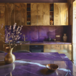
Dusty Purple
Dusty purple is a muted, softer shade of purple that reads almost mauve-like in hue.
This makes it feel feminine but not overly bold.
The soft tones provide pleasing contrast without being too harsh against light-medium gray cabinets.
Purple undertones warm up any cooler grays for a pulled-together color story.
As an elegant alternative to pinks and blues, it feels polished and unique.
Works well for traditional, vintage or eclectic kitchen designs where lavender is incorporated.
Could feel moody in a dark shade, so best in a lighter, muted iteration like dusty plum.
Provides lovely texture and visual interest without distracting from the cabinets.
White or light wood accents allow the gray to subtly stand out.
Being a deeper tone also masks marks and fingerprints well over time.
So in summary, dusty purple offers an elegant alternative to everyday pastels, complementing gray cabinetry through its feminine softness and temperature-warming tones.
Dark Wood
Dark wood like espresso or walnut adds rich warmth and luxury to a gray kitchen.
The tones complement each other beautifully.
Provides ample visual contrast that allows both colors to stand out equally without blending together.
Works particularly well for rustic, farmhouse or transitional style kitchens.
The wood grain adds lovely natural texture against sleek cabinetry surfaces.
Warm undertones in wood offset any coolness in gray for an inviting, balanced space.
Potential for open shelving against wood walls lets cabinets subtly shine.
May feel a tad heavy in large doses, so consider lighter accents too like white quartz.
High-gloss gray cabinets will look especially sharp contrasted with dark wood.
Requires more maintenance than paint but offers an artisanal, sophisticated vibe over time.
Light fixtures should balance the darkness and allow gray to glow through.
So in summary, dark wood makes gray cabinetry feel rich and polished through its warmth and natural complementarity.
Black
Black creates a high-contrast, dramatic backdrop that really makes gray stand out sharply.
Provides a moodier, more contemporary vibe suited to modern or industrial styles.
The darkness creates ample definition between walls and lighter gray cabinetry.
May feel too stark if used throughout, so consider black accent walls instead.
Works best with light or white countertops, backsplashes for visual lightening.
Pay attention to ample lighting fixtures so it doesn’t feel too heavy or dim.
Sleeker cabinets styles like gloss or lacquered will look ultra crisp against black.
Both colors hide dirt and grime well over time in high-traffic areas.
Sharp contrast also helps disguise any flaws or imperfections in the space.
Not for everyone but creates a striking aesthetic when balanced with lighter elements.
Black offers drama and dimension behind gray cabinets but needs lightening accents for an inviting flow.
Sharp contrast makes it a bold statement.
Ready to Master the Kallax?
Transform your IKEA cube storage into custom furniture. Get my complete guide with 100+ projects, material lists, and pro tips.
“The IKEA Kallax Bible: 100+ Ways to Transform Cube Storage”
Quick Design Dilemma
Cast your vote — see what other readers think! 🤔
White Shaker Panels
White shaker panels are a classic, versatile choice that will look fresh and clean paired with nearly any wall hue.
Light, bright colors like pale gray, pale yellow or light blue will make the white cabinets really pop without competing.
Warm neutrals like taupe, putty or light wood tones provide lovely contrast while still maintaining a light, airy feel.
Bolder colors in small doses like navy, olive or terracotta provide visual interest behind the cabinets without overwhelming the white.
Darker walls like espresso or navy set the white shakers off to beautiful definition while keeping the kitchen from feeling too stark.
Black creates maximum high-contrast definition and makes the cabinets feel ultra crisp and polished.
White on white keeps things simple and let’s other décor like backsplashes take center stage.
The shaker panels are versatile enough to work with anything from light and airy to moody and modern color schemes.
So, white shaker cabinets allow for flexibility and will look both classic and contemporary alongside different wall hues.
Seafoam Green
Seafoam green is a light, fresh aquatic hue with subtle blue and green tones.
Provides high contrast definition against gray or white cabinets in a soft, refreshing way.
Invokes feelings of calmness like the sea with its pale, mossy tone.
Works for coastal, beachy or modern mermaid-inspired kitchens.
Lighter than bolder blues which could overwhelm neutral cabinets.
Adds an underwater dreaminess to the space.
White, gray or pale wood accents prevent it feeling too bright.
Small amounts prevent it from veering into hospital-like territory.
Stands out beautifully against light neutral tones.
Creates a cheery, unique look you don’t see in every home.
So in summary, seafoam green offers a whimsical pop of color that beautifully highlights neutral cabinets through its high contrast, yet soft aesthetic evoking waves crashing on the shore.
A lovely conversational option.
Choosing wall colors that complement gray or white kitchen cabinets gives your space beautiful harmony and balance.
The right hues provide visual definition, warmth or contrast as needed.
Keeping other design elements like countertops, fixtures and backsplashes in lighter colors also ensures the cabinets remain the beautiful focus.
Experimenting with color swatches beforehand is key to finding perfect pairings you’ll love for years to come.
With the right wall colors supporting them, gray or white cabinets provide a polished backdrop to make any kitchen design come together in sophisticated style.