ot gray cabinets in your kitchen?
You’re in good company!
Gray cabinets have become super popular because they look clean, modern, and go with practically everything.
But now you’re probably wondering what color to paint your walls to make those gorgeous gray cabinets really shine.
That’s where this post comes in handy!
The best part?
Many of my ideas are trending right now on Pinterest, so you know your kitchen will look up-to-date and stylish:
Crisp White: The Classic Companion


White walls and gray cabinets are like peanut butter and jelly – they just work perfectly together.
This combo creates a clean, bright, and timeless look that never goes out of style.
When you pair your gray cabinets with white walls, you’re creating a canvas that can adapt to any decorating style you might want to try in the future.
The white walls make the space feel bigger and brighter by reflecting light around the room.
This is especially helpful if your kitchen doesn’t get a ton of natural light.
Not all whites are the same though – you’ve got options ranging from stark whites to softer off-whites.
If your gray cabinets have cool undertones (bluish), a pure white like Benjamin Moore’s “Simply White” creates a crisp, modern look.
For gray cabinets with warm undertones (brownish), try a warmer white like Sherwin Williams’ “Alabaster” to keep everything harmonious.
White walls also give you total freedom with your accessories and decor.
You can add colorful dishes, bright tea towels, or vibrant artwork, and they’ll all pop against the neutral backdrop.
The white and gray combo works in farmhouse kitchens, modern spaces, traditional homes – literally everywhere!
This pairing also makes your kitchen look super clean and organized (even when it might not be!).
One cool trick is to use white subway tile as a backsplash to tie the white walls and gray cabinets together even more.
You can add interest with different grout colors – light gray grout blends in for a seamless look, while darker grout creates more pattern and definition.
If an all-white wall feels too stark for you, consider adding some texture with shiplap or beadboard painted white.
This gives you the brightness of white but with added dimension that catches shadows and creates interest.
White walls also make your cabinet hardware really stand out, so it’s a great opportunity to showcase special knobs or pulls.
For an extra designer touch, consider painting your ceiling a high-gloss white to reflect even more light down into the space.
Tap to Explore These Beauties
See my ideas in action 👇 Tap any image to explore full details.
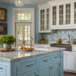
Soft Blue: A Calming Contrast

Soft blue walls create a soothing, almost spa-like atmosphere when paired with gray cabinets.
This combination feels both fresh and relaxing at the same time.
Think about the peaceful feeling you get when looking at a light blue sky – that’s the vibe you’re bringing into your kitchen.
Blue and gray are natural partners because they both have cool undertones that complement each other beautifully.
Light blue shades like powder blue, sky blue, or pale aqua create a subtle contrast that isn’t overwhelming.
This color combo works especially well if you want your kitchen to feel like a calming retreat from the chaos of daily life.
The soft blue adds just enough color to keep the space from feeling too neutral or boring.
When the morning light hits blue walls, they create a gentle glow that makes your kitchen feel welcoming and bright.
For the perfect shade, look at colors like Benjamin Moore’s “Blue Veil” or Sherwin Williams’ “Atmospheric.”
These light blues have just a hint of gray in them, which helps them coordinate seamlessly with your gray cabinets.
If your cabinets are a darker gray, a lighter blue creates beautiful contrast that highlights both colors.
💭 Ever wondered what your room would actually look like rearranged?
I built a free tool that lets you drag furniture around a 2D floor plan. No signup, no catch.
See the Room Planner →For lighter gray cabinets, you can go with a slightly deeper blue for definition.
The great thing about this combo is that it works with many decorating styles – from coastal to farmhouse to contemporary.
You can accent this color scheme with natural wood tones, white countertops, or brushed nickel hardware.
For a coordinated look, pull in some blue accessories like tea towels, a mixer, or decorative plates.
Small pops of yellow or green look amazing as accent colors with the blue and gray foundation.
If painting all your walls blue feels like too much, consider using the blue on just one accent wall behind the sink or stove.
Another option is using blue in an adjacent dining area while keeping the main kitchen walls white.
The soft blue and gray palette also makes stainless steel appliances look perfectly at home in your space.
This color combination photographs beautifully too – perfect for those kitchen snapshots you’ll want to share!
Light Gray: Monochromatic Magic


Painting your walls a similar gray to your cabinets creates a sophisticated, monochromatic look that designers love.
This approach feels cohesive and intentional, like you really thought about your design choices.
The key to making this work is choosing a wall color that’s a shade or two lighter than your cabinets.
This subtle difference creates depth without harsh contrasts.
A monochromatic gray palette creates a peaceful vibe that feels both modern and timeless.
This look is particularly popular in minimalist and Scandinavian-inspired kitchens.
When you go monochromatic, your eye notices textures and materials more than color differences.
This makes it a perfect backdrop for showcasing beautiful countertops, statement lighting, or special cabinet hardware.
Light gray walls have a chameleon-like quality, sometimes appearing almost white and other times showing more color depending on the lighting.
This changeability adds interest to your space throughout the day.
For this look to succeed, pay attention to the undertones in your cabinet gray and match them in your wall color.
If your cabinets have warm undertones, choose a warm-toned light gray for your walls like Sherwin Williams’ “Agreeable Gray.”
For cool-toned cabinet grays, try something like Benjamin Moore’s “Gray Owl” on your walls.
The monochromatic approach makes your kitchen feel larger and more open because there are fewer visual interruptions.
This is especially helpful in smaller kitchens or galley layouts.
To prevent a monochromatic gray kitchen from feeling flat, incorporate plenty of texture and materials.
Consider a marble or butcher block countertop, woven baskets, or textured glass pendant lights.
Metal accents like copper or brass hardware and fixtures pop beautifully against an all-gray backdrop.
This creates welcome warmth in what could otherwise be a cool-toned space.
Window treatments in similar tones but with subtle patterns can add interest without breaking the monochromatic theme.
If you’re worried about too much gray, introduce small colorful accessories that can be easily changed with the seasons.
The all-gray approach also makes for a perfect background for houseplants, which add life and organic shapes to the space.
Don’t forget that lighting plays a huge role in how grays appear – make sure you have adequate lighting sources throughout your kitchen.
Sage Green: Nature-Inspired Harmony


Sage green walls create a nature-inspired backdrop that makes gray cabinets feel grounded and organic.
This muted green has become super popular lately, and for good reason!
Sage green has a calming effect that makes your kitchen feel like a peaceful retreat connected to the outdoors.
This color works because it’s a “new neutral” – colorful enough to be interesting but subtle enough to live with long-term.
Gray and sage green are natural partners because they both have a soft, muted quality that doesn’t compete for attention.
The earthy green adds warmth to cool gray cabinets, creating a balanced feel that’s neither too cool nor too warm.
Sage green works with both light and dark gray cabinets, though it creates different effects with each.
With light gray cabinets, sage creates a soft, airy feel perfect for morning coffee and bright breakfasts.
When paired with dark gray cabinets, sage green walls create more drama and sophistication for a moodier vibe.
This combination feels especially current right now as more people bring nature-inspired colors inside.
Sage green has versatile undertones that can lean more gray, blue, or even slightly yellow depending on the specific shade.

Find Your Room’s Color Palette
Tap a vibe — get a curated 5-color palette with hex codes you can copy ✨
💭 I Wrote a Book About My Biggest Decorating Mistakes!
When I decorated my first home, I thought I knew what I was doing. Spoiler: I didn’t. 😅
💸 I bought a sofa way too big for my living room. Paint colors that looked amazing in the store but terrible on my walls.
Look for shades like Benjamin Moore’s “Saybrook Sage” or Sherwin Williams’ “Clary Sage” for that perfect muted green.
This color combo works beautifully with natural materials like wood, stone, and plants.
Try adding wooden cutting boards, stone countertops, or a collection of herbs in terra cotta pots to enhance the nature-inspired theme.
Metal finishes that look amazing with this combination include brushed brass or bronze for warmth.
The gray and sage palette creates a perfect backdrop for vintage or antique pieces that add character to your kitchen.
For a complete look, consider carrying the sage green into adjacent spaces like a breakfast nook or pantry.
If you want a more subtle approach, use sage green as an accent on an island or butler’s pantry instead of all the walls.
This color combination is easy to accessorize – cream, white, black, and natural wood tones all work seamlessly.
Sage green is also a color that transitions beautifully through seasons – it feels fresh in spring, cool in summer, rich in fall, and cozy in winter.
Warm Beige: Cozy and Inviting
Warm beige walls bring a cozy, inviting feeling to kitchens with gray cabinets.
This combination bridges the gap between cool and warm color palettes beautifully.
If you’ve been hesitant about gray cabinets because they can sometimes feel a bit cold, beige walls are your perfect solution.
The warmth of beige softens the coolness of gray, creating a balanced space that feels welcoming.
Beige has made a major comeback in interior design, leaving behind its boring reputation and emerging as a sophisticated neutral.
Today’s beiges often have complex undertones that add depth and interest to your walls.
This color combination works particularly well in kitchens that open to living spaces where you want a cohesive, flowing feel.
Look for beiges with a slight pink or yellow undertone like Benjamin Moore’s “Manchester Tan” or Sherwin Williams’ “Accessible Beige.”
These warm neutrals make your kitchen feel like the heart of the home – a place where people naturally want to gather.
The gray-beige combo creates a versatile backdrop for both cool and warm accent colors.
You can easily incorporate blues, greens, reds, or oranges as accent colors through accessories and décor.
This pairing works with virtually any style from traditional to transitional to modern farmhouse.
The beige walls make wood elements like floating shelves or a butcher block island look especially rich and beautiful.
This combination also works wonderfully with stone countertops, particularly those with beige, cream, or taupe veining.
For a designer touch, consider adding textured beige wallpaper on one wall while painting the others.
Beige walls make stainless steel appliances stand out less than white walls do, creating a more integrated look.
If your kitchen doesn’t get a lot of natural light, beige walls can help it feel warmer and more inviting than stark white.
This color combination also hides everyday kitchen messes better than higher-contrast combinations.
For a cohesive look throughout your home, beige walls allow gray kitchen cabinets to blend beautifully with wood furniture in adjacent rooms.
Gold or brass hardware and fixtures pop against gray cabinets while complementing the warmth of the beige walls.
Navy Blue: Bold and Dramatic
Navy blue walls create a bold, dramatic backdrop that makes gray cabinets look incredibly sophisticated.
This high-contrast combination makes a statement that visitors won’t soon forget.
Navy blue might seem like a daring choice, but it’s actually considered a new neutral in interior design circles.
The deep blue creates a cozy, embracing feeling that makes large kitchens feel more intimate.
Gray and navy share cool undertones, making them natural partners that enhance each other’s best qualities.
This combo works especially well if you have a well-lit kitchen, as the navy provides a rich background without making the space feel dark.
With light gray cabinets, navy walls create a striking contrast that highlights the cabinet details.
For darker gray cabinets, navy walls create a moody, monochromatic feel that’s very on-trend right now.
The navy and gray combination feels both classic and current at the same time – it won’t go out of style quickly.
Try colors like Benjamin Moore’s “Hale Navy” or Sherwin Williams’ “Naval” for that perfect deep blue that isn’t too purple or black.
White countertops and backsplashes pop dramatically against navy walls, creating a crisp, clean look.
This color combination works beautifully with brass or gold hardware and fixtures, which shine like jewelry against the deep background.
If painting all your walls navy feels too overwhelming, consider using it just on a focal wall or in a connected dining nook.
Navy blue has historically been used in formal dining rooms, so it brings a touch of that elegance into your kitchen space.
This color combination creates a perfect backdrop for displaying white dishes or pottery on open shelving.
The contrast between the navy walls and gray cabinets creates natural visual zones in your kitchen.
For a cohesive look, pull small navy blue accents into your accessories like tea towels, small appliances, or artwork.
This combination works with many different flooring options from light wood to tile to darker hardwoods.
A navy and gray kitchen can handle pops of unexpected color like coral, mustard yellow, or emerald green in small doses.
This dramatic color combination creates a kitchen that feels special and intentionally designed rather than builder-grade basic.

Pale Yellow: Sunny and Cheerful
Pale yellow walls bring sunshine and cheer to kitchens with gray cabinets.
This combination creates a space that feels happy and welcoming year-round.
The contrast between cool gray and warm yellow creates a balanced space that’s neither too cool nor too warm.
Yellow is known to stimulate conversation and appetite, making it a perfect choice for the heart of your home.
For a successful pairing, choose a soft, buttery yellow rather than something bright or neon.
Look at shades like Benjamin Moore’s “Hawthorne Yellow” or Sherwin Williams’ “Butter Up” for that perfect pale yellow tone.
This color combination brings to mind sunny breakfast nooks and cheerful Sunday morning pancake sessions.
The pale yellow brightens and warms spaces that don’t get a lot of natural light.
This pairing works especially well in north-facing kitchens that tend to receive cooler, bluer light.
The gray cabinets provide a solid anchor that keeps the yellow from becoming overwhelming or too childish.
This color combo fits perfectly with farmhouse, cottage, or traditional kitchen styles.
For a coordinated look, pull small yellow accents into your kitchen accessories or artwork.
White trim and ceilings look crisp and clean against pale yellow walls, creating nice definition.
This combination works well with many countertop options, from white quartz to butcher block to darker granites.
Black hardware on the gray cabinets creates a nice contrast that defines the cabinet details.
The yellow and gray combination offers a perfect backdrop for displaying colorful cookware or dishware collections.
If painting all walls yellow feels too much, consider using it just on the wall above your cabinets or in an adjacent breakfast area.
This cheerful palette transitions beautifully through the seasons – it’s bright in summer and cozy in winter.
Plants and herbs look fantastic against the yellow backdrop, bringing in natural elements that enhance the sunny feel.
Morning light makes yellow walls glow beautifully, starting your day on a positive, energetic note.
What’s Your Decor Personality?
5 questions · 30 seconds · Instant style match 🏡
Soft Pink: Unexpected and Fresh

Soft pink walls create an unexpected and fresh pairing with gray cabinets that feels modern and sophisticated.
This isn’t your little kid’s pink – we’re talking about mature, muted pinks with gray undertones.
The combination of soft pink and gray has become increasingly popular in high-end design for its subtle elegance.
This color combo works because pink and gray are both considered new neutrals in contemporary design.
Blush pink or “millennial pink” walls bring warmth and personality to kitchens without overwhelming the space.
The key is choosing a pink that’s muted and sophisticated like Benjamin Moore’s “Love and Happiness” or Sherwin Williams’ “Intimate White.”
Gray cabinets keep the pink walls from feeling too sweet or feminine, creating a balanced space that appeals to everyone.
This combination works equally well with light or dark gray cabinets, though each creates a different mood.
Light gray cabinets with pink walls create an airy, Scandinavian-inspired look that feels fresh and contemporary.
Dark gray cabinets with pink walls create more drama and contrast for a bolder, more fashion-forward statement.
This color combination is perfect for people who want something different without going too wild with color.
The pink adds just enough personality to keep the space from feeling sterile or boring.
Silver or chrome hardware looks crisp and clean against this color palette, enhancing the contemporary feel.
White countertops and backsplashes help bridge the pink and gray, creating a cohesive look.
This combination photographs beautifully and is sure to get lots of attention and likes on your Pinterest or Instagram posts.
Small touches of black as accents help ground this color scheme and keep it from looking too sweet.
The pink and gray palette works well with marble or quartz countertops that have pink undertones or veining.
For a coordinated look, pull tiny touches of pink into your accessories or artwork.
This combination feels extra special with plants that have pink or purple-toned leaves like Chinese evergreens or certain varieties of fittonia.
Though unexpected, this color combination has staying power because it’s subtle enough to live with long-term.
Rich Green: Elegant and Timeless
Rich green walls paired with gray cabinets create an elegant, timeless look that’s both bold and sophisticated.
Think deep emerald or hunter green rather than bright or lime greens.
This combination feels luxurious and draws inspiration from classic English and Victorian design traditions.
The deep green brings a connection to nature while maintaining a formal, tailored appearance.
Gray and green are natural companions since green contains blue (which pairs beautifully with gray) and yellow (which adds warmth).
This color combination works in both traditional and modern contexts – it’s that versatile.
Look at colors like Benjamin Moore’s “Hunter Green” or Sherwin Williams’ “Rookwood Green” for that perfect rich tone.
Light gray cabinets create beautiful contrast against the deep green, highlighting both colors.
Dark gray cabinets create a moodier, more dramatic space that feels cocoon-like and intimate.
This combination works especially well in kitchens with good natural light, as the deep walls absorb some brightness.
The rich green brings a sense of nature and the outdoors inside, even in urban environments.
Brass or gold hardware and fixtures pop beautifully against both the gray cabinets and green walls.
This color combination feels especially luxurious with marble or quartzite countertops in white or cream.
If painting all walls dark green feels too bold, try using it on just one focal wall or in a connected pantry or bar area.
Wood accents like cutting boards, bar stools, or floating shelves add warmth and natural texture to this color scheme.
The green and gray palette handles seasonal decorating beautifully, working well with everything from spring flowers to fall pumpkins to winter greenery.
This combination feels both trendy and timeless – it’s getting lots of attention in design magazines but has historical precedent as well.
For a cohesive look, consider adding small green accents in glassware, plants, or artwork.
White trim creates beautiful definition against the rich green walls, framing the space nicely.
This color combination creates a kitchen that feels designed with intention rather than following the crowd.
Warm Terra Cotta: Southwestern Charm
Warm terra cotta walls bring southwestern charm and earthy warmth to kitchens with gray cabinets.
This rich, clay-inspired color adds instant character and makes your kitchen feel unique and personal.
Terra cotta and gray might seem like an unusual combination, but they balance each other perfectly.
The warmth of the terra cotta softens the coolness of gray cabinets, creating a harmonious whole.
This color combination feels connected to nature and brings the outdoors inside in a subtle way.
Look for terra cotta shades that lean more muted rather than bright orange, such as Sherwin Williams’ “Cavern Clay” or Benjamin Moore’s “Audubon Russet.”
The earthy orange-brown of terra cotta creates a welcoming backdrop that makes people want to gather and linger.
This color brings warmth to north-facing kitchens or spaces that don’t get a lot of natural sunlight.
The combination works particularly well with natural materials like wood, stone, and handmade ceramic pieces.
Light gray cabinets create nice contrast against the warm walls, allowing both colors to stand out.
For darker gray cabinets, the terra cotta prevents the space from feeling too dark or heavy.
This or That?
Pick your fave — see what other readers chose! 👀
💭 I Wrote a Book About My Biggest Decorating Mistakes!
When I decorated my first home, I thought I knew what I was doing. Spoiler: I didn’t. 😅
💸 I bought a sofa way too big for my living room. Paint colors that looked amazing in the store but terrible on my walls.
This combination supports a variety of design styles from Southwestern to Mediterranean to modern rustic.
Black or iron hardware and fixtures ground this color scheme and add a handcrafted feel.
The terra cotta and gray palette opens up possibilities for accent colors like turquoise, deep blue, or olive green.
This combination photographs beautifully in both natural and artificial light, creating a photogenic kitchen.
Natural wood elements like open shelving, cutting boards, or a butcher block island enhance the earthy feel of this palette.
If painting all walls terra cotta feels too bold, use it on just one accent wall or in a connected dining nook.
Plants, especially those with structural forms like succulents or fiddle leaf figs, look stunning against terra cotta walls.
This warm color makes your kitchen feel extra cozy during fall and winter months while still looking fresh year-round.
The gray and terra cotta combination feels current but not trendy – it has staying power that won’t quickly date your kitchen.
Pale Lavender: Subtle and Sophisticated
Pale lavender walls create a subtle, sophisticated backdrop for gray cabinets that feels fresh and unexpected.
This isn’t a bright purple – we’re talking about the most delicate shade of lavender that almost reads as a neutral.
The combination creates a space that feels both calming and uplifting at the same time.
Lavender and gray share cool undertones that make them natural companions in a color scheme.
This pairing works because the gray grounds the lavender, keeping it from feeling too sweet or feminine.
Look for very pale lavenders like Benjamin Moore’s “Dreamy Cloud” or Sherwin Williams’ “Potentially Purple” that have gray undertones.
These super-soft purples can actually function as neutrals in your space while adding just a hint of color.
The lavender brings a subtle energy to the kitchen without overwhelming the senses.
This combination works equally well with light or dark gray cabinets, though each creates a different mood.
Light gray cabinets paired with pale lavender create an airy, almost ethereal kitchen that feels peaceful and serene.
Dark gray cabinets with lavender walls create more contrast and drama while still maintaining a sophisticated vibe.
This color combination feels especially fresh and clean in morning light – perfect for starting your day.
The lavender-gray palette pairs beautifully with marble or quartz countertops, especially those with subtle purple or blue veining.
Silver, chrome, or nickel hardware enhances the cool tones in this color scheme for a cohesive look.
If you’re worried about too much purple, use the lavender only on one wall or in an adjacent breakfast nook.
Small touches of black help ground this palette and keep it from feeling too dreamy or insubstantial.
This combination works well with both warm and cool accent colors from amber to teal.
The soft lavender walls make a perfect backdrop for displaying white dishes or pottery on open shelving.
This color combination feels especially current but not overly trendy – it has a timeless quality while still being unique.
The lavender-gray kitchen creates a perfect setting for both everyday family meals and special occasions.
Charcoal: Bold Contrast
Charcoal walls create bold contrast with light gray cabinets for a dramatic, designer-approved look.
This dark-on-light approach turns your kitchen into a statement space that commands attention.
The monochromatic palette creates a sophisticated, modern vibe that feels intentional and curated.
This combination works best when your light gray cabinets lean toward white or silver rather than beige undertones.
Charcoal walls make your light cabinets pop forward visually, highlighting their details and hardware.
Look for deep charcoal shades like Benjamin Moore’s “Wrought Iron” or Sherwin Williams’ “Tricorn Black” that have depth without reading as pure black.
This high-contrast approach creates natural visual zones in your kitchen, defining different areas clearly.
The dark walls absorb light while the light cabinets reflect it, creating a balanced lighting effect.
This combination works particularly well in kitchens with plenty of natural light or good artificial lighting.
White countertops and backsplashes pop dramatically against the dark walls, creating a striking contrast.
This color approach fits perfectly with contemporary, industrial, or modern farmhouse kitchen styles.
Metallic accents like brass or copper hardware shine brilliantly against this high-contrast backdrop.
If painting all walls charcoal feels too dark, consider using it just on one focal wall behind open shelving or the range.
This dramatic palette allows colorful accessories or appliances to stand out beautifully as accents.
The charcoal and light gray combination creates a perfect background for displaying colorful dishware or art.
Wood elements like floating shelves or bar stools add necessary warmth to this cool-toned palette.
This combination is particularly effective in open concept spaces where you want the kitchen to have its own defined character.
Under-cabinet lighting becomes especially effective with dark walls, creating dramatic pools of light on work surfaces.
Plants and greenery pop vividly against the dark background, adding life to this monochromatic scheme.
This bold approach creates a kitchen that feels purposefully designed rather than dictated by safe choices.
Teal Blue: Vibrant and Energetic
Teal blue walls bring vibrant energy to kitchens with gray cabinets, creating a space that feels alive and dynamic.
This rich blue-green color adds personality and character that makes your kitchen truly unique.
Teal and gray are perfect partners because they share cool undertones that create a harmonious relationship.
The vibrant teal prevents the gray from feeling flat or boring, infusing the space with energy.
This combination works in kitchens of all sizes, though it can make small spaces feel especially jewel-box special.
Look for true teals like Benjamin Moore’s “Aegean Teal” or Sherwin Williams’ “Oceanside” that balance blue and green equally.
Light gray cabinets let the teal walls be the star, creating a beautiful backdrop that highlights your cabinets.
Dark gray cabinets paired with teal create a moodier, more dramatic space that feels cozy and enveloping.
This color combination brings to mind tropical waters and vacation vibes – perfect for creating a happy, uplifting kitchen.
The teal-gray palette opens up possibilities for accent colors like coral, yellow, or even copper and gold metallic tones.
Brass or gold hardware and fixtures pop beautifully against both the gray cabinets and teal walls.
This combination works well with many countertop options from white quartz to butcher block to concrete.
If painting all walls teal feels too bold, try using it just on one accent wall or in an adjacent breakfast nook.
The rich teal creates a beautiful backdrop for displaying dishes, artwork, or collectibles on open shelving.
This color combination transitions beautifully through seasons with different accent colors – coral in summer, rust in fall, red in winter, yellow in spring.
Plants look especially vibrant against teal walls, creating opportunities for a indoor herb garden with both function and beauty.
The teal and gray combination photographs extraordinarily well, making your kitchen instantly Pinterest-worthy.
This pairing works with many design styles from coastal to boho to mid-century modern.
The vibrant walls make even the most basic cabinet style look intentional and designer-chosen.
This bold color combination creates a kitchen that feels personal and customized rather than cookie-cutter basic.
Quick Design Dilemma
Cast your vote — see what other readers think! 🤔
Dark Pink

While gray cabinets can lean sterile if not balanced right, pink offsets this nicely.
It has the effect of softening hard lines and edges which is especially conducive for social family spaces.
The pink also picks up undertones within the wood grain that you may not realize are there otherwise.
In terms of design style, pink works beautifully for both contemporary farmhouse kitchens with white marble and mixed metals, as well as more traditional settings layered with floral textiles and caning details.
It lends romance wherever you choose to incorporate it.
Orange

I’ll admit orange is not the first hue that comes to mind when pairing with gray cabinets.
But hear me out – when used skillfully, a bright burst of orange really energizes gray in a beautiful way.
While bold, keeping the orange on the lighter side, like a soft tangerine or coral, prevents it from overwhelming the space.
These tones flatter gray fabulously instead of fighting against it.
The gray acts as an anchoring neutral to let the orange pop without clutter.
What’s great is gray is versatile enough to pair with both warm and cool hues.
So oranges balance the cool undertones beautifully with their luminosity and sunshine feel.
It creates visual synergy between the two.
I find citrus shades work especially nice for coastal or casual kitchen styles when contrasted with white oak cabinetry.
Layer in woven seagrass accents and you have a colorful yet breezy vibe.
For clients wanting a bolder accent, consider an orange backsplash, barstools or artwork instead of taking the full wall.
Used strategically, it’s a vibrant surprise.
So while an unexpected combo, when balanced skillfully orange truly brings gray cabinets to vibrant life in my professional opinion as a designer.