

Okay, I have to start here because this one hit me hard.
Last winter I pulled my great-aunt’s old quilt out of a cedar chest and draped it over my reading chair, almost as an afterthought.
And the whole room changed.
It wasn’t just a blanket anymore, it was a whole mood.
There’s something about the slightly faded reds and creams, the uneven stitching, the way you can tell real hands made it, that no mass-produced throw can fake.
I’m obsessed with mixing a few patterns together, a star quilt with a simple gingham throw, layered right over the back of a sofa or the foot of a bed.
If you don’t have a family heirloom lying around, flea markets are goldmines for this.
Look for the ones with a little wear, honestly, the imperfect ones are the best ones.
A slightly frayed edge just tells you it’s been used, been loved, been part of somebody’s actual life.
My personal tip: wash it once in cold water with a gentle detergent before you style it, just to soften it up and get that lived-in drape.
And if the colors feel too loud for your space, drape it inside out for a season, the backing fabric is usually more muted.
Optional variation: fold it in thirds at the end of the bed instead of draping it fully, it reads a little more polished if that’s the vibe you’re after.
Either way, this is the cheapest, fastest way to make a room feel instantly warmer.
Flea Market Finds That Actually Have a Story

I used to think flea markets were just for people with a lot of patience and an eye I didn’t have.
Turns out I just needed to slow down.
The first time I really dug in, I found an old porcelain milk pitcher with a hairline crack, and I almost put it back.
But something told me to grab it, and now it holds wildflowers on my kitchen counter every single week.
That’s the thing about Americana pieces from actual flea markets, they carry a little bit of mystery with them.
You don’t know whose table they sat on, whose hands held them, but you can feel that they mattered to someone once.
I love hunting for things like old tin advertising signs, wooden toolboxes, chipped ironstone plates, and rusted milk crates.
Don’t go in with a shopping list, honestly, that’s where I went wrong at first.
Go in with a feeling you’re chasing instead, cozy, nostalgic, sun-faded, whatever word describes the home you’re dreaming of.
My hack: bring a small tote bag and a tape measure, because you will find something you didn’t plan for and you will need to know if it fits.
Bargain gently but kindly, a lot of these sellers are just clearing out family homes and they appreciate someone who actually wants the piece, not just the discount.
I’d rather pay full price for something with soul than get a deal on something soulless.
Vintage Enamelware in the Kitchen

There’s a specific joy in cooking with a pot that’s older than you are.
I picked up a robin’s egg blue enamel colander a few years back, and it still makes me smile every time I use it.
Enamelware just has this soft, chippy texture that plastic and stainless steel can’t touch, literally and emotionally.
The little dings and worn spots aren’t flaws, they’re basically the whole point.
I like mixing a few pieces into open shelving, a stack of enamel bowls next to my everyday dishes, so it doesn’t feel like a museum display.
Cream and red combinations feel the most classically Americana to me, but the soft blues and greens are having a real moment too.
If you’re nervous about actually cooking in vintage pieces, start smaller, use them for serving bread, holding fruit, or catching utensils by the stove.
Function first, nostalgia second, and somehow you get both anyway.
My personal recommendation is to check estate sales specifically for this, they tend to have kitchen lots that get overlooked by bigger furniture shoppers.
And if you can’t find real vintage, there are some newer brands doing a really convincing chippy-paint look, which is a totally valid shortcut if your budget or time is tight.
I don’t believe in decor gatekeeping, so no judgment either way.
Gingham and Ticking Stripes Everywhere

I didn’t expect to fall this hard for a stripe, but here we are.
Ticking stripe fabric, that classic thin navy or red line on cream cotton, has become one of my favorite textures to layer into a room.
It reads farmhouse, it reads Americana, and somehow it still feels fresh instead of overdone.
I used it on a set of dining chair cushions last spring and it completely shifted the feel of that whole corner of my house.
Gingham is the softer, sweeter cousin, and I love it in smaller doses, a table runner, a set of napkins, a curtain in a breakfast nook.
Too much of either can start to feel like a costume, so I try to keep it to two, maybe three spots in a room.
My little rule of thumb, if you’re using a bold pattern on fabric, keep your walls and big furniture pieces neutral so the texture gets to be the star.
A cozy tip: layer ticking stripe pillows on a plain linen sofa, it instantly adds that lived-in, collected-over-time feeling without looking busy.
I also love finding actual vintage grain sack fabric with the stripe woven right in, it’s a little pricier but it feels genuinely special.
If sewing isn’t your thing, no worries, there are so many ready-made pillow covers now that nail this look without any effort on your end.
Farmhouse Signs and Hand-Painted Typography

I’ll be honest, I was firmly over the “live laugh love” wood sign era for a while.
But the vintage version of this, the genuinely old advertising signs and hand-painted lettering, hits totally different.
I found an old feed store sign at an antique mall with peeling red paint and a font that looked hand-drawn, and it’s now the first thing people notice in my entryway.
There’s something about imperfect, hand-lettered type that feels so much more human than anything printed today.
If you can’t find an original, look for reproductions that keep the imperfect brush strokes instead of a crisp digital font pretending to be old.
I lean into signs with a little bit of a story on them, an old town name, a product that doesn’t exist anymore, a faded price.
It gives guests something to ask about, and honestly, that’s half the fun of decorating this way.
My tip here, don’t center it perfectly, let it sit slightly off to one side of a mantel or wall, it reads more authentic that way.
And keep the phrase or image simple, one bold word or image does more work than a paragraph of text ever could.
This is one of those pieces where a little goes such a long way.
Mason Jars and Vintage Glass Bottles

I know, I know, mason jars had their whole moment already.
But the vintage ones, the ones with the actual blue-green tint and the raised lettering on the glass, are a completely different animal from the mass-produced version.
I keep a small collection on my windowsill and the way the afternoon light hits them is honestly one of my favorite parts of my day.
Old glass bottles, the kind that used to hold soda or milk, have that same soft, imperfect quality, tiny bubbles in the glass, a slightly uneven shape.
I like grouping them by color instead of size, it creates this nice little gradient effect on a shelf.
Fill them with dried wildflowers, a few sprigs of eucalyptus, or honestly nothing at all, sometimes empty is the most beautiful option.
My hack for finding the real vintage tint, look for jars marked with an actual manufacturer name pressed into the glass, not painted on.
Avoid anything that looks brand new but is trying to look old, you can usually tell by how uniform and shiny it is.
These are such a low-cost way to bring in that Americana feeling, and they genuinely never go out of style in my book.
The Classic Americana Color Palette

This is the part where I get a little bit nerdy about color, so bear with me.
The real Americana palette isn’t the bright red-white-and-blue you’re picturing from a Fourth of July party.
It’s muted.
It’s a faded barn red, a soft cream, a worn denim blue, maybe a touch of mustard or forest green.
When I repainted my living room, I chose a warm off-white instead of a stark white, and it made every vintage piece I own look so much richer against it.
Think about how these colors actually look after decades of sun fading and gentle wear, that’s the tone you’re chasing, not the crayon-box version.
My tip, pull your palette from one specific object you already love, an old quilt, a piece of pottery, a faded photograph, and build the room’s colors from there.
It keeps everything feeling cohesive instead of like a checklist of “Americana colors” thrown together.
I also love a deep, aged navy on a single accent wall or door, it grounds the whole room without feeling heavy.
Soft and muted always wins over bold and saturated in this particular style, at least in my humble opinion.
Antique Furniture With Real Character

I used to be intimidated by antique furniture, if I’m being fully honest with you.
It felt fragile, fussy, like something you’d see in a museum rather than actually sit on.
Then I found a scuffed-up pine farmhouse table at an estate sale, and it became the heart of my entire dining room.
The dents and scratches on it aren’t damage in my eyes, they’re basically a diary of every meal that’s happened around it.
I love mixing one or two of these bigger antique pieces with simpler, more modern furniture, so the room doesn’t feel like a period film set.
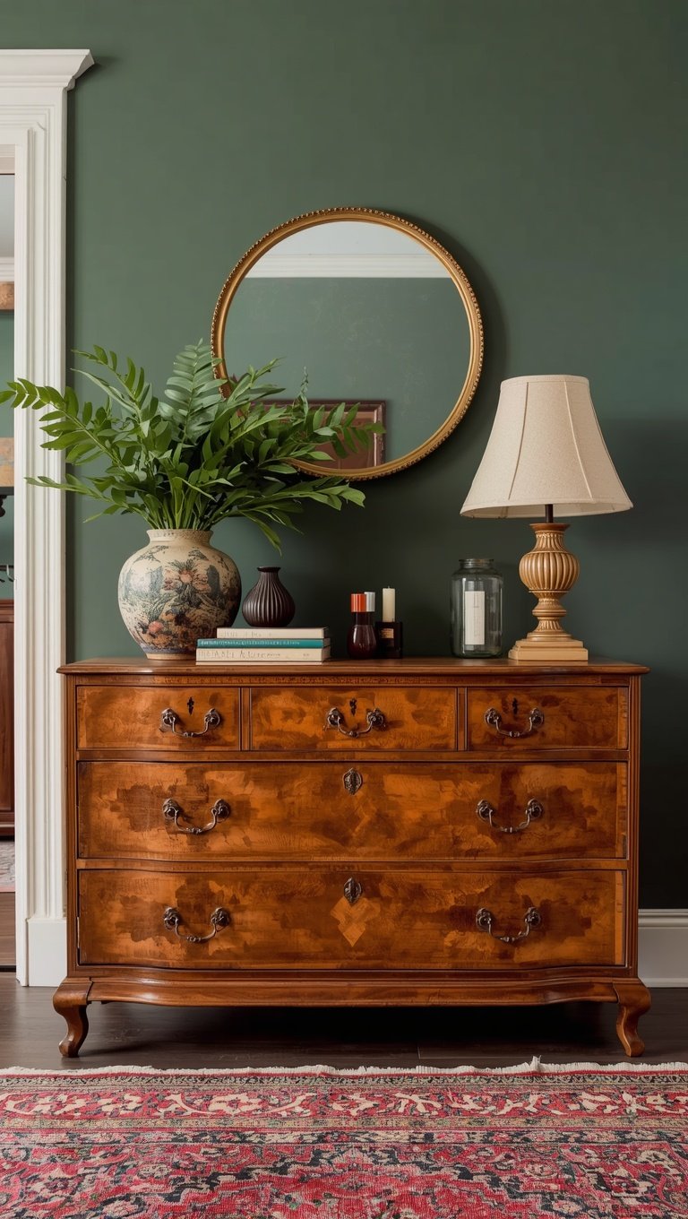
A worn wooden dresser next to a plain linen bed frame, for example, lets the antique piece really shine instead of competing with ten other old things.
My personal tip, don’t refinish everything you find, sometimes the original chippy paint or worn wood grain is exactly what makes the piece special.
If you do need to fix something structurally, a wobbly leg or a loose joint, get that done, but leave the cosmetic character alone.
And check the undersides and backs of furniture at antique shops, sometimes there’s a maker’s stamp or an old price tag that tells you a little bit of its history.
Those tiny details are the whole reason I fell in love with decorating this way in the first place.
Family Photographs and Old Frames

There’s a wall in my hallway that stops people mid-sentence, and it’s just old photographs.
Not professionally shot ones, just real snapshots, slightly blurry, a little sun-faded, from decades I never even lived through.
I collect vintage frames separately from the photos themselves, mismatched wood and gilded metal ones from flea markets and thrift stores.
Then I mix in a few of my own family’s old pictures alongside some anonymous vintage photos I’ve found along the way.
It sounds strange, decorating with strangers’ family photos, but there’s something so tender about it, these were somebody’s whole world once.
My tip, don’t match your frames perfectly, a gallery wall of different frame styles feels so much more like it was collected over a lifetime.
Black and White or sepia tones work beautifully together even when the subjects and settings are totally different.
I also like propping a few loose photos against books on a shelf instead of framing everything, it feels more casual and lived-in.
This is one of those sections where I really encourage you to use your own family photos if you have access to them.
Nothing store-bought will ever compete with the real thing.
Braided and Woven Rugs Underfoot

I didn’t realize how much a rug could change a room until I put down my first braided one.
It’s got this rope-like texture, all these different fabric scraps woven together into rings of color, and it just feels so grounded and homey underfoot.
I found mine secondhand, slightly faded in one corner from years of sun, and I genuinely love that imperfection more than if it were pristine.
These rugs work so well in entryways and kitchens, spaces that get a lot of foot traffic and could use a little extra texture and warmth.
My tip, layer a smaller braided rug over a larger jute or sisal one, it adds depth without making the floor feel too busy or matchy.
If you’re buying new, look for ones made from cotton or wool rather than synthetic materials, the texture reads so much more authentic underfoot.
And don’t stress about it being perfectly clean or new-looking, a little wear actually makes it look more collected and real.
I keep mine in my kitchen and it’s honestly saved my feet on cold mornings more times than I can count.
Small detail, big difference, that’s basically my whole philosophy with this trend.
Wooden Crates and Vintage Storage

Old wooden crates are one of those pieces that work so much harder than people give them credit for.
I have one stacked sideways in my living room holding my most-read books, and another tucked under a console table catching mail and keys.
The stamped lettering on the sides, usually some old fruit company or farm name, adds so much character without you having to do anything else.
I love that they’re actually useful too, this isn’t just decor for decor’s sake, it’s real, functional storage that happens to look beautiful.
My tip, stack two or three at slightly different heights instead of lining them up evenly, it feels more organic and collected that way.
If you can’t find real vintage crates, unfinished wood crates from a craft store take stain and a light distressing really well.
I like adding a coat of clear wax after distressing mine, it deepens the wood tone and protects it from everyday wear.
These are also fantastic for kids’ toy storage if you have little ones, functional and cute is basically the dream combination.
Honestly, this is one of my favorite budget-friendly ways to bring in that Americana warmth without spending much at all.
Subtle Stars and Flag Motifs Done Right

This is the part of Americana decor that’s easiest to get wrong, so let’s talk about it.
A giant flag draped across an entire wall can tip into costume-party territory pretty fast, at least in my personal taste.
I much prefer a single, small, weathered star cut from tin, tucked onto a shelf among other vintage objects.
Or an old, sun-bleached flag folded neatly and displayed in a shadow box instead of hung flat and huge.
The trick is scale and subtlety, one meaningful piece says so much more than five loud ones competing for attention.
I have a tiny antique brass star that sits on my mantel year-round, not just around a holiday, and it never feels like seasonal decor.
My tip, look for these motifs worked into everyday objects instead of standalone symbols, an old star-stamped tin cup, a quilt with a faded star pattern woven in.
That way it reads as part of your whole aesthetic rather than a once-a-year decoration you forgot to take down.
Less really is more here, I promise you that from experience.
Porch Life and Outdoor Vintage Touches

My porch is honestly where this whole Americana obsession spilled over first, before it even made it inside my house.
I found an old metal glider at a barn sale, slightly rusted at the joints, and reupholstered the cushions myself in a simple ticking stripe.
It creaks a tiny bit when you rock it, and somehow that sound has become one of my favorite parts of summer evenings.
Vintage porch decor doesn’t need much, a few galvanized buckets planted with flowers, an old wooden ladder leaned against the railing for hanging blankets, a weathered welcome sign by the door.
My tip, use real, aged materials outside rather than anything trying too hard to look distressed, actual weathering only gets more beautiful with time.
I love hanging a string of simple string lights across the porch ceiling in the evenings, it adds that warm, golden glow that makes the whole vintage feel come alive after dark.
If you’ve got a small porch like I do, one great chair, one great side table, and a couple of thoughtful details will always beat a cluttered space trying to fit in everything at once.
This is the spot in my house where I actually slow down the most, coffee in hand, watching the neighborhood go by.
And every single vintage piece out there just makes that quiet little ritual feel even richer.
Related read: Things I Wish I Knew Before I Decorated My First Home — Instant PDF + Kindle download. Secure checkout by Stripe

