

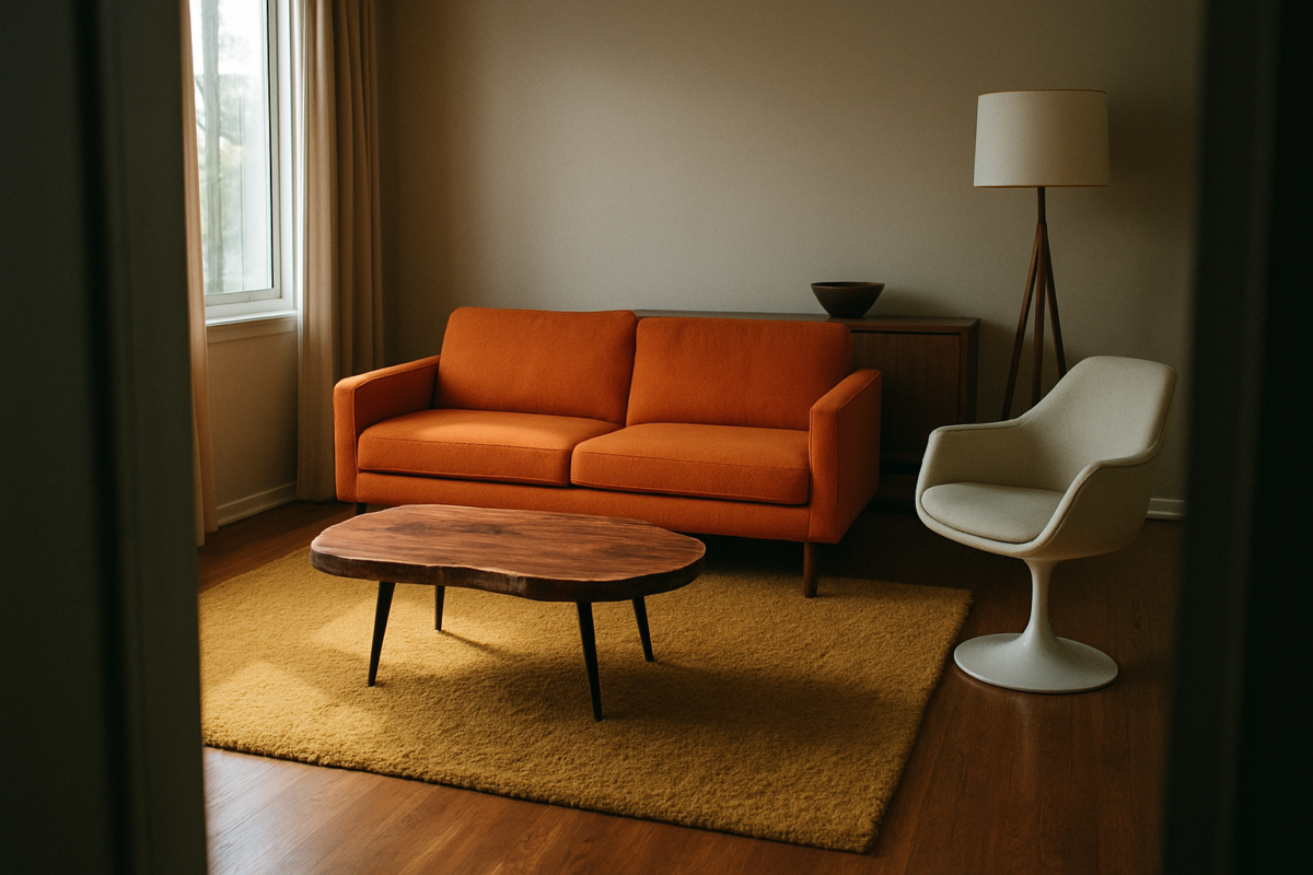
Here’s how to make a mid-century-style living room feel open instead of boxed in, using sight lines, furniture legs, and floor space as the main tools.
I’ll walk through sofa and chair legs, case furniture height, seating layout, rug sizing, and vertical contrast, then point you to a free plan you can rearrange yourself.
Stick with the rules and the room does the rest.
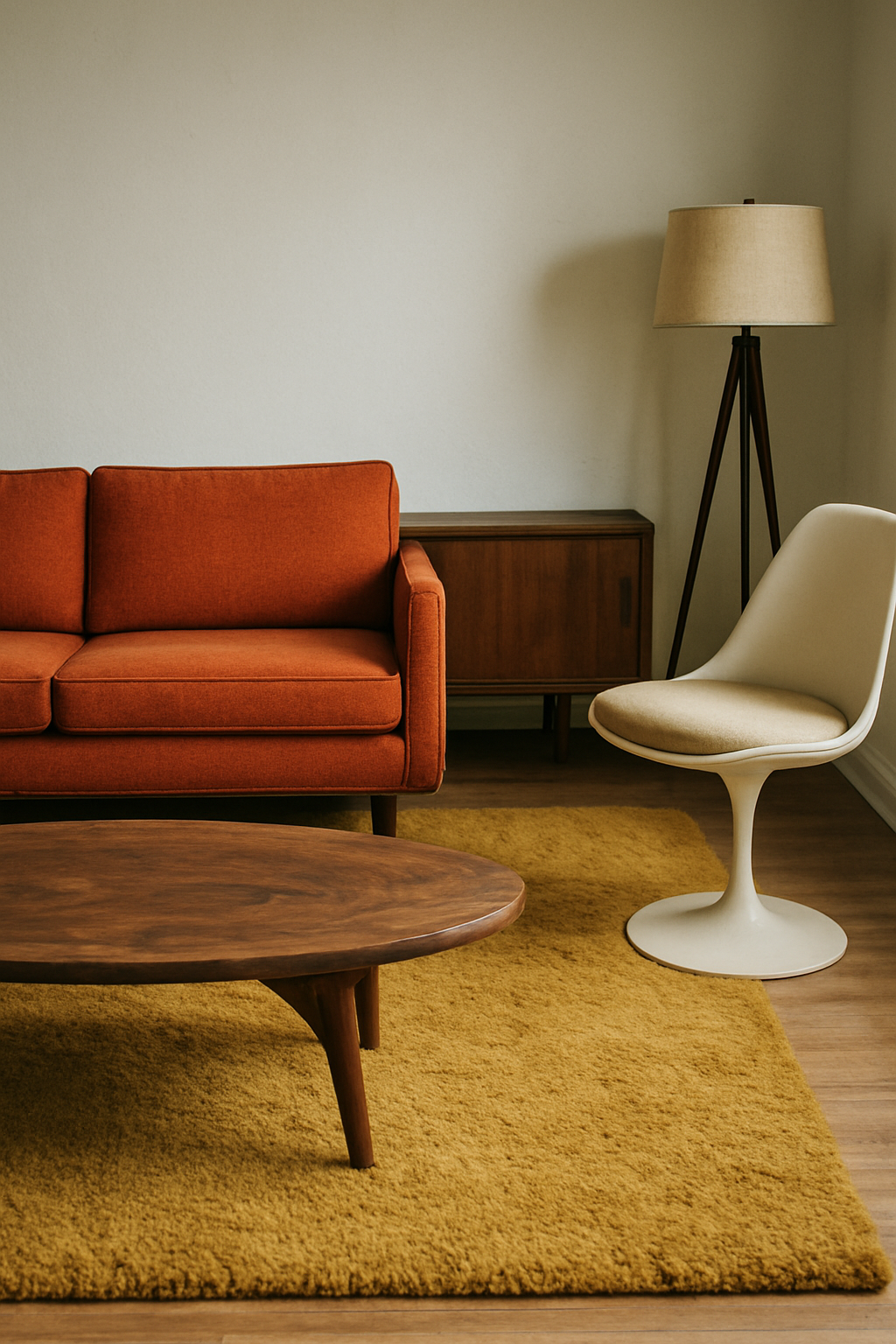
Free floor plan: Open this mid-century modern living room layout in the free room planner — furnished, to scale, and yours to move around →
Sight Lines Are the Whole Trick
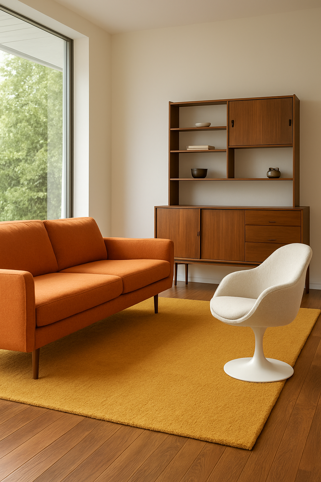
The living rooms that look mid-century but still feel boxed in almost always share one thing: you can’t see the floor under anything.
Everyone wants to credit the walnut tone, or that one bold accent color, or the tapered legs, for making a room feel open.
Honestly?
The legs are doing all the work.
Everything else is just finish.
Here’s what I mean.
A solid, skirted base sits on the floor like a little wall — your eye hits it and stops.
A tapered wood leg lets your eye slide right underneath and keep going, out to the baseboard, to the actual floor.
That gap is the whole trick.
A tangerine sofa on thin angled legs reads open because you can see six inches of hardwood under it.
A tulip chair on its pedestal base does the same thing, just more dramatically, because there’s basically nothing between the seat and the floor except air and one skinny stem.
A “mid-century” sofa — secondhand, low profile, walnut arms — can look right in every photo and still turn out wrong underneath.
Plenty of them sit on a plinth base, basically a solid wood box running the whole length underneath.
Zero floor visibility.
They look heavy and closed-off in a room, and it’s hard to say why until you look underneath.
Low isn’t the same thing as open.
You need low AND leggy.
Floor Is a Design Element, Not Wasted Space
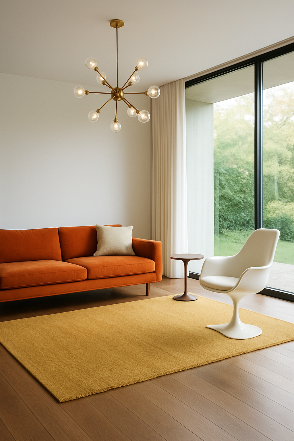
I think most people treat visible floor as empty space they haven’t filled yet.
Wrong instinct for this style.
The floor you can see is part of the design, same as the rug or the coffee table.
It’s doing a job.
Which is why I tell people flat out: skip the sectional.
I know, I know, sectionals are comfortable, they fit a family of five, they come in every fabric under the sun now.
Doesn’t matter.
A sectional eats the entire floor plane a mid-century room depends on.
There’s no version of a sectional, no matter how low or how nicely upholstered, that leaves you strips of visible floor around it.
It’s one continuous mass hugging the perimeter, and that’s the opposite of what this room wants.
Same problem with wall-to-wall carpet run under the whole seating group.
If the floor itself disappears under carpet from wall to wall, it doesn’t matter how leggy your sofa is.
There’s no floor plane left to see, just fabric everywhere you look.
If your room has a great plate-glass window, one of those big single panes that floods a room with afternoon light, that’s a room already built for sight lines.
Don’t undo that gift by burying the floor under carpet and burying the seating under a sectional.
Let the light and the open floor do what they’re already good at.
Trust me on this one.
Park the Credenza at Sofa Height
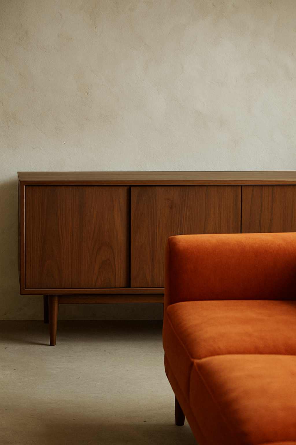
Case furniture is where most mid-century layouts quietly fall apart, and it’s almost always the credenza’s fault.
Or rather, what people stack around it.
Run your credenza along one wall, and aim for it sitting at roughly the same visual height as your sofa’s arm, usually around 26 to 30 inches off the floor.
Long, low, horizontal.
A walnut credenza in that spot does exactly what the sofa does: it reads as a low horizontal line instead of a block.
The top two-thirds of that wall above it should stay bare.
I know that feels wrong.
A bare wall feels unfinished to a lot of people, like you forgot something.
But hanging a big piece of art up there, or worse, a whole gallery wall, stacks height right back onto the one wall you were trying to keep low.
You just rebuilt the tall, closed-in room with extra steps.
If you genuinely need more closed storage than one credenza gives you, don’t stack a wall unit on the same run.
A walnut wall unit is the lower-profile alternative.
Use it instead of the credenza, on a different wall, not in addition to it.
The credenza should be the only piece of case furniture doing visual work on its wall.
One low horizontal line per wall.
That’s it.
Read next: A cozy mid-century modern living room
Group the Seats, Skip the Wall-Hugging
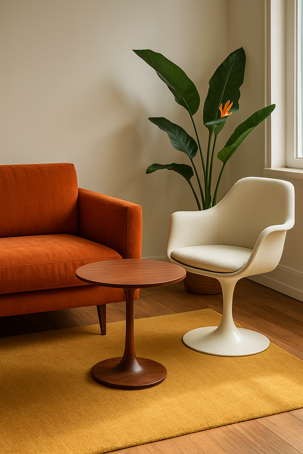
Every generic small-room guide tells you to push furniture to the walls to open up the middle.
In this room, that’s exactly backwards.
A leggy sofa and a tulip chair pushed to opposite walls just look stranded.
They lose all relationship to each other, and the room stops feeling like a place you’d actually sit.
It feels like a waiting room.
What actually reads as open here isn’t empty center floor.
It’s the grouping.
Pull the sofa and the chair in toward a shared table so they’re facing each other, having a conversation, doing something together instead of orbiting the walls separately.
Set your walnut slab coffee table about 14 to 18 inches from the front edge of the sofa.
That’s the standard rule of thumb, and it holds up here.
Close enough that you’re not stretching for your coffee mug, far enough that knees have room.
Position the tulip chair so it’s angled toward the sofa and the table, not toward the wall behind it.
The whole cluster should feel like a little island, legs visible all around it, with the floor doing its job on every side.
Rug Size Follows the Legs, Not the Sofa
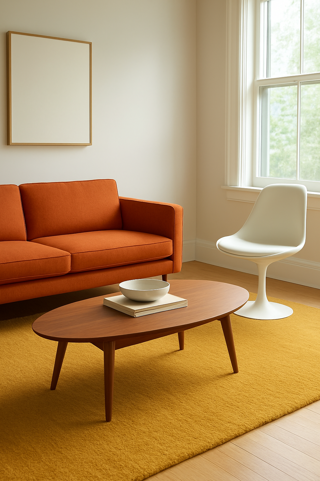
This is the one I see wrecked more than anything else.
People buy a rug that “fits the room” (meaning it’s sized to the wall dimensions, or whatever looked reasonable rolled out on the store floor) instead of sizing it to the actual furniture sitting on it.
Then the rug ends up floating under just the coffee table, way too small, like a 5×7 in a 12×14 room, with the sofa and chair legs sitting off the edge on bare floor.
It looks like clutter.
Genuinely, a skimpy rug is worse than no rug at all in this style, because the whole point of the room is looking uncluttered on purpose, and a too-small rug just adds a random shape in the middle of the floor that doesn’t relate to anything around it.
Size the rug to the whole seating cluster, not the sofa alone.
A mustard wool rug, something like 9×12, under the sofa, the tulip chair, and the coffee table together, with the front legs of everything landing on it (back legs can go either way, I’m not precious about it), is what makes the group read as one intentional arrangement instead of furniture that happens to be near a rug.
Don’t forget the walking room around all this.
Standard rule of thumb: your main walkway through the room needs about 36 inches to feel like an actual path and not a squeeze.
Secondary paths, like getting around the back of a chair to a side table, can drop to 24 to 30 inches.
Get your rug and your cluster sized right, and there’s usually plenty of room left over for both.
Free calculator: Find the right rug size for this room →
Free calculator: Size the coffee table to your sofa →
One Tall Thing Does the Contrast Work
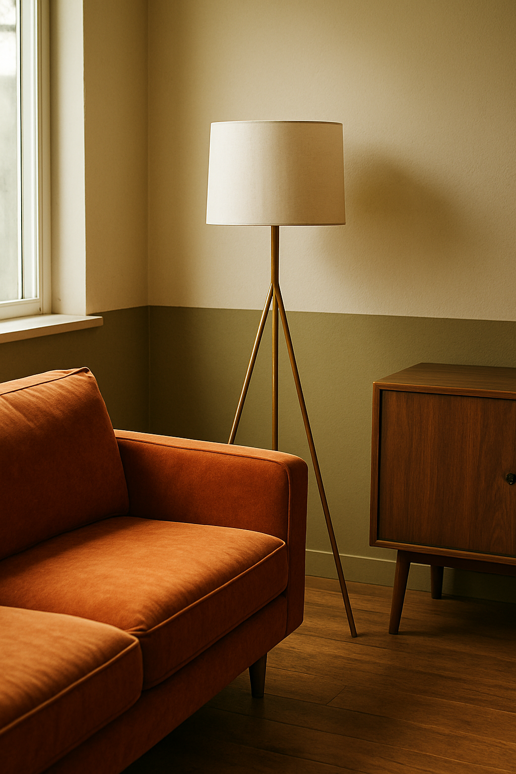
A room that’s all low horizontals starts to feel flat after a while, no matter how nicely you’ve done the legs and the rug and the credenza.
You need one vertical element to break the horizon line and give your eye somewhere to land.
Just one.
A tripod floor lamp next to the sofa is my go-to.
The thin angled legs echo the sofa and chair legs, so it doesn’t feel like a foreign object, and the height gives the room a single confident vertical line.
If a lamp isn’t quite doing it, or you already have great lighting, a bird of paradise in a corner does the same job with leaves instead of a lampshade.
Either one works.
Not both.
That’s the part people get wrong constantly — they add the lamp AND the plant AND then throw in a tall bookshelf “for layers,” and suddenly you’ve got three vertical elements competing for attention in a room that only has space for one.
Two tall pieces don’t add interest.
They just cancel each other out and drag you right back to the boxed-in feeling you started with.
A Sputnik chandelier overhead doesn’t count against this limit, by the way.
It lives up on the ceiling plane, not down at floor height, so it’s not competing with your lamp or your plant for the same visual space.
It’s doing its own separate job up there.
Open Dreamy’s Free Plan and Move Everything
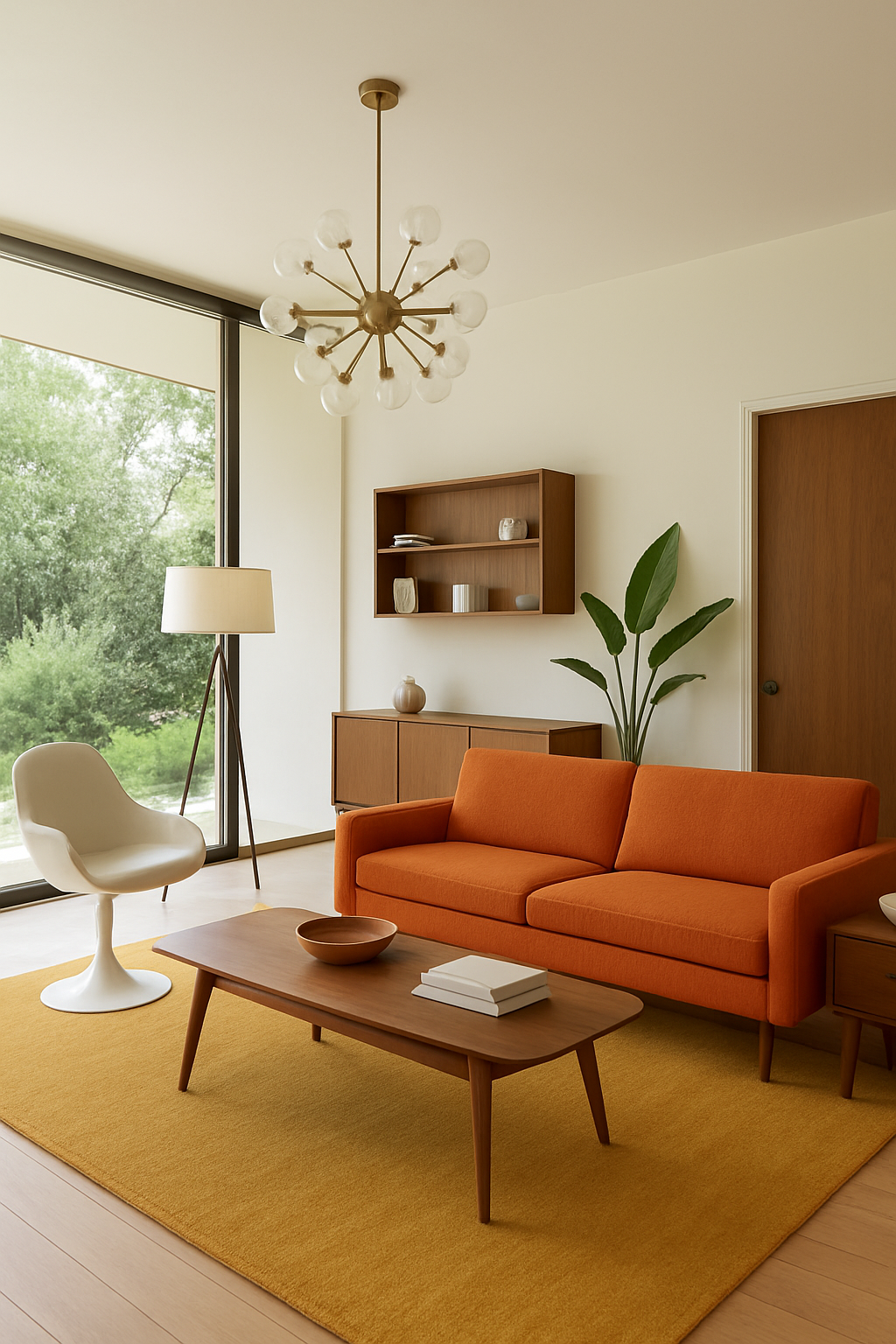
If you’d rather see all this sitting in an actual room than keep reading rules, the free plan follows exactly this logic.
It’s got the mustard wool rug, the tangerine sofa, the tulip chair, a walnut slab coffee table, a walnut credenza, a tripod floor lamp, a walnut wall unit, a bird of paradise, a walnut side table, a plate-glass window, a walnut door, and a Sputnik chandelier overhead, all laid out following the floor-visibility test.
Every piece in it can be moved, resized, swapped, or flat-out deleted in the free plan.
That’s the point of opening it, honestly.
Not to admire it, but to break it.
Pull the credenza to a different wall.
Swap the tulip chair for something else and see if it still clears the floor.
Drag the rug bigger or smaller and watch what happens to the legs.
One thing I’ll say clearly: the size of the room in the free plan is not a recommendation for your room.
It’s just the size that fit the demo layout.
Your living room is its own shape and its own square footage, and the whole exercise only works if you resize the pieces and the walkways to your actual walls, not to whatever canvas the free plan happens to use.
Use the proportions and the rules.
Ignore the dimensions.