hoosing the right color palette is one of the most important decisions when designing any interior space.
The colors you select for the walls, furniture, decor items, and textiles set the entire mood and style of the room.
While trends come and go, there are some timeless color combinations that interior designers rely on to create stylish, inviting spaces.
These combinations are tried-and-true and have stood the test of time, looking as fresh today as ever.
They provide the perfect starting point when planning the look of any room.
Navy Blue and White


Crisp, classic, and forever stylish – the navy blue and white pairing is a decorator favorite.
Navy has a grounded, anchoring effect that provides the perfect backdrop for lighter accents and furniture.
White offers a fresh, airy counterbalance.
Together, these two neutrals create a relaxed, coastal vibe perfect for bedrooms, living rooms, dining spaces, and more.
Navy takes on a slightly warmer, bolder effect next to bright white.
For a softer look, try pairing navy with an off-white or oatmeal instead.
Accent navy and white with natural wood tones, rattan and jute textures, and a mix of modern and vintage accessories.
White-framed artwork and mirrors help reflect light around the space.
This timeless palette works with any style from traditional to contemporary.
Tap to Explore These Beauties
See my ideas in action 👇 Tap any image to explore full details.
Sage Green and Terracotta


For a palette inspired by nature, combine fresh sage greens with rich terracotta orange and red earth tones.
These colors mirror beautiful mossy greens and Southwestern clay pots.
The blend of bright and muted shades creates a warm, inviting look.
Use muted sage on larger surfaces like walls and save the brighter popping greens for accents.
Terracotta makes a bold statement on feature walls, cabinets, or front doors.
You can also incorporate the look through tile, area rugs, pillows, and artwork instead.
Floor-to-ceiling curtains in a muted sage add softness and privacy.
Finish the look with rattan and wood furniture, potted plants, and natural textiles.
The colors work well in any room but are especially perfect for living spaces, bedrooms, and entryways.

Soft Pink and Pale Blue


For a dreamy romantic palette, nothing beats the combination of blush pink and powder blue.
These sweet pastel shades complement each other beautifully and create a delicate, ethereal look.
Use soft pink on the walls to define the overall color scheme.
Then bring in powder blue through furniture, decor accents, and textiles.
Try florals, antique furnishings, and crystal chandeliers to enhance the feminine charm.
For a bright and inviting look, use pale pink and baby blue as your wall colors.
The watercolor shades will make any room feel like a soothing escape.
Accent with white trim for a crisp contrast.
This pairing is ideal for bedrooms, sitting rooms, and feminine bathrooms.
It also translates well to kids’ spaces.
Mix in some modern or minimalist elements to keep the look from becoming too saccharine.
Mustard Yellow and Dark Teal
This bold duo brings together two strong colors that complement each other perfectly.
The pairing first became popular in the 90s and has resurged in recent years, feeling fresh and current again.
Deep teal has an exotic Moroccan flair, while mustard yellow adds a cheerful pop.
Use teal as your foundational shade on larger surfaces, walls, and furniture pieces.
Then layer in mustard accents through art, pillows, rugs, and decor items.

Find Your Room’s Color Palette
Tap a vibe — get a curated 5-color palette with hex codes you can copy ✨
💭 I Wrote a Book About My Biggest Decorating Mistakes!
When I decorated my first home, I thought I knew what I was doing. Spoiler: I didn’t. 😅
💸 I bought a sofa way too big for my living room. Paint colors that looked amazing in the store but terrible on my walls.
For a look that doesn’t overwhelm, balance the vibrant walls with white trim, cabinetry, and ceilings.
Rattan chairs, marble accents, and fluffy textiles help soften and ground the space.
This combo is ideal for making a stylish statement in any room.
Sage Green and Bright Orange

Earthy shades of green and rusty orange make for an unexpectedly harmonious pairing.
The colors mirror nature with warm orange evoking autumn leaves while green reflects lush plants and trees.
Use olive or sage green on walls and larger furniture pieces as your base.
Then bring in pops of rust through decorative accents, artwork, pillows, and vases.
Dark wood furnishings also help complement the look.
For a brighter effect, opt for lime green instead of a more muted tone.
Mint and coral work well together, too.
This palette feels right at home in living spaces, bedrooms, and home offices.
Accents like macrame hangings and rattan add organic texture.

Pale Yellow and Dusky Lavender


Soft pastels meet in this dreamy color combination that provides an ethereal, romantic look.
Cool lavender and warm antique yellow have just enough contrast while remaining highly complementary.
Use lavender or lilac on large-scale surfaces like walls and furniture.
Then accent with touches of pale yellow and cream through bedding, decor items, and artwork.
💭 Ever wondered what your room would actually look like rearranged?
I built a free tool that lets you drag furniture around a 2D floor plan. No signup, no catch.
See the Room Planner →
White trim helps add definition and brightness.
Floral motifs, lace trims, faded Persian rugs, and chandeliers reinforce the feminine charm.
The palette would be lovely in a bedroom, sitting room, or powder room.
Avoid bright yellows and intense purples, which can clash with the muted tones.
What’s Your Decor Personality?
5 questions · 30 seconds · Instant style match 🏡
Deep Red and Black


Few color combinations feel more luxurious and sophisticated than deep red and black.
The pairing has a distinctly regal, opulent effect that works in spaces both traditional and modern.
Use black as your foundational neutral on larger surfaces and furniture.
Red makes the perfect bold pop of color through accents like throw pillows, window treatments, artwork, and decor.
Leather furnishings and metallic accents enhance the luxe vibe.
Deep berry reds or oxblood work especially well with black’s inky backdrop.
The combination brings drama and intimacy to bedrooms, formal living rooms, libraries, and home offices.
Gold, cream, or white details help lighten and balance the dark palette.
Robin’s Egg Blue and Moss Green

For a bright spring-inspired interior, try robin’s egg blue alongside earthy moss green.
The playful pastel blue conjures serene skies while the muted green represents new growth.
Use mossy shades on walls and larger accents like sofas or chairs.
Then introduce the blue through decorative objects, tile, throw blankets, curtains, and artwork.
White trim keeps the room feeling light and breezy.
This cheerful palette helps spaces feel uplifting and refreshed.
It’s ideal for bringing playfulness into living rooms, offices, bedrooms, and bathrooms.
Natural wood, rattan accents, and leafy plants enhance the organic vibe.
Golden Yellow and Slate Gray


Warm goldenrod yellow coupled with cool slate gray creates an inviting, well-balanced pairing.
The colors complement each other beautifully while offering clear definition and contrast.
Use rich gray as a neutral backdrop on walls, flooring, and base furniture pieces.
Bring in golden accents through artwork, patterned pillows, mirrors, and decor items.
White trim and ceilings keep the space feeling bright and airy.
Vintage suitcases, botanical prints, and modern sculpture add visual interest.
The versatile combination translates well into kitchens, dining rooms, living spaces, and entryways.
Golden oak floors and furnishings reinforce the warm yellow tones.
This or That?
Pick your fave — see what other readers chose! 👀
Sunny Yellow and Turquoise Blue


Tropical, playful, and cheery – this combo channels beach house vibes with vibrant sunny yellow and aqua blue.
The jolt of color energizes any space and creates an uplifting, vacation mindset.
Use aqua on large surfaces as your base color.
Sunny yellow makes an instant impact even through smaller accents like barstools, throw pillows, vases, or an area rug.
💭 I Wrote a Book About My Biggest Decorating Mistakes!
When I decorated my first home, I thought I knew what I was doing. Spoiler: I didn’t. 😅
💸 I bought a sofa way too big for my living room. Paint colors that looked amazing in the store but terrible on my walls.
White trim adds contrast and enhances the brightness.
This pairing shines (literally) in kitchens, bathrooms, laundry rooms, and kids’ spaces.
Painted wood furniture, woven accents, and potted palms add to the coastal charm.
The mood-boosting colors bring positivity to any room.
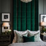
Cream and Emerald Green


Understated cream coupled with rich emerald green creates an elegant, timeless look.
The neutral cream allows the jewel-toned green to take center stage, while acting as a classic counterpoint.
Use cream or ivory on walls, trimwork, cabinetry, and furniture bones to create a subdued palette.
Layer in emerald through velvet pillows, drapes, ottomans, and artwork for dramatic contrast.
Brass accents warm up the space while marble, travertine, and hardwoods ground it with texture.
Ferns, palms, and leafy motifs reinforce the earthy green tones.
This combo luxuriously transforms formal living rooms, bedrooms, and offices.
Quick Design Dilemma
Cast your vote — see what other readers think! 🤔
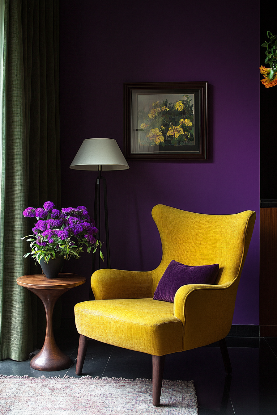
Eggplant Purple and Chartreuse


Vibrant jewel tones meet in this bold, eclectic color pairing.
Deep eggplant purple combined with bright chartreuse yellow packs a visual punch.
Contrasting with creamy neutrals prevents it from becoming overpowering.
Use eggplant purple as your foundational color on feature walls, base furniture pieces, and larger accents.
Then chartreuse adds a vivid pop as pillows, stools, artwork, or a painted cabinet.
White walls, trim, and furniture keep the space feeling grounded.
The dramatic colors would make a statement in any room but work especially well in home offices, dining spaces, and powder rooms.
Complement them with industrial metals, sleek leather, and exotic wall art.
Leaning modern helps keep the palette feeling fresh.
Psst… Check This Out
Gallery Wall With Plants That Instantly Bring Life And Style To Your Home Take Me There →Pure White and Natural Wood Tones

For a light, bright, and serene interior, try pairing crisp white with natural unstained wood tones.
The combo evokes Nordic style with its clean lines, cozy textures, and minimalist aesthetic.
Use bright white on walls, ceilings, cabinetry, base furniture pieces, and textiles to create a snowy backdrop.
Then bring in warm wood through furnishings, floors, and accents.
Opt for light hardwoods like oak, ash, maple, and birch.
Woven textures, fresh flowers, and leafy plants enhance the organic charm.
This palette provides a relaxing oasis in living rooms, bedrooms, entryways, and home offices.
Avoid clutter and let the white truly shine.
Finding the perfect color scheme doesn’t have to feel overwhelming with so many tried-and-true options to choose from.
Interior designers rely on these combinations time and again because they simply work.
Start with a base neutral or subdued shade on larger surfaces then build on it with punches of color through accent furnishings and decor.
Be sure to balance warm and cool undertones and add plenty of texture.
Use this guide as inspiration when planning your interior paint colors, fabrics, tiles, and furniture purchases.
Then have fun seeing how your own personal style transforms these classic combinations and makes them your own.
With strategic use of color, you can set the entire mood and style of a room.