I used to stare at that big, blank wall in my living room like it personally offended me.
Every weekend I’d tell myself, this is the week I finally do something with it.
And every weekend, I’d walk past it, sigh a little, and make coffee instead.
Then one rainy afternoon I started pinning frames next to trailing pothos and something just… clicked.
Not just visually — emotionally.
That wall suddenly felt alive in a way that no paint color or single piece of art ever managed to do.
It felt like me.
And now, every single person who walks into my home asks about it first.
So let me tell you everything.

Why a Gallery Wall With Plants Just Hits Differently Than Either One Alone


There’s something almost magical about combining art and living greenery on the same wall.
I know that sounds dramatic, but stay with me.
When I first tried a traditional gallery wall in my old apartment, it looked polished — but sort of cold.
Like a hotel lobby, you know?
And when I tried just hanging a few shelves with plants, it felt cozy but a little… unfinished.
Like something was missing.
The moment I mixed the two together — frames, botanical prints, trailing vines, small potted plants on ledges — the whole wall exhaled.
It stopped being a decorated wall and started being a moment.
The plants add this soft, organic energy that makes the rigid lines of frames feel warmer.
And the frames give the plants a sense of intention, like they were curated rather than just plopped there.
Together they create this layered, textured, lived-in look that feels genuinely modern without being sterile.
It’s the kind of wall that makes a room feel like someone actually lives there and loves it.
And honestly, that’s the whole vibe I’m always chasing.
My Favorite Wall to Start With (And Why I’d Never Start Anywhere Else)


If you’re thinking about where to put your gallery wall with plants, I always say: go for the wall you see first when you walk into the room.
That’s your money wall.
In my living room, it’s the long wall behind the sofa.
It’s the first thing I see every morning when I shuffle in for coffee, and it sets the whole tone of how I feel in that space.
Starting there made the biggest emotional impact for the least amount of effort.
It didn’t require rearranging furniture or doing any major renovation.
I just took a wall that was doing absolutely nothing and turned it into the most intentional spot in the whole room.
If I had a small hallway instead, that’s actually where I’d go first — a narrow hallway with a gallery wall and a little hanging plant in the corner is chef’s kiss for making guests feel something the second they walk in.
Don’t overthink which wall is “worthy.”
The right wall is the one you look at most often.
Start there, and you’ll feel the difference immediately.
The Frames I Chose and Why the Mix Matters So Much


Here’s where I see people go wrong most often — they buy a matching frame set and call it a day.
And listen, I get it.
Matching frames feel safe.
But safe doesn’t create that layered, editorial look that stops people in their tracks.
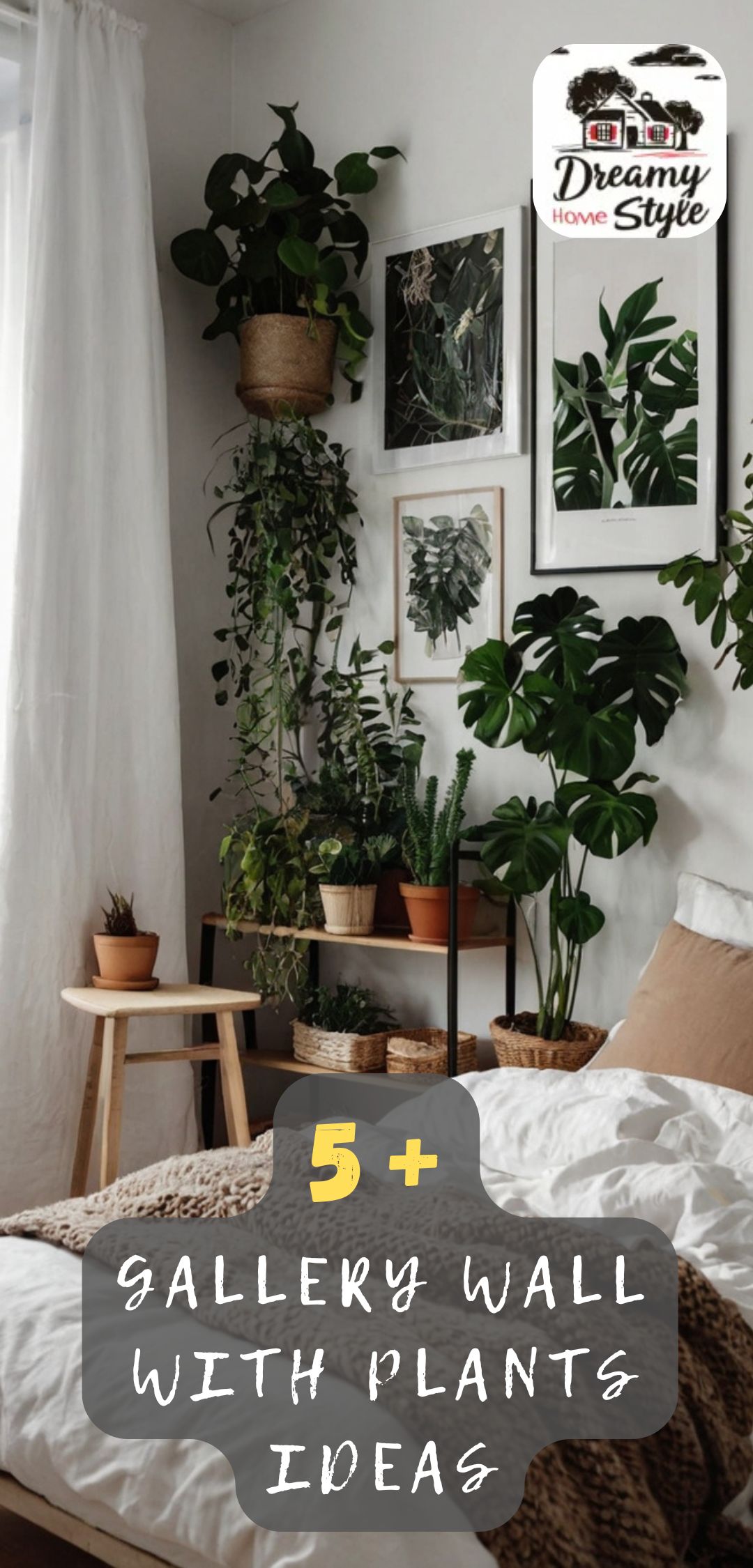
For my gallery wall, I mixed three different frame styles: thin black metal frames, warm natural wood frames, and one chunky white plaster-style frame that I found at a thrift store for almost nothing.
The black frames feel modern and sharp.
The wood frames bring in warmth and a little boho softness.
And that one quirky white frame?
It breaks the pattern just enough to keep it interesting.
When you mix metals, woods, and textures, the wall stops looking like a product display and starts looking like something you actually collected over time.
That’s the feeling you want.
Like your wall has a story.
My personal tip: keep your frame colors within the same family — warm tones together, cool tones together — so it still feels cohesive even when the styles vary.
It’s the difference between “eclectic” and “chaotic.”
The Art I Chose to Hang (And the One Type I’m Obsessed With)

Okay, so here’s my absolute favorite thing to put in a gallery wall that also has plants: botanical prints.
I know, I know — so obvious.
But hear me out, because there’s a specific way to do this that feels elevated rather than expected.
Instead of going full “here are some leaves in frames,” I love mixing one or two classic botanical illustrations with more abstract art pieces.
Think a moody watercolor next to a crisp line-drawing of a fern next to a simple geometric print.
The botanical pieces connect visually to your real plants without making the whole wall feel like a nature exhibit.
And the abstract pieces give it that modern, curated gallery feel.
When I put together my own wall, I included one large-scale black and white abstract print as my anchor piece, then layered smaller botanicals and a tiny framed photo around it.
The contrast is everything.
One more thing I love: mixing framed art with unframed canvas pieces or even a woven textile.
The texture variation is so good in person — it catches the light differently throughout the day and keeps your eye moving around the whole arrangement.
How I Picked My Plants (And Why I Didn’t Go With What I Actually Wanted)


Full transparency: I originally wanted a big fiddle leaf fig as the main plant in my gallery wall situation.
I love how dramatic they look.
But fiddle leaf figs are famously fussy, and my living room gets inconsistent light depending on the season.
So I pivoted — and honestly, I’m glad I did.
I ended up with a trailing pothos on a small floating shelf at the upper left corner of the wall.
Below that, a compact peace lily on a lower ledge.
And tucked into the corner beside the whole arrangement, a tall snake plant in a textured ceramic pot.
The pothos trails down and softens the edges of the frames in the most gorgeous, organic way.
The peace lily adds a little elegance without demanding too much attention.
And the snake plant anchors the whole thing with vertical height.
My honest recommendation: choose plants based on your actual light conditions, not just what looks pretty on Pinterest.
A thriving, healthy plant will always look more beautiful than a struggling “perfect” plant.
And a struggling plant next to carefully curated art just looks… sad.
Go with what will actually grow happily in your space.
The Floating Shelf Trick That Changed Everything for Me

If you want plants to feel like part of your gallery wall rather than just sitting nearby, floating shelves are your best friend.
This was honestly my biggest lightbulb moment when I was designing my wall.
I added two small floating shelves — one at about eye level on the left side, and one slightly lower toward the right — directly within my frame arrangement.
Not below the frames.
Not beside them.
Within them.
The plants sit right there among the art, like they belong to the same family.
It makes the whole wall feel three-dimensional in the best possible way.
You get depth, texture, and life all at once.
The shelves I used were simple, thin natural wood — nothing fancy.
But they tied into my wood frames perfectly and gave the plants a place to live that felt intentional rather than afterthought-y.
If you only take one idea from my whole setup, make it this one.
Floating shelves within the gallery arrangement, not around it.
It changes the entire dynamic of the wall.
The Layout Process I Actually Used (No Graph Paper Required)

I am not the kind of person who carefully sketches out gallery wall layouts on paper before I start.
I’ve tried.
I end up with a crumpled page and more stress than I started with.
Instead, I use the paper bag method — and I’m mildly obsessed with how well it works.
I trace each frame onto brown kraft paper, cut out the shapes, and tape them to the wall with painter’s tape.
Then I live with it for a day or two.
I move pieces around.
I add a paper rectangle where I’m thinking about a shelf.
I hold up a plant in a pot and see where it might feel right.
No commitment, no nail holes in the wrong spots, no regret.
When everything feels balanced and I genuinely like looking at the wall, that’s when I start actually hanging things.
The key feeling I’m going for: when your eye doesn’t know where to land first.
Not in a chaotic way.
In a “there’s so much to discover here” kind of way.
That gentle visual tension is what makes a gallery wall feel rich and editorial rather than flat.
The Color Story That Ties Plants and Art Together

Here’s something I didn’t think about enough on my first gallery wall attempt: color cohesion.
I just grabbed frames and prints I liked individually and hoped for the best.
It looked fine, but not great.
The second time around — with plants in the mix — I was much more intentional.
I pulled my color palette from three places: the green of my plants, the warm honey tones of my wood frames, and one deep terracotta accent color I used in one of my art prints.
Those three colors show up in small ways throughout the whole arrangement.
A terracotta pot.
A print with a warm ochre wash.
A little woven macramé piece in a natural jute tone.
When you tie your plant pots, frame colors, and art palette together even loosely, everything starts to feel like it was designed as a single installation rather than assembled from random pieces.
It doesn’t have to be matchy-matchy.
It just has to rhyme.
That’s the word I always use when I’m styling anything in my home.
Does it rhyme?
The Lighting Detail That Makes the Whole Wall Glow

Can we talk about how much lighting matters here?
Because I feel like this is the step most people skip, and it’s honestly the one that elevates the whole thing from “nice” to “wow.”
My gallery wall faces a window that gets soft afternoon light, and in those golden hours, the plants cast the most beautiful, delicate shadows across the frames.
It’s genuinely one of my favorite things to look at in my whole home.
But not every wall is going to have that kind of natural light advantage.
So I added a small plug-in picture light above my largest anchor frame.
It casts this warm, downward glow that highlights both the art and the plants sitting just below it.
At night, that corner of my living room looks like something out of a design magazine.
I’m not exaggerating.
If you have the option to add even a tiny clip light or a warm-toned LED strip above or below your arrangement, do it.
You’ll thank yourself every single evening when you turn it on and your wall transforms into this cozy, glowing little world.
My Personal Tips for Keeping It Looking Fresh Over Time

One thing nobody talks about with gallery walls — especially ones with live plants — is how to keep them feeling fresh without starting over from scratch.
Because rearranging an entire gallery wall every few months sounds exhausting.
And it is.
So instead, I make tiny swaps.
I’ll swap one small print for a new one.
I’ll move a plant from the left shelf to the right one.
I’ll change out a pot cover for a new texture or color.
These tiny little edits keep the wall feeling current and alive without requiring a full redesign.
It’s sort of like rotating throw pillows on a sofa — the difference is subtle, but you feel it.
I also make a habit of doing a monthly “plant check” on my gallery wall specifically.
I trim any yellowing leaves.
I dust the frames.
I wipe down the shelves.
It takes maybe fifteen minutes, but keeping everything looking intentional and cared-for is what makes the difference between a wall that impresses people and one that just kind of… exists.
The Modern Interior Design Principle Behind Why This Works So Well

There’s a design concept I think about a lot when I’m building out a styled wall, and it’s the idea of contrast through texture.
Modern interior design can sometimes feel cold — all clean lines and monochrome palettes.
Which looks incredible in photos but can feel a little sterile to actually live in.
Plants and layered gallery walls solve that problem beautifully.
The soft, unpredictable shapes of leaves contrast with the sharp, geometric lines of frames.
The organic, living quality of a plant contrasts with the stillness of art.
The varied textures of ceramic pots, woven art pieces, metal frames, and trailing vines all play off each other in a way that feels warm but still visually modern.
It hits that sweet spot of looking curated and intentional without feeling like a showroom.
When I finally understood that this was the why behind the look I was going for, everything clicked into place.
I stopped adding things just because I liked them individually.
I started asking: does this add contrast?
Does this add texture?
Does this make the whole wall feel more layered and alive?
If yes — it stays.
What I’d Do Differently If I Were Starting This Wall From Scratch Today

I love my gallery wall deeply.
But if I’m being honest with myself — and I think that’s kindda the whole point of writing a personal blog — there are a few things I’d do differently now.
First, I’d invest in one larger statement plant from the beginning rather than starting with smaller ones and waiting for them to grow.
A fuller, more dramatic plant has immediate visual impact and anchors the whole arrangement faster.
Second, I’d hang my largest frame higher than I initially did.
I went a little conservative with my placement and the whole thing ended up sitting just slightly lower than it should have.
Now I have to pretend that was intentional.
(It wasn’t.)
Third, I’d add one unexpected element — something that’s not art and not a plant.
A small vintage clock.
A tiny sculptural object.
A ceramic wall piece.
Something that makes someone stop and go, wait, what is that?
Those little surprises are what make a gallery wall feel genuinely personal rather than Pinterest-assembled.
And that feeling — that this is so her feeling — is honestly what I’m always chasing in every corner of my home.


