I’ll be honest—I used to think pink and red together was too much.
Like, way too much.
But then I walked into my friend’s apartment last spring, and she had this blush pink velvet chair next to deep crimson curtains, and I literally stopped mid-sentence.
It wasn’t Valentine’s Day chaos.
It was warm, sophisticated, and kinda romantic in a way that made me want to curl up with a book and never leave.
That moment changed everything for me.
Let me show you exactly how I make it work in my own space.

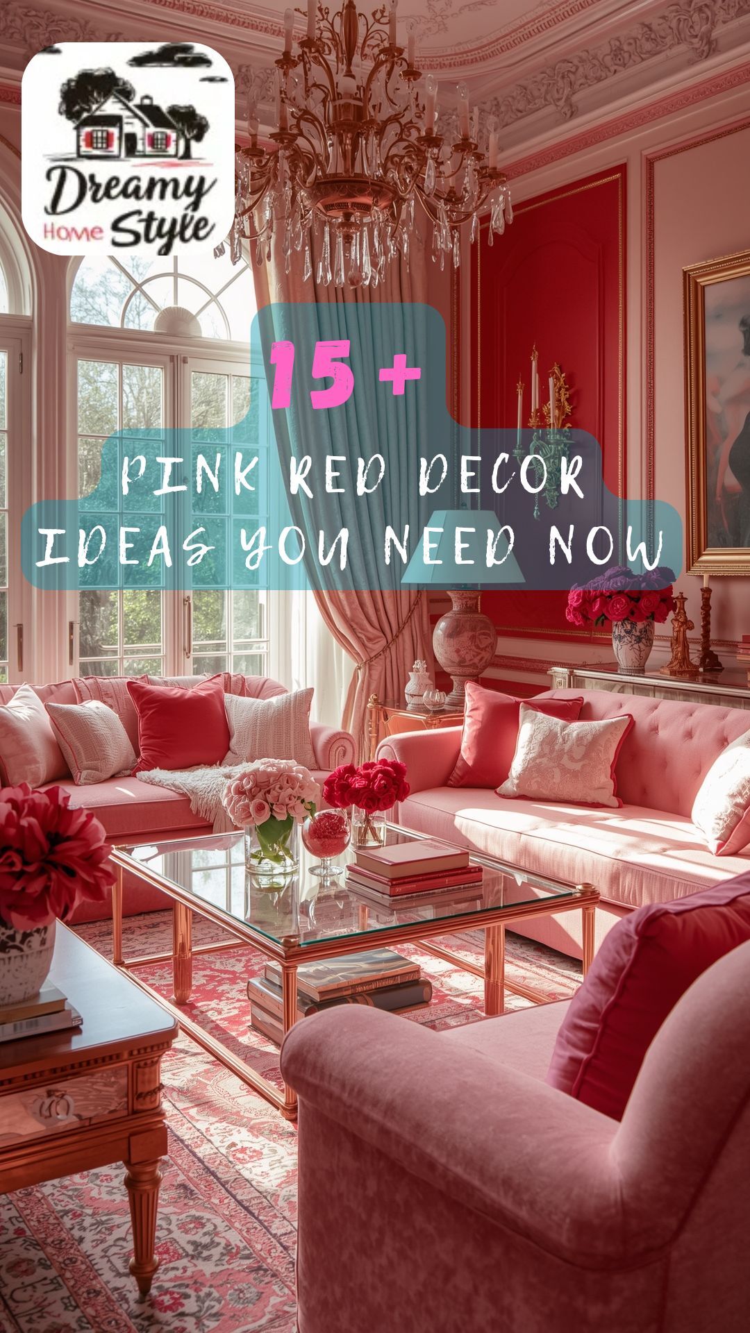
Start With A Neutral Foundation (Trust Me On This)


Here’s the thing about pink and red—they’re both strong personalities.
And if you don’t give them a calm backdrop, they’ll fight for attention like siblings on a road trip.
I always start with whites, grays, or soft beiges as my base, which creates a calming backdrop that lets pink and red accents pop without overwhelming the space.
My living room has creamy white walls, and that neutral canvas makes my blush throw pillows and burgundy accent chair look intentional instead of chaotic.
If I had tried this combo on dark walls?
Total disaster.
One trick I love: keep your largest furniture pieces neutral—like your sofa or bed frame.
Then layer in the pink and red through smaller, swappable pieces.
That way, if you get tired of the look (which I doubt you will), you’re not stuck repainting or buying a whole new couch.
Think of neutrals as the foundation of your outfit—they make everything else shine.
Mix Your Shades Thoughtfully (Not All Pinks Are Created Equal)


So here’s where most people mess up.
They grab any pink and any red and wonder why it looks like a craft store threw up in their house.
The secret?
You need to be picky about your shades.
I tend to pair deep, opulent reds with light soft pinks for that perfect balance.
For example, dusty rose pillows look stunning next to a deep wine-colored throw blanket.
But hot bubblegum pink next to bright cherry red?
That’s gonna give you a headache.
When I decorated my bedroom, I chose a pale blush for the walls and brought in deeper raspberry accents through my rug and artwork.
The variation in tone creates depth instead of flatness.
Play with different intensities—some soft and whisper-quiet, some bold and confident.
That’s how you get a space that feels layered and interesting, not one-note.
Layer Textures Like Your Life Depends On It


Okay, this is where the magic really happens.
Color is great, but texture?
That’s what makes a room feel expensive and considered.
Layering red and pink textiles introduces both depth and vibrancy, and I’m all about mixing different materials.
In my reading nook, I have a pink velvet cushion on a red knit throw over a linen sofa.
Three different textures, same color family, total game-changer.
I also love bringing in unexpected materials—like a glossy pink ceramic vase next to a matte red wool pillow.
The contrast between shiny and soft, smooth and chunky, keeps your eye moving around the room.
Don’t forget about your rug, either.
A woven or textured rug in complementary tones can anchor the whole space and tie everything together.
Texture is what takes your decor from “pretty” to “I never want to leave this room.”
White Accents Are Your Secret Weapon

Can I tell you about the time I went a little overboard with pink and red in my guest room?
It looked like the inside of a jewelry box—and not in a good way.
That’s when I learned that white accents can effectively soften bold red and pink color schemes, introducing a sense of calm and preventing the space from feeling saturated or visually heavy.
I added crisp white picture frames, a white ceramic lamp base, and white bedding with pink and red accents.
Instant refresh.
The white gives your eyes a place to rest.
It’s like taking a breath between sentences—necessary and grounding.
I also swapped out some of my colored decor for white vases and candle holders, and suddenly the pink and red felt sophisticated instead of overwhelming.
You don’t need a lot—just strategic pops of white throughout the space.
This one change made my room feel airy and intentional instead of chaotic and heavy.
Go Big With Wall Art (But Make It Personal)

I used to be scared of large-scale art.
Like, what if I picked the wrong piece and hated it forever?
But then I realized that large-scale wall art in bold red and pink tones instantly amplifies a room’s visual impact, especially when placed above the bed.
I found this oversized abstract canvas with soft pinks bleeding into deep reds, and I hung it above my headboard.
It became the focal point instantly—everything else in the room just supports it.
If you’re not ready to commit to a huge piece, try creating a gallery wall with smaller prints in coordinating frames.
I did this in my hallway using a mix of pink and red botanical prints, and it feels curated and personal.
The trick is to choose artwork that actually speaks to you, not just something that matches your color scheme.
When you love the art itself, the colors become secondary.
And that’s when your space starts to feel like you.
Bring In Natural Elements (Wood And Greenery Are Your Friends)

Here’s something I learned the hard way: pink and red can feel artificial if you don’t balance them with organic textures.
Pink and red work beautifully with natural elements like wood and greenery, and a wooden coffee table or woven baskets can ground the vibrant colors.
I have a chunky wooden bench at the foot of my bed, and it completely changes the vibe.
Suddenly my pink and red bedroom feels earthy and livable instead of like a showroom.
And don’t even get me started on plants.
A fiddle leaf fig in a terracotta pot or a snake plant in a neutral planter adds life and freshness to all those warm tones.
I also love adding dried pampas grass in a simple glass vase—it’s subtle but so effective.
The greenery breaks up the pink and red without competing with them.
Nature just knows how to balance things, you know?
Lighting Can Make Or Break The Whole Look

I cannot stress this enough: bad lighting will ruin even the best color scheme.
Pink and red need warm, soft lighting to really glow.
Soft, warm lights complement pink and red tones, and string fairy lights or candles can make the colors pop and create a romantic vibe.
In my bedroom, I have warm-toned LED bulbs in my bedside lamps, and I swear it makes the whole room feel like a hug.
I also strung fairy lights along my bookshelf, and when I turn them on at night, the soft glow hits the pink and red accents just right.
Candles are another must—I keep a few on my nightstand and dresser.
The flickering light adds warmth and depth that overhead lighting just can’t match.
Avoid harsh, cool-toned lights at all costs—they’ll make your pinks look too bright and your reds too aggressive.
Warm lighting is what creates that cozy, inviting atmosphere you’re going for.
Kitchen And Dining Spaces Deserve Love Too

Most people think pink and red belong in bedrooms and living rooms.
But why stop there?
Kitchens can benefit from these bold color options, like red bar stools or blush pink dinnerware.
I added a set of dusty rose placemats and deep red cloth napkins to my dining table, and it instantly elevated my dinner setup.
Even something as small as pink tea towels or a red fruit bowl can add personality without commitment.
I’m also obsessed with my blush pink mixing bowls that sit on my open shelving.
They’re functional and decorative, which is my favorite kind of decor.
If you’re nervous about going bold in the kitchen, start small—a pink kettle, red utensil holder, or a rose-colored vase with fresh flowers.
These little touches add warmth to a space that can sometimes feel too utilitarian.
And honestly?
It makes cooking feel more fun and intentional.
Seasonal Flexibility (It’s Not Just For February)

Okay, real talk: I was worried people would think my pink and red decor was “Valentine’s only.”
But here’s the truth—pink and red are perfect for seasonal decorating, but they can also transition seamlessly into other times of the year.
The trick is keeping things subtle and timeless.
In the fall, I lean into deeper burgundies and mauve pinks.
Spring?
I lighten it up with blush and coral tones.
I swap out throw pillows and blankets seasonally, but the core pieces stay the same.
My pink velvet chair works year-round because it’s a classic shape and a versatile shade.
You don’t have to redecorate every few months—just adjust the accents.
A red plaid throw in winter, a pink floral arrangement in spring.
It’s all about tweaking the mood without starting from scratch.
This color combo is way more adaptable than people think.
The Power Of Pink And Red In Small Spaces

Living in a smaller apartment taught me that pink and red can actually expand a space if you use them right.
Sounds backwards, I know.
But when I painted one accent wall in my tiny home office a soft blush pink and added a deep red desk chair, it created a focal point that drew the eye and made the room feel more intentional.
Small spaces benefit from bold choices because they eliminate that “safe but boring” trap.
I also use mirrors with pink or red frames to reflect light and make the room feel bigger.
And instead of a ton of tiny decor pieces, I choose one or two statement items—like a large red vase or a pink upholstered ottoman.
Less clutter, more impact.
In a small room, every piece needs to earn its spot, and pink and red pieces definitely do that.
They add personality without taking up physical space, which is exactly what you need.
Don’t Forget The Bathroom (Seriously)

The bathroom is the most underrated room for fun decor.
I gave mine a pink and red refresh, and now it’s my favorite spot in the house.
I started with pink wainscoting—I used Loveable by Sherwin Williams—and it made a huge difference.
Then I added a red bath mat and blush pink hand towels.
Small changes, major impact.
I also brought in a vintage-style pink soap dispenser and a red candle on the counter.
It feels like a little spa retreat now instead of just a functional space.
If you’re renting or can’t paint, try a pink shower curtain or red storage baskets.
Even switching out your toothbrush holder and soap dish can add personality.
The bathroom is where you start and end your day—why not make it a place that sparks joy?
I promise, brushing your teeth feels better in a pretty space.
Mix Patterns (But Keep Them In The Same Color Family)

I used to think mixing patterns was a designer-only skill.
Turns out, it’s way easier than I thought—you just need to stay within your color palette.
I have a pink floral pillow next to a red striped throw, and they work together because the colors are cohesive.
The different patterns add visual interest without clashing.
Another combo I love: a pink checkered blanket with a red velvet cushion.
Totally different vibes, but they play nicely together.
The rule I follow: vary the scale of your patterns.
If one is big and bold, make the other small and subtle.
That way they complement instead of compete.
I also throw in a solid piece here and there to give the eye a break.
Mixing patterns makes a space feel collected over time, like you’ve curated pieces you love—not bought everything in one trip to a home store.
And that’s the kind of vibe I’m always going for.


