ransforming the look and feel of your home with a fresh coat of paint can be an exciting yet daunting task.
With so many paint colors and combinations to choose from, how do you settle on a scheme that perfectly suits your style?
The key is finding a color palette that feels elegant and timeless, while still reflecting your personal tastes.
Let’s look at sophisticated paint color schemes to elevate the style of any room in your home.
I’ll offer advice on which hues pair well together, how to incorporate accent colors, and top tips for applying your chosen scheme.
With the right approach, you can craft a cohesive, elegant look that makes your space feel luxurious yet inviting.
Read on for stunning inspiration to refresh your home with sophisticated style!
Soothing Neutrals
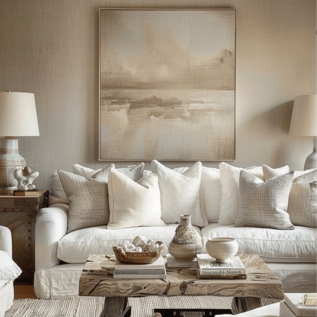
Nothing evokes refined style quite like an elegant neutral color scheme.
Soft hues like cream, beige and pale gray create a calm, soothing backdrop that allows accent colors and textures to really pop.
Here are three go-to neutral palettes that work for any room:
Creamy Neutrals – Pair soft vanilla, almond and candlelight shades of white for a dreamy, ethereal look.
Add visual interest by mixing matte and glossy paint finishes.
Warm metallics like brass and gold complement this scheme beautifully.
Use it in bedrooms for a peaceful spa-like vibe.
Warm Gray & Greige – Combine grayish taupes and warm greiges for an earthy neutral blend.
Incorporate organic textures like wood and rattan to enhance the natural feel.
Cool blues and greens make crisp accents.
This versatile scheme creates a welcoming atmosphere in living spaces.
Crisp Black & White – For dramatic contrast, go bold with a classic black and white palette.
Use in modern spaces with sleek decor and clean lines.
Pops of crimson or citrus add vibrant flair.
Limit use of this sharp scheme to avoid an imposing, cold ambiance.
When working with neutral palettes, pay close attention to the undertones of each shade.
Blend colors with similar undertones (warm with warm, cool with cool) for a harmonious look.
Keep the palette cohesive by limiting the number of neutral hues to 3 or 4.
Neutrals may be subtle, but they make up the foundation of any elegant color scheme.
Tap to Explore These Beauties
See my ideas in action 👇 Tap any image to explore full details.
Serene Blues
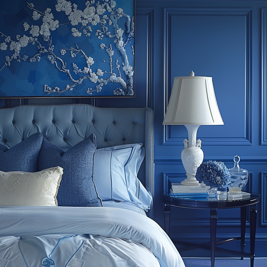
From pale powder to dramatic navy, shades of blue impart a sense of tranquility perfect for relaxed living.
Here are two elegant blue combinations that exude refined style:
Soft Powder Blue & Pale Yellow – Pair misty, ethereal blues with buttery creams and chalky yellows inspired by vintage French kitchens.
Distressed wood furniture and painted tiles complement this scheme.
Use in informal dining spaces for casual elegance.
Deep Navy & White – Bold navy instantly elevates any space with drama and sophistication.
Contrast with bright white trim, cabinetry and moldings for nautical refinement.
Metallic finishes like brass and chrome provide warmth.
Use in studies or libraries for an old-world gentleman’s club aesthetic.
When decorating with different shades of blue, opt for a mix of intensities.
Lighter, airy blues bring luminance and dimension when contrasted with bolder mid-tones and deep shades.
For variety, incorporate blue-tinged greens like teal or aqua.
Sophisticated blues create a relaxing yet refined backdrop for any living space.
Vibrant jewel tones
Looking to add daring drama?
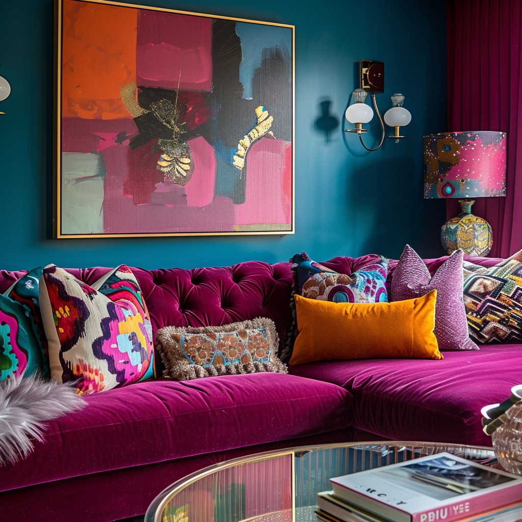
Turn to the deep, saturated hues of jewel tones like emerald, sapphire and amethyst.
These rich shades make a bold statement, but thoughtfully balanced, their vibrancy offers an elegant energy.
Here are two ways to effectively incorporate them:
Sapphire Blue & Ruby Red – Pair sumptuous shades of blue and red for a luxe, glamorous statement.
Accent with metallic finishes, dark wood and white trim for contrast.
Reserve this exciting combination for dining rooms, sitting rooms or bedrooms.
Deep Green & Plum – Earthy jewel tones like forest green and plum evoke nature’s beauty.
Highlight with natural linen, sheepskin rugs and wicker accents.
Avoid bright whites to keep the cozy, organic vibe.
Use this scheme in studies, libraries or bedrooms.
The secret to elegantly using jewel tones is blending colors with shared intensity.
Combining deep, saturated hues creates harmony while still allowing each shade’s richness to shine.
Don’t be afraid to test bolder colors – dark jewel tones can instantly create drama while still feeling polished.
Ready to Master the Kallax?
Transform your IKEA cube storage into custom furniture. Get my complete guide with 100+ projects, material lists, and pro tips.
“The IKEA Kallax Bible: 100+ Ways to Transform Cube Storage”
Warm & Inviting Hues
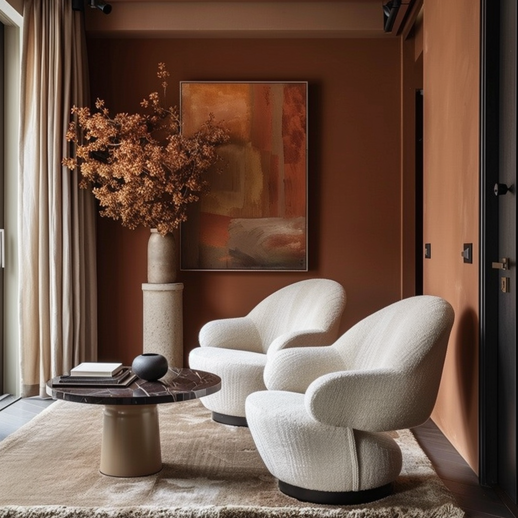
Who says neutral palettes have a monopoly on elegance?
Warm, earthy paint colors can provide a welcoming, informal elegance perfect for family spaces.
These inviting schemes add sophistication with natural texture and finish variety:
Tuscan Sun – Capture the warmth of a Tuscan villa with burnt orange, ochre and terracotta.
Hand-plastered walls, wood beams and handmade ceramics enhance the old-world charm.
Use in casual dining rooms, kitchens and sunrooms.
Retro Avocado Green & Pink – Vintage color combos are back in vogue!
Pair moody avocado greens with blush pink and salmon tones.
💭 Ever wondered what your room would actually look like rearranged?
I built a free tool that lets you drag furniture around a 2D floor plan. No signup, no catch.
See the Room Planner →
Mid-century furnishings give this playful palette a stylish Mad Men aesthetic.
Use in living rooms, offices or rec rooms.
Earthy hues offer an elegant vibrancy perfect for relaxed spaces meant for gathering.
Don’t be afraid to push the saturation – deeper, moodier shades keep things sophisticated.
Adding painted or aged natural wood furniture grounds these colors in organic texture.
Find Your Room’s Color Palette
Tap a vibe — get a curated 5-color palette with hex codes you can copy ✨
Monochromatic Styling
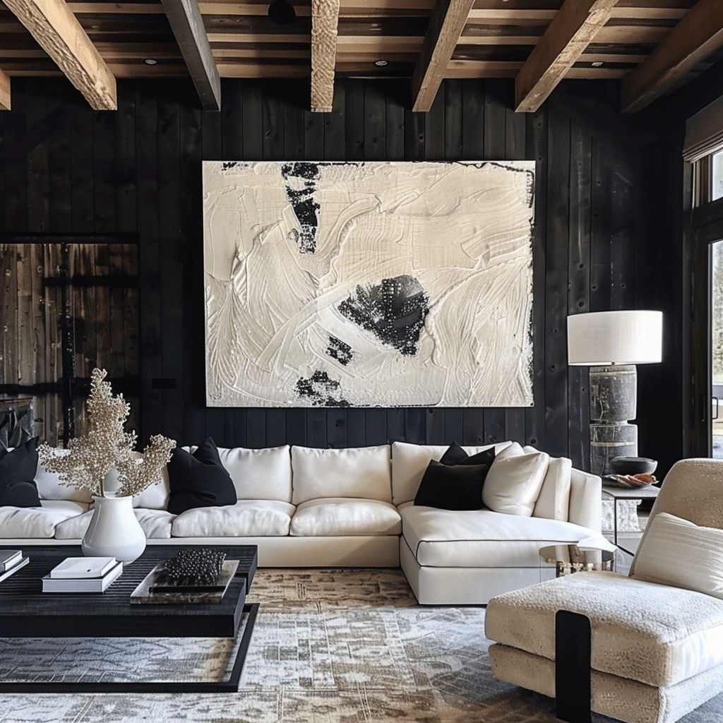
Using a single hue in varying shades and intensities creates a sophisticated, cohesive look.
Monochromatic color schemes offer elegance through simplicity – when done well, the effect is clean and refined.
Here are two ways to skillfully use this technique:
Shades of Green – Layer pale mint, sage and deep emerald for a lush monochromatic statement.
White trim prevents the space from feeling too dark.
Botanical prints, rattan furniture and antiqued mirrors complement this nature-inspired palette.
Tones of Taupe – Mix cream, beige, tan and dark umber to build dimension.
Add interest with a mod geometric wallpaper in similar tones.
Metallic accents in copper, silver and bronze provide a hint of glamour.
Use this versatile scheme in any living space.
The key to nailing monochromatic refinement is thoughtfully blending tones and finishes.
Pair matte and high-gloss paints, vary textures and incorporate tasteful patterns for visual intrigue.
Most importantly, limit accent colors to avoid a cluttered look.
Done right, a single-hue palette has a stylish simplicity hard to achieve with color mixing.
Muted Pastels
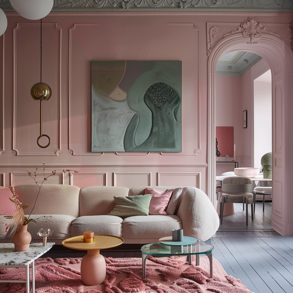
Soft, muted pastels offer an elegant versatility perfect for larger open-concept spaces.
These light hues blend seamlessly across rooms, unified by their subtle tones.
Here are two pastel combinations ideal for creating harmony:
Lavender & Sea Glass – Blend lilac, heather and ice blue-green for a pretty, vintage palette.
Painted wooden furniture adds warmth.
Use in open living spaces, libraries and kitchens.
Hushed Rose & Sage – Pair dusty mauves and peachy pink with muted sage greens.
Rain-greyed hardwood floors complement this scheme.
Use in nurseries, open dining rooms and master suites.
The biggest challenge when working with pastels?
Preventing spaces from feeling washed-out or flat.
Seek shades with grey, earthy or moody undertones for more depth.
Incorporate wood elements for coziness and warmth.
With thoughtful color mixing and rich textures, pastels can feel timelessly elegant.
What’s Your Decor Personality?
5 questions · 30 seconds · Instant style match 🏡
Ready to Master the Kallax?
Transform your IKEA cube storage into custom furniture. Get my complete guide with 100+ projects, material lists, and pro tips.
“The IKEA Kallax Bible: 100+ Ways to Transform Cube Storage”
High-Contrast Punch
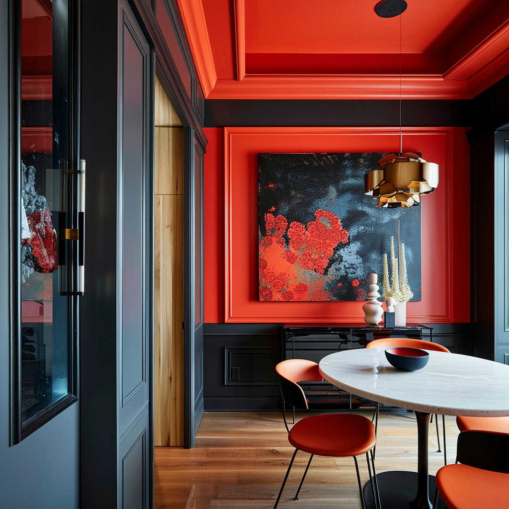
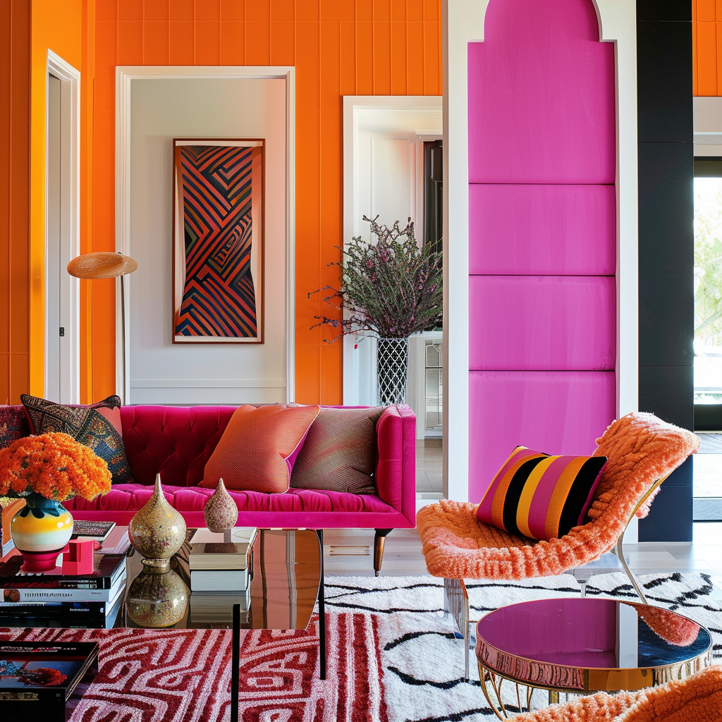
Some spaces call for an extra bold, lively palette.
Combining contrasting colors in a thoughtful balance results in sophisticated drama.
Here are two high-energy color schemes:
Sunshine & Raspberry – Cheerful yet refined, sunshine yellow and raspberry pink are playful complements.
Temper their vibrancy with cool whites and sleek modern decor.
Use in laundry rooms, offices and kitchens.
Electric Blue & Burnt Orange – For show-stopping punch, combine these intense complementary colors.
Highlight with glossy black accents and plenty of bright white for balance.
Reserve this energetic combo for dining rooms, fireplace focal points or entryways.
When combining contrasting hues, including a neutral third color is key for keeping spaces elegant.
Black, white or wood tones temper the high visual contrast.
Manage the balance so neither color overwhelms the other.
Bold contrasts add spirited sophistication when skillfully composed.
Organic Elegance
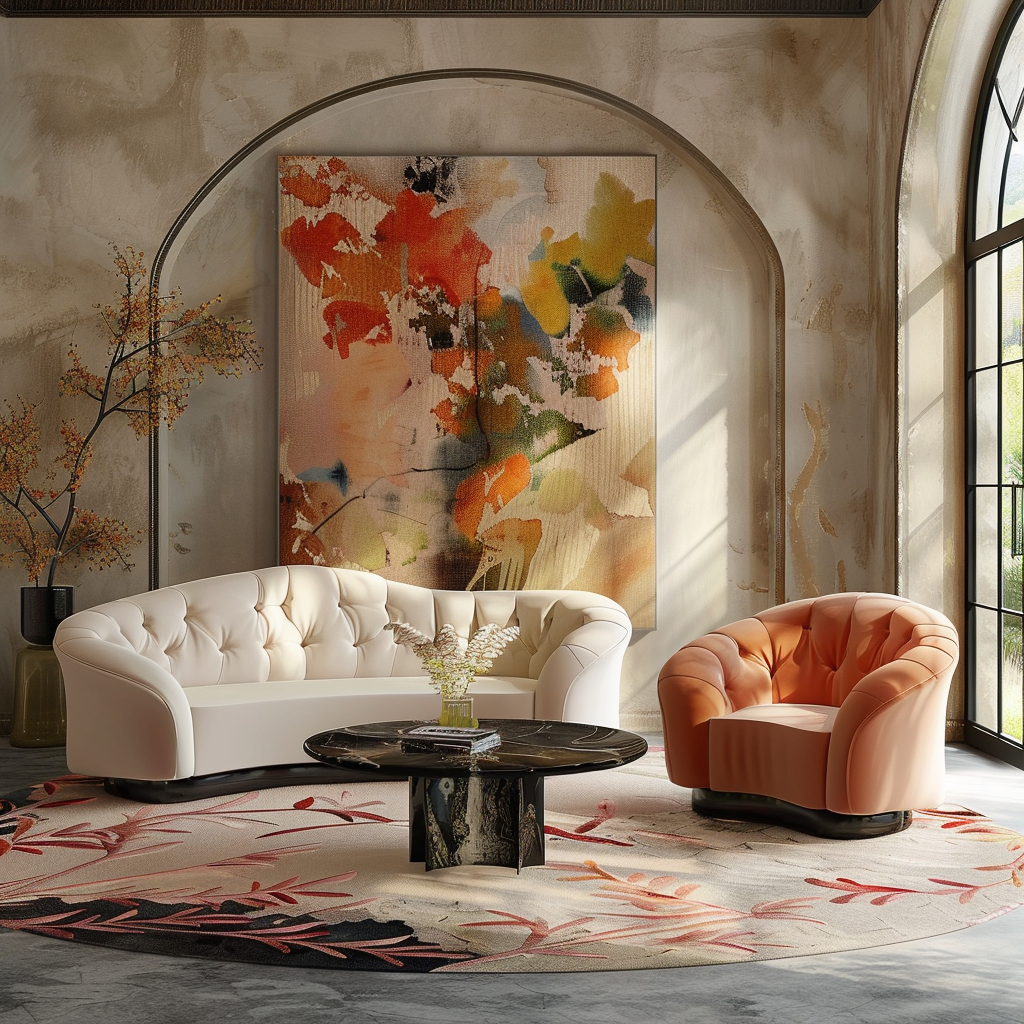
Nature-inspired colors like moss green, sky blue and sand beige effortlessly evoke casual refinement.
These organic palettes feel earthy yet elegant, perfect for creating a laid-back sophisticated oasis.
Here are two skillful ways to use them:
Oceanic Blues & Greens – Cool aquas, seafoam and sage capture the essence of breezy beach houses.
Whitewashed floors and weathered wood finishes enhance the coastal charm.
Use in sunrooms, bathrooms and bedrooms.
Warm Terracotta & Moss – Rich terracotta, brown and olive green hues resemble the colors of the desert.
Adobe and Spanish-style elements emphasize the earthy drama.
Use in dining rooms, libraries and living rooms.
Organic palettes work best with lots of natural textures and finishes.
Unpainted wood, visible stonework, linen and wool bring warmth.
Ensure colors share the same muted intensity for harmony.
With a considered composition, earth tones cultivate an organic yet refined elegance.
Crisp, Bold Primaries
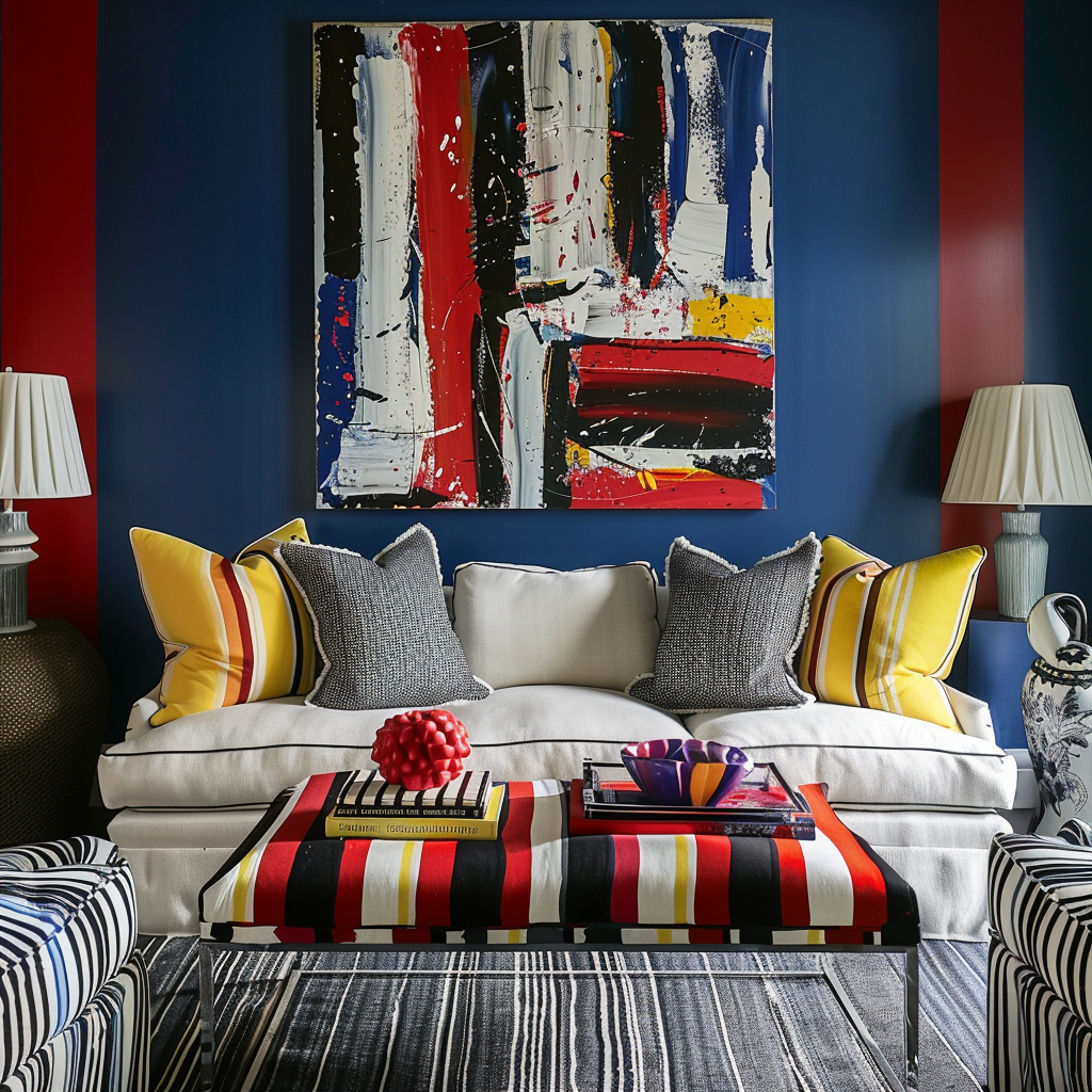
Some spaces call for an elevated palette that celebrates basic color at its boldest.
Combining pure, saturated primary shades creates instant graphic impact.
But thoughtfully balanced, this scheme offers elegant pop.
Here are two ways to skillfully use them:
Cobalt, Crimson & Sunshine – These powerful hues pack a punch but their even use creates equilibrium.
White walls, trim and ceilings keep the look refined.
Use in kitchens, rec rooms and kids’ spaces.
Ultramarine, Chartreuse & Vermilion – Vibrant yet classic color combinations inspire retro mod designs.
Black and white graphic patterns accentuate the boldness.
Use in offices, studios and eclectic dining rooms.
The balance between primary colors is key – if the distribution feels uneven, the look can become childlike and unsophisticated.
Aim for similar saturations across all three shades.
Crisp whites help manage the intensity.
With the right dose of restraint, primary palettes feel youthful yet elegant.
This or That?
Pick your fave — see what other readers chose! 👀
Ready to Master the Kallax?
Transform your IKEA cube storage into custom furniture. Get my complete guide with 100+ projects, material lists, and pro tips.
“The IKEA Kallax Bible: 100+ Ways to Transform Cube Storage”
Moody, Sophisticated Hues
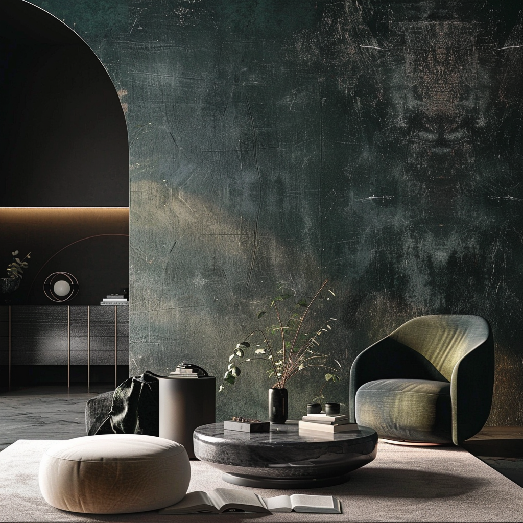
Deep, dramatic paint colors easily create an air of refined sophistication.
These moody shades feel indulgent, transforming rooms into rich spaces for relaxation.
Here are two ways to embrace the dark side:
Eggplant & Slate Blue – Royal purple and stormy blues create a rich, elegant cocoon.
Embrace the coziness with velvet and leather textures.
Use in intimate dining rooms and bedrooms.
Deep Forest & Black – Sultry shades of green paired with classic black exude modern elegance.
Clean lines and sparce decor keep the look from feeling too imposing.
Use in home theaters, galleries and wine cellars.
Very dark colors can overwhelm a space, so tactic moderation is key.
If using more than one, vary intensities for dimension.
Keep accent colors and additional patterns to a minimum – let the moody colors speak for themselves.
Thoughtful lighting is also essential for showcasing dark hues at their sophisticated best.
Rich Bordeaux & Golden Yellow
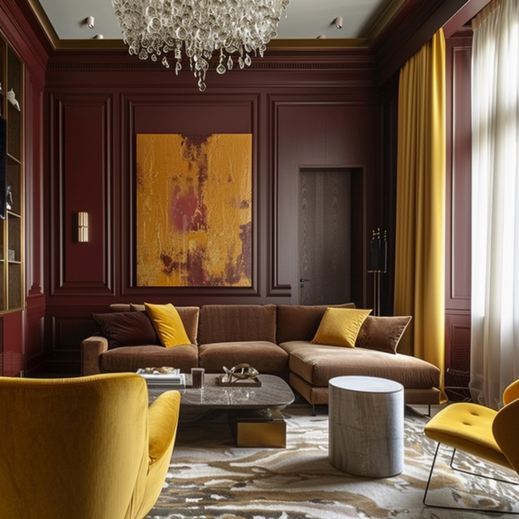
A color combination that evokes refined old-world glamour, pairing deep bordeaux reds with warm golden yellows creates an elegant palette full of rich contrast.
The bold intensity of a dramatic hue like bordeaux instantly conjures images of ornate detailing, opulent furnishings and romantic drama.
Slightly metallic, bordeaux has a deep reddish-purple undertone that feels indulgent and luxurious.
Depending on lighting, it can read as anything from a moody cranberry to a vibrant raspberry.
When using a powerful shade like this, it’s best to stick to just one deep bordeaux hue rather than mixing several red tones.
To balance out the vibrancy of bordeaux, warm golden yellows make the perfect complementary counterpart.
Ranging from muted mustard to bright marigold, golden yellows feel cheerful and inviting, tempering the moodiness of the red.
Select a golden yellow with orange undertones rather than lemon yellows for the most pleasing blend.
Keeping the yellow tone more muted helps continue the shared intensity between both colors.
When combined, rich bordeaux and golden yellow create a bold, sophisticated impact perfect for elegant formal spaces.
Use this blend in dining rooms, where the dramatic colors set an upscale tone for entertaining.
Velvet upholstered chairs in bordeaux pop against golden yellow walls.
Or make a statement by painting the ceiling and wood trim a bright marigold and the walls a deeper mustard.
In bedrooms, a bordeaux feature wall adds a glamorous focal point, especially when paired with gilded vintage frames and golden yellow bedroom furnishings.
For intimate library or office spaces, roll with dark oak built-ins and paneling against bordeaux walls and golden yellow tufted leather arm chairs.
This color scheme gains elegance and flair with the incorporation of natural wood tones and metallic brushed brass or antique gold accents.
Sconces, table lamps, hardware and decorative objet will feel striking against the colors.
Avoid strongly contrasting patterns – go for tone-on-tone designs or subtle textures like grasscloth wallpaper for interest without overwhelming the rich hues.
With its bold, dramatic contrast, a bordeaux and golden yellow color scheme makes a stunning statement in any formal living space.
Blending colors of similar intensity creates harmony, while the vibrancy adds a glamorous, elegant energy perfect for elevating a space to feel special and luxe.
Quick Design Dilemma
Cast your vote — see what other readers think! 🤔
Cool Gray, Blush & Rose Gold
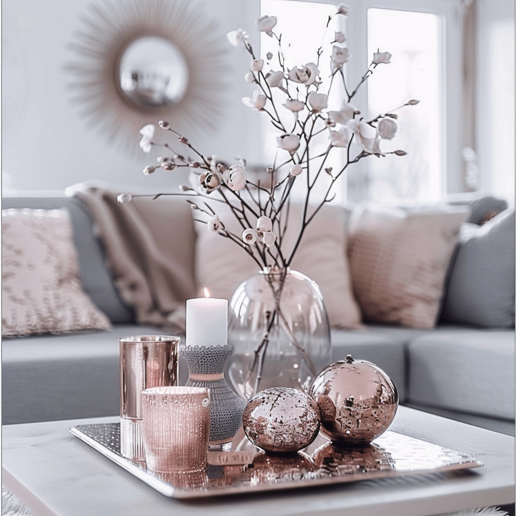
For refined spaces with a contemporary edge, blending cool grays with rosy pinks and subtle rose gold creates a palette that’s sophisticated and serene.
Medium gray hues offer flexibility to suit any aesthetic from modern to traditional.
Stick to gray with blue undertones rather than warm grays to maintain a cool, crisp feel.
Pair a range of tonal shades like fog, raincloud or granite for calming, airy dimension.
Using all flat matte gray finishes will make for a muted, monochromatic look.
Introduce subtle sheen in a paint or wallpaper for added depth.
Soft blush pinks and dusty mauves provide a romantic, feminine contrast to the tranquil grays.
Blush has enough punch to avoid feeling too sugary sweet.
Keep the rosy hues light and desaturated.
Combining matte and velvet finishes adds nice texture.
Look for blush shades with a touch of grey or brown for refinement.
As a finishing metallic touch, a hint of rose gold pulls the palette together, playing off both the gray and pink in a shimmering accent.
The most elegant application of rose gold comes through hardware, lamp bases, photo frames and decor objects.
Ready to Master the Kallax?
Transform your IKEA cube storage into custom furniture. Get my complete guide with 100+ projects, material lists, and pro tips.
“The IKEA Kallax Bible: 100+ Ways to Transform Cube Storage”
A little of the gilded rosy hue goes a long way – too much and it could feel gaudy.
This blend of cool and warm neutrals creates a versatile color scheme perfect for modern elegant spaces.
Use in airy living rooms and bedrooms, where the colors evoke rest and relaxation.
Paint the walls a soft blush pink and upholster any seating in matte medium grays.
Rose gold sconces and floor lamps add a subtle glitter.
In bathrooms, echo blush pink in the wall details and mix cool gray tones in the cabinetry, tilework and fixtures.
Metallic rose gold hardware ties the palette together.
Or go bold with a dark gray grasscloth accent wall and light gray cabinets.
For offices opt for medium gray walls and built-ins with rosy pink upholstered desk chairs.
Rose gold desk lamps and accessories impart an subtle, refined sheen against the matte colors.
Avoid strong patterns – let the calming colors speak for themselves.
Serene and stylish, this elegant pairing of cool grays, blush pinks and rose gold creates a relaxing yet sophisticated look perfect for transitional spaces.
Deep Green, Navy Blue & Antique Gold
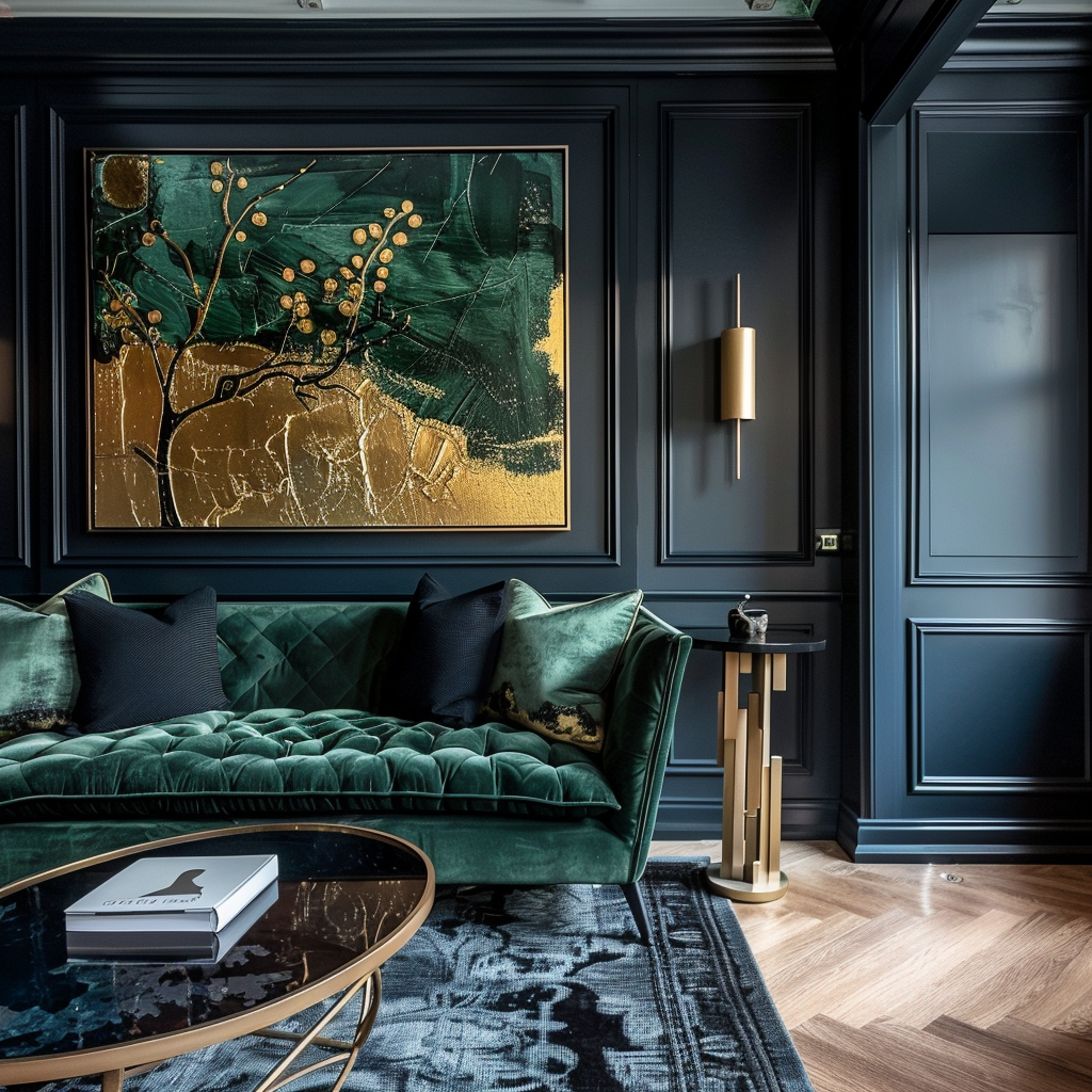
Combining rich jewel-toned shades like deep green and navy blue gains a vintage flair when accentuated with antique gold detailing for an overall moodily elegant feel.
Deep forest greens and nautical navy blues have a natural intensity and drama that makes them perfect for creating an intimate refined ambiance.
Choose darker, moodier emerald and hunter greens with blue undertones.
Mixing a deep green on the walls with a navy blue ceiling creates bold contrast.
Accentuate with classic decorative molding or chair rail detailing in true black rather than brown for definition.
Use navy strategically as an accent in velvet upholstery, drapery panels or area rugs to establish the color.
The addition of a warm metallic like antique gold adds the final vintage touch.
Brass fixtures or hardware aged to a darkened worn patina will pop against the jewel tones in a glamorous way.
Look for antique gold in ceiling light fixtures, cabinet hardware, frames and lamps for punch.
This color combination is ideal for more formal elegant spaces like libraries, sitting rooms and formal parlors.
Deep green walls with navy blue wainscoting and antique gold sconces exude refined taste.
In a dining space, navy blue walls become a moody backdrop for antique gold candle holders and deep green velvet upholstered chairs.
For a vintage lounge, deep green walls with a navy blue fireplace surround and hearth become cozy and elegant when paired with natural elements like walnut wood built-ins.
Complement with Persian style wool rugs in navy and emerald green patterns.
The overall look comes together in a bold yet grounded way with the inclusion of warm wood pieces.
Walnut, mahogany or espresso-stained wood in flooring, furniture and millwork provide organic texture.
Avoid bright whites and additional strong patterns.
Simple herringbone-patterned wood floors allow the rich paint colors to take center stage.
Sophisticated and striking, combining intense jewel tones like deep green and navy blue with antique gold accents creates moody elegance perfect for more formal living spaces and conversation areas.
