
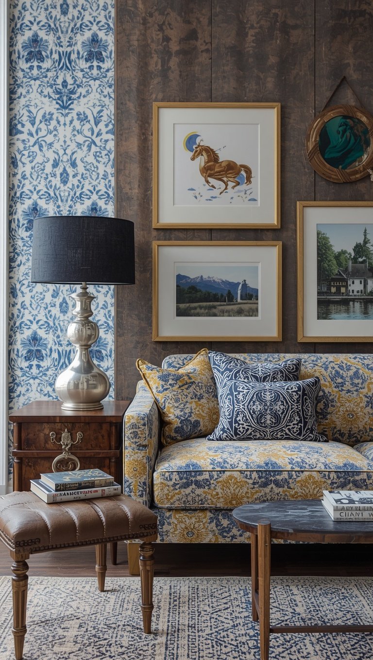

I used to think Americana decor meant flags on every wall and rooster figurines on every shelf.
And honestly, for a while, that’s exactly what my house looked like.
My grandmother’s ticking stripe pillow sat next to a random eagle statue I bought at a flea market because I thought “more is more.”
It wasn’t cozy.
It was cluttered, and a little bit costume-y, if I’m being real with you.
So I slowed down.
I started asking myself what actually made me feel something, versus what just felt “themed.”
That shift changed everything about how my home feels today.
So grab your coffee, because I’m walking you through exactly how I turned nostalgic Americana into something that feels warm, layered, and honestly kind of elegant.
Start With Textiles That Have a Story

The first thing I changed was my linens, and it made the biggest difference of anything on this list.
I pulled out an old quilt that used to sit folded in my mom’s closet for years.
I draped it over the back of my reading chair instead of hiding it away.
That one move made the whole room feel lived-in instead of staged.
Ticking stripe is my forever love here.
It’s classic, it’s a little farmhouse, and it never feels like a costume the way a literal flag print can.
I mix it with soft cream linen throws so it doesn’t feel too matchy or too “theme.”
My tip: buy one real vintage textile if you can find one at an estate sale or antique mall.
The imperfections are the whole point.
A little fraying, a faded patch, a hand-stitched repair, that’s what makes it feel like it belongs to a real family instead of a catalog.
If you can’t find vintage, a heavyweight cotton with a subtle stripe or gingham does the job beautifully too.
Just avoid anything glossy or synthetic feeling, because that’s where it starts to look cheap instead of cherished.
Why this works emotionally is simple.
Texture makes a house feel touched by hands, not just decorated by a checklist.
And that’s the whole secret to nostalgic decor that doesn’t feel dated.
It’s not about the pattern.
It’s about the feeling of history sitting quietly in the room with you.
Painted Furniture With Some Chip in It

I have this little side table that I painted a soft robin’s egg blue years ago.
It’s chipped on one corner from where I dragged it across my old apartment floor.
I used to want to fix that chip.
Now I kind of love it.
There’s something about a slightly worn painted finish that says “this has lived a life” instead of “this came from a warehouse yesterday.”
If you’re starting from scratch, chalk paint is your best friend here.
Sand the edges lightly after painting so the wood peeks through just a little, especially on corners and handles.
Don’t overdo it though, because there’s a fine line between “charming farmhouse” and “distressed for the sake of distressed.”
I’d say go for one, maybe two pieces per room with this treatment.
Any more than that and it starts to feel like a set instead of a home.
My favorite colors for this look are soft sage, buttery cream, and a dusty barn red used sparingly.
Skip the true bright red if you can, it tips things into “theme park” territory fast.
A muted, faded version feels like it’s been sitting on a porch for decades.
If I had one small dresser to redo this weekend, I’d start there.
It’s such a low-lift project with a really high emotional payoff.
Whisper the Flag, Don’t Shout It

Okay, this one is important, so stay with me.
I am not saying skip the flag motif entirely.
I’m saying stop hanging a giant flag over your couch like it’s a dorm room.
Instead, I look for small, faded flag art, the kind that looks like it was found in an old barn.
A single small piece in a hallway gallery wall does so much more than one giant statement piece.
I also love a subtle red, white, and blue color story woven into pillows or a table runner instead of literal imagery.
Think dusty navy, warm cream, and a faded brick red rather than primary colors straight off a crayon box.
That softened palette is what separates “nostalgic Americana” from “novelty store.”
My rule of thumb is one flag-adjacent moment per room, max.
Let it be a quiet nod, not the whole conversation.
When I did this in my own living room, I used a small vintage flag print tucked into a gallery wall with botanical prints and old family photos around it.
It reads as heritage, not holiday decor.
That’s the feeling you’re going for.
Something that could live on your wall in July and in November and feel exactly right both times.
Bring the Farmhouse Kitchen Energy In Gently

My kitchen is where this whole aesthetic really clicked for me.
I started collecting chipped enamelware mugs from thrift stores, the kind with little rust spots on the rim.
Every single one has a slightly different pattern, and I love that they don’t match perfectly.
Mason jars are an obvious choice here, but I’ll be honest, I got tired of the Pinterest version of mason jars everywhere.
So I use them sparingly now, mostly for wildflowers on the counter, not as a full storage system.
Open shelving with mismatched ironstone pitchers does more heavy lifting for this look than almost anything else.
I love how the slightly cream, slightly imperfect white glaze catches the afternoon light.
It’s soft, not stark.
My favorite hack is layering in one or two wooden cutting boards, propped up rather than laid flat, just for visual texture.
A dish towel with a simple stripe hanging off the oven handle finishes it without trying too hard.
Avoid anything with printed rooster graphics or cutesy sayings if you want this to feel timeless instead of trendy.
The goal is “this could have been my great-grandmother’s kitchen,” not “this came from a seasonal decor aisle.”
That distinction matters so much more than people realize.
Give Your Porch a Little Soul

If you have any kind of porch, front stoop, or even a balcony, please don’t skip this one.
My porch used to just have a doormat and nothing else.
Now it’s genuinely my favorite fifteen minutes of my day, sitting out there with coffee.
I added a simple wooden rocking chair I found secondhand and refinished with just a little linseed oil, nothing fancy.
A worn braided rug underneath grounds the whole space and hides scuffs beautifully.
String lights are optional but honestly, I’m obsessed with mine.
Warm white, never the cool blue-toned bulbs, because warmth is everything in this style.
A galvanized bucket planted with something simple, like herbs or geraniums, adds that lived-in porch feeling without costing much at all.
My tip is to resist buying anything shiny or new-looking for this space.
Let the materials be a little raw.
Aged wood, worn metal, faded cushions, that’s the whole vibe.
If I had a small apartment balcony, this is honestly the first thing I’d set up, even before the inside of my place.
There’s something about sitting outside in the evening that makes a house start to feel like home.
Let Wood Tones Do the Talking

I made the mistake early on of painting almost everything white.
It looked fine, but it felt a little flat and a little cold, if I’m honest.
Warm Wood Tones are what bring the nostalgic feeling back into a room without saying a single word about “Americana” specifically.
I added a reclaimed wood console table to my entryway, and it instantly warmed up the whole space.
The knots and grain variations are the whole point, so don’t sand them down to perfection.
Mixing wood tones is totally fine, by the way, and honestly kind of encouraged here.
A warmer oak next to a cooler weathered gray adds depth instead of looking matchy-matchy.
My personal hack is thrifting old wooden crates and stacking them as a bookshelf or plant stand.
They already have that worn, sturdy look you’d pay a premium for at a boutique store.
Beeswax polish over synthetic wood cleaner keeps that grain looking rich instead of plasticky.
It also smells incredible, which is a small joy I did not expect to love this much.
Wood is what makes a room feel warm even in the middle of winter.
It’s quiet, it’s honest, and it never really goes out of style.
Vintage Signage, But Make It Subtle

I have a small metal sign in my mudroom that’s slightly rusted at the edges.
It says something simple, nothing cutesy or overly worded.
That’s my rule for this category, by the way.
Short phrases only, and nothing that reads like a greeting card.
Old advertising-style signage, feed store graphics, or simple hand-painted numbers all bring in that nostalgic typography without tipping into novelty gift shop territory.
I found mine at a flea market for a few dollars, already worn in perfectly.
If you can’t find an original, look for reproductions with a matte, slightly textured finish rather than glossy printed metal.
The glossy ones are what make this look feel cheap, so trust me on that one.
One sign per room is plenty.
Let it be a focal point, not part of a cluster of competing text.
I love mine propped on a shelf leaning against the wall instead of hung perfectly straight.
That slight imperfection makes it feel found, not purchased for the room.
It’s such a small detail, but it changes the whole energy of the space.
Ironstone, Creamware, and a Little Bit of Chip

I started collecting ironstone almost by accident, one pitcher at a time from different thrift trips.
None of my pieces match exactly, and that’s exactly why I love them.
The slightly off-white, slightly cream glaze catches light so beautifully on an open shelf.
Some pieces have hairline cracks, and I’ve genuinely stopped seeing that as a flaw.
It reads as history now, not damage.
I like grouping odd numbers together, three pitchers or five small bowls, rather than perfect matching pairs.
It feels more like a collection built over years, which, let’s be honest, is exactly what nostalgic decor is supposed to feel like.
My tip is to resist buying a whole matching set from one store.
That instantly reads as “recently purchased” instead of “gathered over a lifetime.”
Estate sales are gold for this, by the way, so if you have one nearby, go early.
I’ve found some of my favorite pieces for just a couple dollars because nobody else wanted the “imperfect” one.
Their loss, honestly, because that’s the one with all the character.
Mix Your Patterns Like You Mean It
For a long time I was scared of pattern mixing.

I thought everything had to match perfectly or it would look messy.
Turns out, a little imperfection is exactly what makes this style feel authentic.
Ticking stripe and gingham are my go-to pairing, and I promise it works better than you’d think.
I use stripe on a bigger piece, like a chair or a curtain, and save gingham for smaller accents like napkins or a table runner.
Keeping the color palette tight helps a ton here.
I stick to cream, soft red, and a faded denim blue so nothing fights for attention.
A small floral thrown in occasionally softens the whole look, especially if it’s a muted vintage print instead of anything bold or modern.
My rule is three patterns max in one space, and one of them should always be a solid to give the eye somewhere to rest.
When I first tried this in my dining nook, I was nervous it would look chaotic.
Instead it felt collected, like it had come together slowly over years instead of all at once.
That’s the feeling you’re chasing with this whole aesthetic.
Let Old Photographs Do Some Emotional Heavy Lifting

Nothing makes a house feel more like a home than actual family photos, and I mean the old ones.
I scanned a handful of Black and White photos from my grandparents and had them reprinted in simple thin black frames.
Grouped together on a stairwell wall, they instantly gave the whole house a sense of continuity.
You don’t need fancy frames for this, honestly the simpler the better.
Thin black metal or slightly worn wood frames both work beautifully and won’t compete with the photos themselves.
I mix mine with one or two botanical prints so it doesn’t feel like a strict museum wall.
My tip is to vary the frame sizes slightly instead of buying a matching set.
That variation is what makes it feel like it was built over time, memory by memory.
If you don’t have old family photos, thrifted vintage photography works surprisingly well too.
Somebody else’s grandmother’s photo, framed with intention, still brings that same warm, nostalgic feeling into a space.
There’s something so grounding about walking past faces every day, even ones you never met.
It reminds you that your home has roots, even if you just moved in last spring.
Natural Fiber Rugs Instead of Anything Shiny

I swapped my synthetic area rug for a braided jute rug a couple years ago and honestly never looked back.
The texture underfoot is completely different, warmer somehow, even though that doesn’t totally make sense.
Braided rugs specifically have that old farmhouse feeling built right into the weave pattern.
I layer a smaller vintage-style rug on top of a larger jute base in my living room.
That layering trick adds depth without needing to buy one giant, expensive rug.
Wool rugs with a simple stripe or diamond pattern are another favorite of mine, especially in muted, faded tones rather than bright saturated colors.
Avoid anything with a glossy synthetic sheen if you’re going for this look.
It photographs fine, but in person it reads as new in a way that fights against everything else you’re building.
My tip is to look for rugs described as “vintage-inspired” or “distressed” if you can’t source an actual antique one.
They mimic that worn-in look without the sometimes-difficult upkeep of a truly old textile.
Bare feet on a slightly worn, soft rug is honestly one of the coziest feelings in a home.
It’s a small detail that most people don’t even consciously notice, but they feel it.
Seasonal Touches Without Going Full Costume
I used to go a little overboard around the Fourth of July, if I’m being honest with you.

Everything got covered in literal stars and stripes for one weekend and then felt weird for the rest of the summer.
Now I keep my base decor neutral and nostalgic year-round, and just add small, swappable touches for the season.
A bundle of fresh flowers in a simple ironstone pitcher does more than a dozen decorations ever did.
A faded bunting made from vintage-style fabric, used sparingly on a mantel, feels festive without feeling like a party store exploded.
My tip is to buy one or two quality seasonal pieces instead of a whole bin of dollar store items.
They’ll actually last, and they won’t clutter your storage closet for the other eleven months.
I also like swapping in a seasonal candle scent, something like cedar or fresh cotton, to bring in that feeling without touching the visual decor at all.
Sometimes the emotional shift is more about smell and light than actual objects on a shelf.
Warm lighting alone can make a space feel celebratory without adding a single new item.
That’s honestly become my favorite decorating secret over the years.
Mix Old With New So Nothing Feels Like a Set

This is probably the most important thing I’ve learned through this whole process.
If every single item in a room is “on theme,” it stops feeling like a home and starts feeling like a display.
I always pair my vintage pieces with something modern and simple, like a plain linen sofa or matte black hardware.
That contrast is what keeps the whole space feeling current instead of stuck in the past.
My rule of thumb is roughly seventy percent timeless and neutral, thirty percent nostalgic and detailed.
That ratio keeps things feeling curated instead of overwhelming.
When I redid my living room last year, I kept the big furniture pieces simple and modern, and let the smaller layers, the textiles, the frames, the ironstone, carry all the nostalgic weight.
It gave my eyes places to rest between all the detail.
My tip for anyone starting this style from scratch is to pick one or two “hero” vintage pieces you truly love, and build slowly around them.
Don’t try to buy the whole look in one weekend.
The slow, gathered feeling is genuinely the whole point of this aesthetic.
A home that looks like it happened overnight rarely feels as warm as one that grew a little at a time.
Related read: Things I Wish I Knew Before I Decorated My First Home — Instant PDF + Kindle download. Secure checkout by Stripe

