
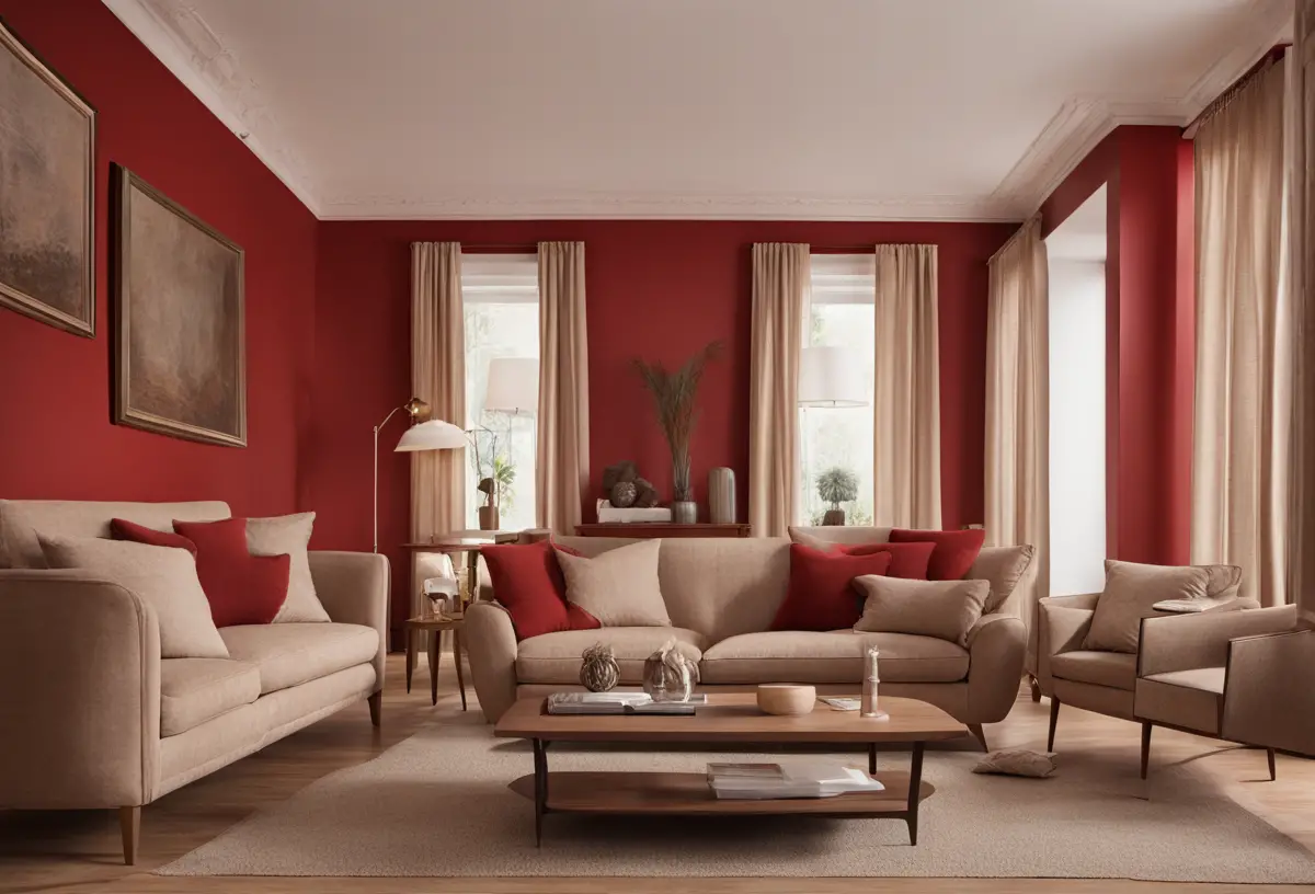


When I first moved into my new apartment last year, one of the biggest challenges I faced was deciding on a paint color for the walls.
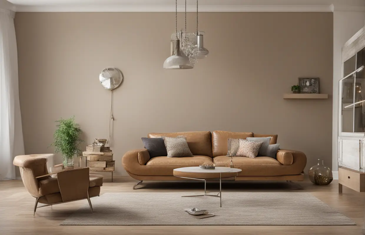
The living room already had light brown leather couches that I loved, but I was struggling to pick out colors that would look good with the furniture.
Everything I tried seemed to either wash out the brown tones or clash with them.
It felt like I was stuck in an endless paint color rabbit hole!
After weeks of sampling different hues and reading countless online articles for inspo, I started to realize that certain shades naturally complement light brown without being too harsh.
And once I selected a neutral gray and olive green, it all came together.
Now, I’m sharing the top colors that I discovered work well for light brown furniture.
So if you find yourself in a similar situation, hopefully this guide will help you choose hues that will make your space feel pulled together and at peace.
I finally chose neutral gray and olive green shades that enhance the warmth of the wood tones without overwhelming the space.
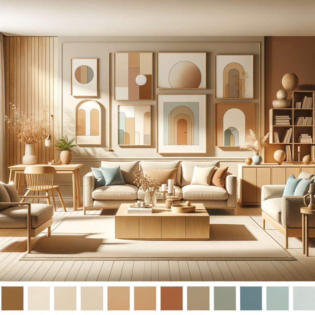
Here are 20 wall color picks that go well with light brown furniture:
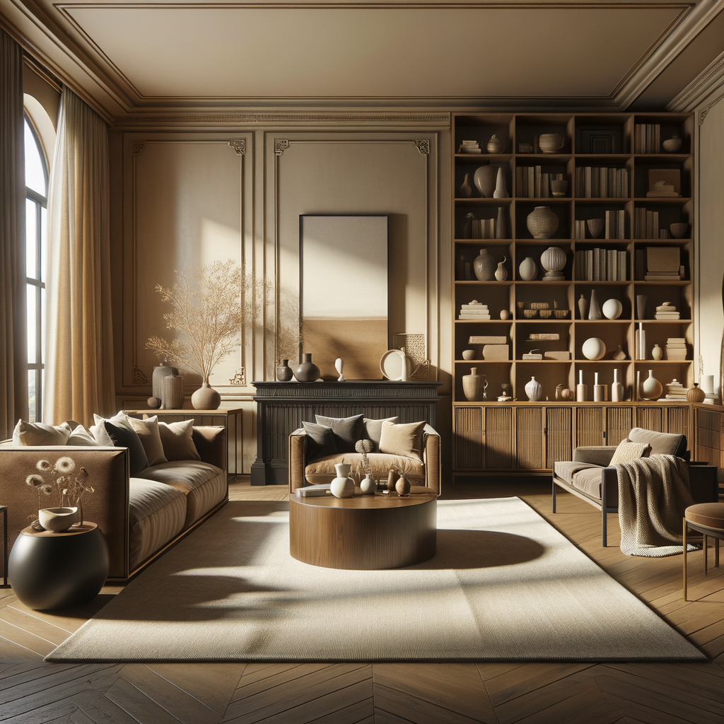
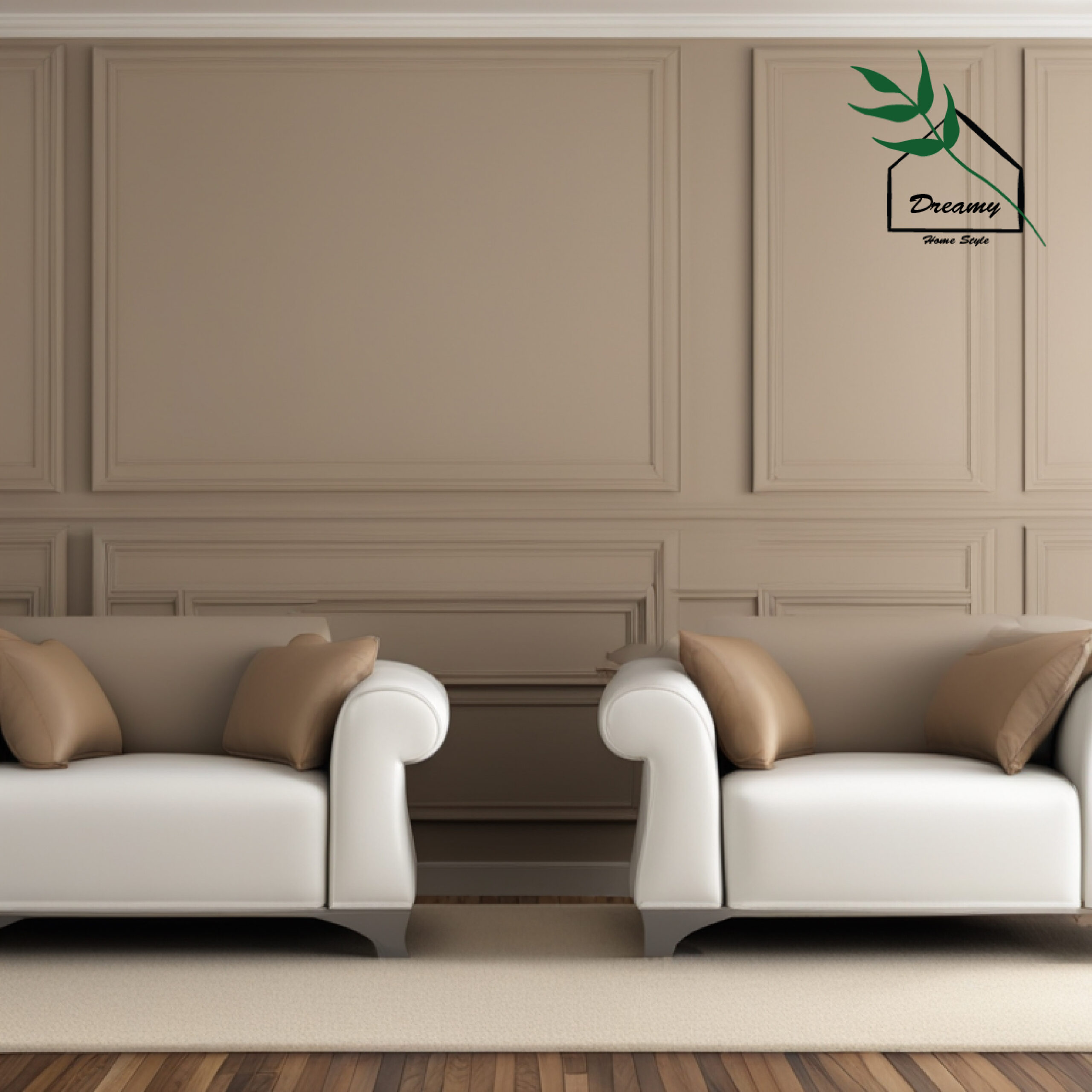
Neutral Gray
Neutral gray is one of the most versatile paint colors you can choose because it pairs beautifully with just about any style of furniture.
When it comes to light brown wooden pieces, a cool, soft neutral gray allows the warmth of the wood tones to really stand out.
The gray balances the cozy vibe of the brown without overwhelming the space.
It creates a soothing, relaxed atmosphere.
Some key reasons why neutral gray is a fantastic match for light brown include:
- The cool undertones in gray make the brown pop and enhance its richness.
- Gray has a calming effect that lets the eye and mind rest without competing with the furniture color.
- It’s a neutral backdrop that allows the brown to take center stage without contrasting harshly.
- The gray tones down any yellow undertones that can sometimes be present in light brown woods.
Whether you choose a true cool gray like Cloud Nine or one with warmer hints like Repose Gray, neutrals like these provide the perfect canvas to showcase light brown furniture in a balanced, serene way.
The gray acts like a complementary backdrop for the wood to shine.
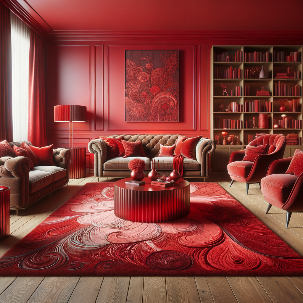
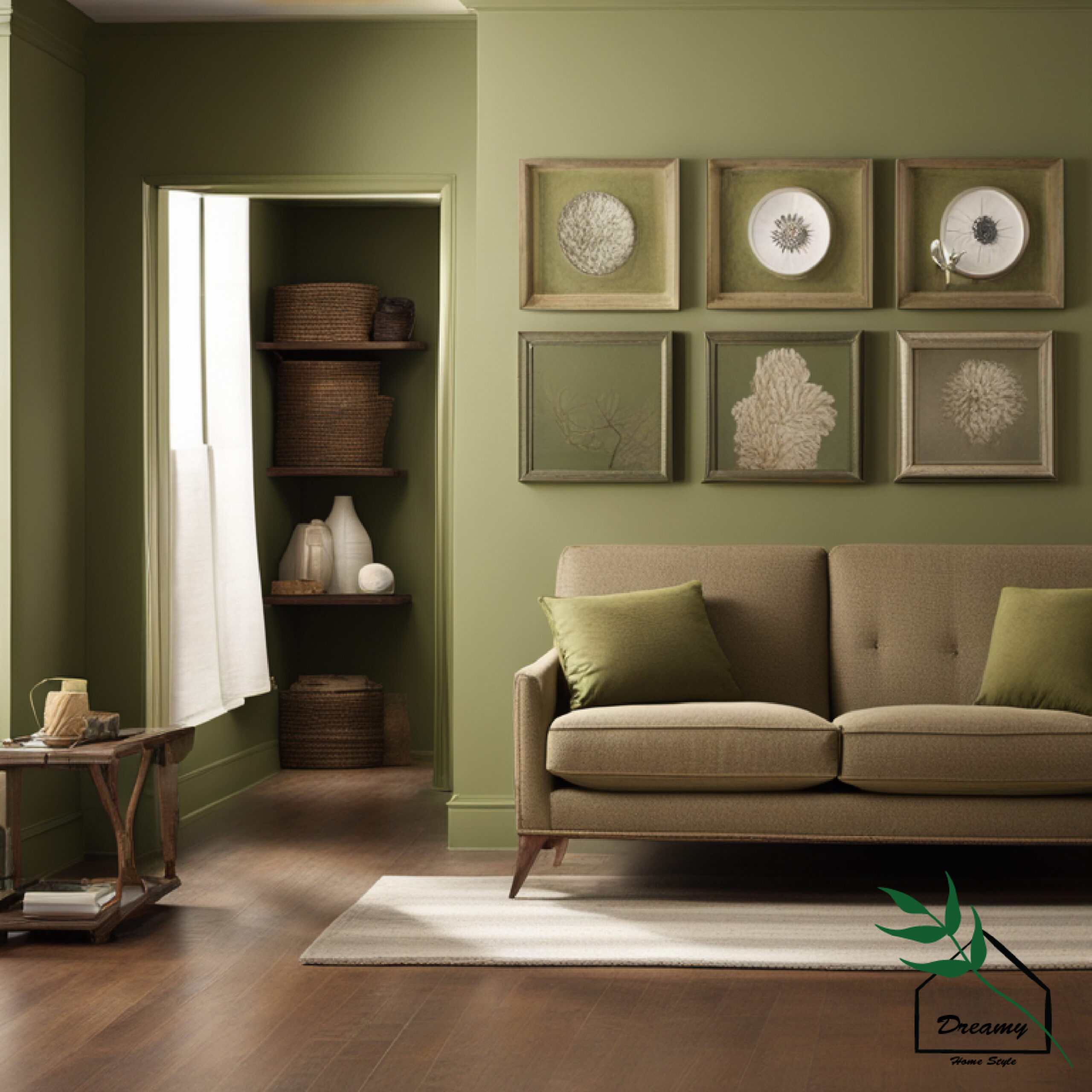
Olive Green
While olive green may not seem like the most obvious choice for pairing with brown furniture, its natural earth tones can actually complement light brown very nicely when chosen correctly.
The key is opting for a muted, softer green hue rather than a brighter lime color.
Shades like Huntington Estate have brown and gray undertones that mesh harmoniously with wood.
The green adds visual interest while still respecting the brown’s place as the dominant color.
It brings a touch of boldness without overwhelming the space.
Some benefits of using olive green with light brown include:
- The green’s natural tones echo the warmth of the wood grain.
- It infuses uniqueness while remaining grounded alongside natural materials.
- The subtle green livens up plain brown without contrasting too starkly.
- Earthy green creates a cozy, grounded atmosphere when paired with wood.
An olive green helps liven up light brown’s inherent coziness in a sophisticated, eclectic way.
With the right undertone shade, it proves green and brown can seamlessly mesh to create unexpected harmony.
Design Your Dream Room in Minutes!
🏡 Start Creating FREE →Taupe
As a home designer, I’ve found that taupe is one of the most foolproof wall colors to pair with light brown furniture.
The light neutral taupe acts almost like a canvas backdrop that allows the warmth and detail of the wood to shine through.
When choosing furniture, light brown tones are popular for their versatility and ability to create a relaxed, comfortable ambiance.
However, you want to be careful that the wall color doesn’t inadvertently wash out the brown or make the space feel flat.
This is where a light taupe acts as the perfect neutral complement.
The subtle beige-gray undertones both emphasize and temper the brown hues.
It creates a soft equilibrium where neither color dominates too much.
Homeowners often worry taupe may read too dull against furnishings, but it actually has the opposite effect.
The taupe gently brings out rich dimension and resonates harmoniously with the medium wood tones.
It makes the brown pop without harsh contrasts.
From a design perspective, taupe establishes a serene backdrop that allows eyes to focus on interesting textures.
Yet it isn’t so light that it seems stark against the furniture either.
The balanced taupe neutrally elevates any light brown wood to perfection.
As both a decorator and color expert, light taupe is one of my tried-and-true recommendations for anyone wanting to showcase warm wood tones to their best advantage through complementary walls.
It simply works.
TRENDING NOW
Paint Your Wood Fence: 12+ Colors That Stand OutBeige
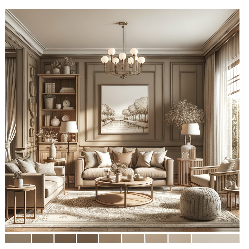
Beige is another wall color I often suggest for light brown furniture spaces.
While it may seem like a basic choice, beige truly deserves its reputation as a foolproof partner to light wood tones.
When used correctly, beige creates a soft, serene environment for the eye to rest while appreciating details in the brown furnishings.
The slightest warmth in the beige picks up on undertones in the brown without looking stark.
Some beiges have more gray while others lean pinker, but they all impart an airy sense of ease.
From a design perspective, this relaxed atmosphere allows homeowners to freely accessorize and rearrange without competing colors distracting eye lines.
Relative to stark white, beige also doesn’t wash out wood’s natural beauty.
As a designer, I find white too high-contrast against brown and prone to date rooms quickly.
Beige serves as a bridge between the brown and off-white without apparent seams.
Its softness also means beige remains flexible for years, muting with age parallel to furniture refinishing or new wood pieces.
This longevity is invaluable compared to bolder hues requiring constant updating.
In the end, beige allows light brown to maintain its place as the focal aesthetic draw.
The walls step back as a calm, flexible setting for the true star – the gorgeous woodgrains.
For that reason, beige will forever be a go-to choice in my book.
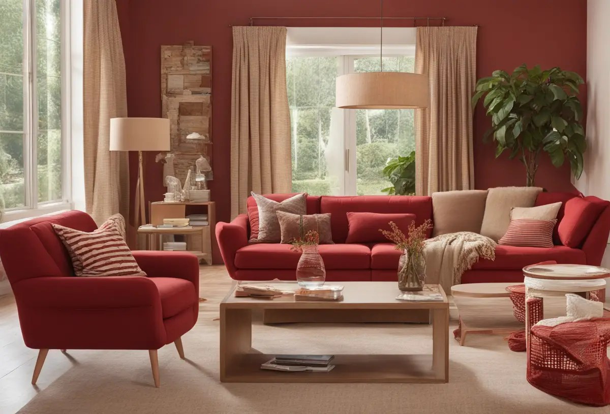
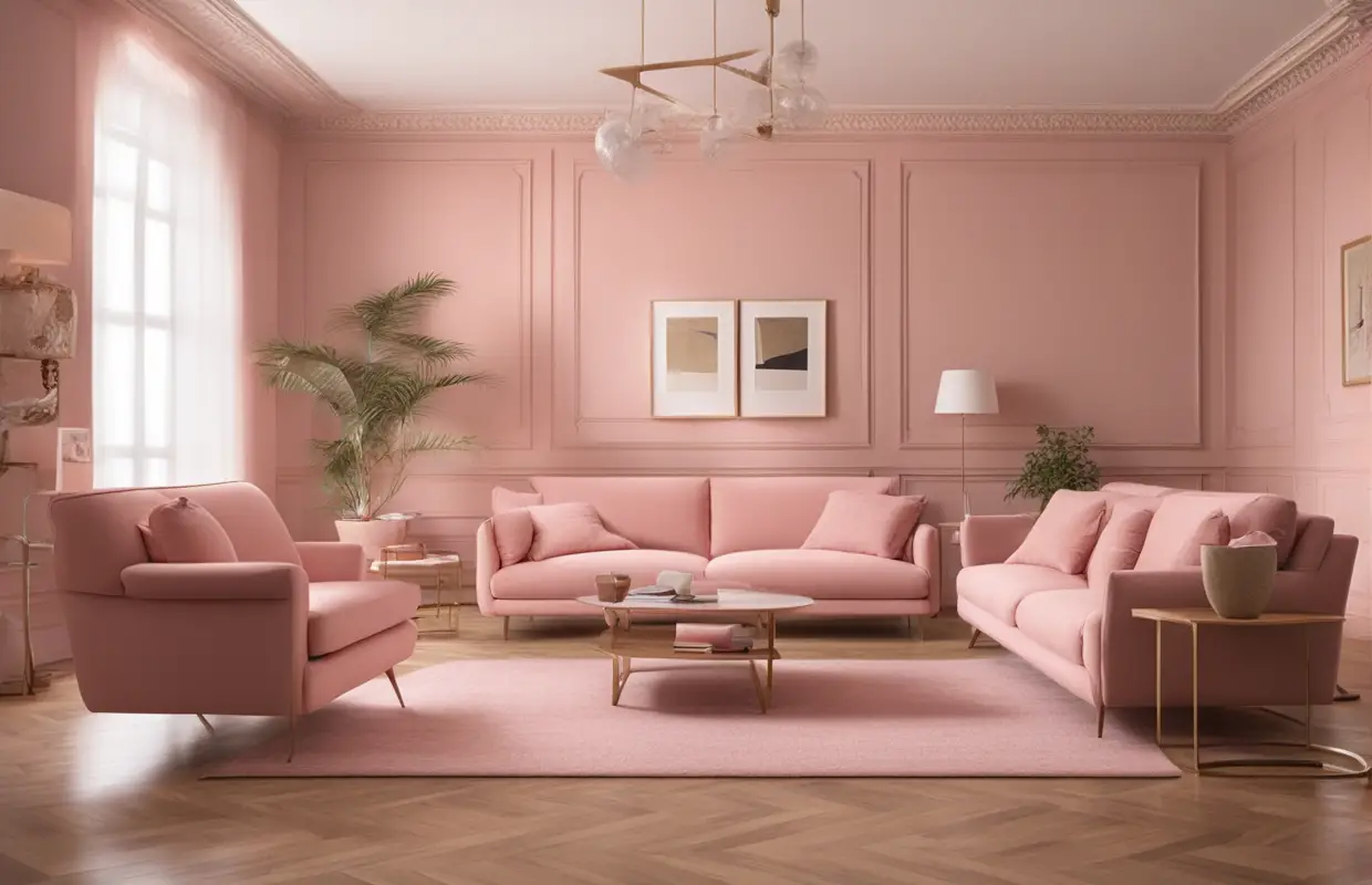
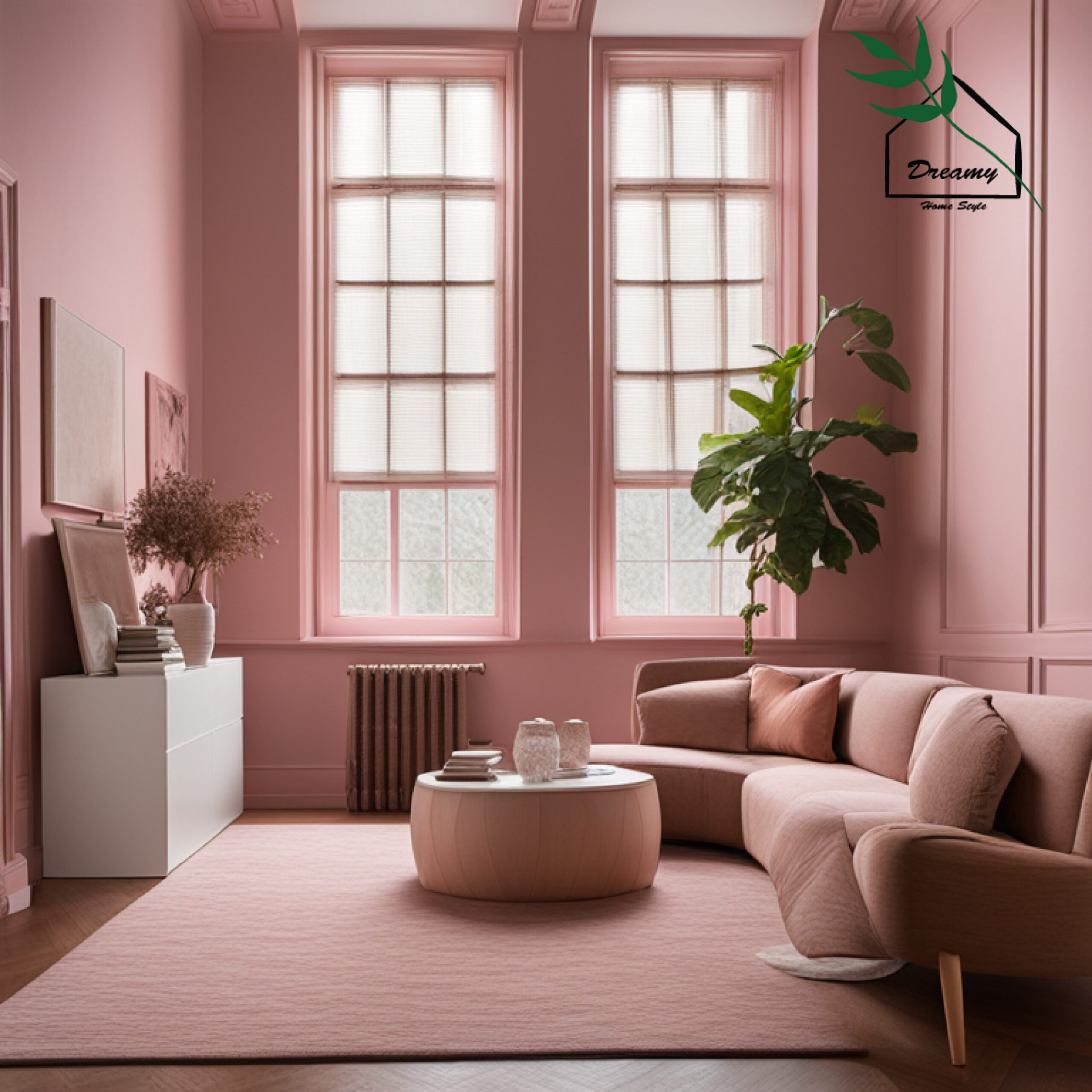
Pink
I’m always excited to see homeowners experimenting with colorful accents beyond typical neutrals.
Pinks especially have gained popularity mixed with wood tones.
When choosing the right pink for light brown furniture though, it’s key to select a lighter, softer shade.
While bolder hot pinks could overwhelm subtle woodgrains, lighter blush tones have a way of brightening brown’s coziness without looking out of place.
They infuse intimacy without acting too feminine.
The pinks reflect light beautifully off furniture piece details.
From a design perspective, blush pink serves as a breath of fresh air lifting brown’s grounding energy.
It feels youthful and cheerful without veering juvenile.
Paired with natural materials, the delicate color remains sophisticated.
Laying out fabric swatches next to wood samples in different lights also helps assess thickness of pigment.
Pink too thick comes across jarring against brown’s depth, but thinner shades subtly enhance wood’s richness.
Ultimately pink adds vitality where beige risks flatness.
As a designer leading with creativity, I love how it challenges expectations charmingly.
When selected carefully and in moderation, the softer coral or ballerina tones simply makes brown’s warmth glow.
So while pink may seem an unlikely choice, when balanced thoughtfully it proves color combos don’t require playing it safe.
Experimenting can yield rewards for interior styles beyond the expected.
Sea Salt
Sea Salt is a lovely light neutral gray-blue shade that has become increasingly popular in recent years.
As a designer, I’m a big fan of this subtle gray-blue tone for several reasons when paired with light brown furniture.
The hint of blue in Sea Salt livens up plain neutrals without being overly cool or stark like bright whites can.
It subtly picks up reflections in light brown wood grains for a warmer feel.
At the same time, the gray balances potential yellow undertones in some light brown pieces.
This color creates a soft, breezy aesthetic that feels fresh and relaxed.
The essence of a seaside retreat is instantly felt.
Yet the pale tone remains sophisticated rather than juvenile like brighter blues could.
Homeowners love how Sea Salt serves as a serene backdrop without distracting from decorative accents and architectural details.
It allows wood tones to truly shine as the focal point.
In my view, Sea Salt is the epitome of an understated coastal gray that feels contemporary when blended with natural elements like light brown wood.
It makes a great alternative to ordinary beiges.
White Dove
White Dove is a very pale, soft neutral gray with cool undertones.
It lean closer to white than gray.
As a designer, I find it creates a bright, airy feel that doesn’t overwhelm warm wood tones like stark white can.
The subtle gray nuance provides balance.
The wall color acts as a feather-light backdrop that allows light brown details to shine without competing for attention.
It works especially well for reflecting light into medium-toned woodgrains, bringing out richness without harsh contrast.
Homeowners appreciate how the pale sophistication makes furniture styles like Scandinavian and mid-century modern really pop.
White Dove feels crisp and fresh but not stark.
It maintains a relaxed synergy with natural materials.
Over time, the soft gray tone means the color scheme will age well as furniture refinishing lightens or darkens the brown.
As a versatile neutral, it also serves as a nice blank canvas for trying different decorative accents and textures.
So , with its serene clarity, White Dove seamlessly sets the stage for showcasing light wood’s beauty.
It lets the furniture take the spotlight comfortably.
Storm
Storm is a very pale, muted green-gray hue with cool beige-toned undertones.
It reads almost like a softened sea mist.
As a designer, I appreciate how Storm lifts plain woodgrains without overwhelming them like bolder blues could.
The soft green element provides depth.
The gentle tone creates harmony between warm woods and refreshing coastal ambiance.
It feels breezy and calming.
Homeowners note Storm makes furniture styles like vintage and Scandinavian sing without seeming stark.
The veil-like wash perfectly flatters medium-toned light brown pieces without contrasting harshly.
Over time, subtle Storm will age attractively as furniture lightens from exposure or wear.
Its pale chroma acts as a tranquil backdrop that lets wood’s natural beauty predominate the room.
As a designer, I’ve seen Storm work for both intimate living rooms and open layouts needing a cohesive feel.
So, Storm elegantly marries natural elements and relaxed comfort through its soft washed-out presence bringing out light brown furniture’s inherent beauty.
Dusty Rose
Dusty rose is a very pale, muted pink-beige shade that adds a soft blush of femininity without being overly bright.
I’ve found it can subtly warm up the essence of light brown woods in a sophisticated yet soothing way.
The gentle pigment plays up qualities like natural grain and hints of caramel undertones beautifully.
It serves as a feathery backdrop that lets the eye focus on wood details without competing for attention.
Homeowners appreciate how dusty rose feels fresh and romantic rather than juvenile like hot pink could.
When paired with natural materials, the delicate pink remains elevated and elegant.
Over multiple design phases, its softness ensures it won’t date the space as quickly as bolder hues.
As light brown furniture styles shift, the coordinating wall color can flexibly change too.
In low or indirect lighting, dusty rose mellows to an almost neutral beige that shines through.
So, with its subtle delicate essence, dusty rose captivates the eye through light brown furnishings in a continually charming, uplifting way.
Mushroom
Mushroom is a very pale, neutral taupe shade with warm beige undertones.
It skews close to a natural clay color.
I find mushroom serves as an excellent companion to medium-toned light brown woods.
The subtle taupe tones echo and bring dimension to the warmth found within grains.
It serves as a quiet backdrop that allows furniture to take visual precedence in the room.
Homeowners appreciate how mushroom feels fresh and calming without overwhelming details.
When paired with natural materials, the earthy hue feels elegant and sophisticated.
Over time, its gentle chroma means the color palette will age attractively as pieces lighten.
Mushroom also works beautifully with a variety of accent colors and textures.
I’ve seen it work especially well for farmhouse, lodge and eclectic modern styles.
This versatile neutral sets the perfect relaxed tone for showing off light brown wood tones.
So, mushroom elevates natural elements through its relaxed, grounding presence bringing peace and visual harmony to a space.
Thistle
Thistle is a very pale lavender-gray hue that reads almost white in most lighting.
It has cool undertones.
As a designer, I appreciate how Thistle livens up a brown space without overwhelming warm wood tones.
The hint of pale periwinkle picks up subtle reflections in grain but doesn’t fight the furnishings.
It serves as a soft backdrop to let the eye rest on furniture details without stark contrast.
Homeowners like the breathing room Thistle provides compared to stark whites traditionally used.
When used with natural elements, the powdery tone feels sophisticated and refined, not childish.
Over time, its muted essence will age gracefully as the light brown naturally changes shades too.
Thistle also has the benefit of working with a variety of decorative accents and artwork.
I’ve seen it look especially nice for Swedish, English country and French farmhouse styles.
This breathable neutral underscores light woods’ attractive qualities through balance and poise.
So, Thistle brings serenity and space to brown furnishings through its sophisticated, feminine undertone.
Pale Oak
Pale Oak is a very soft neutral tan color with subtle warm undertones.
It reads almost putty in tone.
As a designer, I’ve found this muted shade enhances light brown woods without competing for attention.
The gentle pigment echoes the organic essence of wood materials in a peaceful way.
It allows furniture to shine as the focal point while providing a blank backdrop for the eye.
Homeowners like how Pale Oak feels fresh and airy without overwhelming room details.
When paired with natural elements, the earthy tint feels elevated and works for both casual and refined interior styles.
Over time, its faint chroma means the palette will age well as wood grains mellow or darken slightly through use.
Pale Oak also partners beautifully with differing decor styles and textiles without appearing too matchy.
I’ve seen it particularly suit farmhouse, vintage and eclectic modern schemes.
This soft neutral underscores warm accents through relaxed poise and visual breathing room.
So in essence, Pale Oak brings the serenity of light woods to the fore through balancing, harmonious placement.
Pebble
Pebble is a very pale grayish taupe shade that verges almost mint in tone.
It has both cool and warm undertones.
I appreciate how Pebble lifts wood grains in an invigorating way rather than competing.
The subtle color infuses interest without overwhelming furniture details like stark white can.
It provides a tranquil backdrop for the eye to focus fully on warm wood tones and accents.
Homeowners enjoy the breathing room and brightness Pebble lends to natural elements.
When used with organic materials, its soft tone feels both uplifting and refined rather than cold.
Over time, the gentle chroma means the palette will wear attractively as pieces lighten naturally.
Pebble complements an array of decor styles from eclectic to beachy while suiting family life.
I’ve seen it work particularly well in Scandinavian, modern farmhouse and English country schemes.
This adaptive neutral underscores lights woods’ qualities through poise, harmony and visual interest.
So in essence, Pebble tones lighten and enhance warm accents through balanced, refreshing placement.
TRENDING NOW
Rental-Friendly Removable Wall Decor IdeasClay
Clay is a very soft neutral taupe/beige shade that is warm without being overly yellow.
It has subtle olive and pink undertones.
I find Clay enhances light brown woods through echoing their organic essence in an earthy, comforting way.
The gentle pigment allows furniture to shine as the focal point while serving as an embracing backdrop.
Homeowners appreciate how Clay feels relaxed and sophisticated without overwhelming details.
When paired with natural materials, the putty-like hue feels elevated and works cross a variety of styles.
Over time, its mellow chroma ensures the palette will age beautifully as wood tones evolve naturally.
Clay also meshes well with different decorative accents and art through its adaptive versatility.
I’ve seen it particularly suit Southwestern, French farmhouse and global eclectic schemes.
This muted neutral underscores warmth through relaxed harmony, visual ease and nurturing ambient qualities.
Clay lifts and grounds light woods magnificently through balanced, comforting placement and tone.
Stone
Stone is a very soft neutral gray color with subtle brown, beige and green undertones.
It reads almost like weathered concrete.
I find that Stone enhances light brown woods through echoing their natural tone in an earthy yet grounded way.
The muted pigment allows furnishings to shine as the focal point while providing an anchoring backdrop.
Homeowners like how Stone feels calmly sophisticated without overwhelming the space.
Paired with organic materials, its stony tone feels refined and works for modern farmhouse, industrial, and mountain design aesthetics.
Over time, the gentle chroma ensures the palette will harmoniously age as woods mellow or darken naturally through use.
Stone also pairs well with various decorative elements through its chameleonic versatility.
I’ve seen it particularly suit rustic, minimalist and Japanese-inspired interior schemes.
This adaptive neutral underscores light wood’s warmth through balanced placement, visual ease and stabilizing qualities.
Stone subtly enhances furnishings through its composed, grounding essence and thoughtful blending with natural elements.
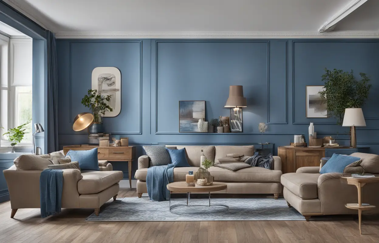
Dusty Blue
Dusty Blue is a very pale, muted blue-gray shade that has subtle greenish undertones.
It reads almost like a faded denim.
I’ve found Dusty Blue lifts light brown woods in an invigorating yet soothing way rather than competing for attention.
The hint of blue infuses cerebral interest without overwhelming furniture details like stark whites can.
It provides a serene backdrop to allow warm tones to shine while creating visual excitement.
Homeowners enjoy how Dusty Blue feels fresh and sophisticated without seeming harsh.
Paired with natural elements, its softness feels elevated and works well in coastal, mountain and Scandinavian styles.
Over time, the gentle chroma ensures the palette will age attractively as wood tones mellow naturally.
Dusty Blue complements various decor accents through its balancing ability to flatter warm accents.
I’ve seen it work particularly well in breezy beach homes, rustic cabins and airy modern farmhouses.
This adaptive neutral elevates light woods’ appeal through relaxed contrast, poise and visual breathing room.
Dusty Blue enlightens furnishings through balanced, refreshing layering of tone.
Mist
Mist is a very pale, subtle grayish lavender hue with soft blue undertones.
It reads as an airy, faded pastel.
Mist lifts and lightens brown woods in an ethereal way without competing for attention.
The hint of lavender infuses interest while allowing furnishings to remain the focal point.
It provides a dreamlike backdrop that lets warm tones shine through for visual ease and relaxation.
Homeowners appreciate how Mist feels fresh, romantic and sophisticated without dominating a space.
When paired with natural fibers, its soft essence feels refined and works well for coastal, bohemian and minimalist styles.
Over time, the light chroma ensures the palette coordinates beautifully as wood tones evolve naturally.
Mist also pairs beautifully with varied accents and brings serenity through balanced layering.
I’ve seen it work especially well in breezy bedrooms, light-filled living areas and zen mudrooms.
This ethereal neutral magnifies furnishings through relaxed harmony, visual ease and ambiance.
So, Mist elevates light wood’s appeal through its poised, calming presence.
Sage Green
Sage Green is a soft, pale green with gray and yellow undertones.
It reads as a washed-out greenery.
Sage Green livens up brown wood tones without overwhelming them.
The hint of green is refreshing.
It provides visual contrast while still allowing furnishings to remain the focal point of the space.
Homeowners like the breath of life Sage Green brings without seeming high-contrast.
When used with natural materials, its subtle tone feels sophisticated and elevated, not harsh.
This color pallet will age gracefully as wood tones mellow over time.
Sage Green pairs beautifully with varied decorative styles from modern farmhouse to coastal cottage core.
I’ve seen it work especially well in light-filled kitchens and breezy porches or sunrooms.
Its mellow qualities balance and enhance warm woods through calming contrast and dimension.
In essence, Sage Green freshens up spaces with an zen, organic ambiance that flatters natural elements.
So this muted green livens up light brown furnishings through balanced, Earthy layering and dimensionality.
Dusty Rose
Dusty Rose is a very pale, muted pink-beige shade that adds a soft blush of femininity without being overly bright.
I’ve found it can subtly warm up the essence of light brown woods in a sophisticated yet soothing way.
The gentle pigment plays up qualities like natural grain and hints of caramel undertones beautifully.
It serves as a feathery backdrop that lets the eye focus on wood details without competing for attention.
Homeowners appreciate how Dusty Rose feels fresh and romantic rather than juvenile like hot pink could.
When paired with natural materials, the delicate pink remains elevated and elegant.
Over multiple design phases, its softness ensures it won’t date the space as quickly as bolder hues.
As light brown furniture styles shift, the coordinating wall color can flexibly change too.
In low or indirect lighting, Dusty Rose mellows to an almost neutral beige that shines through.
So , with its subtle delicate essence, Dusty Rose captivates the eye through light brown furnishings in a continually charming, uplifting way.
Pale Gold
Pale Gold is a very soft neutral hue with warm yellow and peach undertones.
It reads almost champagne in tone.
I’ve found Pale Gold beautifully enhances light brown wood tones without overwhelming them.
The gentle hint of gold picks up flecks and brings out richness without being overly yellow.
It serves as a luminous backdrop that allows furnishings to shine as the focal point.
Homeowners appreciate how Pale Gold feels fresh, glamorous and sophisticated rather than gaudy.
When used with natural materials, its flattering essence feels elevated and refined.
Over time, the mellow chroma ensures the palette will age attractively as wood shifts tones through use.
Pale Gold also pairs beautifully with varied decorative accents in a balanced, uplifting way.
I’ve seen it work particularly well in coastal or luxurious modern farmhouse schemes.
Ultimately, this nurturing neutral magnifies warmth in furnishings through harmony and balanced layering of light.
So in essence, Pale Gold brings out the very best in light brown woods through its glowing, subtly enhancing touch.
The key to successfully pairing light neutral paint colors like those discussed with light brown wood furniture is balance and harmony.
The best colors will enhance rather than compete with the natural qualities of the wood.
They will serve as a tranquil backdrop that allows the furniture to shine as the focal point.
Choosing a neutral with undertones that echo the woods is ideal.
Pale taupes, greys, blues and gold/peaches work particularly well.
Consider colors that will not overwhelm delicate caramels and grains but that provide graceful contrast through depth and dimension.
Above all, select a hue like Mist, Pebble or Clay that feels soothingly sophisticated in small doses rather than high-impact.
Soft pastels enabling the furniture to naturally transition between foreground and background create relaxed synergy.
Over time, these coordinated yet adaptive palettes will gracefully age together as wood tones evolve naturally through years of use and ambient light exposure.
An easeful, integrated design will feel fresh for far longer than one built on stark contrasts or aggressive hues.
In furnishing a quiet refuge, these muted neutral walls paired with warm timber create a balanced, livable canvas.
Their harmonious blending accentuates qualities both substantial and subtle for a sophisticated space beautifully anchored by natural materials.
