hoosing the perfect paint color to pair with dark gray carpet might seem challenging at first.
You might wonder if your walls should contrast or complement your floors.
You might be concerned about making your space feel too dark or too cold.
You might be looking for a way to brighten your room while still honoring the elegance of your carpet choice.
The good news is that dark gray carpet works beautifully with many different paint colors.
Let’s have a look at my favorites here:
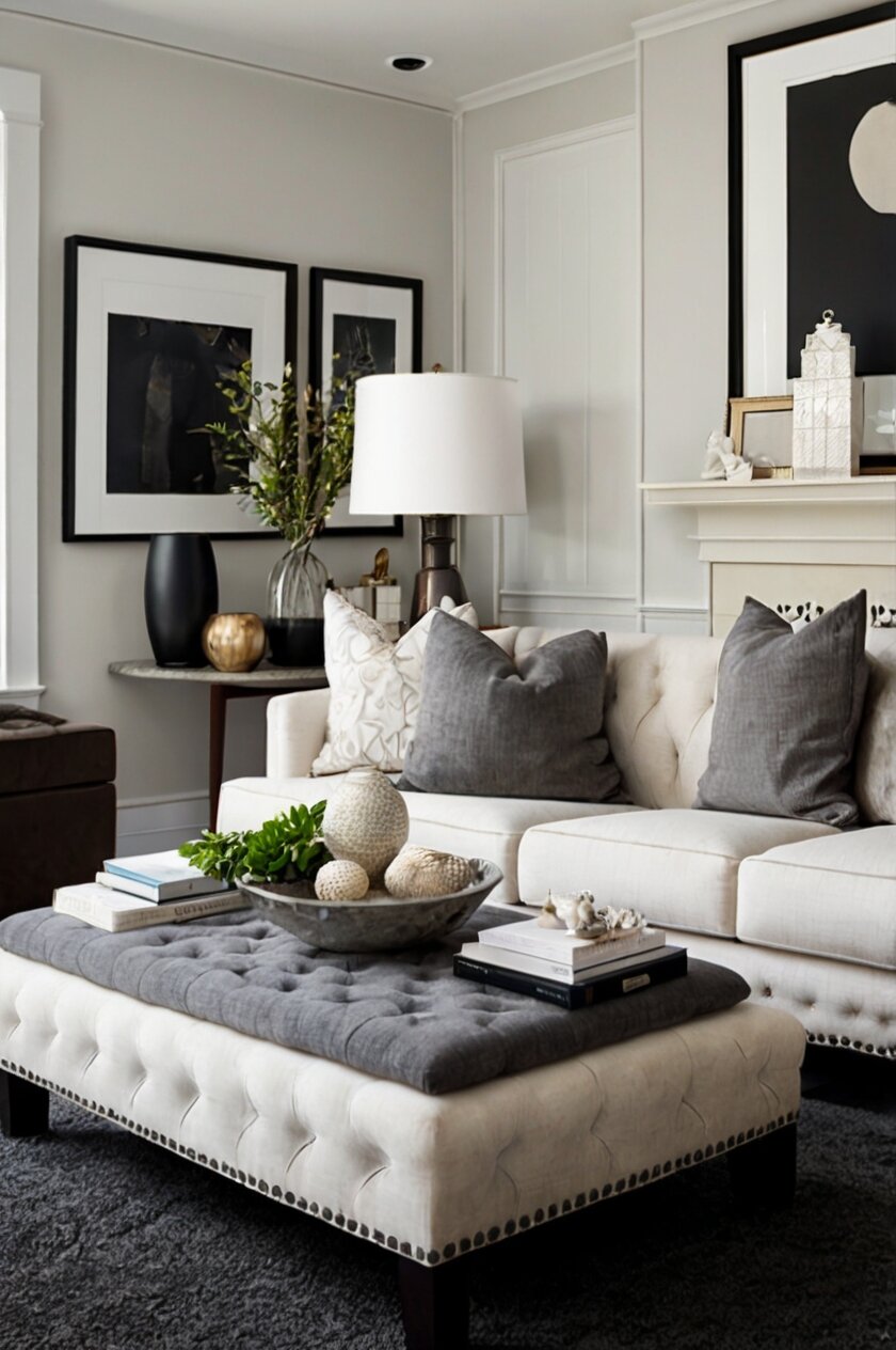
Crisp White for a Classic Contrast


White walls paired with dark gray carpet create a timeless, sophisticated look that works in virtually any space.
This high-contrast combination brings a clean, fresh feeling to your room while allowing your dark carpet to serve as a grounding element.
When you choose white paint with dark gray carpet, you’re creating a versatile canvas that works with any accent colors you might want to introduce.
The crisp white walls reflect light throughout the space, helping to balance the visual weight of the darker floor.
You might consider shades like Benjamin Moore’s “Simply White” or Sherwin Williams’ “Pure White” for a clean look without harsh brightness.
These whites have subtle undertones that keep them from feeling too sterile or clinical.
For a slightly warmer approach, you could choose an off-white with creamy undertones like “White Dove” or “Alabaster.”
These softer whites create a more welcoming atmosphere while still providing that classic contrast.
In a living room, this combination creates an airy, spacious feel that makes the room appear larger than it actually is.
Your furniture and decorative items will stand out beautifully against this neutral backdrop.
For bedrooms, the white-and-gray pairing offers a serene, restful environment that promotes relaxation and good sleep.
You can easily warm up this color scheme with natural wood tones, plants, and textiles in various textures.
When working with white walls, consider the finish carefully.
A flat or matte finish hides imperfections but can be harder to clean, while an eggshell or satin finish offers more durability for high-traffic areas.
The lighting in your room will also affect how the white appears throughout the day.
North-facing rooms might benefit from a slightly warmer white, while south-facing rooms can handle cooler whites.
This combination works particularly well in minimalist, Scandinavian, or modern design schemes.
Your dark gray carpet provides definition and depth, while the white walls create a sense of expansiveness and possibility.
Tap to Explore These Beauties
See my ideas in action 👇 Tap any image to explore full details.
Soft Gray for Sophisticated Harmony
Pairing soft gray walls with dark gray carpet creates a sophisticated monochromatic look that feels cohesive and intentional.
This tone-on-tone approach creates visual interest through subtle variations rather than stark contrasts.
When you select a lighter gray for your walls, you’re creating a seamless flow from floor to ceiling that can make your space feel larger and more harmonious.
The key to making this combination work is choosing a gray with the right undertones to complement your carpet.
You might consider a gray with subtle blue undertones like “Stonington Gray” by Benjamin Moore or one with warmer taupe undertones like “Agreeable Gray” by Sherwin Williams.
These nuanced grays have more depth and character than a simple neutral gray.
The light-to-dark gradient from walls to floor creates a natural visual hierarchy in the room.
Your furniture and decorative elements will pop against this subdued background, allowing them to become focal points.
In living areas, this color combination creates a calm, sophisticated atmosphere that feels both current and timeless.
The soft gray walls provide a perfect backdrop for artwork and photographs, allowing them to stand out without competing with the wall color.
For home offices or studies, this pairing offers a focused, distraction-free environment that promotes concentration and productivity.
The subtle variation between the two grays keeps the space from feeling flat or monotonous.
Adding metallic accents like silver, chrome, or gold can enhance this color scheme, bringing warmth and dimension to the space.
Textural elements such as velvet throw pillows, woven blankets, or natural wood furniture add depth to this sophisticated palette.
If you’re concerned about the space feeling too cool, introducing plants and organic materials can add necessary warmth and life.
This color combination works exceptionally well in contemporary, transitional, or modern design styles.
The layered grays create a refined foundation that allows your personal style to shine through in your furnishings and accessories.
Light Blue for Tranquil Elegance
Light blue walls create a serene, refreshing counterpoint to dark gray carpet, establishing a peaceful atmosphere in any room.
This color combination evokes the feeling of clear skies above solid ground, bringing a natural harmony to your space.
When you choose light blue for your walls, you’re selecting a color that has been proven to reduce stress and promote relaxation.
Paired with dark gray carpet, you’ll create a grounded yet uplifting environment that feels both sophisticated and approachable.
Consider soft, muted blues like “Borrowed Light” by Farrow & Ball or “Windmill Wings” by Benjamin Moore for a subtle, airy effect.
These gentle blues have gray undertones that connect beautifully with your carpet while still providing a distinct color story.
For a slightly more pronounced blue presence, shades like “Palladian Blue” or “Sea Salt” offer more color while still maintaining a light, airy quality.
These blues carry various undertones that can shift from green to gray depending on the lighting.
In bedrooms, this color palette promotes restful sleep and morning tranquility, making it ideal for creating a personal sanctuary.
The combination works equally well in bathrooms, where it can evoke spa-like serenity and cleanliness.
Living rooms with this color scheme feel inviting yet sophisticated, with the blue walls lifting the visual weight of the dark carpet.
Your guests will feel instantly at ease in a space that balances coolness with comfort.
Adding natural elements like driftwood, seagrass, or linen textiles enhances this palette’s connection to nature and coastal influences.
For accent colors, consider corals, warm woods, or creamy whites to balance the coolness of the blue and gray.
Metal finishes like brushed nickel or chrome complement this color scheme beautifully, adding subtle shimmer without overwhelming the tranquil feeling.
This color combination transitions well through seasons, feeling cool and refreshing in summer months while remaining cozy when accessorized appropriately for winter.
The versatility of this pairing allows it to work in various design styles from coastal casual to contemporary elegance.
Your light blue and dark gray combination creates a sophisticated foundation that can evolve with your changing tastes and needs.
Warm Beige for Cozy Comfort
Warm beige walls paired with dark gray carpet create an inviting, balanced atmosphere that feels both sophisticated and comfortable.
This combination brings warmth to your space while allowing the dark carpet to anchor the room with its visual weight.
When you choose a warm beige for your walls, you’re introducing a neutral that has inherent warmth without overwhelming color.
Shades like “Manchester Tan” by Benjamin Moore or “Accessible Beige” by Sherwin Williams offer subtle warmth that complements rather than competes with your gray carpet.
The contrast between warm and cool elements in this pairing creates visual interest while maintaining a cohesive, pulled-together look.
Your dark gray carpet grounds the space while the beige walls lift and brighten the overall atmosphere.
In living rooms, this color combination creates an environment that feels welcoming for both everyday family use and entertaining guests.
The warmth of beige walls makes furniture and people look their best, casting a flattering glow throughout the space.
For dining rooms, this pairing establishes a sophisticated backdrop for meals and conversation, with the warm walls creating an appetite-stimulating environment.
The contrast between beige and gray helps define the architecture of your space while keeping the overall feel harmonious.
Adding texture through natural materials like wood, rattan, or woven fabrics enhances the organic quality of this color scheme.

💭 I Wrote a Book About My Biggest Decorating Mistakes!
When I decorated my first home, I thought I knew what I was doing. Spoiler: I didn’t. 😅
💸 I bought a sofa way too big for my living room. Paint colors that looked amazing in the store but terrible on my walls.
Metallic accents in bronze, gold, or copper bring additional warmth and sophistication to this neutral backdrop.
This color combination works well with both modern and traditional furnishings, making it exceptionally versatile for evolving style preferences.
Your beige and gray foundation can support seasonal changes in accent colors, from spring greens to autumn rusts.
If your beige has yellow undertones, it will create a warmer, sunnier feeling in the space.
Beiges with pink undertones offer a subtly flattering glow that works beautifully in spaces where people gather.
This combination is particularly effective in spaces that receive limited natural light, as the warm walls counteract any potential gloominess from the dark carpet.
Your warm beige walls and dark gray carpet create a timeless foundation that will support many different decorating choices over the years.
Find Your Room’s Color Palette
Tap a vibe — get a curated 5-color palette with hex codes you can copy ✨
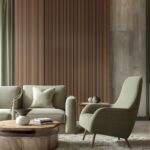
Sage Green for Natural Serenity
Sage green walls create a nature-inspired partnership with dark gray carpet, bringing the calming essence of the outdoors inside your home.
This subtle green has enough gray in its undertones to connect harmoniously with your carpet while adding a distinct character to your space.
When you select sage green for your walls, you’re choosing a color that has been shown to reduce stress and promote a sense of wellbeing.
Popular options like “Clary Sage” by Sherwin Williams or “October Mist” by Benjamin Moore offer the perfect balance of color and neutrality.
The earthy quality of sage green makes it an excellent transition color between your dark floor and whatever might be happening above it visually.
Your space will feel cohesive and thoughtfully designed, with the sage providing a gentle contrast to the stronger gray below.
In living spaces, this combination creates a sophisticated yet approachable atmosphere that feels connected to nature without being overtly rustic.
The subtle coloration supports both quiet reflection and social engagement, making it versatile for various activities.
For home offices or studies, sage green offers concentration-enhancing properties while the dark carpet provides a grounding presence.
This combination creates a productive environment that doesn’t feel clinical or sterile.
Bedrooms with sage walls and dark gray carpet feel like peaceful retreats, promoting relaxation and restful sleep.
The natural association with plants and foliage makes this color particularly effective for creating a sense of renewal and tranquility.
Sage green pairs beautifully with natural wood tones, from light oak to rich walnut, enhancing the nature-inspired theme.
Metallic accents in brass or bronze add warmth and sophistication to this earthy palette.
Adding actual plants to this color scheme creates a powerful connection to nature that enhances the psychological benefits of the green walls.
Your artwork will stand out beautifully against sage green, especially pieces with earthy tones or natural subjects.
This color combination works well in various design styles from modern farmhouse to contemporary and even traditional settings.
The timeless quality of both sage green and dark gray ensures your space won’t quickly feel dated or trendy.
Pale Yellow for Sunny Cheerfulness
Pale yellow walls bring unexpected sunshine and warmth to rooms with dark gray carpet, creating a balanced and uplifting environment.
This combination pairs the grounding stability of dark gray with the cheerful optimism of yellow for a space that feels both sophisticated and friendly.
When you choose pale yellow for your walls, you’re introducing subtle energy and positivity without overwhelming brightness.
Shades like “Hawthorne Yellow” by Benjamin Moore or “Dayroom Yellow” by Farrow & Ball offer gentle warmth without veering into intense territory.
The contrast between the cool dark carpet and warm yellow walls creates visual interest and a dynamic energy in your space.
Your room will feel balanced between light and dark, cool and warm, creating a harmonious environment that appeals to various moods and activities.
In kitchens and dining areas, pale yellow stimulates appetite and conversation, making meals more enjoyable and social.
The dark carpet anchors these active spaces while the yellow walls encourage engagement and connection.
Living rooms with this color combination feel welcoming and cheerful while maintaining an air of sophistication from the dark carpet.
Your guests will feel immediately at ease in a space that balances formality with friendly warmth.
For home offices or creative spaces, pale yellow stimulates innovation and positive thinking while the gray carpet provides focus and groundedness.
This combination supports productivity while preventing the space from feeling too serious or corporate.
Adding natural wood elements enhances the warmth of this palette, creating a cohesive look that feels intentional and refined.
Blue accents provide a beautiful complement to this color scheme, creating a triadic harmony that feels balanced and complete.
Textiles with patterns incorporating yellow, gray, and white can tie the walls and floors together seamlessly.
Your artwork will pop against pale yellow walls, especially pieces with blue, purple, or gray tones that echo the carpet color.
This combination works particularly well in spaces that receive limited natural light, as the yellow walls reflect and amplify available light.
The timeless nature of this pairing ensures your space will feel current regardless of changing design trends.
What’s Your Decor Personality?
5 questions · 30 seconds · Instant style match 🏡
Rich Navy for Bold Sophistication
Navy blue walls create a striking, sophisticated partnership with dark gray carpet, establishing a bold yet classic aesthetic.
This powerful combination feels both timeless and current, offering dramatic depth while maintaining an air of refinement.
When you select navy for your walls, you’re creating a cocoon-like atmosphere that feels both protective and luxurious.
Colors like “Hale Navy” by Benjamin Moore or “Naval” by Sherwin Williams provide that perfect deep blue that reads as a neutral while still offering color.
The dark walls and dark carpet create an enveloping effect that can make large spaces feel more intimate and purposeful.
Your furnishings and decorative elements will stand out dramatically against this rich background, especially if they include lighter colors or metallic finishes.
In living rooms, this combination creates a sophisticated entertainment space that feels elegant in the evening and cozy during daylight hours.
The navy walls provide a perfect backdrop for artwork and family photos, allowing them to become focal points in the space.
For home libraries or studies, navy walls with dark gray carpet establish a serious, intellectual atmosphere conducive to concentration and deep thinking.
This color combination signals purpose and intention, making it ideal for spaces dedicated to specific activities.
Adding metallic accents in gold, brass, or copper brings necessary warmth and light to this deep color scheme.
White or cream trim and ceiling creates striking contrast that defines the architecture and prevents the space from feeling too dark.
Incorporating mirrors and glass elements helps reflect available light throughout the room, maintaining brightness despite the deeper wall color.
Your textiles and soft furnishings offer opportunities to add texture and pattern against this strong background.
This color combination works beautifully in both traditional and contemporary design styles, making it versatile for different aesthetic preferences.
The formal quality of navy and gray can be balanced with casual elements to create a space that feels approachable yet sophisticated.
In bedrooms, this rich color palette creates a restful sanctuary that promotes deep, quality sleep.
Your navy walls and dark gray carpet create a dramatic foundation that will make even simple furnishings look intentional and stylish.
Soft Lavender for Unexpected Elegance
Soft lavender walls create an unexpected yet harmonious partnership with dark gray carpet, offering subtle color with sophisticated appeal.
This gentle purple hue contains enough gray in its undertones to connect beautifully with your carpet while adding a unique character to your space.
When you choose soft lavender for your walls, you’re selecting a color that historically represents creativity, wisdom, and tranquility.
Shades like “Organdy” by Sherwin Williams or “Lavender Mist” by Benjamin Moore offer that perfect balance of color and neutrality.
The cool undertones in both lavender and gray create a cohesive look while the distinct wall color prevents the space from feeling monochromatic.
Your furnishings and decorative elements will stand out against this subtle backdrop, especially pieces in complementary yellows or harmonious blues.
In bedrooms, this color combination creates a serene, restful environment that promotes quality sleep and peaceful mornings.
The lavender walls have a soothing effect that pairs beautifully with the grounding presence of the dark carpet.
For home offices or creative spaces, lavender stimulates innovation while maintaining a calming presence that prevents overwhelming stress.
Your productivity may increase in a space that balances focus with gentle inspiration.
Living areas with this color scheme feel sophisticated and unique without being overly trendy or attention-seeking.
The subtle coloration creates a refined backdrop for daily life and special occasions alike.
Adding natural elements like driftwood or bleached oak brings organic texture that balances the cooler tones in this color scheme.
Silver, chrome, or brushed nickel accents enhance the cool sophistication of this palette while adding necessary light-reflecting elements.
This combination works particularly well in spaces that receive good natural light, which will reveal the subtle beauty of the lavender walls.
Your artwork and photographs will appear striking against lavender, especially pieces with complementary yellow or orange elements.
This color pairing creates a distinctly feminine energy without being overtly girlish, making it appropriate for various inhabitants and visitors.
The unexpected nature of this combination demonstrates confidence and design sophistication that sets your space apart from more common color schemes.

Warm Terracotta for Earthy Warmth
Terracotta walls bring Mediterranean warmth and earthiness that beautifully balances the cool tones of dark gray carpet.
This rich, orange-based neutral creates a welcoming atmosphere while establishing a sophisticated color story in your space.
When you select terracotta for your walls, you’re introducing a color with deep historical roots in design across many cultures.
Shades like “Venetian Red” by Benjamin Moore or “Terra Cotta” by Sherwin Williams offer that perfect balance of warmth and sophistication.
The contrast between the cool gray floor and warm terracotta walls creates visual tension that makes both colors appear more vibrant and intentional.
Your space will feel designed rather than accidental, with a clear color direction that guides other decorative choices.
In living and dining areas, terracotta walls stimulate conversation and appetite, creating spaces that feel energetic yet comfortable.
The grounding effect of the dark carpet prevents the warm walls from feeling overwhelming or too stimulating.
For entryways and transition spaces, this combination creates a memorable first impression that sets the tone for the rest of your home.
Visitors will feel immediately welcomed by the warm walls while experiencing the sophistication of your dark carpet.
Adding natural elements like plants, especially those with green foliage, creates a striking complement to the warm terracotta.
Wood furniture in mid-tones like walnut or cherry connects beautifully with this palette, enhancing the natural, earthy feeling.
This color combination works particularly well with Southwestern, Mediterranean, or global-inspired decor styles.
Your terracotta and gray foundation supports accent colors like turquoise, cobalt blue, or emerald green for a rich, layered look.
Textiles with geometric patterns incorporating both warm and cool tones help tie the walls and carpet together cohesively.
Metal accents in antiqued brass or copper enhance the warmth of this palette while adding necessary reflective elements.
This combination feels especially appropriate in spaces that receive northern light, as the warm walls counteract cool natural light.
Your terracotta walls and dark gray carpet create a sophisticated foundation that feels both timeless and current, rooted in historical color traditions while remaining relevant to contemporary design.
This or That?
Pick your fave — see what other readers chose! 👀
Soft Pink for Subtle Warmth
Soft pink walls create an unexpected yet sophisticated partnership with dark gray carpet, offering subtle warmth with contemporary appeal.
This delicate color brings a gentle glow to your space while the dark carpet provides grounding contrast and visual weight.
When you choose a soft pink like “Setting Plaster” by Farrow & Ball or “Intimate White” by Benjamin Moore, you’re selecting a new neutral with inherent warmth.
These barely-there pinks have enough gray in their undertones to connect with your carpet while adding a subtle blush to your walls.
The contrast between the cool, dark floor and warm, light walls creates a balanced environment that feels both cozy and spacious.
Your furniture and decorative elements will stand out beautifully against this subtle backdrop, especially pieces in complementary greens or harmonious grays.
In living spaces, this color combination creates a flattering, welcoming environment that makes both people and furnishings look their best.
The pink walls cast a gentle glow that enhances skin tones while the dark carpet adds sophistication and definition.
For bedrooms, this pairing establishes a serene yet nurturing atmosphere that promotes both relaxation and positive energy.
The subtle coloration supports restful sleep while providing a cheerful environment upon waking.
Adding natural elements like light wood, marble, or plants brings additional dimension and life to this color scheme.
Metal accents in gold, brass, or copper enhance the warmth of the pink while providing attractive contrast to the gray carpet.
This combination works particularly well in spaces that need to feel both sophisticated and welcoming, like formal living rooms or guest bedrooms.
Your space will feel current without being trendy, as this subtle pink functions more as a warm neutral than a bold color statement.
Incorporating textural elements through textiles, wallcoverings, or natural materials adds depth to this nuanced color palette.
This color combination allows artwork to take center stage, providing a subtle background that enhances rather than competes with your collection.
In spaces with limited natural light, soft pink walls reflect and maximize available light while counteracting any gloominess from the dark carpet.
Your soft pink walls and dark gray carpet create a refined foundation that feels both current and timeless, allowing for various decorative directions as your tastes evolve.
💭 I Wrote a Book About My Biggest Decorating Mistakes!
When I decorated my first home, I thought I knew what I was doing. Spoiler: I didn’t. 😅
💸 I bought a sofa way too big for my living room. Paint colors that looked amazing in the store but terrible on my walls.
Charcoal for Dramatic Depth
Matching charcoal walls with dark gray carpet creates a bold, enveloping space with dramatic sophistication and unexpected depth.
This monochromatic approach makes a confident design statement while creating a cocoon-like atmosphere of luxury and intention.
When you choose charcoal for your walls to match your dark carpet, you’re creating a deliberate envelope of color that feels both daring and refined.
Shades like “Iron Ore” by Sherwin Williams or “Wrought Iron” by Benjamin Moore offer deep, rich color that transforms ordinary spaces into extraordinary ones.
The subtle variation between your walls and carpet adds dimensional interest while maintaining a cohesive, seamless look.
Your decorative elements and furniture become striking focal points against this deep background, especially pieces in lighter colors or metallic finishes.
In media rooms or entertainment spaces, this color combination minimizes visual distractions and enhances screen viewing experiences.
The dark surround helps direct attention to the illuminated screen and creates a theater-like atmosphere.
For dining rooms, this dramatic backdrop creates an intimate, sophisticated environment for memorable meals and conversation.
Candlelight and ambient lighting take on magical qualities against the dark surfaces, creating a romantic, elevated dining experience.
Adding metallic elements in silver, gold, or copper becomes essential to reflect light and prevent the space from feeling too heavy.
Light-colored furniture and textiles create necessary contrast that defines shapes and prevents the room from feeling like a void.
This combination requires thoughtful lighting design with multiple sources at different heights to ensure adequate illumination.
Your artwork and photographs will appear to float dramatically against charcoal walls, creating gallery-like focus on each piece.
This color approach works best in spaces with good natural light or rooms where a cozy, intimate atmosphere is desired.
The sophisticated urban feel of this combination makes it particularly appropriate for city dwellings or contemporary design styles.
Including plants or natural elements adds necessary life and organic contrast to this deeply saturated palette.
Your charcoal walls and dark gray carpet create an envelope of sophisticated calm that separates your space from the outside world, establishing a true sanctuary within your home.
Quick Design Dilemma
Cast your vote — see what other readers think! 🤔
Pale Teal for Refreshing Balance
Pale teal walls bring a refreshing, spa-like quality to rooms with dark gray carpet, creating a balanced environment of cool sophistication.
This subtle blue-green hue offers enough color to be interesting while remaining neutral enough to serve as a versatile backdrop.
When you select pale teal for your walls, you’re choosing a color that evokes water and sky, bringing natural serenity into your space.
Shades like “Sea Salt” by Sherwin Williams or “Palladian Blue” by Benjamin Moore offer that perfect balance of color and neutrality.
The cool undertones in both teal and gray create a cohesive temperature throughout the room while providing enough contrast to be visually interesting.
Your furnishings and decorative elements will appear crisp and defined against this subtle backdrop, especially those in complementary coral or warm wood tones.
In bathrooms and bedrooms, this color combination creates a tranquil retreat with spa-like qualities that promote relaxation and rejuvenation.
The pale teal walls feel fresh and clean while the dark carpet adds necessary visual weight and sophistication.
For living spaces, this pairing establishes an atmosphere of casual elegance that feels both current and timeless.
Your guests will feel at ease in a space that balances cool sophistication with approachable comfort.
Psst… Check This Out
Over 8 Stunning Carpet Colors Perfect for Your Cherry Wood Floors Take Me There →Adding natural elements like driftwood, seagrass, or plants enhances the connection to nature that this color palette suggests.
Metal finishes in brushed nickel or chrome complement the cool tones while adding necessary reflective elements.
This combination works particularly well in coastal settings or urban environments where a connection to water and sky feels refreshing.
Your space will feel open and airy despite the darker carpet, with the pale teal walls creating visual expansion.
Incorporating textural elements through natural fibers, stone, or ceramic pieces adds dimensional interest to this subtle color scheme.
This palette supports both modern and traditional furnishing styles, making it versatile for evolving design preferences.
In spaces with strong natural light, the teal will reveal beautiful undertone variations throughout the day, bringing the walls to life.
Your pale teal walls and dark gray carpet create a sophisticated foundation that feels both fresh and grounded, offering the perfect balance for contemporary living.
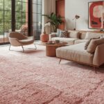
Soft Coral for Energetic Warmth
Soft coral walls create an energizing yet sophisticated partnership with dark gray carpet, introducing warm, flattering color that enlivens your space.
This peachy-pink hue brings subtle warmth while the dark carpet provides necessary grounding and visual weight.
When you choose soft coral for your walls, you’re selecting a color that flatters skin tones and creates an inviting, positive atmosphere.
Shades like “Coral Clay” by Behr or “Emerging Taupe” by Sherwin Williams offer that perfect balance of warmth without overwhelming brightness.
The contrast between warm walls and cool carpet creates visual interest and balance, preventing either element from dominating the space.
Your furnishings will appear crisp and intentional against this warm backdrop, especially pieces in complementary blue-greens or neutral grays.
In social spaces like living and dining rooms, coral walls stimulate conversation and create an energetic yet comfortable atmosphere.
The grounding effect of the dark carpet prevents the warm walls from feeling too stimulating or overwhelming.
For creative spaces or home offices, this combination provides energizing warmth balanced with the focus and concentration that gray promotes.
Your productivity may increase in a space that balances energy with groundedness.
Adding natural elements like plants, especially those with blue-green foliage, creates striking complementary contrast with the coral walls.
Metal accents in gold or brass enhance the warmth of this palette while adding necessary light-reflecting elements.
This color combination works particularly well in spaces that receive northern light, as the warm walls counteract cool natural illumination.
Your artwork and photographs will stand out beautifully against coral, especially pieces with blue, green, or gray elements.
Incorporating textural elements through natural materials, woven textiles, or dimensional wallcoverings adds depth to this warm color scheme.
This combination feels especially appropriate in spaces where social gathering and connection are prioritized, as coral promotes communication and warmth.
In bedrooms, this pairing creates a cozy, flattering environment that feels both energizing in morning light and soothing in evening lamplight.
Your soft coral walls and dark gray carpet create a sophisticated foundation that balances energy with elegance, offering the perfect backdrop for both everyday living and special occasions.