


I used to think carpet color didn’t matter much for stairs.
As long as it wasn’t white or too light, what difference does it make?
Well, after replacing the bedroom carpet that runs partly up our staircase, I learned there’s more to consider with stair carpeting than I realized.
The best carpet colors for stairs are medium to dark tones that hide dirt and wear well, like beige, brown, gray, navy and burgundy.
Lighter colors like light gray can work too if paired with darker tones on upper floors.
Here’s an overview of popular stair carpet color options, with pros and cons of each shade:
Here are 17 popular carpet color options for staircases:
Beige
I like how beige color carpet goes well with staircase.
The color beige is a neutral tone that can work well in many different design schemes, including staircases.
Beige is versatile and can complement a variety of styles and materials.
If your staircase is made of dark wood, beige can create a beautiful contrast.
The warmth of beige can soften the richness of dark wood, creating a balanced and elegant look.
Beige is a neutral color, so it pairs well with other neutrals.
Consider using beige for the walls, balusters, or risers, and complement it with white or off-white for the trim and handrails.
This creates a clean and timeless aesthetic.
Beige is an earthy color, and it can harmonize with other earth tones.
If your staircase features natural materials like stone or slate, beige can complement these elements, creating a cohesive and grounded feel.
Beige is often associated with a minimalist and modern aesthetic.
If your staircase has clean lines and a contemporary design, beige can enhance the modern vibe, especially when combined with sleek materials like metal or glass.
In spaces with an industrial or urban design, beige can soften the overall look.
It can balance the hardness of materials like metal and concrete, adding a touch of warmth and comfort.
Use beige as a backdrop for colorful accents.
This can include decorative elements such as artwork, throw pillows, or a rug.
Beige serves as a neutral canvas that allows other colors to pop.
Beige can work well in areas with ample natural light.
It reflects light and can make the space feel brighter and more open.
Consider beige for areas near windows or in open stairwells.
For a cohesive and calming look, use different shades of beige in a monochromatic color scheme.
This creates a subtle and sophisticated atmosphere.
When choosing a color scheme for your staircase, consider the overall style of your home, the materials used in the staircase, and your personal preferences.
It’s also a good idea to test paint samples in the actual space to see how the lighting conditions affect the color.
Light Brown
Light brown is a warm and versatile color that can be a great choice for a staircase.
If your staircase is made of wood, especially light or medium-toned wood, using a light brown color on the walls or as an accent can enhance the natural beauty of the wood.
This creates a cohesive and warm look.
Light brown can provide a pleasing contrast if your staircase features dark wood elements.
Consider using light brown for the walls, balusters, or risers to balance the darker tones in the staircase.
Light brown is an earthy color that pairs well with other natural tones.
If your staircase is surrounded by elements like stone or brick, light brown can complement these materials, creating a harmonious and grounded feel.
Light brown is a neutral color that exudes warmth and elegance.
It can be combined with other neutrals, such as whites or creams, to create a sophisticated and timeless staircase design.
If you’re aiming for a rustic or country-inspired look, light brown can contribute to the warm and inviting atmosphere.
Pair it with rustic materials like reclaimed wood or wrought iron for a charming effect.
Light brown can evoke a sense of warmth and coziness.
Consider using it in spaces where you want to create a welcoming and comfortable ambiance, such as a foyer or entryway with a staircase.
Light brown can serve as a neutral backdrop for accent colors.
Consider adding pops of color through accessories, artwork, or decorative elements to add visual interest to the staircase area.
Create a cohesive look by using different shades of light brown in a monochromatic color scheme.
This approach can result in a serene and unified aesthetic.
If your staircase features cool-toned materials like metal or glass, light brown can provide a warm and balancing element.
It prevents the space from feeling too cold and adds a touch of comfort.
When incorporating light brown into your staircase design, consider the overall style of your home, the existing materials in the staircase, and your personal preferences.
It’s always a good idea to test paint samples in the actual space to see how the color interacts with the lighting conditions.
Medium Brown
Medium brown is a versatile and classic color that can work well with various staircase designs.
If your staircase is made of wood, especially if it’s medium-toned, using a medium brown color on the walls or surrounding areas can complement the wood tones.
This creates a cohesive and unified look.
Medium brown is a timeless and sophisticated color.
Use it for the walls, balusters, or risers to achieve an elegant and warm ambiance in your staircase area.
Medium brown serves as a neutral foundation that pairs well with a variety of colors.
Consider combining it with other neutrals, such as whites or creams, for a clean and classic look.
Medium brown is well-suited for rustic or traditional staircase styles.
It complements the warmth of natural materials and can be paired with wrought iron elements for a classic and inviting feel.
If your staircase features cool-toned materials like metal or glass, medium brown can provide a warm and grounding effect.
It balances out the cool tones, creating a harmonious and inviting space.
Medium brown is an earthy color that can be part of a broader natural palette.
If your staircase is surrounded by elements like stone, brick, or plants, medium brown can blend seamlessly with these earthy tones.
Use medium brown as a backdrop for accent colors.
Introduce pops of color through decorative elements, artwork, or accessories to add visual interest to the staircase area.
Medium brown can contribute to a rich and cozy atmosphere.
This is especially effective in creating a welcoming entryway or foyer with a staircase as the focal point.
Consider using different shades of medium brown in a monochromatic color scheme for a harmonious and cohesive look.
This approach can be particularly effective in creating a serene and unified aesthetic.
When working with medium brown in your staircase design, consider the overall style of your home, the materials used in the staircase, and your personal preferences.
Always test paint samples in the actual space to see how the color interacts with the lighting conditions.
Dark Brown
Dark brown can provide a striking contrast, especially when paired with lighter elements.
Consider using dark brown for the stairs, handrails, or balusters to create a bold and dramatic look.
Dark brown exudes a sense of luxury and opulence.
Use it for the staircase elements to create a sophisticated and upscale atmosphere, especially if your staircase is the focal point of a grand entryway.
Dark brown is well-suited for traditional and classic staircase styles.
It pairs well with ornate details and can be complemented by rich materials like hardwood or wrought iron.
If your staircase features light-colored materials, such as light wood or white balusters, dark brown can provide a grounding effect.
It balances out the lighter tones, creating a harmonious and visually appealing contrast.
Dark brown can also work well in modern designs, especially when paired with sleek materials like metal or glass.
It adds a touch of warmth and sophistication to contemporary staircases.
Dark brown is part of an earthy color palette.
If your staircase is surrounded by natural elements like stone or brick, dark brown can complement these materials and create a cohesive and grounded look.
Consider using different shades of dark brown in a monochromatic color scheme for a cohesive and unified aesthetic.
This approach can be particularly effective in creating a serene and sophisticated atmosphere.
Dark brown serves as a versatile backdrop for accent colors.
Consider adding pops of color through artwork, decorative elements, or accessories to add interest and personality to the staircase area.
Dark brown can contribute to a warm and cozy ambiance, especially in areas where you want to create a comfortable and inviting atmosphere.
When incorporating dark brown into your staircase design, it’s important to consider the overall style of your home, the materials used in the staircase, and your personal preferences.
Testing paint samples in the actual space will help you see how the color interacts with the lighting conditions.
Warm Gray
Warm gray exudes a sense of sophistication and neutrality.
It can be used on walls, balusters, or risers to create an elegant and timeless staircase design.
If your staircase features lighter or darker elements, warm gray can provide a subtle contrast.
It works well with both light and dark materials, offering a balanced and harmonious look.
Warm gray is a popular choice for contemporary and modern designs.
It pairs well with sleek materials like metal and glass, creating a clean and sophisticated aesthetic.
Warm gray can enhance the beauty of natural materials such as wood.
If your staircase incorporates wooden elements, warm gray can provide a neutral backdrop that allows the natural beauty of the wood to shine.
Consider using different shades of warm gray in a monochromatic color scheme for a cohesive and calming atmosphere.
This approach creates a unified look without being too stark.
Warm gray serves as a versatile backdrop for various decor styles.
You can easily introduce pops of color through artwork, rugs, or decorative accessories to add visual interest to the staircase area.
Warm gray can be sensitive to lighting conditions.
It may appear different in natural light compared to artificial light.
Consider the lighting in your staircase area and test paint samples to ensure the desired effect.
If your staircase features cool-toned materials, warm gray can provide a balancing effect.
It adds warmth to the space and prevents it from feeling too cold.
Warm gray can contribute to a cozy and inviting ambiance, making it suitable for areas where you want to create a welcoming atmosphere.
When incorporating warm gray into your staircase design, consider the overall style of your home, the materials used in the staircase, and your personal preferences.
Charcoal Gray
Charcoal gray is a sophisticated and versatile color that can create a modern and elegant look in a staircase design.
Charcoal gray is often associated with a modern and sophisticated aesthetic.
Use it for elements such as stair treads, handrails, or balusters to achieve a contemporary and upscale look.
Charcoal gray provides a striking contrast when paired with lighter elements.
Consider using it for the staircase components to create a bold and dramatic effect, especially if your staircase features light-colored walls or trim.
Create a cohesive and stylish look by incorporating different shades of charcoal gray in a monochromatic color scheme.
This approach can result in a harmonious and visually appealing staircase design.
If your staircase incorporates metal or glass elements, charcoal gray can complement these materials beautifully.
It adds depth and elegance to the overall design.
Charcoal gray can contribute to a rich and timeless atmosphere.
This is especially effective in creating a formal entryway or foyer where the staircase is a focal point.
Charcoal gray serves as a neutral backdrop that works well with a variety of decor styles.
It allows you to easily introduce accent colors through artwork, textiles, or decorative accessories.
If your staircase features warm-toned materials, such as wood, charcoal gray can provide a balancing effect.
It adds a touch of cool sophistication to prevent the space from feeling too warm.
Charcoal gray is a popular choice for contemporary minimalist designs.
Pair it with clean lines and simple forms to create a sleek and modern staircase.
Charcoal gray is versatile when it comes to decor options.
You can introduce a variety of colors or patterns in the form of rugs, artwork, or furnishings to add personality to the staircase area.
When using charcoal gray in your staircase design, consider the overall style of your home, the materials used in the staircase, and your personal preferences.
It’s recommended to test paint samples in the actual space to see how the color interacts with the lighting conditions and other elements in the environment.
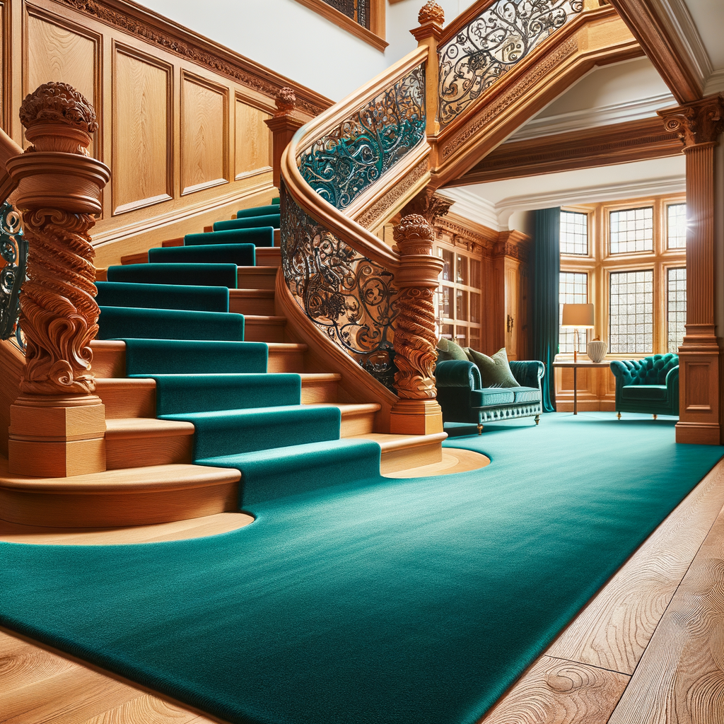
Navy
In my opinion, navy is a fantastic choice for a staircase, especially if you want to make a bold and stylish statement.
Its versatility allows you to experiment with different design elements, and it pairs well with both traditional and contemporary styles.
Navy adds depth and a sense of luxury, making your staircase a visually appealing part of your home.
Just ensure that there is enough natural or artificial light to prevent the space from feeling too dark, and consider incorporating lighter accents to create a balanced and inviting atmosphere.
Navy is a deep, rich color that can add a sense of sophistication and depth to a staircase design.
This color is a classic and timeless color that exudes elegance.
Using navy for elements like handrails, balusters, or accent walls can create a sophisticated and refined look in your staircase area.
It provides a dramatic contrast, especially when paired with lighter elements.
It can make a bold statement and add a touch of luxury to your staircase, particularly if your walls or trim are lighter in color.
Navy is often associated with nautical and coastal themes.
If your home has a beachy or coastal style, navy can enhance that aesthetic, creating a cohesive and stylish connection between different areas of your home.
Navy works well with various materials, such as wood, metal, and glass.
It adds depth and visual interest to the staircase, making it a versatile choice for different design styles.
Navy can effectively balance warm tones in a staircase.
If your stairs are made of wood or if there are warm-colored accents, navy can provide a cool and grounding contrast.
Burgundy
I appreciate burgundy for its ability to add warmth and a sense of luxury to a space.
When considering burgundy or any color for your home, it’s important to take into account your personal preferences, the overall design aesthetic you’re aiming for, and how the color interacts with the lighting and other elements in your space.
If you enjoy the warmth and depth that burgundy provides, and it complements your design vision, it can be a wonderful choice for various elements in your home, including carpets, upholstery, or accent pieces.
Burgundy is a deep, rich color that can add warmth, sophistication, and a touch of luxury to a staircase when used as carpeting.
This color is a classic and elegant color that can elevate the overall aesthetic of a staircase.
Its deep hue exudes a sense of sophistication and can create a refined look in your home.
Burgundy is a warm color that can contribute to a cozy and inviting atmosphere.
Having burgundy carpeting on the staircase can make the space feel more comfortable and welcoming.
This color carpet can serve as a focal point in the staircase area, drawing attention and adding visual interest.
This is particularly effective if the rest of the staircase elements, such as the railings and walls, are in neutral tones.
Burgundy is a versatile color that can complement a range of decor styles.
It pairs well with neutrals, such as beige, gray, or white, and allows you to introduce accent colors or patterns through other decor elements.
Burgundy has a timeless quality that doesn’t go out of style.
Choosing burgundy carpeting for your staircase ensures that it will maintain its classic appeal over time.
Darker colors like burgundy are often chosen for high-traffic areas because they can hide stains and wear more effectively than lighter colors.
This is practical for staircases, which can experience a lot of foot traffic.
If your staircase features wood elements, burgundy can complement the warm tones of the wood.
It creates a harmonious and balanced look, especially if the wood has reddish undertones.
This color has a regal and luxurious quality, making it well-suited for formal spaces.
If you want your staircase to convey a sense of opulence, burgundy carpeting can achieve that effect.
Remember that personal preferences play a significant role in choosing the right color for your staircase.
If you enjoy the warmth and depth that burgundy brings, and it complements the overall design and color scheme of your home, it can be a stylish and inviting choice for staircase carpeting.
Forest Green
I would say that forest green is a versatile and sophisticated color that can be a great choice for a staircase, depending on the overall design goals and the existing elements in the space.
It brings a touch of the natural world into the home, making the staircase a visually appealing and calming element.
The color has a timeless and classic quality.
When used in a staircase, it can exude a sense of elegance and sophistication.
This is particularly true if the staircase design includes traditional or ornate elements.
Forest green is a bold and rich color that can make a strong statement.
Using it for the staircase can add character and personality to the space, especially if the surrounding elements are more neutral.
It works well with a variety of materials, including wood, metal, and glass.
It can complement different textures and finishes, providing flexibility in staircase design.
If the surrounding walls or other elements are in lighter tones, forest green can create a balanced contrast.
It adds depth and richness to the staircase while preventing the space from feeling too light.
This color often associated with mid-century modern design.
If you’re aiming for a retro or vintage look, incorporating forest green into your staircase can contribute to that aesthetic.
Forest green can be part of a coordinated color scheme.
Consider pairing it with complementary or contrasting colors to create a cohesive and harmonious overall design.
Despite being a bold color, forest green can evoke a sense of warmth and coziness.
It can make the staircase area feel inviting and comfortable.
When using forest green in a staircase design, it’s essential to consider factors such as lighting conditions, the size of the space, and personal preferences.
As a home designer, I would recommend testing paint samples in the actual space to ensure that the color interacts well with the environment and achieves the desired aesthetic.
Light Blue
Light blue is a versatile and calming color that can work well in various design schemes, including staircases.
Light blue is often associated with a calming and serene atmosphere.
Using it on a staircase can create a visually soothing environment, especially in spaces where you want to promote relaxation.
This color is known for its ability to visually expand and open up a space.
If your staircase is in a smaller area, using light blue can give the illusion of more space and airiness.
It is a versatile color that works well with various decor styles.
It pairs nicely with both neutral tones and complementary colors, allowing for flexibility in decorating the staircase area.
Light blue is often associated with coastal and nautical themes.
If you’re aiming for a beachy or seaside look, light blue can contribute to that aesthetic, especially when paired with white trim or accents.
Light blue is a color often associated with a youthful and playful ambiance.
If you want your staircase area to have a more casual and lighthearted feel, light blue can be a suitable choice.
t blue has the ability to reflect and enhance natural light in a space.
If your staircase is located in an area with windows, light blue can amplify the brightness and create a cheerful atmosphere.
If your staircase features warm-toned materials like wood, light blue can provide a cool and balancing effect.
It creates a harmonious contrast and prevents the space from feeling too warm.
Light blue, especially in softer tones, has a timeless and classic appeal.
It can maintain its relevance and aesthetic charm over the years.
When using light blue in your staircase design, consider the overall style of your home, the amount of natural light in the space, and your personal preferences.
Testing paint samples in the actual environment will help you assess how the color interacts with the lighting conditions and other elements in the surroundings.
Dark Blue
Dark blue is a classic and timeless color that exudes elegance.
Incorporating it into a staircase design can add a touch of sophistication and create a refined aesthetic.
Dark blue is a versatile color that can complement various design styles, ranging from traditional to modern.
It works well with a variety of materials and finishes, providing flexibility in staircase design.
Dark blue can create a rich and dramatic look, especially when used for elements such as handrails, balusters, or accent walls.
It adds depth to the space and makes a bold statement.
If your staircase is surrounded by lighter elements, such as white walls or light-colored flooring, dark blue can provide a balanced contrast.
It prevents the space from feeling too light and adds a grounding effect.
Dark blue is often associated with nautical and coastal themes.
If you want to evoke a seaside or beachy vibe in your home, dark blue can contribute to that aesthetic, especially when paired with white or natural wood accents.
This color has a regal and luxurious quality, making it well-suited for formal spaces.
If your staircase is part of an entryway or foyer, incorporating dark blue can create a grand and upscale atmosphere.
This color can be used strategically to accentuate the architectural features of a staircase.
For example, it can highlight the curves of balusters or the profile of the handrail, adding visual interest.
This color can be part of a coordinated color scheme, allowing you to integrate it with other colors and materials in the home.
Consider complementary or contrasting colors to achieve a cohesive and harmonious overall design.
Dark colors, including dark blue, can be practical for high-traffic areas like staircases as they are better at concealing wear and tear compared to lighter colors.
Remember to consider the overall design vision for your home, the amount of natural light in the space, and your personal preferences when incorporating dark blue into your staircase design.
Testing paint samples in the actual environment will help you evaluate how the color interacts with the surrounding elements and lighting conditions.
Eggplant
Eggplant is a deep, rich color that can create a dramatic focal point in a staircase design.
Eggplant can work well with a variety of complementary tones.
Consider combining it with lighter neutrals, metallic accents, or Warm Wood Tones to create a balanced and harmonious color palette.
This color has regal and luxurious associations.
If you want to create a sense of opulence, incorporating eggplant into the staircase can contribute to a high-end and refined aesthetic.
Eggplant can serve as a foundation for a coordinated decor scheme.
Choose furnishings, artwork, or accessories that complement or contrast with eggplant to create a cohesive and visually interesting space.
If your staircase area features lighter elements such as walls or flooring, eggplant can provide a striking contrast.
It adds depth to the space and prevents it from feeling too monochromatic.
Eggplant color can create depth and dimension in a staircase design.
This is particularly effective when used in combination with lighter and darker shades, adding visual interest to the overall composition.
If you plan to display artwork on the staircase walls, eggplant can serve as a backdrop that harmonizes with the colors in the artwork.
This creates a curated and intentional look.
Eggplant can appear differently under various lighting conditions.
It’s important to assess the natural and artificial lighting in the staircase area and test paint samples to ensure the desired effect.
Mustard
Mustard is a warm and vibrant color that can add personality and energy to a staircase design.
Incorporating mustard into your staircase can create a bold and stylish look.
Use mustard carpet as an accent color for specific elements of the staircase, such as risers, balusters, or handrails.
This allows you to infuse the vibrant hue without overwhelming the entire space.
Or you can consider painting one wall in the staircase area with mustard to create a statement wall.
This can serve as a focal point and add visual interest to the space.
Mustard pairs well with neutral tones such as white, gray, or beige.
Use mustard as a pop of color against a neutral backdrop to achieve a balanced and harmonious look.
Mustard carpet can be complemented with colors like navy blue, deep green, or even shades of purple.
Experiment with color combinations to find a palette that suits your taste and the overall design scheme.
If your staircase features dark wood elements, mustard can create a striking contrast.
Consider using mustard-colored accents against the dark wood to add warmth and vibrancy.
Mustard is a popular choice in bohemian or eclectic designs.
Integrate mustard-colored rugs, cushions, or decorative items to give the staircase a boho-inspired vibe.
Mustard is reminiscent of retro design styles.
If you’re aiming for a vintage look, incorporate mustard into the staircase with retro-inspired furnishings, artwork, or accessories.
This color can pair well with natural materials like wood or stone.
If your staircase incorporates these elements, mustard can complement the earthy tones for a cohesive and inviting feel.
Mustard can look different under various lighting conditions.
Take into account the natural and artificial lighting in the staircase area to ensure that the color appears as desired.
When working with mustard in your staircase design, it’s essential to strike a balance and ensure that the color harmonizes with the overall theme of your home.
Testing small samples in the actual space will help you visualize how mustard interacts with the existing elements and lighting conditions.
Terracotta
When using terracotta in a staircase design, it’s essential to balance the color with other elements in the space, considering the overall design goals and preferences.
Testing samples and visualizing the color in the specific lighting conditions of the staircase area will help ensure a successful integration of terracotta into the design.
As a home designer, I’d say that terracotta is a warm and earthy color that can bring a sense of warmth and character to a staircase design.
Terracotta, inspired by natural clay, adds an earthy and organic touch to the staircase.
It can contribute to a warm and inviting atmosphere, particularly in areas where you want to create a connection with nature.
Terracotta serves as a great balance between warm and neutral tones.
It can be used as a subtle accent color on elements like stair risers or balusters against a backdrop of neutral colors for a harmonious look.
This color is often associated with Mediterranean and rustic design styles.
If your home has elements of these aesthetics, incorporating terracotta into the staircase can enhance the overall theme.
Terracotta can complement natural materials like wood or stone commonly used in staircases.
It creates a cohesive and integrated design that feels grounded and connected to the environment.
Terracotta’s warm undertones contribute to a cozy and inviting ambiance.
This is especially beneficial for staircases in areas of the home where you want to evoke a sense of comfort and welcome.
This color pairs well with green tones, so consider incorporating potted plants or greenery near the staircase.
This combination enhances the natural and inviting feel of the space.
Terracotta can appear differently under various lighting conditions.
Test paint samples in the actual staircase area to ensure that the color achieves the desired warmth and richness in different lighting scenarios.
Terracotta should complement and enhance the overall aesthetics rather than clash with existing elements.
Mocha
Mocha is a warm and neutral color that can create a cozy and inviting atmosphere in your staircase area.
It adds warmth without being too bold, making the space feel comfortable.
Mocha is a versatile color that pairs well with a variety of decor styles.
It serves as a neutral backdrop, allowing you to easily incorporate different furnishings, artwork, or decor elements into the staircase area.
Choosing a mocha-colored carpet for your staircase ensures that the design remains elegant and relevant over the years, avoiding trends that may become outdated.
Neutral tones like mocha are practical for high-traffic areas, as they can hide dirt and wear more effectively than lighter colors.
This is particularly advantageous for staircase carpeting.
If your staircase features a mix of light and dark elements, mocha can serve as a balancing factor.
It provides a cohesive transition between contrasting colors, creating visual harmony.
Mocha is easy to coordinate with other colors.
Whether your staircase is surrounded by light-colored walls or rich wood tones, mocha can complement the existing palette, offering a seamless integration.
If your staircase is visible from other areas of the home, choosing a mocha carpet can contribute to a unified and cohesive look.
It allows for smooth transitions between different living spaces.
Mocha, inspired by the color of coffee, has an earthy and natural feel.
This can be particularly appealing if you want to introduce a touch of nature into your home’s design.
Mocha, being a darker neutral, can create an optical illusion of depth and space.
This is beneficial if you want to make your staircase area feel more expansive.
If your staircase includes hard surfaces like wood or metal, a mocha carpet can soften the overall aesthetic.
It adds a layer of comfort and tactile warmth to the space.
When choosing a mocha-colored carpet for your staircase, consider the overall design vision, the existing color scheme of your home, and your personal preferences.
Additionally, ensure that the carpet material is durable and suitable for the level of foot traffic typically experienced on a staircase.
Testing carpet samples in the actual space is recommended to see how the color interacts with the lighting conditions and other elements in the environment.
Mauve
Mauve carpet has warm undertones that can contribute to creating a cozy and inviting atmosphere in the staircase area.
This is particularly advantageous for spaces where you want to evoke a sense of comfort.
It is a versatile color that pairs well with various decor styles.
It can serve as a neutral base, allowing for easy coordination with other colors, patterns, and materials in the staircase design.
Mauve, being a gentle and subdued color, can bring a feminine and delicate touch to the staircase.
It’s a great choice if you’re aiming for a softer and more romantic aesthetic.
A mauve carpet can work well in accentuating the architectural details of a staircase.
It provides a visually interesting element without overpowering the space.
If your staircase features a mix of light and dark elements, mauve can serve as a harmonizing factor.
It provides a balanced transition between contrasting colors, creating a cohesive overall look.
Mauve, when used in a subtle and sophisticated manner, can have a timeless appeal.
Opting for mauve carpeting ensures that your staircase design remains relevant over the years.
Mauve can look different under various lighting conditions.
It’s important to consider the natural and artificial lighting in the staircase area and test carpet samples to ensure that the color appears as desired.
If you want the staircase to be a focal point in your home, a mauve carpet can achieve that by adding a pop of color without being too bold or overpowering.
Mauve allows for a personalized and unique design.
You can complement the carpet with furnishings, artwork, or decor items that enhance the overall mauve color scheme.
When incorporating a mauve carpet into your staircase design, be mindful of the existing color scheme of your home, the level of natural light in the space, and your personal preferences.
Testing carpet samples in the actual environment will help you visualize how the color interacts with the surroundings and lighting conditions.
Plum
Plum is a deep, rich color that exudes a sense of opulence and regality.
Using plum in a staircase design can instantly elevate the overall aesthetic, creating a luxurious and sophisticated ambiance.
This carpet color is a bold color choice that can serve as a focal point in the staircase area.
Consider using plum for elements like the risers, balusters, or handrails to make a strong design statement.
Plum pairs well with a range of colors, both light and dark.
It can be complemented with neutrals like gray, beige, or white, as well as metallic accents such as gold or silver, enhancing the overall color scheme.
Plum has a timeless quality that transcends design trends.
Opting for plum in your staircase design ensures that it maintains its elegance and relevance over time, avoiding the risk of looking outdated.
Despite its boldness, plum is surprisingly versatile and can work well with various design styles.
It can complement both traditional and contemporary aesthetics, offering flexibility in design choices.
If your staircase features a mix of light and dark elements, plum can act as a harmonizing factor.
It creates a balanced contrast and prevents the space from feeling too monochromatic.
Plum adds a layer of drama and depth to the staircase design.
Whether used as an accent or as the dominant color, it can contribute to a visually interesting and dynamic space.
Plum allows for coordination with other decor elements.
Consider incorporating furnishings, artwork, or decorative items that complement the plum color scheme, creating a cohesive and intentional look.
This carpet color may appear differently under various lighting conditions.
Test paint samples or material swatches in the actual staircase area to ensure that the color achieves the desired richness and depth under both natural and artificial lighting.
Plum is a unique and distinctive color choice that allows for personalization.
Consider integrating personal touches, such as artwork or decor items, to showcase your individual style within the staircase design.
Selecting the right carpet color for your staircase is a crucial decision that can significantly impact the overall aesthetics of your home.
The array of choices, from timeless neutrals to bold and vibrant hues, offers an opportunity to express your style and enhance the atmosphere of your living space.
Neutrals like beige and light blue provide versatility and timelessness, while bolder choices such as plum or mustard can infuse character and personality.
Whether you opt for the calming embrace of light tones, the rich allure of deep shades, or the balance of earthy hues, your chosen carpet color should harmonize with the overall design scheme of your home.
Don’t hesitate to experiment with combinations, and feel free to add personal touches through accessories, artwork, or furniture.
Ultimately, the perfect carpet color for your staircase is one that not only complements the architecture but also resonates with your lifestyle and design aspirations.
Let your staircase be a canvas for creativity, reflecting the warmth, style, and individuality that make your home uniquely yours.


