As I was painting my fence last weekend, I had a bit of a mishap.
I had bought this bright, neon green paint thinking it would be fun and lively.
But as soon as I started painting, I realized what a huge mistake I had made!
That bright green totally clashed with the rest of my yard.
It looked like someone had plopped down glow-in-the-dark alien spaceships in my backyard.
After a quick trip back to the hardware store for a more sensible color, I learned my lesson.
You want something that complements your home’s exterior and landscaping, not distracts from it.
Trust me, you don’t want to end up with a fence as hideous as my first attempt.
So what are the best fence colors?
✨Click to Get My 101 FREE Designer Room Ideas
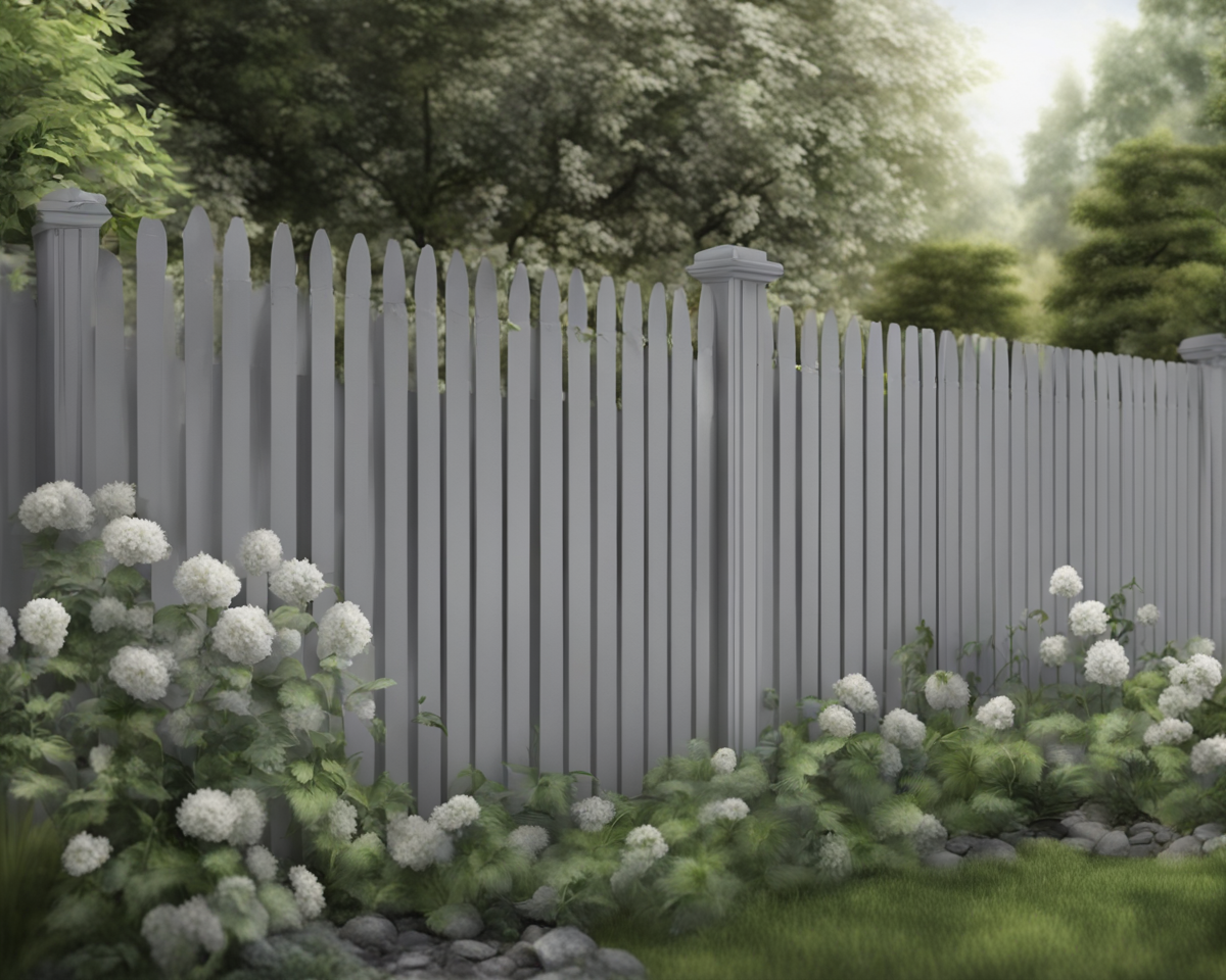
1. White
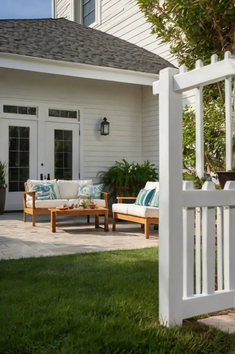
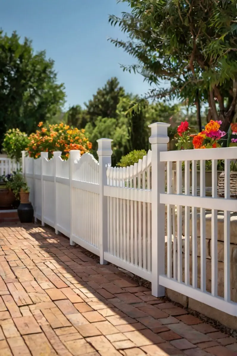
A classic white fence is timeless and versatile.
It looks crisp and clean, pairs well with any color scheme, and gives your home a charming, quintessential feel.
White works great with all home exteriors but looks especially nice against brick, stone, and colorful exteriors as it helps unify and brighten.
A bright white pops while an antique white adds a touch of whimsy.
White also makes small spaces appear larger.
If your house is Craftsman style, for example, opt for a white picket fence to enhance its character.
White fences show dirt easily though, so maintenance is key.
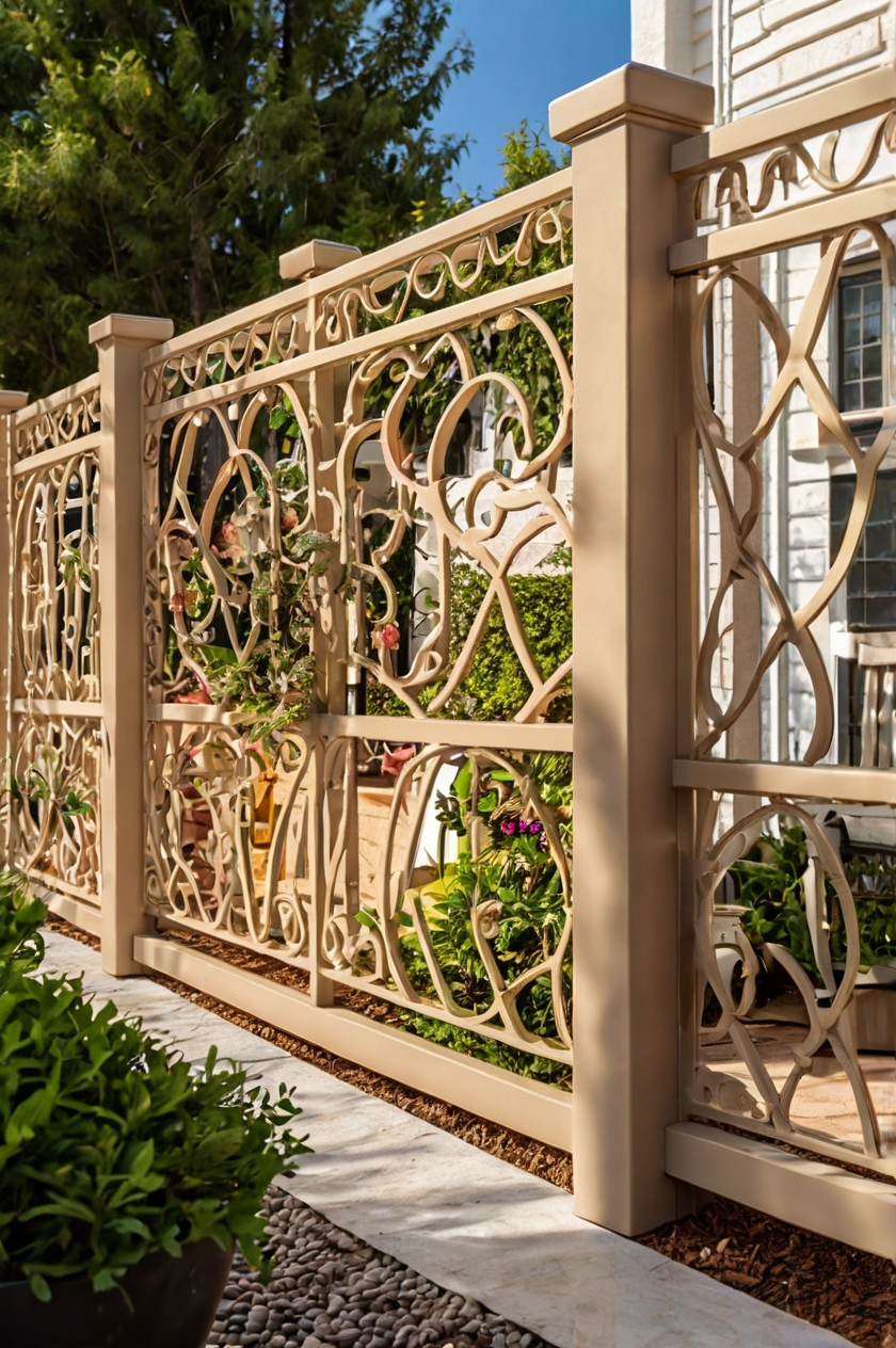
2. Beige

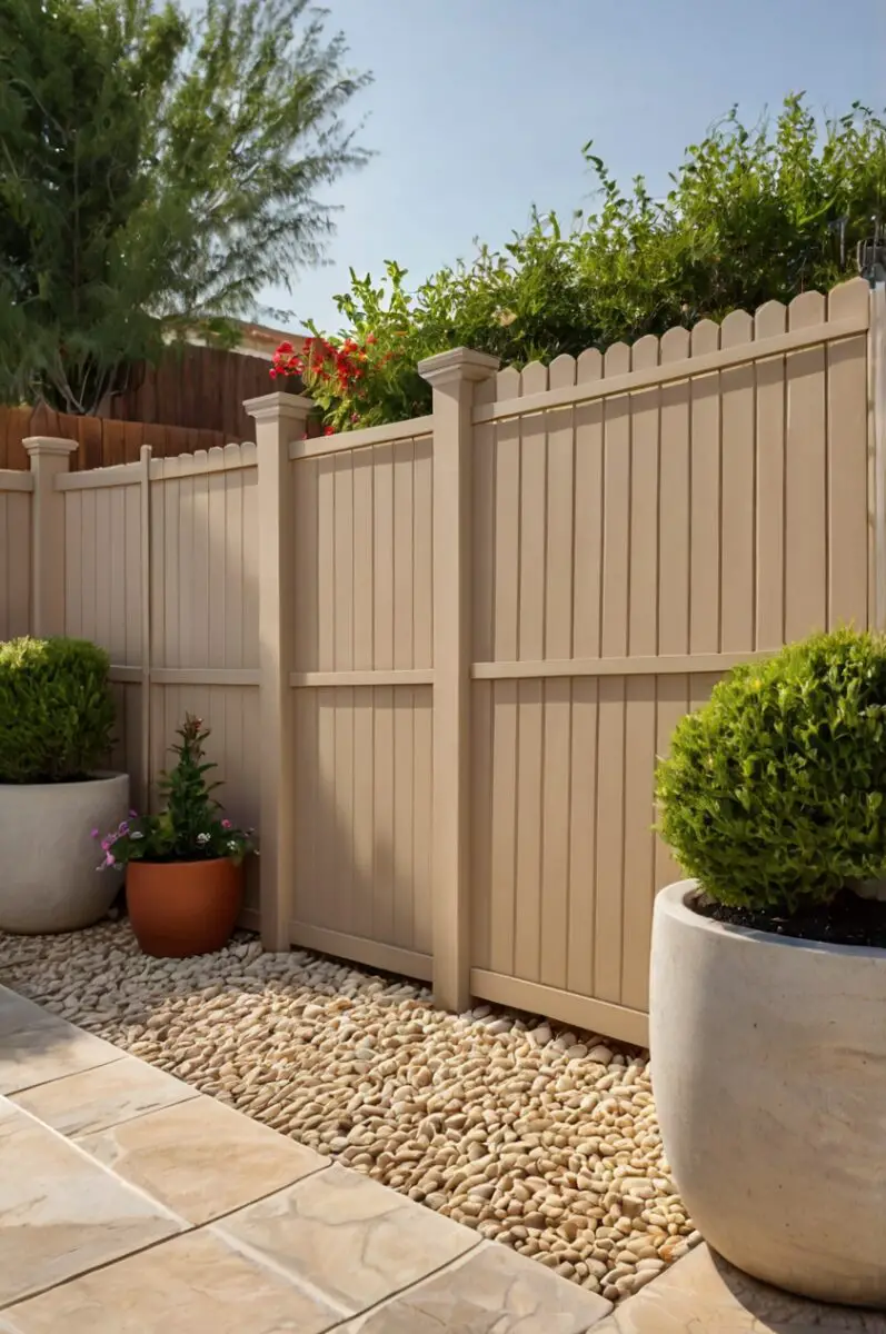
For a warm, inviting look, go with a lighter beige or tan.
This earthy tone complements brick and stone exterior homes beautifully.
Try a desert sand beige for Spanish style stucco homes or a warm tan that contrasts nicely against cool gray siding.
Stay away from dingy, dull beige shades and opt for one with a subtle touch of yellow or pink undertone to keep it looking bright yet neutral.
3. Light Gray
A light gray fence has a modern, sleek look.
It’s a great backdrop that won’t compete with colorful flowers or foliage.
Look for light gray with a hint of green or blue for a soothing, zen-like feel.
Light grays work on any home style from Mediterranean to farmhouse.
For a beachy look, try a pale coastal gray against blue shutters and white trim.
Just stay away from greenish grays, which can make your fence appear drab over time.
4. Dark Gray
For more contrast, try a charcoal or gunmetal gray fence.
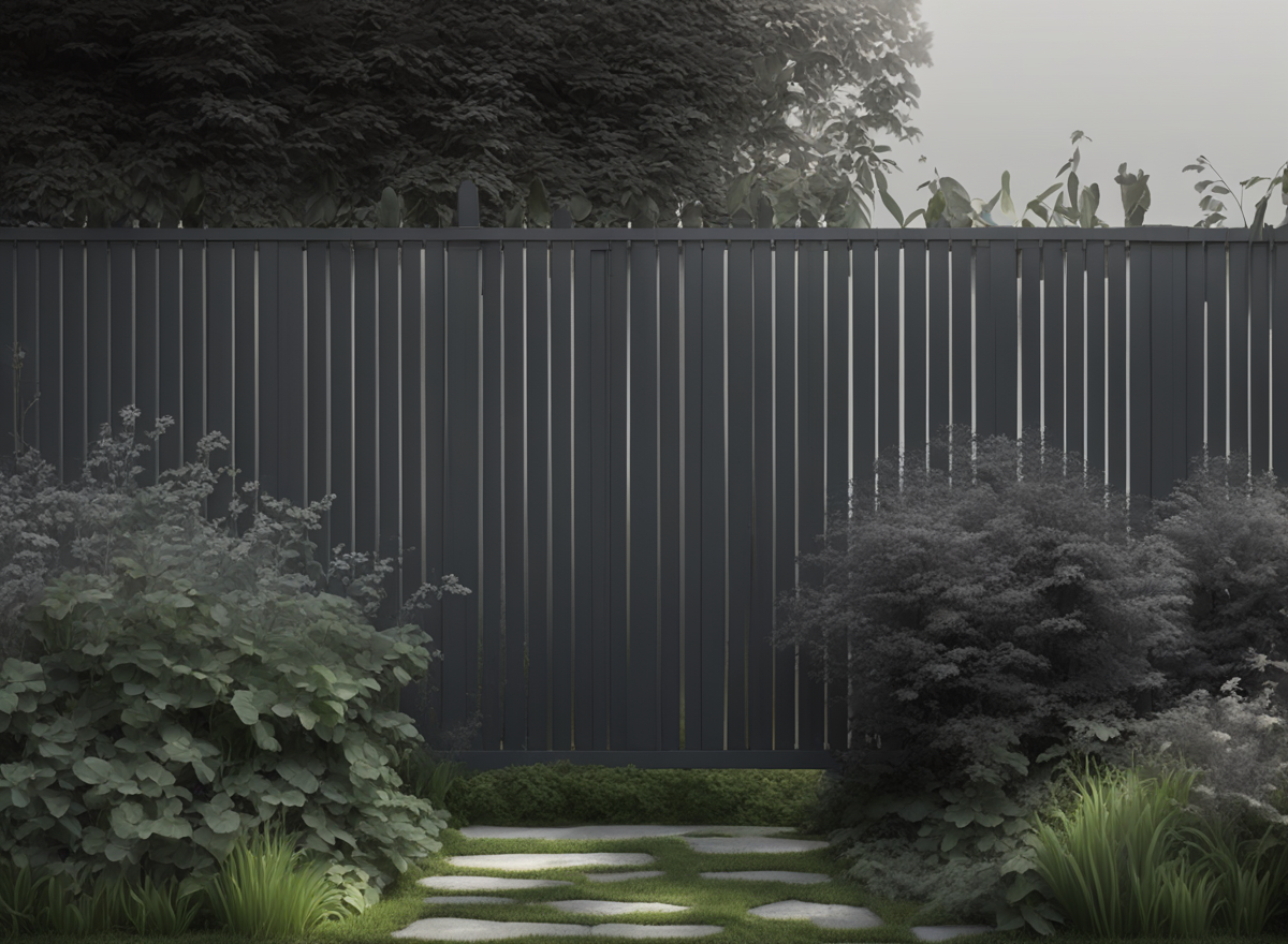
It makes a dramatic statement against a white or light-colored house.
Opt for a blue-based gray versus brown for a crisp, cool tone.
Matte finishes hide imperfections well.
Wrought iron fences coated in a dark charcoal gray ooze modern elegance.
Or try a dark gray wood grain finish for timeless appeal.
Just beware dark colors on fences show dust and age faster.
✨Click to Get My 101 FREE Designer Room Ideas
5. Blue
From sky blue to navy, a blue fence brings fun personality to your yard.
Use it as an accent or go bold with an all-blue fence.
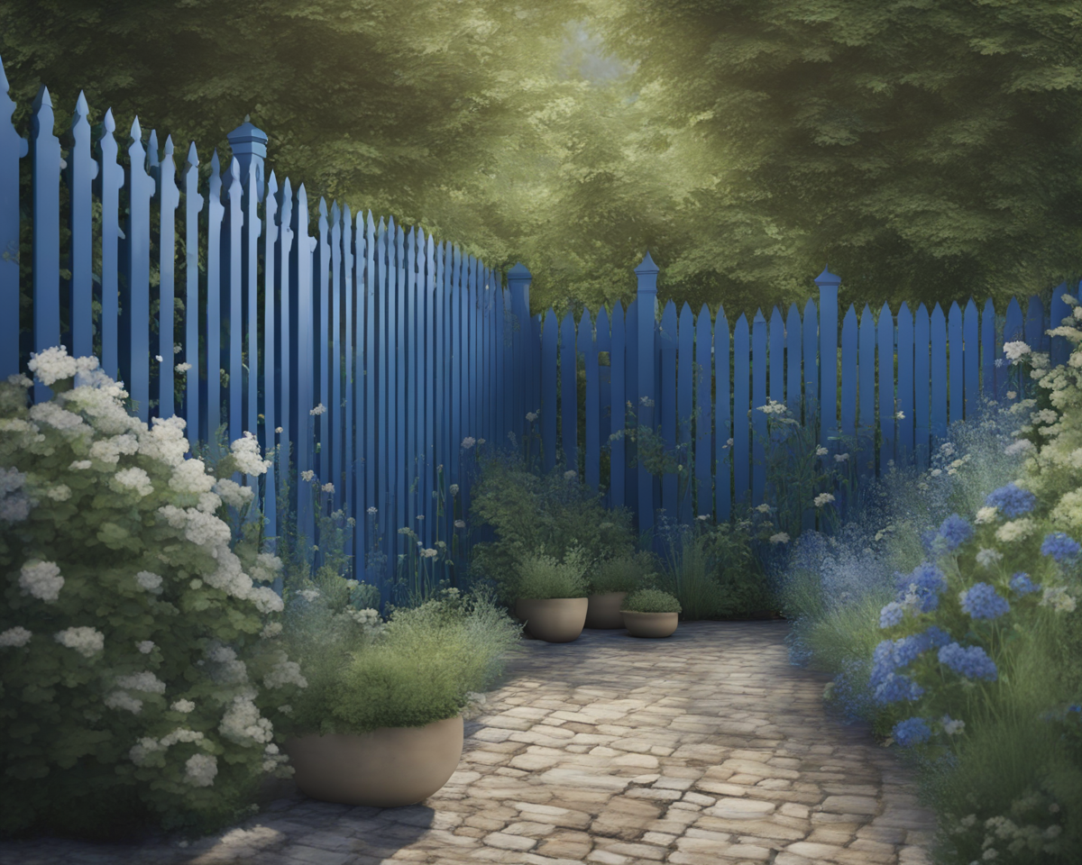
Powder blue makes for a very soothing, spa-like feel.
Robin’s egg blue adds a playful, beachy vibe.
Navy blue offers sophistication and pairs nicely with red brick.
Make sure the shade complements your home versus clashing.
For a lively contrast, opt for brighter, bolder blues against neutral backdrops.
6. Red
Make a bold statement with a cherry red or burgundy fence.
It looks especially nice against a white or light gray house.

Barn red evokes rustic farmhouse charm, especially with wood fencing.
For a more modern pop of color, try fire engine red coated aluminum.
Deep wine reds and burgundies contrast beautifully against light beiges and grays.
Just make sure the red hue flatters, not fights, existing brick or stonework.
Soft red stains on cedar fences also impart natural warmth.
7. Black
A black fence oozes modern elegance.
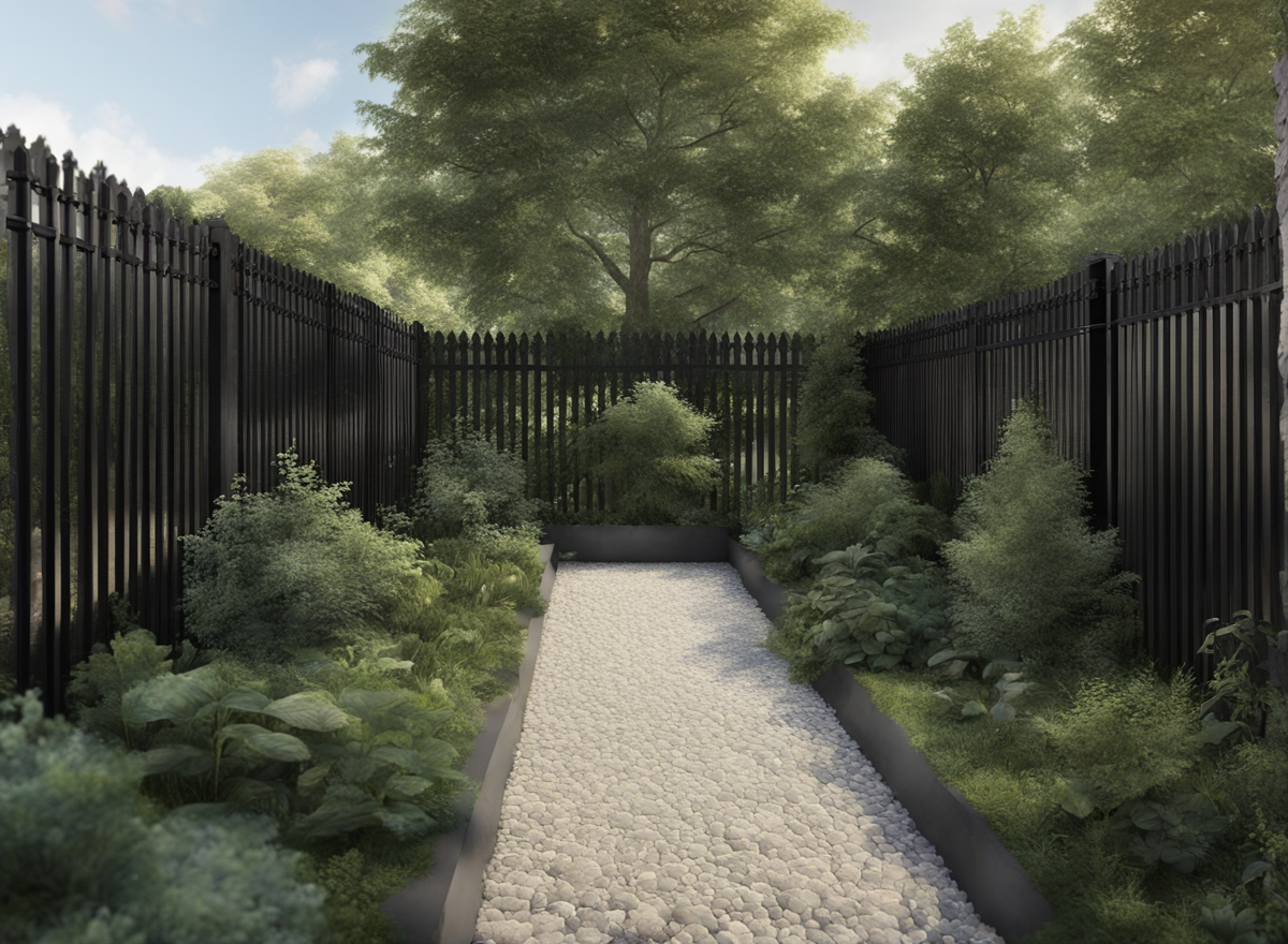
Use it to create a chic, eye-catching divide between yards.
Black makes for a dramatic look, so stick to fences and gates only.
It shows flaws easily, so opt for steel, wrought iron, or vinyl over wood.
Matte black minimizes defects best.
For contrast against bright home exteriors, black evokes a trendy industrial vibe.
Or partner with white for a striking, modern yin-yang color scheme.
Just don’t overdo it or your yard may start to resemble a certain corporation’s color scheme.
8. Yellow
Happy, sunshine yellow makes for a cheery fence.
Use a pastel yellow for a soft look or go bright for fun pops of color.
Pale lemon yellow complements light blue homes beautifully and feels beachy.
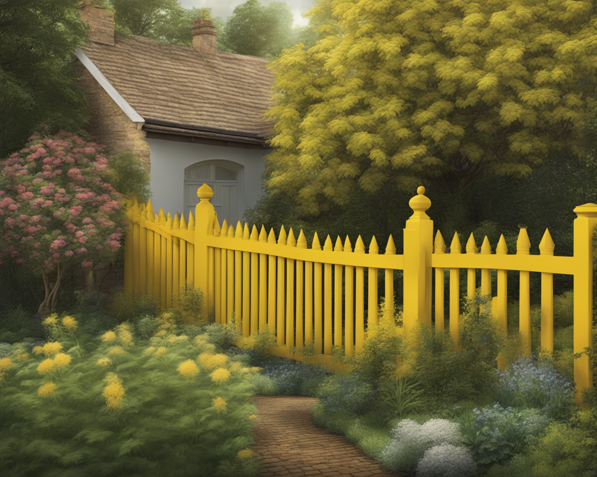
Daffodil or marigold yellows beam brightness against white.
Mustard yellows offer a more muted, earthy tone.
Just avoid school bus yellows, which can look jarring.
For whimsical contrast, use different yellow hues on fence panels, posts, and gates.
✨Click to Get My 101 FREE Designer Room Ideas
9. Green
Deep green looks sophisticated and earthy.
For a more natural look, try a muted sage green fence color.
Forest green stained cedar offers an organic, woodsy feel.
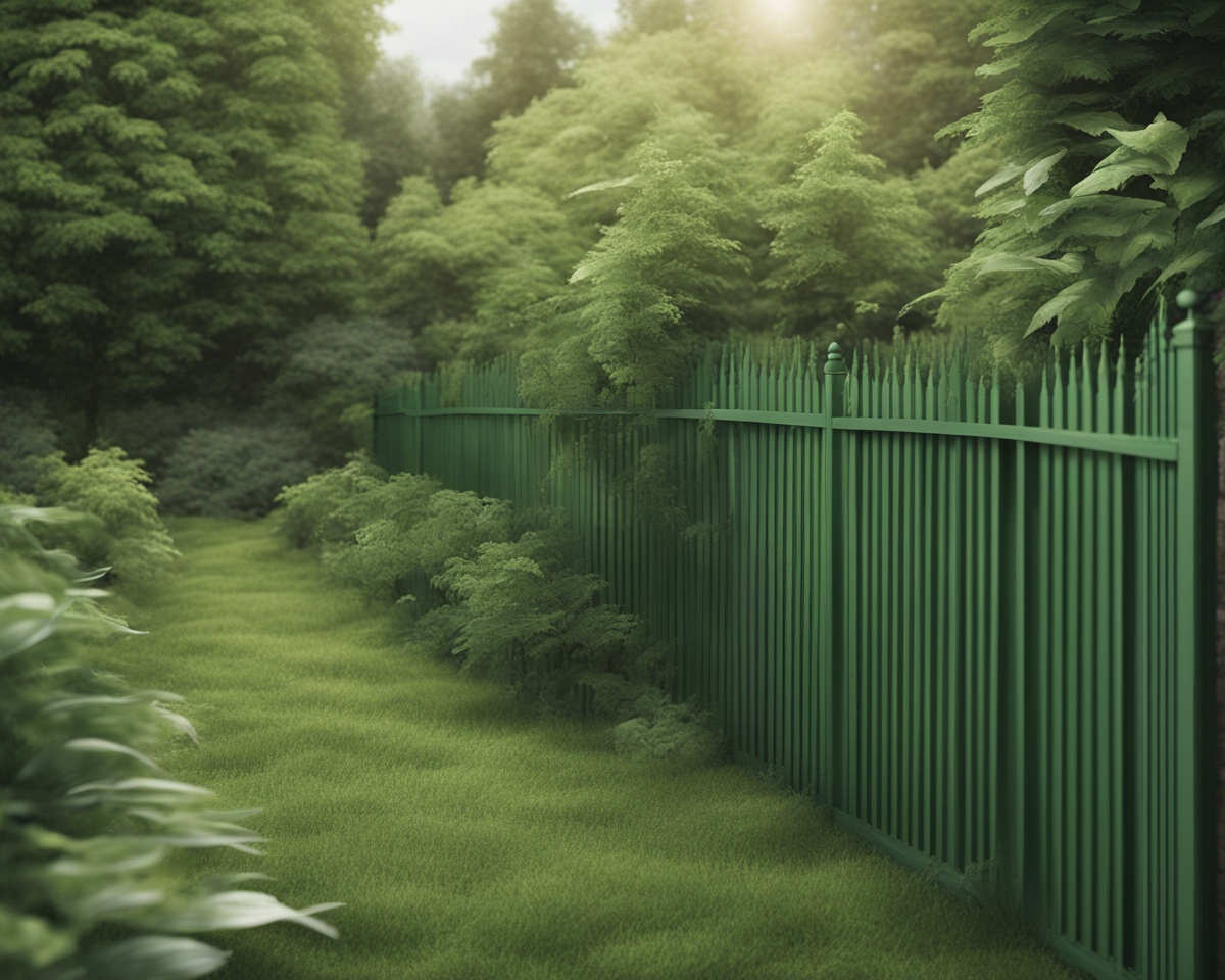
Sage green vinyl fencing adds crisp definition without competing with lush yards.
Moss green makes for a soothing backdrop to gardens.
Lime green vinyl is fun and lively against neutral exteriors.
Just avoid shades too close to grass hues, which can get lost visually.
Play with different green tones for extra depth and interest.
10. Brown
Rich chocolate browns complement brick or wood-sided homes beautifully.
Or try a lighter tan brown for a more neutral look.
Espresso-stained wood feels luxurious and elegant, especially against white trim.
For ranch homes, opt for saddle brown vinyl fencing to enhance the rustic style.
Try mixing deep and golden browns on alternating fence panels for visual interest.
Just avoid flat brown shades that can fade into the background or appear dingy over time.
11. Purple
Make your fence stand out with a vibrant violet or eggplant purple.
Or opt for a pale lavender for a soft, elegant look.
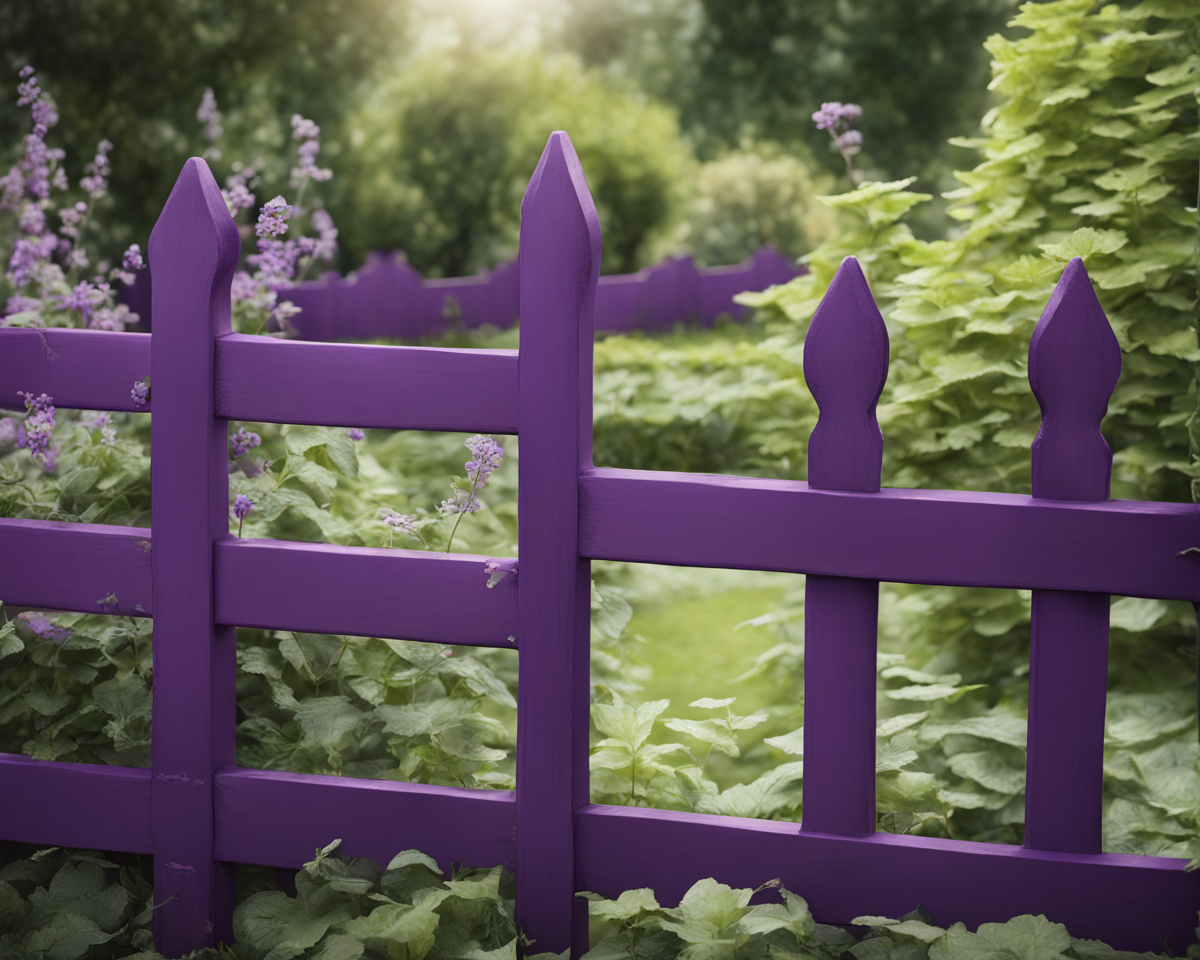
Plum purple makes a regal statement against white columns and trim.
Pair pale mauve with black for a sophisticated, art deco vibe.
Vibrant purple vinyl pops against green lawns and foliage.
For whimsy, use lavender on fencing with violet posts.
Just beware bright purples can appear loud and jarring if overdone.
Use it sparingly or diluted for best effect.
12. Orange
Pumpkin orange makes for a bold, eye-catching fence.
Or tone it down with a softer peach or coral orange hue.
For a playful look, opt for bright persimmon orange against a yellow house.
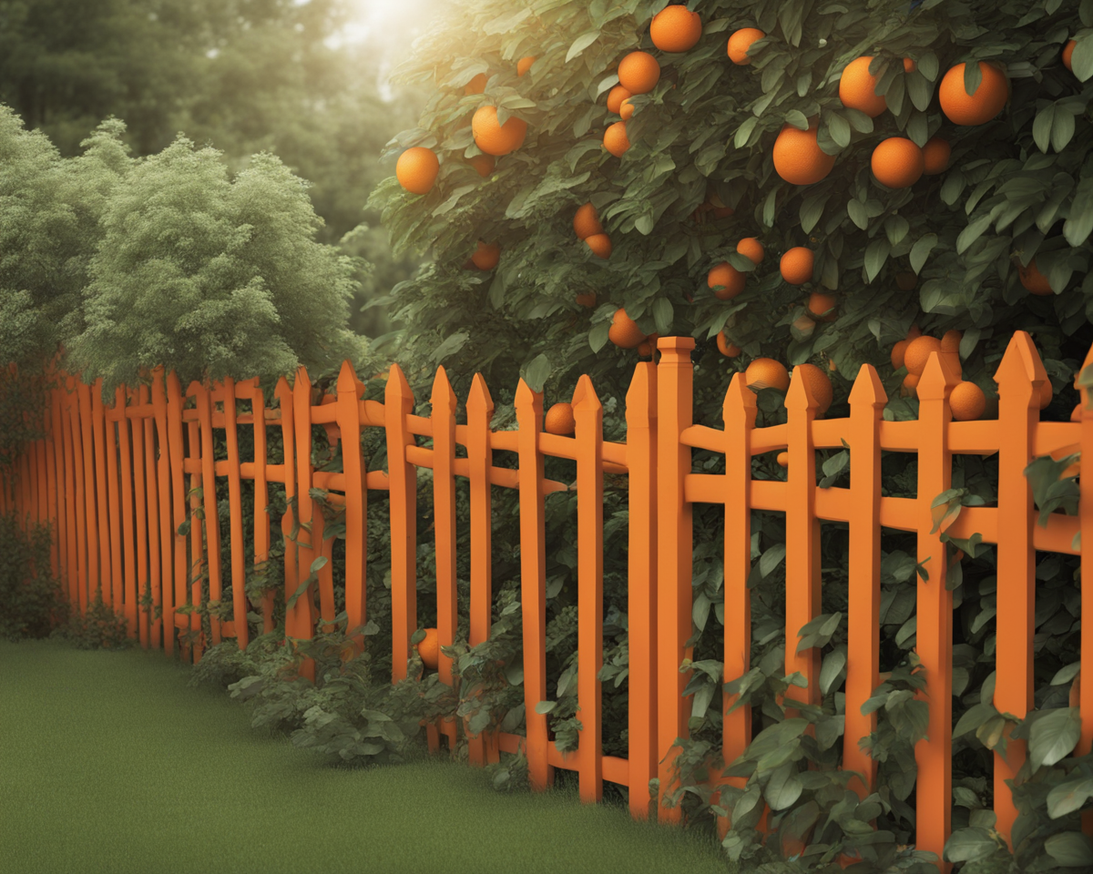
Try terra cotta on stucco homes to enhance the Spanish vibe.
Muted peach stands out nicely against gray and complements blue.
Varying orange hues on fence panels and posts boosts visual dynamics.
Just avoid neon oranges, which tend to look dated and fade quickly.
Partner with purples and blues for a sunset color scheme.
✨Click to Get My 101 FREE Designer Room Ideas
13. Turquoise
From Tiffany blue to aqua, a pop of turquoise looks lively and beachy.
It’s especially nice against white or tan houses.
For beach cottages, robin’s egg blue evokes casual seaside charm.
Bolder turquoise makes a tropical statement against yellow homes.
Try medium blue-green shades for a more flexible pairing.
Use turquoise only as an accent unless you’re on an island.
Too much can feel jarring or theme park-ish if you’re inland.
White trim unifies and prevents clashing.
14. Pink
Pretty in pink!
A blush pink fence looks romantic and charming.
Or go bright with a hot pink for a fun pop of color.
Soft pink is feminine and elegant against white columned porches.
Bubblegum pink makes a playful, upbeat statement on a little girl’s playhouse.
Try pairing lighter and darker pinks for extra dimension and flair.
Vary hues against different surfaces like brick, siding, stone.
Just don’t overdo it or your yard may start looking like a bottle of pepto.
Pink complements green foliage beautifully too.
15. Cream
A creamy off-white fence has a soft, understated look.
It works with just about any color scheme and provides a neutral backdrop.
Antique white or cream make great compromise hues when you can’t decide between white and beige.
They provide that clean, classic white look without the harsh glare.
Soft cream adds subtle warmth against cool stucco.
Try different cream shades on fences, gates and posts for nuance.
Just maintain regularly since cream does show age more than bright white.
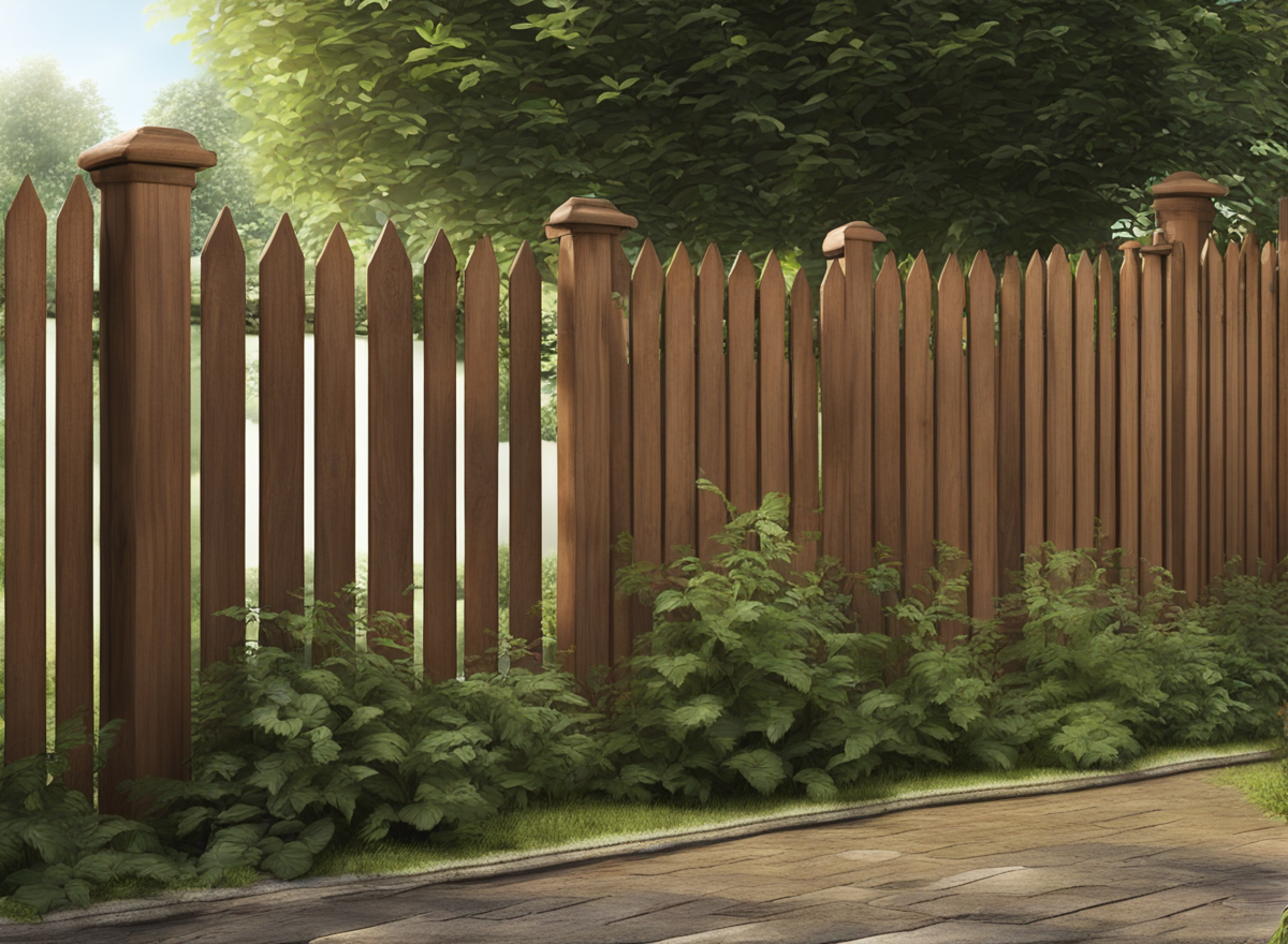
16. Wood Stain
For wooden fences, use a natural wood stain in a light oak or walnut tone.
This enhances the wood’s natural beauty.
Light oak stains allow wood grains to show through while protecting the wood.
Walnut stains add warmth and age more gracefully than opaque paints.
Mahogany and cherry stains offer bolder hues for more drama.
Mix a few complimentary stains for extra flair.
Semi-transparent options still let grains show while blocking UV rays.
Just maintain yearly to keep wood from graying.
✨Click to Get My 101 FREE Designer Room Ideas
17. Charcoal
A matte charcoal grey fence is sophisticated and ultra-modern.
Pair it with contrasting brights for a striking look.
Charcoal grey stained cedar planks make a chic, contemporary privacy screen.
Wrought iron fences coated in charcoal mimic ornate antique ones at a fraction of the cost.
Try charcoal posts against black fencing for an elegant yin-yang dynamic.
Use charcoal to ground bright accent colors like chartreuse without muting them.
Charcoal does show its age, so go matte over gloss for best durability.
18. Rustic Wood
For an earthy, organic look, you can’t go wrong with a rustic wood-toned fence.
Rather than painting or staining the wood, let it age naturally to a silvery gray patina.
This works especially well with naturally rot-resistant woods like cedar and redwood.
The silver gray hue provides a neutral, harmonious look that blends into landscapes gracefully.
Rustic grays showcase wood’s natural grain beautifully.
Mixing weathered woods with stone or brick exteriors enhances the earthy charm.
Let wood fences sit untouched for a year until grayness sets in.
Then maintain yearly with a sealant to protect from turning brittle and silver.
The end result is wood that looks like it’s been there forever.
19. Olive Green
Olive green is an underrated fence color that provides an earthy sophistication.
It’s a great alternative to black or brown that blends into lush surroundings.
Think of olive green’s versatility.
It pairs well with everything from Mediterranean orange to New England red brick.
Olive makes a smart neutral backdrop to colorful plantings.
It has a chameleon-like ability to pick up different undertones depending on light.
In shade, olive skews sage green.
In sunlight, it warms to a hazelnut hue.
For harmonious depth, stain wooden fences multiple olive tones.
Or alternate olive and avocado green panels.
Olive green fences exist to blend in, not shout.
20. Slate Blue
Somewhere between navy and gray lies the beauty of slate blue.
This sophisticated, mineral shade effortlessly grounds both warm and cool exterior palettes.
Slate blue allows bolder colors to pop without overpowering them.
Against brighter yellow homes, slate blue fences and shutters provide crisp definition.
Against red brick, slate blue adds modern versatility.
For beach homes, the cool blue-gray hue evokes the color of ocean pebbles and stones beautifully.
Slate blue is an adaptable chameleon that shifts from green to gray depending on surroundings.
For extra flair, incorporate slate blue with metallic silver accents.
21. Rose Gold
Why should a fence be limited to commonplace colors?
These days you can find aluminum, steel, and vinyl fences coated in dazzling new metallic shades.
One stunning option is a rose gold fence.
The warm, pinkish gold hue provides the glamour of real gold at a fraction of the price.
Against white exteriors, a rose gold fence pops with stylish personality.
Pairing rose gold with deep purple or navy blue creates an elegant, regal vibe.
For more striking contrast, partner rose gold with matte black metalwork.
The glimmering feminine hue juxtaposed against the strong masculine one makes a chic design statement.
When paired with white, rose gold fences emit a gorgeous romantic glow at sunrise and sunset too!
22. Seafoam Green
Seafoam green is a soothing, zen-inducing fence hue that invokes ocean waves and sea glass.
The pale, bluish-green shade is soft and relaxing to the eyes.
Against sunny yellow homes, seafoam green makes a vibrant yet harmonious pairing.
Try seafoam fencing against a sandy beige exterior for breezy, beach house style.
For tropical vibes, accent with pops of coral and salmon.
Seafoam green stained cedar planks have an organic spa-like feel.
Or opt for breezy seafoam aluminum panels that withstand oceanfront elements gracefully.
Seafoam green fences remind us of the serenity and renewal of coastal living.
23. Terra Cotta
Earthy terra cotta makes a wonderfully warm, inviting fence color.
The rich orangey-red hue has a Southwestern or Mediterranean feel that enhances stucco or adobe homes.
Use terra cotta fences, gates and accents to teleport yourself to Tuscan vineyards or Spanish courtyards.
For old world charm, try terra cotta stained cedar panels.
Or opt for durable, vibrant terra cotta vinyl.
To boost cultural character, incorporate decorative tiles in complementary terra cotta tones.
Pair with sage green shutters or glowing yellow walls for further warmth.
Terra cotta fences evoke the sun’s glowing warmth and joyful hospitality.
24. Slate Gray
Splitting the difference between black and silver sits the sophisticated splendor of slate gray.
This mineral-inspired shade offers darker distinction than silver without the boldness of black.
Slate gray fences elegantly delineate boundaries without dominating the landscape.
Against lighter exteriors, slate gray makes a chic, modern style statement.
Pair with whites and creams for contrast balanced with harmony.
For an artistic dynamic, incorporate slate gray fencing with metallic silver and black iron accents.
Slate’s understated refinement pairs effortlessly with everything from prairie style to postmodern.
Think slate gray for fences that ground without overpowering.
