was struggling to find the right curtains for my dark living room.
Nothing seemed to really “pop” against the black couch and wood coffee table.
I must have gone to like five different stores before I discovered that some colors just pair better with black and brown than others.
Seriously, did you know that certain hues will make your furniture practically disappear?
Here are the top colors that will look awesome with your black and brown furniture without washing them out:

Gray

Gray is always a safe bet to pair with darker colors.
There are so many shades of gray to choose from – you’ve got your lighter grays, like silver or ash, which will brighten things up a bit.
Then there are your classic medium grays that blend in well without standing out too much.
One of my favorite medium grays is “dove.” The subtle hints of blue make it more interesting than a flat gray.
I’ve also seen some curtains in “lattice” gray that had a cool geometric weave – those totally gave my living room a modern vibe.
You could even go darker like “charcoal” for a super sleek look.
Charcoal curtains against a black leather couch would be totally boss.
Just be sure not to go too dark or it might feel oppressive.
I’ve also noticed a lot of curtains featuring subtle gray pinstripes or houndstooth patterns lately.
Those add visual interest while still letting the gray color pop against darker furniture.
The chillest part about gray is that it matches like everything.
Black, brown, navy – you name it.
And it stays pretty neutral so you can change up your other decor without the curtains feeling mismatched.
Whether you want a light, airy look or a rich, moody one – gray is sure to complement your black and brown pieces without clashing or getting lost in the mix.
Tap to Explore These Beauties
See my ideas in action 👇 Tap any image to explore full details.
Navy blue

Navy is such a classic color that always looks polished and put together.
A true navy – that deep, bright midnight blue – pairs perfectly with black without being too similar.
It also complements warm wooden tones without competing.
The key is finding a navy with depth and saturation.
A lighter, faded navy might wash things out too much.
I just hung some curtains in “ink” navy in my dining room and wow, do they ever make the wood table pop.
It’s like it darkens the space in the most flattering way.
I’ve also seen home goods stores featuring navy curtains with subtle white polka dots lately.
Those add a fun, retro flair while keeping the color sophisticated.
You could get really creative and opt for a navy with an interesting weave or sheen too.
Satin or metallic navies look so expensive and luxurious against dark walls.
I know a lot of guys think navy is too “feminine” but trust me, in the right context, it’s totally modern and cool too.
Just pair it with gray or charcoal accents for a more muted look.
The bonus is that navy works year-round – from dark winter nights to breezy summer evenings.
It always feels put together and pulls a room together seamlessly.
💭 Ever wondered what your room would actually look like rearranged?
I built a free tool that lets you drag furniture around a 2D floor plan. No signup, no catch.
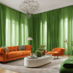
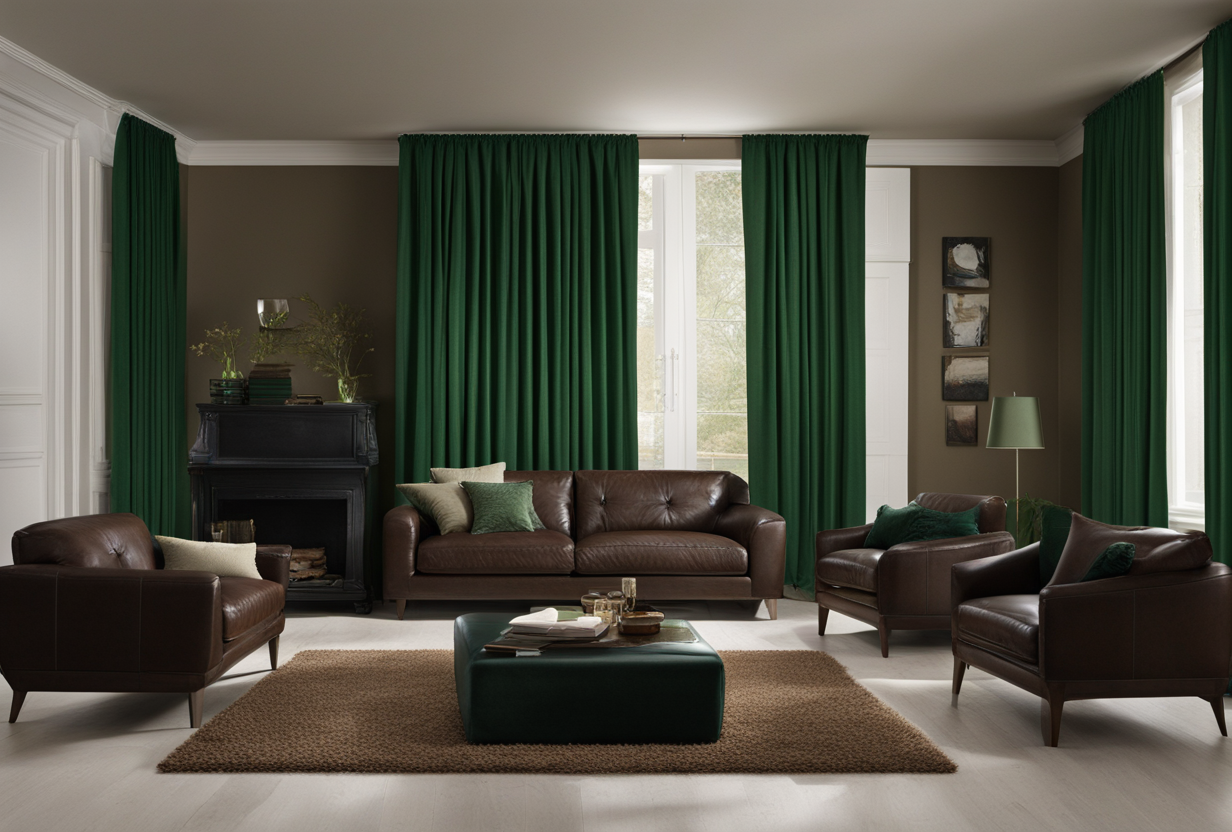
See the Room Planner →Forest green

Green is nature’s color, so it makes total sense that forest green pairs well with wood.
Shades like pine, moss or fern green impart a rustic, woody vibe.
They complement oak or mahogany furnishings without being matchy-matchy.
I’ve seen cabin rentals rock forest green plaid curtains against a worn wooden hutch.
It really transported you to the mountains!
You could also do curtains in a deeper emerald or hunter green for modern luxury.
Those pair gorgeously with espresso or walnut pieces.
I actually changed out my brown suede couch for forest green velvet ones last year.
Now the space feels so cozy and glam at the same time.
Pair forest green with natural textures like burlap, seagrass or faux fur throws for luxe mountain lodge vibes.
Or add brass, wood or stone accents.
The best part is it works year-round.
Swap in winter white shear curtains over the forest green for a layered look too.
Seriously, green is where it’s at.
It makes dark rooms feel fresh and light while complementing natural elements beautifully.
Burgundy

Wine colors like burgundy are just so elegant and rich.
Deeper burgundy, oxblood or merlot shades pair magnificently with black.
They add warmth and vibrancy without being high-contrast.
I know a girl who did burgundy velvet drapes in her dining room – it felt so luxurious and glamorous against dark wood paneling.
You can also find fun burgundy and black check or stripe patterns on curtains nowadays.
Those add visual interest for a contemporary look.
Pair burgundy with brass, gold or antiques for a sophisticated mansion vibe.

💭 I Wrote a Book About My Biggest Decorating Mistakes!
When I decorated my first home, I thought I knew what I was doing. Spoiler: I didn’t. 😅
💸 I bought a sofa way too big for my living room. Paint colors that looked amazing in the store but terrible on my walls.
Or keep the surroundings neutral in creams and grays for a moody juxtaposition.
I’ve noticed some high-end furniture stores featuring burgundy linen or velvet sofas lately too.
Those colors coordinate seamlessly.
In the colder months, burgundy feels downright cozy.
But it also works well in summer paired with whites or light woods.
The rich berry tones give any space polish without being overly bold.
Burgundy always looks expensive and luxurious against darker pieces.
Find Your Room’s Color Palette
Tap a vibe — get a curated 5-color palette with hex codes you can copy ✨
Olive

Olive is such a versatile green that works well in any space, from modern lofts to farmhouse cottages.
Shades like army green, hunter green or eucalyptus pair beautifully with walnut, mahogany or espresso pieces.
The tones complement each other without competeing for attention.
I saw some olive curtains recently with a cool weathered copper metallic print on them.
Against brown walls, it had major mountain lodge vibes.
You could also opt for solid olive curtains in a soft velvet or linen material.
Those feel super cozy and elegant all at once.
I’ve also noticed olive accents like pillows or throws pairing gorgeously with black leather sections.
The army tones look so luxe and sophisticated together.
Another fun way to incorporate olive is with a patterned fabric.
Plaids, herringbones and geometric prints in olive/cream color palettes are so on-trend.
No matter the style, olive just works.
It has a laidback appeal but looks polished and expensive too when paired with quality materials.
The tone-on-tone green coordinates beautifully with brown hardwoods or rich wooden furnishings all year long.
Olive is also very versatile – it mixes and matches everything from whites and taupes to grays, blues and rich jewel tones.
Your decor options are endless!
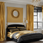
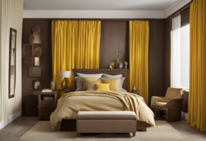
Mustard yellow

Yes, even a bold yellow like mustard can totally work with black or brown!
The trick is opting for a deeper, richer yellow tone rather than a pastel or neon shade.
Think burnt yellow, goldenrod or saffron over baby or highlighter yellow.
Mustard curtains looked so gorgeous in a house I peered in once.
Against walnut built-ins and a espresso leather chair, it felt vibrant but not too “in your face.”
I’ve also seen European design blogs feature mustard velvet drapes or soft printed cotton blinds.
Those add a pop of sunshine without overwhelming.
Pair mustard with neutral solids, soft whites or creams.
Brass, wood or warm stony textures also complement the hue beautifully.
For a trendy look, opt for a geometric or botanical print involving mustard, olive, cream and gray tones.
So many cool options out there!
Mustard also transitions nicely between seasons.
Layer it over lighter curtains in summer then let it stand alone in fall/winter for cozy vibes.
Yellow gets a bad rep sometimes but done right with the right tones, it uplifts a space in the most chic way against neutral or darker backdrops.
Terracotta

Terracotta gives off major rustic appeal which suits natural woods like oak or teak perfectly.
Shades closer to terra cotta than orange complement various tones of brown without dominating.
Think adobe, reddish clay or burnt sienna hues.
I stayed at an AirBnB once decked out in terracotta everything – from the curtains to pillows to artwork.
Against white-washed wood, it had serious Spanish hacienda energy.
You can also find some pretty awesome terracotta textured weaves or dramatic geometric patterns on curtains nowadays.
Mixing various tans, creams and taupes with terra cotta gives a room cozy appeal.
Or go bolder by pairing it with navy, kelly green or pops of jewel tones.
Textiles like hemp or rattan combined with the clay color palette feel authentically earthy and rustic without trying too hard.
Terracotta infuses richness and vibrancy to dark rooms.
It ties natural elements together for an organic, lived-in aesthetic.
The warm red tones also make black and brown furniture colors pop without competing for attention either.
Like olive and burgundy, terra cotta coordinates beautifully with various darker color families for endless styling options too.
Plum
Plum curtains turn any space ultra-romantic and glamorous.
Pair deeper eggplant or prune shades with espresso or onyx furnishings.
Or go lighter with lavender tones against charcoal or gray walls.
The violet-based purple tones add vibrancy that complements cool grays as well as warm wood tones.
One living room I spied featured plum velvet drapes lined in gold seen through glass doors – it was beyond gorgeously dramatic.
You could also do fun touches like plum sequin or metallic brocade curtains for glitzy evenings in.
Mixing various purple families like plum, burgundy and eggplant makes for a moody, luxurious color scheme too.
Plum works beautifully with gold, brass or blush accents too for added flair.
Or keep it unique styling with eco-materials like seagrass.
The moody berry tones infuse any space with posh elegance.
Pair plum curtains with your fine crystal and you’ve got one luxe pad!
What’s Your Decor Personality?
5 questions · 30 seconds · Instant style match 🏡
Taupe
Taupe is the chillest neutral that coordinates with everything under the sun.
Shades vary from pale grayish beige to darker ash brown.
No matter the tone, taupe always blends in seamlessly without clashing.
I favor lighter “cashmere” or grayish taupe shades that brighten up dark rooms.
They won’t overpower black or rich brown furnishings.
You’ll find taupe in every weave under the rainbow too – from soft linen to textured brocades.
It takes styling well in any material.
Pair taupe with brass, wood or earth tones for a cozy cottage vibe.
Or keep it sleek styling with crystal, chrome and white marble.
I’ve seen some beautifully woven taupe and natural fiber curtains that gave hotel lobby grandness to a living space.
It’s also nice that taupe coordinates with all color families – from pastels to jewel tones.
It’s endlessly versatile.
The subtle tone brightens and pulls together contrasting colors without competing for attention itself.
Taupe is a super safe – and chic – choice if you don’t want color but still want depth and warmth against dark tones.
Psst… Check This Out
Findin' the Perfect Curtains to Match your Cozy White Comforter Take Me There →Crimson
Don’t be afraid of red – some deeper tones really sing against black.
Crimson, oxblood or garnet reds add vibrancy and richness without clashing.
They have beautiful depth.
Pair crimson curtains with black walnut or espresso furnishings for a moody vibe.
Or offset with rouge velvet chairs – so glam.
You could also find fun Damask or paisley prints incorporating reds, burgundys, navys and more.
Very maximalist chic.
Textural elements like velvet, velour or faux fur in darker shades of red infuse drama.
Add brass or gold knick knacks too.
For a modern look, try geometric or bloom patterned reds accented with touches of gray, olive or poppy orange.
Done right against the right tones, red is beyond stunning.
It adds vibrancy where plain neutrals just can’t compare.
💭 I Wrote a Book About My Biggest Decorating Mistakes!
When I decorated my first home, I thought I knew what I was doing. Spoiler: I didn’t. 😅
💸 I bought a sofa way too big for my living room. Paint colors that looked amazing in the store but terrible on my walls.
Denim blue
Denim blue is a casually cool alternative to navy.
Shades like indigo, ink or cobalt blue have lovely depth against black leather or espresso wood.
They really make those colors “pop” without competing.
Opt for darker washes of denim rather than medium or light shades.
You can also find subtle variations incorporating gray, olive or even pink for visual interest.
Hunter green
Hunter green is a deeper, moodier version of forest green.
It perfectly complements dark brown tones like espresso, walnut or mahogany without competing for attention.
The tones mesh beautifully together.
You’ll also find fun variations incorporating shades like tea dye hunter or lamppost green.
Mixing hunter green with olive or moss shades creates a stunning palette that feels luxurious against wood furnishings.
This or That?
Pick your fave — see what other readers chose! 👀
Camel
Camel is the chiller version of taupe with just a touch more warmth.
Shades like sand, putty or beige blend in beautifully without washing things out.
Like a nice neutral tan.
I stayed at an Airbnb once with cozy camel curtains, throws and pillows.
Against dark wood, it felt so inviting.
You’ll find lots of fun weaves incorporating camels with hints of gray, navy or olive nowadays too.
Mixing tonal camels, creams and whites infuses softness.
Or pair with blush pinks for an effervescent vibe.
The hue also looks gorgeous when woven with metallic like rose gold or copper threads.
Camel coordinates seamlessly with various brown families from espresso to rosewood.
So versatile.
It’s a nice alternative to taupe if you want more vibrancy without color.
Camel just feels “cozy luxe.”
Moss green
Moss green exudes nature’s appeal like no other.
Shades read variously as fern, pine or olive depending.
All pair gorgeously with walnut or weathered wood.
Some moss textured curtains I saw gave a cabin vibe despite being in an apartment.
So clever!
You can find lots of fun moss tones nowadays woven with copper, gray or hint of pink threads too.
The tone coordinates beautifully with Elements like linen, rattan, driftwood or earthy pottery for total organic vibes.
It also looks beautiful layered with linens or gauzes lightly printed with birch forests or ferns.
Moss green is a calming, thoughtful choice that enlivens dark rooms with natural wonder.
Graphite
Graphite is sleek, moody gray with subtle blue undertones.
It makes a bolder statement than cool grays like silver or dove against black or espresso furnishings.
I saw an apartment once use graphite curtains, throw pillows and art.
Looked so put together.
You’ll find lots of graphic weaves and patterns incorporating graphite, white and hint of maroon nowadays too.
Mixing various shades of graphite infuses dimension.
Or pair with navy or charcoal for modern contrast.
The tone pairs gorgeously when woven with metallic silver or gunmetal threads too.
Graphite coordinates beautifully dark stained oak, walnut or ebony woods for luxe appeal.
It’s perfect for creating a polished, moody vibe in contemporary spaces.
Very “urban cabin chic.”
✦ You Might Love This
Complete Your Room: 6+ Curtain Colors for White Walls & Brown Furniture Combos Keep Reading →Indigo
Nothing sings sophistication like deep indigo.
Pair it with black leather, suede or ebony furnishings.
The tones read as yin and yang.
I indulged in indigo silk curtain at a boutique once – felt totally glam and elegant.
You can find lots of dense indigo tones woven with hints of teal or gray nowadays too.
The hue also looks beautiful when layered with linens or gauzes lightly printed with florals.
Quick Design Dilemma
Cast your vote — see what other readers think! 🤔
💭 I Wrote a Book About My Biggest Decorating Mistakes!
When I decorated my first home, I thought I knew what I was doing. Spoiler: I didn’t. 😅
💸 I bought a sofa way too big for my living room. Paint colors that looked amazing in the store but terrible on my walls.
Indigo coordinates gorgeously with macassar ebony, walnut or rosewood.
So dramatic yet polished.
It’s perfect for creating a serene, luxurious mood.
Very “bohemian aristocrat” vibes.
Cherry red
A hint of red makes certain curtains beyond boss against black.
Cherry tones of red with plum or raspberry undertones pair beautifully.
Opt for slightly darker cherry shades over bright primary reds.
You can find lots of brocade curtains featuring cherries, vines and pomegranates.
The tone also looks beautiful woven with metallics, like rose gold or antique brass.

Cherry red feels glam when styled with blush pink, navy or emerald accents.
It’s perfect for infusing vibrancy and drama.
Very “Baroque boudoir” vibes.
Curtain Colors That Get an A+ When Paired With Black and Brown Furniture
| Rank | Why It Works | |
|---|---|---|
| Gray | 9 | Brings depth without washing things out.
Works with any style. |
| Navy blue | 9 | Classic, polished color that contrasts without clashing.
Pairs with any wood tone. |
| Forest green | 9 | Complements wood tones beautifully.
Imparts cozy, rustic vibes. |
| Burgundy | 9 | Adds warmth and vibrancy without competing.
Works well in any season. |
| Olive | 9 | Versatile tone that pairs gorgeously with wood.
Works in any style space. |
| Taupe | 9 | Ultimate chic neutral that coordinates with everything.
Always polished. |
| Mustard yellow | 8 | Pops without clashing when using the right tones.
Uplifting color. |
| Terracotta | 8 | Imparts rustic charm.
Works beautifully with wood tones and black. |
| Plum | 8 | Adds richness and drama without being overpowering.
Always luxurious. |
| Crimson | 8 | Adds vibrancy when done right.
Pairs gorgeously with black for mood. |
| Denim blue | 8 | Casually cool alternative to navy.
Pops furniture without competing. |
| Hunter green | 8 | Deeper, moodier green perfectly complements wood tones. |
| Camel | 8 | Warm, inviting neutral that blends in nicely.
Exudes coziness. |
| Moss green | 8 | Calming tone evokes nature.
Enlivens without competing. |
| Graphite | 8 | Sleek gray makes a bolder statement.
Very modern contrast. |
| Indigo | 8 | Adds depth and richness.
Pairs beautifully with any dark finish. |
| Cherry red | 8 | Infuses drama without clashing.
Glamorous pop of color. |
| Silver | 7 | Light, bright gray adds shine.
Works best with cool tones. |
| Aqua | 7 | Pops without clashing in right tones.
Brightens dark rooms. |
| Amber | 7 | Adds richness when paired with wood.
Works well in small doses. |
| Sage | 7 | Light green brightens while complementing wood.
Versatile. |
| Dusty rose | 7 | Feminine pop of color that pairs nicely with gray.
Soft contrast. |