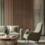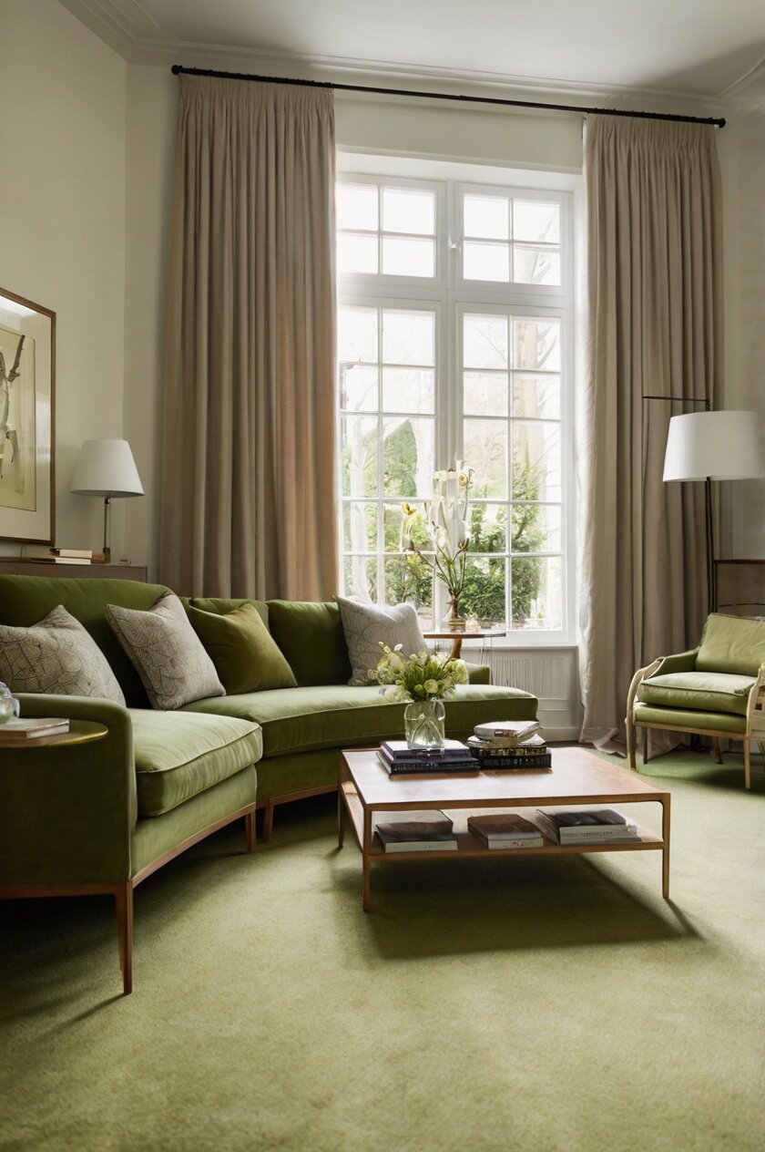
live green carpet creates a natural, grounded feeling in any room.
This versatile neutral has earthy undertones that can make your space feel cozy and connected to nature.
The wrong shade might clash or make your room feel dark, while the perfect match will create a harmonious space that feels perfectly put together.
Olive green is unique because it contains both warm and cool undertones, making it surprisingly flexible when it comes to paint pairings.
Creamy White: A Timeless Complement


Creamy whites like Benjamin Moore’s “Swiss Coffee” or Sherwin-Williams “Alabaster” create a perfect backdrop for olive green carpet.
These soft, warm whites avoid the harshness of bright white while still keeping your space feeling light and airy.
The subtle warmth in creamy whites picks up the earthy quality of olive green, creating a natural harmony between your walls and floor.
This combination works especially well in rooms that don’t get a lot of natural light, as the light walls will help brighten the space without fighting against the deeper carpet tone.
To enhance this pairing, consider adding natural wood accents through furniture or decorative elements.
These wooden tones will bridge the gap between the creamy walls and olive carpet, creating a cohesive, organic feeling throughout the room.
Textural elements like woven baskets, linen curtains, or jute rugs layered over parts of the carpet add depth to this neutral palette.
For accent colors with this combination, consider terracotta, rust, or mustard yellow—all of which complement both olive green and creamy white beautifully.
In living rooms, this color scheme creates a welcoming, timeless atmosphere that never goes out of style.
For bedrooms, the creamy white walls with olive carpet make a soothing backdrop for restful sleep.
If your olive carpet has more yellow-green undertones, choose whites with a hint of yellow (like Benjamin Moore’s “White Dove”).
For olive carpets with more gray-green qualities, whites with the slightest touch of gray (such as Sherwin-Williams “Snowbound”) will create a more harmonious look.
This combination provides a perfect neutral foundation that allows your furniture and accessories to take center stage.
Tap to Explore These Beauties
See my ideas in action 👇 Tap any image to explore full details.
Soft Sage: Monochromatic Magic
Creating a monochromatic look with soft sage walls and olive green carpet produces a sophisticated, cohesive space that feels both trendy and timeless.
Colors like Benjamin Moore’s “Sage Tint” or Sherwin-Williams’ “Clary Sage” offer just enough contrast while staying within the same color family.
The key to making this combination work is choosing a sage tone that’s lighter than your carpet but shares the same undertones.
This subtle contrast creates depth without introducing competing colors.
In a monochromatic green scheme, texture becomes especially important for adding visual interest.
Consider incorporating different textures through pillows, throws, curtains, and other accessories to prevent the space from feeling flat.
Natural materials like wood, rattan, and jute work beautifully in this color scheme, adding warmth and organic elements.
For accent colors, consider copper or brass metallics, which bring a touch of glamour that complements the earthy greens.
This palette works wonderfully in spaces where you want to create a calm, nature-inspired retreat.
Bedrooms, home offices, and reading nooks particularly benefit from this soothing combination.
If you’re concerned about too much green, use the sage on just one accent wall, with a neutral tone on the remaining walls.
The subtle difference between the sage walls and olive carpet creates an elegant gradient effect that professional designers often use.
For a modern look, pair this combination with black metal furniture and minimal decor.
For a more traditional space, warm woods and classic furniture shapes complement this color scheme beautifully.
This combination also provides a perfect background for houseplants, which will look vibrant against the green backdrop without competing with it.
Warm Taupe: Natural Neutrality
Warm taupe creates a sophisticated, earthy pairing with olive green carpet that feels both elegant and grounded.
Colors like Benjamin Moore’s “Revere Pewter” or Sherwin-Williams’ “Accessible Beige” provide the perfect mid-tone neutral complement.
This combination works because both colors have natural, organic qualities that create a peaceful, harmonious foundation.
The gray undertones in taupe balance the yellow/brown undertones often found in olive green, creating a balanced, cohesive look.
This color combination works particularly well in living rooms and family spaces where you want a welcoming, comfortable atmosphere.
To enhance this pairing, introduce natural textures like wood, leather, and stone to emphasize the earthy quality of both colors.
Metallic accents in brushed brass or copper add warmth and elegance to this neutral foundation.
For pattern and visual interest, consider tribal prints, subtle botanicals, or geometric designs in complementary earth tones.
This color scheme transitions beautifully through changing decorative seasons—add burgundy and orange in fall, deep greens in winter, and lighter accents in spring and summer.
The taupe-olive combination creates a perfect backdrop for artwork, as the neutral palette doesn’t compete with colorful pieces.
For a more dramatic look, choose a darker taupe with more brown undertones like Benjamin Moore’s “Weimaraner.”
For a lighter feel, a paler taupe like Sherwin-Williams’ “Agreeable Gray” will keep the space feeling open while still complementing the olive carpet.
This combination works in any design style from traditional to contemporary, making it one of the most versatile options on this list.
In rooms with limited natural light, warm taupe prevents the olive carpet from making the space feel too dark or closed in.
Professional designers often recommend this pairing for its timeless quality and ability to work with virtually any furniture style.
Soft Buttery Yellow: Unexpected Brightness
Soft buttery yellow walls create a surprising yet delightful combination with olive green carpet, bringing warmth and cheer to any space.
Colors like Benjamin Moore’s “Yellow Lotus” or Sherwin-Williams’ “Butter Up” add a sunny disposition without overwhelming the room.
This combination works because yellow and green are adjacent on the color wheel, creating a naturally harmonious relationship.
The warmth of buttery yellow balances the cooler aspects of olive green, resulting in a space that feels both vibrant and grounded.
This pairing is especially effective in rooms that don’t receive much natural light, as the yellow walls reflect and amplify available light.
In kitchens or dining spaces with olive carpet, this combination creates an inviting, energetic atmosphere that encourages gathering.
For a sophisticated look, keep accessories minimal and in neutral tones like white, cream, and natural wood.
For a more playful space, consider adding small accents in coral or turquoise, which complement both the yellow walls and olive carpet.
Botanical patterns and natural imagery work particularly well with this color combination, enhancing its connection to nature.
To prevent the yellow from feeling too intense, choose shades with a slight muting or ones that lean slightly toward cream.
This color pairing creates spaces that feel optimistic and uplifting—perfect for home offices, craft rooms, or children’s play areas.
White trim and moldings provide a crisp contrast that helps define the architecture while balancing the colorful palette.
Warm wood tones in furniture pieces bridge the yellow walls and olive carpet beautifully, creating a cohesive look.
For a seasonal update, this combination transitions effortlessly with accent pieces in different colors throughout the year.
This unexpectedly delightful pairing proves that sometimes the most interesting interior designs come from color combinations you might not initially consider.

Find Your Room’s Color Palette
Tap a vibe — get a curated 5-color palette with hex codes you can copy ✨
💭 I Wrote a Book About My Biggest Decorating Mistakes!
When I decorated my first home, I thought I knew what I was doing. Spoiler: I didn’t. 😅
💸 I bought a sofa way too big for my living room. Paint colors that looked amazing in the store but terrible on my walls.
Rich Terracotta: Mediterranean Warmth
Rich terracotta walls create a dramatic, warm partnership with olive green carpet that evokes Mediterranean and Southwestern design traditions.
Colors like Sherwin-Williams’ “Redend Point” or Benjamin Moore’s “Sienna Clay” bring a sun-baked earthiness that complements olive green’s natural quality.
This combination works because terracotta’s reddish-orange tones are complementary to green on the color wheel, creating a vibrant yet balanced contrast.
The earthy quality of both colors creates a grounded, organic feeling that makes spaces feel both cozy and sophisticated.
This color pairing works exceptionally well in gathering spaces like dining rooms and living rooms, creating an atmosphere that feels warm and inviting.
To enhance this combination, incorporate natural materials like wood, leather, clay pottery, and wrought iron.
Textiles with subtle patterns in cream, rust, and olive add depth and interest without competing with the strong wall color.
This color scheme supports both minimalist and maximalist approaches—it can be a bold backdrop for simple furnishings or part of a richly layered look.
For a global-inspired design, add handcrafted accessories, vintage textiles, and plants to complete the Mediterranean or Southwest feel.
The terracotta-olive combination transitions beautifully through seasons, feeling cozy in winter and reminiscent of desert landscapes in summer.
In larger spaces, consider using terracotta on just one accent wall to prevent the color from overwhelming the room.
This combination pairs beautifully with houseplants, which stand out dramatically against the warm terracotta background.
For a more contemporary take, incorporate modern furniture with clean lines to balance the traditional feel of these earth tones.
This color pairing carries rich cultural associations that can help tell a story in your space, especially when complemented with appropriate art and accessories.
For rooms that receive lots of natural light, this combination becomes even more dramatic as sunlight enhances the warmth of the terracotta walls.
Pale Blue: Cool Contrast
Pale blue walls create a refreshing, unexpected contrast with olive green carpet, resulting in a space that feels both sophisticated and tranquil.
Colors like Benjamin Moore’s “Breath of Fresh Air” or Sherwin-Williams’ “Atmospheric” offer a cool, airy quality that balances the earthiness of olive.
This combination works because blue and green, while both cool colors, create a pleasing contrast that evokes natural landscapes like forests against sky.
The coolness of pale blue helps modernize olive green carpet, which might otherwise feel traditional or vintage.
This pairing is especially effective in bedrooms, where the cool blue promotes relaxation while the olive grounds the space.
To enhance this color scheme, incorporate natural wood tones, particularly medium to light woods like oak or maple.
White trim and furniture help bridge these two colors, creating a clean, coherent look with defined transitions.
For accent colors, consider introducing small touches of coral, rust, or mustard yellow to add warmth and visual interest.
This color combination works well in coastal-inspired designs, where the blue evokes water and the olive represents natural vegetation.
In smaller spaces, this pairing can help the room feel larger, as the light blue visually expands the walls while the olive carpet anchors the space.
Silver or chrome metallics enhance the cool aspects of this palette, while brass or gold warm it up—choose based on your preferred temperature.
This combination allows for versatility in decorating styles, from traditional to contemporary, depending on your furniture and accessory choices.
For a serene, spa-like bathroom with olive carpet, pale blue walls create a refreshing atmosphere that feels both clean and calm.
To prevent this combination from feeling too cool, incorporate plenty of textures through natural fabrics, woven elements, and layered textiles.
This unexpected color pairing demonstrates how contrasting colors can create spaces with depth and visual interest that evolve beautifully as lighting changes throughout the day.
What’s Your Decor Personality?
5 questions · 30 seconds · Instant style match 🏡
Soft Lavender: Elegant Contrast
Soft lavender walls bring an unexpected yet elegant contrast to rooms with olive green carpet, creating spaces that feel both sophisticated and unique.
Colors like Benjamin Moore’s “Violet Mist” or Sherwin-Williams’ “Enchant” create a subtle purple hue that complements olive green beautifully.
This combination works because lavender sits opposite olive green on the color wheel, creating a complementary scheme that’s been softened to feel harmonious.
The feminine quality of lavender balances the more masculine energy of olive green, resulting in spaces that feel balanced and welcoming to all.
This color pairing brings a hint of luxury and creativity to rooms without being overpowering or trend-dependent.
In bedrooms, this combination creates a restful yet interesting atmosphere that promotes good sleep while keeping the space visually engaging.
To enhance this pairing, incorporate silver or chrome metallics which complement both the cool lavender and the more neutral olive.
White furniture and trim help define the space and prevent the color combination from feeling too heavy or overwhelming.
For a cohesive design, consider incorporating fabrics or accessories that contain both olive and lavender tones to tie the room together.
This color pairing works surprisingly well in home offices, where the lavender promotes creativity while the olive grounds the space for focus.
For a more dramatic look, consider a slightly deeper lavender like Benjamin Moore’s “Amethyst Shadow” with darker olive carpet.
Natural light enhances this combination beautifully, so it’s especially effective in rooms with good window exposure.
If full lavender walls feel too committed, consider using this color on just one accent wall or through substantial accessories against neutral walls.
This combination demonstrates how unexpected color pairings often create the most memorable and personality-filled spaces.
For a transitional design style that bridges traditional and contemporary elements, this lavender-olive pairing provides the perfect foundation.
Charcoal Gray: Modern Sophistication
Charcoal gray walls paired with olive green carpet create a sophisticated, dramatic statement that feels both contemporary and timeless.
Colors like Benjamin Moore’s “Kendall Charcoal” or Sherwin-Williams’ “Iron Ore” provide a deep neutral backdrop that allows olive green to shine.
This combination works because the cool undertones of charcoal balance the warm aspects of olive, creating a harmonious temperature in the space.
The contrast between dark walls and the mid-tone floor creates architectural interest and depth that makes rooms feel intentionally designed.
This pairing performs beautifully in media rooms, home offices, or anywhere you want to create a cocoon-like, focused atmosphere.
To prevent the space from feeling too dark, incorporate plenty of strategic lighting, including table lamps, floor lamps, and uplighting.
White or light-colored furniture and accessories pop dramatically against this dark backdrop, creating visual relief and highlighting your key pieces.
Metallic accents in silver, chrome, or brass add essential glimmers of light and luxury that enhance this moody color scheme.
This combination provides the perfect backdrop for displaying colorful art, which will stand out dramatically against the charcoal walls.
For a more contemporary look, maintain minimalist styling with clean lines and carefully chosen accessories.
This color pairing works surprisingly well in smaller spaces, where it can create a jewel-box effect rather than making the room feel smaller.
In rooms with architectural features like crown molding or wainscoting, charcoal paint highlights these details dramatically.
Consider limiting this bold combination to rooms where you spend evening time rather than spaces that need to feel bright and energizing.
For a softer version of this look, try a medium gray like Benjamin Moore’s “Chelsea Gray” which provides contrast without such dramatic depth.
This sophisticated pairing demonstrates how deep, rich wall colors can transform spaces with olive carpet from ordinary to extraordinary.

Warm Coral: Vibrant Energy
Warm coral walls create a vibrant, energizing contrast with olive green carpet that feels both current and timeless.
Colors like Benjamin Moore’s “Coral Gables” or Sherwin-Williams’ “Coral Reef” introduce a lively warmth that balances the earthy olive tones.
This combination works because coral’s reddish-orange quality complements green on the color wheel, creating a naturally harmonious pairing with visual tension.
The warmth of coral walls prevents olive green carpet from feeling too cool or somber, resulting in spaces that feel welcoming and alive.
This color pairing works exceptionally well in dining rooms, where the coral stimulates conversation and appetite while the olive grounds the space.
To enhance this bold combination, incorporate natural wood tones and plenty of white elements to provide visual breaks.
Gold or brass metallic accents amplify the warmth of this palette, adding touches of glamour that elevate the entire space.
For a more subtle approach, consider using coral as an accent wall rather than throughout the entire room.
This combination transitions beautifully through seasons, feeling fresh in spring, vibrant in summer, warm in autumn, and cheerful in winter.
Pattern mixing works particularly well with this color scheme—consider geometric, botanical, or global-inspired patterns that incorporate both hues.
To prevent the space from feeling too busy, maintain simplicity in furniture shapes and styles when using this bold color combination.
This pairing creates rooms with definite personality and energy, perfect for homeowners who want spaces that feel unique and expressive.
In spaces with limited natural light, coral walls help counteract darkness while complementing the olive carpet beautifully.
For a toned-down version of this look, consider a terracotta-tinted coral like Benjamin Moore’s “Sienna Clay” which offers warmth with less intensity.
This combination proves that bold color choices can create sophisticated, designer-worthy spaces when paired thoughtfully with existing elements like olive carpet.
This or That?
Pick your fave — see what other readers chose! 👀
Mushroom Taupe: Sophisticated Neutral
Mushroom taupe walls create a sophisticated, understated partnership with olive green carpet that feels both current and timeless.
Colors like Benjamin Moore’s “Pashmina” or Sherwin-Williams’ “Mega Greige” offer a complex neutral that complements olive without competing.
This combination works because both colors share earthy qualities and natural origins, creating a grounded, organic feeling throughout the space.
The gray undertones in mushroom taupe balance the yellow/green aspects of olive carpet, resulting in a harmonious temperature throughout the room.
This pairing excels in living rooms and bedrooms where you want a serene, sophisticated atmosphere that doesn’t rely on high contrast.
To enhance this combination, incorporate natural materials like stone, wood, leather, and linen that reinforce the organic quality of these colors.
Black accents add definition and visual punctuation to this subtle color scheme, preventing it from feeling too soft or undefined.
For added interest, introduce textured wallpaper or paint techniques in the mushroom taupe color to create subtle dimension on the walls.
This color combination serves as a perfect backdrop for both antique and contemporary furniture, making it exceptionally versatile.
The mushroom taupe-olive pairing allows artwork and special pieces to stand out without competing with a bold background.
For accent colors, consider dusty blues, muted purples, or soft rust tones that complement both the walls and carpet.
This sophisticated neutral pairing creates spaces that photograph beautifully and have an unmistakable designer quality.
In open floor plans, this combination helps create visual cohesion and flow between connected spaces.
For those concerned about color trends, this pairing has staying power because it’s rooted in natural elements rather than fashion.
Professional designers often recommend this combination for its ability to feel both current and timeless, sophisticated yet livable.
💭 I Wrote a Book About My Biggest Decorating Mistakes!
When I decorated my first home, I thought I knew what I was doing. Spoiler: I didn’t. 😅
💸 I bought a sofa way too big for my living room. Paint colors that looked amazing in the store but terrible on my walls.
Deep Navy: Bold Elegance
Deep navy walls create a dramatic, elegant contrast with olive green carpet that feels luxurious and intentionally designed.
Colors like Benjamin Moore’s “Hale Navy” or Sherwin-Williams’ “Naval” provide a sophisticated backdrop that makes olive carpet look incredibly intentional.
This combination works because navy’s blue undertones complement the yellow aspects of olive green, creating a balanced, harmonious contrast.
The depth of navy walls adds architectural interest to rooms, making even simple spaces feel more designed and considered.
This color pairing performs beautifully in dining rooms, libraries, or home offices where you want to create a sense of focus and sophistication.
To prevent the space from feeling too dark, incorporate adequate lighting, including table lamps, floor lamps, and possibly wall sconces.
White trim and ceiling create essential contrast that defines the architectural elements and prevents the room from feeling too enclosed.
Gold or brass accents add warmth and luxury to this combination, preventing it from feeling too cool or severe.
This pairing works exceptionally well with traditional furniture styles, creating spaces with a timeless, classic quality.
For a more contemporary look, keep accessories minimal and incorporate geometric patterns and clean-lined furniture.
Large mirrors help bounce light around the space and expand the visual dimensions when using this darker color combination.
This navy-olive pairing creates a perfect backdrop for displaying collections or special objects, which stand out dramatically against the deep walls.
In powder rooms or small spaces, this combination creates a jewel-box effect that turns ordinary rooms into memorable design moments.
For a slightly softer version of this look, consider a navy with slight gray undertones like Benjamin Moore’s “Midnight Navy.”
This bold pairing demonstrates how high-contrast design choices often create the most distinctive and impressive interiors.
Quick Design Dilemma
Cast your vote — see what other readers think! 🤔
Soft Mint: Fresh Perspective
Soft mint walls create a refreshing, unexpected combination with olive green carpet that feels both vintage-inspired and completely current.
Colors like Benjamin Moore’s “Fresh Mint” or Sherwin-Williams’ “Mint Condition” add a cool, airy quality that lightens and brightens rooms with olive carpet.
This combination works because mint and olive are both green-family colors but with different enough undertones to create interesting contrast.
The coolness of mint balances the warmth often found in olive green, creating a temperature-balanced space that feels harmonious.
This pairing works beautifully in bedrooms, nurseries, or home offices where you want a refreshing, creative atmosphere.
To enhance this combination, incorporate plenty of white elements through furniture, trim, and accessories to provide visual breaks.
Natural wood tones—particularly mid-tone woods like walnut—help bridge these two green shades and add necessary warmth.
For a vintage-inspired look, complement this color scheme with curvy furniture shapes and thrifted or antique accessories.
This pairing supports both minimalist and maximalist approaches, depending on how you style the rest of the space.
In bathrooms with olive carpet, mint walls create a spa-like atmosphere that feels both clean and calming.
For accent colors, consider blush pink, soft coral, or pale yellow, which complement both mint and olive beautifully.
This combination transitions well through seasons, feeling cool in summer months and providing a refreshing backdrop for holiday decorating in winter.
To prevent the space from feeling too “theme-y,” avoid overtly retro accessories unless you’re specifically aiming for a vintage look.
For a more sophisticated take on this pairing, choose a grayed-out mint like Benjamin Moore’s “Hollingsworth Green” that feels more mature.
This unexpected color combination demonstrates how staying within one color family while varying undertones and values can create spaces with depth and character.
Warm Ochre: Earthy Richness
Warm ochre walls create a rich, earthy partnership with olive green carpet that feels both historical and completely contemporary.
Colors like Benjamin Moore’s “Golden Retriever” or Sherwin-Williams’ “Cut the Mustard” bring a golden warmth that complements olive’s natural qualities.
This combination works because both colors have natural, organic origins that create spaces feeling connected to the earth and natural materials.
The yellow undertones in ochre complement the yellow aspects sometimes found in olive green, creating a harmonious relationship between walls and floor.
This pairing performs exceptionally well in living rooms, dining rooms, and studies where you want to create a warm, inviting atmosphere.
To enhance this combination, incorporate natural materials like wood, leather, clay, and stone that reinforce the earthy quality of these colors.
Black or very dark brown accents provide necessary contrast and definition to this warm color scheme.
For a global-inspired look, add textiles and accessories with tribal patterns or handcrafted qualities that complement this earthy palette.
This color combination creates a perfect backdrop for displaying plants, which stand out beautifully against the warm ochre background.
In rooms with good natural light, this color pairing takes on a glowing quality throughout the day as sunlight enhances the golden walls.
For accent colors, deep teal, burgundy, or plum add rich contrast while still feeling cohesive with the overall earthy scheme.
This combination transitions beautifully through seasons, feeling cozy in fall and winter yet still working well in warmer months.
For a slightly more subtle approach, consider a toned-down ochre like Benjamin Moore’s “Tumeric” that offers warmth without intensity.
This color pairing demonstrates how rich, saturated colors can create spaces with depth and character when they share similar organic qualities.
Professional designers often use this combination in spaces where they want to create a sense of history and permanence while still feeling fresh.