he right curtain color can transform your entire room from boring to breathtaking.
It can make your space feel bigger, cozier, or more elegant – all with just a simple fabric change!
Think of curtains as the jewelry of your room – they add that perfect finishing touch that brings everything together.
Your gray walls and brown furniture create a beautiful neutral foundation that works with many different curtain colors.
This gives you plenty of options to express your unique style through your window treatments.
Some curtain colors will create a calm, peaceful feeling while others might add energy and excitement to your space.
Some colors complement both your gray walls and brown furniture, while others create eye-catching contrast.
No matter what look you’re going for, there’s a perfect curtain color waiting for you here:
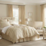
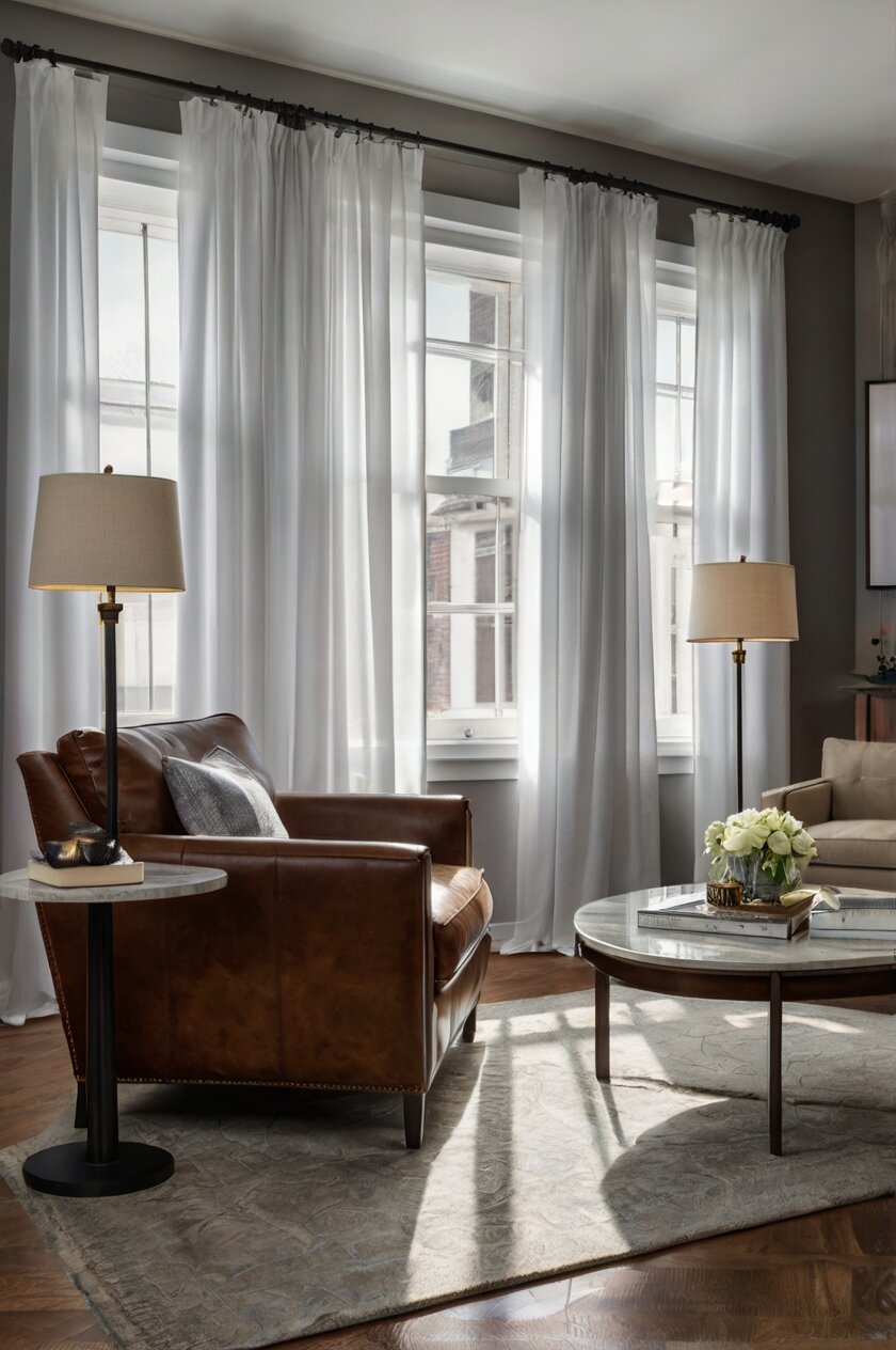
Crisp White Curtains


White curtains are a classic choice that never goes out of style when paired with gray walls and brown furniture.
They create a clean, fresh look that brightens up your entire room.
White curtains reflect natural light, making your space feel larger and more open.
They work especially well in smaller rooms where you want to create an airy feeling.
The contrast between white curtains and gray walls creates a modern, sophisticated look.
Your brown furniture will stand out nicely against this neutral backdrop.
White curtains are like a blank canvas that allows your other decor elements to shine.
You can easily add colorful pillows or artwork to bring pops of color into the room.
For a more interesting look, choose white curtains with subtle patterns or textures.
Sheer white curtains let in beautiful filtered light while still providing some privacy.
Heavier white drapes can help control the temperature in your room and block out unwanted light.
White curtains with gray walls and brown furniture work in any room of your house.
They look especially beautiful in living rooms, bedrooms, and dining areas.
To keep your white curtains looking their best, choose machine-washable fabrics that are easy to clean.
Add trim in a contrasting color for a more custom, designer look.
White curtains with tassels or fringe can add a playful element to your room.
Floor-length white curtains create an elegant, formal feeling.
Shorter white curtains give a more casual, relaxed vibe.
White works well with any shade of gray, from light silvery tones to deeper charcoal.
This color combination creates a timeless look that you won’t tire of quickly.
Tap to Explore These Beauties
See my ideas in action 👇 Tap any image to explore full details.
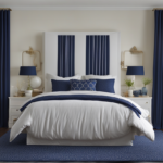
Navy Blue Curtains
Navy blue curtains create a bold, dramatic look when paired with gray walls and brown furniture.
This deep blue color adds richness and depth to your space.
Navy is considered a neutral color in decorating, so it works well with many different styles.
Your gray walls will take on a cooler tone when paired with navy blue curtains.
The contrast between navy curtains and light gray walls creates a striking visual impact.
Navy blue complements brown furniture beautifully, enhancing its warm tones.
This color combination gives your room a sophisticated, high-end appearance.
Navy curtains work especially well in bedrooms, creating a peaceful, sleep-friendly environment.
They’re also perfect for home offices or libraries, where they create a focused, studious atmosphere.
The darkness of navy blue curtains helps block out light, making them practical as well as beautiful.
You can lighten up this color scheme with metallic accents like gold or silver.
Navy blue curtains with white patterns add visual interest without being overwhelming.
This color choice gives a nod to classic nautical style when used in the right way.
Navy blue velvet curtains add luxury and texture to your space.
Lighter-weight navy fabrics create a more casual, relaxed feeling.
This color is perfect if you want your room to feel grounded and substantial.
Navy blue curtains can make a large room feel more intimate and cozy.
They provide an excellent backdrop for artwork and other wall decorations.
Consider navy curtains with grommets for a more modern look.
For a traditional style, choose navy curtains with pleats or a valance.

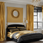
Soft Yellow Curtains
Soft yellow curtains bring sunshine and warmth into a room with gray walls and brown furniture.
This cheerful color instantly brightens your space and creates a welcoming atmosphere.
Yellow is the perfect counterbalance to the coolness of gray walls.
The warm tones in yellow curtains highlight similar warm tones in your brown furniture.
Pale yellow curtains create a subtle, sophisticated look that isn’t overwhelming.
This color choice works especially well in kitchens, breakfast nooks, and sunrooms.
Yellow curtains make your room feel sunny and bright even on cloudy days.
They create a happy, uplifting mood that can boost your energy levels.
Butter yellow, lemon yellow, or pale gold are all beautiful options to consider.
Yellow curtains with a subtle pattern add dimension without being too busy.
This color choice helps create a cohesive look between your gray walls and brown furniture.
Yellow is associated with optimism and creativity, making it perfect for art studios or craft rooms.
Sheer yellow curtains create a beautiful glow when sunlight filters through them.
Heavier yellow drapes provide privacy while still maintaining a cheerful atmosphere.
Yellow curtains look stunning with green plants and natural wood elements.
This color choice works well with both modern and traditional decorating styles.
Yellow and gray has been a popular color combination in interior design for many years.
Adding some yellow throw pillows that match your curtains helps tie the room together.
Consider curtains with yellow and gray patterns to connect with your wall color.
Yellow curtains can make a small room feel more spacious and inviting.
Rich Burgundy Curtains
Burgundy curtains create a luxurious, sophisticated look when paired with gray walls and brown furniture.
This deep, rich red color adds drama and elegance to any room.
Burgundy is a timeless color choice that never really goes out of style.
The richness of burgundy curtains creates a warm, inviting atmosphere in your space.
Your gray walls will seem to recede, making your room feel larger and more open.
Burgundy complements brown furniture beautifully, enhancing its natural wood tones.
This color combination creates a cozy, intimate feeling that’s perfect for living rooms and dining areas.
Burgundy curtains make a statement without being too bright or overwhelming.
They add a touch of formality that elevates the entire look of your room.
Velvet burgundy curtains create amazing texture and depth in your space.
Lighter-weight burgundy fabrics still provide rich color without the heaviness of velvet.

Find Your Room’s Color Palette
Tap a vibe — get a curated 5-color palette with hex codes you can copy ✨
💭 I Wrote a Book About My Biggest Decorating Mistakes!
When I decorated my first home, I thought I knew what I was doing. Spoiler: I didn’t. 😅
💸 I bought a sofa way too big for my living room. Paint colors that looked amazing in the store but terrible on my walls.
This color works well in rooms that don’t get much natural light.
Burgundy curtains with gold accents or hardware create a regal, upscale look.
They pair beautifully with brass light fixtures and picture frames.
Your burgundy curtains will look amazing during the fall and winter months.
This color choice creates a perfect backdrop for holiday decorating.
Burgundy, sometimes called wine or maroon, has sophisticated undertones that change with the light.
You can lighten the mood by adding cream or white accents throughout the room.
Consider burgundy curtains with a subtle pattern or texture for added visual interest.
This color is perfect if you want your room to feel established and refined.
Emerald Green Curtains
Emerald green curtains create a bold, luxurious statement when paired with gray walls and brown furniture.
This rich jewel tone adds vibrancy and life to your neutral color scheme.
Green is associated with nature, making this color choice feel fresh and organic.
Emerald green curtains add a touch of elegance and sophistication to any room.
The contrast between green curtains and gray walls creates visual excitement.
Your brown furniture will look rich and well-coordinated with this color combination.
Emerald green works especially well in dining rooms, creating a dramatic backdrop for entertaining.
This color choice also looks stunning in living rooms and bedrooms.
Green is known to be calming and restful, making it perfect for spaces where you want to relax.
Emerald velvet curtains create a sense of luxury and opulence.
Lighter-weight emerald fabrics still provide beautiful color without feeling too heavy.
This color combination creates a contemporary look with classic undertones.
Emerald green curtains make a perfect backdrop for gold or brass accessories.
They help bring the outdoors in, connecting your interior spaces with nature.
This color choice works well year-round but feels especially fresh in spring and summer.
Consider emerald curtains with a subtle pattern for added dimension.
Green and gray is a designer-approved color pairing that always looks stylish.
Adding some emerald green throw pillows helps tie the room together beautifully.
This color creates a focal point that draws the eye toward your windows.
Emerald green curtains are perfect if you want your room to feel lively and sophisticated.
✦ You Might Love This
19+ Perfect Curtains for Your Black Comfy: Spicing Up Your Bedroom Keep Reading →Soft Gray Curtains
Soft gray curtains create a seamless, monochromatic look when paired with gray walls and brown furniture.
This tone-on-tone approach is sophisticated and calming.
Different shades of gray add depth and dimension to your space.
Lighter gray curtains keep your room feeling open and airy.
Darker gray curtains create more contrast and visual interest.
Your brown furniture will stand out beautifully against this neutral backdrop.
Gray curtains with subtle patterns or textures add visual interest without being overwhelming.
This color choice creates a peaceful, serene atmosphere in any room.
Soft gray is the perfect backdrop for colorful accessories and artwork.
Your room will feel cohesive and well-designed with this coordinated color scheme.
Gray curtains work equally well in modern and traditional spaces.
They create a versatile foundation that can evolve with changing decor trends.
This color choice is perfect for minimalist or Scandinavian-inspired interiors.
Soft gray curtains with silver hardware create an elegant, sophisticated look.
For a warmer feel, pair gray curtains with gold or brass curtain rods.
This color choice works well in any room, from bedrooms to living areas.
Gray curtains in different textures – like linen, cotton, or velvet – create visual interest.
The subtle nature of gray curtains allows your furniture and accessories to be the stars.
Consider gray ombré curtains that fade from dark to light for a modern touch.
This color choice is perfect if you want your room to feel calm, collected, and curated.
💭 Ever wondered what your room would actually look like rearranged?
I built a free tool that lets you drag furniture around a 2D floor plan. No signup, no catch.
See the Room Planner →What’s Your Decor Personality?
5 questions · 30 seconds · Instant style match 🏡
Blush Pink Curtains
Blush pink curtains create a soft, romantic atmosphere when paired with gray walls and brown furniture.
This gentle color adds warmth and femininity to your space.
Pink and gray is a designer-favorite color combination that always looks stylish.
Blush pink is subtle enough to act almost like a neutral in your decorating scheme.
Your gray walls will look softer and more inviting with blush pink curtains.
The warm tones in your brown furniture will be enhanced by this pink hue.
Blush pink creates a soothing, calming effect that’s perfect for bedrooms and sitting areas.
This color choice adds just the right amount of color without being overwhelming.
Blush pink curtains allow your room to feel fresh and current without being trendy.
Sheer blush curtains create a beautiful glow when sunlight filters through them.
Heavier pink drapes provide privacy while maintaining a soft, feminine atmosphere.
This color choice works surprisingly well in both modern and traditional settings.
Blush pink curtains look stunning with gold or brass hardware and accessories.
They create a perfect backdrop for artwork and wall decorations.
Your room will feel more welcoming and inviting with this gentle color addition.
Blush pink velvet curtains add luxury and texture to your space.
Lighter-weight pink fabrics create an airy, ethereal feeling.
This color choice is perfect for creating a sense of romance and softness.
Consider blush curtains with subtle patterns or textures for added dimension.
Blush pink is timeless and versatile, making it a color you won’t tire of quickly.
Teal Blue Curtains
Teal blue curtains create a vibrant, energetic look when paired with gray walls and brown furniture.
This beautiful blue-green color adds personality and life to your space.
Teal is bold enough to make a statement but still sophisticated and livable.
The coolness of teal curtains creates an interesting contrast with warm brown furniture.
Your gray walls provide the perfect neutral backdrop for this striking color.
Teal blue curtains add a contemporary, fresh feeling to any room.
This color choice works especially well in living rooms and home offices.
Teal is known to promote feelings of calmness and clarity.
The richness of teal curtains creates a sense of luxury and elegance.
Your room will instantly feel more designer-inspired with this color choice.
Teal velvet curtains add amazing texture and depth to your space.
Lighter-weight teal fabrics still provide beautiful color without the heaviness.
This color looks stunning year-round but feels especially fresh in spring and summer.
Teal curtains with subtle patterns add even more visual interest to your room.
This color choice pairs beautifully with metallics like gold, silver, or copper.
Adding some teal throw pillows helps tie the room together cohesively.
Teal is versatile enough to work with many different decorating styles.
This color creates a perfect focal point that draws the eye to your windows.
Consider teal curtains with white patterns for a more dynamic look.
Teal is perfect if you want your room to feel creative, expressive, and bold.
This or That?
Pick your fave — see what other readers chose! 👀
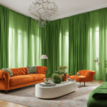
Burnt Orange Curtains
Burnt orange curtains create a warm, inviting atmosphere when paired with gray walls and brown furniture.
This earthy color adds richness and coziness to your space.
Burnt orange has enough brown undertones to coordinate beautifully with your furniture.
The warmth of orange curtains balances the coolness of gray walls perfectly.
This color combination creates a sophisticated, modern look that feels intentional.
Your space will feel more vibrant and energetic with this color addition.
Burnt orange curtains work especially well in living rooms and dining areas.
This color choice adds a seasonal touch that feels perfect for fall and winter.
Burnt orange velvet curtains create luxurious texture and depth.
Lighter-weight orange fabrics provide beautiful color without feeling too heavy.
This color choice complements natural materials like wood, leather, and stone.
Your room will feel more grounded and connected to nature with burnt orange curtains.
This color creates a perfect backdrop for houseplants and natural decorative elements.
Burnt orange pairs beautifully with blue accessories for an eye-catching color combination.
Your gray walls will appear warmer and more inviting with this curtain color.
This color choice works well in both modern and traditional decorating styles.
Burnt orange curtains make a statement without being too bright or overwhelming.
Consider curtains with orange and neutral patterns for added visual interest.
This color is perfect if you want your room to feel warm, cozy, and stylish.
Adding some burnt orange throw pillows helps create a cohesive look throughout your space.
Lavender Curtains
Lavender curtains create a soft, soothing atmosphere when paired with gray walls and brown furniture.
This gentle purple hue adds a touch of unexpected color to your neutral space.
Lavender is subtle enough to live with long-term but interesting enough to make a statement.
The coolness of lavender curtains creates a beautiful contrast with warm brown furniture.
Your gray walls will take on a slightly purple undertone when paired with lavender curtains.
This color choice creates a peaceful, calming effect that’s perfect for bedrooms.
Lavender is known to promote relaxation and better sleep.
Your space will feel more feminine and romantic with this gentle color addition.
Sheer lavender curtains create a beautiful glow when sunlight filters through them.
Heavier lavender drapes provide privacy while maintaining a soft, dreamy atmosphere.
This color choice adds just the right amount of color without being overwhelming.
Lavender curtains pair beautifully with silver or chrome hardware and accessories.
Consider lavender curtains with subtle patterns or textures for added dimension.
This color choice looks stunning with gray walls of any shade, from light silver to dark charcoal.
Your brown furniture will stand out beautifully against this soft backdrop.
Lavender can make a small room feel more spacious and airy.
This color creates a perfect backdrop for artwork and decorative objects.
Consider lavender ombré curtains that fade from dark to light for a modern touch.
This color is perfect if you want your room to feel serene, elegant, and unique.
Adding some lavender throw pillows helps tie the room together beautifully.
💭 I Wrote a Book About My Biggest Decorating Mistakes!
When I decorated my first home, I thought I knew what I was doing. Spoiler: I didn’t. 😅
💸 I bought a sofa way too big for my living room. Paint colors that looked amazing in the store but terrible on my walls.
Mustard Yellow Curtains
Mustard yellow curtains create a bold, energetic look when paired with gray walls and brown furniture.
This rich, golden color adds warmth and personality to your space.
Mustard yellow is trendy yet timeless, making it a smart color choice for curtains.
The warmth of mustard curtains balances the coolness of gray walls perfectly.
Your brown furniture will look rich and well-coordinated with this color combination.
This bold color choice creates a focal point that draws the eye to your windows.
Mustard yellow adds a touch of mid-century modern style to any room.
Your space will feel more vibrant and lively with this color addition.
This color works especially well in living rooms, dining rooms, and kitchens.
Mustard yellow curtains bring warmth to rooms that don’t get much natural light.
They create a cozy, welcoming atmosphere that guests will notice immediately.
This color choice looks stunning year-round but feels especially appropriate in fall.
Mustard yellow curtains pair beautifully with blues and greens for an eye-catching color scheme.
Your gray walls will appear warmer and more inviting with this curtain color.
Consider mustard curtains with geometric patterns for a modern, trendy look.
This color is perfect if you want your room to feel artistic and expressive.
Mustard yellow is bold enough to make a statement but still livable long-term.
Your room will instantly feel more designer-inspired with this color choice.
Adding some mustard yellow throw pillows helps create a cohesive look throughout your space.
This color creates a perfect backdrop for black and white photography or artwork.
Quick Design Dilemma
Cast your vote — see what other readers think! 🤔
Chocolate Brown Curtains
Chocolate brown curtains create a rich, cohesive look when paired with gray walls and brown furniture.
This color choice creates a seamless connection with your existing brown furniture.
Brown curtains add depth and warmth to rooms with cool gray walls.
This monochromatic approach with your furniture creates a sophisticated, intentional look.
Your space will feel more grounded and cozy with chocolate brown curtains.
Different shades and textures of brown add visual interest without introducing new colors.
This color choice works especially well in living rooms, dens, and home offices.
Chocolate brown velvet curtains add amazing texture and luxury to your space.
Lighter-weight brown fabrics provide beautiful color without the heaviness.
This color combination creates a perfect backdrop for colorful accessories and artwork.
Your room will feel pulled together and well-designed with this coordinated color scheme.
Brown curtains with subtle patterns or textures add dimension without being overwhelming.
This color is perfect for creating a warm, inviting atmosphere in any room.
Chocolate brown pairs beautifully with metallic accents like gold, brass, or bronze.
Your gray walls will appear warmer and more inviting with brown curtains.
This color choice creates a traditional, classic look that never goes out of style.
Brown curtains can make a large room feel more intimate and cozy.
They provide excellent light blocking capabilities for bedrooms and media rooms.
Consider brown curtains with cream or white patterns for added visual interest.
This color is perfect if you want your room to feel warm, rich, and timeless.
Coral Curtains
Coral curtains create a fresh, energetic look when paired with gray walls and brown furniture.
This vibrant pinkish-orange color adds life and personality to your space.
Coral is unexpected and distinctive, making it perfect for those who love unique interiors.
The warmth of coral curtains creates a beautiful contrast with cool gray walls.
Your brown furniture will look rich and well-coordinated with this color combination.
This color choice adds a contemporary, fresh feeling to any room.
Coral works especially well in living rooms, bedrooms, and dining areas.
Your space will feel more vibrant and energetic with this color addition.
Coral is associated with happiness and optimism, creating a positive atmosphere.
Sheer coral curtains create a beautiful warm glow when sunlight filters through them.
Heavier coral drapes provide privacy while maintaining a cheerful atmosphere.
This color looks stunning year-round but feels especially appropriate in spring and summer.
Coral curtains pair beautifully with blues and greens for an eye-catching color scheme.
Your gray walls will appear warmer and more inviting with this curtain color.
This color choice works well in both modern and traditional decorating styles.
Coral is bold enough to make a statement but still livable long-term.
Your room will instantly feel more designer-inspired with this color choice.
Consider coral curtains with subtle patterns or textures for added dimension.
This color is perfect if you want your room to feel cheerful, welcoming, and stylish.
Adding some coral throw pillows helps create a cohesive look throughout your space.