hite walls and brown furniture create a classic, versatile foundation for any room.
But what really brings this combo to life?
The perfect curtains!
Choosing the right curtain color can completely change how your room feels – making it cozy, elegant, bright, or dramatic.
The right color can highlight your furniture, brighten your space, or add that perfect pop of personality:
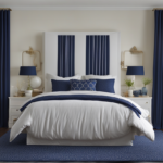
Navy Blue


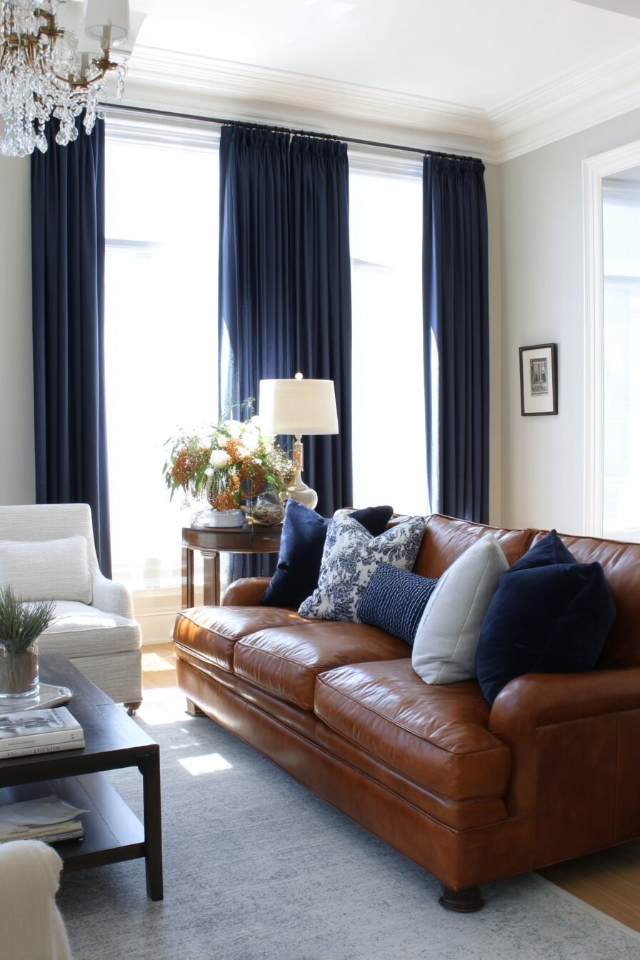
Navy blue curtains bring a touch of sophistication to rooms with white walls and brown furniture.
This deep, rich color creates a stunning contrast against white walls while complementing the warmth of brown furniture.
Navy acts almost like a neutral but with more character and depth.
When sunlight filters through navy curtains, it creates a gentle, calming blue glow throughout the room.
These curtains work especially well in living rooms and home offices where you want a focused, polished atmosphere.
The combination reminds many people of classic libraries or traditional studies, bringing that established, timeless feel to your space.
For lighter brown furniture, navy provides a beautiful anchor that grounds the room.
For darker brown pieces, navy creates a coordinated look that feels intentional and designed.
You can enhance this color scheme with brass or gold accessories that will pop against both the navy and the brown tones.
Small navy accents in throw pillows or rugs help tie the curtains into the rest of your design.
This color works in both modern and traditional spaces, making it incredibly versatile.
In bedrooms, navy curtains also provide excellent light blocking for better sleep.
The navy and brown combination creates a gender-neutral space that appeals to nearly everyone.
Consider adding white trim or tiebacks to your navy curtains to echo the wall color and create visual connection.
Navy blue is also practical because it doesn’t show dust or small stains as easily as lighter colors.
Tap to Explore These Beauties
See my ideas in action 👇 Tap any image to explore full details.
Emerald Green: Natural Luxury
Emerald green curtains add a touch of luxury and nature to rooms with white walls and brown furniture.
This rich jewel tone brings life and vibrancy while still feeling grounded when paired with brown wood tones.
The combination of emerald, white, and brown creates a palette inspired by the outdoors – sky, trees, and earth.
These curtains make a statement without overwhelming your existing décor.
Emerald works beautifully in dining rooms, giving them a formal yet inviting atmosphere.
The color has associations with abundance and prosperity, making it perfect for spaces where you entertain.
When paired with darker brown furniture, emerald green creates a rich, traditional look reminiscent of classic libraries or studies.
With lighter brown furniture, emerald provides a beautiful contrast that feels fresh and modern.
You can enhance this color scheme with brass fixtures and accessories that will shine against the green.
Plants become natural accessories in this color scheme, extending the nature-inspired theme.
Consider velvet emerald curtains for added texture and luxury that catches the light beautifully.
This combination works year-round but feels especially cozy in fall and winter months.
For a cohesive look, incorporate small emerald accents in artwork, throw pillows, or decorative objects.
The psychological benefits of green – including feelings of renewal and relaxation – make these curtains perfect for spaces where you want to unwind.
Emerald green curtains can make your windows the focal point of your room, drawing attention to architectural details or beautiful views.
Soft Gray: Subtle Sophistication
Soft gray curtains offer a versatile, modern option that brings subtle sophistication to rooms with white walls and brown furniture.
This neutral shade adds dimension without competing with your existing color scheme.
Gray curtains create a layered neutral palette that feels intentional and designed.
Light gray options keep spaces feeling open and airy while still providing visual interest.
This color works in any room of your home, from bedrooms to living spaces to home offices.
Gray complements both light and dark brown furniture, acting as a bridge between different wood tones.
The soft contrast between gray curtains and white walls creates depth without harsh boundaries.
For a luxurious look, consider gray curtains with a slight sheen or subtle pattern.
This combination creates a perfect backdrop for colorful accessories if you want to add seasonal pops of color.
Gray curtains allow your brown furniture to stand out as warm focal points in the room.
This neutral choice provides flexibility as you update other decorative elements over time.
Consider layering different shades of gray in your accessories to create a calming monochromatic effect.
Textured gray curtains, like linen or woven fabrics, add another dimension of interest.
This color combination works well in Scandinavian, minimalist, or contemporary design styles.
Gray also provides a perfect middle ground for couples or families who prefer different decor styles, as it complements both warm and cool color palettes.
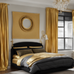
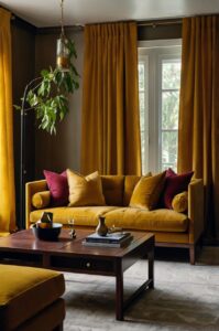
Mustard Yellow: Warm and Inviting
Mustard yellow curtains bring sunshine and warmth to rooms with white walls and brown furniture.
This rich, golden tone creates a welcoming atmosphere that feels both vintage and modern.
Yellow is known to promote happiness and optimism, making these curtains perfect for gathering spaces.
The earthy undertones in mustard yellow naturally complement brown wood tones in furniture.
This color adds warmth to rooms with limited natural light or north-facing windows.
In living rooms, mustard curtains create an inviting focal point that draws people in.
The combination creates a mid-century modern vibe when paired with teak or walnut furniture.
Mustard yellow works year-round but feels especially appropriate in fall when it echoes seasonal colors.
For a coordinated look, incorporate small touches of mustard in throw pillows or decorative objects.

💭 I Wrote a Book About My Biggest Decorating Mistakes!
When I decorated my first home, I thought I knew what I was doing. Spoiler: I didn’t. 😅
💸 I bought a sofa way too big for my living room. Paint colors that looked amazing in the store but terrible on my walls.
This color pairs beautifully with plants, creating a nature-inspired palette of green, brown, and gold.
Consider different fabric textures to enhance the visual interest – linen for casual spaces or velvet for more formal rooms.
Mustard yellow curtains can brighten dark brown furniture that might otherwise feel heavy in a space.
This color combination creates a perfect backdrop for both black and white photography and colorful artwork.
In bedrooms, mustard curtains create a cozy, nest-like feeling that promotes relaxation.
The contrast between bright mustard and clean white walls creates an energetic, positive atmosphere throughout your space.
Find Your Room’s Color Palette
Tap a vibe — get a curated 5-color palette with hex codes you can copy ✨
Burgundy: Rich and Dramatic
Burgundy curtains add rich, dramatic flair to rooms with white walls and brown furniture.
This deep red wine color brings warmth and sophistication to any space.
The combination creates a traditional, library-like atmosphere that feels established and timeless.
Burgundy naturally complements brown wood tones, enhancing their richness.
These curtains make a bold statement while still feeling classic rather than trendy.
In dining rooms, burgundy creates an appetite-stimulating, conversation-friendly atmosphere.
The color brings a cozy feel to larger spaces that might otherwise feel too open or stark.
When light filters through burgundy curtains, it casts a warm, flattering glow throughout the room.
This color works beautifully in formal living rooms or studies where you want a distinguished look.
Burgundy pairs well with traditional brown furniture styles, from leather sofas to carved wooden pieces.
For a coordinated look, incorporate small burgundy accents in throw pillows, rugs, or artwork.
This rich color provides excellent light-blocking properties for bedrooms or media rooms.
Consider adding gold or brass hardware to enhance the luxurious feel of burgundy curtains.
The combination of white walls, brown furniture, and burgundy creates a color scheme that works year-round but feels especially cozy during fall and winter.
This dramatic color choice can make your windows and views the focal point of your room.
Blush Pink: Soft and Contemporary
Blush pink curtains add a soft, contemporary touch to rooms with white walls and brown furniture.
This gentle hue brings warmth without overwhelming your space.
Blush acts as a “new neutral” that complements both white walls and brown wood tones.
This color softens the contrast between white walls and dark brown furniture.
Blush pink adds a touch of personality while maintaining an elegant, sophisticated feel.
These curtains work beautifully in bedrooms, creating a peaceful, soothing atmosphere.
When sunlight filters through blush curtains, it casts a flattering, rosy glow throughout the room.
The combination feels feminine without being overly girly – perfect for shared spaces.
Blush pairs especially well with walnut or cherry furniture that has red undertones.
This color adds warmth to rooms with limited natural light or north-facing windows.
For a cohesive look, incorporate small blush accents in throw pillows, vases, or artwork.
Blush pink works well in both traditional and modern design styles, making it incredibly versatile.
Consider different textures – like linen or velvet – to add another dimension of interest.
This color combination creates a perfect backdrop for gold or brass accessories that will shine against all three tones.
Blush curtains can make a room feel larger and more open while still adding subtle color and personality.
What’s Your Decor Personality?
5 questions · 30 seconds · Instant style match 🏡
Teal: Bold Statement
Teal curtains make a bold statement in rooms with white walls and brown furniture.
This blue-green jewel tone adds vibrant energy while still feeling grounded and sophisticated.
Teal creates a perfect balance – eye-catching without being overwhelming.
The color works well with both light and dark brown furniture pieces.
In living spaces, teal curtains create a conversation-starting focal point.
This rich color draws attention to windows and architectural details.
Teal adds a contemporary edge to traditional brown furniture styles.
The combination creates a palette inspired by nature – sky, water, and earth.
When light filters through teal curtains, it creates a serene, underwater glow in your space.
This color works especially well in rooms where you want to create a memorable impression.
For a coordinated look, incorporate small teal accents in throw pillows, vases, or artwork.
Teal pairs beautifully with natural elements like plants, woven baskets, or stone accessories.
Consider different fabric weights – lighter sheers allow more colored light to filter through while heavier fabrics make a stronger color statement.
This color combination works well in creative spaces like home offices or craft rooms, promoting both focus and imagination.
Teal is also practical because it hides small stains better than lighter options while still bringing vibrant color to your space.
Crisp White: Clean and Bright
Crisp white curtains create a clean, bright look in rooms with white walls and brown furniture.
This monochromatic approach feels fresh, open, and intentionally designed.
White curtains allow your brown furniture to become the focal point of the room.
This combination creates a perfect backdrop for colorful art or accessories.
Sheer white curtains filter sunlight beautifully, creating a soft, diffused glow.
The all-white approach makes spaces feel larger and more expansive.
Different textures in white curtains – like linen, cotton, or jacquard patterns – add subtle interest.
This combination works in any room but feels especially appropriate in bedrooms and bathrooms.
White curtains maintain the clean backdrop that white walls provide while still adding necessary softness around windows.
This color scheme is perfect for minimalist or Scandinavian-inspired spaces.
The high contrast between white curtains and brown furniture creates a crisp, defined look.
White is timeless and versatile, allowing you to update other decorative elements as trends change.
Consider adding trim or borders in a complementary color if you want a bit more visual interest.
This combination works well year-round but feels especially fresh in spring and summer.
White curtains reflect maximum light into your space, making them perfect for rooms with limited natural lighting.

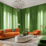
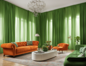
Burnt Orange: Warm and Earthy
Burnt orange curtains add warm, earthy energy to rooms with white walls and brown furniture.
This rich, spicy hue naturally complements brown wood tones while standing out against white walls.
The combination creates a palette inspired by autumn leaves and natural landscapes.
Burnt orange brings unexpected personality to your space without feeling too bright or jarring.
These curtains work especially well in living rooms and dining areas where you want to create a cozy atmosphere.
When light filters through burnt orange fabric, it casts a warm, amber glow throughout the room.
This color choice adds visual warmth to spaces that might otherwise feel too cool or stark.
Burnt orange pairs beautifully with mid-century modern furniture styles in teak or walnut.
For a cohesive look, incorporate small orange accents in throw pillows, vases, or artwork.
✦ You Might Love This
Findin' the Perfect Curtains to Match your Cozy White Comforter Keep Reading →This color creates a perfect focal point that draws attention to windows and views.
The combination works especially well in southwestern, bohemian, or eclectic design styles.
Burnt orange also provides excellent light-filtering properties for rooms that get harsh afternoon sun.
Consider adding touches of turquoise as an accent color – the complementary color to orange that creates beautiful balance.
This warm color choice can make larger rooms feel more intimate and inviting.
Burnt orange curtains bring a touch of the unexpected that makes your space feel personally curated rather than cookie-cutter.
This or That?
Pick your fave — see what other readers chose! 👀
Sage Green: Calm and Natural
Sage green curtains bring a calm, natural feel to rooms with white walls and brown furniture.
This soft, muted green creates a soothing atmosphere inspired by nature.
The color has enough gray undertones to feel sophisticated rather than bright or primary.
Sage green complements brown furniture by echoing colors found together in nature.
These curtains work in any room but feel especially appropriate in bedrooms and living spaces where relaxation is key.
The combination creates a backdrop reminiscent of forests with sun-dappled clearings.
Sage curtains filter light beautifully, creating a gentle, diffused glow throughout your space.
This color choice works well in rooms that transition to outdoor spaces, creating visual flow.
💭 I Wrote a Book About My Biggest Decorating Mistakes!
When I decorated my first home, I thought I knew what I was doing. Spoiler: I didn’t. 😅
💸 I bought a sofa way too big for my living room. Paint colors that looked amazing in the store but terrible on my walls.
For a cohesive look, incorporate natural elements like plants, wood accents, and stone accessories.
Sage green has timeless appeal that won’t quickly feel dated or trendy.
This color provides subtle contrast with white walls without creating harsh boundaries.
Sage pairs especially well with lighter brown furniture pieces like maple, oak, or pine.
Consider different textures in sage green fabrics to add dimension and interest.
This color combination creates a perfect backdrop for both vintage and modern decor accents.
Sage green curtains add color to your space while maintaining a serene, neutral-adjacent feel.
Charcoal: Modern and Dramatic
Charcoal curtains add modern, dramatic contrast to rooms with white walls and brown furniture.
This deep gray shade creates striking definition around your windows.
Charcoal acts as a neutral but with more depth and presence than lighter options.
These curtains create a sophisticated frame for your views and natural light.
The high contrast between charcoal and white walls creates architectural interest.
This color choice works especially well in contemporary spaces with clean lines.
Charcoal provides excellent light-blocking properties for bedrooms or media rooms.
The combination of white, brown, and charcoal creates a timeless palette that won’t quickly feel dated.
This dark neutral allows your brown furniture to maintain its visual importance in the room.
For a cohesive look, incorporate small charcoal accents in throw pillows, artwork, or decorative objects.
Charcoal curtains can make ceilings appear higher when hung properly.
This color combination works well in home offices or creative spaces where focus is important.
Consider adding metallic accents in silver or gold that will pop against the charcoal background.
The combination creates a perfect backdrop for displaying colorful art or collections.
Charcoal is also practical because it doesn’t show dust or small stains easily.
Quick Design Dilemma
Cast your vote — see what other readers think! 🤔
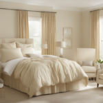
Light Beige: Subtle and Warm
Light beige curtains create a subtle, warm look in rooms with white walls and brown furniture.
This neutral shade adds soft dimension without competing with your existing elements.
Beige curtains gently warm up the crispness of white walls.
This combination creates a layered neutral palette that feels intentional and designed.
Beige acts as a bridge between white walls and brown furniture, connecting the two.
These curtains work in any room of your home, creating consistent flow between spaces.
The soft contrast adds interest without creating harsh visual boundaries.
Light beige allows both your white walls and brown furniture to maintain their visual importance.
This color combination creates a perfect backdrop for both colorful art and neutral decor.
Beige curtains filter light beautifully, creating a warm, gentle glow in your space.
Consider different textures – like linen, cotton, or subtle patterns – to add visual interest.
This combination works with any design style from traditional to contemporary.
Beige curtains can be easily accessorized with seasonal colors as your preferences change.
This neutral choice provides flexibility as you update other decorative elements over time.
Light beige creates a calming effect that works especially well in bedrooms and relaxation spaces.
Royal Purple: Luxurious and Unexpected
Royal purple curtains add luxurious, unexpected drama to rooms with white walls and brown furniture.
This rich jewel tone creates an elegant focal point that transforms your space.
Purple has historical associations with royalty and luxury, bringing that elevated feel to your room.
The combination creates a high-contrast look that feels bold yet sophisticated.
Royal purple particularly complements dark brown furniture with red undertones.
These curtains make a statement in living rooms or dining areas where you entertain.
The color brings energy and personality while still coordinating with your neutral background.
When light filters through purple curtains, it creates a magical, otherworldly glow.
For a cohesive look, incorporate small purple accents in throw pillows, vases, or artwork.
This color combination creates a perfect backdrop for gold or silver accessories that will shine.
Royal purple curtains work especially well in spaces where you want to create a memorable impression.
Consider velvet or silk fabrics to enhance the luxurious feel of this rich color.
This bold choice transforms ordinary windows into dramatic design features.
Purple contains both warm and cool tones, helping it bridge different elements in your space.
This unexpected color choice shows personality and design confidence, making your space feel uniquely yours.