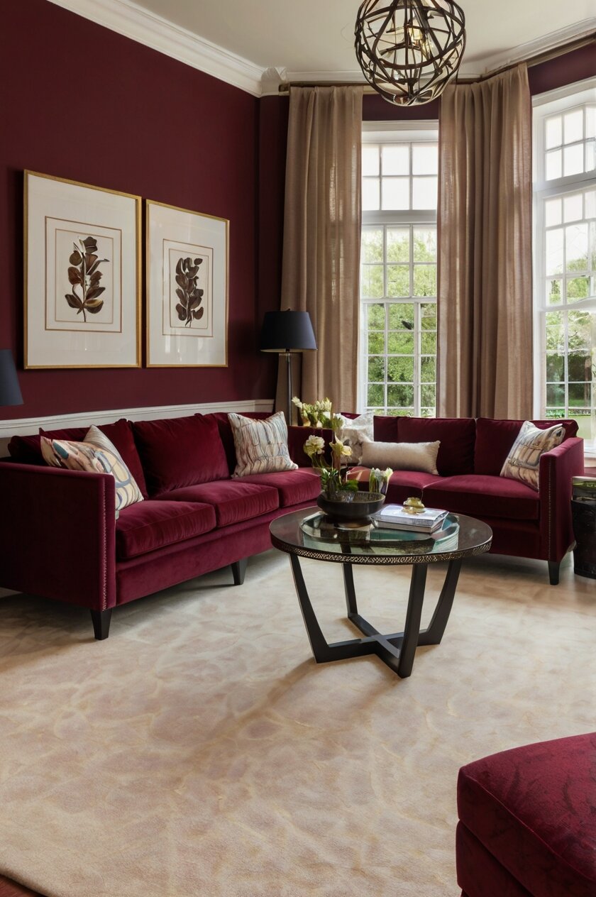
urgundy, with its deep red undertones and sophisticated vibe, serves as an excellent backdrop for various carpet colors and textures.
The carpet you choose can either ground the space, highlight the walls, or create a perfect balance between the two:
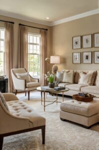
Cream or Ivory Carpet


Cream or ivory carpet creates a stunning contrast against the rich depth of burgundy walls.
This light neutral allows the burgundy to truly stand out as the star of the show.
When you choose a cream carpet, you’re creating a classic pairing that feels both elegant and timeless.
The lightness of cream helps to balance the intensity of burgundy, making the room feel more spacious and airy.
This combination works especially well in rooms that don’t get much natural light, as the cream brightens the space considerably.
The warm undertones in cream complement the warm red tones in burgundy, creating a harmonious feel throughout the room.
You can enhance this pairing by adding gold or brass accents through lighting fixtures, picture frames, or decorative objects.
Texture plays an important role when working with cream carpets.
A plush, high-pile cream carpet adds luxury and softness, making the room feel more inviting and comfortable.
For busy households, consider a cream carpet with subtle patterns or flecks that help hide minor stains or dirt between cleanings.
When decorating the rest of the room, you can pull colors from both the burgundy walls and cream carpet.
Think about throw pillows in shades that blend the two, like blush pink, terracotta, or soft gold.
Maintenance is something to consider with cream carpets, as they do show dirt more easily than darker options.
Regular vacuuming and occasional professional cleaning will keep your cream carpet looking fresh against your burgundy walls.
The beauty of this combination is its versatility across different design styles.
It works equally well in traditional spaces, contemporary rooms, or even in transitional designs that blend different elements.
For a more dynamic look, consider adding textural contrast through furniture and accessories.
Velvet furniture pieces in complementary colors can add depth and interest to this color scheme.
Tap to Explore These Beauties
See my ideas in action 👇 Tap any image to explore full details.
Beige or Tan Carpet
Beige or tan carpet provides a warm, grounded foundation that complements burgundy walls beautifully.
This neutral pairing creates a sophisticated look that feels both inviting and elegant.
When you select a beige carpet, you’re choosing a versatile option that allows your burgundy walls to remain the focal point while adding warmth underfoot.
The earthy quality of tan or beige helps to soften the intensity of burgundy, creating a more balanced and harmonious space.
This combination works wonderfully in living rooms, dining areas, or bedrooms where you want to create a cozy, welcoming atmosphere.
The varying shades within the beige family give you plenty of options to find the perfect match for your specific shade of burgundy.
Warmer tans complement the red undertones in burgundy, while cooler beiges can create a subtle contrast that adds dimension to the room.
Texture is particularly important with this pairing, as it prevents the neutral carpet from feeling flat or boring.
Consider a berber carpet with subtle flecks or a plush carpet with visible texture to add visual interest to your floor.
Beige and tan carpets are practical choices for busy households since they hide dirt and footprints better than lighter options like cream or white.
This pairing creates a perfect backdrop for furniture in various wood tones, from light oak to rich mahogany.
The neutral floor allows you to introduce other accent colors through accessories like throw pillows, artwork, or window treatments.
Deep greens, navy blues, or mustard yellows all work beautifully as accent colors with the burgundy-beige combination.
For a more layered look, consider adding an area rug with subtle pattern over your beige carpet in seating areas.
This combination transitions well between seasons, feeling cozy in winter months yet not too heavy during summer.
Natural materials like jute, rattan, or wicker complement this color scheme perfectly, adding textural contrast and visual interest.

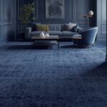
Gray Carpet
Gray carpet offers a contemporary counterpoint to the traditional richness of burgundy walls.
This modern neutral creates a sophisticated palette that feels fresh and current.
When you choose gray carpet, you’re creating an interesting tension between warm and cool tones that adds depth to your space.
The contrast between the cool gray and warm burgundy creates a dynamic energy in the room that feels intentional and designed.
Light gray carpets help brighten a room with burgundy walls, preventing the space from feeling too dark or heavy.
Medium to charcoal grays create a more dramatic look that feels elegant and refined against the deep red tones.
Gray carpets with blue undertones create a cooler contrast, while grays with taupe undertones blend more harmoniously with the warmth of burgundy.
This pairing works exceptionally well in contemporary or transitional spaces where you want to honor traditional elements while incorporating modern touches.
The versatility of gray means you can take this color scheme in many directions through your choice of accessories and furnishings.
Silver or chrome accents enhance the contemporary feel of this combination, adding a bit of glamour and shine.
For a softer approach, incorporate fabric textures like velvet, wool, or linen to add warmth to the gray-burgundy palette.
This color pairing creates an excellent backdrop for artwork, allowing paintings or photography to stand out beautifully.
Gray carpet serves as a neutral canvas that lets other design elements in the room take center stage when desired.
The combination of burgundy and gray works well with various wood tones, from light ash to deep walnut.
For added interest, consider a gray carpet with subtle pattern or texture to create more visual dimension.
This pairing allows you to incorporate accent colors like mustard yellow, emerald green, or even touches of blush pink for a more layered design.
Black or Charcoal Carpet
Black or charcoal carpet creates a bold, dramatic foundation that amplifies the richness of burgundy walls.
This high-contrast pairing makes a confident design statement that feels luxurious and sophisticated.
When you choose a black carpet, you’re embracing a theatrical quality that gives your space depth and character.
This combination works particularly well in formal spaces like dining rooms, studies, or master bedrooms where drama is welcome.
The darkness of black or charcoal grounds the rich burgundy, creating a cocoon-like effect that feels both intimate and elegant.
This pairing allows the unique undertones in your burgundy walls to stand out more prominently against the neutral black base.
Despite its boldness, this combination can be surprisingly versatile across different design styles from traditional to ultra-modern.
For spaces that might feel too dark with this pairing, strategic lighting becomes essential to create the right atmosphere.
Metallic accents in gold, brass, or silver add necessary highlights that prevent the room from feeling too heavy.
The black-burgundy combination provides an excellent backdrop for artwork or architectural features you want to showcase.
Texture becomes especially important with dark carpets – consider options with subtle patterns, varying pile heights, or visible weaves.
This dramatic pairing works well for those who entertain frequently, as it creates a memorable, impactful space for guests.
Dark carpets are also practical choices for high-traffic areas as they hide stains and wear better than lighter options.
To prevent the room from feeling closed in, balance the dark floor and walls with lighter furniture pieces and accessories.
Consider incorporating mirrors or reflective surfaces to bounce light around and add dimension to the space.
For a more nuanced look, charcoal gray with subtle undertones can soften the contrast while maintaining the dramatic effect.

Find Your Room’s Color Palette
Tap a vibe — get a curated 5-color palette with hex codes you can copy ✨
💭 I Wrote a Book About My Biggest Decorating Mistakes!
When I decorated my first home, I thought I knew what I was doing. Spoiler: I didn’t. 😅
💸 I bought a sofa way too big for my living room. Paint colors that looked amazing in the store but terrible on my walls.
Navy Blue Carpet
Navy blue carpet creates a rich, complementary partnership with burgundy walls that feels both classic and unexpected.
This color combination draws on the traditional pairing of red and blue but elevates it to a more sophisticated level.
When you choose navy carpet, you’re creating a space with depth and dimension that feels thoughtfully designed.
The cool tones of navy help to balance the warmth of burgundy, creating a harmonious temperature balance in the room.
This pairing works beautifully in studies, libraries, or formal living areas where you want to create an intellectual, refined atmosphere.
Navy and burgundy both have royal associations, giving this combination a timeless, prestigious quality.
Despite both colors being deep and rich, they don’t compete but rather enhance each other’s distinctive characteristics.
The blue-red combination has a psychological effect of feeling both energizing and calming simultaneously.
For a more traditional approach, choose a navy carpet with subtle patterns like small geometric designs or traditional motifs.
In contemporary spaces, a solid navy with interesting texture creates a more modern foundation for your burgundy walls.
This color combination allows for versatile accent choices – gold and brass look stunning, while silver and chrome provide a cooler contrast.
White or cream accents become particularly striking against this rich color backdrop, providing necessary moments of visual relief.
The navy-burgundy pairing transitions beautifully between seasons, feeling cozy in winter yet not overwhelmingly heavy in summer.
This combination works well with various wood tones, particularly medium to dark woods like cherry, walnut, or mahogany.
For a more eclectic approach, consider incorporating global patterns and textiles that often feature both red and blue tones.
The depth of both colors makes this pairing perfect for creating intimate conversation areas in larger rooms.
Forest Green Carpet
Forest green carpet creates a nature-inspired harmony with burgundy walls that feels both grounding and sophisticated.
This combination draws on complementary color theory, as green sits opposite red on the color wheel.
When you choose forest green carpet, you’re creating a rich, jewel-toned space that feels like a modern take on traditional design.
The natural qualities of green help to balance the more formal, intense feeling that burgundy sometimes brings to a space.
This pairing works particularly well in spaces where you want to create a connection to the natural world while maintaining elegance.
Libraries, studies, and dining rooms benefit from this combination that feels both scholarly and inviting.
The depth of forest green complements burgundy without competing, allowing both colors to maintain their distinct character.
This color scheme has historical roots in Victorian and traditional design, giving it a timeless quality that transcends trends.
For a more contemporary approach, look for forest green carpets with subtle variations in texture rather than patterns.
💭 Ever wondered what your room would actually look like rearranged?
I built a free tool that lets you drag furniture around a 2D floor plan. No signup, no catch.
See the Room Planner →The richness of this combination pairs beautifully with natural materials like leather, wood, and brass.
This color pairing creates a perfect backdrop for botanical prints, natural history themed artwork, or landscape paintings.
For homes with a traditional aesthetic, this combination provides a perfect foundation for antique furniture pieces and heirloom accessories.
The psychological effect of this pairing tends to be calming yet stimulating – ideal for spaces where both relaxation and conversation are valued.
For a more layered look, incorporate smaller accents in complementary colors like amber, gold, or deep purple.
Both colors have a depth that makes them appear different throughout the day as natural light changes, adding visual interest to your space.
Though both colors are strong, their natural compatibility prevents the room from feeling overwhelming or unbalanced.
Gold or Mustard Carpet
Gold or mustard carpet creates a warming complement to burgundy walls that feels both vibrant and sophisticated.
This combination draws on analogous color theory, as both burgundy and gold share red undertones.
When you choose a gold or mustard carpet, you’re embracing a color scheme that feels rich and intentional.
The warmth of both colors creates an inviting atmosphere that works beautifully in spaces where you entertain or gather.
This pairing has a certain opulence that references historical design periods like Renaissance or Baroque in a modern way.
The yellow tones in gold or mustard carpeting help to brighten the deep burgundy walls, preventing the space from feeling too dark.
This combination works exceptionally well in dining rooms, formal living spaces, or master bedrooms where luxury is welcome.
The rich color pairing creates a perfect backdrop for both metallic accents and natural materials like wood and leather.
For a more traditional approach, consider a gold carpet with subtle damask or oriental patterns that reference classic design.
In contemporary spaces, a solid mustard carpet with interesting texture adds warmth without feeling overly traditional.
This color combination allows for versatile accent choices – emerald green, sapphire blue, or deep purple all complement this palette beautifully.
The pairing creates a natural coziness that makes it perfect for spaces in northern climates or rooms used primarily in evening hours.
For a more subdued version of this look, consider gold carpets with beige undertones that feel more neutral while still complementing burgundy.
This combination tends to feel seasonally flexible, though it has a particular resonance with autumn décor schemes.
The richness of both colors means that lighting plays a crucial role – warm lighting enhances the coziness, while cool lighting can help balance the warmth.
Texture becomes particularly important in this pairing to prevent the bold colors from feeling flat or one-dimensional.
What’s Your Decor Personality?
5 questions · 30 seconds · Instant style match 🏡
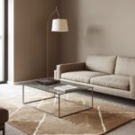
Taupe Carpet
Taupe carpet offers a sophisticated neutral foundation that beautifully complements burgundy walls with subtle elegance.
This versatile color, with its perfect balance of gray and beige undertones, creates a refined backdrop that lets burgundy shine.
When you choose taupe carpet, you’re selecting a chameleon-like neutral that adapts to various design styles and accessories.
The complex undertones in taupe respond differently to the specific shade of burgundy on your walls, creating a nuanced relationship.
This pairing works exceptionally well in living rooms, bedrooms, or offices where you want a sense of calm sophistication.
Taupe’s subtle warmth prevents the space from feeling too cool, while its grayish qualities add contemporary flair to the traditional burgundy.
This combination creates a perfect canvas for introducing other colors through artwork, textiles, and accessories.
The understated quality of taupe allows the rich burgundy to take center stage while still maintaining interest at the floor level.
For added visual texture, consider taupe carpets with subtle patterns or berber styles with flecks of complementary colors.
This neutral pairing transitions seamlessly between seasons, feeling cozy in winter months yet light enough for summer.
Taupe carpet provides a versatile foundation that works with various wood tones from light oak to dark mahogany.
The combination of burgundy and taupe creates an excellent backdrop for both traditional and modern furniture styles.
This pairing allows for versatile accent color choices – navy blue, forest green, mustard yellow, or even lavender all work beautifully.
For a more layered look, consider incorporating metallic accents in brushed gold or antique brass that complement both colors.
The subtle contrast between burgundy and taupe creates a sophisticated tension that feels intentionally designed rather than matched.
This combination has timeless appeal that resists dating, making it a smart choice for spaces you don’t plan to redecorate frequently.
Patterned Carpet with Burgundy Accents
Patterned carpet featuring burgundy accents creates a cohesive connection with your burgundy walls.
This coordinated approach ties the room together while adding visual interest at the floor level.
When you choose a patterned carpet that incorporates burgundy, you’re creating a thoughtful design that feels intentional and complete.
This strategy works particularly well in formal spaces like dining rooms or living areas where you want a pulled-together look.
The pattern provides visual texture while the burgundy elements create a subtle color echo that unifies the space.
Look for patterns where burgundy is one of several colors rather than the dominant shade to prevent the room from feeling overwhelming.
Oriental or Persian-style carpets often feature burgundy along with navy, gold, and green, creating a rich palette that complements burgundy walls.
Modern geometric patterns that incorporate burgundy with neutrals offer a contemporary take on this coordinated approach.
This strategy allows you to introduce additional colors that can be pulled into the rest of your décor through accessories and furniture.
The visual complexity of a patterned carpet helps to hide dirt and wear, making it practical for busy households.
For a more subtle approach, consider carpets with small-scale patterns where the burgundy elements are noticeable but not dominant.
This pairing works across different design styles from traditional to transitional, depending on the specific pattern you choose.
When working with this combination, keep other elements in the room relatively simple to prevent visual competition with the pattern.
The benefit of this approach is that the carpet already provides a perfect color match to your walls, taking the guesswork out of coordination.
For rooms with architectural features you want to highlight, this coordinated approach creates a cohesive backdrop that doesn’t distract.
This strategy works well for open floor plans where you want to create a sense of continuity between different areas.
This or That?
Pick your fave — see what other readers chose! 👀
Soft Purple or Lavender Carpet
Soft purple or lavender carpet creates an unexpected yet harmonious companion to burgundy walls.
This combination plays with the red undertones present in both colors, creating a sophisticated tonal relationship.
When you choose a soft purple carpet, you’re creating a unique color story that feels both current and timeless.
The cooler tones in lavender help to balance the warmth of burgundy, creating a pleasing temperature contrast in the room.
This pairing works beautifully in bedrooms, sitting rooms, or creative spaces where a touch of the unexpected is welcome.
The purple-burgundy combination has a regal quality that references historical color schemes in a fresh, modern way.
Lighter lavender carpets help to brighten rooms with burgundy walls, preventing the space from feeling too dark or heavy.
For a more subtle approach, look for purple carpets with gray undertones that feel more neutral while still maintaining the color relationship.
This combination creates an excellent backdrop for both silver and gold accents, offering flexibility with your metallic choices.
💭 I Wrote a Book About My Biggest Decorating Mistakes!
When I decorated my first home, I thought I knew what I was doing. Spoiler: I didn’t. 😅
💸 I bought a sofa way too big for my living room. Paint colors that looked amazing in the store but terrible on my walls.
The psychology of this pairing tends to feel both calming and creative – ideal for spaces where you want to relax or be inspired.
For a more dramatic look, deeper purple carpets create a jewel-toned space that feels luxurious and enveloping.
This color combination transitions well across seasons, feeling cozy in winter yet not too heavy for summer months.
When working with this pairing, consider incorporating natural elements like wood and stone to ground the color scheme.
For a more nuanced look, choose purple carpets with subtle variations in tone or interesting textural elements.
This combination is particularly flattering in spaces with lots of fabric – think reading nooks with comfortable seating or bedrooms with layered textiles.
The unexpected nature of this pairing makes it perfect for those who want their space to feel unique and personally curated.
Chocolate Brown Carpet
Chocolate brown carpet creates a rich, grounding foundation that complements burgundy walls with natural warmth.
This earthy combination feels both cozy and sophisticated, perfect for creating inviting spaces.
When you choose chocolate brown carpet, you’re embracing a classic color pairing that has stood the test of time.
The depth of brown helps to balance the intensity of burgundy, creating a harmonious relationship between floor and walls.
This pairing works particularly well in living rooms, family rooms, or studies where you want to create a comfortable, welcoming atmosphere.
Both colors share warm undertones, creating a cohesive temperature that feels consistent throughout the space.
The natural quality of brown helps to soften the formality that burgundy sometimes brings, making the room feel more approachable.
This combination creates a perfect backdrop for both traditional and rustic furniture styles, particularly those featuring natural wood.
Chocolate brown carpets are practical choices for busy households as they hide dirt and stains better than lighter options.
For added interest, consider brown carpets with subtle texture or slight variations in tone that create visual dimension.
This pairing allows you to introduce accent colors like sage green, mustard yellow, or even turquoise for unexpected pops of color.
The richness of both colors creates an excellent foundation for layering textiles with different textures and patterns.
This combination has a timeless quality that resists dating, making it a smart choice for spaces you don’t plan to redecorate frequently.
For a more contemporary take, pair burgundy walls with a chocolate brown carpet that has geometric or abstract patterns.
The psychological effect of this pairing tends to be grounding and secure – ideal for spaces where you want to relax or feel at ease.
This combination works beautifully with leather furniture, creating a cohesive color story throughout the room.
✦ You Might Love This
11+ Designer-Approved Carpet Colors That Complement White Walls Keep Reading →Quick Design Dilemma
Cast your vote — see what other readers think! 🤔
Olive Green Carpet
Olive green carpet creates a sophisticated earthy complement to burgundy walls that feels both natural and refined.
This combination draws on complementary color theory in a more subdued way than brighter greens, creating a balanced, mature palette.
When you choose olive green carpet, you’re embracing a color pairing with both historical references and contemporary appeal.
The muted quality of olive green helps to temper the richness of burgundy, creating a more subtle relationship between the two colors.
This pairing works beautifully in spaces where you want to create a connection to nature while maintaining elegance.
Dining rooms, studies, or living areas benefit from this combination that feels both grounded and distinguished.
Both colors have earthy qualities that reference the natural world, creating a palette that feels organic and authentic.
The military heritage of olive green adds a touch of structure and discipline to the romance of burgundy, creating an interesting tension.
This combination creates an excellent backdrop for both metallic accents and natural materials like leather, wood, and stone.
For traditional spaces, this pairing has historical precedent that gives it a timeless quality that resists trends.
In more contemporary settings, the unexpectedness of this combination feels fresh and intentionally designed.
This color scheme transitions beautifully between seasons, feeling cozy in fall and winter yet not too heavy for spring and summer.
The subdued nature of both colors creates a sophisticated backdrop for artwork and accessories to stand out.
This pairing allows for versatile accent color choices – amber, navy, or even touches of blush pink all work beautifully within this scheme.
For added dimension, consider olive carpets with subtle variations in tone or interesting textural elements.
This combination works particularly well with mid-century furniture pieces, creating a curated look that feels both vintage and current.
Multi-Tonal Neutral Carpet
Multi-tonal neutral carpet creates a sophisticated foundation that complements burgundy walls while adding subtle visual interest.
This versatile approach incorporates various shades of beige, gray, or taupe in one carpet, creating depth without competing with your walls.
When you choose a multi-tonal neutral carpet, you’re selecting a dynamic floor covering that adapts to changing light throughout the day.
The varied tones help to bridge different elements in your room, creating a cohesive look that feels thoughtfully designed.
This pairing works exceptionally well in larger spaces where a solid color carpet might feel too flat or one-dimensional.
The complexity of multi-tonal neutrals helps to hide dirt and wear, making them practical choices for busy households.
This approach provides a perfect foundation for introducing various accent colors through furniture and accessories.
Look for carpets with flecks of warmer tones that pick up on the warmth of your burgundy walls for a harmonious relationship.
For contemporary spaces, consider carpets with abstract patterns or textural variations that create subtle movement.
In more traditional rooms, multi-tonal berber carpets offer classic appeal that complements burgundy’s rich character.
This combination allows your burgundy walls to remain the focal point while still maintaining interest at the floor level.
The neutral base creates flexibility for changing other elements in your room over time without needing to replace your carpet.
For added dimension, choose carpets with varying pile heights or interesting weaves that create textural contrast.
This approach works well in open floor plans where you want to create visual continuity between different areas.
The subtle complexity of multi-tonal neutrals prevents the room from feeling too matched or formulaic.
This combination offers the perfect compromise between bold color statements and practical everyday living, giving you the best of both worlds.