
Your dark purple walls look amazing, but now you’re staring at bare windows wondering what curtains will complete the look.
Purple walls can feel tricky to decorate around, especially when you want curtains that enhance the beauty instead of clashing with it.
They can work with both warm and cool colors, creating different moods depending on what you choose.
You might want a cozy, romantic feel or a bold, dramatic statement.
Maybe you’re going for something modern and sleek, or perhaps you prefer a classic, timeless look.
Some colors will make your walls look richer and more luxurious.
Others will brighten up the space and make it feel more open.
A few choices will create stunning contrast that makes both the walls and curtains stand out.
Your personal style should guide your final choice, but my options makes the decision easier and more fun.
✨Click to Get My 101 FREE Designer Room Ideas
White Curtains: The Classic Choice That Never Fails
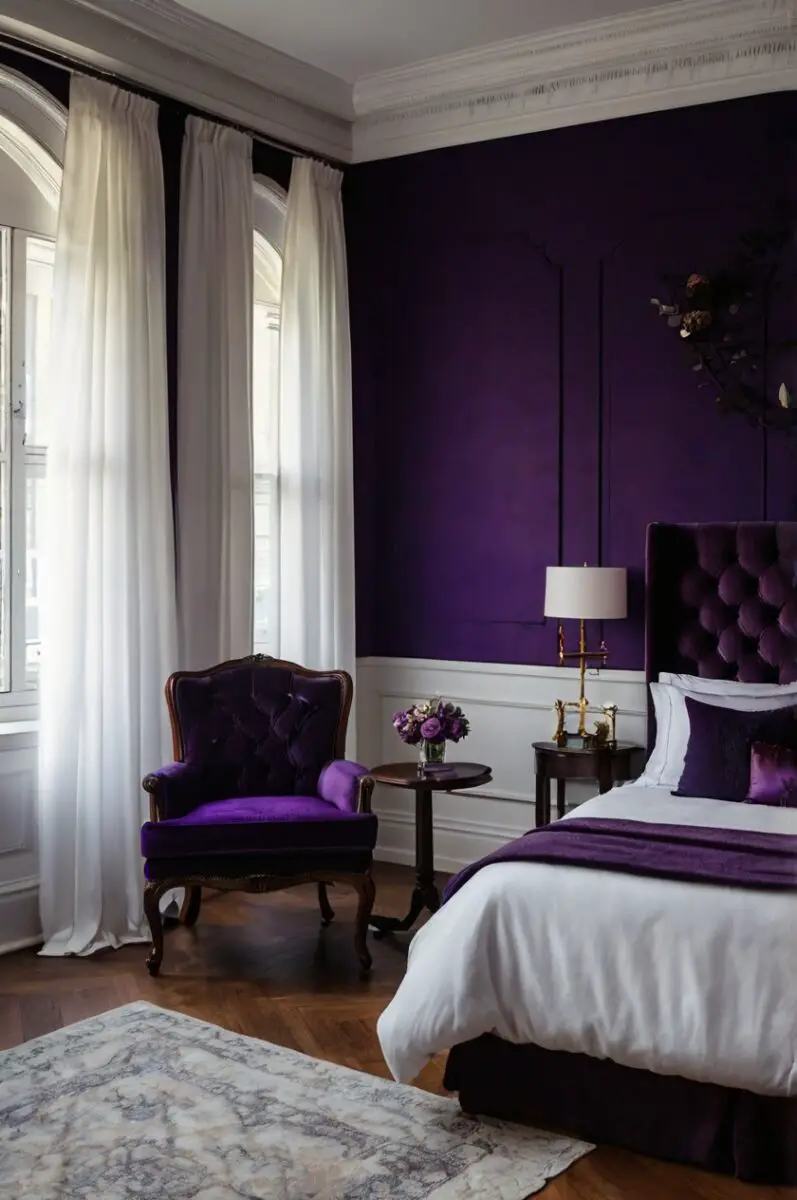
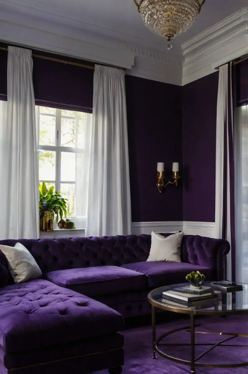
White curtains with dark purple walls create one of the most striking and elegant combinations you can choose.
This pairing gives you a clean, sophisticated look that works in any room of your house.
The contrast between the deep purple and crisp white makes both colors pop in the best possible way.
White curtains reflect light beautifully, which helps brighten up rooms with dark purple walls.
This is especially helpful if your room doesn’t get a lot of natural light during the day.
The white fabric catches and bounces light around the room, making everything feel more open and airy.
You can choose from many different white shades to get exactly the look you want.
Pure white gives you the strongest contrast and most dramatic effect.
Off-white or cream creates a softer, more relaxed feeling while still providing that beautiful contrast.
Ivory adds a touch of warmth that can make the purple walls feel more inviting.
The texture of your white curtains also makes a big difference in the overall look.
Smooth, silky white curtains give you a modern, sleek appearance that works great in contemporary rooms.
Linen white curtains add texture and create a more casual, relaxed vibe.
Cotton white curtains offer a classic, traditional look that never goes out of style.
White curtains also give you flexibility with the rest of your room’s decor.
You can add colorful pillows, artwork, or accessories without worrying about them clashing with your window treatments.
This makes it easy to change up your room’s look with the seasons or whenever you want something new.
Cream Curtains: Soft Warmth That Complements Purple Perfectly
Cream curtains offer a gentler alternative to stark white while still providing beautiful contrast with dark purple walls.
This combination creates a warm, welcoming atmosphere that feels both elegant and comfortable.
The soft, neutral tone of cream helps balance the boldness of purple without competing for attention.
Cream has warm undertones that bring out the warmer aspects of purple, creating a cohesive color scheme.
This pairing works especially well in bedrooms where you want a relaxing, peaceful environment.
The cream softens the intensity of the purple while maintaining the sophisticated look you’re going for.
Different shades of cream can create slightly different effects in your room.
Light cream stays close to white but adds just a hint of warmth that makes the space feel more inviting.
Rich cream has more yellow undertones that create a cozier, more intimate feeling.
Antique cream has a slightly aged look that works beautifully in traditional or vintage-style rooms.
The fabric choice for cream curtains can enhance the warm feeling even more.
Velvet cream curtains add luxury and richness that pairs beautifully with purple walls.
Linen cream curtains create a relaxed, natural look that keeps the room from feeling too formal.
Silk cream curtains give you elegance and a subtle sheen that catches light beautifully.
Cream curtains also hide dirt and stains better than pure white, making them a practical choice for busy households.
This is especially important in rooms like kitchens or children’s bedrooms where accidents happen more often.
The neutral nature of cream means it won’t clash with other colors you might want to add to your room later.
Gray Curtains: Modern Sophistication Meets Purple Drama
Gray curtains create a modern, sophisticated look when paired with dark purple walls.
This combination gives you a contemporary color scheme that feels both bold and refined.
The cool tones in gray complement the cool undertones in purple, creating a harmonious color palette.
Gray comes in many different shades, each creating a unique effect with your purple walls.
Light gray curtains provide gentle contrast while keeping the overall look soft and calming.
Medium gray offers more definition and creates a balanced, sophisticated appearance.
Dark gray or charcoal curtains create a dramatic, moody atmosphere that’s perfect for cozy spaces.
The beauty of gray curtains lies in their versatility and timeless appeal.
They work equally well in modern minimalist rooms and traditional spaces with classic furniture.
Gray doesn’t compete with purple for attention, allowing both colors to shine in their own way.
This pairing is particularly effective in rooms where you want a calming, serene environment.
Bedrooms and living rooms benefit from this peaceful color combination that promotes relaxation.
The neutral nature of gray also makes it easy to add accent colors through pillows, throws, or artwork.
Metallic accents like silver, gold, or copper look stunning against the gray and purple combination.
Different textures in gray curtains can change the entire feel of your room.
Smooth gray curtains give you a sleek, modern look that works well in contemporary spaces.
Textured gray curtains add visual interest and depth to your windows.
Patterned gray curtains can introduce subtle design elements without overwhelming the purple walls.
Gold Curtains: Luxurious Elegance That Makes Purple Shine
Gold curtains transform dark purple walls into a space of royal elegance and luxury.
This rich combination creates one of the most opulent and sophisticated color pairings possible.
The warm tones of gold bring out the regal qualities in purple, making both colors look more expensive and refined.
Gold curtains catch and reflect light in a way that makes your entire room glow with warmth.
This is especially beautiful in the evening when artificial lighting makes the gold fabric shimmer and dance.
The combination of gold and purple has been associated with royalty and luxury for centuries.
When you choose this pairing, you’re creating a space that feels truly special and unique.
Different shades of gold can create varying effects with your purple walls.
Bright, vibrant gold creates a bold, dramatic statement that commands attention.
Antique gold has a more subdued, vintage feel that works well in traditional rooms.
Champagne gold offers a softer, more elegant look that still provides warmth and richness.
The texture and fabric of gold curtains play a crucial role in the overall effect.
Silk gold curtains give you the ultimate in luxury and elegance.
Velvet gold curtains add depth and richness that enhances the royal feeling.
Satin gold curtains provide a subtle sheen that’s not too overwhelming.
This color combination works particularly well in formal dining rooms and master bedrooms.
The richness of gold and purple creates an atmosphere perfect for special occasions and intimate gatherings.
You can enhance this luxurious look with matching gold accessories like picture frames, lamps, or decorative objects.
✨Click to Get My 101 FREE Designer Room Ideas
Silver Curtains: Cool Elegance That Balances Purple Perfectly
Silver curtains offer a cool, sophisticated alternative that creates stunning contrast with dark purple walls.
This combination gives you a modern, elegant look that feels both fresh and timeless.
The metallic quality of silver adds a touch of glamour without being too overwhelming or flashy.
Silver curtains reflect light beautifully, helping to brighten rooms with dark purple walls.
This is particularly helpful in spaces that don’t receive much natural light during the day.
The cool tones in silver complement the cool undertones in purple, creating a harmonious color scheme.
This pairing works exceptionally well in contemporary and modern interior design styles.
Different shades and finishes of silver can create unique effects in your room.
Bright silver creates a bold, modern statement that works well in minimalist spaces.
Pewter silver has a more subdued, sophisticated look that’s perfect for traditional rooms.
Antique silver adds character and depth while maintaining the elegant contrast with purple.
The texture of silver curtains can dramatically change the overall appearance of your space.
Smooth, silky silver curtains give you a sleek, modern look that’s perfect for contemporary homes.
Textured silver curtains add visual interest and depth to your windows.
Metallic silver curtains with a subtle sheen create a glamorous effect without being too bold.
This color combination is particularly effective in bedrooms where you want a calming, serene environment.
The cool tones promote relaxation while the elegant contrast maintains sophistication.
Silver curtains also work beautifully with other metallic accents in your room like chrome, stainless steel, or brushed nickel fixtures.
Black Curtains: Bold Drama That Creates Stunning Contrast
Black curtains with dark purple walls create one of the most dramatic and sophisticated color combinations possible.
This pairing gives you a bold, moody atmosphere that’s perfect for creating intimate, cozy spaces.
The deep contrast between black and purple makes both colors appear richer and more intense.
Black curtains add weight and grounding to rooms with purple walls, creating a sense of stability and luxury.
This combination works particularly well in spaces where you want to create a dramatic focal point.
The boldness of black curtains requires confidence, but the payoff is a truly stunning interior design statement.
Different textures and fabrics in black can create varying effects with your purple walls.
Velvet black curtains add luxury and depth that enhances the dramatic feeling.
Silk black curtains provide elegance with a subtle sheen that catches light beautifully.
Linen black curtains create a more casual, relaxed look while maintaining the bold contrast.
This color combination is perfect for rooms where you want to create a sense of intimacy and coziness.
Master bedrooms benefit from this dramatic pairing that creates a romantic, luxurious atmosphere.
Home theaters and media rooms also work well with this bold combination that helps focus attention on screens.
The key to making black and purple work together is balancing the darkness with adequate lighting.
Table lamps, floor lamps, and overhead lighting become even more important in these dramatic color schemes.
Metallic accents like gold, silver, or copper can add sparkle and prevent the combination from feeling too heavy.
This pairing also works beautifully with jewel-toned accessories that complement both colors.
Navy Blue Curtains: Classic Harmony That Never Goes Wrong
Navy blue curtains create a harmonious, sophisticated look when paired with dark purple walls.
This combination stays within the same color family while providing enough contrast to be visually interesting.
The deep, rich tones work together to create a calming, serene environment that’s perfect for relaxation.
Navy blue has both warm and cool undertones that complement the complexity of purple walls.
This pairing works exceptionally well in traditional and nautical-inspired interior design styles.
The classic nature of navy blue means this combination will never go out of style or look dated.
Different shades of navy can create slightly different effects with your purple walls.
Deep navy creates a rich, sophisticated look that’s perfect for formal spaces.
Lighter navy provides more contrast while maintaining the harmonious color relationship.
Navy with gray undertones creates a more modern, contemporary appearance.
The texture and fabric choice for navy curtains can enhance the overall look of your room.
Cotton navy curtains give you a classic, traditional appearance that works in any home.
Linen navy curtains add texture and create a more relaxed, casual feeling.
Velvet navy curtains provide luxury and richness that enhances the sophisticated atmosphere.
This color combination is particularly effective in bedrooms and living rooms where you want peace and tranquility.
The related colors work together to create a cohesive look that’s easy on the eyes.
Navy blue curtains also provide excellent light control, making them practical as well as beautiful.
You can easily add accent colors like white, cream, or metallics to brighten up the space when needed.
Burgundy Curtains: Rich Depth That Enhances Purple’s Beauty
Burgundy curtains create a rich, luxurious atmosphere when paired with dark purple walls.
This combination stays within the same color family while adding depth and warmth to your space.
The wine-red tones in burgundy bring out the warmer undertones in purple, creating a cohesive color scheme.
This pairing gives you one of the most elegant and sophisticated looks possible in interior design.
Burgundy curtains add weight and richness that makes purple walls look even more luxurious and expensive.
The deep, saturated colors work together to create an intimate, cozy atmosphere perfect for relaxation.
This combination works particularly well in formal dining rooms and elegant living spaces.
Different shades of burgundy can create varying effects with your purple walls.
Deep burgundy creates a dramatic, moody atmosphere that’s perfect for creating focal points.
Lighter burgundy provides warmth while maintaining the sophisticated color relationship.
Burgundy with brown undertones adds earthiness that grounds the purple and creates balance.
The fabric choice for burgundy curtains plays a crucial role in the overall effect.
Velvet burgundy curtains provide the ultimate in luxury and create a truly regal appearance.
Silk burgundy curtains offer elegance with a beautiful sheen that enhances the rich colors.
Cotton burgundy curtains give you a more casual look while maintaining the sophisticated color pairing.
This color combination benefits from good lighting to show off the rich, complex tones properly.
Natural light during the day and warm artificial lighting in the evening both enhance these deep colors.
Metallic accents like gold or bronze work beautifully with the burgundy and purple combination.
✨Click to Get My 101 FREE Designer Room Ideas
Forest Green Curtains: Natural Balance That Brings Calm
Forest green curtains provide a natural, earthy balance to dark purple walls.
This combination creates a rich, sophisticated look that feels both elegant and grounding.
The deep green tones complement purple beautifully, creating a color scheme inspired by nature.
Forest green curtains add a sense of calm and tranquility that balances the boldness of purple walls.
This pairing works exceptionally well in spaces where you want to create a peaceful, serene environment.
The natural quality of green helps soften the intensity of purple while maintaining visual interest.
Different shades of forest green can create unique effects with your purple walls.
Deep forest green creates a rich, dramatic look that’s perfect for creating cozy spaces.
Lighter forest green provides more contrast while maintaining the natural color relationship.
Forest green with blue undertones creates a cooler, more contemporary appearance.
The texture of forest green curtains can enhance the natural feeling of this color combination.
Linen forest green curtains create a relaxed, organic look that’s perfect for casual spaces.
Velvet forest green curtains add luxury while maintaining the connection to nature.
Cotton forest green curtains provide a classic, traditional appearance that works in any home.
This color combination is particularly effective in bedrooms and reading rooms where you want peace and quiet.
The natural colors work together to create a restful environment that promotes relaxation and sleep.
Forest green curtains also work beautifully with natural materials like wood, stone, and wicker.
You can enhance this natural theme with plants, natural fabrics, and earth-tone accessories.
Taupe Curtains: Neutral Sophistication That Lets Purple Shine
Taupe curtains offer a sophisticated neutral that beautifully complements dark purple walls.
This combination creates an elegant, refined look that’s both calming and visually interesting.
Taupe has warm undertones that bring out the complexity in purple while providing gentle contrast.
The neutral quality of taupe allows purple walls to be the star while adding softness and balance.
This pairing works well in any room where you want sophistication without boldness or drama.
Taupe curtains provide a timeless look that won’t go out of style or clash with future decor changes.
Different shades of taupe can create varying effects with your purple walls.
Light taupe provides subtle contrast while keeping the overall look soft and peaceful.
Medium taupe offers more definition and creates a balanced, sophisticated appearance.
Dark taupe adds depth while maintaining the neutral quality that makes this pairing so versatile.
The texture and fabric of taupe curtains can enhance the sophisticated feeling of your room.
Linen taupe curtains create a relaxed, natural look that’s perfect for casual elegant spaces.
Silk taupe curtains provide luxury and elegance with a subtle sheen that’s never overwhelming.
Cotton taupe curtains give you a classic, traditional appearance that works with any decor style.
This color combination is particularly effective in living rooms and bedrooms where you want calm sophistication.
The neutral tones create a peaceful environment while the purple adds personality and character.
Taupe curtains also provide an excellent backdrop for colorful accessories and artwork.
You can easily change the room’s personality by switching out accent colors while keeping the curtains and walls.
Champagne Curtains: Soft Luxury That Creates Warmth
Champagne curtains bring soft luxury and warmth to rooms with dark purple walls.
This combination creates an elegant, refined atmosphere that feels both sophisticated and welcoming.
The warm, golden undertones in champagne bring out the warmer aspects of purple, creating harmony.
Champagne curtains add a touch of glamour without being too bold or overwhelming.
This pairing works particularly well in spaces where you want elegance with a comfortable, livable feeling.
The soft metallic quality of champagne reflects light beautifully, helping to brighten purple-walled rooms.
Different shades of champagne can create unique effects with your purple walls.
Light champagne stays close to cream but adds a subtle metallic shimmer that catches light.
Rich champagne has more golden tones that create a warmer, more luxurious feeling.
Antique champagne has a vintage quality that works beautifully in traditional or classic rooms.
The fabric choice for champagne curtains plays an important role in the overall effect.
Silk champagne curtains provide the ultimate in elegance with a beautiful, subtle sheen.
Satin champagne curtains offer luxury with a slightly more pronounced metallic quality.
Linen champagne curtains create a more casual, relaxed look while maintaining the soft luxury.
This color combination works exceptionally well in master bedrooms and formal living rooms.
The soft, romantic quality makes it perfect for creating intimate, cozy spaces.
Champagne curtains also work beautifully with other warm metallics like gold and bronze.
The versatile nature of champagne means it coordinates well with many different accent colors.
Ivory Curtains: Gentle Contrast That Creates Serenity
Ivory curtains provide gentle contrast and serene beauty when paired with dark purple walls.
This combination creates a soft, peaceful atmosphere that’s perfect for relaxation and rest.
Ivory has warm undertones that soften the boldness of purple while maintaining elegant contrast.
The creamy quality of ivory adds warmth and comfort to rooms with dramatic purple walls.
This pairing works exceptionally well in bedrooms where you want a calming, restful environment.
Ivory curtains reflect light softly, helping to brighten spaces without being stark or harsh.
Different shades of ivory can create slightly different effects with your purple walls.
Pure ivory provides clean contrast while maintaining the soft, warm quality.
Antique ivory has a slightly aged look that works beautifully in traditional or vintage-style rooms.
Ivory with pink undertones creates an even warmer, more romantic feeling.
The texture and fabric of ivory curtains can enhance the serene quality of this color combination.
Linen ivory curtains create a relaxed, natural look that’s perfect for casual elegant spaces.
Cotton ivory curtains provide a classic, traditional appearance that never goes out of style.
Silk ivory curtains add luxury and elegance with a subtle sheen that’s never overwhelming.
This color combination is particularly effective in nurseries and children’s rooms where you want peace and calm.
The gentle colors create a soothing environment that promotes rest and relaxation.
Ivory curtains also work beautifully with natural materials like wood and wicker.
The neutral quality of ivory makes it easy to add seasonal accessories without clashing.
✨Click to Get My 101 FREE Designer Room Ideas
Rose Gold Curtains: Modern Romance That Warms Purple
Rose gold curtains bring modern romance and warmth to rooms with dark purple walls.
This combination creates a contemporary, sophisticated look that’s both bold and feminine.
The pink undertones in rose gold complement purple beautifully, creating a harmonious color scheme.
Rose gold curtains add a trendy, current feeling while maintaining elegance and sophistication.
This pairing works particularly well in modern bedrooms and contemporary living spaces.
The metallic quality of rose gold reflects light beautifully, adding sparkle and glamour to your room.
Different shades of rose gold can create varying effects with your purple walls.
Bright rose gold creates a bold, modern statement that’s perfect for contemporary spaces.
Soft rose gold provides subtle warmth and romance while maintaining sophistication.
Antique rose gold has a vintage quality that works well in eclectic or transitional rooms.
The fabric choice for rose gold curtains plays a crucial role in achieving the desired effect.
Silk rose gold curtains provide luxury and elegance with a beautiful metallic sheen.
Satin rose gold curtains offer glamour with a more pronounced metallic quality.
Linen rose gold curtains create a more casual, relaxed look while maintaining the trendy color.
This color combination works exceptionally well in spaces where you want to create a romantic atmosphere.
The warm, feminine tones make it perfect for master bedrooms and powder rooms.
Rose gold curtains also coordinate beautifully with other warm metallics like copper and brass.
The trendy nature of rose gold makes this combination perfect for those who love current design trends.
