
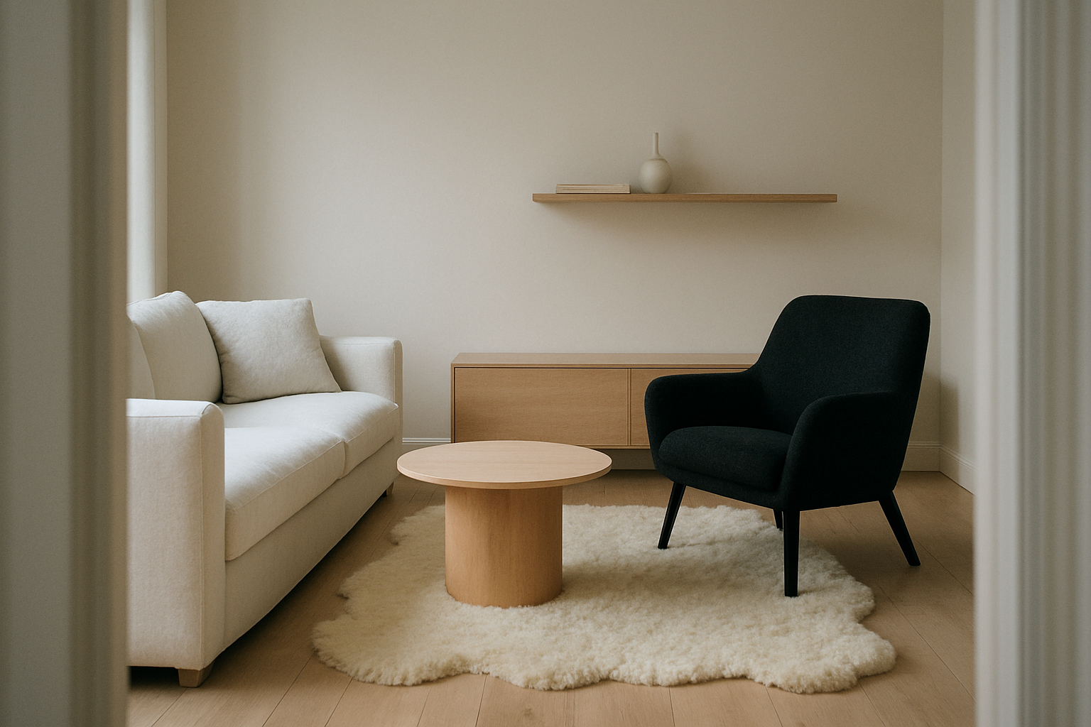

This post walks through a Scandinavian-style living room built on the free plan, covering how to angle furniture toward the light instead of a screen, why one contrasting piece beats an all-neutral palette, and how legs, layered lighting, and closed storage keep a sparse room from feeling cold or cluttered.
By the end you’ll have a layout logic to adapt, not just a look to copy.
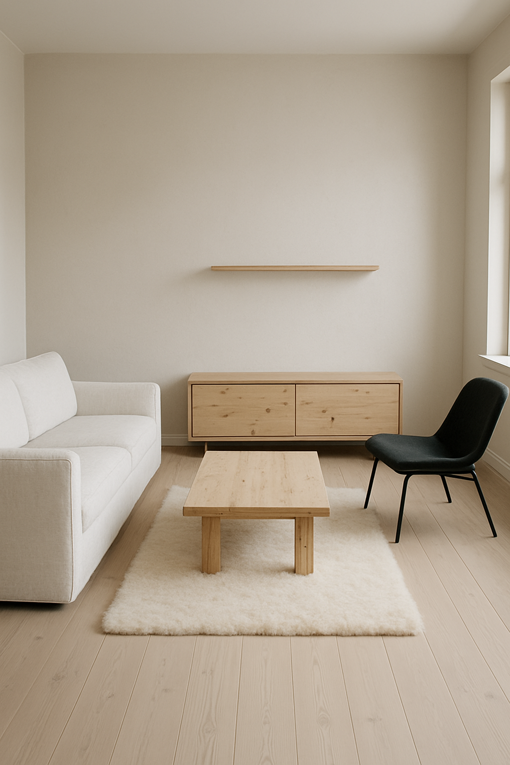
Free floor plan: Open this Scandinavian minimalist room layout in the free room planner — furnished, to scale, and yours to move around →
Face the Sofa Toward the Light, Not the Screen
A living room with exactly four pieces of furniture in it can still look like a mess, and the problem is almost never the stuff.
It’s the angles.
Here’s the default nobody questions: TV goes on one wall, sofa goes on the opposite wall, done.
Layout solved in thirty seconds.
Except in a Scandinavian-style room, that default is exactly what makes the whole thing feel flat and sort of gray, even when every surface is white and every material is “natural.” In the plan I’m using here, there’s a Nordic window on one wall doing all the real work — that’s where the daylight comes from, cool and a little blue-toned the way it gets through those tall panes.
Face the white linen sofa toward it.
Back to the dead wall, front to the glass.
I know that feels backwards if you’re used to arranging a room around a screen.
But a sofa facing a wall of daylight gets used differently.
You sit down at 3pm and the light’s doing something.
You sit down at night and the room reads as considered instead of just parked there.
Facing the sofa at a TV instead of a window is, in my opinion, the single most common reason these rooms feel like showroom leftovers.
Not the paint.
Not the lack of a rug.
The orientation.
One Chair That Doesn’t Match Anything
Here’s the classic first attempt at a “Scandi” living room: a beige sofa, a beige rug, a light oak table, and a linen throw in (you guessed it) beige.
It looks like a hospital waiting room that’s given up.
It feels like minimalism.
It’s nothing.
An all-neutral room isn’t calm.
It’s boring, and there’s a difference.
What actually makes a room like this work is one piece that refuses to match.
In this layout it’s a black accent chair; set it at an angle to the white linen sofa, with a birch coffee table and all that warm birch tone surrounding it.
The chair doesn’t blend in.
That’s the point.
Without it, your eye has nowhere to land.
Everything’s the same temperature, same lightness, and it just sort of hums along without ever resolving into a “look.”
Put the black chair in and suddenly the birch reads as a deliberate warm note instead of just what was on sale at the furniture store.
The white linen reads as crisp instead of washed-out.
One contrast piece does that.
You don’t need five.
Legs and the Floor You’re Supposed to See
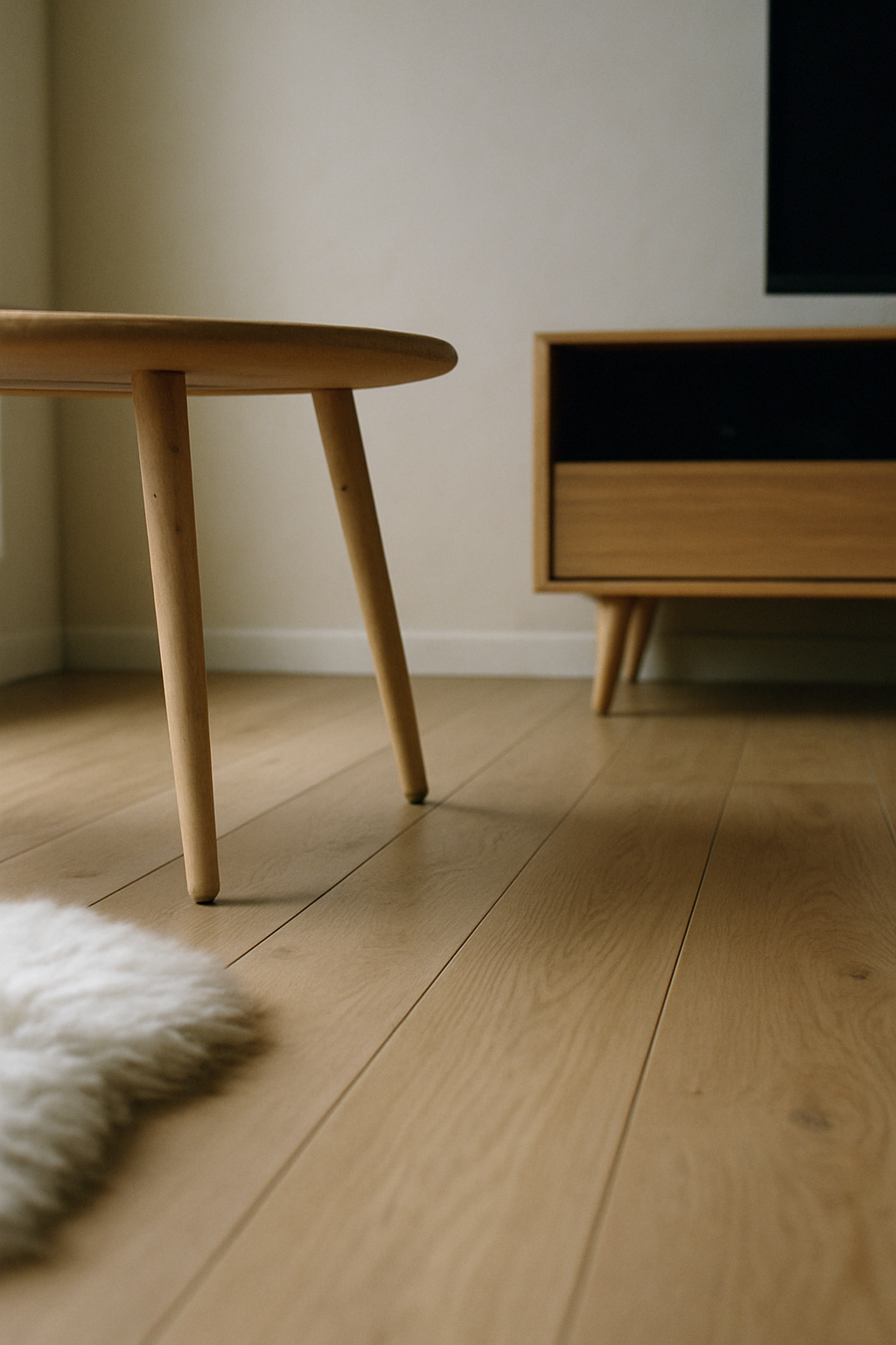
Bare floor can feel like you haven’t finished shopping yet, like the room is waiting on you.
In this style, though, empty floor is the design, not a gap in it.
The trick is legs.
Furniture that sits up off the ground, on visible little legs, birch ones ideally, like a birch coffee table and side table, lets light and floor pass underneath it.
The room looks lighter because there’s literally more visible floor and less visible bulk.
Skirted furniture, or anything that hugs the ground with a solid base, blocks all that and makes even a sparsely furnished room feel heavy.
The one thing that’s allowed to sit flush on the floor, no legs, no gap, is the sheepskin rug.
That’s it.
Everything else needs air underneath.
Now, the practical part, because “float everything” isn’t a full plan.
Keep your coffee table about 14 to 18 inches off the sofa’s front edge — close enough to reach your coffee mug without leaning, far enough that your shins have a say in the matter.
And leave real walkways: about 36 inches for a main path through the room, 24 to 30 inches for a secondary one, like the gap past a side table.
Push furniture flush against the walls to “make room” and you lose the exact thing that made the layout feel open in the first place.
Bare floor isn’t unfinished.
Covering it back up is what actually undoes the whole look.
Read next: A Scandinavian interior
Read next: Size a coffee table to the sofa
Read next: Not sure this is your style?
Take the decor style quiz
Skip the Overhead and Build Light in Layers
Overhead lighting is a crime.
I will die on this hill, and I mean it more in a minimalist room than anywhere else, because there’s nothing else in the room to soften it.
One flat bulb in the ceiling, blasting down on four pieces of furniture and a rug, and the whole space reads like a rental unit mid-showing.
Doesn’t matter how warm the bulb is rated.
A 2700K bulb in the wrong fixture position still flattens a room; it just flattens it in a slightly yellower way.
What actually fixes it is layering, and in this plan that means two black fixtures doing different jobs.
Arch the black arc lamp over the seating area specifically, over the sofa and that accent chair, so there’s a warm pool of light exactly where people’s faces are when they’re talking or reading.
Then hang the black pendant somewhere else in the room, not as the main light source but as an accent, a visual anchor that also happens to throw some light.
Neither one is trying to light the whole room by itself.
That’s the job of having two.
People assume that once the furniture count is already this low, one bright ceiling fixture is plenty.
Less furniture, less need for atmosphere, right?
Wrong.
Storage That Actually Closes
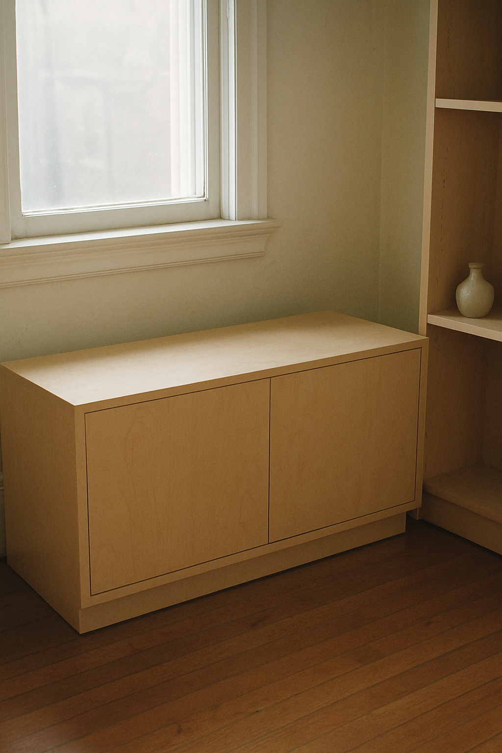
Open shelving gets so much credit it doesn’t deserve.
Every photo of a “minimalist” living room has some open shelf with three ceramic bowls and a stack of hardcover books arranged just so, and everyone calls that storage.
It’s not storage.
It’s display, and the second you actually start living in the room, mail, chargers, the dog’s leash, whatever, that shelf either stays perfectly staged forever (unlikely, ask me how I know) or it becomes the exact clutter you were trying to avoid, just at eye level where it’s more visible, not less.
In this layout, the birch media unit is the closed storage.
Doors, drawers, whatever’s actually shut, that’s where the remote and the cables and the stuff you don’t want photographed lives.
The birch shelf stays for display only: a small, deliberate arrangement, not a dumping spot for whatever’s in your hands when you walk by.
If it’s not closed, it’s not storage.
It’s just clutter with better lighting.
Cutting a Cluttered Room Down to Size
When a room feels cluttered but it’s clearly not overfurnished, you can count the pieces on one hand, the instinct is to start pulling small stuff off surfaces.
Candles, the little dish for keys, a stack of coasters.
I’ve done this.
It barely moves the needle, and honestly it’s kind of backwards.
The bigger offenders are duplicated pieces and competing focal points, and those are almost always large.
Two plants of similar size fighting for the same visual weight.
A second surface that’s basically doing the same job as your coffee table.
Two things in the room both trying to be the thing your eye lands on first.
In this plan there’s exactly one big plant, an olive tree, and one small one, a succulent.
Not both plus a third for good measure.
One big, one small, done.
If you’re decluttering your own room, start there: find the pieces that are duplicating each other’s job, or the ones competing for the same spot as your focal point, and cut those before you touch a single knickknack.
Free floor plan: Try it on your own measurements: open the Scandinavian minimalist room plan and drag the walls to your room →
Dreamy’s Free Plan: Thirteen Pieces, Nothing Extra
The free plan lays this out in Dreamy’s room planner, so you’re not just taking my word on angles and inches.
You can actually open it and move things around.
Thirteen pieces, nothing extra: the sheepskin rug, white linen sofa, black accent chair, birch coffee table, birch media unit, birch shelf, black arc lamp, olive tree, succulent, birch side table, the Nordic window, a door, and the black pendant.
None of it’s precious.
Swap the black chair for a different contrast color if black doesn’t work in your space.
Drag the sofa closer to the window if yours is bigger, even six or eight inches makes a difference.
The plan’s canvas isn’t meant to be a stand-in for your actual room’s dimensions.
It’s a layout logic, not a floor plan to trace.
A sample plan is only useful if you’re willing to wreck it a little, resize it, push the coffee table an inch closer, swap the media unit for something narrower.
Copy it exactly and you’ve just moved my clutter problems into your house instead of solving your own.
Related read: Things I Wish I Knew Before I Decorated My First Home — Instant PDF + Kindle download. Secure checkout by Stripe

