

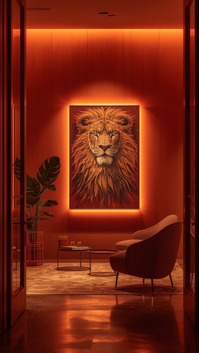
So I have a confession.
For years I hung art on my walls and just… left it there.
Flat lighting, no drama, no glow, nothing.
And I genuinely thought that was just how art at home was supposed to look.
Then I stayed at my aunt’s place over the holidays and she had this one little light above her grandmother’s old painting.
It wasn’t even a fancy piece of art, you know.
But with that warm little beam hitting it just right, it looked like something you’d see in a tiny boutique museum.
I stood there staring at it longer than I’d like to admit.
That was the night I became a little obsessed with picture lights.
And honestly, it changed how I see every wall in my own home now.
Why a Tiny Light Changes Everything

Okay so here’s the thing nobody tells you about art at home.
It’s not really about the piece itself.
It’s about the light hitting it.
I learned this the hard way in my old apartment.
I had this beautiful botanical print I loved so much.
But under my regular ceiling light, it just looked kind of flat and forgettable.
Sort of sad, honestly.
Then I added a small picture light above it.
And it was like the print woke up.
Suddenly you could see the texture in the paper, the little variations in the ink.
It felt intentional instead of just, well, there.
That’s the magic of a picture light.
It doesn’t just illuminate something.
It tells your eye where to look.
It says “hey, this matters, come look closer.”
And in a home, that kind of quiet direction does so much.
It makes a space feel curated instead of thrown together.
If I had to pick one small change that makes a room feel more expensive, this would be it.
Not a bigger couch.
Not a new rug.
A little warm light, aimed just right, at something you love.
It’s such a small thing.
But it changes the whole mood of a room.
The Warm Glow Versus Cool Glow Debate

Can we talk about bulb temperature for a second.
I know it sounds like a boring detail.
But it is not boring, I promise you.
When I first got my picture light, I grabbed whatever bulb was in my junk drawer.
It was this harsh, cool white light.
And my painting looked almost clinical under it, like it belonged in a dentist’s office instead of my living room.
So I swapped it for a warm white bulb, somewhere around that soft glowy range.
And oh my gosh, the difference.
The colors in my art felt richer.
The whole wall felt cozier.
It’s such a subtle shift but it changes the entire feeling of the room.
Warm light tends to feel more like candlelight, more like golden hour.
Cool light feels more like an office.
Unless you’re going for a really modern, gallery-white kind of look, I always steer people toward warm.
It just feels more like home.
My personal tip here is to test the bulb before you commit.
Screw it in, step back, squint a little.
Does it feel inviting or does it feel sterile.
Trust your gut on this one.
Your eyes will know before your brain figures out why.
Hardwired Versus Plug-In Options

This is where a lot of people get stuck, myself included at first.
Do you go hardwired into the wall, or do you go with a plug-in version.
Hardwired looks incredibly clean, no cord in sight, very polished.
But it usually means an electrician and cutting into your wall.
When I did my first hardwired light, I actually hired someone for it.
It felt like a big commitment at the time.
But now, years later, I still love how seamless it looks.
Plug-in versions, though, are so much more forgiving.
You can move them, you can test them out, you can commit later if you want.
I actually recommend plug-in first if you’ve never used a picture light before.
It lets you feel out the placement and the mood before you do anything permanent.
And honestly, with a little cord cover or a cable clip, you can hide most of that wire anyway.
Nobody’s going to be inspecting your wall that closely, promise.
So if you’re renting, plug-in is basically your only real option and that’s totally fine.
It still gives you that same warm, gallery feeling.
Don’t let the cord scare you off from trying this.
It’s such a small trade-off for how much richer your art will look.
Picking the Right Size for Your Art

Here’s a mistake I made early on.
I bought a light that was way too small for my piece.
It only lit up the middle third of the painting, leaving the edges in shadow.
It looked kind of awkward, honestly, like the light was shy or something.
The general rule I go by now is that the light should be about two-thirds the width of your art.
So if your painting is thirty inches wide, you want a light closer to twenty inches.
This way the glow spreads evenly across the whole piece instead of just spotlighting the center.
For really large statement pieces, sometimes you actually need two lights.
I did this above my bed with a big abstract print.
One light on each side, angled slightly toward the middle.
It created this even, soft wash of light across the whole canvas.
And it looked so much more finished than a single light straining to cover that much space.
My advice is to actually measure your art before you shop.
I know it feels like an extra step.
But it saves you from that awkward half-lit look I dealt with.
And if you’re between two sizes, size up.
A slightly bigger light spreading soft light is so much more forgiving than a small one creating a harsh little circle.
The Angle Makes or Breaks the Look

I did not expect angle to matter this much, but here we are.
My first picture light was mounted too straight, pointing almost directly down.
It created this weird glare on the glass of my framed print.
Kind of distracting, actually, once I noticed it I couldn’t unsee it.
So I adjusted the angle slightly, tilting it a bit more forward.
And that glare basically disappeared.
The general sweet spot is somewhere between thirty and forty five degrees from the wall.
It’s enough to wash the light evenly without bouncing straight back at your eyes.
If your art has glass or a glossy finish, this matters even more.
Glare can totally ruin that gallery moment you’re going for.
My little hack here is to do a test walk.
Turn the light on, then walk around the room from a few different spots.
Sit on your couch, stand in your doorway, whatever spots you actually use.
Check if the glare bothers you from those angles specifically.
You don’t need to please every angle in the house.
You just need it to look right from where you’ll actually be sitting.
It’s a small adjustment, maybe five minutes of fiddling with the mount.
But it’s the difference between a light that feels professional and one that feels like an afterthought.
Choosing a Finish That Blends In

Picture lights come in so many finishes now, it’s honestly a little overwhelming.
Brass, black, brushed nickel, white, you name it.
My rule of thumb is to match your other hardware in the room first.
If your other fixtures are black, go black.
If everything is warm brass, lean into that.
I did this in my dining room where all my hardware is this soft antique brass.
So naturally, my picture light above the buffet is brass too.
It just feels cohesive, like it was always meant to be there.
But here’s an optional variation if you want more of a statement.
You can actually go bolder and let the light be its own little design moment.
I’ve seen matte black picture lights on cream walls look incredibly chic.
It’s a nice contrast if your art is more minimal and you want the fixture itself to add some personality.
There’s no wrong answer here honestly, it really depends on the vibe you’re after.
Do you want it to disappear, or do you want it to be part of the story.
Either way works beautifully.
Just try to be intentional about which one you’re going for.
Because a finish that clashes can pull focus away from the art itself.
And the whole point here is celebrating what’s on the wall, not the hardware holding the light.
Layering Picture Lights With Your Existing Lighting

This is something I wish someone had told me sooner.
A picture light isn’t meant to be your only light source in a room.
It’s meant to be a layer, one warm little accent among several.
When I lit my gallery wall, I didn’t turn off my lamps or my overhead light.
I just added the picture light on top of what I already had.
And the effect was so much richer because of it.
It created these little pockets of light and shadow throughout the room.
Kind of like the room had depth now, instead of feeling flat.
If you only have one light source in a space, everything gets lit the exact same way.
But when you layer a picture light with a floor lamp and maybe a candle or two, the whole room starts to feel more dimensional.
My personal favorite combo is a picture light plus a warm table lamp nearby.
It creates this really soft, intimate glow in the evenings.
Almost like the room is glowing from within rather than being lit from above.
If you’re someone who dims your lights at night, this pairing is so worth it.
The picture light stays soft and steady while everything else can shift with your mood.
It’s such a simple addition but it makes evenings at home feel a little more special.
Using Picture Lights Beyond Just Paintings

Okay so this one might be my favorite discovery honestly.
Picture lights are not just for paintings.
I started using one over a small shelf of my grandmother’s china.
And it completely transformed how that corner of my dining room felt.
Suddenly those old plates looked like treasured pieces instead of just stuff sitting on a shelf.
I’ve also seen people use them over a favorite mirror, which adds this gorgeous ambient glow to a hallway.
Or above a bookshelf, highlighting a curated stack of your favorite hardcovers.
One of my readers actually told me she put one above her kid’s artwork, framed nicely of course.
And she said it made her daughter feel like a real artist, like her work belonged on a wall.
That one got me a little emotional if I’m being honest.
My tip here is to think about what you actually love looking at in your home.
It doesn’t have to be traditional art to deserve this kind of spotlight.
Maybe it’s a collection of vintage cameras.
Maybe it’s a quilt your mom made.
Maybe it’s just a really beautiful mirror you found at a flea market.
Anything with a little texture or story to it works beautifully under this kind of light.
Don’t limit yourself to the traditional gallery rules here.
Your home, your rules, your spotlight.
Common Mistakes I See All the Time

Let’s go through a few slip-ups, partly because I’ve made most of them myself.
Mistake one is mounting the light too close to the art.
This creates a hot, uneven glow right at the top instead of a soft wash.
Mistake two is skipping the dimmer.
A dimmable picture light gives you so much more control over the mood.
Bright for when you’re showing off your space, softer for a quiet evening in.
Mistake three, and this one’s sneaky, is forgetting about the shadow the frame casts.
If your light is angled wrong, you can end up with a dark shadow line right across your art.
I dealt with this on a gallery wall and it drove me a little crazy until I figured out the fix.
Mistake four is choosing a light that’s visually too heavy for a delicate piece.
A dainty little watercolor doesn’t need some huge industrial fixture looming over it.
Let the scale of your light match the personality of your art.
And mistake five, probably the most common one, is just not using one at all.
So many beautiful pieces sit in people’s homes completely unlit and underappreciated.
If there’s one artwork in your home that you truly love, give it this treatment.
Even just one picture light in your whole house makes a difference.
You don’t have to do every piece.
Start with the one that means the most to you.
That’s honestly the best place to begin this whole journey.
Related read: Things I Wish I Knew Before I Decorated My First Home — Instant PDF + Kindle download. Secure checkout by Stripe