Orange brick homes offer timeless charm and character that’s hard to match with other building materials.
However, finding the perfect complementary colors to enhance those warm terracotta tones can be challenging without the right inspiration.
The following carefully curated color schemes will help you transform your orange brick exterior from ordinary to extraordinary, creating curb appeal that stops traffic and makes your home the standout on the block.
Classic White & Navy: Timeless Elegance


White trim against orange brick creates a clean, striking contrast that never goes out of style.
Adding navy blue as an accent color for the front door, shutters, or porch ceiling takes this classic combination to the next level.
The coolness of the navy balances the warmth of the orange brick, creating a harmonious visual experience that feels both traditional and fresh.
Navy accents work particularly well on Colonial, Federal, or Georgian style orange brick homes, honoring their historical roots while keeping the look current.
For maximum impact, consider painting porch columns, window frames, and fascia boards in a crisp, bright white with a semi-gloss finish that reflects light beautifully.
Your front door can become a stunning focal point in a Deep Navy Blue with either satin or high-gloss finish that catches the eye immediately.
Hardware in polished nickel or chrome will complement this color scheme perfectly, adding just the right amount of sparkle against the navy and white.
Landscaping choices that enhance this palette include hydrangeas, white roses, and blue salvias that echo your home’s color story in the surrounding garden.
For a cohesive look, carry the navy and white theme to outdoor furniture cushions, planters, and even mailbox details.
Light fixtures in black or dark bronze will anchor this scheme while providing elegant contrast to the white trim.
This combination works in any region, from New England to the Southwest, adapting beautifully to different architectural styles while maintaining its classic appeal.
The contrast between orange brick, white trim, and navy accents creates excellent definition that highlights your home’s best architectural features.
When photographed, homes with this color scheme tend to stand out in real estate listings, potentially increasing property value and buyer interest.
If your brick varies in color from light orange to deeper red tones, this palette still works beautifully, as the white and navy provide a consistent framework.
Sage Green & Cream: Nature-Inspired Harmony

Sage green complements orange brick naturally because these colors exist together harmoniously in nature, creating an organic, soothing exterior palette.
The muted, gray-green tone of sage softens the intensity of orange brick while enhancing its warm undertones.
Cream accents add brightness without the starkness of pure white, resulting in a gentle, cohesive look that feels both sophisticated and relaxed.
This combination works exceptionally well for Craftsman, bungalow, or cottage-style homes, emphasizing their connection to natural surroundings.
Window trim and fascia boards in cream provide definition without creating harsh lines, allowing the architecture to flow naturally with the landscape.
Shutters in sage green frame windows beautifully while tying the overall color story together across the facade.
Porch ceilings painted in a lighter shade of sage create an unexpected element that draws the eye upward and makes the space feel more intimate.
Outdoor lighting fixtures in brushed brass or antique copper harmonize perfectly with this earthy palette, adding warm metallic accents.
For landscaping, consider plants with silver-green foliage like lavender, artemisia, or lamb’s ears that will echo the sage tones of your trim.
Wooden elements like porch railings or decorative brackets stained in a medium-to-light brown enhance the natural aesthetic of this color scheme.
Roof colors that work well with this combination include medium gray, light brown, or a variegated blend that incorporates both warm and cool tones.
During autumn months, this color palette looks especially striking as falling leaves complement both the orange brick and sage green accents.
For a more modern interpretation, consider a slightly bluer shade of sage paired with warmer cream tones to create subtle tension in the color relationship.
Gutters and downspouts painted to match either the sage or cream trim create a more cohesive look than leaving them in standard aluminum finish.
This color scheme ages gracefully over time, requiring less frequent repainting than brighter combinations that may show fading more quickly.
Charcoal Gray & Black: Modern Sophistication


Charcoal gray provides a contemporary counterpoint to orange brick, creating a sophisticated dialogue between warm and cool tones.
The depth of charcoal trim frames the vibrant brick, allowing it to appear more intentional and less dated in modern architectural contexts.
Black accents add definition and drama without overwhelming the natural character of the brick.
This bold combination works surprisingly well with orange brick because it allows the warmth of the terracotta tones to shine while providing structure and edge.
For maximum impact, consider painting all trim, including window frames, soffits, and fascia boards in charcoal gray with a matte or satin finish.
Your front door in glossy black becomes a powerful focal point, especially when paired with modern hardware in brushed nickel or matte black.
Garage doors painted in the same charcoal gray as your trim create a cohesive look that doesn’t compete with the main entrance.
Lighting fixtures in blackened steel or matte black provide industrial-chic touches that reinforce the modern aesthetic.
For contrast, consider white planter boxes or urns filled with greenery to brighten the otherwise dark accents.
This color scheme works exceptionally well on mid-century modern homes, ranch styles, or contemporary architectural designs with clean lines.
The neutral nature of charcoal and black means you can easily update seasonal decor without worrying about color clashes.
Metal roof accents in dark gray or black can tie the entire exterior together while adding textural interest.
For hardscaping elements like driveways or walkways, consider dark gray concrete or bluestone that continues the sophisticated neutral palette.
Window boxes in charcoal gray filled with silver-leaved plants and white flowers create beautiful texture against the orange brick backdrop.
House numbers and mailboxes in brushed stainless steel pop beautifully against the dark background while adding a touch of modernity.
Porch or patio furniture in black or dark gray with cushions in cream or light gray complement this color scheme while providing comfortable outdoor living spaces.
Forest Green & Bronze: Timeless Richness


Forest green creates a stunning partnership with orange brick by drawing on complementary color theory – green and orange sit opposite each other on the color wheel.
This rich, deep green evokes the timeless quality of historic homes while feeling fresh and intentional in a contemporary setting.
Bronze accents add metallic warmth that bridges the brick and green tones, creating a cohesive palette with dimension and character.
This combination works particularly well on Tudor, Colonial Revival, or Victorian style homes with ornate architectural details.

The depth of forest green trim frames windows and doorways with substantial presence, highlighting rather than competing with intricate brickwork patterns.
A front door in the same forest green with bronze hardware creates an elegant, welcoming entrance that feels both distinctive and appropriate.
Bronze light fixtures, house numbers, and mail slots add subtle metallic highlights that catch the light beautifully against both the green and orange backgrounds.
Copper gutters and downspouts, which naturally patinate to a greenish hue over time, make for a luxurious addition that ages gracefully with this color scheme.
Landscaping with boxwoods, yews, and other evergreens reinforces the forest green theme while providing year-round structure and color.
This palette creates a natural transition between your home and garden spaces, especially when surrounded by mature trees and established plantings.
For seasonal decor, autumn wreaths and garlands look especially striking against forest green doors and orange brick, creating a harmonious celebration of fall colors.
Porch ceilings painted in a lighter sage or celadon green provide an unexpected accent that complements the deeper forest green trim.
Wooden porch floors stained in a rich walnut tone add warmth while tying into the bronze accents of the hardware and lighting.
This color combination feels equally appropriate in wooded suburbs, historic urban neighborhoods, or country settings.
The timelessness of this palette means your home will never look dated or trendy, maintaining its elegant appeal through changing design fads.
Taupe & Dark Brown: Earthy Sophistication


Taupe—that perfect neutral between gray and beige—creates a sophisticated bridge between orange brick and the surrounding landscape.
This chameleon-like color shifts subtly throughout the day, sometimes appearing more warm, sometimes more cool, adding depth and interest to your home’s exterior.
Dark brown accents ground the palette, adding weight and definition to architectural features while complementing the earthy quality of the brick.
This understated combination allows the natural variation in your orange brick to take center stage while providing a refined framework.
Window frames in the same taupe create elegant framing without the stark contrast that white might provide.
A front door in rich chocolate brown becomes a welcoming focal point, especially when paired with hardware in oil-rubbed bronze or antique brass.
Shutters in the same dark brown add balance and symmetry to your home’s facade while reinforcing the earthy color story.
This palette works beautifully with natural stone elements like limestone or sandstone accents, creating a multi-textured exterior that feels organic and timeless.
Landscaping with ornamental grasses, Russian sage, and lavender enhances the neutral palette while adding movement and seasonal interest.
For hardscaping, consider flagstone walkways or driveways in variegated tans and browns that complement both the brick and trim colors.
Wooden elements like porch railings or pergolas stained in dark brown add architectural interest while reinforcing the color scheme.
This combination works especially well on Craftsman, Prairie, or Spanish-influenced home styles where natural materials and earthy tones are already key elements.
Outdoor furniture in natural teak or mahogany requires no additional finishing to look perfect against this color palette.
Roof colors in weathered wood tones or warm brown shingles complete the top portion of your home while maintaining the natural aesthetic.
The subtle sophistication of this palette appeals particularly to those who appreciate understated elegance rather than high-contrast drama.
Slate Blue & Light Gray: Cool Sophistication


Slate blue offers a surprising yet harmonious companion to orange brick, creating a balanced tension between warm and cool tones.
This smoky blue-gray hue has enough depth to stand up to the intensity of orange brick while introducing a refreshing coolness to the overall palette.
Light gray accents provide a neutral bridge between these contrasting colors, softening what could otherwise be a jarring juxtaposition.
The result is an exterior that feels both distinctive and sophisticated, with a contemporary edge that updates traditional orange brick architecture.
Window trim and fascia boards in light gray create definition without competing with either the statement door or the textural brick.
Shutters in the same slate blue as the door provide balanced punctuation across the facade, especially effective on symmetrical house designs.
Porch ceilings painted in a paler shade of slate blue create an unexpected element that draws the eye upward and makes outdoor living spaces feel more expansive.
Light fixtures in brushed nickel or chrome add crisp, cool metallic notes that complement this color palette perfectly.
For landscaping, blue-flowered plants like hydrangeas, catmint, or blue fescue grasses reinforce the color story while softening hardscape elements.
This combination works particularly well on Colonial, Federal, or Georgian-style homes, bringing a contemporary twist to classical architecture.
Gray concrete or bluestone hardscaping elements create seamless transitions between your home and surrounding landscape.
During winter months, this color scheme remains striking against snow, with the slate blue providing beautiful contrast to both the brick and white landscape.
For a more dramatic version, consider a darker charcoal gray in place of light gray, creating higher contrast that emphasizes architectural details.
Metal roof accents in zinc or silver tones extend the cool palette upward, creating a cohesive look from foundation to roofline.
This color combination photographs exceptionally well, making it an excellent choice if you plan to sell your home in the near future.
Burgundy & Beige: Rich Warmth


Burgundy paired with orange brick creates a surprisingly harmonious warm palette, as both colors share red undertones that connect naturally.
This rich wine-inspired hue adds depth and sophistication to orange brick exteriors without fighting against their inherent warmth.
Beige trim provides neutral spacing between these two strong colors, allowing each to maintain its distinct character while creating a cohesive whole.
The overall effect feels luxurious and inviting, perfect for creating an exterior that speaks of comfort and established elegance.
Shutters in the same burgundy create rhythm and balance across your home’s facade, especially striking against the textural variation of brick.
Window trim, fascia, and soffits in warm beige provide framework without competing with the stronger colors in the palette.
Hardware and light fixtures in antique brass or copper enhance the warm color story while adding subtle metallic highlights.
For seasonal decor, this palette transitions beautifully through fall and winter, providing a perfect backdrop for holiday decorations.
Landscaping with burgundy-leaved plants like Japanese maples or heuchera creates living extensions of your color scheme in the garden.
This combination works particularly well on Victorian, Tudor, or Mediterranean style homes where rich, complex color is historically appropriate.
Wooden elements like porch railings or decorative brackets stained in a medium mahogany tone bridge the burgundy and brick beautifully.
Roof colors in dark brown or variegated brown shingles complete the warm, enveloping palette from ground to roofline.
For hardscaping, consider brick pavers in a complementary tone or stamped concrete in warm beige to extend the color story to walkways and driveways.
Outdoor furniture in deep red cushions against dark wood frames creates comfortable exterior living spaces that connect visually to your home’s color scheme.
The richness of this combination feels especially welcoming during evening hours, particularly when complemented by warm outdoor lighting.
Olive Green & Cream: Mediterranean-Inspired Charm


Olive green brings a Mediterranean sensibility to orange brick, creating a sun-washed, timeless aesthetic that feels both sophisticated and relaxed.
This dusty, muted green has enough yellow undertones to connect harmoniously with orange brick while providing a gorgeous, nature-inspired contrast.
Cream accents add brightness and definition without the starkness of pure white, resulting in a soft, cohesive palette that feels organically developed rather than formula-driven.
The overall effect evokes Italian villas and Spanish haciendas while adapting beautifully to American architectural styles from Craftsman to Ranch.
Window trim and fascia boards in cream brighten the facade while providing gentle definition to architectural elements.
Shutters in olive green frame windows with European charm, especially when paired with decorative wrought iron hardware.
Porch ceilings in a lighter shade of cream create an airy feeling in outdoor living spaces while maintaining connection to the overall color scheme.
Light fixtures in oil-rubbed bronze or blackened iron add old-world character that reinforces the Mediterranean influence.
Terracotta pots filled with rosemary, lavender, and olive trees continue the Mediterranean theme into your landscaping choices.
This combination works particularly well in sunny climates where the interplay of light and shadow enhances the depth and variation in both the brick and painted surfaces.
Wrought iron elements like railings, window boxes, or garden gates in matte black provide beautiful textural contrast to both brick and painted surfaces.
For hardscaping, consider irregular flagstone in warm tan tones or gravel pathways that evoke European garden traditions.
Wooden pergolas stained in a medium brown create shaded outdoor living spaces that extend the Mediterranean aesthetic into the landscape.
Roof options that complement this palette include clay tiles in traditional terracotta or concrete tiles in warm sandy tones.
During spring and summer, this color scheme provides a perfect backdrop for flowering vines like bougainvillea or wisteria that cascade over walls and pergolas.
Black & Gold: Dramatic Elegance


Black trim against orange brick creates immediate drama and definition, framing the natural warmth of the brick with bold, graphic lines.
This high-contrast approach transforms even the most traditional brick home into a statement of contemporary confidence.
Gold accents, whether in hardware, lighting fixtures, or decorative elements, add touches of luxury that elevate the entire exterior from striking to sophisticated.
The combination feels both timeless and current, drawing on classic color theory while reflecting modern design sensibilities.
Window frames in black create “picture frames” that showcase the texture and variation of the brick walls between them.
A front door in glossy black becomes a powerful centerpiece, especially when adorned with gold hardware that catches the light beautifully.
Lighting fixtures in brass or gold finish provide warm illumination while adding metallic highlights that stand out dramatically against the black trim.
House numbers, mail slots, and door knockers in polished brass become jewelry-like accents that draw the eye to important functional elements.
For landscaping, consider plants with gold or chartreuse foliage like golden cypress or Japanese forest grass that echo the metallic accents while providing contrast to both the brick and black trim.
This bold palette works surprisingly well on almost any architectural style, from Georgian Colonial to Mid-Century Modern, adding contemporary edge while respecting original character.
Garage doors painted black recede visually, allowing the main entrance to remain the focal point of your home’s facade.
For hardscaping, consider dark gray or black concrete that continues the dramatic backdrop against which the orange brick and gold accents can shine.
Outdoor furniture in black with gold accent tables or decorative elements extends your color story into living spaces around the home.
This color scheme looks particularly striking in evening light, especially with well-placed landscape lighting that highlights the interplay of textures and tones.
The simplicity of this dramatic palette means seasonal decorations in almost any color will stand out beautifully against this strong, neutral backdrop.
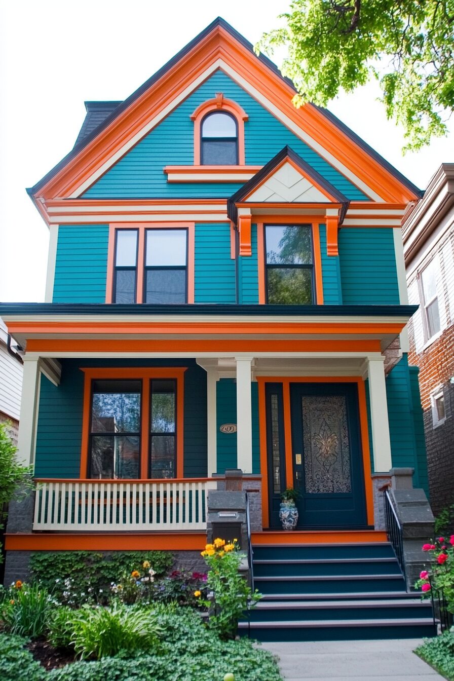
Teal & White: Bold Refresh


Teal against orange brick creates a dynamic tension between complementary colors that feels both energetic and intentionally designed.
This bold blue-green hue brings immediate contemporary relevance to traditional orange brick, signaling creative confidence and design awareness.
Crisp white trim provides necessary breathing space between these two strong colors, creating clean lines and definition that frame the overall composition.
The result is unexpectedly harmonious while making a clear statement that this is not your average brick home.
Window trim, fascia boards, and soffits in bright white create sharp, clean lines that modernize the traditional brick structure.
Porch columns or railings in the same bright white add architectural interest while reinforcing the fresh, updated aesthetic.
Hardware and light fixtures in brushed nickel or chrome add cool metallic notes that complement the contemporary feel of this color scheme.
For maximum impact, consider painting shutters in the same teal as the door to create rhythm and repetition across the facade.
Landscaping with plants that have silver foliage like dusty miller or blue-toned juniper enhances the cool elements of this palette.
This combination works particularly well on Ranch, Mid-Century Modern, or Craftsman style homes, adding personality while respecting architectural integrity.
For a more subtle approach, consider using teal only on the front door and one or two accent pieces, allowing it to function as a punctuation mark rather than a dominant element.
White garden furniture creates outdoor living spaces that feel fresh and consistent with your home’s exterior design.
For hardscaping, light gray concrete or white gravel provides clean, contemporary surfaces that complement this bold color scheme.
House numbers in brushed aluminum or stainless steel pop beautifully against teal or white backgrounds while reinforcing the modern aesthetic.
This color combination feels especially appropriate in coastal settings or urban environments where architectural innovation is celebrated.
Bringing Your Orange Brick Vision to Life
Orange brick offers a timeless foundation that can adapt to almost any aesthetic with the right color combinations.
If you prefer classic elegance, contemporary boldness, or natural harmony, there’s a perfect palette waiting to transform your home’s exterior.
Remember that sample colors often look different in various lighting conditions, so test your choices on small areas before committing to a full painting project.
With these inspiring color schemes as your guide, your orange brick home can become the standout beauty you’ve always envisioned—a perfect expression of your personal style that harmonizes with its architectural heritage while embracing contemporary design sensibilities.


