ed brick homes have a timeless appeal, but finding the perfect exterior color scheme can take your curb appeal to the next level.
If your home is a traditional colonial, modern farmhouse, or classic Tudor, these color combinations will help showcase your red brick’s natural beauty while adding your personal touch.

Classic White Trim with Black Accents

Nothing complements red brick quite like crisp white trim paired with bold black accents.
This timeless combination creates a striking contrast that enhances your home’s architectural details without competing with the natural warmth of the brick.
White window frames, fascia boards, and columns will make your red brick pop while giving your home a clean, refreshed appearance.
Black shutters, doors, and light fixtures provide the perfect punctuation marks to this color scheme, adding depth and sophistication.
For the ultimate curb appeal, consider a glossy black front door—it creates an elegant focal point that draws the eye immediately.
The beauty of this combination lies in its versatility; it works equally well with traditional, colonial, and modern red brick homes.
When selecting your white, choose a warmer shade with cream or ivory undertones to complement the warmth of the brick rather than stark, bluish whites that might clash.
For black elements, consider soft blacks with subtle brown undertones that harmonize with the brick’s natural color variations.
This color scheme also provides the perfect backdrop for seasonal decorations and landscaping elements, allowing your garden colors to shine without competition.
Hardware finishes in either matte black or antique brass will complete this look beautifully, adding subtle details that tie everything together.
Tap to Explore These Beauties
See my ideas in action 👇 Tap any image to explore full details.
Sage Green with Cream Accents


Sage green is a natural partner for red brick, creating a harmonious color scheme inspired by nature’s own palette.
This muted, gray-green hue has enough presence to stand on its own while allowing your brick to remain the star of the show.
Painting your trim, shutters, or siding in sage green creates a sophisticated, earthy vibe that feels both current and timeless.
Cream-colored accents—like window trim, porch ceilings, and columns—soften the overall look and prevent your home from feeling too dark or heavy.
The beauty of sage green lies in its chameleon-like quality; it can appear more gray in overcast light and more green in direct sunlight, creating visual interest throughout the day.
For maximum impact, consider painting your front door in a deeper forest green or even a rich navy blue to create a focal point.
💭 Ever wondered what your room would actually look like rearranged?
I built a free tool that lets you drag furniture around a 2D floor plan. No signup, no catch.
See the Room Planner →This color combination works particularly well for homes surrounded by mature landscaping, as the sage green creates a seamless transition between your architecture and natural surroundings.
When selecting your sage green, opt for a shade with gray undertones rather than yellow ones to avoid clashing with the red in your brick.
Cream accents should lean warm rather than stark white to maintain the cohesive, earthy palette.
For hardware and fixtures, consider brushed nickel or bronze finishes that complement both the brick and the sage green without competing for attention.
Navy Blue with Soft Gray Highlights

Navy blue creates a bold yet sophisticated complement to red brick that instantly elevates your home’s exterior.
This deep, rich color provides dramatic contrast while still feeling classic and appropriate for homes of various architectural styles.
Using navy blue on shutters, doors, and architectural details creates a sense of visual weight that grounds your home and draws the eye to its most interesting features.
Soft gray highlights on trim, fascia boards, and window frames help balance the intensity of the navy while providing necessary definition and contrast.
This color scheme works exceptionally well for more traditional brick homes where you want to honor the historical character while adding fresh, current appeal.
The navy and gray palette creates the perfect backdrop for brass or gold hardware and lighting fixtures, which pop beautifully against these cooler tones.
For added dimension, incorporate varying shades of blue and gray throughout the exterior elements—perhaps a slightly lighter blue on a porch ceiling or a darker charcoal gray for railings.
This sophisticated color combination transitions beautifully through the seasons, looking equally appropriate with summer flowers, autumn decorations, or winter holiday lights.
When selecting your navy, look for shades with a hint of gray rather than purplish undertones to best complement the red brick’s natural coloring.
Find Your Room’s Color Palette
Tap a vibe — get a curated 5-color palette with hex codes you can copy ✨
Warm Taupe with Creamy White Details

Taupe—that perfect neutral that’s not quite gray, not quite brown—creates a seamless color transition with red brick facades.
This sophisticated neutral picks up the subtle undertones in your brick while adding a contemporary touch to traditional architecture.
Painting trim, siding, or architectural details in warm taupe creates a coordinated, cohesive look that feels intentional and designed.
Creamy white accents on window frames, columns, and fascia boards provide necessary contrast without the starkness of pure white.
This color combination excels at highlighting your home’s architectural details while maintaining an elegant, understated presence.
For maximum curb appeal, consider a front door in a deep burgundy or terra cotta that echoes the warmer tones in your brick.
The taupe and cream palette creates a neutral backdrop that allows your landscaping colors to really shine, from vibrant flowers to lush greenery.
Hardware and fixtures in antiqued brass or copper complement this warm color scheme beautifully, adding a rich patina that improves with age.
When selecting your taupe, bring a brick sample with you to ensure you choose a shade with complementary undertones—warmer taupes with pink or red undertones often work best with red brick.
This versatile color scheme transitions well through different lighting conditions, maintaining its sophisticated appearance from bright daylight to evening hours.

💭 I Wrote a Book About My Biggest Decorating Mistakes!
When I decorated my first home, I thought I knew what I was doing. Spoiler: I didn’t. 😅
💸 I bought a sofa way too big for my living room. Paint colors that looked amazing in the store but terrible on my walls.
Charcoal Gray with Crisp White Trim


Charcoal gray creates dramatic contrast against red brick while maintaining a sophisticated, contemporary edge.
This deep, rich neutral has enough presence to stand up to bold brick while allowing the natural color variations in the masonry to shine through.
Using charcoal on shutters, doors, or architectural details creates clear focal points that draw the eye across your home’s facade.
Crisp white trim provides essential definition, outlining windows, doors, and rooflines with clean, sharp edges that pop against both the brick and charcoal.
This high-contrast combination works beautifully on virtually any style of brick home, from traditional colonials to modern farmhouses.
For a truly striking entry, consider a front door in either the same charcoal or a bold accent color like yellow or red for an unexpected pop.
The charcoal and white palette creates the perfect backdrop for statement lighting fixtures and hardware in either black or silver finishes.
When selecting your charcoal, look for shades with blue or green undertones rather than brown ones to create pleasing contrast with the warmth of your brick.
This color scheme maintains its sophisticated appearance in all weather conditions and lighting situations, looking equally impressive on bright sunny days or overcast afternoons.
For added interest, consider using the charcoal on larger surfaces like garage doors and the white for detailed trim work to create depth and dimension.

What’s Your Decor Personality?
5 questions · 30 seconds · Instant style match 🏡
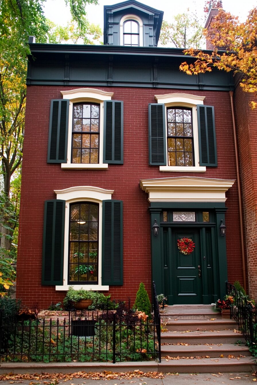
Forest Green with Antique White Accents


Forest green creates a rich, timeless partnership with red brick that evokes the classic color schemes of historic homes.
This deep, saturated green has enough body to hold its own against the brick while creating a harmonious, nature-inspired palette.
Using forest green on shutters, doors, and architectural details grounds your home visually and creates a sense of permanence and stability.
Antique white trim—with its subtle yellow or cream undertones—softens the overall effect and brightens the facade without harsh contrast.
This combination works particularly well for brick homes in wooded settings or with mature landscaping, as it creates visual continuity with the surrounding environment.
Copper or brass hardware and lighting fixtures develop a beautiful patina over time that enhances this traditional color scheme.
For added depth, incorporate varying intensities of green throughout your exterior—perhaps a slightly lighter shade on larger surfaces and the deepest green on accent pieces.
When selecting your forest green, opt for shades with blue rather than yellow undertones to create pleasing contrast with the warm brick.
This timeless color scheme transitions beautifully through the seasons, providing the perfect backdrop for holiday decorations and seasonal plantings.
Warm Terracotta with Buttery Cream Trim


Terracotta siding or accents create a harmonious, tone-on-tone effect with red brick that feels both cohesive and intentional.
This warm, earthy orange-brown picks up similar undertones in your brick, creating a coordinated palette that celebrates rather than competes with the masonry.
Using terracotta on gables, dormers, or architectural details adds visual interest while maintaining a seamless color story.
Buttery cream trim provides gentle contrast that defines architectural features without the starkness of white against these warm earth tones.
This Mediterranean-inspired palette works particularly well for brick homes with arched details, courtyards, or Spanish-influenced architecture.
For a coordinated entry, consider a front door in a deeper version of the terracotta or a complementary olive green.
Wrought iron hardware and lighting fixtures add authentic detail to this warm, sun-drenched color scheme.
The terracotta and cream combination creates a welcoming glow in evening light, making your home appear particularly inviting at sunset.
When selecting your terracotta shade, bring a brick sample to ensure you choose a tone that complements rather than clashes with your specific brick color.
This warm color scheme transitions beautifully through the seasons and pairs especially well with drought-tolerant landscaping and Mediterranean-inspired plantings.
Slate Blue with Soft Beige Accents


Slate blue offers a refreshing yet sophisticated complement to red brick that feels both current and timeless.
This muted, gray-blue creates gentle contrast with red brick without the heaviness of darker navy or the brightness of clearer blues.
Using slate blue on shutters, doors, and architectural details adds a cool counterpoint to the warmth of the brick, creating balanced visual interest.
Soft beige trim provides a neutral transition between these contrasting colors, softening the overall effect and creating a cohesive palette.
This color combination works beautifully for brick homes in coastal areas or those seeking a calming, serene exterior appearance.
Brushed nickel or chrome hardware complements this color scheme perfectly, adding subtle shimmer without competing with the thoughtful color selections.
For added dimension, incorporate varying shades of blue-gray throughout your exterior elements—perhaps a slightly lighter blue on a porch ceiling (known as “haint blue” in Southern traditions).
When selecting your slate blue, choose versions with gray undertones rather than purple ones to create the most harmonious pairing with red brick.
This versatile color scheme looks equally beautiful in bright sunlight, overcast conditions, and evening light, maintaining its sophisticated appearance throughout the day.
This or That?
Pick your fave — see what other readers chose! 👀
Olive Green with Warm White Details

Olive green creates an earthy, organic partnership with red brick that feels grounded and timeless.
This complex green with its yellow and brown undertones picks up similar earth tones in the brick, creating a harmonious, nature-inspired palette.
Using olive green on shutters, doors, or architectural details adds depth and dimension without overwhelming the natural beauty of the brick.
Warm white trim provides necessary definition and lightness, preventing the combination from feeling too dark or heavy.
This color scheme excels at bridging traditional architecture with contemporary color sensibilities, making it perfect for updating classic homes.
For a coordinated entry, consider a front door in either the same olive green or a complementary burgundy that echoes tones in the brick.
Bronze or antique brass hardware and lighting fixtures complement this earthy palette beautifully, adding warmth and character.
The olive and warm white combination provides the perfect backdrop for lush landscaping, picking up the natural green tones of plants and trees.
When selecting your olive green, bring a brick sample to ensure you choose a shade with complementary undertones—olives with more brown than yellow often work best with traditional red brick.
This versatile color scheme maintains its sophisticated appearance through changing seasons and different lighting conditions, looking equally appropriate year-round.
Deep Burgundy with Ivory Accents


Deep burgundy creates a rich, monochromatic partnership with red brick that celebrates rather than competes with the masonry’s natural color.
This sophisticated red-brown picks up the darkest tones in your brick, creating a coordinated, intentional color story with subtle variation.
Using burgundy on shutters, doors, and architectural details adds depth and intensity while maintaining a cohesive overall appearance.
Ivory trim—softer and warmer than stark white—provides necessary definition and lightness that prevents the combination from feeling too dark or heavy.
This elegant color scheme works particularly well for traditional brick homes with formal architecture or historical details.
For a truly stunning entry, consider a high-gloss burgundy front door that creates a rich, jewel-like focal point.
Antique brass or gold hardware and lighting fixtures add warmth and sophistication to this stately color combination.
Quick Design Dilemma
Cast your vote — see what other readers think! 🤔
💭 I Wrote a Book About My Biggest Decorating Mistakes!
When I decorated my first home, I thought I knew what I was doing. Spoiler: I didn’t. 😅
💸 I bought a sofa way too big for my living room. Paint colors that looked amazing in the store but terrible on my walls.
The burgundy and ivory palette transitions beautifully through the seasons, looking equally appropriate with summer flowers, autumn decorations, or winter holiday lights.
When selecting your burgundy, bring a brick sample to ensure you choose a shade that complements rather than clashes with your specific brick color—look for burgundies with brown rather than purple undertones.
This timeless color scheme creates a sense of permanence and stability, perfect for homes where you want to honor traditional architecture while adding your personal touch.
Choosing the right exterior color scheme for your red brick home is about finding the perfect balance between honoring the natural beauty of the brick and expressing your personal style.
Remember that paint samples often look different on your actual home than they do in the store, so always test your selections on a small area before committing.