

I’ll confess something.
For years I was terrified of dark paint.
I was sure it would swallow my rooms whole.
Then on a rainy Sunday I painted a tiny powder room a deep, inky color, mostly out of boredom.
And I stood in the doorway with a mug of tea, completely smitten.
It didn’t feel dark at all.
It felt like a candlelit evening.
That’s the secret nobody tells you, friend.
Moody doesn’t mean gloomy.
Here are my favorites, and what I learned painting them.
Inky Navy That Feels Like Midnight Velvet
I’m obsessed with a deep navy.

My powder room was the first place I tried it.
Think of something like Hale Navy, with just enough blue to keep it from turning black at night.
In the morning light it looks rich and almost silky.
By evening it settles into this soft, glowing cocoon.
I paired mine with a warm brass mirror, and honestly, I love it.
My tip is to use an eggshell finish so the walls catch a little light.
Flat can sometimes look chalky in a deep shade.
And if you’re nervous, start in a small space.
Tiny rooms are sort of the perfect training ground.
Forest Green That Makes You Want to Linger
Green might be my absolute favorite.

A deep forest green, the kind with a little black in it, feels like walking into an old library.
I painted my reading nook in it last autumn, and I swear I read so much more now.
It’s calm, it’s grounding, and it plays so nicely with natural wood.
If I had a dull hallway, this is what I’d do first.
Add a vintage rug in warm reds, and the whole thing just hums.
Sage’s moodier cousin is the way I think of it.
It feels earthy without being heavy.
And it looks gorgeous with creamy white linen curtains.
Warm Charcoal That Never Feels Cold

Charcoal can go icy fast, so I’m picky here.
I look for a shade with a hint of brown or green underneath.
You know the kind, a soft, smoky shade that feels like cashmere.
I used something like this in my bedroom, and it’s become my favorite retreat.
The walls sort of melt into the shadows at night.
That makes the lamplight feel so much warmer.
I layered it with oatmeal bedding and a chunky knit throw.
The contrast is kind of dreamy.
My little hack is to hold the sample next to something white before committing.
It tells you right away if the undertone is too cool.
Chocolate Brown for Pure Comfort

Brown is having a moment, and I’m here for it.
A deep chocolate brown on the walls feels like sinking into a leather armchair.
I tried it in my dining room, and every dinner party since has felt a little more intimate.
Guests linger longer, and I think that’s the magic.
It’s rich, it’s grown-up, and it flatters candlelight like nothing else.
Pair it with cream, caramel, and a touch of black.
And please, add some greenery.
Plants look unreal against a brown backdrop.
If you’re hesitant, try it on just the lower half of the wall.
You still get that cozy punch without going all in.
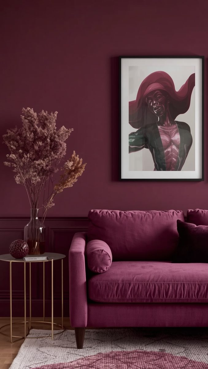
Plum and Aubergine for a Little Drama

This is for the romantics.
A deep aubergine has a quiet, jewel-box glow I can’t resist.
I painted the inside of a built-in bookshelf this color, and it felt like opening a secret.
The trick is choosing a plum with a brownish base.
Too much purple and it can feel theatrical.
But the right shade feels like red wine in a velvet glass.
I love it with gold frames and soft blush accents.
It’s feminine and a little mysterious, kind of the best combo.
If I were painting a bedroom, I’d pick this and never look back.
Petrol Teal That Feels Like a Deep Breath
Teal gets a bad rap, I think.

Sometimes it reads like a swimming pool, and that’s not what we want.
But a smoky, petrol-leaning teal is something else entirely.
It’s moody, it’s calm, and it feels like the sea right before a storm.
I used it on a small study wall, and I get so many compliments.
It glows in daylight and settles beautifully in the evening.
Pair it with warm wood and a rust-colored throw pillow.
The warmth balances the coolness perfectly.
And honestly, it makes everything else in the room look more expensive.
Olive That Feels Like Old-World Charm

Olive is the underdog I never saw coming.
It’s a green that leans a bit golden, almost like a worn leather book.
I painted my entryway in it, and now it feels welcoming the moment you walk in.
It’s warm, it’s earthy, and it hides scuffs surprisingly well.
That’s a real win if you have kids or pets.
I love it with aged brass hardware and a woven basket or so.
And try it with warm white trim for a soft contrast.
Crisp bright white can feel a little harsh next to it.
A creamy shade just feels right.
Burnt Terracotta for a Sun-Warmed Glow

Sometimes moody can be warm and sunny at once.
Deep terracotta does exactly that for me.
It’s like the last light of a summer evening, caught on a wall.
I painted a small sitting area this shade, and it feels like a hug.
The color carries a lot of depth without any heaviness.
I’d pair it with natural linen, rattan, and a few dried stems in a ceramic vase.
It’s cozy in a barefoot-on-the-floor kind of way.
If your room gets limited light, this is a lovely choice.
It adds warmth instead of fighting the shadows.
Slate Blue-Gray for Quiet Sophistication

Not every moody color needs to shout.
A slate blue-gray whispers instead, and I adore that.
It has a stormy-sky quality that feels calm and collected.
I used it in my home office, and I’m kind of shocked at how focused I feel in there.
It’s soft enough for daytime and deep enough for evening.
Pair it with white oak furniture and a few black accents.
The look is clean, but still warm.
And here’s a small trick.
Add a little lamp with a warm bulb, and the whole wall glows.
Soft Black That Feels Like Charcoal Silk

Yes, I’m going to say it.
Black can be cozy.
The trick is a soft black, slightly warm and not stark.
I painted a front door and an accent wall in mine, and I haven’t regretted it once.
It feels sleek but surprisingly gentle.
Use a matte or eggshell finish so it doesn’t feel glossy and harsh.
I love pairing it with creamy textiles and a bit of gold.
It makes every piece of art pop.
And if I had a tiny dining nook, I’d do this in a heartbeat.
Oxblood and Burgundy for Rich Warmth

This is the color of a good red wine.
A deep oxblood has so much warmth and softness in it.
I tried it on a bedroom accent wall, and it feels like being tucked into a cashmere blanket.
It’s bold, but it’s cozy bold, if that makes sense.
Brown undertones keep it from feeling too bright or shouty.
Pair it with cream bedding and wood tones.
I’d also add a soft brass lamp.
The glow against that deep red is just so romantic.
Honestly, I think it works best in rooms you use at night.
Dusky Rose for a Moody, Feminine Touch

Pink can be moody, too.
I know, it surprised me as well.
A dusty, deep rose with a bit of brown or gray in it feels sophisticated and soft.
I painted a little dressing area in it, and I feel pampered every morning.
It’s not sugary at all, just warm and glowing.
Pair it with deep green or chocolate brown for contrast.
And add some antique gold, because why not.
This shade also loves candlelight and soft, sheer curtains.
It’s the color I’d choose if I wanted a room to feel like a love letter.
Mushroom Taupe for Cozy Depth Without the Drama

Last but never least, the mushroom.
This is a deep, earthy taupe with a gray-brown warmth.
It’s my answer for anyone who loves moody but isn’t ready to go bold.
It wraps the room in a cozy neutral that feels rich but not heavy.
I used it in my living room, and I’m so happy with it.
It plays well with everything, from cream sofas to dark wood.
And it makes natural textures like jute and wool feel even more tactile.
My best tip for any moody shade is to test big samples on different walls.
Look at them morning, noon, and night.
The light changes everything, and it’s worth the wait to choose well.
xo, Madison
Related read: Things I Wish I Knew Before I Decorated My First Home — Instant PDF + Kindle download. Secure checkout by Stripe