

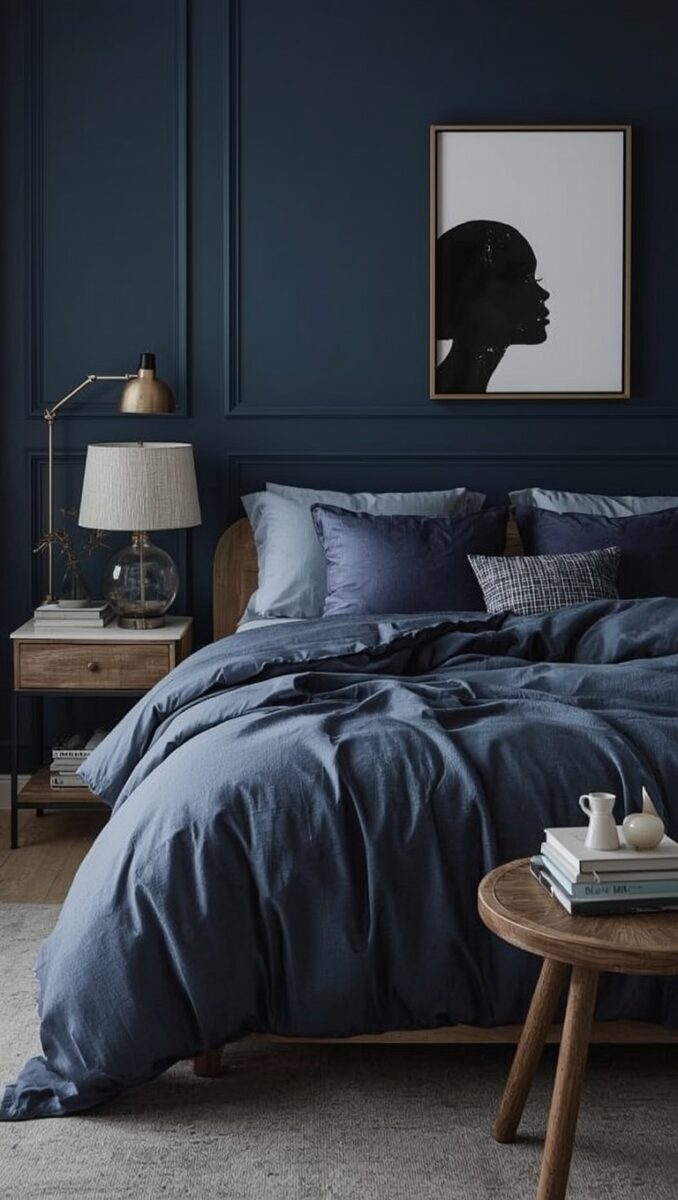
I used to think dark walls in a bedroom were a mistake.
I was so wrong.
The night I finally painted my bedroom a deep midnight blue, I remember standing in the doorway with the lights dimmed and just… exhaling.
It felt like the room finally matched how I wanted to feel at the end of a long day.
Not bright, not loud, not “on.”
Just quiet and cocooned and a little bit moody in the best way.
If you’ve been eyeing that inky, almost-black blue on Pinterest and wondering if it’s too much for a bedroom, I’m here to tell you it’s not.
It’s kind of magic, actually.
So let’s talk about how to do it right, because there’s a wrong way to do midnight blue, and I learned some of these lessons the hard way.
Why Midnight Blue Just Works for Sleep

There’s something about this color that hits different than any other paint choice I’ve made.
It’s not depressing dark, you know?
It’s more like being wrapped in a soft blanket at dusk.
Color psychology folks will tell you blue lowers your heart rate a little.
I don’t need a study to believe that though, because I feel it every single night.
My old bedroom was a flat, builder-beige box.
It never once made me want to linger in bed on a Sunday morning.
This one does.
And I think that’s the real test of a bedroom color, honestly.
Does it make you want to stay?
Midnight blue also does this sneaky thing where it makes the ceiling feel higher and the whole room feel a little more expensive.
I did not expect that.
My sister walked in after I finished mine and said it felt like a boutique hotel.
I’m not going to pretend that didn’t make my whole week.
If your bedroom currently feels like an afterthought, this color change alone can shift the emotional temperature of the whole space.
It did for me.
And honestly, once you sleep in a room like this, going back to plain white walls feels kind of impossible.
Choosing the Right Shade of Midnight Blue

Okay, this part matters more than people think.
Not all midnight blues are created equal, friend.
Some lean almost black and can feel like a cave if your room doesn’t get much natural light.
Others have a slight purple undertone that reads more moody-glam than cozy-calm.
When I was picking mine, I taped huge swatches on every wall and watched them for a full week.
Morning light, afternoon light, lamp light at night.
It changed so much depending on the hour.
My personal pick ended up being a shade with just a whisper of green undertone, because it felt less cold and more grounded to me.
If your room faces north and doesn’t get much sun, I’d gently steer you toward a blue with a touch more depth and warmth rather than a true navy.
South-facing rooms can handle a moodier, almost-black blue beautifully.
Small tip from my own trial and error.
Always look at the paint chip next to your existing furniture before committing.
I almost picked a blue that clashed horribly with my walnut dresser.
Glad I caught that one in time.
Sort of a happy accident, honestly, because the shade I landed on instead is the one I still gush about to anyone who’ll listen.
Pairing Midnight Blue with Warm Metallics

This is where the magic really happens, in my opinion.
Midnight blue on its own can feel a little flat if you don’t bring in some shine.
I went with warm brass on my light fixtures and drawer pulls.
The way brass catches lamplight against that deep blue backdrop is honestly one of my favorite things in my whole house.
It glows instead of just sitting there.
Gold works too, especially if you want something a bit more polished and formal feeling.
I’d steer clear of cool chrome or silver here though.
It can make the whole room feel a little sterile, almost clinical, when paired with such a warm, enveloping wall color.
My small hack was swapping out my old nickel curtain rod for a brushed brass one.
Twenty minute project, completely changed the vibe.
I also added a small brass tray on my dresser for perfume bottles and jewelry.
It catches the evening light in the most beautiful way.
If brass feels like too much of a commitment, start small.
A single lamp, one picture frame, maybe just your door hardware.
You’ll be surprised how much warmth even one metallic piece adds against all that deep, cool blue.
Layering Textures Like Velvet, Linen, and Wool

Dark walls need texture or they can start to feel a little heavy.
This took me a minute to figure out.
My first attempt at styling the room felt kind of flat, if I’m honest with you.
Then I added a chunky knit throw at the foot of the bed and everything changed.
Velvet is my personal obsession in a midnight blue room.
A velvet headboard or even just a couple of velvet throw pillows adds this soft, almost liquid richness against the matte wall paint.
Linen sheets are the other half of the equation for me.
They keep things from feeling too formal or hotel-stiff.
I love mixing a slightly rumpled linen duvet with one or two structured velvet pillows for contrast.
Wool rugs underfoot add another layer too, especially in colder months.
There’s something so grounding about stepping onto a soft wool rug in a dim, blue-toned room first thing in the morning.
My tip here is to touch everything before you buy it if you can.
Texture is honestly half the feeling in a room like this.
You want your hand to want to reach out and touch the blanket, the pillow, the curtain.
That’s the whole cozy factor right there.
Warm Ambient Lighting Changes Everything

Please don’t rely on one overhead light in a midnight blue bedroom.
I’m begging you.
Harsh overhead lighting against dark walls creates shadows in all the wrong places and honestly kind of kills the mood you worked so hard to create.
I layered mine with a dimmable bedside lamp on each nightstand, a small plug-in sconce near my reading chair, and warm string lights tucked behind my headboard.
That string light trick was a total experiment that turned into my favorite detail in the whole room.
It gives this soft, twinkly glow at night that makes the deep blue walls feel almost like a night sky.
Warm bulbs are non-negotiable here, by the way.
Anything above 2700 kelvin will read too cold and clinical against this wall color.
I made that mistake in my first lamp purchase and had to return it the next day.
A dimmer switch on your main light, if you can swing the install, is honestly worth every penny.
Being able to slowly dim the room as you wind down for bed feels like such a small luxury.
It’s the kind of detail nobody notices consciously but everyone feels.
Trust me on the lighting.
It’s the difference between moody-and-magical and just dark-and-sad.
Bedding Combinations That Feel Like a Hug

Your bedding is doing so much heavy lifting in a room like this.
I switched between two combinations depending on the season, and I love them both for different reasons.
For colder months, I go with a chunky cream knit blanket over crisp white sheets, with one or two navy or forest green accent pillows.
The contrast against the dark walls feels rich and warm at the same time.
For warmer months, I lighten things up with all-white linen bedding and just a single dusty rose pillow for a soft pop of color.
It keeps the room from feeling too heavy once the weather warms up.
My personal rule of thumb is at least one light, breathable layer no matter the season.
All-dark bedding against dark walls can tip into gloomy territory fast.
You want your bed to feel like the brightest, softest spot in the room, a little oasis inside the moodiness.
A pro tip I picked up from a designer friend: wash your white sheets in a tiny bit of blueing agent occasionally.
Keeps them looking crisp and bright instead of dingy against the dark backdrop.
Small thing, big difference.
I promise your bed will feel like the coziest place on earth once you get this balance right.
Accent Wall or Full Room Commitment

This is the question I get asked more than almost anything else.
Should you paint just one wall or go all in on all four?
I did all four walls in my own bedroom, and I’ll be honest, it felt like a huge leap of faith the day I started rolling paint on.
But a single accent wall can read a little dated at this point, especially with how popular the full-envelope look has become.
If you’re nervous about commitment though, start with the wall behind your headboard.
It’s the wall you’ll see least often since you’re usually facing away from it in bed, which makes it a low-risk way to test the color.
Live with it for a month before deciding on the rest.
I’d also gently suggest painting your ceiling the same color if you go full room.
It sounds intense, I know.
But it creates this enveloping, cocoon-like feeling that a white ceiling breaks up and kind of ruins.
My ceiling took an extra afternoon of work and I almost skipped it.
So glad I didn’t, because that continuous color from floor to ceiling is what makes the room feel intentional instead of just dark.
Bringing in Greenery Against the Deep Blue

Plants against midnight blue walls might be my favorite unexpected combination in the whole house.
The green just pops in a way it never did against my old beige walls.
I added a large fiddle leaf fig in the corner near my window, and honestly, the deep green leaves against that inky blue backdrop stop me in my tracks some mornings.
Snake plants work beautifully too if you want something lower maintenance.
I killed two fiddle leaf figs before this one stuck around, for what it’s worth, so don’t feel bad if plant parenthood is a learning curve.
Trailing plants like pothos on a high shelf add this soft, cascading movement that keeps the room from feeling static.
Even faux greenery works if you don’t trust yourself with a watering schedule, no judgment at all.
The visual effect against the wall color is really the whole point.
My tip is to cluster plants of varying heights rather than scattering single small pots around the room.
A cluster reads intentional and lush.
Scattered single pots can look more like an afterthought.
Trust me, the plant corner became one of my favorite spots to sit with my coffee some mornings.
Nightstand Styling That Feels Curated

Your nightstands are basically the jewelry of the room, and I don’t say that lightly.
I used to just toss my phone charger and a water glass up there and call it done.
Now I actually think about what lives on that little surface.
A small stack of books I’m actually reading, a taper candle in a brass holder, and a tiny dish for rings before bed.
That’s my current setup and I genuinely love looking at it.
Symmetry matters here if you have two nightstands flanking the bed.
Matching lamps create this calm, balanced feeling that asymmetrical styling just doesn’t give you in a bedroom.
I learned this after years of mismatched thrifted lamps that honestly just looked chaotic.
A little variation in height between your objects keeps it from looking too stiff though.
Tall lamp, medium stack of books, short little dish.
That kind of visual rhythm is what makes a nightstand feel styled instead of staged.
My favorite hack is a small vase with a single stem of eucalyptus or a dried flower.
It adds life without any maintenance and looks so pretty against the dark wall behind it.
Curtains and Window Treatments

Windows are tricky in a dark room because you want them to feel intentional, not like an afterthought hanging there.
I went with floor-to-ceiling linen curtains in a warm ivory, and the contrast against my midnight blue walls is honestly stunning.
Height matters so much here.
Hang your curtain rod as close to the ceiling as you can, even if your window itself is much shorter.
It tricks the eye into thinking the whole room is taller and more dramatic.
I did this in my own bedroom and the difference was almost shocking.
Blackout lining is worth every extra dollar if you can swing it, especially paired with a color scheme designed for deep, restful sleep.
There’s something almost funny about painting a whole moody sleep sanctuary and then letting morning sun blast through thin curtains at six a.m.
Learned that one the hard way too.
If you want a little more drama, a rich navy or deep green curtain can work beautifully instead of the ivory contrast.
It creates a more monochromatic, enveloping look that some of my readers absolutely love.
I go back and forth on which I prefer, honestly, depending on my mood that season.
Rug Choices to Ground the Space

A good rug pulls this whole look together in a way I didn’t expect until I actually did it myself.
I went with a soft, high-pile rug in a warm cream with subtle texture woven through it.
Against the dark floor-to-ceiling blue, it feels like a little island of softness underfoot.
Wool rugs are my top recommendation if your budget allows for it.
They’re naturally soft, they hold up beautifully over years of use, and they add this subtle textural richness that a flat synthetic rug just can’t match.
A patterned rug can work too, especially something with a little vintage, faded quality to it.
It adds visual interest without competing with the drama of the walls.
My tip is to size up more than you think you need.
A too-small rug floating in the middle of a dark room can make the whole space feel disjointed and oddly proportioned.
I sized mine to extend at least two feet past the edges of my bed frame on all sides.
Made such a difference in how grounded and finished the room felt once it was down.
Small Bedroom Adaptations That Still Work

I know what some of you are thinking right now.
This all sounds gorgeous, but will it work in my tiny bedroom?
I promise you it can.
My best friend has a genuinely tiny city bedroom and did this exact color, and it reads cozy, not cramped, every time I visit.
The trick is keeping your furniture low profile and floating as little as possible off the floor plane.
A platform bed instead of a tall frame helps a ton here.
Mirrors are your best friend in a small dark room too.
A large mirror leaning against the wall or hung opposite your window bounces available light around and keeps things from feeling closed in.
Keep your metallics and lighting consistent with the tips above, because those elements matter even more in a smaller footprint.
Skip heavy curtains in a tiny room and go with something lighter and more sheer if natural light is already limited.
My final small-space tip is to resist the urge to fill every corner.
Negative space actually makes a small, dark room feel more intentional and less like it’s bursting at the seams.
Personal Touches That Make It Truly Yours

At the end of the day, none of this matters if the room doesn’t feel like you.
I have a small gallery of photos from my grandmother’s house hung above my dresser, mismatched frames and all.
It’s not trendy or perfectly curated, but I love it more than almost anything else in the room.
Add the things that actually mean something to you.
A ceramic bowl from a trip you took, a piece of art you made yourself, a candle that smells like somewhere you loved.
These are the details that turn a beautifully painted room into an actual sanctuary.
My honest advice after living in mine for a while now is to give yourself permission to let it evolve slowly.
I didn’t buy everything at once, and honestly, some of my favorite pieces were thrifted finds I stumbled on months after the paint had already dried.
Let the room breathe and grow with you a little.
That’s when it starts to feel less like a Pinterest board and more like an actual home.
xo, Madison