

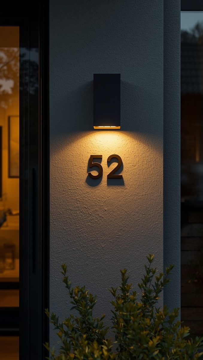
Your house numbers are the very first thing people notice, even before they clock your front door color.
They’re basically your home’s opening line.
And most homes, mine included at one point, are stuck saying something boring.
I remember standing at the end of my driveway with my coffee, just staring at those flat little silver numbers the builder slapped on.
They said nothing.
No warmth, no charm, nothing that hinted at who lived inside.
So here’s my little theory, and I stand by it.
A house with beautiful numbers feels cared for.
It tells your mail carrier, your guests, even a stranger driving by, that someone here pays attention to the little things.
And honestly, that feeling matters more than we give it credit for.
If you only fix one thing on your exterior this month, I’d start here.
It’s cheap, it’s fast, and it changes how the whole front of your home reads.
I think of it like putting on a great necklace before you walk out the door.
Small thing, huge impact.
Picking a Font That Actually Matches Your Home’s Personality

Okay, this is the part people skip, and it’s honestly my favorite part.
Your font is basically your home’s handwriting.
A skinny serif number on a farmhouse just feels off, kind of like wearing heels with sweatpants.
When I redid my own numbers, I spent way too long comparing fonts, and I regret nothing.
For a modern or contemporary home, go with a clean sans-serif, something with straight lines and no fuss.
For a cottage or bungalow, a slightly rounded, friendly font feels so much more like a hug.
And if your home leans traditional, a classic serif with a little flourish just feels right, like it’s always belonged there.
My tip here is simple.
Stand across the street and squint at your house.
Ask yourself, does it feel cozy, modern, romantic, or bold.
Let that one word guide your font choice.
It sounds silly, but it works every time.
And if you’re stuck between two options, I always say pick the one that feels a little more you than expected.
Matte Black Numbers, The Classic That Just Never Fails

I have a small obsession with matte black, if we’re being honest.
It’s the little black dress of house numbers.
It works on brick, it works on white siding, it works on stone, it basically works everywhere.
When I switched mine to matte black, my next door neighbor actually texted me a photo of it.
That’s how much of a difference it made.
The reason it works so well is contrast.
Matte black creates this crisp, grounded look against almost any exterior color, so your eye goes right to it.
And there’s something about the finish, not shiny, not flashy, just quietly confident.
If your home has warm tones, like a creamy exterior or wood accents, matte black adds just enough edge without feeling harsh.
My personal tip is to avoid glossy black if you can.
Glossy catches glare and honestly looks a bit cheap in direct sunlight.
Matte just feels more expensive, even when it costs the same.
If you want a small variation, try mixing matte black numbers with a matte black light fixture nearby.
It ties the whole look together in the sweetest way.
Brass and Gold Tones for a Warmer, Softer Welcome

If matte black is the little black dress, brass is the gold hoops you never take off.
I have a friend with a soft yellow cottage, and she did her numbers in warm brass, and I actually gasped a little when I saw it.
It just glowed against that buttery exterior.
Brass and gold tones bring warmth, and warmth is what makes a house feel like a home instead of a building.
They work beautifully on cream, sage green, dusty blue, and Warm Wood Tones especially.
There’s an emotional reason this combo works so well.
Gold tones read as inviting, almost like candlelight, so your home feels welcoming before anyone even reaches the door.
My tip here is to choose an aged or antique brass finish over a super shiny one.
Aged brass ages gracefully outdoors and doesn’t show water spots the way polished brass does.
If you’re nervous about full brass, try it as an accent, maybe just the house number plaque itself, with black numbers on top.
It’s a soft way to test the look before committing fully.
Floating Numbers Versus Flush Mount, Which One Fits You

This one comes up so often in my inbox, so let’s talk about it.
Floating numbers are mounted with small spacers, so they sit slightly off the wall and cast this delicate little shadow.
Flush mount numbers sit directly against the surface, clean and simple, no shadow play.
I went floating on my own house, and I genuinely love the shadow it creates in the late afternoon light.
It’s such a small detail, but it makes the numbers feel dimensional instead of flat.
Floating tends to look more modern and a little more custom.
Flush mount feels classic, tidy, and honestly a bit easier to install if you’re doing it yourself for the first time.
If your exterior is textured, like stucco or stone, floating numbers usually look cleaner because they sit above the uneven surface.
If your exterior is smooth siding or a flat panel, flush mount can look really polished too.
My honest tip, if you’re torn, go floating.
That little shadow does so much visual heavy lifting for barely any extra cost.
It’s the kind of detail people notice without knowing exactly why they love it.
Playing With Placement, Vertical Lines and Unexpected Spots

Nobody talks about this enough, so let’s fix that right now.
You don’t have to line your numbers up horizontally like everyone else on your street.
Vertical house numbers, stacked one on top of the other, look so unexpected and kind of architectural.
I tried this on a little side porch project and it instantly felt more designer than anything I’d done before.
It works especially well next to a front door, running alongside the frame instead of above it.
Another placement I love is on a porch post, wrapped around the wood in a clean vertical line.
It draws the eye up and adds height to a low porch, which is such a nice little trick.
If you have a covered entry, try placing your numbers on the support beam instead of the wall.
It feels intentional, like you actually thought about your entryway instead of just following the standard.
My tip is to always mock it up with painter’s tape first.
Stick pieces of tape where each number would go, then step back and look before you drill a single hole.
Trust me, future you will thank present you.
Adding a Light Above Your Numbers for Nighttime Charm

If I had a small entryway, this is the very first thing I’d add.
A little light fixture right above your house numbers.
It’s such a small addition, but it completely changes how your home feels once the sun goes down.
I added a tiny brass sconce above mine last fall, and now I genuinely look forward to driving home in the evening just to see it lit up.
There’s something so cozy about a softly lit number against a dark exterior.
It feels like your house is saying, come on in, we’ve been waiting for you.
Beyond the charm factor, it’s practical too.
Guests can actually find your address at night, which sounds obvious but so many homes get this wrong.
My tip is to go with a warm white bulb, never a cool blue-white one.
Warm light makes everything, your siding, your door, your numbers, feel golden and inviting instead of clinical.
A small solar sconce works great if you don’t want to deal with wiring.
It’s an easy weekend project that punches so far above its cost.
Painted Numbers, The Budget Friendly Option I Still Love

Okay, so this one is for anyone on a tighter budget, and I promise it still looks intentional.
Painted house numbers, either directly on a mailbox, a porch step, or a small wood plaque, can look so charming when done right.
I painted numbers on a little scrap of reclaimed wood for a friend’s cottage, and honestly, it stole the whole porch.
The trick is using a steady hand or a simple stencil, and taking your time.
Rushed paint job, and it shows immediately.
Slow, careful paint job, and it looks like a custom piece someone made just for you, because it is.
Choose a paint color that pulls from somewhere else on your exterior, like your door or your shutters.
That little bit of color repetition makes your whole front yard feel pulled together.
My tip here is to seal it with a clear outdoor sealant once it’s dry.
Sun and rain are not kind to unsealed paint, and you want this to last more than one season.
It’s the kind of project you can do with a five dollar can of paint and an afternoon.
Cheap, sweet, and surprisingly impressive.
Ceramic and Tile Numbers for Cottage and Coastal Vibes

There’s a softness to ceramic house numbers that metal just can’t replicate.
I found a little hand-painted ceramic number tile at a flea market once, and it completely changed how I saw my own front step.
Ceramic and tile numbers feel handmade, imperfect in the best way, like something you’d find in a seaside village.
They work beautifully with white or pale blue exteriors, and honestly anywhere with a relaxed, cottage feel.
The slight variation in glaze or color from tile to tile is part of the charm, not a flaw.
If your home has any coastal or farmhouse touches, this option ties right in without trying too hard.
My personal tip is to look for local pottery makers or small shops instead of big box stores.
You’ll usually find more character, and you’re supporting someone’s actual craft.
A fun variation is mixing tile numbers with a woven doormat and some potted herbs by the step.
It creates this whole little moment right at your entrance.
It’s not flashy, but it’s the kind of detail that makes people slow down when they walk up.
Getting the Size Right So Your Numbers Actually Read

This is the detail that gets overlooked constantly, and it drives me a little crazy.
Tiny numbers on a big house just disappear, no matter how pretty the font is.
A good general rule is numbers around four to six inches tall for most homes, and larger, up to a foot, if your house sits farther back from the street.
When I sized mine, I actually stood at the curb and had my husband hold up paper cutouts so I could see what read clearly from the road.
It felt a little silly, standing there squinting, but it saved me from ordering numbers that would’ve looked lost on my wall.
Spacing matters just as much as size.
Numbers crammed too close together read as one blurry shape from a distance.
Give them a little breathing room, and suddenly they’re so much easier to read.
My tip is to always check visibility at night too, not just during the day.
A number that looks great in daylight can vanish completely once it’s dark, especially without any nearby light source.
Get this right, and every other pretty detail actually gets to be seen.
Coordinating Your Numbers With Your Front Door Color

Your door and your numbers are basically a matched set, whether you’ve thought about it that way or not.
When I painted my front door a deep sage green, I knew the old silver numbers had to go immediately.
They just clashed, in that way you can’t quite explain but definitely feel.
Matte black numbers against a colorful door create such a striking, grounded look.
Brass or gold numbers soften a bold door color and add warmth instead of more contrast.
If your door is a neutral, like black or navy, this is actually your chance to have a little fun with a metallic number finish.
My tip is to hold a paint swatch of your door color next to a photo of the number finish you’re considering, right there in the store or online.
Colors read so differently outdoors than they do on a screen, so this little check saves you from a mismatch.
A sweet variation is choosing a house numbers plaque in a color that echoes your door, then mounting metal numbers on top.
It’s an extra step, but it looks so intentional.
This is the kind of pairing that makes people say your house just feels put together, without knowing exactly why.
Seasonal Touches That Make Your Numbers Feel Alive

I like to think of my house numbers as a tiny stage, and the season sets the scene.
Around fall, I tuck a small pumpkin or a few dried stems near mine, and it instantly feels warmer.
In spring, a little planter with trailing greenery underneath does the same thing in the sweetest way.
This isn’t about spending money on decorations.
It’s about drawing a tiny bit more attention to a spot on your house that’s already working hard for you.
I did this on a whim last winter with a small strand of warm white lights looped near my numbers, and neighbors kept commenting on it for weeks.
My tip is to keep it simple and let the numbers stay the star.
One small planter or one subtle string of lights is enough.
Overdoing it can bury the very thing you worked to make beautiful in the first place.
A nice variation is rotating a small wreath-style accent nearby throughout the year, tiny and understated, not the big front door version.
It keeps that entry feeling fresh without any real effort.
Related read: Things I Wish I Knew Before I Decorated My First Home — Instant PDF + Kindle download. Secure checkout by Stripe