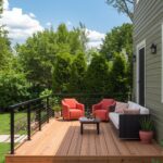
ooking to breathe new life into your tired deck?
The right paint color can completely revolutionize your outdoor living area without breaking the bank.
Colors have the power to set the mood, reflect your personality, and make your outdoor space feel like a natural extension of your home.
By the end of this guide, you’ll discover fantastic deck paint colors that combine style, durability, and curb appeal – plus insider tips on how to make each shade work for your specific outdoor space.
Here are game-changing deck colors that will have your neighbors asking for your secret!

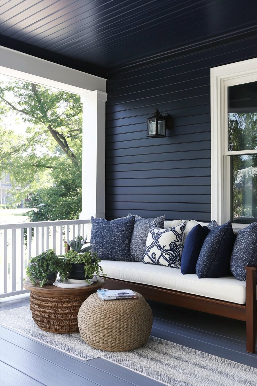
Classic Navy Blue: The Timeless Sophistication


Navy blue has become the new neutral for outdoor spaces, offering a perfect balance between bold statement and classic appeal.
This rich, deep tone brings a nautical elegance to your deck that feels both sophisticated and welcoming.
When you choose navy for your deck, you’re selecting a color that naturally hides dirt and scuff marks, making it ideal for high-traffic outdoor areas.
Navy blue creates a stunning backdrop for natural wood furniture, bright white accessories, or vibrant potted plants in yellows and oranges.
This versatile color works exceptionally well in coastal settings but can bring a touch of coastal charm to any home anywhere.
The blue undertones in navy create a calming atmosphere, making your deck feel like a peaceful retreat from the bustle of daily life.

For the best results, look for marine-grade deck paints in navy that offer UV protection to prevent fading under harsh sunlight.
Navy blue decks pair beautifully with homes in white, gray, beige, brick, or even sage green exteriors.
During evening gatherings, navy decks transform under string lights, creating a magical starry-night effect that elevates any outdoor entertainment.
This color choice shows particular staying power through changing seasons, looking equally appropriate during summer barbecues or when adorned with autumn decorations.
A navy deck can visually expand smaller spaces, especially when the surrounding landscape is lush and green.
Many designers recommend Benjamin Moore’s “Hale Navy” or Sherwin-Williams’ “Naval” for their perfect balance of depth without appearing black in outdoor applications.
The dramatic contrast between navy decking and light-colored furniture creates a high-end designer look that photographs beautifully for social media.
If you’re concerned about heat absorption, newer navy formulations include cooling technology that reflects rather than absorbs the sun’s rays.
A semi-gloss finish in navy provides just enough sheen to enhance the color’s depth while still being practical for an outdoor surface.
Tap to Explore These Beauties
See my ideas in action 👇 Tap any image to explore full details.
Weathered Gray: The Sophisticated Neutral

Weathered gray has emerged as the color of choice for homeowners seeking a contemporary yet timeless look for their outdoor spaces.
This versatile shade mimics naturally aged wood, giving your deck instant character without waiting years for that coveted patina.
When applied to your deck, weathered gray creates a sophisticated neutral backdrop that complements virtually any architectural style from farmhouse to ultra-modern.
The subtle variations within gray tones add visual interest to your deck surface, creating depth that flat colors simply can’t achieve.
Gray decking pairs exceptionally well with vibrant furniture cushions and accessories, allowing your decorative pieces to take center stage.
This adaptable color choice transitions seamlessly between seasons, looking equally appropriate with spring flowers or winter holiday decorations.
Weathered gray’s popularity stems from its remarkable ability to hide dirt, leaf stains, and the inevitable wear that outdoor spaces endure.
For homes near water, this color evokes driftwood and coastal elements, creating a natural connection to the surrounding environment.
Premium deck paints in weathered gray often incorporate subtle blue or brown undertones that add dimension and prevent the color from appearing flat or institutional.
The understated elegance of this shade works particularly well for larger deck areas where bolder colors might overwhelm the space.
When selecting weathered gray, consider samples with various undertones – cooler grays work well with blue and purple landscapes, while warmer grays complement red brick homes.
This color choice reflects current design trends while simultaneously channeling classic New England coastal aesthetics that never go out of style.
Weathered gray serves as an excellent transitional color between your home’s exterior and the natural surroundings, creating visual harmony across your property.
This particular shade shows exceptional durability against UV exposure, maintaining its intended appearance far longer than many darker alternatives.
The subtle sophistication of weathered gray attracts buyers with discriminating taste, potentially increasing your home’s resale value compared to more personalized color choices.
For the most natural appearance, look for weathered gray paints with slight variations in tone that mimic authentic aged wood grain patterns.
When paired with black metal railings and fixtures, weathered gray creates a modern industrial aesthetic that feels both current and timeless.
This versatile neutral serves as the perfect foundation for seasonal decor changes, allowing you to refresh your outdoor space without repainting.
Sage Green: The Natural Harmony Choice

Sage green brings the soothing essence of nature directly to your outdoor living space, creating perfect harmony with surrounding landscapes.
This soft, muted green with gray undertones strikes the ideal balance between color and neutrality for decks of all sizes.
When you choose sage green for your deck, you’re embracing a color that naturally complements foliage, making your outdoor space feel like an intentional extension of your garden.
This versatile hue appears differently throughout the day, shifting from a cool gray-green in morning light to a warmer, more vibrant tone in evening sunlight.
Sage green’s natural camouflaging abilities help disguise fallen leaves and pollen, requiring less frequent cleaning than stark white or dark deck colors.
This particular shade creates a visual connection between your built environment and the natural world, reducing the jarring transition between structure and landscape.
For homes with brick exteriors, sage green decking provides a complementary color that enhances the warmth of the red tones without competing for attention.
The understated elegance of sage creates a perfect backdrop for both neutral furniture and bold accent pieces in coral, rust, or deep purple.
This calming color choice has been shown to reduce stress, making your deck feel like a true sanctuary for relaxation after hectic days.
The versatility of sage green spans design styles from farmhouse rustic to contemporary minimalist, adapting to your aesthetic as accessories and furniture change.
When selecting a sage green deck paint, opt for formulations with built-in mildew resistance, as this mid-tone color can sometimes show water spots in humid climates.
The subtle sophistication of sage appears increasingly upscale when paired with natural wood elements like cedar pergolas or teak furniture.
This shade reflects just enough sunlight to keep your deck comfortable on warm days while providing enough pigment to hide scuffs and wear patterns.
For the most natural integration with your landscape, choose sage variations that echo the specific green tones in your property’s established vegetation.
Designers frequently recommend pairing sage green decks with copper or brass accents that will develop their own natural patina over time.
The timeless quality of sage green ensures your deck won’t look dated in five years, unlike trendier color choices that quickly identify with specific decades.
This earth-tone selection creates visual continuity when your property features stone elements, pulling from the subtle green undertones often present in natural stone.
When socializing on your sage green deck, guests often comment on the peaceful atmosphere, not realizing how significantly the color choice contributes to this feeling.
For year-round appeal, sage green transitions beautifully through seasons, looking fresh with spring blossoms and equally appropriate with autumn decorations.
Rather than competing with nature’s palette, this sophisticated choice enhances it, making both your plantings and hardscaping appear thoughtfully designed.
Find Your Room’s Color Palette
Tap a vibe — get a curated 5-color palette with hex codes you can copy ✨
Warm Terracotta: The Mediterranean Escape

Terracotta transforms your deck into a sun-drenched Mediterranean retreat, instantly adding warmth and character to any outdoor space.
This rich, earthy orange-red pulls inspiration from Italian villas and Spanish haciendas, bringing centuries of design heritage to your backyard.
When you choose terracotta for your deck, you’re embracing a color that radiates warmth even on cooler evenings, psychologically extending your outdoor season.
The natural clay undertones in terracotta create a perfect bridge between built structures and surrounding landscapes, particularly in areas with red soil or desert environments.
This vibrant yet earthy hue stands up remarkably well to fading, often developing a beautiful patina that adds character rather than looking worn.
Terracotta pairs exquisitely with turquoise accessories, creating a classic color combination that feels both timeless and fresh.
For homes with neutral exteriors, this warm deck color adds personality and visual interest without requiring a complete property makeover.
The rich depth of terracotta creates a perfect backdrop for lush greenery, making your plants appear more vibrant against this complementary background.
This color choice experiences resurgences in popularity every few decades, meaning your investment will likely come back into high trend repeatedly over your home’s lifetime.
When entertaining on a terracotta deck, the warm color creates a convivial atmosphere that encourages guests to relax and linger longer.
The natural pigments in quality terracotta deck paints reflect rather than absorb heat, making this surprisingly practical for warmer climates despite its rich tone.

💭 I Wrote a Book About My Biggest Decorating Mistakes!
When I decorated my first home, I thought I knew what I was doing. Spoiler: I didn’t. 😅
💸 I bought a sofa way too big for my living room. Paint colors that looked amazing in the store but terrible on my walls.
This earthy shade effectively hides dirt and pollen, requiring less frequent cleaning than lighter deck colors while still looking intentional and well-maintained.
For smaller deck spaces, terracotta creates an intimate atmosphere, embracing rather than fighting the cozy dimensions of your outdoor area.
The psychological warmth of this color makes it ideal for cooler climates where you’re trying to visually extend summer feelings into autumn months.
Terracotta’s connection to ancient pottery and traditional building materials gives it a timeless quality that transcends fleeting design trends.
When paired with wrought iron furniture or accessories, terracotta creates a rustic European aesthetic that brings old-world charm to American homes.
This particular color choice communicates hospitality and warmth, subtly signaling to visitors that your outdoor space is designed for comfort and connection.
For properties with southwestern or Mediterranean architectural elements, terracotta decking creates cohesion across your design narrative.
The vibrant yet natural quality of terracotta photographs exceptionally well, making your outdoor space shine in real estate listings or social media posts.
Unlike trendy colors that quickly date themselves, terracotta has maintained consistent presence in design palettes across centuries, ensuring long-term aesthetic relevance.
What’s Your Decor Personality?
5 questions · 30 seconds · Instant style match 🏡
Rich Espresso Brown: The Luxurious Foundation


Espresso brown brings an unmistakable air of luxury to your deck, creating a sophisticated foundation for outdoor living that rivals high-end interior spaces.
This deep, dark brown with subtle chocolate undertones offers timeless appeal that transcends passing trends.
When you choose espresso for your deck, you’re selecting a color that creates dramatic contrast with surrounding greenery, making your landscape pop against this rich backdrop.
The depth of this color creates a sense of grounding, making furniture and accessories appear to float above the deck surface with striking visual impact.
Espresso brown’s connection to fine furniture finishes brings interior design sensibilities outdoors, elevating your deck to true outdoor room status.
This rich color choice works exceptionally well on larger decks where lighter colors might feel washed out or lack the substantial presence needed to anchor the space.
The sophisticated depth of espresso creates a perfect neutral foundation for any design direction, from modern minimalist to traditional ornate styles.
Unlike medium browns that can sometimes appear dated, the intensity of true espresso remains consistently elegant through changing design cycles.
For homes with light-colored exteriors, an espresso deck creates architectural definition and visual weight that enhances your property’s overall design.
This dark tone hides surface imperfections exceptionally well, making older deck boards appear refreshed without replacing the entire structure.
The luxurious feel of espresso brown communicates intentional design choices, signaling to visitors that your outdoor space received the same careful consideration as your home’s interior.
For properties surrounded by lush greenery, this rich dark tone creates a perfect frame that showcases nature’s vibrancy without competing for attention.
When styled with crisp white cushions and natural textures, espresso decking creates a sophisticated outdoor palette that feels both current and timeless.
The dramatic depth of this color choice creates striking photo opportunities, especially when adorned with string lights that sparkle against the dark background.
For four-season climates, espresso creates a handsome winter foundation when other landscape elements have lost their color and visual interest.
This versatile color pairs beautifully with metals across the spectrum – from brass and copper to chrome and blackened steel – offering unlimited accessorizing options.
The psychological impact of this rich tone creates a sense of enclosure and security, making your deck feel like a true outdoor room rather than an exposed platform.
Espresso’s connection to coffee culture subtly suggests relaxation and conversation, perfectly aligned with how most people want to use their outdoor spaces.
For multi-level decks, this deep tone on the lower level creates a visual anchor while allowing upper levels to feel lighter and more expansive.
When maintained properly, espresso decking develops a subtle sheen that catches light beautifully, adding dimension rather than appearing flat or one-dimensional.
Coastal Teal: The Refreshing Statement


Coastal teal injects vibrant personality into your outdoor space, creating a refreshing statement that captures the essence of oceanside living regardless of your actual location.
This balanced blue-green hue bridges the gap between bold color choice and livable neutral, offering striking visual impact that remains comfortable for everyday enjoyment.
When you choose teal for your deck, you’re embracing a color that psychologically cools your outdoor space, making it appear more refreshing during hot summer months.
The natural association with water makes teal particularly appropriate for homes with pools or water features, creating visual continuity across your outdoor elements.
This versatile shade pairs beautifully with natural wood tones, creating a perfect backdrop for cedar furniture or redwood accents.
The unexpected yet harmonious quality of teal makes your outdoor space memorable, distinguishing your home from cookie-cutter deck designs throughout the neighborhood.
For homes with conservative exterior colors, teal decking introduces personality and character without committing to permanent architectural changes.
This vibrant yet sophisticated hue reflects changing skies, appearing differently throughout the day and creating a dynamic outdoor experience.
Teal’s position between blue and green allows it to complement both cool and warm color schemes, making it surprisingly versatile despite its distinctive character.
The emotional response to teal generally includes feelings of tranquility and rejuvenation, perfect for creating a deck space that serves as your personal retreat.
For coastal properties, this color choice creates an intuitive connection to nearby waters, while for inland homes, it brings a hint of vacation vibes to everyday living.
The rich saturation of teal provides excellent coverage for pressure-treated lumber, effectively disguising the yellowish undertone of new deck boards.
This particular shade shows remarkable staying power in design trends, maintaining relevance from mid-century modern through contemporary aesthetics.
When entertaining on a teal deck, the color creates an immediate conversation starter, signaling that your home celebrates individuality rather than conformity.
For smaller deck spaces, teal creates depth and interest that might otherwise be lacking in limited square footage.
This bold choice photographs extraordinarily well, making your outdoor space pop in real estate listings or social media posts.
The balanced undertones in teal create a perfect backdrop for both cool-toned and warm-toned accessories, offering unmatched decorating flexibility.
Unlike trendy turquoise that can quickly feel dated, the more sophisticated depth of teal maintains relevance through changing design cycles.
This particular shade complements both modern furniture with clean lines and antique pieces with ornate details, adapting to your personal style preferences.
When illuminated with warm outdoor lighting in the evening, teal takes on a magical quality that transforms your deck into an enchanting nighttime environment.
Soft Taupe: The Versatile Chameleon


Taupe delivers sophisticated neutrality to your deck, creating a chameleon-like foundation that adapts effortlessly to changing design trends and seasonal decorations.
This complex neutral, balancing gray and beige undertones, offers subtle depth that flat whites or standard browns simply cannot achieve.
When you choose taupe for your deck, you’re selecting a color that creates visual harmony with both the natural environment and your home’s architecture.
The chameleon-like quality of taupe allows it to appear cooler or warmer depending on surrounding elements, making it extraordinarily versatile for any property style.
This sophisticated neutral efficiently bridges the visual gap between indoor and outdoor spaces, creating seamless transitions when seen through doorways or windows.
The subtle depth of quality taupe deck paint reveals complex undertones that shift throughout the day, creating visual interest without demanding attention.
For homes with busy architectural details or vibrant landscaping, this understated deck color provides necessary visual rest rather than competing for focus.
Taupe’s remarkable adaptability allows your seasonal decorations and furniture choices to take center stage without clashing with the deck itself.
This particular neutral excels at disguising everyday dirt and pollen, maintaining a clean appearance with significantly less maintenance than stark whites or dark colors.
The timeless appeal of taupe ensures your deck investment remains stylish through changing design trends, avoiding dated looks associated with more specific colors.
For properties on the market, this universally appealing neutral appeals to the widest range of potential buyers without limiting their personal design visions.
The sophisticated restraint of taupe communicates design confidence, demonstrating that you understand true elegance often lies in subtle choices rather than bold statements.
This versatile foundation pairs effortlessly with any accent color from vibrant corals and teals to more subdued navy or forest green.
The visual texture created by taupe’s complex undertones adds dimension to your deck surface that flat, one-dimensional colors cannot provide.
For homes transitioning between design aesthetics, taupe offers a flexible foundation that accommodates evolving style preferences without requiring complete renovation.
The earthy quality of this color creates natural harmony with landscape elements while its gray undertones connect seamlessly with architectural features.
Unlike beige which can sometimes appear dated, taupe’s gray influence keeps it firmly in contemporary design conversations year after year.
This neutral superstar performs exceptionally well in both bright sunlight and evening settings, maintaining its intended character throughout changing light conditions.
For multi-season use, taupe creates a perfect year-round backdrop that complements both summer brights and autumn earth tones without missing a beat.
The subtle sophistication of this shade elevates your entire outdoor space, making even modest deck furnishings appear more luxurious against this refined background.
This or That?
Pick your fave — see what other readers chose! 👀
Classic White: The Timeless Brightener


Classic white brings unmatched crisp freshness to your deck, creating a timeless backdrop that maximizes the feeling of space and light in any outdoor area.
This clean, bright choice instantly modernizes older deck structures, giving them new life with minimal investment beyond the paint itself.
When you choose white for your deck, you’re embracing a color that significantly reduces surface temperatures on hot summer days, creating a more comfortable barefoot experience.
The reflective quality of white decking brightens shadier yard sections, effectively functioning as a natural light amplifier for surrounding areas.
This versatile neutral creates the perfect foundation for any design direction, from nautical themes with navy accents to bohemian styles with multicolored textiles.
White decking visually expands smaller spaces, making modest decks appear more generous and creating an airier feeling throughout your outdoor living area.
The timeless quality of white transcends fleeting color trends, ensuring your deck maintains its fresh appeal through changing design cycles.
For homes with colorful exteriors, white decking creates visual breathing room that prevents the overall property from feeling overwhelming or busy.
This bright choice creates dramatic contrast with surrounding greenery, making your landscape plantings appear more vibrant and intentional against the clean backdrop.
The psychological impact of white creates feelings of cleanliness and order, subtly influencing how guests perceive your entire property’s maintenance level.
For evening entertaining, white decking maximizes the impact of landscape lighting, creating a luminous surface that enhances overall ambiance without additional fixtures.
This particular color choice photographs exceptionally well, capturing more light and detail in pictures than darker alternatives would allow.
The versatility of white accommodates seasonal decorating with unmatched flexibility, providing a neutral canvas for holiday decor from summer brights to winter greens.
For traditional architectural styles, white decking connects to historical precedents while simultaneously feeling fresh and current in today’s design landscape.
This classic choice creates striking definition when paired with black furniture or railings, embracing the enduring appeal of high-contrast design.
White’s unique ability to visually recede while simultaneously brightening makes it ideal for creating outdoor spaces that feel expansive and inviting.
The clean simplicity of white decking communicates intentional design choices rather than design indecision, particularly when coordinated with other exterior elements.
For coastal properties, white creates natural continuity with traditional seaside architecture while reflecting heat to keep surfaces comfortable in direct sun.
This particular shade requires more frequent cleaning than darker alternatives, but rewards your maintenance efforts with unmatched crispness and visual appeal.
The timeless elegance of white decking creates a sophisticated foundation that elevates the perceived value of your entire outdoor living space.
💭 Ever wondered what your room would actually look like rearranged?
I built a free tool that lets you drag furniture around a 2D floor plan. No signup, no catch.
See the Room Planner →Slate Blue: The Sophisticated Standout


Slate blue delivers unexpected sophistication to your deck, offering the perfect balance between distinctive color and practical neutrality.
This complex blue-gray hue changes dramatically with shifting light, creating a dynamic outdoor surface that reveals new dimensions throughout the day.
When you choose slate blue for your deck, you’re selecting a color with subtle depth that appears differently in sunlight versus shade, creating visual interest without overwhelming the space.
The nuanced undertones in quality slate blue paint connect seamlessly with both natural stone elements and architectural features, creating cohesion across your property.
This versatile color bridges the gap between traditional and contemporary aesthetics, making it appropriate for homes across the architectural spectrum.
The sophisticated restraint of slate blue communicates design confidence, showing thoughtful color selection rather than following predictable outdoor trends.
This particular shade creates a perfect backdrop for both warm-toned woods and metal furniture, offering exceptional design flexibility.
The subtle, complex nature of slate blue allows it to function practically as a neutral while still providing more personality than standard grays or tans.
For homes with red brick or warm stone exteriors, this cool-toned deck color creates pleasing contrast that highlights both elements without competition.
This distinctive yet approachable color photographs beautifully in all lighting conditions, making your outdoor space shine in real estate listings or social media shares.
Slate blue’s natural association with water and sky creates a subconscious connection to nature even in urban settings with limited greenspace.
The depth of this color effectively disguises everyday scuffs and dirt, maintaining a clean appearance with less obvious wear than lighter alternatives.
For properties with swimming pools, this color creates visual continuity between water features and deck spaces, enhancing overall landscape cohesion.
This sophisticated choice pairs beautifully with copper or brass accents that will naturally patina over time, creating evolving color relationships throughout the seasons.
Slate blue creates a perfect foundation for both coastal decor themes and mountain-inspired design directions, adapting effortlessly to your specific location.
The timeless quality of this color ensures long-term aesthetic relevance, unlike trendy blues that quickly identify with specific design eras.
For regions with frequent overcast days, slate blue maintains its character even in flat light, while still revealing rich depth when the sun emerges.
This versatile hue creates a perfect transitional color between your home’s interior and the natural landscape, facilitating visual flow from indoor to outdoor spaces.
The unexpected yet harmonious quality of slate blue deck creates memorable first impressions that distinguish your home from standard beige and brown options throughout the neighborhood.
Unlike navy that can sometimes appear almost black in lower light, slate blue maintains its distinctive blue character throughout changing light conditions.
Quick Design Dilemma
Cast your vote — see what other readers think! 🤔
Rustic Red: The Bold Heritage Statement

Rustic red brings dramatic heritage appeal to your deck, connecting to traditional barn red while offering updated sophistication for contemporary homes.
This rich, earthy red contains subtle brown undertones that prevent it from appearing artificially bright or cartoonish in outdoor settings.
When you choose rustic red for your deck, you’re embracing a color with deep American architectural heritage that still feels fresh and relevant today.
The natural mineral quality of rustic red contains complex undertones that shift throughout the day, creating visual depth that flat modern reds simply cannot achieve.
This bold yet earthy choice creates striking contrast with surrounding greenery, making your landscape appear more vibrant against this complementary background.
For homes with neutral exteriors, rustic red decking adds personality and character without requiring changes to the main structure’s color scheme.
This heritage color actually improves with age, developing a rich patina over time that adds authentic character rather than appearing worn or faded.
Rustic red’s connections to traditional farmhouse aesthetics allow it to bridge casual and formal design approaches with equal success.
For properties with historic elements, this color choice creates visual continuity with architectural traditions while still feeling intentional rather than outdated.
The psychological warmth of red creates a naturally inviting atmosphere for gatherings, subtly encouraging conversation and connection in your outdoor space.
This rich tone pairs beautifully with natural stone elements, pulling out the warm mineral undertones present in many landscape features.
Unlike brighter Chinese reds, the earthy quality of rustic red allows it to function almost as a neutral in outdoor settings while still providing distinctive character.
For homes in heavily wooded settings, this warm color creates a perfect visual bridge between architectural elements and natural surroundings.
The traditional associations with rustic red create an immediate sense of established permanence, making newer constructions feel more settled in the landscape.
This bold color choice demonstrates design confidence, showing thoughtful selection rather than defaulting to expected neutral deck colors.
For snowy regions, rustic red creates striking winter beauty against white landscapes, ensuring your outdoor space remains visually interesting year-round.
This rich tone effectively hides everyday dirt and leaf stains, maintaining its handsome appearance with less frequent cleaning than lighter alternatives would require.
The natural pigments in quality rustic red deck paint age gracefully, developing character rather than simply fading like many synthetic bright colors.
For entertaining spaces, this warm color creates an immediate atmosphere of hospitality that welcomes guests before they even sit down.
The timeless appeal of rustic red ensures your deck will maintain its distinctive character through changing design trends, avoiding the dated appearance of more trendy color choices.
Remember that quality matters as much as color – invest in premium deck paint specifically formulated to withstand your climate’s particular challenges.
Now it’s time to grab some sample pots, test your favorites in different lighting conditions, and transform your outdoor space into the retreat you’ve always imagined!
💭 I Wrote a Book About My Biggest Decorating Mistakes!
When I decorated my first home, I thought I knew what I was doing. Spoiler: I didn’t. 😅
💸 I bought a sofa way too big for my living room. Paint colors that looked amazing in the store but terrible on my walls.