ust like finding the perfect frame for a beautiful painting, the right wall color will make your emerald carpet look even more amazing.
Some colors will create dramatic contrast that makes your space feel energetic and exciting, while others create a calming, harmonious flow that feels peaceful and natural.
Maybe you want your emerald carpet to be the star of the show, or perhaps you’re looking for a perfect partner that shares the spotlight.
Get ready to fall in love with your emerald carpet all over again!
Design Your Dream Room in Minutes! – By Madison
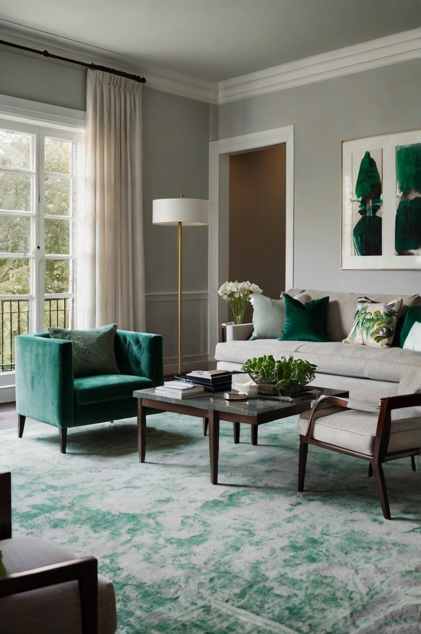
🏡 Start Creating FREE →Soft Gray: Modern Sophistication


Gray walls create a sophisticated, contemporary backdrop that allows emerald green carpet to make a statement.
This combination feels urban and refined, perfect for modern spaces that still want warmth and character.
The cool undertones in light gray paint balance the richness of emerald green, creating visual harmony without competing for attention.
Popular gray options like Benjamin Moore’s “Gray Owl” or Sherwin-Williams “Repose Gray” have subtle undertones that complement the jewel tone of emerald carpeting.
This pairing creates a perfect backdrop for modern furniture with clean lines, particularly in black, white, or natural wood finishes.
In rooms with gray walls and emerald carpet, metallic accents in silver, chrome, or pewter add cohesion and sophisticated sparkle.
This color combination works beautifully in home offices, dining rooms, or living spaces where you want a put-together look that isn’t overly formal.
Gray’s neutrality means you can introduce accent colors through art and accessories without creating visual clutter or competition.
The contrast between gray walls and emerald carpet creates visual interest while still feeling serene and balanced.
If your space lacks natural light, choose a warm-leaning gray to prevent the room from feeling too cool or sterile.
This combination feels particularly current while having staying power – it won’t quickly look dated as some trendier color pairings might.
For a more dramatic look, consider a darker charcoal gray, which creates a moody, cocoon-like effect when paired with emerald carpet.
The gray-and-emerald combination works equally well in large, open spaces and smaller, cozier rooms, making it versatile for various home layouts.
Tap to Explore These Beauties
See my ideas in action 👇 Tap any image to explore full details.
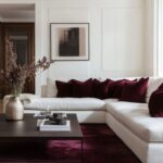
Crisp White: The Perfect Canvas
White walls create a clean backdrop that allows your emerald green carpet to be the star of the show.
The contrast between bright white walls and rich emerald flooring creates a fresh, modern look with tons of visual impact.
This combination works especially well in spaces that get plenty of natural light, making both colors appear even more vibrant.
When you choose white paint with emerald carpet, you’re creating a versatile foundation that works with nearly any furniture style or accent colors.
Benjamin Moore’s “Simply White” and Sherwin-Williams “Pure White” are excellent choices that have just enough warmth to keep the room from feeling cold.
For a slightly softer look, consider off-whites with the faintest hint of cream, which creates a more relaxed contrast while still keeping the space bright.
The white-and-emerald combination creates a perfect backdrop for gold or brass accessories, which pick up the warm undertones in your carpet.
In rooms with white walls and emerald carpet, wood furniture in medium to dark tones helps bridge the contrast and adds natural warmth.
This pairing works beautifully in both modern and traditional spaces – in contemporary rooms, it creates clean lines and dramatic contrast, while in traditional spaces it feels fresh and updated.
White walls also make your room feel larger and more open, which can balance the visual weight of a dark green carpet.
Adding texture to white walls through techniques like board and batten, beadboard, or even textured wallpaper prevents the contrast from feeling too stark.
For a truly polished look, consider painting trim and moldings in a glossier finish than your walls, creating subtle dimension that enhances the sophisticated feeling.
Warm Beige: Timeless Elegance
Beige paint creates a soft, warming effect that balances the coolness of emerald green carpet.
This combination feels timeless and elegant, perfect for traditional spaces or rooms where you want a sense of calm sophistication.
The neutral beige walls allow your emerald carpet to shine while creating a more subtle contrast than stark white.
When selecting beige paint, look for options with slight yellow or pink undertones that complement the richness of emerald – Sherwin-Williams “Accessible Beige” or Benjamin Moore’s “Manchester Tan” are excellent starting points.
This pairing creates a versatile backdrop for artwork and furniture, allowing you to incorporate additional colors through accessories.
Beige and emerald together evoke a natural, organic palette that feels connected to the outdoors while remaining refined.
In rooms without much natural light, beige walls prevent the space from feeling too dark or cave-like when paired with rich emerald flooring.
This combination works beautifully with natural materials like rattan, wicker, and light to medium wood tones.
For a more layered look, consider incorporating textiles with patterns that include both your wall color and emerald green.
Beige walls with emerald carpet create an excellent foundation for either a neutral-focused design or one with strategic pops of accent colors like coral, navy, or gold.
The warmth of beige helps make emerald carpet feel more inviting in spaces where you want to encourage relaxation, like bedrooms or family rooms.
If your emerald carpet has blue undertones, choose beige with peach undertones to create balance; if your carpet has yellow undertones, beige with subtle yellow tones creates harmony.
This combination allows for seasonal decor changes without clashing, making it practical for spaces you like to refresh throughout the year.

💭 I Wrote a Book About My BIGGEST Decorating Mistakes!
When I decorated my first home, I thought I knew what I was doing. Spoiler alert: I DIDN’T. 😅
💸 I bought a sofa that was WAY TOO BIG for my living room. I chose paint colors that looked amazing in the store but terrible on my walls. I spent THOUSANDS on pieces that didn’t work together. Sound familiar?
“Things I Wish I Knew Before I Decorated My First Home” is your shortcut to avoiding ALL my costly mistakes. ✨ Inside, you’ll find practical, NO-NONSENSE advice that will save you time, money, and a whole lot of decorating regret. 🏡
Design Your Dream Room in Minutes! – By Madison
🏡 Start Creating FREE →Pale Blush Pink: Unexpected Charm
Blush pink walls create a surprisingly perfect complement to emerald green carpet, tapping into the classic appeal of pink and green combinations.
This pairing feels fresh, fashionable, and slightly unexpected, adding personality to any room.
The soft warmth of blush pink balances the coolness of emerald, creating a space that feels both vibrant and soothing.
For this combination to work best, choose a muted, sophisticated blush rather than a candy pink – Benjamin Moore’s “Pink Damask” or Sherwin-Williams “Intimate White” are beautiful options.
This color pairing creates a perfect backdrop for gold or brass accents, which enhance the warmth and richness of both the pink walls and green carpet.
In bedrooms or dressing areas, this combination feels glamorous and feminine without being overwhelming or juvenile.
The pink and green combination has historical roots in traditional design but feels updated and fresh in modern contexts.
Natural light enhances this pairing beautifully, bringing out the subtle undertones in both colors for a dimensional look.
For a cohesive design, incorporate small touches of emerald in your wall decor, and blush accents in your floor-level items like poufs or throw pillows.
This combination creates a perfect backdrop for artwork featuring botanicals or nature scenes, enhancing the garden-inspired feeling.
Furniture in light wood tones or white helps maintain the airy feeling of this color combination.
If you’re concerned about the pink being too dominant, consider using it on just one accent wall, with remaining walls in a complementary neutral.
This unexpected color pairing shows design confidence and creates spaces that feel personally curated rather than straight from a catalog.
Find Your Room’s Color Palette
Tap a vibe — get a curated 5‑color palette with hex codes you can copy ✨
Navy Blue: Dramatic Depth
Navy blue walls paired with emerald green carpet create a rich, dramatic space with incredible depth and character.
This bold combination feels luxurious and cozy, perfect for creating intimate spaces like dining rooms, libraries, or media rooms.
The depth of both colors creates a jewel-box effect that feels both traditional and thoroughly modern.
When selecting navy paint, choose options with slight green undertones like Benjamin Moore’s “Hale Navy” or Sherwin-Williams “Naval” to create subtle harmony with your emerald carpet.
This powerful combination benefits from contrasting lighter elements – white trim, light ceiling paint, and strategic lighting prevent the space from feeling too dark.
Navy and emerald together create the perfect backdrop for antique furniture pieces, giving traditional items a contemporary context.
The rich blue walls make the green carpet feel intentional and designed rather than simply a bold flooring choice.
This color pairing works beautifully with art and accessories in gold, brass, or copper tones, which pop dramatically against the deep background colors.
In rooms with architectural features like crown molding or built-ins, navy paint highlights these details while complementing your emerald flooring.
For balance in navy and emerald rooms, incorporate textiles and accessories in lighter neutrals like cream or tan.
This combination creates spaces that feel different throughout the day – dramatically bold in daylight and intimately cozy in evening light.
The navy-emerald pairing feels particularly sophisticated in spaces where you entertain guests, creating memorable rooms with distinct personality.
For a slightly less intense version of this look, consider a navy accent wall with remaining walls in a lighter, related blue tone.
Pale Sage Green: Tonal Harmony
Sage green walls create a beautiful tonal relationship with emerald carpet, producing a soothing, nature-inspired space.
This green-on-green approach feels cohesive and intentional, perfect for creating peaceful rooms with visual flow.
The lighter sage walls prevent the emerald carpet from feeling too dominant, creating balance while maintaining the green theme.
Good sage options include Benjamin Moore’s “Saybrook Sage” or Sherwin-Williams “Clary Sage,” which have enough gray to contrast with the richer emerald.
This combination creates rooms that feel connected to nature, making it perfect for spaces where you want to encourage relaxation and restoration.
The tonal green approach works beautifully with natural wood furniture, particularly in light to medium finishes.
In sage and emerald spaces, incorporate texture through natural materials like linen, cotton, and jute to add dimension to the monochromatic color scheme.
This pairing feels particularly effective in bedrooms, creating a cocoon-like effect that promotes rest and calm.
The green-on-green combination provides a perfect backdrop for houseplants, which look striking against the complementary wall color.
For visual interest, incorporate patterns that include both sage and emerald tones in your upholstery or window treatments.
This tonal approach works well in spaces that flow into rooms with different color schemes, providing a gentle transition between areas.
The subtle contrast between sage walls and emerald carpet creates spaces that feel sophisticated yet approachable.
This combination has timeless appeal, feeling both currently fashionable and historically grounded in classic color theory.
Buttercream Yellow: Sunny Warmth
Buttercream yellow walls create a cheerful, warm contrast to cool-toned emerald green carpet.
This pairing feels sunny and welcoming, perfect for spaces where you want to create an uplifting atmosphere.
The yellow-green combination has roots in nature, evoking sunlight filtering through leaves for a fresh, organic feel.
Choose soft, buttery yellows rather than bright lemon tones – Benjamin Moore’s “Hawthorne Yellow” or Sherwin-Williams “Friendly Yellow” work beautifully.
This combination creates rooms that feel good in any light, maintaining their warmth even on gray days or in spaces with limited natural light.
Yellow and green together create a perfect backdrop for white furniture and accents, which provide crisp contrast to both colors.
This pairing feels particularly effective in morning-use spaces like breakfast rooms, kitchens, or east-facing bedrooms.
The contrasting warm-cool relationship creates visual interest while maintaining a cohesive, nature-inspired palette.
In family spaces, this combination creates an energetic yet balanced background for daily activities.
For a more sophisticated take on this sunny pairing, incorporate gold or brass accents and artwork with both yellow and green tones.
This combination works particularly well in traditional homes, complementing classic architecture while still feeling fresh.
To prevent the yellow from overwhelming the space, consider using it on just two walls, with remaining walls in a complementary neutral.
The yellow-emerald combination feels timeless yet personal, creating spaces with clear design intention.
Design Your Dream Room in Minutes! – By Madison
🏡 Start Creating FREE →Rich Chocolate Brown: Earthy Elegance
Chocolate brown walls create a rich, earthy backdrop that makes emerald carpet feel like a natural extension of an organic color scheme.
This combination feels grounded and sophisticated, perfect for creating spaces with depth and warmth.
The brown-green pairing mimics combinations found in nature, creating rooms that feel inherently harmonious and welcoming.
Select brown paint with red undertones like Benjamin Moore’s “Coffee” or Sherwin-Williams “Turkish Coffee” to complement the richness of emerald.
This color combination creates a perfect backdrop for leather furniture, wood accents, and natural textiles.
Brown walls help emerald carpet feel less bold and more integrated into an overall design vision.
This pairing creates cozy, intimate spaces perfect for rooms where you gather in evenings or want a sense of enclosure and warmth.
The rich contrast between dark walls and vibrant carpet creates dramatic spaces with character and depth.
In brown and emerald rooms, incorporate cream or ivory accents to prevent the space from feeling too dark or heavy.
This combination works beautifully with traditional furniture styles, creating rooms with timeless, library-like appeal.
For balance in spaces with limited natural light, use plenty of strategic lighting and mirrors to brighten corners and reflect light.
Brown and emerald together create a perfect backdrop for artwork and accessories in gold or brass, which add warmth and gleam to the rich color scheme.
This strong color combination shows design confidence and creates memorable spaces with distinct personality.
What’s Your Decor Personality?
5 questions · 30 seconds · Instant style match 🏡
Powder Blue: Fresh Contrast
Powder blue walls create a cool, fresh contrast that brings out the richness of emerald green carpet.
This combination feels both soothing and vibrant, creating spaces with energy and calm in perfect balance.
The blue-green pairing has natural harmony, reflecting colors often found together in outdoor landscapes.
Choose soft, gray-leaning blues like Benjamin Moore’s “Breath of Fresh Air” or Sherwin-Williams “Rainwashed” for sophisticated coordination.
This color combination works beautifully in bedrooms, creating restful spaces that still have personality and character.
The contrast between the soft walls and rich flooring creates visual interest without competing elements.
In powder blue and emerald rooms, silver or chrome accents add cohesion and sparkle to the cool color scheme.
This pairing creates a perfect backdrop for white furniture, which provides crisp definition against both colors.
For additional color, incorporate purple or lavender accents, which complement both the blue and green tones.
The powder blue and emerald combination feels particularly effective in spaces that get natural light, which enhances the freshness of both colors.
This pairing works well in both traditional and contemporary settings, depending on your furniture and accessory choices.
Consider adding subtle patterns that incorporate both blue and green tones through textiles or wallpaper in adjacent spaces.
This combination creates spaces that feel carefully designed yet livable and comfortable for everyday use.
💭 I Wrote a Book About My BIGGEST Decorating Mistakes!
When I decorated my first home, I thought I knew what I was doing. Spoiler alert: I DIDN’T. 😅
💸 I bought a sofa that was WAY TOO BIG for my living room. I chose paint colors that looked amazing in the store but terrible on my walls. I spent THOUSANDS on pieces that didn’t work together. Sound familiar?
“Things I Wish I Knew Before I Decorated My First Home” is your shortcut to avoiding ALL my costly mistakes. ✨ Inside, you’ll find practical, NO-NONSENSE advice that will save you time, money, and a whole lot of decorating regret. 🏡
Soft Lavender: Unexpected Harmony
Lavender walls create an unexpected yet harmonious companion to emerald green carpet, tapping into complementary color theory.
This combination feels fresh and distinctive, perfect for spaces where you want to create a memorable impression.
The purple-green pairing has roots in nature but feels fashion-forward in interior applications.
Choose muted, gray-leaning lavenders like Benjamin Moore’s “Violet Mist” or Sherwin-Williams “Sensitive Tint” for sophisticated coordination.
This color combination creates a perfect backdrop for either silver or gold accents, making it versatile for various metallic preferences.
In lavender and emerald rooms, white trim and ceiling paint provide necessary contrast and definition.
This pairing feels particularly effective in spaces used primarily by adults, like formal living rooms, home offices, or primary bedrooms.
The contrast between the soft walls and rich flooring creates spaces with depth and personality without overwhelming the senses.
For a cohesive look, incorporate small touches of lavender in floor-level accessories and emerald accents at wall level.
This combination creates a perfect backdrop for artwork featuring botanical themes or abstract pieces with both purple and green tones.
The lavender-emerald pairing works beautifully with light wood furniture, which adds warmth to the cool color scheme.
For visual interest, consider incorporating patterns that include both lavender and emerald in textiles or accessories.
This unexpected color combination shows design confidence and creates spaces with a custom, personally curated feeling.
Charcoal Gray: Modern Elegance
Charcoal gray walls create a dramatic, sophisticated backdrop that makes emerald carpet feel luxurious and intentional.
This bold combination feels urban and refined, perfect for creating spaces with depth and character.
The dark walls/rich carpet pairing creates rooms with a cocoon-like quality, ideal for spaces where you want intimacy and drama.
Select true charcoal grays like Benjamin Moore’s “Kendall Charcoal” or Sherwin-Williams “Peppercorn” that have enough depth to create contrast.
This color combination creates a perfect backdrop for artwork and accessories in bright white or metallic finishes, which pop dramatically against the dark background.
In charcoal and emerald rooms, strategic lighting becomes essential – incorporate multiple light sources at different heights to create dimension.
This pairing feels particularly effective in spaces used for evening entertaining or media rooms where a darker ambiance is desired.
The contrast between dark walls and rich flooring creates spaces that feel both contemporary and timeless.
For balance in charcoal and emerald rooms, incorporate lighter textiles and accessories to prevent the space from feeling too heavy.
This combination works beautifully with contemporary furniture in clean lines and simple shapes.
For visual continuity in open floor plans, consider using the charcoal as an accent wall that transitions to lighter, related grays in adjoining spaces.
The dark gray-emerald pairing creates spaces with photographic quality, looking striking in both real life and in photos.
This powerful color combination makes a statement about your design confidence and creates memorable rooms with distinct personality.
Design Your Dream Room in Minutes! – By Madison
🏡 Start Creating FREE →Ivory: Classic Foundation
Ivory walls create a warm, soft backdrop that allows emerald green carpet to shine without the stark contrast of pure white.
This combination feels classic and timeless, perfect for creating spaces with traditional elegance.
The subtle warmth of ivory balances the coolness of emerald green, creating visual harmony throughout the room.
Choose true ivory tones like Benjamin Moore’s “Ivory White” or Sherwin-Williams “Alabaster” that have creamy undertones without appearing yellow.
This color pairing creates a versatile foundation for furniture in any wood tone, from the darkest mahogany to the lightest oak.
In ivory and emerald rooms, gold or brass accessories add warmth and coordination to the classic color scheme.
This combination feels particularly effective in formal living spaces or dining rooms where traditional elegance is desired.
The subtle contrast allows architectural details like crown molding or ceiling medallions to shine without competing with bold wall color.
For visual interest, incorporate patterns that include both ivory and emerald tones in your upholstery or window treatments.
This pairing creates spaces that feel bright and airy while still having the richness that emerald carpet provides.
In rooms with ivory walls and emerald carpet, art and accessories in black or dark brown provide valuable contrast and visual anchoring.
The ivory-emerald combination has enduring appeal, creating spaces that won’t quickly look dated as color trends change.
This classic foundation allows for seasonal decor changes and evolving style preferences while maintaining its timeless elegance.
Room Decorating Budget Calculator
Get a realistic estimate before spending a single dollar 🙌
Coral: Bold and Beautiful
Coral walls create an energetic, fashionable contrast to emerald green carpet, tapping into color combinations currently trending in interior design.
This bold pairing feels modern and confident, perfect for creating spaces with personality and flair.
The warm coral tones complement the cool emerald, creating a balanced space with visual excitement.
Choose sophisticated coral shades like Benjamin Moore’s “Coral Gables” or Sherwin-Williams “Coral Reef” that have enough brown undertones to feel grounded.
This color combination creates a perfect backdrop for both natural wood elements and metallic accents in gold or brass.
In coral and emerald rooms, incorporate plenty of white or cream to provide visual breaks from the saturated color pairing.
This combination feels particularly effective in spaces where you want to create energy and conversation, like dining rooms or living areas.
The contrast between warm walls and cool flooring creates spaces with dimension and interest at every level.
For a more subtle approach to this bold pairing, consider using coral as an accent wall with remaining walls in a complementary neutral.
This combination works beautifully with light wood furniture, which bridges the warm-cool contrast with natural tones.
For cohesion, incorporate small touches of emerald in your wall decor, and coral accents in your floor-level accessories.
The coral-emerald pairing creates spaces that feel current and fashion-forward while having enough classic color theory behind them to avoid quickly becoming dated.
This statement-making combination shows design confidence and creates rooms that reflect personality rather than playing it safe.