ray has established itself as the ultimate neutral backdrop in modern home design.
With gray walls and carpet creating your room’s foundation, you’ve set the stage for virtually endless furniture possibilities.
The beauty of a gray room lies in its versatility – it can swing from cool and contemporary to warm and inviting, depending entirely on your furniture choices.
When both your walls and carpet share gray tones, your furniture selections become the stars of your design show.
Now let’s find out how my favorite furniture colors can completely change the feel of your gray room:
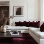
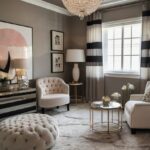
Crisp White Furniture


White furniture against gray walls and carpet creates a clean, refreshing contrast that instantly brightens your space.
This classic combination works in virtually any room and never goes out of style.
When you choose white furniture for your gray room, you’re embracing a timeless elegance that feels both modern and inviting.
White sofas, tables, or cabinets pop dramatically against darker gray walls, creating a sophisticated visual anchor in your space.
For lighter gray rooms, white furniture helps maintain an airy, spacious feeling while providing subtle definition.
The beauty of white furniture lies in its versatility – it pairs wonderfully with any accent colors you might want to introduce later.
Consider white furniture with interesting textures to add dimension against your gray backdrop.
Options like white bouclé sofas, painted wood cabinets with visible grain, or glossy lacquered pieces all add character while maintaining the clean white palette.
To prevent a white-and-gray room from feeling too cold or clinical, incorporate natural elements like wooden side tables, woven baskets, or houseplants.
These organic additions warm up the space while preserving the crisp contrast you’ve created.
White furniture shows dust and stains more readily, so consider performance fabrics if you have children, pets, or frequently entertain.
Many manufacturers now offer stain-resistant white upholstery that maintains its pristine appearance with minimal effort.
For smaller spaces with gray walls and carpet, white furniture helps prevent the room from feeling closed in or overwhelmed.
The visual lightness of white pieces creates an illusion of more space and airiness.
In bedrooms, white bedframes and dressers against gray walls create a peaceful, hotel-like atmosphere conducive to relaxation.
White dining tables in gray dining rooms establish an elegant backdrop for colorful dishes, food, and dinner conversation.
For a more interesting look, mix pure whites with creamy off-whites to create subtle depth while maintaining the clean aesthetic.
Tap to Explore These Beauties
See my ideas in action 👇 Tap any image to explore full details.
Bold Black Furniture
Black furniture creates dramatic contrast against gray walls and carpet, establishing a sophisticated, high-end look reminiscent of luxury hotels and designer showrooms.
When you select black furniture pieces, you’re making a confident design statement that anchors your gray space.
The stark contrast between black furniture and gray surroundings creates a striking visual hierarchy that naturally draws attention to your carefully selected pieces.
Black sofas, beds, or dining tables become impressive focal points that command attention when placed against lighter gray walls.
Even in rooms with darker gray walls, black furniture maintains its distinctive presence while creating a moody, intimate atmosphere.
For a truly contemporary look, choose black furniture with clean lines and minimal ornamentation.
The simplicity of modern black pieces allows their dramatic silhouettes to stand out beautifully against gray backgrounds.
To prevent the combination from feeling too heavy, incorporate black furniture with some visual lightness – pieces with slim legs, open backs, or glass elements maintain the dramatic color contrast while avoiding visual weight.
Black leather upholstery offers particular sophistication in gray rooms, aging beautifully while becoming increasingly comfortable over time.
For wooden furniture, black stained or painted wood with visible grain adds rich texture that prevents the piece from looking flat or one-dimensional.
The beauty of black furniture in gray spaces is its ability to work with any accent color you might introduce.
From vibrant jewel tones to subtle pastels, any color you add through pillows, throws, or art will pop beautifully against the black-and-gray foundation.
To balance the boldness of black furniture, incorporate metallic elements like brass, chrome, or gold through hardware, lighting fixtures, or decorative objects.
These shiny accents reflect light and add warmth to the high-contrast space you’ve created.
Black furniture shows dust more readily than some colors, but generally hides stains and everyday wear better than lighter options.
For smaller spaces, use black furniture judiciously – perhaps one statement piece rather than multiple black elements – to prevent overwhelming the room.
The timeless quality of black furniture ensures your gray room will remain stylish for years to come, adapting easily to changing accent colors and decorative trends.
💭 Ever wondered what your room would actually look like rearranged?
I built a free tool that lets you drag furniture around a 2D floor plan. No signup, no catch.
See the Room Planner →Navy Blue Statements
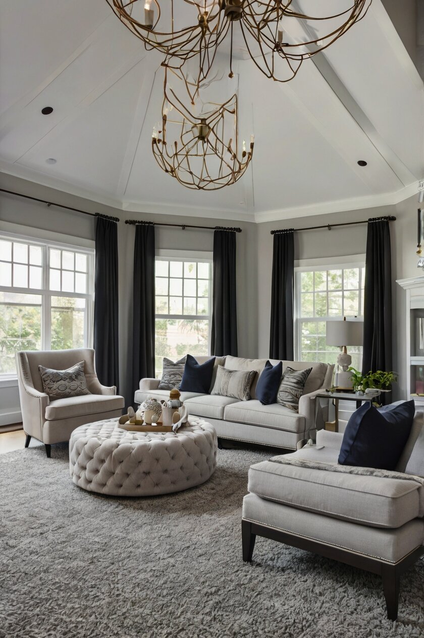
Navy blue furniture creates a sophisticated yet comfortable atmosphere when paired with gray walls and carpet.
This rich, timeless color brings depth and character to your space without overwhelming it.
When you choose navy blue furniture for your gray room, you’re embracing a palette that feels both classic and surprisingly fresh.
The combination creates a modern yet comforting atmosphere that guests will immediately respond to.
Navy acts as a “new neutral” that’s more interesting than black or brown while still providing versatility for various decorating styles.
In lighter gray rooms, navy furniture creates a beautiful anchor that grounds the space with its rich, substantial presence.
For spaces with darker gray walls, navy furniture creates a luxurious, enveloping feeling perfect for cozy living rooms or bedrooms.
Navy velvet sofas or armchairs introduce both color and texture, creating irresistible focal points in your gray space.
The subtle contrast between cool grays and slightly warmer navy tones creates visual interest without clashing.
For a truly sophisticated look, consider navy furniture with classic silhouettes – a Chesterfield sofa or wingback chair in navy creates timeless elegance.
You can easily accent navy and gray with brass or gold metal finishes to add warmth and brightness to the palette.
White accessories pop beautifully against navy furniture, creating crisp contrast that enlivens your gray space.
Navy blue has historically been associated with trustworthiness, stability, and intelligence – qualities that subtly influence how your space feels.
For a more casual interpretation, consider navy blue furniture with relaxed slipcovers or less structured designs.
In home offices with gray walls and carpet, navy desks or bookshelves create a productive, focused atmosphere without the severity of black.
Navy blue dining chairs bring color to gray dining rooms while hiding everyday wear and tear better than lighter options.
The versatility of navy extends to various design styles – from traditional to coastal to contemporary – making it an excellent choice regardless of your preferred aesthetic.
Natural Wood Tones
Natural wood furniture brings essential warmth and organic texture to rooms with gray walls and carpet.
This timeless pairing creates a perfectly balanced space that feels both contemporary and comfortably lived-in.
When you incorporate natural wood tones into your gray room, you’re adding elements that have universal appeal and will never go out of style.
The contrast between cool gray surfaces and warm wood creates a visually pleasing temperature balance in your space.
Light woods like maple, ash, or birch brighten gray rooms while maintaining a contemporary Scandinavian-inspired aesthetic.
Medium-toned woods such as oak, cherry, or walnut provide rich warmth that beautifully complements both light and dark gray backgrounds.
For darker, moodier gray spaces, deeply colored woods like mahogany or rosewood add sophisticated richness and depth.
The natural grain patterns in wooden furniture add visual interest and organic movement to potentially flat-looking gray rooms.
Consider mixed-wood furniture that combines different finishes – perhaps a table with a natural wood top and painted legs – to add dimension to your space.

Find Your Room’s Color Palette
Tap a vibe — get a curated 5-color palette with hex codes you can copy ✨
💭 I Wrote a Book About My Biggest Decorating Mistakes!
When I decorated my first home, I thought I knew what I was doing. Spoiler: I didn’t. 😅
💸 I bought a sofa way too big for my living room. Paint colors that looked amazing in the store but terrible on my walls.
Wood furniture with clean, contemporary lines maintains a modern feel while still bringing natural warmth to your gray foundation.
For a more eclectic approach, vintage or antique wood pieces create compelling contrast against contemporary gray walls and carpet.
The beauty of wood furniture in gray spaces is its flexibility – you can easily update your look by repainting or refinishing wood pieces as your style evolves.
Wooden furniture shows its age in ways that add character rather than looking worn out, developing a beautiful patina over time.
In bedrooms with gray walls and carpet, wooden bed frames and dressers create a grounding, restful atmosphere conducive to quality sleep.
For living spaces, wooden coffee tables, bookcases, and entertainment centers add warmth while providing essential functionality.
Consider incorporating different wood tones throughout your gray room rather than matching everything perfectly – this creates more visual interest than a single matched set.
Wood furniture pairs beautifully with plants, creating a natural connection that enhances biophilic design principles in your gray space.
Vibrant Red Accents
Red furniture creates bold, energetic focal points that dramatically transform rooms with gray walls and carpet.
This powerful color combination balances neutral backgrounds with passionate, attention-grabbing statements.
When you introduce red furniture into your gray space, you’re creating a dynamic visual tension that immediately draws the eye.
The high contrast between cool gray and warm red creates a sophisticated, designer-worthy color story that looks intentional and confident.
A red sofa in a gray living room becomes an instant conversation piece that anchors your entire design scheme.
For more subtle incorporation, consider red accent chairs or ottomans that add color without overwhelming the space.
Red furniture works particularly well in gray rooms that serve as entertainment spaces, as the color stimulates conversation and creates an energetic atmosphere.
The psychological effects of red – including increased energy and appetite stimulation – make it perfect for dining rooms with gray walls and carpet.
When selecting red furniture, consider various shades – from bright cherry to deeper burgundy – to find the perfect complement to your specific gray tones.
Cooler grays pair beautifully with true reds that have blue undertones, while warmer grays harmonize with orange-based reds like coral or terracotta.
To prevent red furniture from dominating completely, balance it with neutral accessories that echo your gray walls and carpet.
For a cohesive look, incorporate small red accents throughout the room – pillows, artwork, or decorative objects – that reference your red furniture.
Red leather furniture offers particular sophistication in gray rooms, aging beautifully while maintaining its dramatic presence.
In home offices with gray walls and carpet, a red desk chair adds energy and motivation to your workspace.
The boldness of red furniture means you can keep other elements simple, letting your gray backdrop and red pieces create a complete design statement.
For bedrooms, consider a red headboard or bench against gray walls for a romantic, dramatic focal point that doesn’t overwhelm sleeping areas.
Red furniture shows less everyday dirt and wear than lighter colors, making it both striking and practical for frequently used spaces.
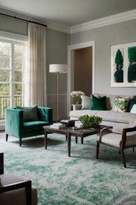
Emerald Green Elegance
Emerald green furniture creates luxurious, biophilic elegance when paired with gray walls and carpet.
This rich jewel tone brings vibrant life to neutral gray spaces while maintaining sophisticated harmony.
When you choose emerald green furniture for your gray room, you’re introducing an element that feels both fresh and timeless.
The combination evokes the natural world while maintaining a refined, upscale aesthetic that instantly elevates your space.
Green and gray are neighbors on the color wheel, creating a naturally harmonious palette that’s easy on the eyes.
A emerald green velvet sofa becomes a stunning centerpiece in a gray living room, adding both color and sumptuous texture.
For more subtle incorporation, consider emerald green accent chairs or ottomans that introduce the color without overwhelming your space.
The psychological effects of green – including feelings of renewal, balance, and calm – make it perfect for gray bedrooms or reading nooks.
When selecting green furniture, the emerald tone offers particular sophistication compared to lighter or yellowish greens.
The rich, saturated color creates a perfect balance – bold enough to make a statement but not so bright that it becomes jarring.
To enhance the natural connection, pair your emerald furniture with houseplants that echo and amplify the biophilic elements in your gray space.
For a cohesive look, incorporate small green accents throughout the room – pillows, artwork, or decorative objects – that reference your green furniture.
Emerald green upholstery pairs beautifully with brass or gold metal accents, creating a luxurious art deco feeling against gray backgrounds.
In dining rooms with gray walls and carpet, emerald green chairs create a sophisticated setting that flatters guests while adding vibrant color.
The richness of emerald green means it works well in both small doses and larger applications – from accent pieces to substantial sofas.
For home offices with gray walls and carpet, emerald green desk chairs or bookshelves create an environment that balances focus with creativity.
Emerald green furniture shows less everyday dirt and wear than lighter colors, making it both beautiful and practical for frequently used spaces.
What’s Your Decor Personality?
5 questions · 30 seconds · Instant style match 🏡
Soft Blush Pink Pieces
Blush pink furniture creates unexpectedly sophisticated softness when paired with gray walls and carpet.
This subtle yet impactful combination has become a modern classic for its perfect balance of neutrality and gentle color.
When you introduce blush pink furniture into your gray space, you’re creating a refined atmosphere that feels both contemporary and timeless.
The combination works because both colors are understated – gray provides neutrality while blush adds just enough warmth without overwhelming.
A blush pink sofa becomes a delicate focal point in a gray living room, softening the space while maintaining adult sophistication.
For more subtle incorporation, blush pink accent chairs or ottomans introduce the color while keeping your gray space grounded.
The psychological effects of pink – including feelings of nurturing, compassion, and calm – make it perfect for bedrooms or conversation areas.
When selecting pink furniture, the blush tone offers particular sophistication compared to brighter or more saturated pinks.
The dusty, muted quality of blush pink creates a perfect balance – colorful enough to make a statement but subtle enough to function almost as a neutral.
To enhance the sophisticated pairing, incorporate metallic accents in silver, chrome, or gold that complement both your gray and blush pink elements.
For a cohesive look, incorporate small pink accents throughout the room – pillows, artwork, or decorative objects – that reference your pink furniture.
Blush pink velvet upholstery adds both color and luxurious texture, creating irresistible focal points in your gray space.
In bedrooms with gray walls and carpet, a blush pink headboard or bench creates a gentle, romantic focal point that enhances restfulness.
For home offices with gray walls and carpet, blush pink desk chairs or accent furniture create a productive environment that balances focus with creativity.
The versatility of blush pink means it pairs beautifully with various design styles – from minimalist to glam to Scandinavian – making it highly adaptable.
Though lighter in color, performance fabrics have made blush pink furniture more practical than ever for everyday use.
To prevent a pink and gray room from feeling too feminine, incorporate elements with straight lines and geometric patterns for balance.
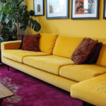
Mustard Yellow Highlights
Mustard yellow furniture creates vibrant, unexpected energy when paired with gray walls and carpet.
This distinctive combination balances neutral backgrounds with warm, attention-grabbing statements that feel both vintage and contemporary.
When you introduce mustard yellow furniture into your gray space, you’re creating a sophisticated color story that interior designers love.
The contrast between cool gray and warm mustard creates visual tension that immediately draws the eye and energizes your space.
A mustard yellow sofa in a gray living room becomes an instant conversation piece that anchors your entire design scheme.
For more subtle incorporation, consider mustard yellow accent chairs or ottomans that add color without overwhelming the space.
The psychological effects of yellow – including feelings of optimism, creativity, and mental stimulation – make it perfect for gray living spaces or home offices.
When selecting yellow furniture, the mustard tone offers particular sophistication compared to brighter or more primary yellows.
The earthy, slightly muted quality of mustard creates a perfect balance – bold enough to make a statement but not so bright that it becomes jarring.

To enhance this pairing, incorporate black accents throughout the room that provide definition and ground both the gray and yellow elements.
For a cohesive look, incorporate small yellow accents throughout the room – pillows, artwork, or decorative objects – that reference your mustard furniture.
Mustard yellow velvet upholstery adds both color and luxurious texture, creating irresistible focal points in your gray space.
In home offices with gray walls and carpet, mustard yellow desk chairs or bookshelves create an environment that stimulates creativity and focus.
For dining rooms, mustard yellow chairs around a neutral table create a welcoming, energetic atmosphere against gray walls.
The versatility of mustard yellow means it pairs beautifully with various design styles – from mid-century modern to contemporary to eclectic – making it highly adaptable.
Though bold in color, mustard yellow furniture shows less everyday dirt and wear than lighter colors, making it both striking and practical.
To balance the boldness of mustard furniture, incorporate natural elements like wood, rattan, or plants that complement its earthy quality.
Silvery Chrome and Glass
Chrome and glass furniture creates sleek, contemporary sophistication when paired with gray walls and carpet.
This refined combination amplifies the modern appeal of your gray space while adding visual lightness and luxurious shine.
When you choose chrome and glass furniture for your gray room, you’re embracing a palette that feels cohesive yet dynamic.
The reflective qualities of these materials bounce light around your space, preventing gray rooms from feeling flat or dark.
Glass coffee tables, console tables, or dining tables create an illusion of more space – particularly valuable in smaller gray rooms.
Chrome furniture frames with clean lines and minimal silhouettes enhance the contemporary feel established by your gray foundations.
The beauty of chrome and glass in gray spaces is their chameleon-like quality – they enhance whatever other accent colors you might introduce.
For living rooms, a glass-topped coffee table with a chrome base becomes a sophisticated centerpiece that doesn’t visually clutter your space.
In dining areas with gray walls and carpet, chrome and glass dining tables create an elegant, upscale atmosphere for entertaining.
Chrome bar carts or side tables add functional glamour to gray living spaces while providing perfect surfaces for styling decorative objects.
For bedrooms, mirrored or glass-topped nightstands with chrome details add sophistication while reflecting bedside lamp light.
To balance the coolness of chrome and glass, incorporate textural elements through upholstery, throws, or area rugs laid over your gray carpet.
For a more dramatic interpretation, consider furniture that combines chrome with black elements – this creates sophisticated definition against light gray walls.
Glass furniture shows fingerprints and dust more readily, but its smooth surfaces are easily cleaned with standard glass cleaners.
The transparent quality of glass furniture means it never competes with your gray backdrop – instead, it complements while adding functional surfaces.
Chrome and glass dining chairs with comfortable upholstered seats blend sleekness with comfort in gray dining spaces.
For home offices with gray walls and carpet, glass desks with chrome details create a productive, uncluttered workspace that feels open and airy.
This or That?
Pick your fave — see what other readers chose! 👀
Purple Passion
Purple furniture creates rich, regal statements when paired with gray walls and carpet.
This sophisticated combination balances neutral backgrounds with color depth that feels both luxurious and unexpected.
When you introduce purple furniture into your gray space, you’re creating a designer-worthy palette that feels both traditional and contemporary.
The compatibility between these colors stems from their shared cool undertones, creating harmony while still offering distinct contrast.
A deep purple sofa in a gray living room becomes an instant focal point that adds both color and sophisticated character.
For more subtle incorporation, consider lavender or lilac accent chairs that provide gentler color against your gray backdrop.
The psychological effects of purple – including feelings of creativity, wisdom, and luxury – make it perfect for living rooms, studies, or bedrooms.
When selecting purple furniture, consider various shades – from soft lavender to deep eggplant – to find the perfect complement to your specific gray tones.
Lighter grays pair beautifully with more saturated purples, while darker grays harmonize with softer, more muted purple tones.
💭 I Wrote a Book About My Biggest Decorating Mistakes!
When I decorated my first home, I thought I knew what I was doing. Spoiler: I didn’t. 😅
💸 I bought a sofa way too big for my living room. Paint colors that looked amazing in the store but terrible on my walls.
To enhance this elegant pairing, incorporate metallic accents in silver or gold that complement both your gray and purple elements.
For a cohesive look, incorporate small purple accents throughout the room – pillows, artwork, or decorative objects – that reference your purple furniture.
Purple velvet upholstery adds both color and luxurious texture, creating irresistible focal points in your gray space.
In bedrooms with gray walls and carpet, a purple headboard creates a romantic, sophisticated focal point that enhances the room’s restful quality.
For home offices with gray walls and carpet, purple accent furniture creates an environment that balances professionalism with creativity.
The versatility of purple means it can lean either warm or cool depending on its undertones, allowing perfect customization for your specific gray shades.
Though bold in color, deeper purples show less everyday dirt and wear than lighter colors, making them both beautiful and practical.
To balance purple’s regal qualities, incorporate natural elements like wood or plants that ground the color and prevent it from feeling too formal.
Teal Tranquility
Teal furniture creates refreshing, sophisticated color when paired with gray walls and carpet.
This balanced combination offers the perfect middle ground between bold statement and calming influence.
When you introduce teal furniture into your gray space, you’re creating a designer-approved palette that feels both timeless and current.
The compatibility between these colors stems from teal’s perfect balance between blue and green, creating versatile harmony with any gray shade.
A teal sofa in a gray living room becomes an inviting focal point that adds rich color without overwhelming the space.
For more subtle incorporation, consider teal accent chairs or ottomans that introduce the color while maintaining your room’s serene quality.
The psychological effects of teal – including feelings of balance, restoration, and creativity – make it perfect for almost any room in your home.
When selecting teal furniture, consider various saturations – from vibrant peacock to more muted sage-teal – to find the perfect complement to your specific gray tones.
Lighter grays pair beautifully with more vibrant teals, while darker grays harmonize with deeper, more jewel-toned teal variations.
To enhance this sophisticated pairing, incorporate natural wood elements that warm up the cool tones of both gray and teal.
For a cohesive look, incorporate small teal accents throughout the room – pillows, artwork, or decorative objects – that reference your teal furniture.
Teal velvet upholstery adds both color and luxurious texture, creating irresistible focal points in your gray space.
In bedrooms with gray walls and carpet, teal headboards or reading chairs create peaceful retreats that encourage relaxation.
For home offices with gray walls and carpet, teal desk chairs or bookshelves create an environment that balances focus with creativity.
The versatility of teal means it works equally well in various design styles – from coastal to contemporary to transitional – making it highly adaptable.
Though colorful, teal furniture shows less everyday dirt and wear than lighter colors, making it both beautiful and practical for family spaces.
To balance your teal and gray palette, consider incorporating contrasting warm metallic accents in brass or gold that bring dimension to the cool color scheme.
Quick Design Dilemma
Cast your vote — see what other readers think! 🤔
Charcoal Monochrome
Charcoal furniture creates sophisticated depth when paired with lighter gray walls and carpet.
This monochromatic approach offers subtle dimension through layered grays rather than contrasting colors.
When you choose charcoal furniture for your gray room, you’re embracing a designer technique that creates visual interest through texture and tone variation.
The beauty of this monochromatic approach lies in its understated elegance – different gray tones create a harmonious, cohesive look.
A charcoal sofa against lighter gray walls provides anchor and definition without introducing competing colors that might disrupt your serene aesthetic.
For bedrooms with gray walls and carpet, charcoal headboards or dressers create a peaceful, unified space conducive to rest.
The psychological effects of an all-gray palette – including feelings of sophistication, calm, and balance – make it perfect for minimalist or modern spaces.
When selecting charcoal furniture, look for pieces with interesting textures or patterns that will stand out against your lighter gray backdrop.
Charcoal velvet or bouclé upholstery adds rich texture, creating distinction between your furniture and walls without relying on color contrast.
To prevent a monochromatic gray room from feeling flat, incorporate plenty of texture through furniture materials, textiles, and decorative objects.
The sophisticated charcoal-and-gray palette creates a perfect background for artwork or decorative objects that you want to showcase.
For living rooms, charcoal sectionals or sofas provide dramatic presence while maintaining the serene quality of your gray space.
In dining rooms with gray walls and carpet, charcoal dining chairs create elegant definition around a lighter gray or glass table.
The versatility of this monochromatic approach means it works beautifully with any accent color you might want to introduce through accessories.
Though dark in color, charcoal furniture shows less everyday dirt and wear than lighter pieces, making it both sophisticated and practical.
To add dimension to your gray-on-gray scheme, incorporate metallic elements in silver, chrome, or pewter that complement the cool tones.
For those who appreciate minimalist design, this layered gray approach creates interest without the visual stimulation of bold colors.
Orange Enthusiasm
Orange furniture creates energetic, unexpected vibrancy when paired with gray walls and carpet.
This bold combination balances cool neutral backgrounds with warm, attention-grabbing statements that feel both modern and inviting.
When you introduce orange furniture into your gray space, you’re creating a confident color story that immediately establishes personality.
The high contrast between cool gray and warm orange creates a designer-worthy complementary palette that looks intentional and sophisticated.
An orange sofa in a gray living room becomes an instant conversation piece that infuses your space with energy and optimism.
For more subtle incorporation, consider burnt orange accent chairs or ottomans that add warmth without overwhelming the space.
The psychological effects of orange – including feelings of enthusiasm, creativity, and sociability – make it perfect for entertaining spaces or family rooms.
When selecting orange furniture, consider various shades – from bright tangerine to more muted terracotta – to find the perfect complement to your specific gray tones.
Cooler grays pair beautifully with more vibrant oranges, while warmer grays harmonize with earthier, more muted orange tones.
To enhance this dynamic pairing, incorporate natural wood elements that bridge the gap between your cool grays and warm oranges.
For a cohesive look, incorporate small orange accents throughout the room – pillows, artwork, or decorative objects – that reference your orange furniture.
Orange velvet upholstery adds both color and luxurious texture, creating irresistible focal points in your gray space.
In home offices with gray walls and carpet, orange desk chairs or bookshelves create an environment that stimulates creativity and productivity.
For dining rooms, orange chairs around a neutral table create a welcoming, energetic atmosphere against gray walls and carpet.
The versatility of orange means it pairs beautifully with various design styles – from mid-century modern to contemporary to eclectic – making it highly adaptable.
Though bold in color, orange furniture shows less everyday dirt and wear than lighter colors, making it both striking and practical.
To balance the boldness of orange furniture, incorporate plenty of neutral accessories that echo your gray walls and carpet, creating visual breathing room.