I’ll never forget the moment I walked into my first apartment and saw that red carpet staring back at me.
My heart sank a little, not gonna lie.
I wanted soft, dreamy walls, but I had no idea what colors would work without making the whole room feel like a Christmas explosion.
So I did what I always do—I experimented.
I painted sample squares on every wall, lived with them for days, and slowly figured out what actually made that red carpet feel intentional instead of overwhelming.
Turns out, red carpet isn’t the design disaster I thought it was.
It just needs the right partner.
And once you find that perfect paint color, everything clicks into place.
Let me share what I learned.

Soft Neutrals: Creams and Warm Beiges

This is my go-to when I want the room to feel calm and inviting.
Cream paint with red carpet creates this cozy, classic vibe that never feels dated.
I used Benjamin Moore’s “Swiss Coffee” in my guest bedroom, and it made the burgundy carpet look like a deliberate, luxe choice instead of a rental leftover.
The warmth in cream tones keeps the red from feeling too aggressive.
It softens everything.
If your red carpet has warm, orange-y undertones, a beige with a hint of yellow or peach works beautifully.
I’m obsessed with colors like “Accessible Beige” or “Shaker Beige”—they have just enough warmth to hug the red without competing.
One trick I learned: avoid stark beige or anything too gray-leaning if your red is warm.
It’ll look muddy.
You want that buttery, soft neutral that feels like candlelight.
This combo works especially well in bedrooms and living rooms where you want things to feel restful.
It’s not trendy or loud, but it’s so comforting.
And honestly, sometimes that’s exactly what you need.
White and Off-White: Crisp and Confident


White walls with red carpet is a bold move, but when it works, it really works.
I did this in my home office, and the contrast made the space feel clean and modern instead of heavy.
The trick is choosing the right white.
Pure white can feel too stark and cold, especially if your red has warm tones.
I love off-whites with just a whisper of warmth—something like “White Dove” or “Alabaster.”
These have enough creaminess to keep things soft, but they still give you that fresh, bright look.
If your red carpet is more of a true red or cool burgundy, you can go a bit crisper with something like “Chantilly Lace.”
It creates a really crisp, gallery-like feel.
One thing I noticed: white walls make the red the star.
So if you love your carpet and want it to stand out, this is your move.
But if you’re trying to downplay the red, maybe skip this one.
Also, white shows everything, so keep that in mind if you have kids or pets.
I love the look, but I’m also constantly wiping down baseboards.
Gray Tones: Cool and Sophisticated


Gray was the color I was most nervous about, but it ended up being one of my favorites.
When I painted my hallway a soft greige, the red runner suddenly looked elegant instead of loud.
The coolness of gray balances the warmth of red in this really satisfying way.
But here’s the thing—gray can go wrong fast.
If you pick a gray that’s too cool or blue-toned, it can make red carpet look garish or outdated.
You want a warm gray, something with a bit of beige or taupe in it.
I’m talking colors like “Agreeable Gray” or “Repose Gray.”
These have enough warmth to play nice with red without losing that sophisticated gray vibe.
If your red carpet leans burgundy or has cool undertones, you can go slightly cooler with your gray.
But test it first.
I always paint a big sample square and live with it for a few days.
Gray also makes a room feel more modern and polished, which is perfect if you’re trying to elevate a space.
It’s kindda like putting a blazer over a red dress—it tones things down in the best way.
Navy and Deep Blue: Dramatic and Timeless

Okay, this combo is for the brave souls, but I’m obsessed.
Navy walls with red carpet create this moody, library-like vibe that feels so rich and intentional.
I did this in my den, and every single person who walks in comments on it.
The deep blue cools down the red and adds this layer of drama that’s hard to achieve with neutrals.
It works especially well if your red carpet is more burgundy or has cool undertones.
If your red is bright or orange-y, navy might feel a bit too intense—but honestly, if you love bold, go for it.
I used “Hale Navy” and it was perfect.
Not too dark, not too bright, just this gorgeous, enveloping blue.
One thing to keep in mind: dark walls make a room feel smaller and cozier.
So if you have a tiny space, this might not be the move.
But if you want a room to feel intimate and dramatic, this is it.
Add some brass lighting and velvet cushions, and you’ve got yourself a whole mood.
Forest Green and Emerald: Unexpected and Gorgeous

I never thought I’d pair green with red until I saw it in a boutique hotel, and I was completely converted.
Deep forest green or emerald with red carpet is so unexpected, but it works.
It’s elegant, a little vintage, and totally unique.
The green tones down the red in this really sophisticated way, and it brings in a natural, grounded element.
I tried “Salamander” by Sherwin-Williams in my reading nook, and the burgundy carpet looked like it belonged in an English manor.
It was so cozy.
This combo works best if your red has deeper, richer tones—think burgundy, wine, or maroon.
If your carpet is bright cherry red, green might feel a bit too Christmas-y unless you’re into that.
I also love that green feels timeless.
It’s not trendy in a way that’ll feel dated in two years.
It’s classic but still has personality.
Add some gold accents, maybe a vintage mirror, and the whole room just glows.
This is one of my personal favorite combinations, honestly.
Blush Pink and Dusty Rose: Soft and Feminine

If you want something soft and romantic, blush pink with red carpet is magic.
I know it sounds counterintuitive, but hear me out.
When I painted my daughter’s room a pale dusty rose, the red carpet suddenly looked intentional and pretty instead of just… there.
The pink tones pull out the softer side of red, and the whole room feels gentle and warm.
This works especially well if your red has pink or cool undertones.
If it’s more orange-red, you might want to skip this or go with a peachier pink instead.
I love colors like “First Light” or “Mellow Pink”—they’re barely there, just a whisper of color.
It’s not bold or loud, but it’s so comforting.
This combo is perfect for bedrooms, especially if you’re going for a dreamy, layered, cozy vibe.
Add white linens, soft lighting, and maybe some cream curtains, and it’s like sleeping in a cloud.
I also think this works beautifully in powder rooms or dressing areas.
It’s feminine without being childish, and it makes red feel romantic instead of aggressive.
Gold and Warm Metallics: Luxe and Inviting

Okay, so this isn’t technically a paint color, but I had to include it because metallic-toned paints are a thing, and they’re stunning with red carpet.
I’m talking warm golds, champagne, soft bronze tones.
I used a metallic gold accent wall in my entryway, and the red runner looked like it cost a million bucks.
The shimmer reflects light and adds this layer of richness that you just can’t get with flat paint.
If a full metallic wall feels like too much, you can use a warm, golden beige with a slight sheen.
Something like “Golden Straw” or “Honeycomb” in a satin finish.
It gives you that warm glow without being too over-the-top.
This combo works especially well in spaces where you entertain—dining rooms, entryways, living rooms.
It feels celebratory and warm.
One tip: balance it out with softer furnishings so it doesn’t feel too glam.
I added linen curtains and natural wood furniture, and it grounded everything.
Metallic tones make red feel intentional and luxurious, like you hired a designer.
And who doesn’t want that?
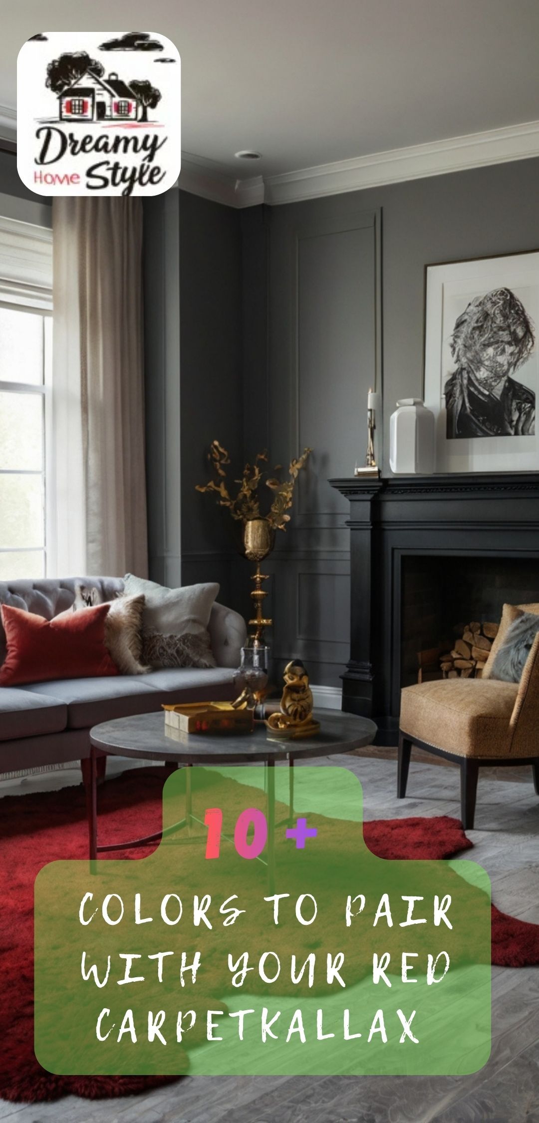
Black or Charcoal: Bold and Moody

This is not for everyone, but if you love drama, black or charcoal walls with red carpet is stunning.
I did this in my home bar area, and it’s the most atmospheric room in my house.
The dark walls make the red pop, and the whole space feels intimate and cozy.
It’s like a chic cocktail lounge.
I used “Black Magic” by Sherwin-Williams, and it was the perfect deep charcoal—not flat black, just really rich and moody.
This works best in rooms where you want a specific vibe—media rooms, dens, bars, even a dramatic powder room.
It’s not great for spaces where you need brightness or energy.
One thing I learned: you need good lighting.
Dark walls swallow light, so I added sconces, lamps, and dimmers to keep it from feeling like a cave.
Also, this combo works better with deeper reds—burgundy, wine, maroon.
If your carpet is bright red, black might be too intense.
But if you want a space that feels bold and unapologetic, this is it.
Taupe and Greige: The Perfect Middle Ground

Taupe is my safe-but-stylish option.
It’s warmer than gray, softer than beige, and it works with almost any shade of red carpet.
I used “Perfect Greige” in my upstairs landing, and it made the red runner feel polished and put-together.
Taupe has this chameleon quality—it shifts with the light, sometimes looking more gray, sometimes more beige.
That flexibility makes it really forgiving.
If you’re not sure what your red carpet’s undertones are, taupe is a solid bet.
It’s also great if you want a neutral backdrop but don’t want plain white or beige.
It has just enough personality to feel intentional.
I love that taupe works in any room—bedrooms, living rooms, hallways, even kitchens.
It’s versatile and timeless.
One trick: pair it with Warm Wood Tones and soft textiles to keep it from feeling too bland.
I added a jute rug, linen cushions, and some terracotta pots, and the whole space felt layered and cozy.
Taupe is kind of the unsung hero of paint colors.
It’s not flashy, but it always works.
Sage Green: Fresh and Calming

Sage green is having a moment, and for good reason—it’s soft, calming, and surprisingly versatile.
I painted my guest room a pale sage, and the red carpet looked so much softer and more intentional.
The green tones cool down the warmth of red without clashing, and the whole room feels fresh and airy.
This works especially well if your red has cooler or neutral undertones.
If it’s a warm, orange-red, sage might feel a bit off—but you could try a warmer green like olive instead.
I used “Clary Sage” and it was perfect.
Not too minty, not too gray, just this soft, earthy green.
Sage also brings in a natural, organic vibe that balances the boldness of red.
It’s calming without being boring.
I love this combo for bedrooms, bathrooms, or any space where you want to feel relaxed.
Add some white bedding, natural wood, and a few plants, and it’s like a little retreat.
Sage green makes red carpet feel intentional and fresh instead of dated.
It’s one of those colors that just makes everything feel easier.
Warm Terracotta and Clay Tones: Earthy and Rich

If you want something unexpected but still warm and inviting, terracotta or clay-toned paint is stunning with red carpet.
I tried this in my entryway, and it completely transformed the space.
The warm, earthy tones complement red beautifully, and the whole room feels cozy and grounded.
This works best if your red carpet has warm, rust, or orange undertones.
If it’s a cool burgundy, terracotta might feel too warm—but test it and see.
I used a color similar to “Cavern Clay,” and it was gorgeous.
Not too bright, not too brown, just this rich, sun-baked warmth.
Terracotta brings in a Southwestern or Mediterranean vibe, which I love.
It feels collected and traveled, like you brought home inspiration from somewhere beautiful.
Pair it with natural textures—rattan, linen, wood—and the whole space feels layered and intentional.
This combo is perfect for living rooms, dining rooms, or entryways where you want to make a warm first impression.
It’s bold without being loud, and it makes red carpet feel like a deliberate design choice.
I’m kind of obsessed with this pairing, honestly.
My Personal Favorite Combinations (And Why They Work)

After all my experimenting, I’ve landed on a few combinations I come back to again and again.
For bedrooms, I love soft cream or blush pink—they make red carpet feel cozy and romantic.
For living spaces, warm taupe or greige gives you that polished, timeless look without feeling boring.
And for bold, dramatic rooms, navy or forest green is unbeatable.
The reason these work is because they don’t fight the red.
They either complement its warmth or provide a cooling contrast that feels intentional.
If you want calm and restful, go soft and neutral.
If you want energy and personality, go darker or more saturated.
My biggest tip?
Paint samples.
Always.
I cannot stress this enough.
Red carpet looks different in every room, and paint looks different on every wall.
Spend the $10 on sample pots and paint big squares.
Live with them for a few days.
See how they look in morning light, afternoon light, evening lamplight.
Trust your gut, and don’t be afraid to go bold if that’s what feels right.
Red carpet is a gift, honestly.
It gives you permission to be creative.


