ot a gold carpet and scratching your head about what colors will work with it?
Gold is actually more versatile than you might think.
It can play well with both bold, dramatic colors and soft, neutral tones depending on the look you’re going for.
Some combinations will create a cozy, traditional feel while others will give your space a modern, energetic vibe:
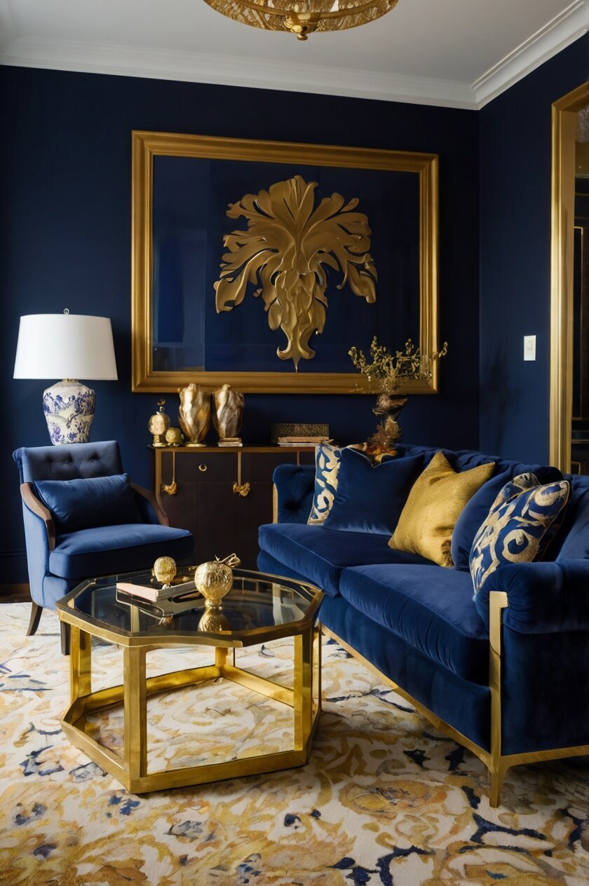
Rich Navy Blue: Classic Elegance Meets Modern Style


Navy blue paired with gold creates a timeless, sophisticated look that never goes out of style.
This deep, inky blue offers dramatic contrast against gold carpet, making both colors stand out in the best possible way.
Think of it as the design equivalent of a perfectly tailored blue suit with gold cufflinks – always impressive!
Navy walls can transform a room with gold carpet into a cozy library vibe or an elegant dining space.
The best part about navy is that it works with any shade of gold, from bright yellow-gold to subtle champagne tones.
For a modern approach, try navy blue furniture against your gold carpet.
A navy sofa or armchairs will “pop” against the warm floor, creating a focal point in your living room.
You can soften this bold color combination with some white or cream accents to keep the space feeling balanced.
Navy blue curtains are another excellent option if you’re not ready to commit to navy walls or furniture.
They frame windows beautifully and connect the gold floor to the rest of your room’s design.
For accessories, consider navy blue throw pillows, vases, or artwork with navy elements to tie the look together.
The contrast between cool navy and warm gold creates visual interest that draws the eye around the room.
If you’re worried about the space feeling too dark, balance is key.
Mix in some lighter elements like white trim, light-colored furniture, or mirrored surfaces that reflect light.
Navy and gold together create a sense of luxury that’s hard to beat.
This combination works especially well in formal living rooms, master bedrooms, or dining rooms where you want to create an impression.
For paint colors, look for true navies that have depth without appearing black – Benjamin Moore’s Hale Navy or Sherwin Williams’ Naval are designer favorites.
Remember that lighting affects how navy appears, so be sure to test your paint color in different lighting conditions before committing.
Tap to Explore These Beauties
See my ideas in action 👇 Tap any image to explore full details.
Crisp White: A Timeless Canvas for Golden Floors
White walls with gold carpet create a bright, airy feeling that makes any room seem larger and more open.
This combination lets your gold carpet be the star of the show while providing a clean backdrop that never competes for attention.
White is actually one of the most versatile options for gold carpet because it works with any shade of gold, from bright yellow-gold to subtle champagne.
The contrast between bright white and warm gold creates a fresh, clean aesthetic that’s both modern and timeless.
In smaller rooms with gold carpet, white walls help prevent the space from feeling cramped or overwhelming.
The light-reflecting quality of white paint brightens the room and makes the gold tones in your carpet appear even richer.
For a cohesive look, try carrying the white theme through your trim, doors, and ceiling to create a seamless envelope for your gold floor.
White furniture can continue this clean aesthetic, creating a sophisticated monochromatic palette above your gold carpet.
If you’re worried about the space feeling too stark, add texture through white elements in different materials – think white linen curtains, fuzzy throw pillows, or a chunky knit blanket.
These textural differences prevent the white from feeling flat or boring.
For accent pieces, consider clear glass, crystal, or chrome to maintain the bright, reflective quality of the space.
These materials bounce light around the room and complement both the white walls and gold carpet.
Don’t be afraid to add pops of a third color through art or accessories – blues, greens, or even black accents create dramatic focal points against the white-and-gold backdrop.
When choosing your white paint, consider the undertones in your gold carpet.
Warmer whites (with yellow or cream undertones) will create a softer, more cohesive look with gold, while bright whites (with blue undertones) will create more contrast and a crisper feel.
For trim and molding, a bright white semi-gloss finish creates beautiful definition against slightly softer white walls.
This white-and-gold combination works beautifully in bedrooms, living rooms, and especially in spaces that don’t get much natural light, as it maximizes whatever brightness is available.
Emerald Green: Luxurious Color That Complements Gold Perfectly
Emerald green paired with gold carpet creates a truly luxurious, jewel-box effect in any room.
This rich, saturated green has been a designer favorite for decades because it complements gold so beautifully.
The combination feels both timeless and current, with emerald bringing depth and gold adding warmth.
Think of how emerald and gold look in jewelry – they’re natural partners that bring out the best in each other!
Emerald green walls with gold carpet create a dramatic, cozy space that feels like a high-end hotel or private club.
This color combination works especially well in dining rooms, studies, or formal living rooms where you want to make a statement.
If emerald walls feel too bold, consider emerald furniture instead – a velvet sofa or accent chairs in this rich green tone look stunning against gold carpeting.
The textural contrast between plush velvet and carpet adds another dimension of interest to your space.
For a more subtle approach, incorporate emerald through accessories like throw pillows, vases, or artwork.
Even small touches of this green bring life and sophistication to a room with gold carpeting.
Plants are another natural way to bring green elements into a gold-carpeted space – large leafy specimens like fiddle leaf figs or monstera plants add organic emerald tones.
The combination of emerald and gold creates a room that feels both grounded and elevated.
This pairing works in both traditional and contemporary spaces, depending on how you style the rest of your room.
For paint colors, look for true emeralds that have depth without being too blue or too yellow – Benjamin Moore’s Emerald Isle or Sherwin Williams’ Greens are excellent options.
When working with such rich colors, consider keeping your trim and ceiling white to provide some visual breathing room.
Emerald and gold together create a space that feels special and intentional – it’s a combination that shows you understand color and aren’t afraid to embrace richness.
This pairing works beautifully year-round but feels especially appropriate during fall and winter months when we naturally gravitate toward cozier, more enveloping spaces.
Soft Gray: The Modern Neutral That Balances Gold’s Warmth
Gray walls provide the perfect modern backdrop for gold carpet, creating a balanced look that’s neither too warm nor too cool.
This versatile neutral acts as a sophisticated canvas that lets your gold carpet shine without competing for attention.
Soft gray tones down the warmth of gold, creating a more contemporary feel than traditional beige or tan walls would.
Think of gray as the perfect “temperature control” for a room with gold carpet – it prevents the space from feeling too yellow or overwhelming.
The key to success with this combination is choosing the right shade of gray.
Warmer grays (with taupe or brown undertones) will create a softer transition with gold carpet, while cooler grays (with blue undertones) will create more contrast and a crisper feel.
Gray furniture also works beautifully with gold carpet – a gray sectional or armchairs create a modern, pulled-together look.
The neutral quality of gray means you can easily add other accent colors to your palette through accessories and art.
For a cohesive look, consider layering different shades of gray throughout the room, from light silvery tones to deeper charcoals.

Find Your Room’s Color Palette
Tap a vibe — get a curated 5-color palette with hex codes you can copy ✨
💭 I Wrote a Book About My Biggest Decorating Mistakes!
When I decorated my first home, I thought I knew what I was doing. Spoiler: I didn’t. 😅
💸 I bought a sofa way too big for my living room. Paint colors that looked amazing in the store but terrible on my walls.
This creates depth while maintaining a sophisticated, monochromatic feel above your gold carpet.
Gray window treatments frame the room nicely, connecting the walls to your other gray elements while allowing your gold carpet to remain the warm foundation.
Metal accents in silver or chrome complement this color scheme, adding a bit of shine that plays nicely against both the gray and gold tones.
If you’re concerned about the space feeling too cool or industrial, add natural elements like wood furniture or woven baskets to bring additional warmth.
Gray and gold together create a versatile backdrop for seasonal decorating – you can easily swap in different accent colors throughout the year without clashing with your foundation colors.
For paint colors, consider mid-tone grays like Benjamin Moore’s “Revere Pewter” or Sherwin Williams’ “Agreeable Gray” that have enough depth to hold their own against gold carpet.
This combination works especially well in bedrooms, living rooms, and hallways where you want a contemporary feel that’s still welcoming and comfortable.
Chocolate Brown: Rich Warmth That Creates Cozy Depth
Chocolate brown paired with gold carpet creates a wonderfully warm, cozy atmosphere that feels like being wrapped in luxury.
This rich color combination works on the same side of the color wheel, creating a harmonious space that feels naturally cohesive.
The depth of chocolate brown balances the brightness of gold, preventing the carpet from feeling too yellow or overwhelming.
Think of these colors as natural companions – like the rich brown of wood paired with golden sunlight.
Brown walls with gold carpet create a cocoon-like effect that’s perfect for bedrooms, dens, or any space where you want to feel embraced and comfortable.
The combination feels traditional and timeless, yet still completely relevant in today’s interiors.
For furniture, dark brown leather pieces look particularly striking against gold carpet, adding another layer of richness and texture.
The natural patina of leather develops over time, adding character that complements the warmth of your gold floors.
Wood elements in chocolate tones create beautiful continuity throughout a room with gold carpet – think dark wood coffee tables, bookshelves, or picture frames.
If the idea of brown walls feels too dark, consider using this rich color on just one accent wall, paired with a lighter neutral on the remaining walls.
Brown and gold together create a perfect backdrop for other natural elements like plants, rattan, or woven textiles that add texture and life.
When accessorizing this color scheme, consider copper or bronze metals that bridge the gap between the brown and gold tones.
For contrast and to keep the space from feeling too heavy, incorporate some cream or off-white elements through upholstery, throw pillows, or lampshades.
Chocolate brown with gold carpet works particularly well in rooms with plenty of natural light, as the light brings out the richness in both colors.
For paint colors, look for true chocolate browns with red or orange undertones rather than those with gray undertones, as the warmer browns will complement gold carpet better.
This color combination creates rooms that feel established and classic – spaces that look like they’ve been thoughtfully designed rather than quickly thrown together.
The brown-and-gold palette works beautifully year-round but feels especially appropriate during fall and winter when we naturally gravitate toward warmer, cozier spaces.
Blush Pink: Soft Sophistication That Flatters Gold
Blush pink creates a surprisingly sophisticated partnership with gold carpet, resulting in a space that feels both elegant and on-trend.
This soft, muted pink has gained popularity in recent years as a “new neutral” that works beautifully in adult spaces.
The warmth in both blush and gold creates a harmonious, flattering glow throughout your room – it’s like having permanent golden-hour lighting!
Think of this combination as the interior design equivalent of rose gold jewelry – refined, feminine without being childish, and undeniably luxurious.
Blush walls with gold carpet create an enveloping warmth that makes any room feel more inviting and complete.
This color pairing works especially well in bedrooms, dressing rooms, or formal living spaces where you want to create a sophisticated yet comfortable atmosphere.
For furniture, consider blush velvet pieces that add textural interest while continuing the color story – a blush sofa or accent chair makes a beautiful statement against gold carpet.
The softness of blush pink balances the more assertive quality of gold, creating a room that feels purposeful but not overwhelming.
If blush walls feel too committed, consider bringing this color in through art, throw pillows, or curtains that can be easily swapped out if your taste changes.

For a more modern interpretation, pair your gold carpet and blush accents with crisp white walls that brighten the space and add contrast.
Brass or gold metal accents enhance this color scheme beautifully, adding shine and connecting to the golden tones in your carpet.
When accessorizing this color combination, consider adding small touches of a deeper color like burgundy or plum for depth and visual interest.
The blush and gold palette creates a flattering backdrop for skin tones, making this combination particularly nice for spaces where you entertain guests.
For paint colors, look for blushes with warm undertones rather than cool, blue-based pinks – Benjamin Moore’s “Love & Happiness” or Sherwin Williams’ “Intimate White” are good starting points.
This color combination transitions beautifully between seasons – it feels cozy in winter, fresh in spring, and continues to look current year after year.
Blush and gold together create spaces that feel curated and intentional – rooms that reflect thoughtful design rather than passing trends.
What’s Your Decor Personality?
5 questions · 30 seconds · Instant style match 🏡
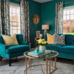
Teal Blue: Bold Contrast That Energizes Gold Carpet
Teal blue creates a stunning contrast with gold carpet, resulting in a space that feels both energetic and balanced.
This rich blue-green hue sits opposite gold on the color wheel, creating what designers call a “complementary color scheme” that naturally pops.
The cool tones of teal balance the warm golden floor, creating visual tension that keeps your eyes moving around the room.
Think of this pairing as the interior design equivalent of a peacock’s feathers – naturally striking, vibrant, and unforgettable!
Teal walls with gold carpet make a bold statement that works wonderfully in spaces where you want to create impact – dining rooms, home offices, or living areas.
This color combination signals confidence and creativity, perfect for homeowners who aren’t afraid of color.
For a more subtle approach, consider teal furniture pieces against your gold carpet – a teal sofa or armchairs create focal points without committing to painted walls.
The deep, saturated quality of teal anchors a room with gold carpet, preventing the gold from feeling too bright or overwhelming.
Teal and gold together create a globally-inspired aesthetic that works beautifully with collected treasures, travel souvenirs, or ethnic textiles.
If you’re concerned about the combination feeling too intense, balance is key – incorporate plenty of neutral elements through white trim, natural woods, or cream textiles.
For accessories, bring in elements that bridge these distinct colors – peacock feathers, vintage brass items with patina showing blue-green oxidation, or art that incorporates both hues.
This color combination looks especially rich in fabrics with texture – consider velvet teal pillows or curtains that catch the light in different ways.
When working with such distinct colors, keep patterns relatively simple to avoid visual overload – solid teal works better than busy patterns in most cases.
For paint colors, explore the range between blue-leaning teals and green-leaning teals to find the perfect tone – Benjamin Moore’s “Galapagos Turquoise” or Sherwin Williams’ “Oceanside” are designer favorites.
Teal and gold together create spaces that feel worldly and collected – rooms that tell a story and reflect a well-traveled, curious personality.
This combination works particularly well in homes with architectural character, highlighting interesting features while adding depth and personality.
Warm Taupe: Subtle Harmony That Expands Your Space
Taupe walls create a beautiful, seamless transition with gold carpet, resulting in a harmonious space that feels expansive and cohesive.
This versatile neutral sits between beige and gray, with warm undertones that complement gold perfectly without competing for attention.
Taupe acts as a sophisticated backdrop that allows your gold carpet to shine while creating a pulled-together look throughout your space.
Think of taupe as the perfect supporting actor to your gold carpet’s starring role – it enhances without overshadowing.
The beauty of taupe with gold carpet is how it visually expands your room – the gentle transition between floor and wall creates flow rather than choppy contrast.
This color combination works especially well in smaller spaces or rooms with lower ceilings where you want to create a sense of continuity and openness.
For furniture, taupe upholstery creates a monochromatic effect that’s soothing to the eye and makes your space feel thoughtfully designed.
The subtle quality of taupe allows you to incorporate other accent colors through art and accessories without creating a busy or disjointed look.
Taupe and gold together create the perfect neutral canvas for showcasing interesting architectural features, statement lighting, or bold art pieces.
💭 Ever wondered what your room would actually look like rearranged?
I built a free tool that lets you drag furniture around a 2D floor plan. No signup, no catch.
See the Room Planner →This combination works in any style home, from traditional to contemporary, making it an excellent choice if you’re unsure about your preferred design direction.
For a more dimensional look, consider layering different shades of taupe throughout your space – from lighter, almost-beige tones to deeper, more mushroom-colored taupe.
When accessorizing this neutral palette, incorporate different textures to keep the space from feeling flat – think nubby linens, smooth ceramics, rough baskets, and sleek metals.
Natural materials like wood, stone, and plants work beautifully with the taupe-and-gold foundation, adding life and depth to your space.
For paint colors, look for taupe with warm undertones that will harmonize with the gold in your carpet – Benjamin Moore’s “Weimaraner” or Sherwin Williams’ “Mega Greige” are excellent starting points.
This color combination creates rooms that feel timeless rather than trendy – spaces that will continue to look current for years to come.
The taupe-and-gold palette transitions beautifully between seasons and provides a flexible foundation as your decorating taste evolves over time.
This or That?
Pick your fave — see what other readers chose! 👀
Deep Burgundy: Regal Richness That Complements Gold
Burgundy paired with gold carpet creates a truly regal combination that recalls the opulence of historic interiors.
This deep, wine-inspired red has enough brown undertones to complement gold beautifully without clashing.
The richness of burgundy balances the brightness of gold, creating a space that feels luxurious and intentionally designed.
Think of famous museums or historic mansions where burgundy and gold create spaces of undeniable importance and gravitas.
Burgundy walls with gold carpet create a statement room that feels both traditional and unexpectedly fresh in today’s homes.
This color combination works especially well in dining rooms, libraries, or formal living spaces where you want to create a sense of occasion.
If burgundy walls feel too committed, consider bringing this rich color in through furniture – a burgundy leather Chesterfield sofa or wingback chairs look stunning against gold carpeting.
The depth of burgundy creates a wonderful backdrop for displaying art, gold-framed mirrors, or collections that might get lost against lighter walls.
For a more subtle approach, incorporate burgundy through window treatments, throw pillows, or a vintage rug layered over your gold carpet.
When working with such rich colors, contrast becomes important – consider white crown molding, trim, or ceiling to provide visual relief and definition.
Burgundy and gold together create a natural holiday palette that feels especially appropriate during fall and winter months.
Wood elements with warm, reddish undertones enhance this color scheme, creating multiple layers of rich, complementary color.
For metallics, choose warm brass or gold rather than silver or chrome to maintain the warm, cohesive palette throughout your space.
When accessorizing this color scheme, consider adding small touches of deep green (like emerald) which creates a beautiful triad color scheme with burgundy and gold.
For paint colors, look for burgundies with brown undertones rather than purple undertones – Benjamin Moore’s “Dinner Party” or Sherwin Williams’ “Bordeaux” create the right effect.
This color combination creates rooms with presence and personality – spaces that make a statement about your confidence and appreciation for timeless design.

Sage Green: Soothing Natural Complement to Gold
Sage green creates a soothing, nature-inspired partnership with gold carpet that feels both fresh and timeless.
This muted, gray-green hue has enough warmth to harmonize with gold while providing a calming contrast that’s easy on the eyes.
The subtle quality of sage prevents it from competing with your gold carpet, creating instead a peaceful backdrop that lets the floor shine.
Think of this combination as bringing the outdoors in – like golden sunlight filtering through soft green foliage.
Sage walls with gold carpet create a space that feels connected to nature while maintaining an elegant, designed quality.
This color combination works beautifully in bedrooms, living rooms, or any space where you want to create a sense of tranquility and welcome.
For furniture, sage upholstery creates a cohesive look that’s interesting without being overwhelming – a sage sofa or accent chairs provide continuity without matching exactly.
The natural quality of sage makes it a perfect partner for other organic elements like wood, stone, plants, and natural textiles.
Sage and gold together create a wonderful backdrop for collections of pottery, baskets, or other handcrafted items that add character to your space.
This color combination transitions beautifully between seasons – it feels fresh in spring, cool in summer, rich in fall, and cozy in winter.
For a layered look, incorporate different shades of green throughout your space – from lighter, almost-gray sage to deeper olive tones.
When accessorizing this palette, consider bringing in earth tones like terracotta or clay that enhance the natural feeling of the sage-and-gold foundation.
Natural linens, cotton, and other matte textiles enhance the organic quality of this color scheme, while adding welcome texture to your space.
For paint colors, look for sage greens with gray undertones rather than blue – Benjamin Moore’s “Saybrook Sage” or Sherwin Williams’ “Dried Thyme” create the right effect.
This color combination creates rooms that feel thoughtfully designed yet unpretentious – spaces that welcome and comfort rather than impress.
The sage-and-gold palette works in any style home, from traditional to modern farmhouse to contemporary, making it versatile for evolving tastes.
💭 I Wrote a Book About My Biggest Decorating Mistakes!
When I decorated my first home, I thought I knew what I was doing. Spoiler: I didn’t. 😅
💸 I bought a sofa way too big for my living room. Paint colors that looked amazing in the store but terrible on my walls.
Charcoal Gray: Dramatic Contrast That Modernizes Gold Carpet
Charcoal gray creates a striking modern contrast with gold carpet, bringing your flooring firmly into contemporary design territory.
This deep, almost-black neutral provides dramatic opposition to gold’s warmth, creating visual tension that makes both colors more impactful.
The cool, sophisticated quality of charcoal balances gold’s more traditional associations, creating spaces that feel current and intentional.
Think of fashion’s favorite pairing of charcoal suits with gold accessories – it’s a classic combination that always looks purposeful and designed.
Charcoal walls with gold carpet create a cocooning effect that works beautifully in media rooms, bedrooms, or spaces where you want to create atmosphere and drama.
This color combination signals confidence and design knowledge – it’s not an obvious pairing, which makes it all the more interesting when executed well.
For furniture, charcoal pieces create continuity with dark walls or provide contrast against lighter walls while still complementing your gold carpet.
The depth of charcoal creates a wonderful backdrop for art, collections, or architectural features that you want to highlight.
If charcoal walls feel too dark, consider an accent wall in this rich color, paired with lighter gray or white on the remaining walls.
When working with such contrasting colors, texture becomes especially important – incorporate different materials and finishes to add depth and interest to your space.
Charcoal and gold together create a perfect foundation for adding a third accent color – emerald green, sapphire blue, or ruby red all pop beautifully against this base.
For a softer approach, layer in some medium grays that bridge the gap between the darkest charcoal and brightest gold elements.
Metal accents work beautifully in this scheme – mix silver, gold, and black metals for an eclectic, collected look that adds dimension.
For paint colors, look for true charcoals with depth rather than those with obvious blue undertones – Benjamin Moore’s “Wrought Iron” or Sherwin Williams’ “Iron Ore” are designer favorites.
This color combination creates spaces that feel intentionally dramatic rather than accidentally dark – rooms that make a statement about your design confidence.
The charcoal-and-gold palette works particularly well in homes with modern architecture or in traditional spaces where you want to add an unexpected contemporary twist.
Quick Design Dilemma
Cast your vote — see what other readers think! 🤔
Soft Lavender: Unexpected Elegance With Gold Carpet
Lavender creates a surprisingly sophisticated partnership with gold carpet, resulting in a space that feels both unique and elegant.
This soft purple has enough warmth in its undertones to complement gold beautifully while adding an unexpected twist to your color scheme.
The gentle quality of lavender balances the more assertive nature of gold, creating rooms that feel intentionally designed but not overwhelming.
Think of lavender and gold as the interior design equivalent of a sunset – colors that naturally occur together in the most beautiful light conditions.
Lavender walls with gold carpet create an atmosphere that’s both soothing and special – perfect for bedrooms, dressing rooms, or spaces where you want a touch of luxury.
This color combination signals creativity and confidence – it’s not an obvious pairing, which makes it all the more interesting when executed well.
For a more subtle approach, consider bringing lavender in through furniture pieces, throw pillows, or artwork rather than committing to painted walls.
The cool tones in lavender provide a beautiful counterpoint to gold’s warmth, creating visual balance that keeps your eye moving around the room.
Lavender and gold together create a perfect backdrop for silver or chrome accents that add sparkle and dimension to your space.
This color combination transitions beautifully between seasons – it feels fresh in spring, cool in summer, rich in fall, and unexpected in winter.
For a cohesive look, consider incorporating flowers in purple tones – from pale lilacs to deeper plums – that enhance your color scheme naturally.
When accessorizing this palette, consider white or cream elements that provide visual breaks between your lavender and gold features.
Natural light enhances this color combination beautifully, bringing out the subtle undertones in both lavender and gold.
For paint colors, look for lavenders with gray or taupe undertones rather than bright, candy-colored purples – Benjamin Moore’s “Organdy” or Sherwin Williams’ “Sensitive Tint” create the right effect.
This color combination creates rooms that feel personal and curated – spaces that reflect an independent spirit and confidence in your own taste.
The lavender-and-gold palette works particularly well in feminine spaces or anywhere you want to create a sense of unexpected elegance.
Warm Terra Cotta: Earthy Richness That Enhances Gold’s Glow
Terra cotta paired with gold carpet creates a sun-baked, Mediterranean-inspired palette that feels both earthy and luxurious.
This warm, reddish-orange hue shares gold’s warm undertones, creating a harmonious flow that feels natural and inviting.
The earthy quality of terra cotta grounds gold’s more luxurious associations, resulting in spaces that feel rich but not pretentious.
Think of ancient palaces where terra cotta tiles meet gold accents – it’s a combination with centuries of design history behind it.
Terra cotta walls with gold carpet create a space that wraps you in warmth, perfect for living rooms, dining spaces, or anywhere you want to foster connection and conversation.
This color combination recalls sun-drenched locations like Italy, Spain, or Morocco, bringing a global, well-traveled feeling to your home.
For a less committed approach, consider bringing terra cotta in through pottery, textiles, or artwork rather than painting entire walls.
The natural variation in terra cotta tones – from lighter clay to deeper rust – provides opportunities to create dimension through layering similar colors.
Terra cotta and gold together create the perfect backdrop for other natural elements like wood, leather, rattan, or plants with red-tinged leaves.
When accessorizing this warm palette, consider adding touches of turquoise or cobalt blue for unexpected pops that enhance the Mediterranean feel.
This color combination creates wonderful opportunities to incorporate handcrafted items – from hand-thrown pottery to woven baskets to artisanal textiles.
For contrast and to keep the space from feeling too warm, incorporate some white elements through trim, accessories, or textiles.
Natural materials with visible texture enhance this palette beautifully – think rough plaster, nubby linens, or irregularly glazed ceramics.
For paint colors, look for terra cottas with brownish undertones rather than pink ones – Benjamin Moore’s “Warm Sienna” or Sherwin Williams’ “Cavern Clay” create the authentic effect you want.
This color combination creates rooms that feel timeless rather than trendy – spaces that could have existed comfortably in the past but still feel relevant today.
The terra cotta-and-gold palette works particularly well in homes with Spanish, Mediterranean, or Southwest architectural elements, enhancing these styles’ natural character.