I spent three weeks staring at carpet swatches on my living room floor before I finally admitted I had absolutely no idea what I was doing.
I had this gorgeous walnut sideboard — rich, warm, with those deep chocolatey undertones — and somehow every carpet sample I brought home looked either too dark, too cold, or just… wrong.
It felt personal, like the room was rejecting me.
And then one afternoon, I held a creamy oatmeal swatch next to the walnut and something just clicked.
The warmth in the wood suddenly had something to lean into.
The whole space softened.
That moment taught me more about color than any mood board ever could.
And honestly?
I want to save you those three weeks.

Why Walnut Furniture Is Both Easy and Tricky to Work With


Walnut is one of those woods that feels incredibly luxurious without even trying.
It has this deep, moody warmth — brown undertones that swing between chocolate, amber, and sometimes even a hint of purple depending on the light.
And that complexity is exactly what makes it so beautiful.
But it’s also exactly what makes carpet pairing feel a little nerve-wracking.
Go too dark with your carpet and the whole room can start to feel heavy and closed in, like the furniture is sinking into the floor.
Go too light without the right undertone and suddenly your walnut pieces look harsh and disconnected, sort of floating on a cold surface.
The sweet spot — and I say this from very personal experience — is finding a carpet that complements walnut’s warmth rather than competing with it or canceling it out.
You want the carpet to feel like it was made for that furniture.
Like they’re in a quiet conversation with each other.
When I finally understood that walnut craves warmth and softness beneath it, every carpet decision got so much easier.
And I think once you see it that way, you’ll feel the same.
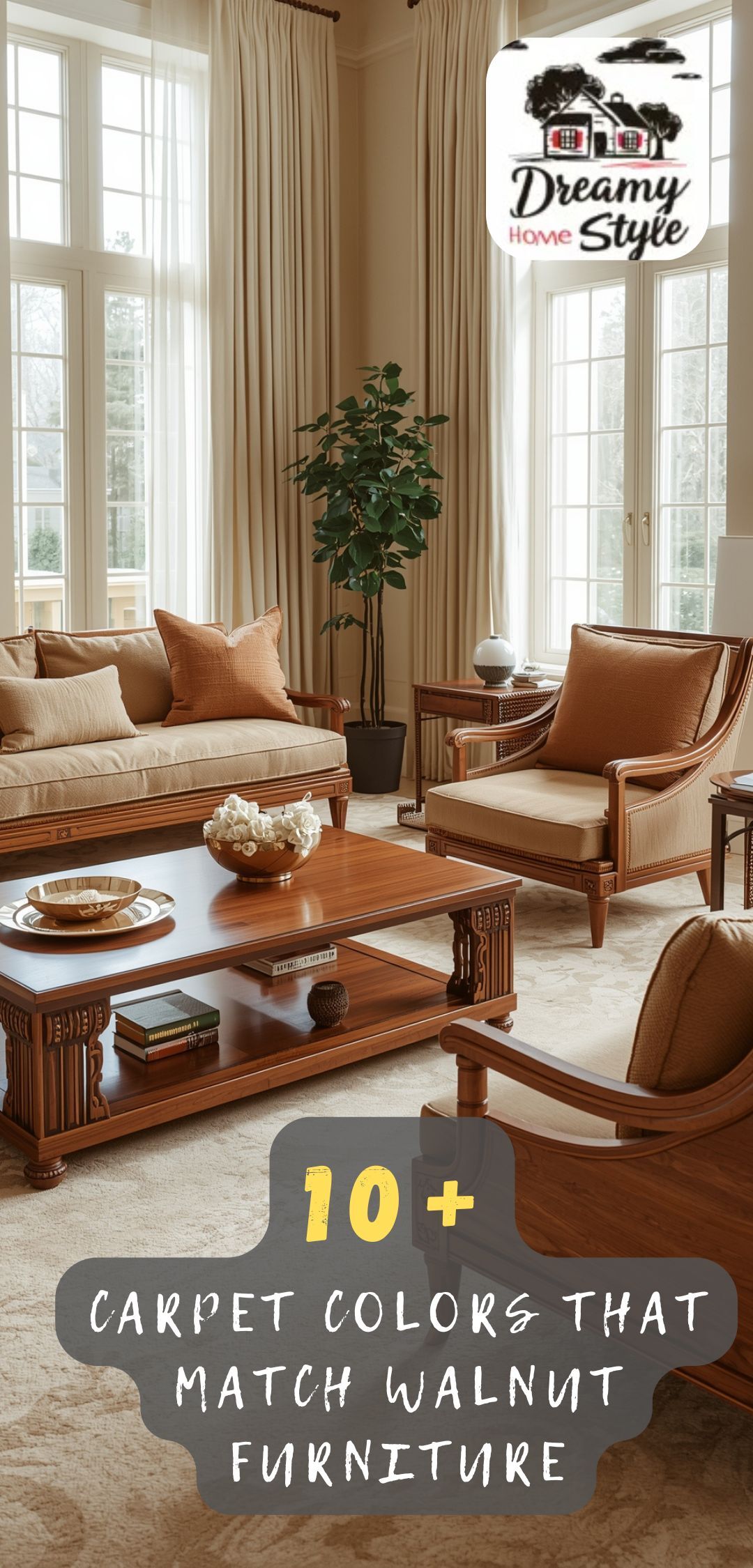
My Favorite Pick: Warm Cream and Oatmeal Tones


If I had to recommend just one carpet color for walnut furniture, I’d say warm cream or oatmeal without hesitation.
Every.
Single.
Time.
It just works in a way that feels effortless and elegant.
The lightness of cream lifts the room — it keeps things from feeling too heavy even when you have a lot of rich, dark wood present.
But because it’s warm cream (not stark white, not cool ivory), it echoes the amber undertones sitting inside the walnut grain.
When I finally laid down a warm oatmeal rug in my own living space next to my walnut pieces, the whole room exhaled.
The furniture looked more intentional.
More considered.
Like someone with very good taste had put it all together (me, finally, after three weeks of chaos).
The texture matters too, by the way.
I love a slightly nubby or woven oatmeal carpet in this pairing — something with a little visual texture that adds depth without adding color.
It makes the floor feel interesting without stealing attention from the furniture you actually want people to notice.
This combination also photographs beautifully, which — not gonna lie — was kindda important to me too.
Why Soft Greige Works Like a Dream


Greige — that gorgeous in-between of grey and beige — is sort of my secret weapon for walnut pairings.
It’s warmer than a true grey, cooler than a full beige, and somehow manages to get along with almost everything.
I’m obsessed with it for this exact reason.
When you place a warm greige carpet under or around walnut furniture, you get this beautifully balanced look that feels modern and cozy at the same time.
The warmth in the greige picks up the brown in the walnut, while the grey element keeps things from feeling too heavy or too traditional.
It’s a sort of grown-up, sophisticated combination that I think works in literally any style of home — whether you’re leaning more Scandinavian and minimal, or warm maximalist and layered.
When I was helping a friend style her new home office last spring, she had a stunning walnut desk and had been going back and forth between carpet samples for weeks.
I told her to trust greige.
She did.
She sent me a photo when it was done and it looked like it came straight out of an interior design magazine.
The carpet grounded the desk without competing with it.
That’s exactly what you want.
The Case for Dusty Sage and Soft Earthy Greens

Okay, hear me out on this one — because I know green carpet sounds intimidating.
But a soft, muted, dusty sage carpet next to walnut furniture is one of the most beautiful combinations I’ve ever seen in person.
It’s unexpected.
It’s organic.
And it makes the whole room feel like it was designed with real intention.
The reason it works so well is that green is literally in the forest with walnut.
Both feel earthy, natural, and grounded.
So pairing them together creates this really cohesive, nature-inspired feeling that’s incredibly warm and calming.
I’m not talking a bright or saturated green here — I mean something soft and almost dusty, like dried eucalyptus or aged sage.
Muted.
Quiet.
Beautiful.
When the light hits a sage carpet next to a piece of walnut furniture in the afternoon, the whole room takes on this warm, golden quality that feels almost magical.
If you’re someone who loves bringing nature indoors — plants, organic textures, linen — this combination is going to make your whole heart happy.
And if you’re nervous about committing, try it with a sage area rug first before going full carpet.
That’s what I’d do.
Warm Terracotta and Rust Tones for the Bold Ones

This pairing is for the person who wants their room to feel like a warm hug you never want to leave.
Terracotta and walnut together are genuinely one of my all-time favorite combinations.
The deep reddish-orange of terracotta carpet pulls out the warmest, richest undertones in walnut and creates this incredibly cozy, almost Mediterranean warmth that’s just stunning.
It’s bold — I’ll be honest about that.
It’s not the choice for someone who wants their room to feel light and airy.
But if you’re drawn to rich, layered, warm interiors — the kind of room where you light a candle and immediately feel completely at peace — then this combination might just be for you.
I remember seeing a dining room with a rust-toned carpet and a big walnut table, and I stood in the doorway for a genuinely embarrassing amount of time.
The whole room glowed.
The carpet made the wood look even richer, even deeper.
And somehow the whole thing felt simultaneously dramatic and incredibly cozy.
If you go this route, I’d balance it with lighter walls — soft white, warm linen, or pale clay — so the room doesn’t feel too cave-like.
But honestly?
Even a little cave-like can feel amazing when done right.
Soft Blush and Blush-Beige Tones (My Feminine Favorite)

I have a soft spot for blush, and I’m not even a little embarrassed about it.
A warm, muted blush carpet next to walnut furniture is one of those combinations that feels so unexpected and so right at the same time.
It’s feminine without being fussy.
It’s soft without being boring.
And it brings out this incredibly warm, almost rosy quality in the walnut that you don’t really notice until you see it next to the right color.
I’m not talking bubblegum pink here.
I mean a deeply muted, dusty blush — something that reads almost as a warm neutral until it catches the light just so.
When I tested a blush-toned rug in a sitting area with walnut accent pieces, the whole space felt like it had been warmed from the inside.
Cozy and calm and somehow very put-together.
This works especially well in bedrooms — a walnut bed frame on a soft blush carpet is genuinely one of the dreamiest bedroom combinations I can think of.
It’s also a gorgeous choice if you have walnut furniture and want the room to feel softer and more romantic overall.
Pair it with linen curtains and warm lighting and I promise you’ll never want to leave.
The Colors I’d Actually Avoid With Walnut

I love giving the good news first, but I also think the honest conversation matters here.
Because some colors really do fight with walnut instead of complementing it — and I’ve made a couple of those mistakes personally so you don’t have to.
Cool greys are the big one.
A true, blue-toned cool grey carpet next to walnut furniture creates this uncomfortable disconnect — like the room can’t decide if it’s warm or cold.
The walnut looks almost orange against it, and the grey looks harsh and uninviting.
I tried it once.
I hated it.
Moved on.
Very dark carpets — deep charcoal, near-black — can also be tricky because they tend to absorb the walnut rather than let it breathe.
The furniture sort of disappears into the floor and the whole space feels visually heavy.
Bright white is another one to be careful with.
A crisp, cool white carpet next to warm walnut creates too much contrast — it’s jarring rather than striking.
If you want light, go for warm white or cream.
The difference is subtle in the store but enormous once it’s in your home.
And finally — very cool blues or lavenders.
Walnut needs warmth around it.
Anything too cool will make it look muddy.
How Carpet Texture Changes Everything

Here’s something I didn’t fully appreciate until I’d bought a few carpets that technically had the right color but still felt wrong in the room.
Texture matters just as much as color when you’re pairing carpet with walnut furniture.
Maybe even more.
A flat, tightly woven carpet in a warm beige will give you a clean, modern, almost sleek feeling.
A chunky, looped or boucle-style carpet in the same color will feel much cozier, softer, and more relaxed.
A plush, high-pile carpet in cream is going to feel completely different from a flatweave in the same shade.
With walnut furniture specifically — because it’s already such a refined, polished material — I tend to love a carpet with a bit of visual texture to balance it out.
Something that softens the space and adds warmth underfoot.
My personal favorite is a low-to-mid pile in a woven or slightly looped texture.
It reads as sophisticated without being cold.
And when you run your toes through it (which I do, constantly), it feels genuinely luxurious.
If you’re working with a more rustic or organic style of walnut furniture — something with raw edges or a live-edge quality — a chunkier, more textural carpet feels right at home.
Using a Patterned Carpet With Walnut Furniture

Pattern feels risky to a lot of people, but I actually think it can be one of the most beautiful ways to pair a carpet with walnut.
The trick is keeping the colors in the pattern within the warm, earthy family.
Think a soft geometric in cream and warm taupe.
Or a subtle vintage-style pattern in muted terracotta, blush, and ivory.
Or even a tonal texture pattern in varying shades of warm grey-beige.
What you want to avoid is a pattern with cool, bright, or highly contrasting colors — because then the pattern becomes the loudest thing in the room, and the walnut furniture you love gets visually lost.
When I added a soft, faded vintage-style rug under my dining table (walnut, obviously), the whole room suddenly felt like it had been designed.
Like someone actually thought it through.
The pattern added personality without chaos.
It tied the warm tones together in a way that a solid carpet almost couldn’t.
If you’re considering pattern, pull one of the lighter tones from the pattern and make sure it echoes the warmth in your walnut.
That’s the thing that makes a patterned carpet feel intentional rather than accidental.
How Room Size and Natural Light Should Influence Your Choice

This is the practical conversation I think a lot of carpet guides skip over — and I really don’t want to.
Because the perfect carpet color in a large, south-facing room with beautiful afternoon light is not necessarily the perfect carpet color in a small, north-facing room with limited natural light.
In a bright, light-filled room, you have a lot more freedom.
You can go darker — a warm mushroom, a deeper greige, even a soft terracotta — and the room will still feel open and warm because the natural light is doing the heavy lifting.
But in a darker room with walnut furniture?
I’d always lean lighter.
Warm cream.
Soft oatmeal.
A pale blush-beige.
You need the carpet to bounce light back up into the space rather than absorbing what little light is there.
I learned this the slightly painful way when I put a medium-toned greige carpet in a small room that faced north.
The room felt like it was closing in on me by 3pm.
I eventually swapped it for a warmer, lighter oatmeal tone — and the difference was immediate and dramatic.
The room opened up.
The walnut looked beautiful.
I could breathe again.
So before you fall in love with a color, think about your light situation first.
My Tips for Testing Carpet Swatches at Home

Please, please bring samples home before you commit.
I cannot stress this enough after my very expensive learning curve with carpet decisions over the years.
Swatches in a showroom under fluorescent lighting look completely different from swatches in your actual home with your actual furniture and your actual light.
When I’m testing carpet swatches alongside walnut furniture, I have a whole little process now.
First, I place the swatch directly next to the furniture piece — as close as possible.
Then I look at it in the morning light, the afternoon light, and the evening light with lamps on.
Because the same swatch can look warm and beautiful at noon and suddenly grey and cold at 7pm.
I also lay it on the floor rather than holding it up, because carpet always looks different horizontal than vertical — the pile direction changes how the color reads completely.
And I live with it for at least two or three days before deciding.
Not one hour.
Days.
Your eye needs time to adjust and really see how it lives in the space.
If after three days it still makes you smile every time you walk in the room?
That’s your carpet.
Once you’ve found the carpet color that works beautifully with your walnut furniture, the rest of the room gets so much easier to style — I promise.
Your carpet becomes the foundation, and everything else builds from it.
If you’ve gone with warm cream or oatmeal, you can layer in so many textures and tones without the room ever feeling busy.
Linen throw pillows.
Warm brass or gold accents.
Soft terracotta pottery.
A chunky knit blanket.
Everything warm and earthy and tactile plays beautifully together when you have that soft, neutral base underfoot.
If you’ve gone with sage, lean into the nature theme.
Lots of plants.
Raw linen.
Rattan.
Natural stone accents.
Let the room feel like a warm, organic retreat.
And if you went bold with terracotta or rust?
Honestly, I’d love your life.
Keep the walls light, add walnut and brass accents, layer in some creamy textures, and let the carpet be the confident, beautiful statement it is.
The thing I always come back to with walnut furniture is that it’s so warm and so rich that it really does deserve a room that matches that energy.
Not cluttered or overdone — just warm, considered, and intentional.
And when the carpet gets it right?
The whole room just feels like home.


