Cherry wood’s rich, warm reddish-brown tones create a timeless elegance in your home.
But pairing it with the right carpet color is kinda challenging.
With the right carpet choice, you can create a space that feels perfectly balanced and professionally designed.
Cherry wood naturally commands attention with its distinctive color and grain patterns.
Your carpet selection can either complement this statement piece or provide an intentional contrast.
✨Click to Get My 101 FREE Designer Room Ideas
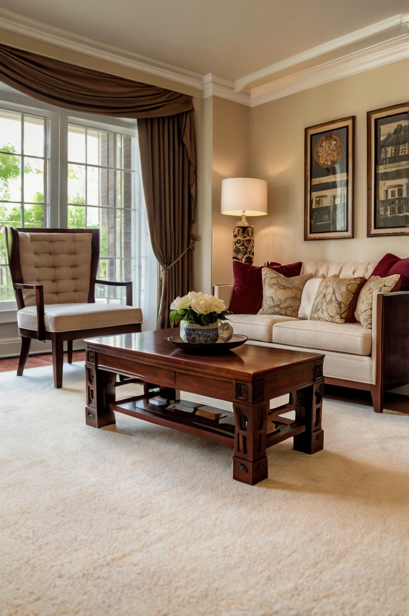
1. Cream or Ivory Carpet
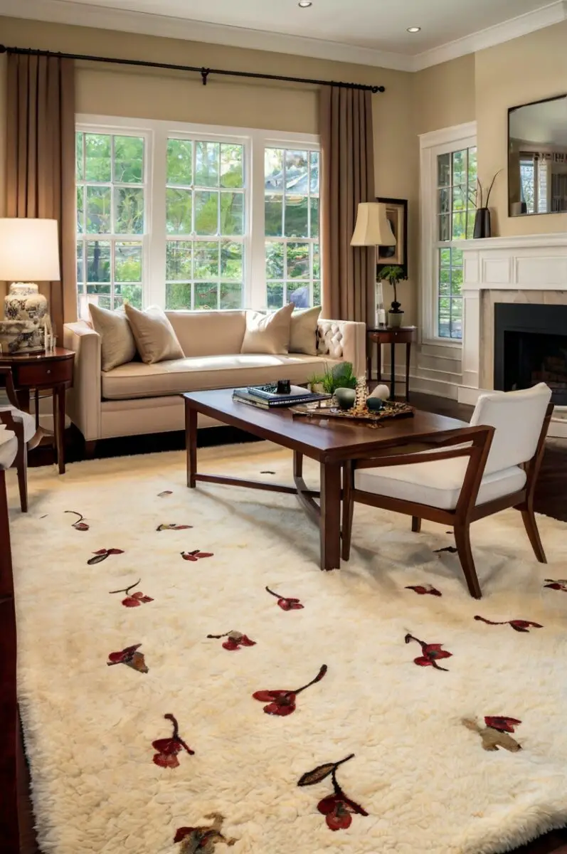

Cream or ivory carpet creates a light, airy backdrop that lets your cherry wood furniture become the star of the show.
This classic pairing works because the warm undertones in cream carpets echo the warmth of cherry wood without competing for attention.
You’ll notice how the light carpet color brightens the entire room, making it feel more spacious and open.
The contrast between dark cherry wood and light carpet creates visual interest that draws the eye.
When cherry wood furniture sits on cream carpet, the rich wood grain and reddish tones become more pronounced.
This contrast helps define your furniture pieces rather than letting them blend into the background.
If you’re worried about keeping light carpets clean, consider a cream option with subtle flecks or patterns that help disguise minor marks.
Many modern stain-resistant carpet options make this lighter choice more practical than you might think.
For homes with children or pets, look for cream carpets with built-in stain protection technology.
You’ll find that cream carpet with cherry wood works well in both traditional and contemporary settings.
In traditional spaces, this combination feels timeless and elegant.
In more modern rooms, it creates a clean, fresh foundation that lets your cherry wood pieces make a statement.
Consider the lighting in your room when selecting cream carpet shades.
Rooms with abundant natural light can handle slightly cooler ivory tones.
Spaces with limited natural light benefit from warmer cream tones that prevent the room from feeling cold.
To enhance this pairing, add accent pieces in complementary colors like navy blue, forest green, or burgundy.
These accents will tie together the warm tones of your cherry wood and create a cohesive color story throughout the room.
Remember that texture matters almost as much as color when choosing cream carpets.
A plush, high-pile carpet adds comfort and luxury, while a tighter berber style offers durability and a more tailored look.
2. Soft Gray Carpet
Soft gray carpet creates a sophisticated, contemporary foundation that balances cherry wood’s traditional warmth.
This pairing works because gray acts as a neutral that allows the rich tones of cherry wood to stand out without competition.
You’ll achieve a balanced look that feels current yet timeless.
Gray carpeting comes in countless shades, from pale silver to deep charcoal.
With cherry wood furniture, medium-toned grays with warm undertones often work best.
These warmer grays prevent the room from feeling too cool or sterile.
The subtle contrast between warm cherry wood and cool gray creates a dynamic tension that makes rooms more interesting.
Your furniture will appear richer and more dimensional against this understated background.
When selecting gray carpet, consider samples with slight taupe or beige undertones that can bridge the gap between cool gray and warm cherry.
These “greige” options create a harmonious transition between your furniture and flooring.
Gray carpet offers exceptional versatility when it comes to other design elements in your room.
You’ll find it easy to incorporate accent colors like navy, burgundy, emerald, or even brighter pops of color.
For a cohesive look, choose throw pillows, artwork, or accessories that pick up both the gray tones and the reddish hues of your cherry wood.
Textured gray carpets add another dimension to this pairing.
Consider options with subtle patterns, berber flecks, or varied pile heights for additional visual interest.
Gray carpeting tends to hide dirt and stains better than lighter options, making it practical for busy households.
This practical benefit doesn’t sacrifice style, as gray remains one of the most designer-approved neutrals.
If your cherry wood has golden undertones, cooler gray carpets create a pleasing contrast.
For cherry wood with deeper red undertones, warmer grays maintain harmony throughout the space.
Lighting plays a crucial role in how this combination appears.
In rooms with abundant natural light, gray carpet appears lighter and brighter.
In spaces with limited natural light, consider lighter gray shades to prevent the room from feeling too dark.
3. Navy Blue Carpet
Navy blue carpet creates a bold, dramatic foundation that pairs surprisingly well with cherry wood furniture.
This rich color combination draws on classic design principles where cool and warm tones balance each other perfectly.
You’ll create a sophisticated space that feels both grounded and elegant with this pairing.
Navy blue works because it’s a complementary color to the reddish tones in cherry wood.
These colors sit opposite each other on the color wheel, creating a naturally pleasing visual dynamic.
The depth of navy provides a strong foundation that supports the visual weight of substantial cherry wood pieces.
Your furniture will appear to “float” beautifully against this deep background.
When choosing navy carpet, look for options with a subtle sheen or varied texture.
These details prevent the dark color from appearing flat or overwhelming.
For rooms with limited natural light, consider navy carpets with slightly brighter undertones to keep the space from feeling too dark.
Navy blue carpet with cherry wood furniture creates a perfect canvas for traditional design schemes.
You’ll find this combination particularly effective in formal living rooms, studies, or master bedrooms where you want to create a sense of luxury and permanence.
To brighten this darker combination, incorporate metallic accents in silver, gold, or brass.
These reflective elements add sparkle and prevent the room from feeling too heavy.
White or cream trim and ceiling paint becomes especially important with this color combination.
You’ll want these lighter elements to provide relief and contrast against the deeper colors.
Consider incorporating patterns in your accessories that contain both navy and burgundy tones.
This strategy ties together your carpet and furniture colors for a cohesive look.
While navy carpet requires some design confidence, it offers practical benefits too.
This dark color excels at hiding stains and showing less wear in high-traffic areas.
For a more contemporary take on this pairing, look for navy carpets with subtle geometric patterns or varying pile heights.
These modern touches prevent the classic color combination from feeling outdated.
If full navy carpet feels too bold, consider area rugs in navy blue placed under or in front of your cherry wood furniture.
This approach gives you the beautiful color contrast without committing the entire floor to dark blue.
4. Sage Green Carpet
Sage green carpet creates a serene, nature-inspired foundation that complements cherry wood furniture beautifully.
This gentle green hue works because it sits adjacent to red on the color wheel, creating a harmonious relationship with cherry wood’s reddish tones.
You’ll achieve a balanced, organic look that brings the calming effect of nature indoors.
The soft, muted quality of sage green provides enough color to be interesting without overwhelming your cherry wood pieces.
This allows your furniture to remain the focal point while still having a distinctive floor covering.
When selecting sage green carpet, look for options with gray undertones rather than yellow ones.
These grayer sages create a more sophisticated backdrop that enhances cherry wood’s rich color.
This combination works particularly well in bedrooms, sitting rooms, or any space where you want to create a relaxing atmosphere.
Your cherry wood pieces will appear warm and inviting against this cool, soothing background.
To enhance this nature-inspired palette, incorporate botanical elements through artwork, throw pillows, or actual plants.
These additions reinforce the organic feeling of your sage green and cherry wood pairing.
For a cohesive color story, choose accessories that bridge your carpet and furniture colors.
Copper accents work beautifully here, picking up the reddish tones in the wood while complementing the sage carpet.
Sage green carpet offers surprising versatility across decorating styles.
You’ll find it works equally well in traditional settings, craftsman-style homes, or even more contemporary spaces when paired with the right accessories.
Natural light affects how sage green carpet appears throughout the day.
In rooms with northern exposure, sage takes on a cooler appearance.
In spaces with southern light, the warmth of the sunlight brings out more of the yellow undertones in sage.
Consider the existing light in your room when selecting your specific shade of sage.
For traditional cherry furniture with ornate details, choose a sage with slightly more gray to create a sophisticated backdrop.
For more contemporary cherry pieces with cleaner lines, brighter sage tones create a fresh, modern feel.
Sage green carpet shows less dirt and wear than many other colors, making it practical for family homes.
This practicality, combined with its aesthetic appeal, makes it a smart choice for rooms with cherry wood furniture.
✨Click to Get My 101 FREE Designer Room Ideas
5. Beige or Taupe Carpet
Beige or taupe carpet creates a warm, neutral foundation that enhances cherry wood furniture without competing for attention.
This timeless pairing works because these neutral colors share the same warm undertones as cherry wood, creating a seamless visual flow.
You’ll achieve a cohesive look that feels intentional and designed.
When selecting beige carpet, look for options with slight pink or reddish undertones.
These warmer beiges harmonize beautifully with cherry wood’s rich color.
Taupe, which blends beige and gray, offers slightly more depth while maintaining the neutral versatility.
This pairing creates a sophisticated backdrop that lets your cherry wood furniture become the focal point of your room.
The neutral carpet allows the distinctive grain patterns and rich color of cherry wood to truly shine.
For smaller spaces, this combination helps maintain an open, airy feel while still incorporating the substantial presence of cherry wood.
Your room will feel larger and more cohesive with this harmonious color pairing.
Beige and taupe carpets serve as excellent foundations for various design styles.
You’ll find they work equally well in traditional settings with ornate cherry pieces or more contemporary spaces with cleaner-lined furniture.
To prevent this neutral combination from feeling flat, incorporate varied textures throughout your space.
Consider textured carpet patterns, nubby throws, or tactile fabrics on accent furniture.
These textural elements add depth and interest to the neutral palette.
Pattern plays well with this combination too.
You can incorporate patterned drapes, pillows, or area rugs that include both the beige/taupe tones and the reddish hues of cherry wood.
This strategy creates visual connections throughout your space.
For a designer touch, add black accents to this neutral combination.
Black picture frames, lamp bases, or decorative objects create definition and prevent the warm tones from blending too much.
Lighting significantly impacts how beige and taupe carpets appear.
In rooms with abundant natural light, these neutrals take on a brighter, more luminous quality.
In spaces with limited light, warmer beige tones prevent the room from feeling cold or flat.
When selecting beige or taupe carpet for your cherry wood furniture, bring home samples to view in your actual space.
These neutral colors are highly influenced by your specific lighting conditions and existing wall colors.
6. Burgundy or Wine Carpet
Burgundy or wine carpet creates a rich, luxurious foundation that amplifies the warmth of cherry wood furniture.
This bold monochromatic pairing works by expanding on the reddish tones already present in your cherry wood.
You’ll create a dramatic, enveloping space that feels both cozy and sophisticated.
When cherry wood furniture sits on burgundy carpet, the similar color families create a seamless visual flow.
This approach embraces color psychology, where surrounding yourself with warm reds creates feelings of energy and comfort.
For formal spaces like dining rooms or studies, this combination creates an atmosphere of traditional elegance.
Your cherry wood dining table or desk will appear more substantial and important against this rich background.
To prevent this combination from feeling overwhelming, balance it with lighter elements elsewhere in the room.
Cream or ivory walls provide necessary contrast, while metallic accents add sparkle that breaks up the deep color palette.
Burgundy carpet works particularly well in rooms that don’t receive abundant natural light.
Rather than fighting the inherent darkness, this approach leans into creating a cozy, enveloping atmosphere.
You’ll find this strategy especially effective in basement rooms, media rooms, or spaces used primarily in the evening.
When selecting burgundy carpet, look for options with subtle variations in tone or texture.
These details prevent the deep color from appearing flat or one-dimensional.
To maintain visual interest with this monochromatic approach, incorporate patterns that contain both burgundy and brown tones.
These patterns create bridges between your carpet and furniture colors.
For a more contemporary interpretation of this pairing, choose a burgundy carpet with geometric patterns or modern textures.
These updated elements prevent the traditional color combination from feeling dated.
From a practical standpoint, burgundy carpet excels at hiding stains and showing less wear in high-traffic areas.
This makes it particularly suitable for family rooms or spaces that see heavy use.
If full burgundy carpet feels too bold, consider incorporating this color through large area rugs under your cherry wood furniture.
This approach gives you the rich color combination without committing the entire floor to burgundy.
For small spaces, this deep color combination can make rooms feel smaller and more intimate.
Embrace this effect in spaces where you want to create a cozy, enveloping atmosphere.
7. Warm Gold or Mustard Carpet
Warm gold or mustard carpet creates a sunny, energetic foundation that complements cherry wood furniture beautifully.
This color pairing works because gold tones sit adjacent to red on the color wheel, creating a harmonious relationship with cherry wood’s reddish-brown hues.
You’ll achieve a warm, inviting space that feels both cheerful and sophisticated.
When cherry wood furniture sits on gold carpet, both elements retain their distinctive character while creating a cohesive color story.
The warm gold pulls out the amber undertones sometimes present in cherry wood, creating a sunlit effect throughout the room.
For traditional cherry furniture with ornate details, deeper mustard tones create a rich, historic feel reminiscent of classic design.
Your antique or traditional cherry pieces will feel right at home against this warm background.
For more contemporary cherry wood furniture with cleaner lines, brighter gold tones create a fresh, modern interpretation.
This pairing feels unexpected and design-forward while still honoring the warmth of natural materials.
Gold and mustard carpets bridge the gap between neutral and colorful options.
You’ll find they act almost as a neutral foundation while still providing more visual interest than beige or cream.
This color combination works particularly well in spaces that receive northern light, which tends to be cooler and bluer.
The warm gold carpet counterbalances this cool light, creating a more balanced, inviting atmosphere.
To enhance this pairing, incorporate accessories in complementary blue-green shades.
These cooler accent colors provide balance to the warm gold and cherry combination.
Textured gold carpets add another dimension to this pairing.
Consider options with subtle patterns, varied pile heights, or berber flecks for additional visual interest.
From a practical standpoint, gold and mustard carpets excel at disguising minor stains and dirt.
This makes them suitable for family rooms and other high-traffic areas.
If you’re hesitant about wall-to-wall gold carpet, consider large area rugs in gold tones placed under your cherry wood furniture groupings.
This approach lets you test the combination without committing the entire floor to this distinctive color.
When selecting gold carpet shades, bring home samples to view in your actual space with your cherry furniture.
The specific undertones in your cherry wood should guide your selection toward either amber-gold or more yellow-gold options.
8. Chocolate Brown Carpet
Chocolate brown carpet creates a rich, grounding foundation that pairs beautifully with cherry wood furniture.
This combination works by creating a subtle contrast between the reddish tones of cherry and the deeper brown of the carpet.
You’ll achieve a sophisticated, layered look that celebrates natural materials and warm tones.
When cherry wood furniture sits on chocolate brown carpet, the slight difference in color temperature creates visual interest without stark contrast.
This approach feels cohesive yet provides enough distinction to highlight your furniture pieces.
For traditional interiors, this pairing creates a timeless, elegant atmosphere reminiscent of classic design.
Your cherry wood dining set or bedroom furniture will feel appropriately substantial against this rich background.
In more contemporary spaces, this combination can be updated with metallic accents and cleaner-lined accessories.
The fundamental warmth of both elements provides a foundation for various design styles.
Chocolate brown carpet offers practical benefits for busy households.
This deep color excels at hiding dirt, stains, and wear patterns in high-traffic areas.
To prevent this combination from feeling too heavy or dark, balance it with lighter elements elsewhere in the room.
Cream or ivory walls provide necessary contrast, while mirrors and glass accents add lightness and sparkle.
For spaces with limited natural light, consider chocolate brown carpets with subtle reddish undertones.
These warmer browns prevent the room from feeling too dark or closed-in.
Texture becomes particularly important with this combination.
Consider chocolate brown carpets with varied pile heights, subtle patterns, or berber flecks to add visual interest.
These textural elements prevent the deep color from appearing flat or one-dimensional.
To brighten this darker combination, incorporate accessories in lighter complementary colors.
Pale blue, sage green, or even coral accents create refreshing counterpoints to the rich brown tones.
For a cohesive color story, choose artwork or textiles that incorporate both chocolate brown and the reddish tones of your cherry wood.
This strategy creates visual connections throughout your space.
When selecting chocolate brown carpet, bring home samples to view in your actual space with your furniture.
The specific undertones in both your carpet and cherry wood significantly impact how this combination appears.
If full chocolate brown carpet feels too bold, consider incorporating this color through large area rugs under your cherry wood furniture.
This approach gives you the rich color combination without committing the entire floor to dark brown.
✨Click to Get My 101 FREE Designer Room Ideas
9. Soft Blue Carpet
Soft blue carpet creates a cool, refreshing foundation that beautifully contrasts with warm cherry wood furniture.
This pairing works because blue sits opposite orange-red on the color wheel, creating a naturally pleasing complementary relationship.
You’ll achieve a balanced, designer-approved look that feels both sophisticated and relaxing.
When cherry wood furniture sits on soft blue carpet, the contrast highlights the rich warmth of the wood.
This approach makes your furniture pieces appear more vibrant and distinctive.
For spaces where you want to create a calming atmosphere, this combination excels.
Your bedroom or sitting room will feel serene yet still visually interesting with this balanced color pairing.
Soft blue encompasses a wide range of shades from pale sky blue to deeper slate blue with gray undertones.
For cherry wood with strong red tones, bluetones with slight gray undertones create the most harmonious contrast.
For cherry wood with more amber undertones, clearer, slightly brighter blues create a beautiful counterpoint.
This combination adapts well to various design styles.
You’ll find it works equally well in traditional settings with ornate cherry pieces or coastal-inspired rooms with more streamlined furniture.
To enhance this pairing, incorporate accessories that bridge your blue carpet and cherry furniture.
Textiles or artwork containing both blue and burgundy tones create visual connections throughout your space.
Soft blue carpet makes rooms feel larger and more open, an optical effect that can balance the substantial presence of cherry wood furniture.
This quality makes it particularly valuable in smaller spaces where you want to create an airier feel.
From a practical standpoint, medium-toned blues show less dirt and wear than very light or very dark options.
This makes soft blue carpet a reasonable choice for family homes and high-traffic areas.
When selecting soft blue carpet, consider how your specific room’s lighting affects the color.
In spaces with warm-toned light bulbs, blue carpets can appear slightly purplish or greenish.
Natural daylight provides the truest representation of blue tones.
If you’re hesitant about wall-to-wall blue carpet, consider incorporating this color through large area rugs under your cherry wood furniture.
This approach lets you test the combination without committing the entire floor to blue.
For a contemporary twist on this pairing, consider blue carpets with subtle patterns or textural elements.
These details add another dimension to the already dynamic color combination.
10. Olive Green Carpet
Olive green carpet creates an earthy, sophisticated foundation that complements cherry wood furniture with natural elegance.
This pairing works because olive green contains both warm yellow and cool blue undertones, allowing it to harmonize with cherry wood’s reddish-brown hues.
You’ll achieve a grounded, organic look that feels both timeless and current.
When cherry wood furniture sits on olive green carpet, the combination evokes the complementary colors found in nature.
This natural partnership creates spaces that feel inherently balanced and restful.
For rooms where you want to create a connection to the outdoors, this combination proves particularly effective.
Your home office, library, or family room will benefit from the serene, nature-inspired palette.
Olive green’s muted quality provides enough color to be interesting without overwhelming your cherry wood pieces.
This allows your furniture to remain the focal point while still having a distinctive floor covering.
From a practical standpoint, olive green excels at disguising dirt and wear patterns.
This medium-toned color shows less soil than lighter options while remaining lighter and more versatile than very dark carpets.
To enhance this pairing, incorporate metallic accents in bronze or antique gold.
These warm metallics bridge the gap between your green carpet and reddish furniture tones.
For a cohesive color story, choose accessories that incorporate both olive green and burgundy or rust tones.
These elements create visual connections throughout your space.
This combination adapts well to various design styles.
You’ll find it works beautifully in traditional settings, craftsman or mission-style homes, or even more contemporary spaces with the right accessories.
When selecting olive green carpet, look for options with slight texture or subtle patterns.
These details add dimension to the color and prevent it from appearing flat.
For cherry wood with stronger red undertones, choose olive greens with more gray in them.
For cherry wood with more amber tones, slightly yellower olive greens create a harmonious relationship.
If you’re hesitant about wall-to-wall olive carpet, consider incorporating this color through large area rugs under your cherry wood furniture.
This approach lets you test the combination without committing the entire floor to green.
In rooms with limited natural light, olive green carpet with slightly brighter undertones prevents the space from feeling too dark.
This consideration becomes particularly important in basement rooms or north-facing spaces.
11. Light Terracotta or Coral Carpet
Light terracotta or coral carpet creates a warm, energetic foundation that amplifies the beauty of cherry wood furniture.
This color pairing works by extending the reddish tones of cherry wood into a brighter, more vibrant expression.
You’ll achieve a space that feels cohesive yet dynamic, with a color story that flows naturally.
When cherry wood furniture sits on light terracotta carpet, the similar color families create a harmonious relationship while the difference in brightness creates visual interest.
This approach embraces color psychology, where surrounding yourself with warm coral tones creates feelings of energy and optimism.
For spaces where you want to create a cheerful, welcoming atmosphere, this combination excels.
Your living room or dining area will feel inviting and vibrant with this warm color pairing.
Light terracotta and coral carpets bridge the gap between neutral and colorful options.
You’ll find they provide more visual interest than beige while remaining versatile enough to work with various accessories.
This combination works particularly well in rooms that receive cool northern light.
The warm carpet tones counterbalance the cooler light quality, creating a more balanced atmosphere.
To prevent this warm combination from feeling overwhelming, incorporate some cooler accent colors like sage green or navy blue.
These contrasting elements provide visual relief and balance.
For a cohesive color story, choose accessories that contain both coral and the deeper burgundy tones found in cherry wood.
These elements create connections throughout your space.
Light terracotta and coral carpets can make rooms feel slightly smaller and more intimate.
This quality can be beneficial in large spaces where you want to create a cozier atmosphere.
When selecting terracotta carpet shades, bring home samples to view in your actual space with your cherry furniture.
The specific undertones in both elements significantly impact how this combination appears.
From a practical standpoint, terracotta and coral show moderate wear and soil.
They’re not as forgiving as darker colors but hide more than very light options.
If you’re hesitant about wall-to-wall terracotta carpet, consider incorporating this color through large area rugs under your cherry wood furniture.
This approach lets you test the combination without committing the entire floor to this distinctive color.
For a more contemporary interpretation of this pairing, choose terracotta carpets with subtle patterns or varied textures.
These details add another dimension to the already warm color combination.
12. Lavender or Lilac Carpet
Lavender or lilac carpet creates an unexpected, sophisticated foundation that pairs surprisingly well with cherry wood furniture.
This color combination works because purple hues contain both warm red and cool blue undertones, allowing them to harmonize with cherry wood’s reddish-brown tones.
You’ll achieve a distinctive, designer-approved look that feels both elegant and unique.
When cherry wood furniture sits on lavender carpet, the contrast highlights the rich warmth of the wood while the shared red undertones create a subtle connection.
This approach makes your furniture pieces appear more vibrant against a distinctive background.
For spaces where you want to create a relaxing yet distinctive atmosphere, this combination excels.
Your bedroom or sitting room will feel both restful and refined with this balanced color pairing.
Choose lavender or lilac carpets with gray undertones for the most sophisticated effect.
These muted purples create a more subtle backdrop than clearer violet shades.
The soft purple tones add a feminine touch to balance the substantial presence of cherry wood furniture.
This quality makes it particularly valuable in spaces where you want to create a more graceful, elegant atmosphere.
To enhance this pairing, incorporate accessories in complementary gold or brass tones.
These warm metallics bridge the gap between your cool carpet and warm furniture tones.
For a cohesive color story, choose artwork or textiles that incorporate both lavender and the burgundy tones of cherry wood.
These elements create visual connections throughout your space.
This combination adapts well to various design styles.
You’ll find it works beautifully in traditional settings with ornate cherry pieces or more contemporary spaces with cleaner-lined furniture.
When selecting lavender carpet, consider how your specific room’s lighting affects the color.
In spaces with warm-toned light bulbs, lavender can appear slightly pinker.
Natural daylight provides the truest representation of purple tones.
If you’re hesitant about wall-to-wall lavender carpet, consider incorporating this color through large area rugs under your cherry wood furniture.
This approach lets you test the combination without committing the entire floor to purple.
From a practical standpoint, medium-toned lavenders show moderate wear and soil.
They’re not as forgiving as darker colors but hide more than very light options.
For a more contemporary interpretation of this pairing, consider lavender carpets with subtle patterns or textural elements.
These details add another dimension to this already distinctive color combination.
✨Click to Get My 101 FREE Designer Room Ideas
13. Patterned Carpet with Cherry Wood Tones
Patterned carpet featuring cherry wood tones creates a coordinated foundation that enhances your furniture while adding visual interest.
This approach works by incorporating the reddish-brown hues of your furniture into a multi-colored pattern.
You’ll achieve a cohesive look that feels intentionally designed rather than coincidental.
When cherry wood furniture sits on patterned carpet containing similar tones, the result feels harmonious and pulled-together.
This strategy creates visual connections that make your entire space feel more coherent.
Patterned carpets with cherry tones come in countless variations, from traditional Oriental designs to more contemporary geometric patterns.
For classic interiors, choose patterns with medallions or floral motifs that include burgundy and brown tones.
For more modern spaces, look for abstract or geometric patterns with similar color stories.
This approach offers practical benefits for busy households.
Patterned carpets excel at hiding dirt, stains, and wear patterns in high-traffic areas.
The varied colors and designs naturally camouflage minor soiling.
When selecting patterned carpet, look for options where cherry wood tones appear as one of several colors rather than the dominant shade.
This prevents the combination from feeling overwhelming or too matched.
To enhance this pairing, pull accent colors from other hues in your carpet pattern.
If your carpet contains navy blue alongside cherry tones, incorporate navy accessories throughout your room.
This strategy extends the color story of your carpet throughout the space.
For a cohesive look, choose patterns where the scale feels proportionate to your furniture pieces.
Large, substantial cherry wood pieces work well with medium to large-scale patterns.
More delicate furniture might pair better with smaller, more intricate designs.
Patterned carpets can make rooms feel slightly busier visually.
Balance this effect by keeping other elements in the room relatively simple.
Solid-colored walls and window treatments provide visual relief from the pattern.
When selecting patterned carpet, bring home samples to view in your actual space with your cherry furniture.
The specific undertones in your furniture significantly impact how the pattern appears.
If wall-to-wall patterned carpet feels too bold, consider incorporating patterns through large area rugs under your cherry wood furniture.
This approach gives you the coordinated color combination without committing the entire floor to pattern.
For rooms with multiple types of wood tones, patterned carpets containing cherry tones can help bridge different wood finishes.
This quality makes them particularly valuable in open-concept spaces where various wood elements need to work together.
