Pine has this warm, golden-amber undertone that honestly makes it one of the coziest wood tones out there.
But that warmth?
Unlike dark walnut or cool grey driftwood finishes, pine sits in this very specific middle zone — not too dark, not too light.
It carries yellow and orange undertones that react strongly to whatever color you put beneath it.
When I first moved into my home, I didn’t think about any of this.
I just picked a carpet I liked on its own — a sort of beige-grey blend — and wondered for months why my pine dining table never looked quite right.
The carpet was pulling cool, the wood was pulling warm, and they were basically having a silent argument on the floor.
You want your carpet to either complement pine’s natural warmth or create a deliberate, beautiful contrast.
Those are really your two paths — and both can be stunning when done right.
The trick is knowing which direction to lean.
Soft Sage Green — My Absolute Favorite Pairing

Okay, if I had to pick one carpet color to put under pine furniture forever, it would be soft sage green.
No hesitation.
I’m obsessed with what sage does to a pine-heavy room.
It’s warm enough to feel organic and earthy, but it brings in just enough coolness to balance out pine’s golden tones.
The result is this incredibly cozy, nature-inspired space that feels like a breath of fresh air.
When I layered a sage green area rug under my pine coffee table last spring, I genuinely stopped in the doorway and just smiled.
The wood looked richer.
More intentional.
Like it belonged there.
Sage works especially well if your pine furniture has a natural or lightly oiled finish — the kind that still shows a lot of that beautiful grain texture.
It also photographs beautifully, which, let’s be honest, matters a little bit.
If you want a variation, try a sage with a slight grey undertone rather than a yellow-green one.
That keeps things sophisticated and stops the room from feeling too rustic.
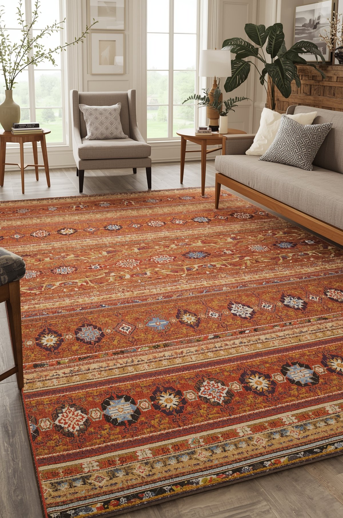
Warm Terracotta and Rust Tones — For the Bold and Beautiful

Now this one is for the girl who isn’t afraid to make a statement.
Terracotta carpet under pine furniture is one of those combinations that sounds risky and then absolutely delivers.
The burnt orange and clay tones in terracotta echo the warm amber already living inside pine wood.
So instead of clashing, they sort of celebrate each other.
It becomes this rich, layered warmth that feels incredibly grounding and stylish.
I remember visiting a friend’s apartment where she had a rust-toned woven rug under her pine bed frame, and the whole room felt like a warm hug.
It was cozy in the best possible way — like autumn permanently lived in that space.
If you’re going terracotta, I’d suggest keeping your walls on the lighter, more neutral side — a creamy white or a warm linen tone works beautifully.
This stops the room from feeling too heavy or closed in.
And you don’t have to go full carpet in this color if it feels like too much.
A large terracotta area rug with natural fiber borders is a softer way to try the look first.
Trust me on this one — it’s so much warmer and more personal than a plain beige ever could be.
Creamy Ivory and Warm White — The Classic That Always Works

Sometimes the most stunning thing you can do is keep it simple.
A creamy ivory or warm white carpet under pine furniture creates this fresh, airy backdrop that lets the wood do all the talking.
And pine really does have so much to say when you give it that kind of space.
The key — and this is something I learned the hard way — is to make sure your ivory leans warm rather than stark white.
A cold, blue-white carpet will immediately make pine look orange and cheap.
But a warm, buttery ivory?
It makes pine look like something from a high-end Scandinavian interior.
I tried this in my guest bedroom, and the change was genuinely shocking.
The same pine wardrobe I’d had for years suddenly looked intentional and elevated.
For texture, I love a low-pile wool blend in this color range — it adds softness without feeling too busy.
And if you have kids or pets (same), look for ivory carpets with a subtle pattern woven in — it hides life beautifully while still giving you that clean, bright aesthetic.
This is also the easiest option to build around as your tastes evolve.
It never really goes wrong.
Dusty Blue and Muted Denim Tones — The Unexpected Gorgeous Option

Can we talk about dusty blue for a second?
Because I feel like not enough people are putting this color on the floor, and it is stunning with pine.
Dusty blue sits on the cooler side, which might seem counterintuitive for warm pine tones.
But that’s exactly what makes it work.
The contrast is deliberate and beautiful — like pairing a cozy flannel shirt with something unexpectedly elegant.
The coolness of the blue makes pine’s warmth pop in the most flattering way.
It creates visual depth and a kind of quiet sophistication that I find really addictive.
I have a dusty blue runner in my hallway where a small pine console table lives, and guests always comment on it.
They can’t quite put their finger on why it works — it just does.
For this pairing, I’d avoid very bright or saturated blues.
You want the muted, almost faded quality — think washed denim or a blue that’s been left in the sun a little.
Linen-blend carpets in this tone are especially gorgeous.
They have that soft, lived-in texture that feels incredibly cozy underfoot.
If you have pine furniture and you’ve never considered blue — please, give it a chance.
Deep Forest Green — Moody, Rich, and Kind of Magical

Okay, this one is for the maximalists and the moody room lovers.
A deep forest green carpet under pine furniture creates this lush, almost cabin-like atmosphere that I find completely irresistible.
Pine’s golden tones glow against deep green in a way that feels very organic — like wood and forest moss existing together naturally.
There’s something ancestral and warm about this combination.
When I decorated my reading nook last winter with a deep green wool rug and my pine bookshelves lining the walls — I genuinely didn’t want to leave that room.
It felt cozy and enveloping in the most wonderful way.
This color works especially well in rooms with lower light or smaller windows, because it leans into the cozy rather than fighting it.
Don’t be afraid of the depth.
Pair it with warm brass or antique gold accents — lamp bases, picture frames, drawer pulls — and the whole thing becomes incredibly cohesive.
Cream or white linen cushions will keep the room from feeling too dark or heavy.
One personal tip: opt for a plush or medium pile carpet in forest green rather than a flat weave.
The texture adds luxury and stops the color from looking flat or too muted.
It’s a look that genuinely feels like a magazine page in real life.
Warm Mushroom and Greige Tones — The Sophisticated Neutral

I know, I know — neutrals can sound boring.
But hear me out, because warm mushroom and greige tones are anything but.
This is a color family that sits right at the intersection of grey and brown, with a soft warmth that genuinely flatters pine furniture beautifully.
It doesn’t compete with the wood.
It doesn’t try to match it exactly.
It just sort of… supports it.
Like a really good supporting actress who lets the lead shine.
Greige carpet gives a room this calm, pulled-together quality that I find endlessly relaxing.
It’s sophisticated without being cold.
Warm without being overwhelming.
When I helped a friend style her open-plan living space — all pine furniture, high ceilings, big windows — we chose a warm mushroom carpet and it tied every single piece of furniture together effortlessly.
The room went from feeling a little scattered to feeling intentional and serene.
If you lean toward a minimal or Japandi-inspired aesthetic, this is your color.
Look for carpet with a subtle texture — a soft loop pile or a gentle boucle — to add dimension without adding noise.
And layer it with natural linen, rattan, and raw cotton for a complete look that feels quietly luxurious.
Burnt Caramel and Honey Tones — When You Lean Into the Warmth

Some rooms just want to be warm.
And if your pine furniture already has that rich, golden caramel finish, you can absolutely lean into it rather than contrast it.
A carpet in burnt caramel, amber honey, or warm toffee tones creates a monochromatic warmth that feels deeply cozy and incredibly intentional.
This is a tonal approach — layering shades of the same warm family — and when done right, it’s absolutely beautiful.
Think of it like a warm cup of tea in room form.
Every single element is working in the same direction, and the result is this enveloping, inviting energy that makes people want to sit down and stay a while.
I tried a honey-toned area rug in my dining room under my pine table and chairs, and the room suddenly felt like it had always been decorated.
Like it had history.
Warm tonal rooms feel very collected and personal.
To keep it from feeling one-note, vary your textures significantly.
A chunky knit throw, a smooth ceramic vase, a raw linen curtain — these textural differences are what keep a warm-toned room feeling rich rather than flat.
And if you’re worried about the room feeling too dark?
White walls are your best friend here.
Charcoal and Soft Black — The Bold Contrast That Stuns

Now this is the pairing nobody expects — and it completely stops me in my tracks every time I see it done well.
Charcoal or deep soft-black carpet under pine furniture creates the most dramatic, beautiful contrast.
Pine’s warmth absolutely glows against a dark floor, in the same way candlelight glows brightest in a dimmer room.
It’s striking.
Sophisticated.
And kind of unexpectedly cozy.
I saw this combination in a small studio apartment tour I bookmarked ages ago — dark charcoal carpet, natural pine bed frame, white walls — and it has lived in my mind ever since.
The pine looked almost luminous against the dark ground.
If this feels too bold for your whole room, try a large charcoal area rug rather than wall-to-wall carpet.
This gives you the contrast without full commitment.
I’d pair this with warm, ambient lighting — table lamps with warm bulbs, a couple of candles — to soften the drama and make it feel inviting rather than stark.
Cool metals like brushed nickel or chrome?
Skip them here.
Go for warm brass, aged bronze, or matte black for hardware and accents.
This combination works especially beautifully in bedrooms, where that cocooning, dramatic quality feels really intentional and luxurious.
Blush Pink and Warm Rose — Feminine, Fresh, and Surprisingly Perfect

I know what you might be thinking.
Pink carpet?
But wait — a soft, muted blush or dusty rose carpet under pine furniture is genuinely one of the prettiest combinations I’ve ever styled.
The warmth in blush pink harmonizes with pine’s golden undertones without matching them, creating this soft, romantic atmosphere that feels incredibly elegant.
It’s the kind of combination that makes a room feel like it belongs in a French countryside home.
Cozy, feminine, and full of quiet charm.
I used a blush pink woven rug in a small bedroom project last year, pairing it with a natural pine dresser and bed frame, and the room was just… dreamy.
There really is no other word for it.
For this look, keep blush on the muted, dusty side rather than bubblegum bright.
You want rose water, not bubble gum.
Pair with cream, soft white, and warm rattan accents to keep things grounded and avoid it feeling too sweet.
Dried botanicals in terracotta pots, linen bedding in oat tones, soft brass fixtures — these details complete the look beautifully.
It’s the perfect option for a primary bedroom or a nursery where you want warmth and softness in equal measure.
Pattern Play — When One Color Isn’t Enough

Sometimes a single solid color just doesn’t capture the full feeling you’re going for.
And that’s exactly when a patterned carpet becomes your best friend.
For pine furniture, I love patterns that incorporate at least two or three of the tones I’ve already mentioned — sage, cream, dusty blue, warm terracotta — woven together into something cohesive and beautiful.
Persian-inspired patterns, soft Moroccan geometrics, and Scandinavian folk motifs all work incredibly well with pine.
They add visual interest to the floor without overpowering the furniture.
My personal favorite?
A faded, vintage-style Persian rug in muted blues and warm reds under a pine dining table.
It creates this collected, well-traveled feel that I find so much more personal than any single solid color ever could.
When choosing a patterned carpet for a pine room, let the pattern include at least one warm tone so it doesn’t fight the wood’s natural color family.
And always lay it out in the room — or order a sample — before committing.
Patterns look very different on a floor than they do on a screen.
Trust the room, not the thumbnail.
My Practical Tips Before You Choose Your Carpet

Before you fall in love with a color and go all in, there are a few things I always do — and always wish I’d done earlier.
First: get a sample.
Always, always get a physical carpet sample and lay it on your actual floor next to your actual pine furniture.
Colors shift completely depending on your room’s light, and what looks perfect on a website can look totally off in your space.
Second: think about your light source.
North-facing rooms pull cooler, so warm carpet tones — terracotta, honey, creamy ivory — will feel even more important in those spaces.
South-facing rooms get that beautiful warm light that makes almost any palette sing.
Third: consider the full picture.
Your carpet doesn’t live alone — it lives with your walls, your curtains, your cushions, and all your other furniture.
Pull everything together in your mind (or on a mood board) before you commit.
Fourth: don’t be afraid of texture.
The texture of a carpet affects how its color reads in a room just as much as the actual color itself.
A plush pile reads richer and deeper.
A flat weave reads lighter and more casual.
And finally — trust your gut.
If you walk into a room and a color makes you exhale a little, that’s usually the right answer.
That exhale?
That’s your home feeling like home.


